Fabric Labels with Logo: How to Order the Right Fit
If a product needs one small detail to keep doing its job long after the packaging is gone, fabric labels with logo are hard to beat. They survive washing, folding, resale, storage, and the everyday friction that tends to wear down the rest of a brand’s presentation. That durability is part of the appeal: the label is still there when the hang tag is in the trash.
Buyers often treat labels as a finishing touch. In production terms, they are more than that. A label affects comfort, compliance, brand consistency, and even how the garment is perceived on first touch. A hoodie with a tidy woven label feels intentional. The same hoodie with a scratchy, off-center tag can suddenly feel less expensive than the fabric itself.
That gap matters because customers rarely separate “brand” from “construction.” They notice the stitch quality, the handfeel of the label, and whether the logo is sharp enough to read at a glance. Those are small signals, but they stack quickly.
What fabric labels with logo actually do for your brand
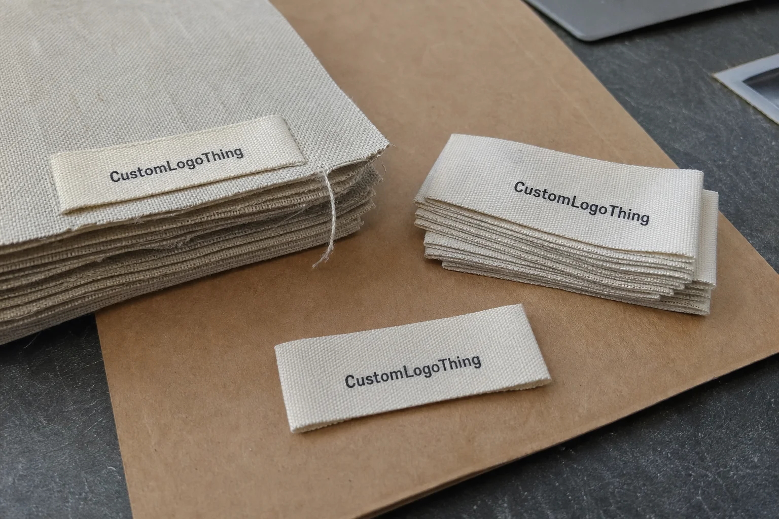
Fabric labels are sewn-in identifiers used on clothing, accessories, and soft goods. They may carry a logo, size, care details, fiber content, or a combination of all three. Depending on the product, the label may sit in the neck, the side seam, the hem, or inside a pocket. Each placement changes how it feels and how long it remains visible.
The strongest role of fabric labels with logo is recognition. Customers may ignore packaging and forget the hang tag, but they keep seeing the sewn-in label every time they wear or wash the item. That repeated exposure is quietly valuable. It reinforces the brand in a way that one-time printed inserts rarely can.
There is also a functional reason these labels exist. Many garments need a permanent mark for sizing, care, or fiber content. Even when the branding is the main goal, the label has to do the practical work too. That means the layout has to balance readability, space, and compliance instead of trying to cram everything into a tiny rectangle.
It helps to keep the different product markings separate:
- Hang tags are temporary and usually removed at purchase.
- Care labels communicate washing and fiber content, often under compliance rules.
- Neck prints can reduce bulk, but they do not behave like sewn labels.
- Packaging inserts support presentation, though they do not stay with the product.
From a buyer’s perspective, the label often acts as a final quality check. It should look like the garment was planned as a whole, not assembled from unrelated pieces. That means thread density, fold style, edge finishing, and attachment method all matter. A strong logo file helps, but it is only one part of the equation.
In practice, the label is a brand mark and a manufacturing spec at the same time. If one of those is neglected, the other usually suffers. Tiny type may look elegant on screen and collapse in fabric. A smooth satin label may feel premium on a sample swatch and become awkward once stitched into a thick seam. Those mismatches are common, and they are usually avoidable with better specification up front.
How logo labels are made: materials, weave, and finishing
The production path usually begins with artwork review. For woven labels, the design is translated into a thread map, which converts the graphic into something a loom can produce. For printed labels, the setup focuses more on substrate, color behavior, and print method. After that come cutting, folding, inspection, and packing.
Woven labels are built into the fabric itself. That gives them a more permanent feel and usually a cleaner brand presentation, especially when the logo needs texture and durability. Printed labels place the design onto the surface of the material, which can suit softer handfeel, simpler artwork, or smaller runs where tooling cost has to stay controlled.
The substrate affects the final result more than many first-time buyers expect. Common material options include:
- Damask for fine detail, tighter structure, and a smoother premium look.
- Satin for a soft surface and low-bulk feel against the skin.
- Cotton for a matte, natural appearance that suits heritage or eco-conscious branding.
- Taffeta for a lighter, budget-friendlier construction where function matters more than texture.
Finishing choices matter just as much as the base material. An end fold works well for side seams and hems. A center fold is common for neck labels and loop applications. A loop fold can be useful when the label needs to wrap around an edge. Heat cut and laser cut edges help reduce fraying, while a sewn edge can create a more traditional finish if the fabric and stitch plan support it.
Logo detail is where many projects either hold together or start to slip. Thin serif fonts, tiny icons, and fine legal text may look acceptable on a mockup and still disappear in the actual weave. If the design is dense, the safest fix is usually to increase the size or simplify the art, not to force the label into a format that cannot hold it.
| Label Type | Best Use | Feel | Typical Cost Impact |
|---|---|---|---|
| Woven damask | Premium apparel, detailed logos | Textured, durable | Moderate to higher depending on density |
| Printed satin | Soft neck labels, clean graphics | Smooth, low-bulk | Often lower for simple art |
| Cotton label | Natural, heritage-style branding | Matte, soft | Varies with finishing and quantity |
| Taffeta label | Functional, budget-conscious programs | Light, crisp | Usually the most economical option |
Before requesting samples, it helps to compare construction styles against the garment category you actually sell. A label that looks right on a flat mockup may not work once it is sewn into a heavyweight hoodie or a fine-knit top. The product page for Custom Labels & Tags is a useful reference point for sorting those options.
Cost, pricing, and MOQ factors that shape your quote
Label pricing is built from several variables, not a single flat rate. Size, weave density, color count, fold style, quantity, backing, and special finishing all affect the final quote. Two labels that look similar in a mockup can land in very different price bands once the production details are set.
For a practical range, simple woven labels at a modest quantity might sit around $0.08-$0.18 per unit. More detailed labels, tighter weave structures, or special finishing can move into the $0.20-$0.40 range or higher. Small orders usually carry a higher unit cost because the setup cost is spread across fewer pieces. Larger runs reduce the per-unit price because the loom or print setup gets used more efficiently.
Color count is another factor that shows up quickly in the quote. A one-color logo is usually easier to produce than a multicolor mark with fine type and small symbols. If the label needs higher thread density to preserve detail, cost can rise even when the design looks simple from a distance.
There are also practical cost drivers that first-time buyers tend to miss:
- Rush production when the timeline is compressed.
- Special backing such as iron-on or adhesive options.
- Retail-ready packing if labels need sorting, bundling, or barcode prep.
- Premium edge finishing that slows throughput.
- Extra revision cycles if artwork changes after proofing begins.
MOQ is not just a supplier preference. It reflects how production runs are organized. A factory setting up a loom for 300 labels is doing almost the same work as it would for 5,000, which is why the unit price improves as volume rises. The buyer sees a minimum order quantity; the production team sees time, setup, and yield.
The cheapest quote is rarely the safest buy. If the label cannot hold the logo clearly, feels rough against the skin, or frays after a few washes, the real cost appears later in rework, complaints, or replacement orders. Those failures usually cost more than choosing the correct spec in the first place.
For brands testing a new line, it can make sense to start with a simpler construction and then move toward a more refined version once the design has proven itself. If your trim program is broader than labels alone, comparing options within Custom Labels & Tags can keep the branding consistent across product categories.
Process and timeline: from artwork approval to delivery
The workflow is usually straightforward, but the details matter. You submit artwork, confirm the label size and fold style, review a digital proof, approve a sample or mockup if needed, and then move into production and shipping. Each step is there to catch a mistake before it turns into inventory.
Lead time depends on more than artwork alone. A clean printed label may move faster than a dense woven label. Larger quantities take longer. Specialty finishing adds time. Factory workload also affects the schedule, and that variable is easy to underestimate if you are used to standard printed goods with predictable turnaround.
Typical delays usually come from a few predictable places:
- Vector files were not provided, so the design has to be rebuilt.
- Pantone references are vague, which creates color uncertainty.
- The fold style changes after the proof is already in motion.
- The logo is too detailed for the chosen size, so the art has to be simplified.
- Approvals sit idle while the launch calendar keeps moving.
For many orders, a reasonable production window is 12-15 business days after proof approval. Dense weaving, larger quantities, and specialty finishes usually extend that window. Rush options may be available, but they depend on capacity and generally cost more.
That is why buffer time matters. If the labels have to match a seasonal drop, a retail delivery date, or a launch event, the proofing stage should never be treated as a side task. A week of slack can be the difference between a controlled launch and a scramble that forces compromises.
Good label planning is not about moving quickly. It is about locking the artwork and construction early enough that the final label matches the garment, the brand system, and the ship date without a last-minute redesign.
How to choose the right label specs for clothing and accessories
The product should drive the label choice. A lightweight tee, a heavy hoodie, a denim jacket, a knit beanie, and a tote bag do not need the same construction. If the label feels right on a sample swatch but becomes uncomfortable on the finished garment, the spec is wrong even if the logo looks perfect.
Placement matters almost as much as size. A neck label has to sit flat and feel soft. A side-seam label can handle more visibility and sometimes a little more structure. An external brand patch can be larger and more expressive, but it changes the garment’s look and handfeel. There is no universal answer; the garment and the brand story have to agree.
Use the fold and edge style to match the sewing plan. If the seam allowance is tight, a bulky label can create a ridge that the customer feels immediately. If the label is meant to hang freely, a different cut may work better. Small manufacturing details like that are what separate a clean production run from a label that irritates the wearer.
Readability should be checked at two distances: arm’s length and close inspection. The first tells you whether the logo reads as a brand mark. The second tells you whether the details survive the chosen weave or print method. Both matter, and both can fail for different reasons.
The compliance layer also needs attention. Some products require size marking, fiber content, or care instructions. That does not mean the branding has to get crowded out. It means the layout has to be planned carefully, especially if the brand wants a clean, premium main label instead of a cluttered block of text.
For brands managing multiple product families, it often helps to create one core label system and vary only the details that must change. That keeps ordering simpler, reduces artwork errors, and gives the line a consistent visual language. If the program is expanding, the Custom Labels & Tags category is useful for comparing which constructions suit which products.
Common mistakes when ordering custom logo fabric labels
The most common mistake is starting with artwork that is too thin or too detailed for the production method. A low-resolution file or a tiny reference image makes accurate weaving harder, and that usually shows up later as fuzzy edges or broken shapes.
Another frequent problem is trying to pack too much into a small label. Thin fonts, tiny legal lines, and several icons can be perfectly readable on a screen and still fail at actual size. If the label is only 20 mm wide, the design has to respect that physical limit. That is not a design preference; it is a manufacturing constraint.
Comfort gets overlooked more than it should. A label that works on denim may feel scratchy on a baby garment or lightweight knit. Fabric weight, backing, and edge treatment all affect how the finished piece sits against the body. Ignoring that can create returns or complaints that have nothing to do with the rest of the product quality.
Proof approval is another point where buyers get burned. The proof should be checked for spelling, spacing, orientation, fold direction, and contrast under realistic lighting. A design that looks fine on a bright monitor can read differently once it is woven into a matte textile.
Skipping a placement test is the last major mistake. A label can look right on paper and still sit awkwardly on the garment, especially near a thick seam or curved edge. A quick sample stitch on the actual fabric is often enough to catch that before a full run is made.
Expert tips for getting a cleaner result on your first order
Keep the artwork as clean as possible. If the logo can be simplified without weakening the brand, do it. In woven production, every extra line competes for space, and that space is limited. Simplification is not a compromise if it improves legibility.
Ask for a proof that reflects the actual size. A scaled mockup can be misleading, especially with narrow labels. If the label is supposed to be 50 mm by 15 mm, the proof should make that obvious. Many problems are caught the moment a buyer sees how much detail is lost in a small format.
Use Pantone references if color consistency matters across garments, cartons, and hang tags. Textile color can shift slightly based on weave, substrate, and lighting, so the supplier needs a clear target. Even then, there is usually some tolerance, so it is better to think in terms of an acceptable range rather than perfect digital matching.
Plan label placement with the pattern rather than after the garment is already sewn. That sounds basic, but it prevents a lot of awkward surprises. Seam allowance, fold direction, and stitching path all affect the final appearance.
For new brands, one strong primary label is usually better than three experimental versions. Start with the core line, then add premium, seasonal, or specialty versions after the system is proven. That keeps production simpler and helps you learn which format customers actually notice.
- Use one clear logo version for small labels.
- Choose a substrate that fits the garment weight.
- Confirm the fold style before production begins.
- Check stitch placement on the actual fabric.
Next steps: what to prepare before requesting a quote
A clean quote starts with a clean spec sheet. Gather the logo artwork, preferred size, estimated quantity, material preference, fold style, and where the label will be sewn. If the supplier has to guess at those items, the quote will be less useful and the revision cycle will be longer.
Include any requirements for care information, size marking, or brand color matching. If the label also needs to coordinate with packaging or trims, say that up front. That makes the first quote closer to the final order instead of forcing a second round of corrections.
It also helps to set the launch date before asking for pricing. Work backward from shipping, proofing, revisions, and production. That timeline tells you whether you need a standard run, a faster option, or a simpler build that is easier to produce on time.
For buyers comparing finishes, ask for the sample to be viewed against the actual garment fabric rather than against white paper. A label can look elegant on a desk and still read too bright, too dull, or too rough once it is sewn into the product. Context changes the result more than people expect.
After the quote arrives, compare the sample or mockup against the garment in context before placing the full order. That is the point where the label either earns its place or gets revised. If the fit, handfeel, and logo clarity are right, the production run usually follows without drama.
For brands building a repeatable trim program, fabric labels with logo remain one of the few small details that can lift the whole product line without adding visual noise. If the construction is right, the label supports the garment instead of competing with it. That is usually the sign the order was specified well.
FAQ
Are fabric labels with logo better woven or printed for clothing?
Woven labels are usually the stronger choice if you want a durable, premium-looking brand mark because the design is built into the fabric. Printed labels can be a better fit when you want a softer handfeel, simpler graphics, or a production path that works better for shorter runs. The right answer depends on logo detail, garment type, and how the label will feel against the skin.
What size should fabric labels with logo be for shirts or hoodies?
There is no single size that works for every product, but small neck labels often suit tees, while hoodies and heavier garments can usually handle a larger side-seam or hem label. The amount of logo detail matters just as much as the garment type, because tiny text can disappear in a small format. Always check the proof at actual size before approving production.
How much do custom fabric labels with logo usually cost?
Price depends on quantity, size, weave density, color count, fold style, and any special finishing. Smaller orders usually cost more per unit because setup is spread across fewer labels. A simple label is generally less expensive than one with very fine detail, higher thread density, or premium edge finishing.
How long does it take to produce fabric labels with a logo?
Lead time varies with material, quantity, artwork readiness, and whether samples or proofs are needed. Woven labels generally take longer than basic printed options because of setup and production steps. Rush orders may be possible, but they depend on current capacity and can increase cost.
What artwork do I need to order fabric labels with logo?
Vector artwork is the best starting point because it keeps edges crisp and helps with accurate weaving or printing. Clear brand colors, spelling, and size preferences make proofing faster and reduce revisions. If the logo is small or includes fine text, be ready to simplify details so the label stays readable in fabric.