Buyer Fit Snapshot
| Best fit | To Minimalist Custom Packaging Design projects where brand print, material claims, artwork control, MOQ, and repeat-order consistency need to be specified before quoting. |
|---|---|
| Quote inputs | Share finished size, material target, print colors, finish, packing count, annual reorder estimate, ship-to region, and any compliance wording. |
| Proofing check | Approve dieline scale, logo placement, barcode or warning zones, color tolerance, closure strength, and carton packing before bulk production. |
| Main risk | Vague material claims, crowded artwork, missing packing details, or unclear freight terms can make a low unit price expensive after revisions. |
Fast answer: To Minimalist Custom Packaging Design: Material, Print, Proofing, and Reorder Risk should be specified like a repeatable production item. The safest quote records material, print method, finish, artwork proof, packing count, and reorder notes in one written spec.
Production checks before approval
Compare the actual filled-product size with the drawing, then confirm tolerance on folds, seals, hang holes, label areas, and retail display edges. Reserve space for logos, QR codes, warning copy, and material claims before decorative graphics fill the panel.
Quote comparison points
Review material grade, print process, finish, sampling route, tooling charges, carton quantity, and freight assumptions side by side. A quote is only useful when the supplier can repeat the same color, closure quality, and packing count on the next order.
I’ve watched premium brands spend more money to look simpler, and honestly, that still surprises people. The strongest guide to minimalist Custom Packaging Design begins with that paradox: restraint can signal confidence, especially when every line, material choice, and finish has a job to do instead of just filling space. I remember one client looking at two box samples in a Shenzhen showroom and saying, “So the expensive one is the boring one?” Which, fair. But also no. Not even close. One sample used 350gsm C1S artboard with matte aqueous coating; the other used a thinner 300gsm stock and a loose 1.2 mm dieline tolerance. That tiny difference changed everything.
On a factory floor in Dongguan, I once stood beside a stack of white rigid boxes for a skincare client. The box looked almost empty at first glance, yet the sample cost 22% more than the louder version they had rejected three weeks earlier. Why? The board was thicker, the wrap stock cleaner, the emboss registration tighter, and the closure magnet sat dead center within a 0.5 mm tolerance. The manufacturing line quoted 14 business days from proof approval, and the final freight moved through Yantian port in Shenzhen before heading to Los Angeles. Those details are the reason a serious guide to minimalist Custom Packaging Design has to cover both appearance and production reality. Minimalism is weird like that: it looks calm and costs everybody a little sleep.
Minimalism is not blankness. It is not a box with the logo dropped on top and nothing else. It is deliberate branding built from fewer colors, cleaner typography, intentional negative space, and copy that only appears when it supports the product story. The best guide to minimalist Custom Packaging Design teaches discipline, not absence. Honestly, I think that distinction is where a lot of brands go off the rails. They confuse “simple” with “unfinished,” and the package ends up looking like a draft that escaped the studio. In practice, a matte white carton printed with Pantone Black C and a 6 pt legal panel can feel more premium than a busy four-color design if the spacing is 4 mm wider and the folds are sharper.
Minimalist Custom Packaging Design: What It Really Means
The first mistake I see is people treating minimalism like a shortcut. It is not. A true guide to Minimalist Custom Packaging design starts with a sharper question: what can be removed without weakening the brand? That question changes everything, because it forces hierarchy, shelf impact, and the unboxing sequence to take priority over decorative excess. I’ve sat through enough packaging reviews in Chicago, Milan, and Guangzhou to know that “less” is easy to say and brutally hard to execute, especially when the structure has to hold a 250 ml glass bottle without crushing in transit.
In plain language, minimalist custom packaging design means using fewer design elements with more intent. A brand might limit the palette to one neutral base and one accent color, use a single type family with two weights, and keep graphics to a logo, a product name, and a short brand line. Plenty of brands say they want minimalist packaging, but what they really mean is “I want it to feel expensive.” Those goals overlap, then split apart fast, and a good guide to minimalist custom packaging design should make that distinction early. A luxury feel can come from silence, yes, but it also comes from precision. Big difference. A 2-color print on 16pt SBS can look cleaner than a full-bleed image if the edges are aligned to within 0.3 mm and the foil is registered properly.
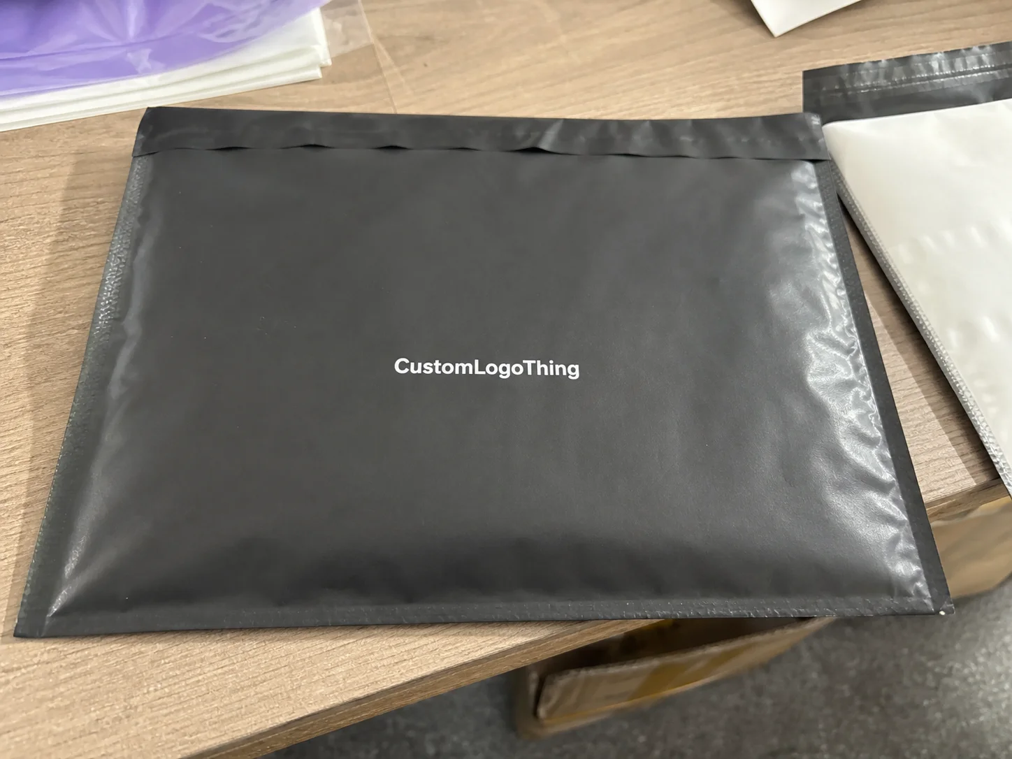
Minimalism differs from plain packaging because it still has a point of view. Plain packaging can feel accidental; minimalist packaging feels edited. The spacing is measured, the typography is tuned, and the surface finish supports the message. I’ve seen the difference firsthand in client meetings where two samples sat side by side: one looked like a private-label afterthought, the other looked like a brand with a design director and a very strict ruler. (That ruler probably had opinions.) A minimalist lid-and-base box wrapped in 157gsm specialty paper with blind debossing can communicate restraint in a way that a bare kraft mailer cannot.
Where does this style work best? Beauty and skincare, definitely. Apparel, yes. Subscription boxes, especially when repeat orders matter. Food and beverage brands that want a cleaner shelf presentation. Luxury goods. Even some industrial or wellness products, if the brand wants to communicate precision and trust. That is why the guide to minimalist custom packaging design keeps showing up in conversations about modern retail packaging and DTC packaging strategy. In Q1 launches, I’ve seen minimalist formats reduce buyer objections at trade shows in New York and Paris because the packaging made the product category obvious within 3 seconds.
“Minimal doesn’t mean empty. It means every square inch has to earn its place.”
That line explains why some minimalist packaging feels elevated and some feels cheap. Empty space alone does nothing. Empty space plus disciplined structure, premium substrate, and tight print control starts to tell a story. And yes, the difference is visible from across the room. Sometimes from across the warehouse. A box with 12 mm of clean margin, a centered logo, and a soft-touch finish reads very differently from one with uneven borders and a crowded back panel.
How Minimalist Packaging Works Across Materials and Formats
A strong guide to minimalist custom packaging design has to go beyond aesthetics and into mechanics. Minimalism behaves differently in boxes, mailers, labels, sleeves, tissue paper, inserts, and rigid packaging. The same design system can look elegant on one format and painfully bare on another. A 2-color mailer with a centered logo can feel sharp. Put that same treatment on a rigid gift box without adjusting proportion or finish, and it can feel underdesigned. I’ve seen it happen in factories in Dongguan and Ho Chi Minh City, and it’s the kind of thing that makes a packaging designer stare into the middle distance for a full minute.
Typography does more work here than most people realize. With fewer graphics, font choice, line spacing, and hierarchy become the product’s voice. On a recent supplier negotiation, a brand team insisted on ultra-thin type on uncoated kraft. The result in proofing was predictable: the fine strokes filled in by about 8% during flexo printing, and the small legal copy lost legibility below 6 pt. We changed the spec to 7.5 pt minimum for body copy and moved the logo to a heavier weight. The package immediately felt more intentional, and that is exactly the sort of correction a practical guide to minimalist custom packaging design should anticipate.
One accent color is often enough. Sometimes two, if one is a neutral and one is a controlled pop. The palette should never feel accidental. Black on white communicates clinical precision. Warm kraft with deep green feels natural and grounded. Soft gray on matte board says quiet luxury. Those associations matter in package branding because color does not simply decorate; it frames expectation before the customer opens the box. I’m biased, but I think this is where minimalist packaging gets interesting: the quieter the surface, the louder the meaning. A single accent stripe printed in Pantone 3435 C on a 300gsm folding carton can carry more memory than a full illustration if it appears consistently across a 6-SKU line.
Material choice is central. Kraft board adds warmth and an eco-conscious signal, though it also introduces texture variation that can affect sharpness. White SBS, especially at 300–400 gsm for folding cartons, gives a crisp, polished base that works well for beauty and supplement packaging. Rigid board, often wrapped with printed or specialty paper, supports premium presentation and keeps edges clean. In a good guide to minimalist custom packaging design, material is not an afterthought. It is half the look. For example, 350gsm C1S artboard with a matte aqueous finish will print fine typography more cleanly than a rough 280gsm kraft stock, and the difference is obvious under 5000K retail lighting.
Here’s the part that often gets ignored: minimalism exposes flaws. If the fold is off by 1.5 mm, you notice it. If the foil is misaligned by even a hair, it stands out because there is no busy artwork to distract the eye. That is why minimalist custom packaging design demands tighter production control than people expect. I’ve had proofs come back “almost right” and, frankly, almost right is not a comforting phrase in packaging. It’s the kind of phrase that makes operations teams sigh into their coffee. A die-cut window placed 2 mm too high can make an otherwise clean carton feel like a misprint.
Brands can still use strong visual identity without filling the surface. Shape language helps. A rectangular window, a vertical logo lockup, a corner stamp, a corner-color panel, or a repeated micro-pattern on tissue paper can create recognition without visual clutter. I’ve seen apparel clients in Toronto and Amsterdam use a single stitched-line motif across inserts and mailers, and it read as branded packaging without ever looking loud. Even a 10 mm corner bar in one signature color can become a recognizable system across shipping cartons, sleeves, and inner wraps.
- Boxes: best for rigid presentation, product protection, and a strong first impression, especially in 2-piece formats made in Shenzhen or Dongguan.
- Mailers: ideal for e-commerce, lower weight, and simplified shipping, especially when the outer board is 24pt to 32pt E-flute.
- Labels and sleeves: effective for short-run product packaging or seasonal variants, with fast turnaround in as little as 7-10 business days.
- Tissue and inserts: useful for subtle package branding and unboxing rhythm, especially when printed in one spot color on 17gsm tissue.
For additional structure and packaging format references, the trade association resources at the Packaging Machinery Manufacturers Institute and material standards discussed by the Forest Stewardship Council are useful starting points. A serious guide to minimalist custom packaging design should connect style with standards, certification, and substrate choice. It should also account for regional sourcing realities: corrugated mailers are often produced more competitively in Guangzhou, while specialty rigid boxes may be quoted from factories in Dongguan or Ningbo depending on paper inventory and finishing capacity.
Key Factors That Shape the Look, Cost, and Performance
Pricing in minimalist packaging is tricky because fewer colors do not automatically mean lower cost. I’ve seen a two-color folding carton come in cheaper than a four-color design, and I’ve also seen a “simple” rigid box cost 38% more than a fully printed alternative because the board grade, wrap stock, and soft-touch lamination pushed the spec higher. That tension is exactly why a useful guide to minimalist custom packaging design has to talk about economics as much as aesthetics. In one quote round from a supplier in Shenzhen, a white tuck box came in at $0.17 per unit for 5,000 pieces, while a rigid set-up with foil bumped to $2.14 per unit.
The major cost drivers are familiar: print method, box style, material thickness, finish selection, and order quantity. For example, a 5,000-unit run of custom printed boxes in a standard straight tuck style with one-color black ink may sit around $0.18 to $0.32 per unit depending on board and region, while a rigid box with foil, embossing, and a wrapped insert may land closer to $1.80 to $3.25 per unit. Those are not universal numbers, but they are realistic enough to help a buyer understand where the money goes. I like numbers because they stop wishful thinking before it gets expensive. In Ho Chi Minh City, a comparable mailer can be quoted 10% to 15% lower than in London, while North American short runs often rise once domestic freight and setup charges are added.
| Packaging Option | Typical Look | Approx. Unit Cost at 5,000 | Best Use |
|---|---|---|---|
| 1-color folding carton on SBS | Clean, crisp, economical | $0.18–$0.32 | Beauty, supplements, lightweight retail packaging |
| 2-color kraft mailer | Warm, natural, branded | $0.42–$0.78 | E-commerce, apparel, subscription boxes |
| Rigid box with soft-touch finish | Premium, restrained, tactile | $1.80–$3.25 | Luxury goods, gift sets, high-value product packaging |
| Mailer with embossed logo | Simple with depth | $0.55–$1.10 | DTC brands, branded packaging, subscription launches |
Brand positioning matters just as much as budget. Minimalism can make a product feel high-end, clinical, eco-conscious, or modern, depending on execution. A white carton with a tight sans-serif and silver foil on the logo says something very different from a kraft box with a blind emboss and no ink coverage. The first feels precise. The second feels organic. Both can work, but they are not the same message. That distinction should be obvious in any honest guide to minimalist custom packaging design. If it isn’t, somebody’s probably selling a mood board instead of a strategy. A brand launching in Seoul may also need a different visual hierarchy than one selling through Seattle boutiques, because shelf context changes expectations fast.
Sustainability gets mentioned a lot, sometimes too loosely. Reduced ink coverage can help, and recyclable substrates can support a lower-impact story, but minimal does not automatically mean eco-friendly. A rigid box with heavy lamination and mixed materials may look quiet while complicating recyclability. If a brand wants to make environmental claims, it should check substrate compatibility, local recycling rules, and certification language before printing anything. The EPA’s packaging and waste resources at epa.gov/recycle are a sensible reference point, especially when teams are balancing visual restraint with end-of-life expectations. A mono-material carton using FSC-certified paperboard and water-based coating is often easier to defend than a mixed-metal, laminated package produced for a one-off launch.
Durability matters too. E-commerce packaging gets slammed in transit. I’ve seen a beautiful minimalist sleeve on a product box arrive with crushed corners after a 1,200-mile ship test because the inner fit was too loose and the outer mailer had no cushioning. The design looked elegant in a studio, but the customer experience turned into damage control. A proper guide to minimalist custom packaging design should never separate appearance from transit performance. I still remember opening that carton and thinking, “Well, that’s one way to teach humility.” A box that passes a 4-foot drop test in Dallas may still fail if the insert leaves 3 mm of side-to-side movement.
That is also where material thickness matters. A 24pt board can feel substantial, while a thinner 16pt stock may save money but lose presence and crush resistance. For retail packaging, the perceived difference between 18pt and 24pt can be immediate. People often describe it as “feels more expensive,” though what they are really noticing is stiffness, sound, and surface finish all at once. In factories around Suzhou, a shift from 18pt to 24pt can add roughly $0.06 to $0.11 per unit on a 10,000-piece run, but that increase often protects against returns and corner damage.
Step-by-Step Guide to Minimalist Custom Packaging Design
Here is the practical version of the guide to minimalist custom packaging design, the one I wish every brand team had on their whiteboard before ordering samples. It turns a vague aesthetic into a process that can be quoted, sampled, and shipped from places like Dongguan, Shenzhen, or Xiamen without constant rework.
Start with the brand goal
Decide what the packaging must communicate in three words or fewer. Luxury, simplicity, sustainability, speed, clinical trust, or modern craft. If the team cannot agree on the message, the design will drift. I’ve sat in meetings where marketing wanted “premium and playful,” operations wanted “cheap and ship-safe,” and leadership wanted “iconic.” That combination usually produces three rounds of revisions and a confused dieline. A disciplined guide to minimalist custom packaging design begins with one priority, one audience, and one channel. A DTC beauty launch in Austin needs different cues than a wholesale skincare line shipping through Rotterdam.
Audit the product and customer journey
List the exact contents, legal copy, warning statements, barcode placement, and opening order. Measure the product in millimeters, not “roughly.” If a jar is 84 mm wide and the insert cavity gives only 2 mm of clearance, say that. If the customer sees the back panel first, design for that. This is where packaging design becomes practical. Minimalism is unforgiving, so the customer journey must be mapped before any artwork begins. A 120 ml bottle, a 38 mm cap, and a 3 mm foam insert will force different decisions than a flat cosmetic compact or a folded apparel set.
On a client call for a supplement brand in California, we discovered the required FDA copy would take 40% of the back panel. That changed everything. Instead of fighting the layout, we moved the brand story to the inner flap and kept the exterior pristine. That solved the tension between compliance and minimalism. It’s a small example, but it captures the logic behind a useful guide to minimalist custom packaging design: structure the information, don’t hide it. If the barcode needs to sit 12 mm from the bottom edge, make that part of the layout system from day one.
Choose the structure first
Pick the box or mailer format before you choose the graphic system. Too many teams do the reverse. They fall in love with a visual concept, then try to force it onto a structure that does not fit the product. That leads to compromise, odd proportions, and higher tooling costs. For custom logo packaging, structure and product fit should be locked before surface details. A straight tuck carton, reverse tuck carton, two-piece rigid box, or magnetic closure box each carries different material, dieline, and assembly requirements.
Think through closure style, flap behavior, stacking efficiency, and fill volume. A straight tuck carton works differently from a reverse tuck. A shoulder-neck rigid box feels different from a two-piece lid-and-base. A mailer with self-locking tabs creates a different unboxing rhythm than a sleeve over a tray. A good guide to minimalist custom packaging design treats these choices as part of the brand experience, not just engineering. In practical terms, the difference between a 210 x 145 x 55 mm mailer and a 220 x 150 x 60 mm mailer can affect freight class, pallet density, and the final unit cost by several cents.
Build a restrained design system
Now comes the visual system: typography, logo placement, spacing rules, palette, and finishes. Keep the rules simple enough that future SKUs can follow them. For example: logo centered on front panel, product name below in 14 pt serif, descriptor in 8 pt sans-serif, one accent color for category, and one tactile finish only. That sort of system is scalable. It also keeps package branding consistent across product lines. A brand with 8 SKUs can maintain the same shell and change only the side-panel color band or a small SKU code without rebuilding the entire structure.
Here’s a simple framework I use in consultations:
- Logo: place it once, clearly, and at the correct scale.
- Type hierarchy: assign one role to each text element.
- Spacing: let margins breathe, but keep them consistent.
- Color: use one base and one accent unless the brand truly needs more.
- Finish: choose one hero finish, not three competing effects.
The last point matters more than most buyers expect. Soft-touch lamination plus foil plus embossing plus spot UV can look expensive on a spec sheet and crowded in person. In a minimalist system, every added effect needs a job. That principle sits at the heart of any serious guide to minimalist custom packaging design. One finish applied with restraint on a 450gsm rigid board in Qiaotou, Dongguan, will usually outperform three finishes scattered across a busy face panel.
Prototype and test with real samples
Never approve minimalist packaging only from a flat PDF. I’ve seen colors shift by 12 Delta E units from screen to press, and I’ve watched a beautiful off-white turn muddy under warehouse lighting. You need physical samples. Test readability at arm’s length, on camera, and under warm and cool light. Run shipping tests if the product is e-commerce bound. If the box dents, scratches, or scuffs too easily, the concept will not survive contact with customers. A sample made in Shenzhen with a matte film may look elegant under studio LEDs and fail under the fluorescent lighting used in distribution centers in Atlanta or Chicago.
For structural validation, ISTA test methods are widely used in shipping and transit qualification. If your packaging must survive distribution, look at the current standards and test profiles at ista.org. A guide to minimalist custom packaging design that ignores shipping performance is only half a guide. If the parcel must travel 800 miles through regional hubs, the corner crush and abrasion scores matter as much as the logo placement.
Plan the timeline with review cycles
Good minimalist packaging takes time because precision takes time. A realistic schedule includes concepting, dieline setup, proofing, sampling, revision rounds, and production. For a standard custom printed box, I’d budget 7-10 business days for initial concepts, 3-5 days for dielines and artwork adaptation, 5-7 days for sampling, and 12-15 business days from proof approval to production for many mid-size runs. Specialty finishes or rigid formats may stretch the schedule further. A shipment leaving Ningbo for the U.S. West Coast can add another 18-24 days on water, which means the calendar matters just as much as the layout.
That timeline is not a scare tactic. It is an insurance policy against rushed mistakes. A brand meeting I still remember involved a retail launch where the team wanted to approve final files before seeing the physical sample. The box looked flawless on screen. In hand, the logo sat 4 mm too high and the gold foil caught glare from the store lights. We fixed it, but only because we had left room in the schedule. The best guide to minimalist custom packaging design always leaves room for reality. That, and for the printer to discover a tiny problem nobody wanted to hear about on Friday afternoon. If you have one round of changes built in, you will use it.
Common Mistakes That Make Minimalist Packaging Feel Cheap
The biggest mistake is making the design too empty. A surface with almost nothing on it can look unfinished instead of intentional. I’ve seen founders strip away so much information that the box felt like a private-label placeholder. That is the opposite of what a guide to minimalist custom packaging design should produce. Minimalism without conviction just looks like a budget cut wearing a turtleneck. A blank white carton with a centered logo and nothing else can work, but only if the stock is at least 16pt or 350gsm and the margins are perfectly controlled.
Typography problems are next. A weak font, bad kerning, or inconsistent margins can destroy the premium feel faster than a loud graphic ever could. Minimal packaging gives typography center stage, so every spacing error becomes visible. If the logo sits 2 mm off-center or the line breaks are sloppy, customers may not know why something feels wrong, but they will feel it. I once reviewed a carton from a supplier in Guangzhou where the product name was 1.8 mm too close to the top edge; the whole pack suddenly looked like a rush job.
Another common issue is overusing grayscale or bland neutrals without contrast, texture, or brand cues. Gray on gray can be elegant, but it can also disappear. Neutral palettes need depth: paper grain, embossing, blind deboss, a warm white stock, or a single contrasting accent. Otherwise, the result is a product packaging system that looks like it forgot the final step. I’ve had to say “it needs one more thing” so many times that I practically hear it in my sleep. A 20% tint of warm gray can help, but only when paired with a tactile finish or a defined type hierarchy.
People also remove too much information. Compliance text, ingredients, warnings, barcodes, and traceability data still matter. So does differentiation. If every SKU looks identical except for a tiny line of text, the line will fail on the shelf. A useful guide to minimalist custom packaging design knows that clarity and restraint are partners, not enemies. In the European Union, where multilingual panels can occupy 30% to 50% of a box, minimalism has to be designed around legal space from the start.
Finally, some brands cut costs on structure or print quality and expect minimalism to save them. It won’t. Poor board caliper, weak glue joints, fuzzy type, or low-grade coating will show immediately because there is nowhere to hide. In my experience, if the structure feels flimsy in the sample room, it will feel even worse in the customer’s hands. A 14pt carton with rough edges can undermine a product priced at $42 before the customer even opens it.
Here are the red flags I watch for during proofing:
- Logo too small to read from 1 meter away.
- Margins that vary by more than 1.5 mm between panels.
- Finishes layered only because they “look premium.”
- Legal copy squeezed into the last 10% of the back panel.
- Substrate choices that fight the intended brand tone.
If the goal is elegant branded packaging, the simplest route is not always the easiest. A strong guide to minimalist custom packaging design will tell you to spend less on decoration and more on precision. That usually means paying for better board, better die cutting, and better proofing, not for another decorative effect.
Expert Tips for Better Minimalist Packaging Decisions
My first tip is simple: choose one focal point. One logo, one product name, or one graphic mark. Not three. If you want the package to feel confident, let that single element carry the composition. The eye needs a place to land. Without one, the package drifts. A centered 24 pt logotype on a 90 mm front panel can be enough if the rest of the face is handled with discipline.
Second, use tactile details to add depth without adding clutter. Soft-touch lamination feels velvety in the hand. Embossing adds shadow. Foil can sharpen a logo at a distance. Uncoated stock creates a more natural surface than gloss. I once worked with a fragrance client in Grasse who replaced a printed floral pattern with a blind emboss of a single stem outline. Sales reported that customers called the package “quietly expensive” during launch week. That result is hard to get if you treat a guide to minimalist custom packaging design like a purely visual exercise. A subtle deboss on a 2-piece rigid box can do more than a whole palette of extra colors.
Third, test under real lighting and on camera. Minimal packaging has to perform in a boutique, a warehouse, and a phone photo. The same matte black box that looks luxurious under warm spotlights can disappear in low light or show scuffs under bright LEDs. If your brand lives on social media, the camera is part of the design environment. That is true for unboxing videos, product pages, and retail packaging displays. I always want one sample under 3000K light, one under 5000K light, and one photographed on an iPhone before approval.
Fourth, if sustainability is part of the brief, choose materials and finishes that support recyclability without sacrificing performance. Water-based coatings, FSC-certified paper, and mono-material thinking can help. But do not promise environmental benefits unless the full structure supports them. The guide to minimalist custom packaging design should be honest about that tradeoff. A kraft mailer with soy-based ink and a paper insert can be easier to explain than a laminated box with mixed-material magnets.
Fifth, keep the system scalable. The visual language should work for future launches without requiring a redesign each time. A good family of custom printed boxes can be expanded with a change in accent color, SKU code, or side-panel pattern while keeping the same core layout. That is how package branding stays efficient as a product line grows. One template can support 12 SKUs if the type scale and panel logic are planned correctly from the start.
If you need a place to compare formats and start spec discussions, the range of Custom Packaging Products can help frame the options before you lock a material direction. A sensible guide to minimalist custom packaging design is always tied to actual product choices, not just mood boards. A quote from a factory in Shenzhen is more useful than a dozen screenshots.
Putting the Guide to Minimalist Custom Packaging Design Into Action
So what should a brand do next? Start by defining the message in one sentence. Then choose the structure, lock the material, and build a small sample run before you commit to production. That sequence saves money and protects the brand. It also keeps the work focused on what matters, which is the heart of the guide to minimalist custom packaging design. I know that sounds annoyingly simple, but simple is often the point. A 1,000-piece prototype order can reveal more than a 10,000-piece blind run.
Compare at least two combinations. For example, test a matte white SBS carton against a kraft version. Or compare a rigid box with soft-touch lamination against one with an uncoated wrap and blind emboss. The same artwork can read very differently depending on substrate and finish. I’ve seen a change in paper shade alter the entire mood of a project by making the logo feel cooler, warmer, or more clinical than intended. A stock with a slight cream tone can soften an otherwise sterile layout instantly.
Use a review checklist before final approval:
- Does the hierarchy make the product name obvious in 2 seconds?
- Is the spacing consistent across all panels?
- Will the packaging survive shipping and handling?
- Do the sustainability claims match the actual materials?
- Are the legal requirements clear and legible?
- Does the finish support the brand position instead of fighting it?
Then gather feedback from operations, sales, and a few target customers. Operations will spot pallet and fulfillment issues. Sales will notice shelf readability and buyer objections. Customers will tell you whether the box feels premium, helpful, or forgettable. That last part is often the most revealing. A smart guide to minimalist custom packaging design uses outside feedback before the budget is locked. If possible, test in three environments: a warehouse, a retail shelf in Miami or London, and a home unboxing setup.
The brands that win with minimalism usually treat it like an editing process. They cut the wrong things, keep the right ones, and invest where the customer can actually feel the difference. They do not confuse quiet with cheap. They do not confuse simple with easy. A well-made minimalist package can cost $0.62 per unit or $2.40 per unit depending on structure, but the customer only notices whether it feels deliberate.
If you remember one thing, remember this: the guide to minimalist custom packaging design is not just a style preference. It is a decision framework for branded packaging, product packaging, and retail packaging that has to look clear, perform in transit, and hold value in the customer’s hands. Use it that way, and minimalism becomes a strategic asset instead of a trend. Ignore the details, and the package will tell on you in the first 5 seconds.
Frequently Asked Questions
What is the guide to minimalist custom packaging design for small brands?
It is a practical way to Create Packaging That feels premium and clear without unnecessary graphics or copy. Small brands benefit because it reduces visual clutter, sharpens recognition, and gives the product a more confident presence. The key is choosing one strong message, one clear structure, and one consistent visual system. For a startup ordering 2,000 units in Shenzhen, that might mean a 1-color 350gsm carton with one accent finish and a 12-15 business day production window after proof approval.
Does minimalist custom packaging design cost less?
Not always. Fewer colors can reduce printing complexity, but premium paper, rigid boxes, or special finishes can raise costs. The total price depends more on materials, order quantity, structure, and finishing choices than on minimalism alone. A simple design can be cost-effective if it avoids unnecessary decoration and keeps production straightforward. For example, a straight tuck carton at 5,000 pieces might run $0.19 per unit, while a rigid gift box with soft-touch lamination and foil could be $2.10 per unit or more.
How long does the minimalist packaging design process usually take?
Timeline depends on whether you need a custom structure, new artwork, samples, and revision rounds. A simple update can move faster than a fully custom box with specialty finishes and prototype rounds. Build in time for dieline setup, proofing, sample approval, and production scheduling so you do not compress decisions at the end. A typical schedule is 7-10 business days for design, 5-7 days for sampling, and 12-15 business days from proof approval to production for many mid-size runs in Dongguan or Ningbo.
What materials work best for minimalist custom packaging design?
Common choices include kraft, white SBS, matte-coated stocks, and rigid board, depending on the brand positioning. The best material depends on whether the goal is eco-friendly, premium, natural, or clean clinical aesthetics. Texture and finish matter because minimal packaging relies on surface quality to create interest. A 350gsm C1S artboard with matte aqueous coating, for instance, gives a cleaner print edge than rough kraft when the design depends on small type and wide margins.
How do I make minimalist packaging stand out without adding clutter?
Use stronger typography, strategic spacing, and one memorable focal point instead of multiple competing graphics. Add dimension through embossing, foil, or soft-touch finishes rather than extra design elements. Make sure the structure, unboxing flow, and product reveal do some of the storytelling work. A single blind emboss on a rigid box made in Shenzhen can create more distinction than two extra colors, especially when the front panel stays under 20% ink coverage.