Buyer Fit Snapshot
| Best fit | Design Minimalist Shipping Cartons projects where brand print, material claims, artwork control, MOQ, and repeat-order consistency need to be specified before quoting. |
|---|---|
| Quote inputs | Share finished size, material target, print colors, finish, packing count, annual reorder estimate, ship-to region, and any compliance wording. |
| Proofing check | Approve dieline scale, logo placement, barcode or warning zones, color tolerance, closure strength, and carton packing before bulk production. |
| Main risk | Vague material claims, crowded artwork, missing packing details, or unclear freight terms can make a low unit price expensive after revisions. |
Fast answer: Design Minimalist Shipping Cartons: Board, Finish, Dieline, and Unit Cost should be specified like a repeatable production item. The safest quote records material, print method, finish, artwork proof, packing count, and reorder notes in one written spec.
Production checks before approval
Compare the actual filled-product size with the drawing, then confirm tolerance on folds, seals, hang holes, label areas, and retail display edges. Reserve space for logos, QR codes, warning copy, and material claims before decorative graphics fill the panel.
Quote comparison points
Review material grade, print process, finish, sampling route, tooling charges, carton quantity, and freight assumptions side by side. A quote is only useful when the supplier can repeat the same color, closure quality, and packing count on the next order.
Knowing how to Design Minimalist Shipping Cartons is one of those skills that looks straightforward until you are standing on a factory floor in Dongguan at 6:40 a.m., holding a sample that should feel “simple” but somehow costs $0.27 more than planned because somebody added a second ink pass and a custom insert nobody asked for. I have seen plain-looking cartons save a brand from a mountain of customer complaints, and I have also seen “minimal” boxes that looked so accidental they practically apologized for existing. I remember one run in particular where the carton looked clean in the PDF, then showed up with a slightly off-center logo and a crease line that made the whole thing feel like it had been designed by a committee in a hurry. Which, frankly, it had.
The truth is, how to design minimalist shipping cartons is not about stripping everything away. It is about choosing the few things that matter: structure, clarity, brand restraint, and package protection. If the carton is doing its job, it supports order fulfillment, survives transit packaging abuse, and still feels intentional when it lands on a doorstep. That is the whole trick. Honestly, I think the best minimalist cartons are the ones that make other packaging look a little overexcited, especially when they are built from a 350gsm C1S artboard or a 32 ECT corrugated board and printed with one clean black flexo plate instead of a four-color circus.
How to Design Minimalist Shipping Cartons: What Minimal Really Means
I will start with the mistake I see constantly: people think minimalist packaging means “leave it blank and hope for the best.” No. That is not design. That is indecision with a recycling logo. How to design minimalist shipping cartons starts with intention. Fewer inks. Fewer graphics. Fewer material layers. More structure. More restraint. More reason behind every printed element. If the carton is carrying a brand message, it should feel like a clear sentence, not a shouted paragraph, and it should do so with a print spec you can actually quote, such as one-color flexo on 275gsm kraft liner or a two-color digital run for 500 to 1,000 pieces.
On one client run for a skincare brand in Guangzhou, we cut the carton from six printed callouts down to a single logo, one product line, and a recycled-material message on the side panel. Complaints dropped within two weeks because customers stopped asking, “Is this the right box?” That plain carton was the quietest box in the warehouse, and somehow the smartest one. The design was not empty. It was disciplined. I still remember the production manager looking at the finished stack and saying, “Wait, that’s it?” with the kind of disbelief that only comes from someone expecting drama and getting competence instead. The run closed at $0.58 per unit for 8,000 pieces, and the brand still had enough margin to upgrade the inner tissue to 17gsm acid-free paper without breaking the launch budget.
There is a big difference between minimal and cheap-looking. Minimal feels calm, premium, and deliberate. Cheap-looking feels like the designer ran out of time or the printer ran out of budget. A carton can have very little on it and still look expensive if the typography is clean, the spacing is balanced, and the material choice is right. I have watched a kraft mailer with one black logo look better than a full-color illustrated box because the first one had confidence. The second had clutter. In my opinion, confidence is what minimalist cartons are really selling, especially when the carton uses a 1.5mm greyboard wrap or a crisp white top liner that keeps the edges sharp in a warehouse under 5000K LED lighting.
How to design minimalist shipping cartons also depends on the channel. E-commerce cartons need to survive label slap, courier handling, and a dozen touches in a fulfillment center. DTC brands want the unboxing to feel considered. Subscription boxes need repeatability. Wholesale shipments need clarity more than drama. Same carton family, different job. You do not design a shipping box for a mood board. You design it for the actual life it will live, whether it is moving through a 30,000-square-foot fulfillment center in Dallas or being palletized for regional distribution in Rotterdam. I know that sounds obvious, but I have sat in too many meetings where someone was clearly designing for a camera and not for a conveyor.
Here is the core rule I use: every printed element has to earn its place. If the logo, a QR code, a handling mark, or a recycled-content note does not improve the customer experience or the logistics flow, it probably does not belong on the carton. That sounds harsh. It is. Packaging is not charity. And yes, I have had people ask for “just one more tiny icon” until the front panel looked like a kitchen magnet collection. At that point, the carton stops being minimalist and starts being needy, which is not a category anyone wants in a shipping spec.
Client note I still remember: “We want minimalist, but not invisible.” That line became the whole brief. Once we defined visibility as logo contrast, panel spacing, and one strong structural shape, the box went from generic to premium without adding a single expensive embellishment. The final version used a 3 mm perimeter margin, a single spot-black print, and a 12 pt sans serif that held up beautifully on a kraft surface.
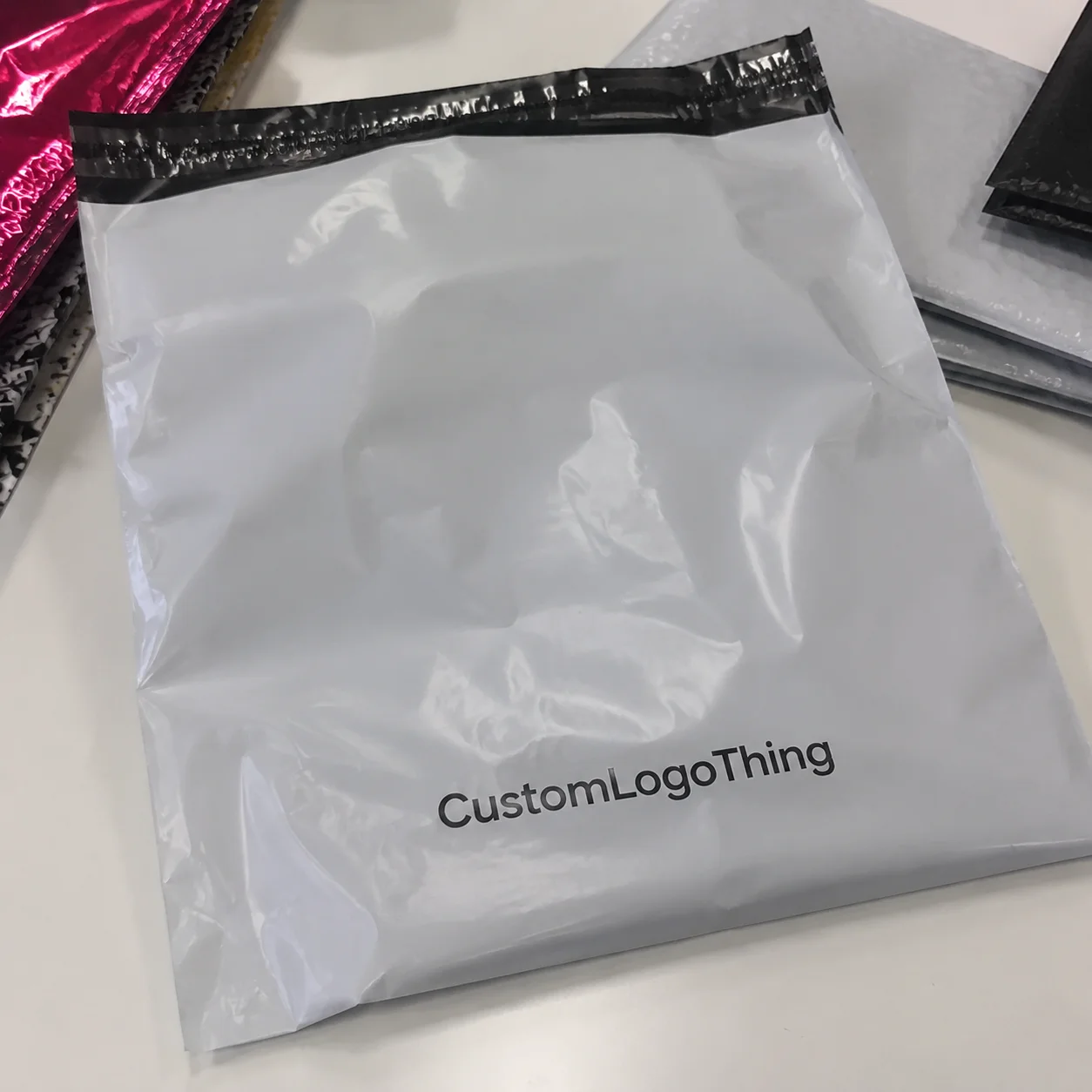
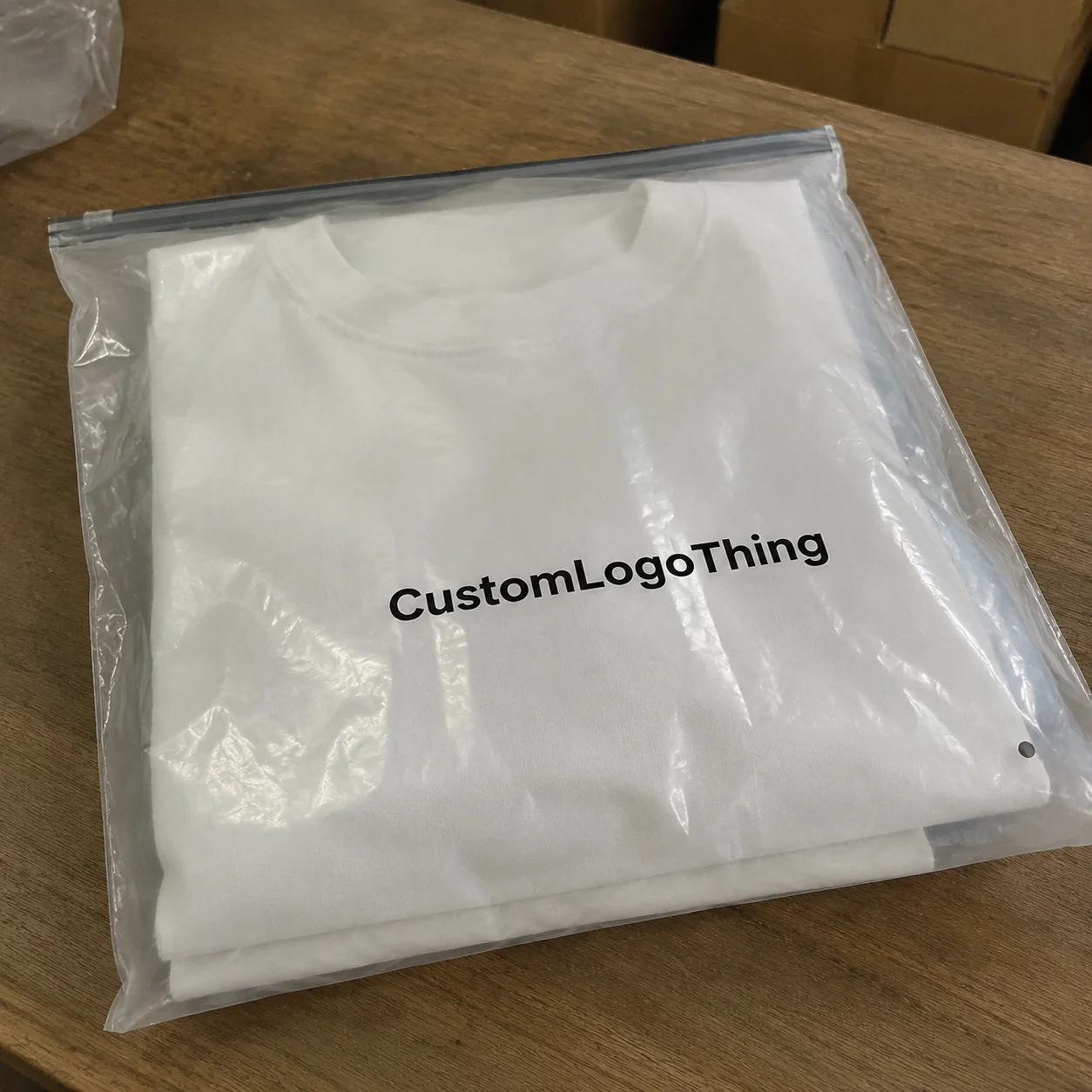
If you want to see how that restraint fits into a broader packaging lineup, I would pair the carton strategy with our Custom Packaging Products and, for lighter fulfillment needs, even consider Custom Poly Mailers where a box would be overkill. That is not me being cute. That is just smart shipping materials planning, especially when a product weighs under 12 oz and ships out of a facility in Chicago where labor time matters as much as print quality.
How Minimalist Shipping Cartons Work in Real Packaging Systems
How to design minimalist shipping cartons gets real the moment you move from sketch to spec. Structure matters. Board grade matters. Flute type matters. Print method matters. The die-line matters even more than the pretty mockup your team keeps sending in Slack. I have had more than one “beautiful” concept get humbled by a crease line that refused to behave, and I can tell you from experience that paperboard has an absolutely relentless way of teaching humility. A carton that works on screen but fails at a 25 mm tuck lock is not minimalist; it is incomplete.
I have stood beside corrugators where a “simple” carton changed by 3 mm on the crease line and suddenly the label applicator started drifting. That tiny shift cost the client two days of order fulfillment delays and a pile of useless test cartons. Minimal designs are less forgiving in one sense: because there is less visual noise, every structural flaw shows up faster. You cannot hide bad folds behind graphics. You also cannot pretend a crooked flap is “part of the aesthetic” (people try, though). In one Shenzhen plant, that same 3 mm variance also forced a pallet rewrap and a $180 same-day courier run to replace the wrong-size inserts.
Most minimalist shipping cartons use one of three visual strategies: kraft texture, white board with high-contrast print, or a matte-coated surface with very little ink coverage. Each one changes the final feel. Kraft says natural and practical. White says crisp and commercial. Matte-coated board says controlled and premium, but it can raise costs. I have paid $0.11 more per unit for a better-facing white liner on a run of 5,000 pieces because the client’s product photos were being shot against the box. Worth it? Yes. Cheap? No. Sometimes the photo department quietly controls the packaging budget, which is its own kind of comedy, especially when the run is scheduled through a plant in Foshan and the studio asks for “just one more shade of white.”
Fewer colors simplify production. That is one of the biggest reasons how to design minimalist shipping cartons matters to brands with multiple SKUs. One-color flexo is usually easier to manage than four-color process, especially when you need reprints across several sizes. Less color means fewer registration issues, fewer proofs, and fewer “why is the logo gray on this batch?” conversations. I have had those conversations. They are not fun. They are also avoidable. Watching a brand spend a week arguing over whether black was “rich black” or merely “sad black” is enough to make anyone appreciate restraint, particularly when the printer is already quoting a 12- to 15-business-day lead time from proof approval and the launch date is fixed.
Spacing does a lot of heavy lifting in minimalist design. So does typography. A single, well-placed logo with generous margins often communicates more premium intent than a box crowded with icons, gradients, and marketing copy. The finish matters too. A soft-touch coating can feel beautiful, but it is not always the right answer for ecommerce shipping because scuff resistance and cost need to be considered together. If the carton is going to ride through parcel systems, stay practical. Parcel systems are not gentle. They are basically an obstacle course with tape guns, especially on routes through Atlanta, Newark, and the regional sort hubs where boxes can hit three conveyor transfers before they ever leave the state.
The logistics side cannot be an afterthought. The carton still needs to stack properly, clear your pack line, survive transit packaging abuse, and leave room for labels, barcodes, and shipping info. If you are designing around dimensional weight, that affects the box footprint before you even think about aesthetics. A carton that looks elegant but adds half an inch to each side can raise shipping costs across thousands of shipments. That is a bad trade. I have seen finance teams go very quiet after realizing a “small” dimension change added more to annual freight than the entire print budget. Quiet in a bad way, and usually after someone in procurement noticed the issue on a $1.12/unit freight lane from Shenzhen to Los Angeles.
And yes, designers, structural engineers, and printers need to talk early. I once saw a startup spend $4,200 on revisions because the design team approved a beautiful die-line before checking tray insert clearance. The “simple” box became a costly retool. Minimal packaging punishes sloppy coordination. It is almost rude about it. But fair, really. The carton only needs one person to be sloppy; the carton will handle the consequences. I have seen a 0.8 mm insert misread as “close enough” and watched it turn into a two-week delay at a plant outside Ningbo.
For standards, I usually tell clients to think about performance verification, not just appearance. If the shipment is fragile, look at ISTA test methods and work with your vendor on drop and vibration expectations. The International Safe Transit Association lays out useful guidance here: ISTA. If you are balancing material choices with environmental claims, the EPA’s packaging and waste resources are a useful reference point too: EPA recycling resources. You do not need to become an engineer overnight. You do need to ask the right questions, especially if your carton is being made in a region where recycled liner availability fluctuates by season.
Key Factors for Designing Minimalist Shipping Cartons
If you are serious about how to design minimalist shipping cartons, start with the factors that actually move the needle. Not the Instagram stuff. Not the mood board stuff. The real stuff that affects cost, protection, and repeatability. I am all for pretty packaging, but only after it survives a pallet stack test and a mildly irritated warehouse team in a 48,000-square-foot facility in Phoenix. Minimalism should make operations easier, not create a prettier problem.
Brand clarity comes first
Ask one blunt question: what should customers recognize in three seconds? If the answer is “our logo and our calm, premium tone,” then build everything around that. I have worked with brands that wanted minimal packaging but kept asking for extra taglines, icons, and social handles on every panel. That is not minimalist. That is just nervous. Keep the signal sharp. If you have ever seen a front panel trying to say hello, explain the product, request a follow, and remind everyone about sustainability all at once, you know exactly what I mean. One concise mark, one line of copy, and one handling icon can be enough on a carton that measures 310 x 220 x 90 mm.
Material selection changes everything
Corrugated strength, recycled content, and surface finish drive both appearance and performance. A recycled kraft liner with an E-flute profile can feel cleaner than a heavy printed SBS wrap if you want natural restraint. For heavier goods, B-flute or a stronger custom shipping box may be smarter, especially when package protection matters more than a perfectly smooth print surface. If the carton is weak, no design language will save it. Honestly, I would rather have a sturdy box that looks quietly excellent than a fragile one that wins a photo shoot and loses the delivery truck. In practical terms, that often means 32 ECT or 44 ECT corrugated board, depending on the product weight and the shipping lane.
Print method and color count affect reality
Flexo is usually economical for larger runs and simpler artwork. Digital helps when you need shorter runs or multiple versions. Litho-lam gives you crisp presentation but adds complexity and cost. I have seen clients chase a “minimal” look using a three-pass print process and then act surprised when pricing came back at $1.18/unit. Minimal design is supposed to reduce friction, not create a tiny art project with a freight bill. If the box needs a parade of production steps, it is no longer behaving like a minimalist carton. In a plant near Suzhou, that same three-pass job also pushed the timeline from 10 business days to 17 because the press needed two extra calibration rounds.
Cost lives in more places than ink
Here is where people get lazy. They focus only on print coverage. The real price drivers are board grade, tooling, Custom Die Cuts, MOQ, freight, inserts, and rework risk. A simple carton can still cost more than expected if it needs a special size or if the packout is awkward. Ask for a split quote. I want to see board, print, tooling, and freight separately. Otherwise you are guessing, and guessing is how budgets die. Not dramatically, either. Budgets die in the boring, invisible way, which is somehow worse. On a 5,000-piece run out of Guangdong, one extra die-cut insert can add $0.19 per unit before freight even enters the conversation.
For example, a standard RSC carton might come in at $0.42/unit at 10,000 pieces, while a custom die-cut mailer with a white liner and matte varnish can land closer to $0.88/unit depending on specs and lane. That spread is exactly why how to design minimalist shipping cartons must be tied to pricing discipline from the start. If the box is shipping from a plant in Dongguan to a West Coast fulfillment center, you should also ask whether ocean freight, domestic drayage, or air replacement cartons are being included in the quote.
| Option | Typical Feel | Approx. Cost at 5,000 Units | Best For |
|---|---|---|---|
| Plain kraft RSC | Natural, practical | $0.31–$0.46/unit | Wholesale, low-friction ecommerce shipping |
| One-color printed mailer | Clean, branded | $0.48–$0.72/unit | DTC, subscription boxes, lightweight goods |
| White board with matte finish | Sharper, premium | $0.68–$1.05/unit | Beauty, apparel, giftable products |
| Custom structural carton with insert | Controlled, engineered | $0.92–$1.45/unit | Fragile products, premium unboxing |
User experience matters too. A carton that opens cleanly, uses tape strip placement intelligently, and gives enough internal space for inserts feels better than one that fights the customer. If you plan reusability, say that clearly. If it is meant to be discarded, do not pretend it is heirloom packaging. Honesty keeps brand trust intact. People can smell fake sustainability copy from across the room, and they can usually tell when a “minimal” box is actually just a cost-cut box with better adjectives.
Compliance is the boring part that saves you from headaches. Barcodes, handling icons, and recycling marks should be visible but not noisy. For FSC-certified paperboard, use the claim properly and verify the chain of custody through FSC. If you are making a sustainability claim, be specific. “Recyclable where facilities exist” is a lot safer than vague green theater. I have had to gently talk clients out of claims that sounded lovely and read like a lawsuit waiting to happen, especially when the carton was being sourced through a supplier in Hanoi or Taicang that required exact claim language on the artwork proof.
From a production standpoint, the cleaner the carton, the easier it is to spot errors. That is one reason minimalist packaging is popular in ecommerce shipping. It reduces the number of failure points in print, and it can make quality control faster. But only if you keep the design disciplined. A carton with four tiny icons and three fonts is not minimalist. It is just needy. I have watched QC teams in Taizhou and Querétaro catch mistakes in seconds because the design was simple enough to reveal a misregistered logo immediately.
How to Design Minimalist Shipping Cartons: Step-by-Step
The best way I know how to design minimalist shipping cartons is to treat it like a production project, not a branding exercise. The sequence matters. Skip steps and you will pay for it later, usually with reproofs, delay fees, or boxes that do not fit the product. I know that sounds a little stern, but packaging has a way of rewarding the people who are annoyingly thorough. That is especially true if your cartons are being made in a factory outside Ningbo where the calendar is already full for the next three weeks.
Step 1: Audit the product and shipping requirements
Start with dimensions, weight, fragility, and fulfillment workflow. Measure the product with inserts if they are required. Then measure again. I have had clients hand me product dimensions that were off by 6 mm because they forgot the zipper pull on a pouch. That six millimeters became a 14-day delay because the carton and insert no longer fit. If you are working in order fulfillment, “close enough” is an expensive phrase. Also, somebody always forgets the zipper pull. Every time. For items packed in a 350gsm C1S artboard sleeve or an E-flute corrugated shipper, that tiny omission can make the whole spec fall apart.
Step 2: Choose the carton structure
RSC, mailer, roll-end tuck, or custom die-cut? That depends on protection, presentation, and shipping method. If you need warehouse efficiency, a standard RSC may be best. If you want a better opening experience, a mailer or roll-end tuck can work. If the product is fragile or premium, a custom structure may be worth the extra tooling. There is no universal winner. The product decides. I would love to tell you otherwise, because it would make meetings shorter, but packaging refuses to be that convenient. A roll-end tuck in Shenzhen might be ideal for apparel, while a double-wall RSC in Dallas may be the better call for glassware.
Step 3: Set a visual hierarchy
Your hierarchy should probably include: logo, product name, one support line, and one utility element if needed. That is it. On one apparel carton project, I removed eight words of copy and one decorative rule line. The box suddenly looked expensive. Funny how that works. The customer did not need a paragraph on the outside. They needed a box that looked like someone had thought about it. And, if I am honest, they needed us to stop decorating every available surface like it was a wedding invitation. The final exterior had one 18 pt logo, a 7 pt line of product description, and a barcode tucked onto the side panel where it belonged.
Step 4: Build the dieline with white space on purpose
This is where many “minimal” cartons fail. White space should be designed, not accidental. Define margins. Define safe zones. Decide how the carton reads from each angle: top panel, side panel, shipping face, and opening flap. If you want the box to feel premium, give the brand room to breathe. Crowded edges make even expensive materials look cheap. A box that cannot sit quietly on its own is not a minimalist carton; it is a carton with stage fright. I like to see at least 4 mm of visual breathing room around logos on smaller cartons and 8 to 10 mm on larger mailers.
Step 5: Select materials and finishes
Kraft, white corrugated, matte coating, spot varnish, or no finish at all. Each choice changes the tone and the budget. A bare kraft box may be perfect for an eco-minded brand. A white face with a black logo may better support a beauty label. A soft-touch finish can feel luxurious but may scuff more easily in transit. I usually tell clients to choose the material first for protection, then style second. Damaged cartons are never stylish. In fact, they usually look like they have had a bad argument with a conveyor belt. A 24pt SBS wrap over corrugated can look elegant, but if the carton is traveling through humid weather in Miami in July, you should test for warp and edge wear first.
In one negotiation with a regional corrugated plant in Ohio, we dropped a costly coating and moved to a cleaner two-color flexo print on a stronger board grade. The unit price fell by $0.09, the lead time improved by four days, and the client still got the premium feel they wanted. That is the kind of tradeoff I like. Less drama. Better economics. Everyone left the meeting looking a little less haunted, which was a nice change. The plant quoted the revised build at $0.63 per unit for 7,500 pieces, and that was enough to keep the launch on schedule.
Step 6: Prototype and test
Order samples. Print them. Fold them. Abuse them a little. Check scuff resistance, label placement, pallet stacking, and how they look on a doorstep under bad lighting. I once watched a beautifully minimal carton fail because the logo disappeared under warehouse fluorescence and the barcode sat too close to a crease. Gorgeous on screen. Useless in the real world. That is why prototypes exist. Also, “bad lighting” is not hypothetical; it is every warehouse, ever. If you can, run at least two rounds of samples: one structural white sample and one printed prototype, ideally with approval in 5 to 7 business days after artwork submission.
Step 7: Prepress and production approval
Confirm artwork, barcode legibility, color tolerances, and packout instructions before the run starts. Make sure everyone is looking at the same file. If you need multiple SKUs, lock the naming conventions. Confirm print tolerances with your vendor. If you are using a supplier like WestRock, International Paper, or a strong regional plant, keep the proof cycle tight and factual. No vague feedback. “Make it pop” is not feedback. It is a cry for help. I have heard that phrase so many times I now feel my eye twitch before anyone finishes saying it. A clean approval loop should include PDF proof, hard copy signoff, and one last fit check before the press date is locked.
If you are building a broader packaging system, this is also the point where you decide whether the carton should coordinate with other shipping materials in your line. A matching mailer for smaller orders, for example, might be more efficient than forcing one box size to do everything. That is where Custom Shipping Boxes can fit into a larger structural family instead of standing alone like a random idea. A coordinated set made in one region, such as the Pearl River Delta, can also reduce variation across SKUs and simplify reorders.
Common Mistakes When Designing Minimalist Shipping Cartons
How to design minimalist shipping cartons gets messier when people confuse restraint with neglect. I see the same mistakes over and over, and honestly, they are all avoidable if somebody slows down for five minutes. Or, ideally, if somebody stops insisting that “less” means “we do not need to check anything.” That one keeps me busy, usually right around the time a sample from a plant in Dongguan arrives with the wrong board grade and everybody acts surprised.
The first mistake is treating blank space like unfinished design. Empty areas need to be balanced. If the box feels accidental, it reads as low-effort. The second mistake is shrinking the logo until it becomes invisible in transit photos. Your carton has a job after the carrier leaves the warehouse. It still has to represent the brand in the customer’s hands, on the doorstep, and in every unboxing video somebody posts with one shaky camera angle. If the logo cannot survive a blurry phone video, it may be too shy for its own good. That is especially true on matte kraft where low-contrast ink can vanish under warm indoor light.
Third, people save too much on board strength. Then the carton crushes, returns climb, and customer service gets hit with photos of dented corners. That is not minimalist. That is expensive. I have watched a client lose $18,000 in a single quarter because they chose lighter board to shave $0.04/unit. They saved pennies and bought headaches. Very efficient, if your goal was pain. I remember the operations director just staring at the return pile like it had personally offended him. The carton was a 24 ECT single-wall when it should have been a 32 ECT build, and the difference showed up in the first 400 shipments.
Another common error is overcomplicating the “minimal” design. Tiny icons. Microcopy. Three fonts. A gradient. A foil accent. Suddenly the box is trying to speak six languages at once. Minimalism needs discipline. If you add too many decorative rules, the concept falls apart. At that point, the carton starts looking like it is trying to be a luxury brochure and a shipping container at the same time, which is a deeply awkward personality for a box to have. One black ink color, one structural story, and one purpose is usually enough.
Then there is the shipping reality problem. Abrasion, moisture, tape pull, stacking pressure, warehouse handling, and courier drops can ruin a beautiful mockup in minutes. I have seen gorgeous cartons come off the pallet looking fine, then arrive with corner whitening and edge crush because no one tested the transit conditions. In packaging, pretty is not a performance metric. Neither is “it looked okay in the conference room.” If your carton is running through a humid lane from Ho Chi Minh City to Singapore, test for warpage and print rub before you approve the full run.
Skipping sample approval is the last big one. People say they will “just go to production” because the file looks fine on screen. That is a bad habit. Screen rendering hides a lot: crease distortion, dark print gain on kraft, registration drift, and how a barcode scans under warehouse lighting. If you are doing how to design minimalist shipping cartons properly, samples are non-negotiable. I would rather lose three days to proofing than three weeks to a reprint, and I say that after seeing a $0.15/unit carton become a $0.41/unit headache because nobody checked the fold pattern.
Warehouse supervisor I worked with once said: “The prettiest box is the one that does not make my team stop the line.” That is not poetic, but it is accurate. He was speaking from the New Jersey fulfillment floor, where 60 carts an hour depend on the carton arriving flat, legible, and ready to build.
Expert Tips to Balance Simplicity, Cost, and Timeline
I have spent enough years in custom printing to know that how to design minimalist shipping cartons is really a balancing act. You are juggling simplicity, cost, and timeline, and if one of those gets ignored, the whole thing tips over. Usually at the least convenient moment possible. It is a little like trying to keep a pallet stack neat during peak season in a warehouse outside Chicago while somebody keeps asking if the logo could be “just 5 percent larger.”
My first tip is to use one strong brand element and let structure do the work. A crisp logo, a well-proportioned panel layout, and a sensible board grade can carry the whole carton. You do not need five messages fighting for attention. Let the box be calm. That calm is what reads as premium. Calm packaging is also easier on the people who have to approve it, which is a nice bonus. A 30 mm logo mark on a 250 x 180 mm panel often does more for perceived value than a full panel of copy ever will.
Second, keep artwork flat and high-contrast. That reduces print problems and speeds approvals. If you are working with WestRock, International Paper, or a capable local plant, a simple black-on-kraft or black-on-white file is easier to quote and easier to reproduce consistently. It also cuts down on approval rounds. Fewer rounds means fewer delays. Amazing concept. I know. The industrial version of “just be organized.” In practice, that often means using a single Pantone black or a one-color process build rather than chasing a special blend that adds a week to prepress.
Third, ask for a real price split. I want board, print, tooling, freight, and any inserts broken out. One of my old clients thought they were paying mostly for print until the quote showed a $2,800 tooling charge for a custom die and a $0.06/unit insert upgrade. Those little items add up fast, especially on lower MOQ runs. If you do not ask, you do not know. And if you do not know, you end up defending a budget you did not actually see. The cleanest quotes I have seen come from suppliers in Shenzhen and Xiamen who list every line item down to the pallet wrap.
Fourth, plan for timeline reality. Sample creation, adjustments, production queue, and transit all take time. Even when the box is “simple,” the workflow is not. Build in buffer. I like to protect at least 10 business days beyond the first estimate if the carton is tied to a launch. That cushion saves you from rushing approvals when everyone is already tired. Tired people approve strange things. It is almost a law of packaging. For most straightforward carton programs, the typical path is 12-15 business days from proof approval, and that assumes no late structural change, no artwork revision, and no holiday backlog at the factory.
Fifth, negotiate around standard sizes when you can. A custom footprint can be worth it, but not every product needs a new die. If the difference between standard and custom is only cosmetic, standard often wins. Reduce die complexity. Avoid last-minute structural changes. Those changes trigger retooling fees, and nobody enjoys paying $350 to move a flap by 4 mm. I certainly do not, and I have never met a client who woke up excited for that invoice. A standard-size carton from a plant in Malaysia or eastern China can also shave a few days off the schedule because the tooling already exists.
Here is a simple comparison I often use with clients deciding between minimalist packaging options:
| Strategy | Strength | Brand Feel | Typical Lead Time | Risk Level |
|---|---|---|---|---|
| Standard kraft carton, one-color print | High | Natural, restrained | 12–15 business days from proof approval | Low |
| Custom white corrugated mailer, matte finish | Medium to high | Clean, premium | 15–20 business days from proof approval | Medium |
| Custom structural carton with insert | High | Engineered, upscale | 18–25 business days from proof approval | Medium to high |
Finally, verify fulfillment compatibility before you fall in love with the design. The box has to work with your pack line, your tape machine, your SKU mix, and your storage space. I have seen cartons that looked brilliant on paper but stacked badly on pallets, which created chaos during order fulfillment. A carton that slows the line is a bad carton, even if the design team wants to frame it. And yes, I have seen somebody want to frame a shipping carton. Humans are strange. The right carton, by contrast, should fold flat in under 3 seconds and hold its shape through at least one cross-dock transfer in Indianapolis.
This is also where dimensional weight matters. A slightly tighter carton can save shipping cost on thousands of packages, especially for ecommerce shipping. If you can shave even 0.25 inches off a dimension without hurting package protection, that can be a real savings. I have seen brands save more on freight than they spent on the design phase. That is the kind of math I like. Clean, measurable, and a lot less emotional than a round of “can we make the logo bigger?” On a 20,000-unit annual program, even a $0.03 reduction in freight per carton becomes real money quickly.
Next Steps for Minimalist Shipping Cartons That Actually Ship
If you want how to design minimalist shipping cartons to work in the real world, make it a process. Not a vibe. Not a brainstorm. A process. The best programs I have seen start with a measured spec sheet, a sample in hand, and a supplier in a manufacturing hub like Dongguan, Suzhou, or Ho Chi Minh City that understands both print and structural discipline.
Start with a one-page carton brief. Include product dimensions, shipping weight, fragility level, brand tone, budget range, required print elements, and any compliance marks. Then request a structural sample and one printed prototype before quoting the full run. If a supplier will not sample, that is a warning sign. I have rejected more than one vendor for that exact reason. A supplier who says “we can skip the sample” usually means “we can skip the part where problems are discovered early.” Hard pass. I would rather wait 5 extra business days for a sample than discover the wrong tuck depth after 6,000 cartons are already in the schedule.
Compare at least two material and print combinations. For example, a recycled kraft board with one-color flexo versus a white corrugated liner with digital print. The cost difference can be surprisingly large, and the final look may differ even more. You may find that the lower-cost option actually fits the brand better because it feels honest. Or you may discover the premium version is worth the extra $0.14/unit because it improves conversion at unboxing. Either way, you are making an informed choice. That is the point. Packaging decisions should not be made by hunch and caffeine alone, though I admit both show up often. In practice, I like seeing the full landed cost before approving anything: board, print, inserts, freight, and any warehousing fees.
Then test the carton with real humans. Not just designers. Have the fulfillment team pack it. Have customer service open it. Put it on a pallet. Drop it from waist height if the testing plan allows. Ship it to someone who does not know the brand story. That person will tell you the truth. The truth is usually less flattering than the mockup. That is useful. It also tends to be the version that saves you money, which is a nice bonus if you enjoy keeping your margins intact. A 500-piece pilot run can reveal whether a carton is actually workable before you commit to a 10,000-piece production order.
Lock the final dieline, confirm the artwork, and launch a small batch first if the run is high stakes. A pilot of 500 to 1,000 pieces can expose issues before they scale. After that, document the spec sheet so future reorders stay consistent. Minimalist cartons drift easily if nobody maintains the file discipline. Files wander. Teams change. Somebody “updates” the logo in a folder named final_final_use_this_one, and suddenly your whole carton family is off by a shade. I wish I were joking. Once the spec is locked, store the approved artwork, the board spec, the ink values, and the folding sequence in one shared folder so a reorder in six months does not become a mystery tour.
One last thing: do not forget the brand system around the carton. If your lightweight products ship in mailers sometimes and boxes other times, make sure the family feels connected. That is where internal consistency helps. A customer should not feel like they ordered from three different companies just because the package changed size. A controlled system keeps the brand stable across shipping materials, ecommerce shipping, and repeat orders. A carton family built across one factory cluster in southern China and one domestic fulfillment center in Texas can still look unified if the color, logo placement, and material choices are specified carefully.
And yes, if you are building out the rest of the line, our Custom Packaging Products can help you keep the family look aligned without turning every shipment into a one-off design exercise.
Honestly, that is the whole reason I care so much about how to design minimalist shipping cartons. A good carton saves money, protects product, and makes the brand look like it knows what it is doing. A bad one just looks “simple” right up until the returns start. If you design it with purpose, how to design minimalist shipping cartons becomes less of a trend and more of a reliable system for packaging, fulfillment, and customer trust. That is worth the time, whether your cartons are being printed in Dongguan, assembled in Ohio, or shipped out of a warehouse in New Jersey at 4:30 p.m. on a Friday.
How do you design minimalist shipping cartons without making them look cheap?
Use intentional spacing, strong typography, and one clear brand signal instead of leaving the carton empty. Choose sturdy board and a clean finish so the box feels engineered, not neglected. Limit colors and graphics, but make sure every printed element has a purpose. A 32 ECT corrugated build with one-color flexo often reads cleaner than an overloaded full-color layout.
What materials work best for minimalist shipping cartons?
Recycled corrugated kraft works well for a natural, restrained look. White corrugated or coated board can feel more premium when you want sharper logo contrast. Pick the board based on strength first, then style second, because damaged cartons are never minimalist in a good way. For heavier products, ask for B-flute or double-wall corrugated, and for lighter presentation boxes, 350gsm C1S artboard wrapped over board can work well.
How much do minimalist shipping cartons cost compared with full-color boxes?
They can cost less because you may use fewer inks, simpler print setups, and less complex finishing. Custom sizing, tooling, and premium board can still push pricing up, so minimal does not automatically mean cheap. Ask for a breakdown of material, print, tooling, and freight to understand the real price difference. For example, a one-color kraft carton can run $0.31–$0.46/unit at 5,000 pieces, while a matte white custom mailer may land closer to $0.68–$1.05/unit.
What is the usual timeline for minimalist shipping carton production?
Simple designs can move faster, but you still need time for dieline setup, samples, approvals, and production. Prototype approval is the part people skip and later regret when the box scuffs, misprints, or fits poorly. Build extra time if you need custom inserts, special coatings, or multiple size versions. In many cases, production is typically 12-15 business days from proof approval, and custom structural programs can take longer if tooling or insert development is involved.
What should I include on a minimalist shipping carton besides the logo?
Include only essential information such as product name, handling instructions, barcode, and recycling marks if required. Use the back or side panels for utility details so the front stays clean. If a QR code supports customer service or setup instructions, keep it small and purposeful. A single logo, one product line, and one barcode are often enough on a carton designed for ecommerce shipping.