Buyer Fit Snapshot
| Best fit | Design Minimalist Shipping Cartons projects where brand print, material claims, artwork control, MOQ, and repeat-order consistency need to be specified before quoting. |
|---|---|
| Quote inputs | Share finished size, material target, print colors, finish, packing count, annual reorder estimate, ship-to region, and any compliance wording. |
| Proofing check | Approve dieline scale, logo placement, barcode or warning zones, color tolerance, closure strength, and carton packing before bulk production. |
| Main risk | Vague material claims, crowded artwork, missing packing details, or unclear freight terms can make a low unit price expensive after revisions. |
Fast answer: Design Minimalist Shipping Cartons: Structure, Print Proof, Packing, and Reorder Risk should be specified like a repeatable production item. The safest quote records material, print method, finish, artwork proof, packing count, and reorder notes in one written spec.
Production checks before approval
Compare the actual filled-product size with the drawing, then confirm tolerance on folds, seals, hang holes, label areas, and retail display edges. Reserve space for logos, QR codes, warning copy, and material claims before decorative graphics fill the panel.
Quote comparison points
Review material grade, print process, finish, sampling route, tooling charges, carton quantity, and freight assumptions side by side. A quote is only useful when the supplier can repeat the same color, closure quality, and packing count on the next order.
If you want to know how to design minimalist shipping cartons, begin with a factory-floor truth I learned in Shenzhen: the cleanest carton I ever approved used two fewer inks, one less coating, and one simpler die-line than the client’s first concept. The quote came back at $0.41 each for 8,000 pieces, and the box looked more expensive than the decorated version. That’s the part brands miss. Minimal doesn’t mean weak. It usually means someone finally stopped treating a shipping carton like a concert poster, which happens more often than anyone in Dongguan, Shenzhen, or Ningbo wants to admit.
I’ve spent enough time in plants and packing rooms to tell the difference between a deliberate minimalist carton and a lazy one. One looks calm, controlled, and expensive. The other looks like the artwork file vanished and someone said, “Print the logo bigger.” If you’re sorting out how to design minimalist shipping cartons for ecommerce shipping, DTC orders, subscription kits, or luxury accessories, the aim is straightforward: fewer visual moves, fewer production headaches, and better package protection without making the carton feel half-finished. A 350gsm C1S artboard shipper for a light cosmetic set behaves very differently from a 5-ply corrugated mailer built for a 2.8 kg appliance, and the design should respect that from the first sketch.
How to Design Minimalist Shipping Cartons: What It Really Means
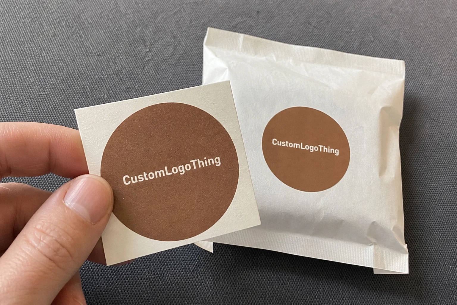
Brands asking how to design minimalist shipping cartons usually want the mood board first. I push them toward the structure first. Minimalist shipping cartons use fewer colors, fewer graphic elements, and a tighter layout, yet they still feel intentional. The surface area may be large, especially in transit packaging, but the design language stays restrained. That restraint is the signal. It says the brand knows what to leave out. A carton with one black logo, 18 mm from the top panel and centered on a 260 x 180 x 90 mm mailer, can look far more expensive than a box with five slogans and three badge icons fighting for attention.
Minimal is not cheap. Cheap looks accidental. Minimal looks edited. There’s a sharp difference between a recycled kraft carton with a single black logo placed 18 mm from the top panel and a carton that feels unfinished because nobody made a decision. I sat through one cosmetics meeting in Bangkok where the client wanted “simple” but kept adding icons, slogans, gradients, and a giant social handle. The first mockup carried six print elements and three fonts. The version we approved had one logo, one short line of copy, and a small QR code on the side panel. It photographed better in store listings because it looked controlled. And yes, someone in the room still asked if we could “make it pop more” after the third revision. I nearly needed coffee through an IV.
How to design minimalist shipping cartons also depends on where the box lives. DTC brands want a polished unboxing moment. Subscription boxes need consistency across repeat deliveries. Luxury accessories call for a quiet, premium read. Tech packaging usually needs to feel engineered rather than flashy. Cosmetics need restraint and better scuff resistance. I’ve watched those priorities show up in supplier negotiations in Shenzhen, Ho Chi Minh City, and Xiamen, where the box itself became the brand message and the material spec became the real argument. A matte black logo on 350gsm C1S artboard may feel premium in a studio; the same artwork on 3-ply kraft corrugated with a 150gsm liner behaves better in a courier network moving 300 parcels an hour.
“The best minimalist carton is the one that looks like it had a designer behind it, not a panic attack.” — what I told a client after reviewing their fourth revision in Dongguan
For brands using Custom Packaging Products, minimalism also helps keep order fulfillment consistent. Fewer design variables mean fewer chances for panel mismatch, ink shift, or awkward seam placement. That matters when you’re shipping 5,000 units a month and every box has to look the same on a warehouse line moving at 300 packs per hour. It also matters in regional manufacturing hubs such as Shenzhen, Guangzhou, and Qingdao, where production crews often prefer a single-print run with one die-line over a carton that requires constant plate changes and extra inspection time.
How Minimalist Shipping Cartons Work in Production
Production is where how to design minimalist shipping cartons turns practical fast. Every extra color adds a plate or another setup step, depending on the print method. Every extra coating brings more drying time, more QC touchpoints, and more chances for finger marks, rub marks, or that awkward “why is this panel shinier than the rest?” problem that appears right before approval. Clean design is easier for a factory to hold in registration and color consistency. In a factory near Foshan, I watched a two-color carton require 42 minutes of press adjustment before the first usable sheet; the one-color version from the same board grade was stable in under 15 minutes.
The logic is simple. A one-color carton is usually easier than a two-color carton. Flat ink coverage is usually simpler than a full-bleed illustration. A strong structural shape often does more for the box than trying to print personality onto weak corrugate. The board grade matters too. A rough recycled liner with visible fibers asks for a design that works with the texture. A white SBS folding carton gives a crisper premium look, but it costs more on the substrate and often more on finishing. For lighter retail products, 350gsm C1S artboard works well for outer sleeves and internal cartons; for shipping, E-flute or B-flute corrugated usually wins because it survives the freight lane better than a rigid cosmetic shell.
For heavier ecommerce shipping, corrugated is the workhorse. E-flute gives a smoother print surface and decent crush resistance. B-flute delivers better stacking strength. RSC styles and mailer-style cartons are common for transit packaging, especially once product weight climbs above 2 kg. Lighter products can sit well in folding carton styles on kraft or SBS board, but only if the outer shipper still protects the product through the freight route. Pretty doesn’t mean protected. I’ve opened cartons that looked beautiful and arrived with corner crush after a 1.2-meter drop test because no one checked the board spec. That kind of thing makes me want to introduce a box to a wall, politely and repeatedly.
The workflow should stay disciplined:
- Concept and brand direction.
- Dieline selection and structural review.
- Artwork built to panel hierarchy.
- Digital proof or white sample.
- Production sample and practical handling review.
- Mass production, QC, packing, and freight.
That sequence matters because minimalist design relies on proportion and material quality more than visual noise. If the logo sits 4 mm too low or the whitespace lands uneven by 8 mm, the carton can feel wrong. Most people won’t know why. They just feel it. That is why spacing matters so much in how to design minimalist shipping cartons. It sounds dull. It saves ugly boxes. A logo that is 22 mm wide on a 240 mm panel, placed 16 mm above the centerline, can look calm; the same logo at 34 mm wide with no margin looks like a supplier template from 2018.
Shipping materials should match what the carton has to survive: compression on a stacked pallet, vibration in transit, humidity during ocean freight, or warehouse abrasion during order fulfillment. Each answer changes the board grade, flute choice, and print method. If you’re working with a supplier in the U.S. or Asia, ask for compression data, not just mockups. Standards from groups like ISTA exist because packages get dropped, shaken, and stacked like the universe has a grudge. A supplier in Jiangsu can quote an elegant carton in 24 hours; that same supplier may need another 48 hours to confirm Edge Crush Tests at 32 ECT or 44 ECT, which is the part clients often forget to budget time for.
Key Factors in Minimalist Shipping Carton Design
If you’re serious about how to design minimalist shipping cartons, treat brand hierarchy like architecture. Logo placement is the roofline. Typography is the window spacing. Negative space is doing more work than most brands realize. In one negotiation with a premium tea brand in Singapore, I convinced them to shrink the logo by 22% and move it up 14 mm. They thought I was being fussy. Once the cartons printed, the whole pack looked more expensive because the visual balance improved. Same ink. Same board. Better ratio. On a 320 mm-wide mailer, that 14 mm shift changed the whole tone of the box.
Material choice changes everything. Recycled kraft gives an earthy, honest look, though the brown tone can flatten light-colored branding. White SBS gives a brighter, cleaner read and suits luxury cosmetics or tech accessories, but it usually costs more than kraft by a noticeable margin. Corrugated board, especially for shipping boxes, brings strength and better package protection. Flute selection matters too. E-flute is smoother and better for print detail. B-flute gives thicker protection. You don’t choose these casually when the carton is going through long-haul transit packaging. A supplier in Vietnam may offer 3-ply E-flute at a lower unit rate, while a plant in Eastern China can provide 5-ply B-flute with stronger stacking performance for palletized export loads.
Finishes are where many brands spend too much. A no-finish carton can look fantastic on the right kraft board. Matte aqueous coating costs less than soft-touch and still reduces glare. Spot UV can work, but only if you want one highlight, not a whole disco floor. Soft-touch lamination feels expensive in hand, yet it adds cost and can scuff differently depending on freight conditions. I usually tell clients to spend on material first, then finish, then decoration. Not the other way around. A matte aqueous finish might add $0.03 to $0.06 per unit on a 5,000-piece run; soft-touch can push that higher depending on the factory in Shenzhen or Dongguan and whether the line has to run an extra drying cycle.
Pricing shifts with MOQ, print method, board thickness, inserts, and freight dimensions. A carton quoted at $0.28/unit for 10,000 pieces can jump to $0.52/unit if you add a custom insert and soft-touch lamination, especially on a short run. That isn’t the supplier being dramatic. That’s production math. If you’re running multiple SKUs, standardizing the outer size can save money across the line because one master carton size can serve several product variants. Smaller dimensional weight also helps on ecommerce shipping. That’s actual savings, not spreadsheet theater. A 230 x 160 x 80 mm master carton can often cover three product bundles if the insert thickness is planned properly; a 12 mm increase in depth can push the freight class into a more expensive bracket.
Sustainability matters here too. Simple cartons often use less ink, fewer finishing chemicals, and less wasted board. If you’re working toward FSC-certified materials, ask for FSC options early in the quoting stage. It is easier to plan for certification than to bolt it on after the sample is already approved and everyone is pretending the timeline is flexible. It isn’t. FSC paperboard sourced through mills in Zhejiang or Guangdong typically needs confirming at the quote stage, because the certificate chain and minimum order quantities can change the unit price by 5% to 12% depending on the paper mill and coating spec.
| Option | Best For | Typical Cost Impact | Design Impact |
|---|---|---|---|
| Recycled kraft corrugated | Eco-focused ecommerce shipping | Lower material cost, strong value | Warm, natural, minimal look |
| White SBS folding carton | Cosmetics, luxury accessories | Higher board cost, cleaner print | Bright, premium, precise graphics |
| E-flute corrugated | Light to medium shipping protection | Moderate cost, good print surface | Crisp surfaces with decent strength |
| B-flute corrugated | Heavier products, better stacking | Moderate to higher cost | Thicker profile, stronger transit performance |
How to Design Minimalist Shipping Cartons Step by Step
The first step in how to design minimalist shipping cartons is not artwork. It’s intent. Ask what the carton needs to do. Premium presentation? Lower freight cost? Faster warehouse handling? Less waste? Eco-friendly positioning? A carton can support more than one of those goals, but it cannot do all of them perfectly without tradeoffs. I’ve had clients swear they wanted the “lightest possible box” until their product got crushed twice in testing. Then a 12% increase in board strength suddenly sounded sensible, especially after the second replacement shipment left the factory in Suzhou.
Start by auditing the existing packaging. Write down what must stay. Usually that list includes logo, product name, SKU code, return info, handling icons, and compliance marks. If you’re shipping cosmetics or food-adjacent items, some markets require specific labeling and batch traceability. Don’t hide that on the underside like a magic trick. It will come back during compliance review. Don’t add extra copy just because the carton has open space, either. Minimalism is disciplined restraint, not a blank canvas for every brand sentence ever written. A clean spec sheet for a shipment to Australia, for instance, may need barcode placement, country-of-origin text, and a recycling mark positioned within 8 mm of the side panel edge so it scans cleanly and stays visible after warehousing.
Next, choose the carton style and size based on the product and the shipping path. A mailer box works well for direct consumer packing. A regular slotted carton may fit bulk distribution better. If you need a custom insert, decide whether paperboard, molded pulp, or corrugated pads are enough. The insert should stabilize the product, not turn into a little engineering project that eats margin. For a 300-gram accessory set I helped spec in Guangzhou, we cut insert complexity from three pieces to one folded tray and saved $0.07 per unit on a 15,000-piece run. Small number. Large impact once multiplied. A molded pulp insert in Qingdao might cost slightly less than a folding paperboard tray, but only if the product tolerates the rougher texture and the lead time stays within 10 to 14 business days.
Then build the layout around one focal point. That might be the logo, the product name, or a short brand statement. Add one supporting line if needed. Keep the rest quiet. White space, or more accurately negative space, does the heavy lifting in minimalist design. Brands used to packing every panel with messages often struggle here. If the eye has nowhere to rest, the carton loses its calm. A good rule is one dominant message on the main panel, one utility message on a side panel, and nothing decorative unless it earns its space.
After the layout is settled, move into the dieline. Review panel hierarchy carefully. The front panel should carry the strongest read. Side panels can hold practical information. The bottom panel usually carries production codes or compliance marks. Pay attention to flap overlap and seam placement. I once had a client insist on a centered logo without realizing the seam would cut through the wordmark on the assembled box. We caught it before print. If we had not, they would have paid for 20,000 cartons that looked like a printer jam. On a 280 x 200 x 100 mm carton, even a 6 mm seam shift can ruin the visual balance and create a visible break in the logo.
Print the first proof at actual size whenever possible. Screen mockups lie. A logo that feels balanced on a laptop can look tiny on a 400 mm carton. A good minimalist carton depends on reading distance. In a warehouse, staff may identify it from 2 meters away. In an unboxing video, the camera may sit 30 cm above the surface. Test both. I’ve watched a black-on-kraft design look beautiful in Adobe Illustrator and then disappear under bright LED lighting in a 1,500 square meter fulfillment center because the ink density was too soft for the board color.
Before you approve mass production, validate the sample with practical checks:
- Drop test from 60 to 80 cm, depending on product weight and distribution route.
- Stacking test under pallet load for at least several hours.
- Scuff test with light friction on corners and panel edges.
- Unboxing check under real lighting, not just studio lights.
If you want to compare practical carton options while planning how to design minimalist shipping cartons, our Custom Shipping Boxes page is a useful place to review structures before you lock specs. Structure first. Artwork second. Sanity always. A 3-ply mailer for a 600-gram item may be fine for domestic delivery in California or Texas, while a 5-ply export box is a better fit for a route that moves through Osaka, Hong Kong, and Singapore before final delivery.
Cost, Pricing, and Timeline for Minimalist Shipping Cartons
Numbers matter, because people want to know whether how to design minimalist shipping cartons actually saves money. Usually, yes. Fewer ink colors can reduce setup costs. Simpler artwork can shorten prepress time. Fewer special finishes can lower the unit cost. Custom structural changes, unusual dimensions, and inserts can wipe out those savings if you are not careful. The trick is to simplify what matters and skip the extras that do nothing for sales or protection. A carton with one-color flexo print, a standard dieline, and no lamination can cost dramatically less than a three-color box with spot UV, even if the overall footprint looks almost identical on a shelf.
Where does the money go? Structure, board, print setup, finishing, sampling, QC, packing, and freight. On a 10,000-piece run, a cleaner carton might save $300 to $900 in print setup and coating expenses, depending on the supplier and print method. On the other hand, if you decide to custom-engineer a new dieline with locking tabs, thumb cuts, and a premium insert, you can spend that right back in tooling and sampling. Minimalist can be cheaper. It is not magic. A simple shipper quoted at $0.23 per unit in Hebei can rise to $0.37 per unit once you add an insert, a matte aqueous layer, and a stricter QC tolerance on print registration.
Timeline usually starts with concept approval, then dieline development, then sample production, then revisions, then mass production, then freight. A straightforward digital print short run might take 7 to 12 business days after proof approval. Offset or flexo runs can take 12 to 18 business days, depending on board availability and scheduling. Rush jobs almost always cost more. I have watched clients lose a discount because they approved artwork late on a Friday and then asked for a Monday ship-out like the factory had a teleport machine. If only. For a standard corrugated project in Shenzhen, the typical pace is 12-15 business days from proof approval to finished cartons, assuming the board is in stock and there is no second-round structural revision.
If your volume is low, digital printing can be the smartest path. You avoid plate costs and can make faster art changes. As volume climbs, offset or flexo often wins on unit price. That matters especially for ecommerce shipping programs where repeat orders justify setup. A 2,000-piece order might be fine digitally at $0.68/unit. A 20,000-piece run with flexo might drop to $0.29/unit if the structure is standardized and the artwork stays simple. In practice, a brand shipping from Los Angeles to Chicago may care more about fast replenishment than chasing the absolute lowest unit price, while a Dubai or Rotterdam distribution model may prioritize freight efficiency and pallet count.
Here’s a practical comparison I use in client reviews:
| Production Choice | Best Volume Range | Approximate Unit Cost | Pros | Tradeoffs |
|---|---|---|---|---|
| Digital printing | 500 to 3,000 units | $0.55 to $0.95 | Fast, flexible artwork, low setup | Higher unit cost at scale |
| Offset printing | 3,000 to 20,000 units | $0.25 to $0.55 | Sharp detail, strong color control | Plate/setup costs, longer lead time |
| Flexographic printing | 10,000+ units | $0.18 to $0.40 | Efficient for high volume, durable output | Less detail than offset on some boards |
Standardizing box sizes can save more than people expect. If one carton fits three product variants with a small insert adjustment, you reduce tooling, simplify warehouse picking, and cut down on dimensional weight. That matters for freight. A box that is 8 mm too tall might push you into a more expensive shipping tier, and I’ve seen clients lose hundreds of dollars a month over tiny size mistakes. Tiny mistakes. Big invoice. A 10,000-unit run manufactured in Dongguan can shift from budget-friendly to frustratingly expensive if the carton depth grows by just 6 mm and the pallet count changes from 48 to 52 cartons per pallet.
For brands balancing budget and speed, I often suggest pairing minimalist shipping cartons with one of our Custom Poly Mailers for lighter items or secondary shipment protection. Not every product needs a full rigid-style solution, and not every shipment deserves a luxury box. The right carton protects the product and respects the shipping math. For example, a 150-gram apparel accessory may ship more efficiently in a 0.05 mm poly mailer with an outer carton only for premium orders, while a 900-gram beauty set usually justifies a stronger corrugated shipper from day one.
Common Mistakes When Designing Minimalist Shipping Cartons
The most common mistake in how to design minimalist shipping cartons is making the carton so bare it looks unfinished. A blank kraft box with a tiny logo in the corner is not automatically premium. Sometimes it just looks like someone ran out of ideas. I’ve had clients bring me samples where the font was too small, the logo contrast was too weak, and the overall piece read like a test print. Minimalism needs confidence. Otherwise it turns into uncertainty with a budget. A 240 mm-wide box with an 8 mm logo can look timid in a retail photo and invisible in a warehouse shelf scan.
Another problem is weak brand recognition. If the logo is tiny, the typography is generic, and the color palette sits too close to the board color, the carton disappears. That can work for industrial parts. It does not work nearly as well for a premium ecommerce brand. Minimal packaging still needs to tell customers who sent the box before they open it. If a carton ships from Munich, Toronto, or Melbourne, the customer should still know the brand from 1 to 2 meters away, not just after the tape is cut.
Shipping realities get ignored far too often. Moisture, corner crush, scuffing, and stacking pressure can wreck an otherwise beautiful carton. I once visited a facility in Johor Bahru where a client’s soft-touch cartons had a gorgeous look but started marking badly after two weeks in a humid warehouse. The fix was plain: change the coating and strengthen the outer shipper. Plain fixes are usually the right ones. Fancy mistakes are still mistakes. On humid routes through Southeast Asia, an aqueous matte finish often performs better than a delicate lamination that shows rub marks after 300 handling cycles.
People also fall in love with premium finishes before the structure works. I’m not against soft-touch or spot UV; I’m against wasting money on finishes sitting on top of a weak box. If the carton collapses, nobody cares how smooth the coating feels. Durability first. Cosmetic decisions second. A 1.5 mm structural error on the dieline can ruin a supposedly elegant finish faster than any design software can warn you.
Over-customization causes its own mess. If every SKU gets a different dieline, different insert, and different artwork flow, order fulfillment gets chaotic fast. Warehouse teams hate that. Finance teams do too. Standardized dimensions reduce the number of shipping materials you need to stock and help you maintain cleaner production runs. Your operations team will thank you. Maybe not with flowers. But with fewer complaints. A brand with 14 SKUs and 14 box sizes often pays more in storage, picking, and replenishment than the design team expects.
Expert Tips for Better Minimalist Shipping Cartons
If you want stronger results from how to design minimalist shipping cartons, use one strong brand cue and let the material carry some of the mood. A kraft carton with a strong logo and the right ink density can look more expensive than a flashy box covered in effects. In my own packaging business, I learned that texture often matters more than people admit. The tactile feel of the board can do half the branding if you let it. A 30% recycled liner with visible fiber can feel honest and premium if the print system respects it instead of fighting it.
Keep copy brutally useful. Product name. Handling note. QR code if it serves a real purpose. Maybe one short brand line, max. I once worked with a skincare startup in Seoul that wanted a poem on every side panel. Nice idea. Wrong box. We cut it down to a product name, a web address, and a clean icon set. Sales photos looked stronger because the carton stopped shouting. A 90-character paragraph on a mailer is almost always too much; a 12-word statement usually does the job better.
Ask for physical samples. Always. PDF files do not show the whole story. Screen color lies, printer calibration drifts, and cardboard texture changes the perception of ink density. In a supplier meeting in Dongguan, I watched a client approve a white-on-kraft design from a monitor and then panic when the actual sample looked softer than expected. The fix was simple: we switched to a darker ink and raised the contrast by one notch. That sort of issue is exactly why samples exist. If possible, request a white sample, a printed sample, and one transit sample with tape and labels applied so you can check the whole chain, not just the artwork.
Build a design system that scales across sizes. One logo placement rule. One typography scale. One handling icon style. That way the cartons feel related even if the dimensions change. It also keeps warehouse staff sane, which is a benefit that never gets enough credit. If your team ships multiple sizes every day, the same visual structure reduces mistakes. A 180 mm box and a 320 mm box can share the same visual grammar if the margins, logo height, and copy hierarchy are defined from the start.
Check supplier capabilities before you finalize the concept. Some factories are excellent at kraft minimalism. Others are strong on loud retail cartons and somehow turn restrained design into sad beige cardboard. I’ve seen both. Ask for previous samples, ask about board availability, and ask what their actual print tolerances are. A supplier who can quote a pretty carton but cannot hold clean registration on a simple black logo is not the supplier you want for this job. If a plant in Guangzhou can hold ±1.5 mm registration and provide a 32 ECT board certificate, that is more useful than a glossy promise from a sales sheet.
Delivery cost matters too. A carton that looks perfect but is 12 mm larger than needed can raise dimensional weight and freight cost. That is not glamorous. It is real money. In ecommerce shipping, real money beats design ego every time. A route from Shanghai to Los Angeles can punish oversize cartons far more than brands expect, especially when carriers charge by dimensional weight instead of actual product mass.
For more packaging formats that support a clean brand system, I also point clients to Custom Packaging Products when they’re building a broader shipping lineup. A minimalist carton should fit the whole package architecture, not stand alone like a good-looking orphan. In practice, that means aligning outer cartons, mailers, inserts, and labels so the same visual rules hold whether the order is leaving a warehouse in Texas, a third-party fulfillment center in Kent, or a production site in Shenzhen.
Frequently Asked Questions
How do I design minimalist shipping cartons without making them look plain?
Choose one visual anchor, such as a logo, seal, or short brand message. Use whitespace on purpose, not by accident. Then pick a carton color and finish that already feels premium, such as recycled kraft with a strong black print or white SBS with a matte coating. That balance is what keeps how to design minimalist shipping cartons from turning into “we forgot the design.” On a 280 x 190 x 80 mm carton, a single centered mark with 15 mm margins often reads cleaner than multiple small icons fighting for space.
What materials work best for minimalist shipping cartons?
Recycled kraft works well for earthy, sustainable branding. White SBS or coated board fits cleaner premium looks. Corrugated board is the safer choice when package protection matters more than a lightweight feel. If the carton is part of a larger transit packaging system, board strength should be decided before you choose the artwork style. A 350gsm C1S artboard sleeve is fine for an inner pack, but a 3-ply or 5-ply corrugated outer shipper is better for routes that include airline transfer or long-haul truck freight.
Are minimalist shipping cartons cheaper to produce?
Usually yes, because fewer ink colors and simpler artwork often reduce setup costs. Custom sizing, inserts, and special finishes can raise the total price quickly. I’ve seen a “simple” box become expensive because the team insisted on a custom insert and soft-touch lamination. Minimal does not mean automatically cheap. A quoted price of $0.15 per unit for 5,000 pieces can still rise to $0.31 once you add a custom tray, matte lamination, and tighter QC for color consistency.
How long does it take to produce minimalist shipping cartons?
Sample creation can take a few days to a couple of weeks, depending on structural complexity and supplier workload. Production timing depends on print method, order size, and how fast you approve proofs. Freight and warehouse scheduling can add extra days, so I always tell clients to build in a buffer before launch. For many factories in Shenzhen, Dongguan, or Ningbo, production is typically 12-15 business days from proof approval on a standard run, while a custom insert or special finish can add another 3 to 5 business days.
What should I put on a minimalist shipping carton?
Keep it to the essentials: logo, product or brand name, shipping or handling details, and compliance marks. Add a QR code only if it has a clear purpose, such as tracking, onboarding, or a product guide. If it does not help the customer or the operations team, it probably does not belong on the box. In practice, that usually means one front-panel logo, one side-panel barcode, one return label area, and a discreet batch code near the bottom flap.
If you are still mapping out how to design minimalist shipping cartons, my blunt advice is this: start with structure, strip out noise, and test the sample in the real world before you print a thousand pieces. That is how you get a carton that looks intentional, moves through order fulfillment cleanly, and holds up in ecommerce shipping without wasting money on overdesigned shipping materials. The cleanest carton often costs less to make than the crowded one. Funny how that works, especially after you compare a 10,000-piece run in Shenzhen with a rushed short run in Los Angeles and realize the quieter design usually wins on both cost and appearance. So the next move is simple: Choose the Right board, lock the dieline, and approve only the artwork that earns its space.