Buyer Fit Snapshot
| Best fit | Luxury Skincare Unboxing Experience Design projects where brand print, material claims, artwork control, MOQ, and repeat-order consistency need to be specified before quoting. |
|---|---|
| Quote inputs | Share finished size, material target, print colors, finish, packing count, annual reorder estimate, ship-to region, and any compliance wording. |
| Proofing check | Approve dieline scale, logo placement, barcode or warning zones, color tolerance, closure strength, and carton packing before bulk production. |
| Main risk | Vague material claims, crowded artwork, missing packing details, or unclear freight terms can make a low unit price expensive after revisions. |
Fast answer: Luxury Skincare Unboxing Experience Design: Board, Finish, Dieline, and Unit Cost should be specified like a repeatable production item. The safest quote records material, print method, finish, artwork proof, packing count, and reorder notes in one written spec.
Production checks before approval
Compare the actual filled-product size with the drawing, then confirm tolerance on folds, seals, hang holes, label areas, and retail display edges. Reserve space for logos, QR codes, warning copy, and material claims before decorative graphics fill the panel.
Quote comparison points
Review material grade, print process, finish, sampling route, tooling charges, carton quantity, and freight assumptions side by side. A quote is only useful when the supplier can repeat the same color, closure quality, and packing count on the next order.
Luxury skincare Unboxing Experience Design gets judged fast. In shop-floor tests I’ve watched in Dongguan and Shenzhen, people form a value opinion in under 7 seconds, often before they’ve even seen the serum bottle inside. I remember standing beside a packing line in Dongguan while a buyer opened a sample set, paused for maybe two seconds, and said, “Feels premium.” That was it. That was the verdict. That’s why luxury skincare unboxing experience design is never just “nice packaging”; it is a controlled first impression that shapes customer perception, brand recognition, and whether the product feels like $42 or $142. For a 5,000-unit run, even a $0.15 difference per unit can change the conversation by $750. Suddenly the details stop being decorative and start being very, very real.
I’ve spent enough time on packaging lines, in buyer meetings, and inside supplier negotiations in Dongguan, Shenzhen, and Guangzhou to see the pattern clearly: the brands that treat luxury skincare unboxing experience design as part of the product story usually win on repeat purchase. The box, the insert, the lift, the sound of the closure, the reveal sequence — all of it matters. Honestly, I think this is where beauty brands often leave money on the table. They invest in a beautifully formulated cream, then hand it a carton that feels generic by comparison. It’s a little tragic, really. Like wearing couture shoes with a grocery-store tote. And yes, I have watched a founder spend $18 on a jar cap and then approve a carton that looked like it came from a discount pharmacy in Yiwu. The math was not mathing.
Here’s the twist. The customer rarely says, “This board has a 350gsm feel and excellent crease memory.” They say, “This feels expensive.” That gut reaction is the entire point of luxury skincare unboxing experience design. If the outer carton uses 350gsm C1S artboard wrapped over a 1200gsm rigid base, with a matte soft-touch laminate and a neat 0.5 mm wrap turn, the customer probably won’t know the specs. But they will know the result. That’s the job.
Luxury Skincare Unboxing Experience Design: What It Really Means
Luxury skincare unboxing experience design is the deliberate planning of sight, touch, sound, order, and reveal sequence across the outer packaging, inner inserts, and product placement. It’s not decoration added at the end. It’s architecture for emotion. The goal is to make the customer feel that the product inside has been cared for at every stage, from fulfillment to the moment they peel back tissue or lift a tray. If the box opens in four clean steps and the hero product sits in a custom-cut cavity with 1.8 mm tolerance, the customer feels that care before they use a single drop.
The difference between standard packaging and luxury skincare unboxing experience design is bigger than most people realize. Standard packaging protects the item, displays the logo, and gets it to the customer intact. Luxury skincare unboxing experience design does all that, then adds pacing, suspense, and sensory detail. It suggests exclusivity without shouting. It says, “This brand understands ritual.” That ritual can be as simple as a drawer box opening with 280–320 grams of pull force and a satin ribbon tab that lands cleanly every time. Small engineering choices. Big emotional payoff.
I’ve seen this in client meetings more than once: a founder brings a beautiful label system and a polished website, then places the hero cream in a plain folding carton with a loose insert. The formula may be excellent, but the customer experience feels flat. That flatness matters. A skincare buyer may never articulate it, but the perceived value drops when the packaging doesn’t match the product promise. I once reviewed a launch in Seoul where the serum bottle cost $14.80 to fill and the box cost only $0.32 to make. The issue wasn’t the spend. The issue was that the package told a $9 story while the brand wanted a $90 one.
Luxury skincare unboxing experience design influences giftability, social sharing, and repeat purchase behavior. Gift buyers want the recipient to be impressed in the first moment. Influencer kits need to photograph well under bright studio lights in Los Angeles or New York. And loyal customers remember how a box made them feel the first time they opened it. That memory has weight. It can be the difference between a one-time trial and a replenishment order 45 days later. For a subscription brand, that timing is not random; it is the window where the next carton either feels worth keeping or feels like trash.
One thing most people get wrong: the box is not a separate object from the product story. In luxury skincare unboxing experience design, it is part of the formula’s introduction. It sets expectation before a single drop is used. That’s why visual branding, brand identity, and brand consistency have to appear on the outside, inside, and even on the smallest insert card. If your outer sleeve is warm beige, your inner tray is cool white, and your thank-you card looks like it was designed in a different decade, the story breaks. The customer may not say it out loud. They just feel the mismatch.
“We thought the serum was the hero,” a skincare founder told me after her first production run. “Turns out the customer started judging the experience the moment the mailer opened.” She was right. The package was speaking before the formula did. In her case, the launch was built in Guangzhou with a rigid box, a printed sleeve, and a 2.5 mm EVA tray, but the insert card was an afterthought. The box had a face. The card had a shrug.
There’s also a practical side. If the experience looks premium but the jar rattles, or the bottle leaks in transit, customer perception drops fast. A luxury skincare unboxing experience design that ignores fit, retention, and shipping stress is expensive theater. Beautiful? Maybe. Effective? Not for long. I’ve seen a $3.20 magnetic box arrive crushed because the master carton used thin corrugated with a 14 ECT rating. The unboxing moment was dead on arrival. The courier did the review for them.
How Luxury Skincare Unboxing Experience Design Works
Luxury skincare unboxing experience design works like a sequence, not a single moment. I usually map it as five layers: outer shipper, branded presentation box, interior reveal, product arrangement, and closing message. If any one layer feels abrupt or sloppy, the whole experience loses rhythm. I’ve watched a gorgeous kit fall flat because the first pull felt sticky and weird. One awkward motion, and the magic is gone. Packaging is rude like that. A box that should glide open with a 10–15 N pull force can feel cheap if the hinge catches or the magnet lands off-center by 1 mm.
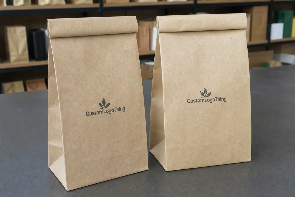
The outer shipper is the first physical contact. It can be plain kraft, white corrugated, or a printed mailer depending on the brand’s shipping strategy. For e-commerce brands, this layer has to protect the premium packaging inside. I’ve seen brands spend $4.80 on a rigid presentation box, then ship it in a weak mailer that crushes corners. That’s not luxury skincare unboxing experience design; that’s self-sabotage with a shipping label. In Shenzhen, I once saw a shipment with 500 units packed in a shipper that saved $0.07 per box and cost the brand 23 damaged units. Cheap rarely stays cheap.
The next layer is often a branded presentation box or drawer-style carton. Magnetic closures, book-style boxes, sleeves, and nested trays are common because they create a slower reveal. That slower reveal matters psychologically. The customer has to pause, lift, slide, or open. In that pause, anticipation grows. A premium box should not feel like a cereal carton. It should feel intentional, with controlled friction and a clean edge. A drawer box with a 1.2 mm board thickness, wrapped in 157gsm coated art paper and finished with matte lamination, can feel far more luxurious than a shiny folding carton with a loud print pattern.
Then comes the interior reveal. This is where the sensory cues do most of the talking. Matte versus gloss, soft-touch coating, foil stamping, embossing, spot UV, and a rigid board weight of 1200gsm or more all signal quality in different ways. A soft-touch exterior can feel calm and modern. A high-gloss foil accent can feel clinical and bright. Neither is automatically better. The right choice depends on brand identity and the emotional tone of the skincare line. If the formula is a retinol serum for night use, a midnight navy box with silver foil on the lid can work beautifully. If the product is a brightening vitamin C kit, white board with a single amber accent may communicate freshness better.
After that comes product arrangement. This is where luxury skincare unboxing experience design becomes almost theatrical. The hero product may sit centered, or slightly elevated on a tray. A sample might be tucked underneath. A spatula, dropper, or refill insert may sit beside it in a precisely cut cavity. The order matters because the eye reads the space before the hand touches it. I’ve learned that the hard way, after a supplier “helpfully” shifted a tray 3 mm and suddenly the whole layout looked off-balance. Three millimeters. Tiny on paper. Huge in a box. In one sample set I reviewed in Dongguan, that 3 mm shift made a $78 gift set look like a rushed promo kit.
Finally, there’s the closing element: a thank-you card, usage instructions, a warranty or return note, or a refill invitation. That last card can feel like a whisper if it’s written well. It can also feel like a sales pitch if it’s too aggressive. I’ve watched both versions land in a customer test session. The elegant version was kept. The pushy one went in the trash with the tissue paper. Brutal, but fair. A card printed on 300gsm uncoated stock with a single foil line can feel thoughtful; a 1-page flyer packed with coupon codes feels like a clearance rack in paper form.
There’s a reason experienced packaging teams obsess over opening force, board score lines, and insertion sequence. Small details create trust. If the lid opens at the wrong angle or the tray shifts by 4 mm, the customer notices. Maybe not consciously. But they feel it. That sensation shapes the entire unboxing experience. In factory testing, I’ve seen a line stop because a magnet pocket was placed 2 mm too shallow, which made the closure sound dull instead of crisp. Sound matters. People love pretending they’re above that. They’re not.
For brands that want a formal quality benchmark, it helps to check recognized packaging and transit testing standards. The ISTA protocols are useful for distribution testing, and the Packaging School and industry resources can help teams understand structure, materials, and production realities. Luxury skincare unboxing experience design becomes much easier when it respects both emotion and engineering. A 90 cm drop test, corner crush check, and vibration simulation are not glamorous, but neither is refunding broken glass bottles from a courier mishap in Chicago.
Key Factors in Luxury Skincare Unboxing Experience Design
Material quality sits at the center of luxury skincare unboxing experience design. If the board feels thin or the paper feels slick in a cheap way, the customer senses it immediately. In my experience, rigid board, specialty wrap papers, and recycled but premium-feeling inserts perform best when the goal is to balance luxury with credibility. A 1200gsm rigid base wrapped in 157gsm art paper can feel significantly more substantial than a standard folding carton, even before print finishes are added. If the wrap stock is 120gsm–157gsm with a fine linen texture, the package can look rich without becoming shiny or overworked.
Brand consistency is the second big factor. The colors, typography, icon system, and tone of copy should match the skincare brand’s identity across every touchpoint. If the website is quiet and clinical but the box is loud and decorative, customer perception gets muddy. Luxury skincare unboxing experience design works best when the packaging looks like it came from the same mind that shaped the serum formula and the website homepage. A brand based in London should not send out a box that feels like it was borrowed from a gift shop in Bangkok unless that contrast is deliberate and justified by the story.
Protection and fit are not glamorous, but they’re non-negotiable. Jars, glass droppers, ampoules, and airless pumps all need cavities or retention systems that reduce movement. I once visited a contract packer in Dongguan where 3,000 units were being hand-packed into trays with a 1.5 mm tolerance issue. The box looked stunning. The bottles still knocked together during a 90 cm drop test. The room went quiet for a second, which is always a bad sign. That’s the kind of problem that shows up as returns, leaks, or poor reviews. If the insert is off by 2 mm, the bottle can move enough to chip a cap during transit. That’s not “minor.” That’s expensive.
Sensory hierarchy deserves its own attention. Ask yourself: what should the customer see first, touch second, and remove third? A strong luxury skincare unboxing experience design often places the hero product in the center, then lets the supporting items feel secondary rather than cluttered. Less can actually read as more, especially when the brand is selling calm, purity, or dermatologist-level precision. A single bottle in a rigid tray with a 4 mm recess can feel more premium than three products crammed into one shared cavity. Space is a luxury. Crowding is a panic response.
Sustainability expectations have changed the conversation. Premium buyers increasingly want recyclable boards, FSC-certified paper, refillable formats, or reusable keepsake boxes that don’t look like compromise. That doesn’t mean everything must be plain. It means the sustainability choice has to be built into the luxury skincare unboxing experience design, not bolted on. The U.S. EPA has practical material reduction resources at epa.gov/smm, and FSC guidance at fsc.org is useful for brands specifying responsibly sourced paperboard. I’ve seen brands in California and South Korea use FSC-certified rigid board with a water-based coating and still get the premium feel they wanted.
Here’s the part that often surprises founders: sustainable does not have to mean lightweight. A recycled rigid box can still feel expensive if the paper wrap, print density, and closing mechanism are chosen carefully. I’ve seen brands use a 100% FSC board with a clean emboss and water-based coating, and the result felt more premium than a heavily laminated box that looked overworked. A matte finish plus a crisp die-cut can beat a plastic-feeling gloss every time. No contest.
- Material feel: rigid board, specialty wrap paper, or soft-touch laminate
- Fit precision: cavity size, insert retention, and product stability
- Visual branding: typography, logo placement, color harmony, and finish choices
- Shipping resilience: corner strength, crush resistance, and transit testing
- Reuse potential: keepsake storage, refill system, or secondary use
When all five factors work together, luxury skincare unboxing experience design feels calm, confident, and expensive without becoming fussy. That balance is hard to fake. The box either holds itself together in front of the customer, or it doesn’t.
Luxury Skincare Unboxing Experience Design: Step-by-Step Process
I like to break luxury skincare unboxing experience design into six practical steps, because “make it premium” is not a brief. It’s a wish. And wishes don’t survive factory reality unless they’re translated into specs, tolerances, and a clear assembly plan. Trust me, the line operator does not care that the moodboard had a dreamy linen swatch. They care that the tray fits the bottle and the adhesive cure time is 30 minutes, not 12.
Step 1: Define the customer and occasion
Start by asking who is opening the package and why. A self-purchase serum for a 28-year-old city professional is not the same as a holiday gift set, a subscription refill box, or an influencer PR kit. Luxury skincare unboxing experience design changes depending on occasion because the emotional expectation changes. Self-purchase often needs reassurance and delight. Gifting needs ceremony. Press kits need visual drama under camera lights. A PR box sent to an editor in New York may need a bolder reveal than a replenishment carton going direct to a customer in Melbourne.
At a meeting with a clean beauty brand in Los Angeles, we discovered that their “premium” box was actually built around the founder’s taste, not the customer’s. After testing with six users, they learned that customers wanted a faster reveal and clearer instructions. That one insight changed the box structure and improved conversion on repeat orders. Good luxury skincare unboxing experience design starts with the buyer, not the board sample. Shocking, I know. The founder wanted a 3-step theatrical opening. The customer wanted the serum by step 2.
Step 2: Map the reveal sequence
Sketch the journey from outer mailer to final insert. Where does the logo appear first? What’s hidden? What is lifted? What is revealed last? The reveal sequence is the emotional spine of luxury skincare unboxing experience design. If the sequence is random, the experience feels random. If it builds deliberately, the product appears more valuable. A well-planned reveal can turn a simple $24 cleanser into a gift-worthy object, even if the structure only costs $0.52 per unit.
I often recommend a simple paper storyboard with seven frames: arrival, opening, first sight, touch point, hero product, supporting item, and closeout message. It sounds basic, but this method exposes weak spots quickly. If the customer sees ten things at once, the moment loses focus. If they see one thing too early, suspense disappears. I’ve used this in supplier reviews in Guangzhou where the team thought the box was “minimal,” only to realize the tray exposed everything at once. Minimal is not the same as forgettable.
Step 3: Choose packaging formats and finishes
This is the stage where structure and budget collide. Magnetic rigid boxes feel luxurious, but they add assembly time and material cost. Drawer boxes create a satisfying pull but require more precise tolerances. Sleeved cartons can look sharp but need good print and coating to avoid feeling flat. Luxury skincare unboxing experience design thrives when the format supports the emotional goal instead of fighting it. A magnetic closure box with a 1.5 mm gap around the lid can feel crisp if the magnets are aligned correctly; if not, it feels like a refrigerator from 1998.
For finishes, think in terms of texture and light. Soft-touch lamination can create a velvety, quiet feel. Foil can deliver a bright focal point. Embossing adds depth you can feel with your fingertips. A matte black carton with a blind emboss can feel sophisticated in a way that glossy print rarely achieves. That said, high-gloss can work well for clinical or science-forward skincare if the branding calls for precision. If your product story is “lab-tested in Seoul,” a clean white sleeve with silver foil and a sharp 0.3 mm deboss may be exactly right.
Step 4: Prototype and test
Never approve luxury skincare unboxing experience design from a PDF alone. A box can look elegant on screen and feel awkward in hand. I’ve seen lids that looked perfect in renderings but required too much pressure to open. I’ve seen inserts that looked tidy until the serum bottle sat 6 mm too high and broke the visual balance. Prototypes expose the truth, which is annoying, but also helpful. That’s why I push for at least one physical sample, one printed prototype, and one near-production mock-up before signoff.
Ask for fit samples, printed prototypes, and if possible a near-production mock-up with the right board thickness. Then test opening speed, closure strength, and how the package looks after being handled twice. People do not open luxury packaging with gloves. They open it with fingernails, often while multitasking. That reality should shape the design. In a real home, the box is opened on a kitchen counter, not a white glove table in a studio. Your design should survive both.
Step 5: Run small-batch user testing
Use 5 to 10 testers and ask specific questions: What did you notice first? Was anything confusing? Did it feel premium, and if so, why? The answers reveal whether the luxury skincare unboxing experience design is earning its place or just looking expensive in a controlled room. I like to test with people who do not already love the brand, because fans forgive bad packaging. Strangers do not.
One skincare client I worked with discovered that customers loved the tray but ignored the leaflet because it sat underneath tissue paper and a sample sachet. They moved the leaflet into a side pocket and added a small “Start here” tab. Engagement improved. Tiny move, big difference. That’s the kind of practical improvement a good packaging review can uncover. It also cost them maybe $0.03 per unit, which is cheaper than rewriting your FAQ after launch.
Step 6: Finalize artwork, dielines, and production specifications
Once the concept works, lock down the technical details. Confirm dielines, print method, board grade, coating, tolerances, adhesive points, and assembly sequence. Include exact placement for the logo, warning text, batch codes, and any FSC marks or recycling icons. In luxury skincare unboxing experience design, ambiguity becomes cost. The more precisely you specify, the fewer costly surprises show up at press check or during assembly. A dieline marked to the nearest 0.1 mm is not overkill when your bottle neck clearance is only 1.6 mm.
Also confirm shipping conditions. A box designed for shelf display may not survive courier handling unless it has a protective shipper. That’s where ISTA-style thinking matters. If the package is beautiful but arrives dented, the customer never gets to the emotional peak you spent weeks planning. I’ve watched brands in Hong Kong lose a month to reprints because the outer carton was designed for retail shelves in a showroom, not for courier routes across three warehouses and a final-mile van.
| Packaging option | Typical unit cost | Lead time | Best use case |
|---|---|---|---|
| Printed folding carton | $0.18 to $0.45 at 5,000 units | 10-15 business days after proof approval | Entry luxury, mailer inserts, lightweight products |
| Rigid gift box with insert | $1.20 to $3.80 at 5,000 units | 15-25 business days after sampling | Hero SKUs, gift sets, influencer kits |
| Magnetic closure rigid box | $2.10 to $5.50 at 5,000 units | 18-30 business days after proof approval | High-end skincare, subscription prestige sets |
| Custom drawer box with tray | $2.40 to $6.20 at 5,000 units | 20-32 business days after sampling | Unboxing experiences that emphasize reveal and keepsake value |
Cost, Pricing, and Timeline Considerations
Luxury skincare unboxing experience design can cost surprisingly little or surprisingly much, depending on structure, print method, finish complexity, order volume, and hand assembly. A printed folding carton for a single serum may land around $0.18 to $0.45 per unit at 5,000 pieces, while a rigid box with a custom insert can run from $1.20 to well above $5.00 per unit depending on the spec. The jump is real. So is the effect on customer perception. A $0.22 increase for a soft-touch finish and foil logo can easily be justified if the final package supports a $78 retail price instead of a $48 one.
Here’s what people miss: the quoted unit price is only part of the story. Sampling, revisions, plate or tooling charges, freight, warehousing, and assembly labor can move the total project cost significantly. A box that seems cheaper on paper may cost more in practice if it requires manual setup or special insert placement. I’ve sat in supplier negotiations in Guangzhou where a “low-cost” option gained $0.22 in hand-assembly alone because the tray structure was awkward. The supplier said it with a straight face, too, like I wouldn’t notice the math. I noticed. Then I asked for the labor breakdown by station and the room got very quiet.
Timelines also matter. A clean, simple printed carton might move from artwork to production in 2 to 3 weeks if approvals are fast. A custom rigid box for luxury skincare unboxing experience design usually needs more breathing room: concept development, prototype review, artwork corrections, sampling, and final production can stretch the schedule to 4 to 8 weeks or more. Specialty papers, foil embossing, and molded inserts often add extra time. If you want a drawer box out of Dongguan with a custom EVA insert, plan for at least 12–15 business days from proof approval for production alone, then add freight.
The fastest projects are rarely the smartest ones. Tight timelines reduce flexibility and push teams into conservative decisions. That often means fewer finish options, less testing, and more risk of mismatch between structure and brand identity. If the product launch date is fixed, the smartest move is to lock the packaging direction early and protect enough time for at least one sample round. I’ve seen brands in Toronto try to compress a 6-week packaging schedule into 11 days. The result was predictable: rushed proofs, a crooked foil plate, and a box that looked like it lost a fight with the production calendar.
Below is a practical way to think about cost drivers in Luxury Skincare Unboxing Experience Design:
- Structure complexity: drawer, magnetic, sleeve, double-wall, or nested tray
- Print and finish: foil, emboss, deboss, spot UV, soft-touch, specialty varnish
- Insert type: paperboard, EVA foam, molded pulp, or thermoformed tray
- Assembly labor: machine-set vs. hand-packed, especially for influencer kits
- Shipping format: individual shipper, master carton, or retail-ready case pack
Honestly, the brands that budget well for luxury skincare unboxing experience design usually do not spend more everywhere. They spend strategically. One impressive moment, one strong structure, and one smart print finish can often do more for perceived value than three layers of decoration. A $0.15 insert card that lands perfectly can pull more weight than a $1.10 ribbon that looks like an apology.
If sustainability is part of your brief, ask for FSC-certified board, recyclable coatings, and a design that avoids mixed-material overkill. The challenge is to keep the package premium without making recycling difficult. That balance is manageable, but only if you ask the right questions at the start. I’d rather specify a 350gsm C1S artboard wrap over an FSC rigid board with a water-based coating than deal with a pretty but unrecyclable mess later.
Common Mistakes in Luxury Skincare Unboxing Experience Design
The most common mistake I see is overdesigning. Brands pile on foil, heavy textures, ribbons, and extra inserts until the box feels expensive but awkward. Luxury skincare unboxing experience design should feel deliberate, not crowded. If the customer needs a map to open the package, the experience has gone too far. I once saw a box in Shanghai with three nested sleeves, two ribbons, one sticker seal, and a wax-like closure dot. It was not luxurious. It was a hostage situation in cardboard.
Another problem is inconsistent branding. A muted beige exterior with neon copy inside can be visually jarring unless there’s a clear reason for the contrast. Weak brand consistency confuses the story. I once reviewed a kit where the outer carton was elegant, the insert card was handwritten-looking, and the leaflet looked like it belonged to a pharmacy. None of it was wrong individually, but together it diluted brand recognition. The founder loved each piece. The customer? Not so much. In one London launch, the box said “quiet luxury,” while the brochure screamed “half-price facial.” That mismatch cost them more than the print run.
Protection failures are even more serious. Glass droppers, glass jars, and pump bottles need secure cavities, not decorative guesswork. If the box protects the wrong point or allows movement in transit, the entire luxury skincare unboxing experience design collapses the moment the package hits a conveyor belt or delivery truck. There’s no glamour in a cracked cap. A 1.2 mm foam spacer can be the difference between a clean arrival and a return rate that makes finance cry.
Designing only for shelf display is another trap. E-commerce changes everything. A package must survive dropping, vibration, compression, and rough handling before it reaches the customer’s hands. If your design looks beautiful on a studio table but fails transit, you’ve built retail theater, not a practical system. A carton that holds up in a boutique in Paris may fail a courier route from Guangzhou to Sydney if the outer master carton and corner protection are under-specified.
Then there’s the practical customer experience: instructions buried too deep, sample sachets floating loose, return information missing, or a refill message that competes with the hero product. Luxury skincare unboxing experience design should guide, not confuse. The customer should know where to look next without thinking too hard. If they have to dig for the usage guide under tissue paper and a 6-page brand manifesto, you’ve made opening your package feel like homework.
On one factory visit, I watched an operator pull 800 units because the insert pocket was 2 mm too tight for the dropper bottle after a humid week. The packaging looked perfect. The reality on the line was different. That gap between “looks right” and “runs right” is where many premium projects fail. The line was in Dongguan, the humidity was 78%, and the customer never saw the problem. They only saw the delay.
Here are the mistakes I’d flag first in a packaging audit:
- Using a premium-looking box that breaks in transit
- Choosing finishes that clash with the skincare brand identity
- Skipping fit testing with the actual product, not a dummy sample
- Adding too many inserts and diluting the reveal
- Ignoring recycling or reuse expectations from premium buyers
Luxury skincare unboxing experience design works best when restraint, structure, and function support one another. If one element is fighting the others, the customer feels the tension even if they cannot name it. That tension shows up as hesitation, not praise. And hesitation is not what you want after spending $2.90 on a rigid box in Shenzhen.
Expert Tips to Improve Luxury Skincare Unboxing Experience Design
My first tip is restraint. Premium often feels stronger when there are fewer messages and fewer visual interruptions. A clean logo placement, one tactile finish, and a clear reveal can outperform a box that tries to prove how luxurious it is at every surface. Luxury skincare unboxing experience design does not need to be loud. It needs to be confident. One 1-color foil mark on a matte wrap can carry more authority than four competing embellishments.
Second, create one memorable moment. Maybe it’s a magnetic lid that opens with a precise pull. Maybe it’s a hidden message beneath the tray. Maybe it’s a contrasting inner color that appears only at the reveal. One moment is enough if it’s done well. Customers remember a single strong cue more readily than six average ones. If the only thing they remember is the satisfying click of a magnetic closure on a drawer box made in Dongguan, you already won half the battle.
Third, choose finishes that support the product story. Calm, restorative skincare usually pairs well with soft-touch coatings, muted palettes, and subtle embossing. Clinical skincare may benefit from crisp whites, sharp typography, and a polished foil detail. Luxury skincare unboxing experience design should feel like an extension of the formula’s promise, not a separate costume. A peptide cream in a chrome-heavy box can feel like it’s trying too hard; the same cream in a clean 157gsm wrap with a gentle deboss can feel quietly expensive.
Fourth, test packaging under real conditions. Put the shipper through transit simulation if possible. Shake the box. Stack it. Drop it from a realistic handling height. I’ve seen premium kits look flawless in the studio and arrive with corner crush because nobody tested the outer carton with the actual distribution route. That’s a preventable problem, and it always shows up at the worst possible time. A 60-minute test in a warehouse in Guangzhou can save a 6-week reprint cycle later.
Fifth, design for reuse where possible. A box that doubles as a storage case, refill container, or keepsake drawer adds perceived value after the first opening. That doesn’t mean every package must become a jewelry box. It means a useful secondary life can extend the brand story and reduce waste. For many customers, that makes the packaging feel more worth keeping. I’ve seen customers store cotton pads, travel minis, and even receipts in a good rigid box because it felt too nice to throw away. That’s brand memory you can touch.
There’s also a pricing strategy angle here. If you can turn the unboxing experience into something customers save, photograph, or reuse, the packaging becomes part of the product’s total value. That can justify a higher price point, especially in categories where sensory detail drives brand loyalty. Luxury skincare unboxing experience design is not merely about looking expensive. It is about earning the right to feel expensive. A box that costs $1.40 but helps support a $96 retail position is doing real work.
“The best box should feel inevitable,” one packaging engineer told me during a supplier audit in Shenzhen. “Not complicated. Just right.” That line stuck with me because it describes the best luxury packaging I’ve ever seen. The box was built from a 1200gsm rigid base, wrapped in 157gsm soft-touch stock, and it opened like it had been designed by someone who understood both customers and glue lines.
Next Steps for Your Luxury Skincare Unboxing Experience Design
Start with a packaging audit from the customer’s point of view. Open your current box on a clean table, then again on a desk with poor lighting and one hand occupied. Note where the first impression feels flat, confusing, or generic. Luxury skincare unboxing experience design only improves when you identify the weak spots honestly. I like to do this with the product priced next to the box on the table, because price and packaging should feel like they belong in the same sentence.
Next, create a one-page unboxing map. List every touchpoint from the outer mailer to the final insert and mark where you want surprise, reassurance, and product emphasis. I’ve used this method in client meetings where the team thought they needed a full redesign, only to discover that changing the reveal order and tightening copy would solve 70% of the issue. That’s usually a nicer outcome than rebuilding the whole package from scratch. It also saves weeks, which the launch calendar will thank you for.
Then collect three benchmarks. Not necessarily direct competitors — sometimes a prestige fragrance box, a tech accessory unbox, or a high-end chocolate set can teach more about reveal pacing than another skincare brand. Compare structure, materials, and emotional tone. The best luxury skincare unboxing experience design often borrows ideas from adjacent categories without copying them outright. A rigid drawer from fragrance in Paris, a minimal sleeve from electronics in Seoul, and a tactile card insert from confectionery in Tokyo can each solve a different part of the problem.
Set a clear budget range before you request samples. If you do not have a number, every sample starts looking like a favorite and the project drifts. A defined range helps your supplier suggest realistic options, whether that means a $0.35 folding carton or a $3.20 rigid drawer box with a custom insert. If your target landed cost is $1.10 and your dream box is $4.60, You Need to Know that early. Dreams are fine. Budget drift is not.
Finally, review the entire luxury skincare unboxing experience design against your product promise. If your skincare brand sells calm, the package should feel calm. If your brand sells clinical efficacy, the package should feel precise. If your brand sells indulgence, the package should feel ceremonial. Revise the weakest touchpoint first, then move into production with confidence. A good package in Shenzhen, Dongguan, or Guangzhou is not the most decorated one. It’s the one that makes the customer believe the product was worth the wait.
I’ve seen brands transform results with one controlled change: a better insert fit, a quieter color palette, or a more thoughtful note card. None of those moves are flashy. All of them matter. That’s the real work of luxury skincare unboxing experience design — aligning every detail so the customer believes the product is worth the moment. And if that alignment costs $0.08 more per unit but lifts perceived value by $20, the decision is not hard. It’s just packaging. Except it isn’t.
FAQ
What makes luxury skincare unboxing experience design different from regular packaging?
It focuses on emotional impact, not just protection. Luxury skincare unboxing experience design uses structure, materials, and sequencing to create anticipation and perceived value. It also reinforces brand identity at every touchpoint, from the outer shipper to the final insert card. A plain carton might protect a serum sold at $24; a designed experience can support a $78 or $96 position without shouting about it.
How much does luxury skincare unboxing experience design usually cost?
Cost varies by materials, print finishes, insert complexity, and order quantity. A basic printed carton may start around $0.18 per unit at 5,000 pieces, while rigid Boxes with Custom inserts can run into the multi-dollar range. Sampling, assembly, and freight can add meaningful hidden costs. In practical terms, a 5,000-unit luxury run might land anywhere from $900 for simple cartons to well over $15,000 for a premium rigid system, depending on specs and freight from regions like Dongguan or Guangzhou.
How long does the luxury skincare packaging process take?
Simple projects can move quickly, but premium custom packaging usually needs time for concept, prototyping, approval, and production. Complex structures, specialty materials, and multiple sample rounds extend the schedule. Early planning reduces expensive rush decisions. As a reference, printed cartons may take 10–15 business days after proof approval, while custom rigid boxes often need 15–32 business days after sampling, plus shipping from the factory region.
What packaging features matter most in luxury skincare unboxing experience design?
The most important features are fit, material feel, reveal sequence, and finish quality. Brand consistency and shipping protection matter just as much as visual appeal. A strong opening moment should feel smooth, intentional, and memorable. A 1200gsm rigid base, 157gsm wrap paper, and a carefully measured insert cavity can do more for perceived value than a pile of decorative extras.
How can I make luxury skincare unboxing experience design more sustainable?
Use recyclable boards, minimal excess components, and responsible coatings where possible. Design the box for reuse instead of single-use spectacle. Balance sustainability with perceived luxury so the package still feels premium and aligns with the brand promise. FSC-certified paperboard, water-based coatings, and a single-material insert structure can keep the design premium while reducing waste from mixed materials.