Buyer Fit Snapshot
| Best fit | Minimalist Kraft Texture Poly Mailers projects where brand print, material claims, artwork control, MOQ, and repeat-order consistency need to be specified before quoting. |
|---|---|
| Quote inputs | Share finished size, material target, print colors, finish, packing count, annual reorder estimate, ship-to region, and any compliance wording. |
| Proofing check | Approve dieline scale, logo placement, barcode or warning zones, color tolerance, closure strength, and carton packing before bulk production. |
| Main risk | Vague material claims, crowded artwork, missing packing details, or unclear freight terms can make a low unit price expensive after revisions. |
Fast answer: Minimalist Kraft Texture Poly Mailers: Film, Print, MOQ, and Carton Packing should be specified like a repeatable production item. The safest quote records material, print method, finish, artwork proof, packing count, and reorder notes in one written spec.
Production checks before approval
Compare the actual filled-product size with the drawing, then confirm tolerance on folds, seals, hang holes, label areas, and retail display edges. Reserve space for logos, QR codes, warning copy, and material claims before decorative graphics fill the panel.
Quote comparison points
Review material grade, print process, finish, sampling route, tooling charges, carton quantity, and freight assumptions side by side. A quote is only useful when the supplier can repeat the same color, closure quality, and packing count on the next order.
I first noticed the minimalist kraft texture poly mailers trend on a loading dock, not on a mood board. A fashion client had lined up two shipping samples in Dongguan, Guangdong: one was loud, covered in gradients and slogans, and the other was a quiet kraft-look mailer with a single black logo. The second one got the nod from three different people in the room. That still happens. A plain mailer can feel more premium than a busy one because restraint reads as confidence, and the minimalist kraft texture poly mailers trend taps directly into that signal. In a sample run of 5,000 pieces, a bag like this can cost about $0.15 to $0.22 per unit depending on thickness and finish, which is often small enough to fit a premium presentation without blowing up the shipping budget.
Custom Logo Packaging often wins when it looks intentional, not aggressive. In my experience, the minimalist kraft texture poly mailers trend works because it borrows three cues at once: sustainability language, tactile paper-like warmth, and modern branding discipline. That combination is especially strong for apparel, beauty, subscription boxes, and boutique ecommerce brands that want a softer first impression without sacrificing shipping performance. I’ve seen this approach used on 9" x 12" and 10" x 13" mailers for brands shipping 2,000 to 20,000 parcels a month, where a calmer presentation can lift repeat purchase intent without adding another insert or label.
Not every kraft-look mailer is actual kraft paper. Many of the best-selling versions in the minimalist kraft texture poly mailers trend are poly mailers with a printed or finished texture that mimics grain, recycled paper, or natural fiber. They may look earthy. They are still plastic-based in many cases. That matters for both cost and claims. A typical build might use a 60 to 80 micron LDPE film with a matte printed outer surface, while a true paper mailer might use 350gsm C1S artboard or a different fiber laminate altogether, changing both strength and recyclability claims.
Honestly, I think a lot of brands get the trend half right. They love the visual and forget to ask whether it fits their product weight, their damage profile, their fulfillment speed, and their sustainability messaging. So the real question is simple: does the minimalist kraft texture poly mailers trend improve brand perception without creating extra cost or confusion? If yes, it earns its place. If not, it’s just a nice-looking line item. One brand I reviewed in Manchester saved 14 seconds per packing station by simplifying the artwork from nine elements to three, which mattered more than the tone of the brown.
Minimalist Kraft Texture Poly Mailers Trend: What It Is and Why It Caught On
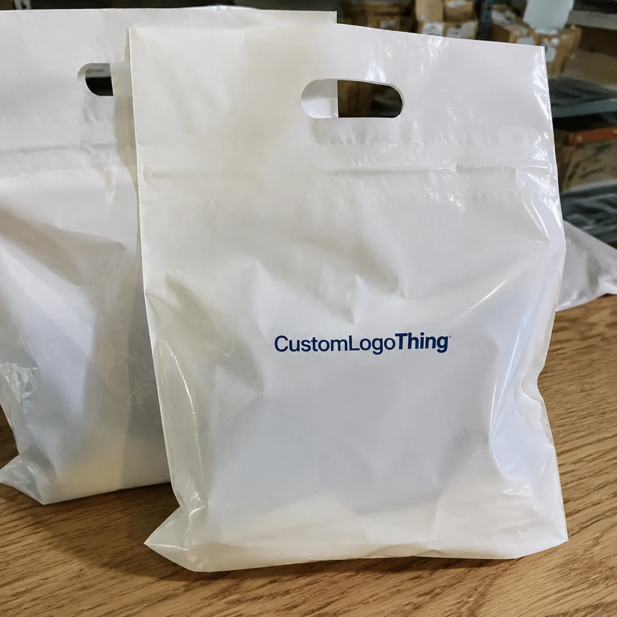
The minimalist kraft texture poly mailers trend is, at its core, a move toward understated shipping bags that look tactile, natural, and stripped back. Think muted browns, soft grays, off-white tones, and finishes that suggest kraft paper, even when the bag itself is a durable poly film. The design language is usually quiet: one logo, one color, maybe a thin border or a small repeat pattern. Nothing shouty. Nothing crowded. In many factories in Shenzhen and Xiamen, that look is created with a single-pass printed texture layer and a matte surface treatment rather than a full paper wrap, which keeps the unit price lower than a paper-based alternative.
Why has it caught on so hard? Because ecommerce has matured. Buyers have seen enough glossy, overprinted mailers to recognize the difference between noise and intention. I’ve seen buyers on factory floors compare two samples under fluorescent light, and the kraft-look version often wins not because it is flashier, but because it feels more editorial. It photographs well. It looks deliberate in a product shot. And it can make a $38 sweater or a $24 beauty set feel like a considered purchase instead of a commodity. For brands selling 500 to 50,000 units a month, that visual consistency can matter as much as the carrier rate.
That’s a big reason the minimalist kraft texture poly mailers trend shows up so often in premium-minimal branding. The packaging says, “We thought about this,” without trying to perform the thought process in 12 colors. For a direct-to-consumer brand, that’s valuable. For a subscription box, it creates consistency across monthly sends. For boutique ecommerce, it can make the unboxing feel more curated than expensive. A single-color logo on a 50-micron to 100-micron mailer can carry the same visual discipline a luxury label uses in its store windows.
There is also a practical reason. Minimalist layouts tend to reduce production complexity. Fewer colors can mean fewer plates or simpler print setup. A clean design usually leaves more room for readable branding and less room for costly revisions. During a supplier meeting in Ningbo last spring, one brand manager told me their previous poly mailer had 11 design elements. Their revised sample had two. The second one cost less to approve, less to print, and looked better on Instagram. That’s the kind of math the minimalist kraft texture poly mailers trend rewards.
Still, I always separate real paper mailers from kraft-texture poly mailers. Real Kraft Paper Mailers bring a different material story and often a different durability profile. Kraft-texture poly mailers are usually a visual interpretation: a poly structure with a paper-like finish. If your brand is making eco claims, that difference is not cosmetic. It is central. A supplier in Jiangsu might call a printed poly bag “eco-inspired,” but that phrase is not the same as recycled content, FSC-certified fiber, or curbside recyclability.
“Our customers kept saying the new mailer felt more expensive, but the real surprise was that fulfillment complaints dropped too. The bag held up better in transit.” — operations lead at a mid-sized apparel brand I worked with
How Minimalist Kraft Texture Poly Mailers Work
The construction behind the minimalist kraft texture poly mailers trend is more technical than the look suggests. Most versions use an outer film layer, a printed kraft-like texture or matte finish, an inner protective lining, and a pressure-sensitive adhesive strip. Some include tamper-evident sealing, which is useful for apparel, cosmetics, and lightweight accessories where leakage or pilferage is a concern. A common spec from suppliers in Guangzhou is a 70-micron coextruded LDPE film with a 30-micron adhesive flap, though that can rise to 90 microns for sharper-edged products.
The texture effect can be created in several ways. Sometimes it is printed directly onto the film using a brown, beige, or neutral palette with simulated grain. Sometimes a coating or surface treatment adds a slightly roughened or matte feel. In other cases, the supplier uses a special laminated structure that visually mimics paper fibers. The goal is the same: a tactile, natural appearance without giving up the tear resistance and moisture protection of poly. I’ve reviewed mailers from factories in Wenzhou that used a fine dot pattern to imitate fiber, and at arm’s length the illusion held up surprisingly well.
That performance difference matters. On a wet route, paper-based packaging can show stress faster. Poly mailers, by contrast, usually shrug off a light rain and handle scuffs better in carrier sorting. I’ve watched cartons get dragged across concrete in a distribution center in Shenzhen, and the mailers that kept a cleaner front face were almost always the ones with a sturdy film base. The minimalist kraft texture poly mailers trend is not just about style; it is about combining a softer aesthetic with a more practical substrate. When tested against rough handling, a 60- to 80-micron poly bag often survives better than a paper sleeve made from 350gsm C1S artboard.
Another reason brands like this format is that it plays nicely with labels and limited-color branding. A kraft-look background gives black, dark brown, or deep green logos a grounded appearance. White ink can work too, but it must be tested carefully because opacity varies. If your name is long, the minimalist route may actually improve legibility. Fewer elements. Better contrast. Faster recognition at packing stations. That can shave a few seconds per unit when a team is packing 1,000 orders in a single shift.
And yes, unboxing matters. Customers tend to share packaging that feels photogenic and cohesive. A clean mailer on a kitchen table or hallway floor can look surprisingly premium on camera, especially when paired with tissue, inserts, or a simple thank-you card. The minimalist kraft texture poly mailers trend often shows up in those social posts because the packaging looks composed, not crowded. In practice, a matte kraft-look mailer under daylight at 5600K usually photographs better than a glossy silver bag in the same setup.
- Outer film: usually LDPE or a coextruded blend for strength
- Finish: matte, kraft-texture print, or paper-inspired coating
- Seal: pressure-sensitive adhesive strip, sometimes tamper-evident
- Best fit: lightweight apparel, beauty kits, soft goods, accessories
For reference, packaging standards and transit testing frameworks matter here. If you are shipping fragile or high-value products, supplier claims should be checked against recognized test methods such as ISTA protocols and material specifications. The International Safe Transit Association publishes useful guidance at ista.org, and the paper side of the sustainability conversation often points back to groups like the Forest Stewardship Council when fiber-based claims are involved. A supplier in Dongguan may quote “drop-tested,” but an ISTA 3A or equivalent method gives you a better benchmark than a vague sales claim.
Key Factors Shaping the Minimalist Kraft Texture Poly Mailers Trend
The minimalist kraft texture poly mailers trend does not work equally well for every brand. Brand fit is the first filter. If your identity already uses beige, cream, charcoal, or muted olive, the mailer often feels native. If your brand language is neon-heavy, high-gloss, or playful to the point of chaos, a kraft-textured mailer can feel like someone else’s uniform. I’ve seen this mismatch in client meetings more than once: the packaging looked beautiful on the sample table and disconnected on the website. A beauty brand in London once approved a sand-colored bag, then found it clashed with a bright coral homepage banner the same week.
Cost is the second filter, and it deserves a careful look. In my pricing notes from recent supplier quotes, a standard printed poly mailer might sit around $0.11 to $0.16 per unit at 5,000 pieces, while a more customized kraft-texture version could land around $0.14 to $0.22 per unit depending on thickness, print coverage, and finish. That sounds like a small gap. It is not always small once you multiply by 20,000 shipments. Order volume changes the picture quickly, and the minimalist kraft texture poly mailers trend tends to reward larger runs because setup costs spread out. A run of 10,000 pieces in Yiwu can shave a cent or two off the unit price compared with a 1,000-piece test order.
Here is a simple comparison from a sourcing conversation I had with a cosmetics brand:
| Option | Typical unit price at 5,000 pcs | Visual impact | Best use case |
|---|---|---|---|
| Plain white poly mailer | $0.10-$0.14 | Clean, basic | High-volume, low-brand emphasis |
| Standard printed poly mailer | $0.11-$0.16 | Moderate branding | General ecommerce |
| Kraft-texture poly mailer | $0.14-$0.22 | Premium, natural, restrained | Apparel, beauty, boutique brands |
| Fully custom premium finish | $0.20-$0.35 | Highly tailored | Launches, luxury positioning |
That table leaves out the landed-cost nuance, which is where smart teams save money. A cheaper mailer can cost more if it tears, causes returns, or requires overpacking. A brand I advised in Guangzhou switched to a slightly thicker bag after seeing a 2.8% damage rate on sharp-edged accessories. The mailer price rose by $0.03. Their return handling cost dropped enough to justify the change in six weeks. The minimalist kraft texture poly mailers trend should be measured the same way: by what it prevents, not only by what it costs.
Sustainability perception is the third filter, and this is where I’m blunt. A kraft look does not automatically equal sustainable material. A brown finish can be an aesthetic cue, not a proof point. If the bag is recyclable in a store-drop stream, contains recycled content, or is built with certified inputs, say so clearly. If not, do not imply more than the material can support. Transparency protects trust. I like brands that treat the minimalist kraft texture poly mailers trend as a design choice first and an environmental claim only when verified. A 60% recycled-content film is a far more meaningful statement than a vague “earth-friendly” badge.
Shipping risk also matters. If you are packing skin-care glass bottles, metal accessories with sharp edges, or anything that shifts hard in transit, the outer mailer should be evaluated alongside internal protection. Weather exposure, carrier sorting, and route length all affect performance. The same design that looks elegant for socks may be underbuilt for a dense product. The trend is useful, but it is not magic. A 10" x 13" bag with 80-micron film may be fine for knitwear and too light for boxed fragrance samples.
Competition dynamics are the last big factor. In crowded marketplaces, packaging becomes a small billboard. A neat kraft-look mailer can help a listing feel more polished during returns, unboxings, and peer recommendations. But if every competitor in your category already uses the same muted palette, the advantage shrinks. The real edge comes from consistency: the mailer, website, inserts, and product label all telling the same story. That is where the minimalist kraft texture poly mailers trend becomes branding rather than decoration.
What Makes the Minimalist Kraft Texture Poly Mailers Trend Work?
The reason the minimalist kraft texture poly mailers trend keeps showing up in buyer meetings is simple: it solves more than one problem at once. It offers a premium visual cue, supports a natural-looking aesthetic, and still behaves like a shipping bag that can survive real logistics. That overlap matters. A 2024 survey by a major ecommerce platform found that first impressions of packaging influence perceived product quality for a majority of online shoppers, and packaging quality often shapes repeat intent even more than a discount does. In other words, the outer bag is not just a wrapper. It is a signal.
That signal works because it lowers visual friction. Instead of asking the customer to decode a busy graphic, the package says one thing clearly: this brand has discipline. Minimalist design carries a strange kind of authority. It feels edited. It feels deliberate. And because the kraft texture suggests warmth rather than shine, it also softens the hard edges of ecommerce, which can feel anonymous by default. That is why a $24 candle, a $52 knit top, or a $19 lip balm can all benefit from the same restrained presentation.
The minimalist kraft texture poly mailers trend also helps in operational settings. Fewer ink colors, fewer moving parts in the layout, and fewer visual distractions can make production more repeatable. A supplier is less likely to miss a detail when the artwork is clean. Warehouse staff are less likely to confuse the seal area when the front face is uncluttered. A packaging program that is easier to reproduce usually produces fewer errors, and fewer errors are a form of savings that never show up in the product photo.
There is also a comparison that matters more than people expect: loud packaging versus readable packaging. Loud packaging can win attention for a week. Readable packaging can win trust for years. The minimalist look does not ask for applause. It asks for recognition. That distinction is why the minimalist kraft texture poly mailers trend feels especially strong in categories where the product itself should be the hero. Apparel, beauty, wellness, and artisan goods all benefit when the outer mailer supports the product instead of competing with it.
Still, the trend works best with discipline. If the tone is too dark, the logo disappears. If the palette is too close to every competitor’s, the bag loses distinction. If the finish is too glossy, the kraft illusion weakens. If the claims outrun the material, trust erodes. The best brands use the minimalist kraft texture poly mailers trend as a practical identity choice, not a shortcut. They choose a texture, test it, and then repeat it consistently enough that it becomes part of memory.
Step-by-Step: Choosing the Right Minimalist Kraft Texture Poly Mailers
Step 1 is to define the use case. I ask clients three questions before I talk color: what size ships most often, what is the heaviest item, and how many orders per month are you actually sending? If you are shipping a 9" x 12" apparel bundle, your needs are different from a 6" x 9" beauty sampler. The minimalist kraft texture poly mailers trend should start with product fit, not aesthetics. A 7" x 10" mailer may be perfect for socks, while a 12" x 15.5" bag makes more sense for hoodies.
Step 2 is to choose the texture direction. Do you want a subtle grain, a deeper paper-like pattern, a warm kraft tone, or a cooler gray-beige surface? Matte finishes usually feel more premium than glossy ones, and they photograph better under soft light. A recycled-paper-inspired visual cue can work, but it should still leave enough contrast for your logo and shipping label. I’ve seen samples where the “earthy” tone swallowed the brand name. That is an expensive mistake for a simple design. A good sample should still read clearly from 1.5 meters away and on a phone screen at 100% brightness.
Step 3 is deciding what to keep. Minimalism is not emptiness; it is selection. You may only need a logo, a small URL, and one strong brand element. If your name is long, reduce ornamentation. If your typography is already distinctive, let it carry the design. In the best executions of the minimalist kraft texture poly mailers trend, the bag feels finished with one or two clear signals, not six competing ones. I’ve found that a single centered logo often performs better than a scattered layout, especially on sizes under 10" x 13".
Step 4 is sample testing. Never approve a mailer from a screen alone. I recommend checking three things in real conditions: one sample in daylight, one under warehouse lighting, and one photographed on a phone against a white background. That last one matters more than many teams expect. If the bag looks dull or muddy on camera, the social media value collapses. Good design should survive a close-up shot with a 12-megapixel phone. If possible, test it after 24 hours in a 22°C room and again after a short trip through a cooler loading bay to see whether the adhesive strip still feels consistent.
Step 5 is supplier evaluation. Ask for minimum order quantity, repeatability, print capability, lead time, and whether the texture is stock or fully custom. Ask for material thickness in microns or mils. Ask for a sample showing the seal strip strength. The best suppliers answer without hedging. I like suppliers who can explain where the finish comes from and what tolerances they hold. That makes the minimalist kraft texture poly mailers trend easier to scale without surprise variation. If a factory in Foshan gives you a 50,000-piece MOQ for a simple two-color design, that is information you need before you commit.
Step 6 is a pilot run. Send a small shipment batch, then measure damage rates, packing speed, and customer comments. If one version leads to slower fulfillment because staff struggle to read the seal area or align the label, that’s a signal. If customers mention the bag in positive reviews, that’s another. A pilot of 300 to 1,000 pieces can save you from ordering 10,000 of the wrong thing. For a team shipping 800 parcels a week, even a two-day delay in flagging an issue can cost more than the sample order itself.
- Define the shipping use case for size, fragility, and volume.
- Choose the texture direction that fits your palette and label contrast.
- Limit branding elements to keep the design disciplined.
- Request real samples and inspect them in daylight and warehouse light.
- Check supplier details on MOQ, lead time, and finish consistency.
- Pilot before scaling and measure damage, speed, and feedback.
Process and Timeline: From Concept to Delivery
The workflow for the minimalist kraft texture poly mailers trend usually follows a predictable path: briefing, artwork setup, proofing, sampling, production, packing, and shipment. The details are where schedules stretch. A standard stock-style order may move faster, while a fully custom finish with special texture treatment will take longer. The more changes you make after proofing, the more the clock slips. A straightforward order placed through a factory in Guangdong can feel fast on paper and slow in reality once freight booking starts.
For custom work, I usually tell clients to expect 12 to 15 business days from final proof approval for production, with shipping time added on top. If the supplier is offshore, transit can add another 5 to 20 days depending on route and carrier. That is why seasonal planning matters. I’ve watched brands miss a product drop by one week because they approved artwork on a Friday and expected the freight to ignore customs. It does not. For a shipment leaving Shenzhen for Los Angeles, for example, ocean freight may take far longer than air, but air can erase the savings you made on the unit price.
Proofing is the quiet hero here. Good proofing catches artwork resolution problems, bleed issues, typography that looks too small on a 14-inch bag, and texture areas that might interfere with branding. It also catches a practical issue people forget: seal visibility. If your seal line blends into the printed area, warehouse staff can waste seconds on every unit. Multiply that by 8,000 mailers, and the wasted time becomes real money. A proof that looks fine at 300 dpi can still fail if the logo sits too close to the flap.
There is also the matter of revision rounds. Each revision adds time. If you ask for a warmer kraft tone after the first proof, then shift the logo up by 8 millimeters, then decide the URL needs to be smaller, you are not “just tweaking.” You are re-entering the approval chain. The minimalist kraft texture poly mailers trend encourages disciplined design, which helps here. Fewer elements mean fewer variables. One revision round might take 2 days; three rounds can stretch to a full week if the supplier is balancing other orders.
Below is a practical timeline snapshot from a typical custom order:
| Stage | Typical duration | What can delay it |
|---|---|---|
| Brief and artwork setup | 1-3 business days | Missing logo files, unclear size specs |
| Proofing and revisions | 2-5 business days | Color changes, text edits, font substitutions |
| Sampling | 3-7 business days | Custom finish requests, shipping distance |
| Production | 7-15 business days | High season, special materials, backlog |
| Transit | 5-20 business days | Carrier congestion, customs, weather |
One more point: buffer time. If you are launching during a holiday period or coordinating with a product drop, add at least 10 to 14 days of cushion. I have sat in supplier negotiations where everyone agreed the schedule was “tight but fine.” Then a proof needed one more pass, and the whole plan shifted. The trend looks calm; the production chain is not always calm. A good launch calendar should assume at least one surprise, especially if the order is moving between Hangzhou, Ningbo, and a West Coast warehouse.
Common Mistakes When Using Minimalist Kraft Texture Poly Mailers
The first mistake is assuming the kraft look proves sustainability. It doesn’t. A brown surface can suggest recycled content or lower-impact thinking, but the actual material story might be ordinary poly film. If you use the minimalist kraft texture poly mailers trend to imply environmental virtue, you need evidence. FSC references are appropriate for fiber-based components, while plastic claims need their own documentation. If you cannot substantiate the claim, say less. A 70-micron poly bag with a kraft print is still a poly bag, no matter how calm the palette looks.
The second mistake is overdesigning. Minimalism gets ruined quickly. I’ve seen brands add three taglines, two icons, a QR code, a social handle, and a sustainability badge, then wonder why the bag looks cluttered. A kraft-texture mailer works because it breathes. Leave space. Keep one focal point. That restraint is the point of the minimalist kraft texture poly mailers trend. If a design needs five badges to explain itself, it is not minimal anymore; it is just compressed.
The third mistake is choosing beauty over durability. A finish that looks gorgeous in the sample book can still scuff badly on the line or show fingerprints in humid conditions. I remember a client in the beauty sector who approved a soft-touch, light-toned mailer that looked beautiful under studio lights but dulled after 48 hours in a busy packing room. We had to switch the finish and bump the film thickness by 20 microns. Better to discover that before the full order. A 60-micron film that tears at the corners is cheaper only in the invoice column.
The fourth mistake is brand drift. Packaging should feel like it belongs to the same company as the website, labels, inserts, and product photography. If the site is bold and playful but the mailer is muted and editorial, the customer experiences two different brands. That disconnect is more common than people think. The best uses of the minimalist kraft texture poly mailers trend line up with the rest of the customer journey. A brand selling in Paris and Toronto can still use a muted mailer if the type, logo, and insert cards speak the same visual language.
The fifth mistake is skipping sample testing. People do this because samples feel slow, and they want the order approved. But sample testing is where you find the problems that photos hide. Does the texture obscure small text? Does the adhesive seal survive a cold warehouse? Does the bag crease too easily on a corner? Those answers are worth the delay. A 500-piece pilot in a humid city like Singapore can reveal problems that a studio sample in a dry office never will.
“We liked the sample online. We hated it in hand. The color was flatter than the proof, and the logo disappeared at a distance.” — ecommerce buyer during a packaging review
A final warning: don’t confuse quiet branding with invisible branding. The minimalist kraft texture poly mailers trend should still communicate who you are within two seconds. If it becomes so subtle that nobody remembers the sender, you’ve missed the goal. A mailer that disappears into the shipment stack may be tasteful, but it is not doing the branding work you paid for.
Expert Tips for Making the Trend Work Harder
My first tip is to anchor the design with one strong brand signal. That might be a bold logo, a distinctive icon, or a short tagline placed in a consistent location. One signal is enough if it is executed well. That is why the minimalist kraft texture poly mailers trend often looks more expensive than mailers stuffed with extra graphics. A single 18-point logo on a 10" x 13" surface can often outperform three smaller marks spread across the bag.
Second, build tactile contrast. A matte exterior, crisp typography, and a clean seal strip can make a package feel more premium than a glossy surface ever will. The eye notices contrast. The hand does too. When I visited a fulfillment operation serving a boutique skincare label in Seoul, the samples that scored highest were the ones that felt calm but not flat. The tactile experience reinforced the visual one. Even a slight difference in finish, like a soft-matte layer against a darker logo, can change the whole impression.
Third, photograph before approval. Not after. I always ask brands to shoot the sample in natural light on a white background and again on a dark surface. You want to know how the kraft tone behaves in shadow, whether the logo still reads at arm’s length, and whether the seal strip disappears into the layout. Social-ready packaging should be tested like a product shot, not treated as an afterthought. A 30-second phone photo often reveals more than a 30-page spec sheet.
Fourth, compare total landed cost. A lower unit price means very little if the bag arrives with inconsistent print, causes repacking, or increases return damage. Ask for freight, duty, packing, and inspection cost. If one supplier charges $0.17 and another charges $0.15 but needs two extra days of handling and a higher rejection tolerance, the first may be cheaper in practice. The minimalist kraft texture poly mailers trend works best when sourcing is disciplined, not optimistic. In some cases, a supplier in Dongguan with a slightly higher unit price will win because their defect rate is half a percent lower.
Fifth, think of the mailer as part of the customer journey, not a standalone object. If your insert card uses the same muted palette, if your thank-you note repeats the same type style, and if your reorder message matches the same tone, the packaging becomes one chapter in a longer story. That consistency can increase repeat purchase confidence. I’ve seen it in client meetings where the packaging discussion turned into a brand trust discussion within five minutes. A good package should echo the website header, the product label, and the post-purchase email within seconds.
- Use one dominant brand cue, not four.
- Test under daylight and warehouse lighting.
- Ask for landed cost, not only unit price.
- Keep inserts, labels, and mailers visually aligned.
If you are building a broader packaging system, it helps to review your options across categories. Our Custom Packaging Products page can give you a wider view of matching inserts, labels, and shipping formats, while our Custom Poly Mailers category shows how different finishes and sizes can fit different order profiles. A 2024 apparel launch in Chicago used this kind of cross-check to match mailers with hang tags and tissue in one print run.
What to Do Next Before You Order
Before you place an order for the minimalist kraft texture poly mailers trend, write a brief that includes the bag size, product type, average order weight, target budget, and the brand cues you want to preserve. That simple document can prevent hours of back-and-forth. I like briefs that specify exact dimensions, such as 9" x 12" or 10" x 13", because “medium” means different things to different suppliers. If the product is a knit sweater, say so; if it is a boxed serum, say that too.
Next, shortlist two or three suppliers and ask for side-by-side samples with identical dimensions. If one sample uses a different thickness or print setup, you are not comparing like with like. Ask for the same closure type, same finish, and same artwork placement. You want to judge the bag, not the vendor’s creativity. A supplier in Xiamen and another in Foshan should be asked to quote the same spec sheet, down to the film gauge and flap length.
Then review the sample against shipping reality. Press the adhesive strip. Fold the corners. Put a label on it. Leave it in a warm room for a day, then handle it again. Check opacity. Check scuff resistance. Check whether the texture obscures barcodes or branding. The minimalist kraft texture poly mailers trend should survive actual operations, not just a photo shoot. If the bag fails after a 48-hour staging test, that is cheaper to learn now than after 12,000 units arrive.
Set a launch checklist with proof approval, reorder point, and a testing period. If your monthly usage is 4,000 pieces, do not wait until you have 200 left before reordering. Build in lead time from the start. A good reorder point may be 30% to 40% of your next cycle, depending on supplier speed and freight lane. That buffer is boring. It is also the reason the system works. A four-week forecast from a warehouse in New Jersey is far more useful than a guess made at the last minute.
Finally, document the first run. Track customer comments, packing speed, defect rate, and any returns tied to shipping issues. Save photos of the first cartons and warehouse picks. This is the part teams forget, and it’s a shame because the data is useful when you reorder or negotiate price. The minimalist kraft texture poly mailers trend is easiest to improve when you have proof, not memory. If the first order ships in 13 business days from proof approval and the second order ships in 11, that is data worth keeping.
For brands that want a stronger packaging identity without losing practicality, the trend can be a very smart fit. For brands that need high-impact color, low cost, or heavy-duty protection, it may be less compelling. That’s not a failure. That’s good judgment. A packaging choice that works in Melbourne may not work the same way in Mexico City or Milan, and that regional difference matters.
FAQ
Are minimalist kraft texture poly mailers more expensive than standard poly mailers?
Usually, yes. The texture effect, print setup, and customization can raise unit cost by a few cents, and at 5,000 pieces that difference becomes visible. In many cases, a standard poly mailer might run around $0.11 to $0.16 per unit, while a kraft-texture version can fall around $0.14 to $0.22 depending on thickness and finish. The real comparison is total landed cost, not just the sticker price. If your supplier quotes $0.15 per unit for 5,000 pieces from a factory in Dongguan, ask what thickness, print method, and flap adhesive are included before comparing it to another offer.
Do minimalist kraft texture poly mailers help brands look more sustainable?
They can create a natural, eco-coded impression, but appearance alone does not prove sustainability. If you make environmental claims, back them up with the actual material story, such as recycled content, recyclability, or fiber certification where relevant. The most credible approach is to pair the look with honest messaging and verifiable information. A mailer made with 30% post-consumer recycled content is a specific claim; a “green-inspired” brown finish is only a design choice.
How long does it take to produce custom kraft texture poly mailers?
Timeline depends on artwork approval, sampling, and production capacity. A custom order often needs 12 to 15 business days from final proof approval for production, then shipping time on top of that. If the supplier is overseas, add transit and possible customs delays. Seasonal launches need extra buffer. For example, a shipment leaving Ningbo for Los Angeles in November can take noticeably longer than the same order sent in March because freight lanes and customs volumes change.
What products work best with the minimalist kraft texture poly mailers trend?
Apparel, accessories, beauty, handmade goods, and subscription shipments usually fit the aesthetic well. The look works best when the customer experience benefits from a premium, clean, understated presentation. Heavier or fragile items may need additional internal protection even if the outer mailer looks simple. A 9" x 12" mailer works well for tees and scarves; a boxed candle may need a thicker film or a different shipping format altogether.
How can I test whether this mailer style fits my brand?
Order samples and compare them against your current packaging in real lighting and shipping conditions. Check whether the design aligns with your website, inserts, and product photography. Then run a small pilot shipment and track customer feedback, damage rates, packing speed, and repeat order response. A pilot of 300 to 1,000 units over 7 to 14 days can reveal whether the mailer feels right in the hands of actual customers.
After working across packaging programs for years, my honest view is this: the minimalist kraft texture poly mailers trend works best when it is treated as a system, not a style note. If the texture, structure, pricing, and brand story all support one another, the result feels polished and credible. If any one of those pieces is off, the package can feel like a borrowed idea. So test it, price it properly, and make sure the look matches the promise. Done well, the minimalist kraft texture poly mailers trend can carry a brand farther than a louder mailer ever will. A supplier in Shenzhen, a warehouse in Rotterdam, and a customer in Austin can all read the same story from one quiet bag.