Buyer Fit Snapshot
| Best fit | minimalist poly mailer branding ideas work for packaging buyers comparing material specs, print proof, MOQ, unit cost, freight, and repeat-order risk where brand print, material, artwork control, and repeat-order consistency matter. |
|---|---|
| Quote inputs | Share finished size, material target, print colors, finish, packing count, annual reorder estimate, and delivery region. |
| Proofing check | Approve dieline scale, logo placement, barcode or warning zones, color tolerance, and any recyclable or compostable wording before bulk production. |
| Main risk | Vague material claims, crowded artwork, or missing packing details can create delays even when the unit price looks attractive. |
Fast answer: Minimalist Poly Mailer Branding Ideas Work: Film, Closure, Print, and Fulfillment should be specified like a repeatable production item. The safest quote includes material, print method, finish, artwork proof, carton packing, and reorder notes in one written spec.
What to confirm before approving the packaging proof
Check the product dimensions against the actual filled item, not only the sales mockup. Ask for tolerance on folds, seals, hang holes, label areas, and retail display edges. If the package carries a logo, QR code, warning copy, or legal claim, reserve that space before decorative graphics fill the panel.
How to compare quotes without losing quality
Compare board or film grade, print process, finish, sampling route, tooling charges, carton quantity, and freight assumptions side by side. A lower quote is only useful if the supplier can repeat the same color, closure quality, and packing count on the next order.
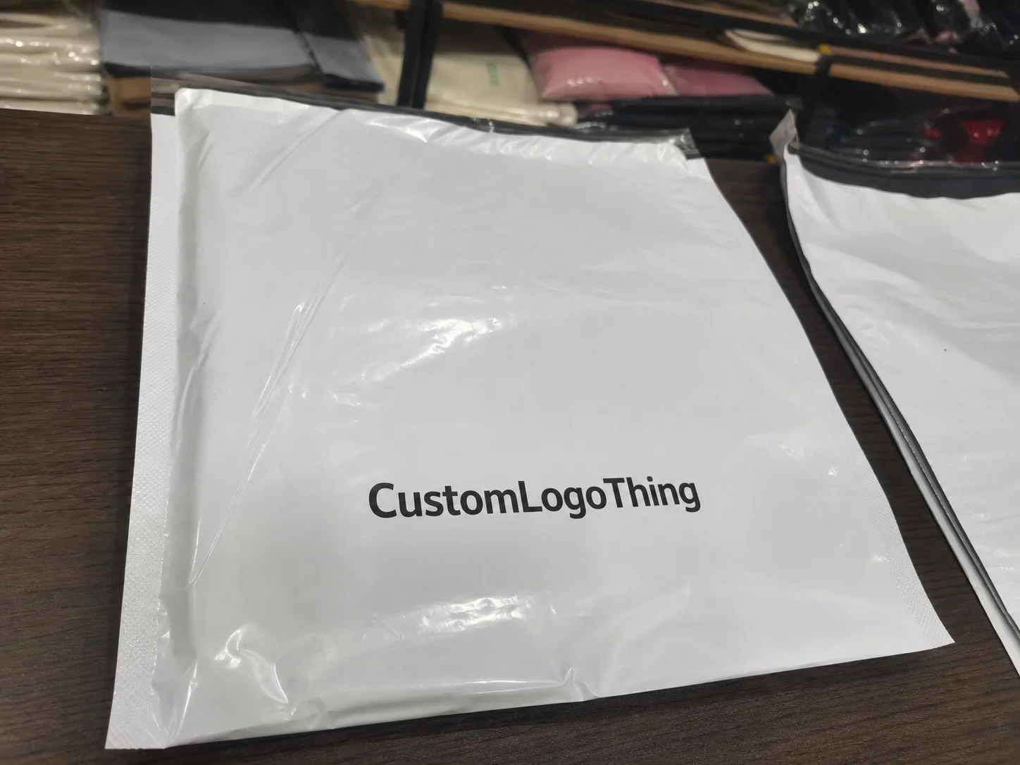
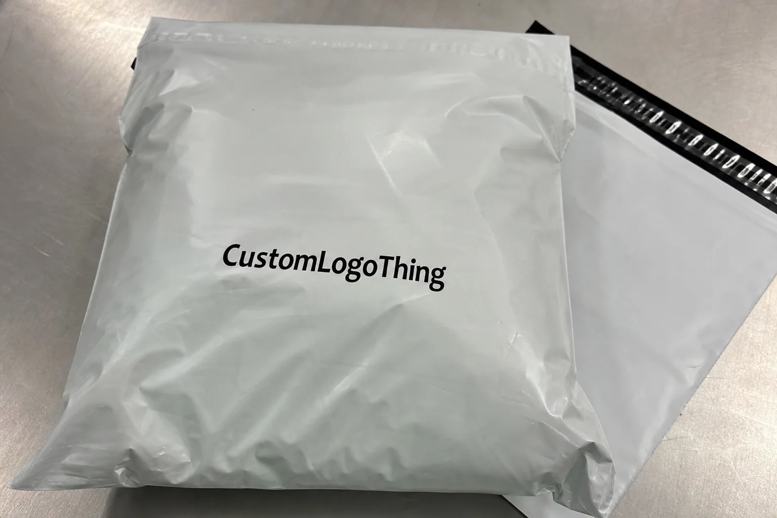
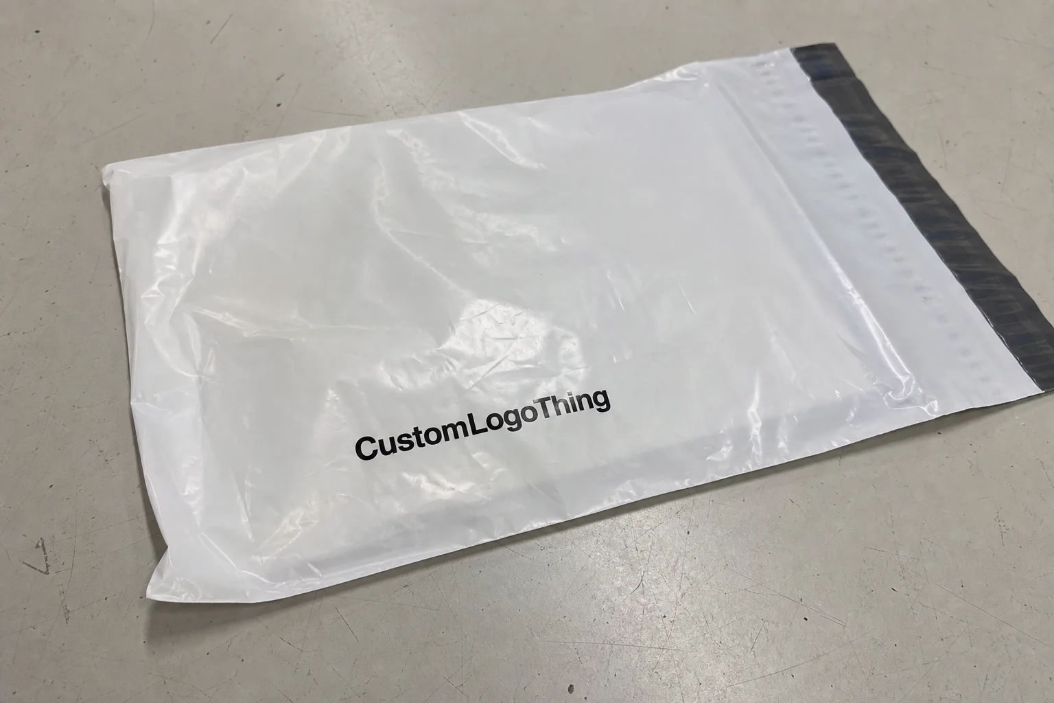
Minimalist poly mailer branding ideas get brushed off as “just less ink,” and that misses the point entirely. I’ve watched a buyer open a plain black mailer with a tiny silver logo and remember the brand three weeks later, while a louder competitor with six colors and three slogans got forgotten by lunch. That gap is why minimalist poly mailer branding ideas matter: they can sharpen brand identity, improve brand recognition, and make customer perception work harder with fewer moving parts, especially on a 10 x 13 inch mailer printed in Dongguan or a 9 x 12 bag sourced through a supplier in southern California.
In packaging meetings, I hear the same complaint from founders with 500-unit minimums and from national accounts shipping 50,000 parcels a month: the mailer feels busy, expensive, or oddly generic. The fix is usually not “more design.” It’s restraint, and restraint gets easier when the spec is clear, such as a 2.25 mil LDPE film, a single black ink, and a matte finish that adds less glare under warehouse LEDs in Atlanta or fulfillment centers in Dallas. When that restraint is intentional, minimalist poly mailer branding ideas often look more premium than full-color artwork with three fonts and a QR code fighting for attention.
Removing elements can improve recall because the brain processes simple visuals faster than crowded ones. That’s not marketing fluff; it’s basic visual hierarchy. The best minimalist poly mailer branding ideas use fewer colors, tighter typography, and more negative space so the package feels edited, not unfinished, whether the artwork is being approved in a Brooklyn studio or printed on a flexographic line in Vietnam.
Minimalist Poly Mailer Branding Ideas: Why Less Gets Remembered
I visited a contract packout line in New Jersey where a cosmetics client had reduced its mailer from a five-ink design to a single-color logo plus a micro-tagline on the back flap. Their ops manager told me damage claims didn’t change, but social tags did: customers were photographing the mailer more often because it looked “calm” and “expensive.” That is the real power of minimalist poly mailer branding ideas. They turn shipping packaging into a brand signal, not background noise, and that signal travels just as well through a Newark sort center as it does on a porch in Phoenix.
Minimalist poly mailer branding ideas are deliberate restraint. Fewer colors. Tighter type. More empty space. Better placement. The mailer still has to carry the brand identity, but it does so with a quiet confidence that feels closer to luxury retail than bargain fulfillment. The difference between plain and premium often comes down to whether the design looks accidental or intentional. A blank mailer with a sticker says “we ran out of budget.” A carefully composed minimalist mailer says “we know exactly what we’re doing,” even if the unit price is only $0.15 each on a 5,000-piece run from a factory in Shenzhen.
Minimalist poly mailer branding ideas also fit modern e-commerce behavior. Customers rarely receive a branded box and then visit a store. More often, the mailer is the first physical touchpoint they get. That makes the shipping bag part of the unboxing experience, and sometimes the first brand asset they can hold. If your package arrives from a warehouse in Tennessee, gets stacked in a parcel hub in Ohio, and lands on a kitchen counter in Texas, the design has to survive distance, handling, and attention spans measured in seconds, often with only 4 to 6 seconds before the customer decides whether the packaging feels worth sharing.
People overcomplicate this. If your product is priced at $24 and your mailer looks like a trade-show brochure, the package can undermine customer perception. If the mailer uses one sharp logo, a controlled palette, and clean spacing, it can lift the whole purchase. That’s why minimalist poly mailer branding ideas keep showing up in the smartest category launches, from indie beauty in Portland to apparel rollouts managed out of a Columbus fulfillment center.
“The package should not shout over the product. It should introduce it.” That was a sentence a luxury apparel client said to me during a supplier review in Los Angeles, and I’ve heard some version of it from seven brands since then, usually after they’ve compared a plain stock bag at $0.12 per unit with a custom print at $0.39.
There’s also a production advantage. Simplified artwork is easier to approve, easier to print consistently, and easier to repeat across multiple sizes. For brands trying to protect brand consistency across polymailers, cartons, inserts, and Custom Packaging Products, that simplicity matters more than most teams admit during creative review. It also keeps proof cycles shorter, which matters when your packaging vendor in Guangzhou is already quoting 12 to 15 business days from proof approval to finished goods.
How Minimalist Poly Mailer Branding Works
The mechanics are straightforward, but only if you respect them. The strongest minimalist poly mailer branding ideas usually rely on one or two core colors, a single logo lockup, and a visual system that knows exactly where to stop. I’ve seen brands try to cram a full tagline, website, social handle, sustainability badge, and customer service number into a 10 x 13 inch mailer printed on 2.5 mil film. The result looked like a ransom note, not a brand, and the proof file often ballooned from 1 MB to 18 MB because the team kept adding tiny utility elements.
A better approach starts with visual hierarchy. What should the customer see first? Usually the logo or logomark. Second, a supporting line like a short brand promise or category cue. Third, any utility information such as a return address panel or shipping compliance markings. Placement matters just as much as content. Centered logos feel formal. Lower-corner marks feel editorial. Edge-to-edge monochrome branding can feel bold if the typography is clean and the film finish is right, especially on a gloss co-extruded mailer sourced from a plant in Ho Chi Minh City.
White space is not empty space. It’s structure. On a matte white mailer, a small black logo can feel more expensive than a full-color print because the eye has somewhere to rest. I’ve watched procurement teams debate 2mm line weights for half an hour, and that detail really does matter when the mailer is viewed from arm’s length or on a phone screen in an unboxing video. Good minimalist poly mailer branding ideas understand that contrast is doing a lot of the work, especially when the actual print area is only 8 inches wide on a 14 x 19 bag.
Finish changes everything. A matte surface absorbs glare and makes the artwork look calmer. A gloss finish can make minimal art feel louder because reflections introduce visual clutter. Soft-touch effects are less common on Poly Mailers than on rigid cartons, but when available they can create a tactile cue that reinforces premium positioning. If your brand is trying to communicate eco-conscious restraint, a recycled-content film with a muted print can support that story without adding a single extra graphic, and a 30% post-consumer recycled blend often reads more authentic than a busy sustainability badge.
Printing method matters too. Flexographic printing is efficient for larger runs and works well when the design uses a limited number of inks, often one to three spot colors. Digital printing can be more flexible for smaller runs, regional variations, or test programs. Stock mailer customization using labels or overprints can be the right answer for brands that need speed or want to keep inventory low. I’ve seen startup teams save thousands by printing a small logo label instead of commissioning full custom artwork before product-market fit was stable, particularly when the first test order was only 1,000 pieces at a unit cost of about $0.22 plus application labor.
- Centered logo lockup for a clean, premium first impression.
- Monochrome edge branding for a strong but restrained visual cue.
- Small return address panel for utility without clutter.
- Micro-pattern at the seam for repeat recognition at close range.
Minimalist poly mailer branding ideas are not the same as “bare minimum branding.” Minimalism is a design discipline. Empty space, selective contrast, and precise placement are all active decisions. If they are not intentional, the package simply looks unfinished, even if the bag itself is well made with a 1.5 inch adhesive lip and a tear strip that passed 50-pound pull testing.
Key Factors Before Choosing Minimalist Poly Mailer Branding Ideas
Before you approve any artwork, answer four questions: who is the audience, what is the product category, where does the brand sit on price, and what personality should the mailer express? A skincare label shipping $48 serum should not use the same visual language as a discount apparel seller moving $9 basics. That sounds obvious, but I’ve sat in meetings where both wanted “simple and modern” as if those words were enough, even though one brand was targeting a $120 average order value and the other was chasing repeat purchases under $20.
Brand position changes everything. If the business wants to feel luxury, the mailer may need a darker palette, crisp typography, and almost no copy. If the brand is eco-conscious, recycled-content film, earthy neutrals, and minimal ink coverage can support the message. If the brand is playful, minimalism can still work, but the humor has to show up in one smart detail instead of five loud ones. Good minimalist poly mailer branding ideas always match customer perception, not just the mood board, and that means aligning the bag with the product margin, the audience age band, and the fulfillment channel in places like Chicago or Raleigh.
Material and finish are not decoration. They shape how the customer reads the package. A translucent recycled mailer with a kraft insert feels different from a smooth black opaque bag. A matte finish reduces glare and can make simple type feel more deliberate. A glossy finish may be better for certain beauty or fashion brands, but the risk is obvious: a glossy bag can also magnify every fingerprint and scuff in transit. If the film is too thin, say under 2 mil, dents and stretch marks become visible after just a few hours in a hot trailer.
Size matters more than many teams expect. Oversized branding on a small mailer can make the package feel cramped. Tiny logos on a large mailer can disappear during shipping. I’ve seen a 4-inch logo float awkwardly on a 14 x 20 inch bag because nobody checked how it would look once folded, sealed, and stacked. A smart layout respects the usable print area, seam placement, and the real-world handling that happens on the dock, where a stack of 500 bags might be compressed under a carton weighing 32 pounds.
Cost also shifts quickly depending on inks and setup. A simple one-color design on a standard size can reduce prepress complexity and often lower setup charges compared with multi-ink art. In many supply chains, fewer inks also mean fewer opportunities for color drift between batches. For a 5,000-piece order, I’ve seen quotes ranging from $0.18 per unit for a stock mailer with a single branded label to around $0.42 per unit for a fully custom printed bag, depending on size, material, and printing method. Those numbers move with volume, but the pattern is consistent: simpler artwork often scales more cleanly, and a 20,000-piece reorder can push the same bag down by 8 to 12 cents per unit.
There’s a practical reason minimalist layouts are easier to scale across different shipping formats. One clean logo can be adapted from a small 6 x 9 mailer to a larger 14 x 19 bag with very little redesign. That means fewer artwork changes, fewer proof cycles, and fewer headaches when a brand expands into multiple product lines. For companies also ordering Custom Poly Mailers or branded inserts, the same visual system can be reused across the kit, which is especially useful if production is split between a plant in Ontario and a packout partner in New Jersey.
| Option | Typical Use | Relative Cost | Visual Impact | Best For |
|---|---|---|---|---|
| Stock mailer + branded label | Low-volume launches, testing, seasonal promos | Lowest | Moderate | Brands that need speed and flexibility |
| Custom printed mailer | Established brands, repeat shipping, higher consistency | Medium to high | High | Brands focused on strong brand consistency |
| Hybrid approach | Multi-SKU programs, regional fulfillment, test-and-scale plans | Medium | High | Brands balancing cost control and visual branding |
If sustainability is part of the story, ask for certification or material documentation early. FSC appears more often on paperboard, but the same diligence should carry over to recycled-content claims and supplier specs for films. For carbon and waste context, the EPA’s packaging and sustainable materials resources are worth a look at epa.gov, and broad certification guidance is available through fsc.org. The point is not to collect logos. It is to make sure the packaging claim matches the material reality, whether the film comes from Jiangsu or a domestic converter in Ohio.
Step-by-Step Process for Minimalist Poly Mailer Branding
The cleanest way to create minimalist poly mailer branding ideas is to treat the work like a packaging audit, not a design sprint. I’ve seen more projects derailed by missing logo files than by creative disagreement. One client sent three versions of a logo, all from different years, and each had slightly different spacing around the mark. That tiny inconsistency caused two proof rounds and a week of delay. Packaging is funny like that: the tiny stuff is the stuff that costs you, especially when the supplier in Shenzhen charges $75 per revision after the second round.
Step 1: Audit the brand identity
Collect the essentials: final logo files, approved brand colors, typography rules, and any legal lines that must appear. Remove anything that does not need to be on the mailer. If the bag is shipping a $29 T-shirt, the packaging probably does not need a paragraph of brand storytelling. The strongest minimalist poly mailer branding ideas use the minimum amount of text required to stay recognizably yours, and that usually means one logo, one short line, and one return address block no larger than 1.5 by 2 inches.
Step 2: Choose the format
Decide whether the right answer is stock mailers with labels, custom printed bags, or a hybrid setup. Stock mailers can make sense if volume is under 2,000 units or the brand is still testing size mixes. Custom Printed Mailers are usually better when monthly shipments are stable and brand recognition matters at every touchpoint. Hybrid systems are common in the real world because they let brands keep inventory manageable while still using cohesive visual branding, particularly when the mailer is filled from both a warehouse in Florida and a 3PL in Nevada.
At a supplier meeting in Los Angeles, I watched a fulfillment director compare three options side by side: blank mailers with stickers, one-color custom print, and a two-color premium version. The company chose the one-color route because it reduced artwork revisions from four to one and kept reorders under 15 business days. That is the kind of tradeoff that makes minimalist poly mailer branding ideas practical instead of aspirational, and it often saves $300 to $600 on the first proof cycle alone.
Step 3: Build the layout
Map the logo position first, then any supporting text, then the utility marks. A good layout often gives the logo 60% of the visual attention, a short brand line 25%, and shipping or return details the remaining 15%. That ratio is not a rule, but it is a useful starting point. If the package needs a return address panel, keep it small and consistent. If there is a QR code, tuck it where it helps rather than interrupts, and keep it at least 0.75 inches from the seam so it survives folding and sealing.
Step 4: Review proofing and samples
Never approve from a screen alone. Ask for physical samples or press proofs because color on monitor rarely matches color on film. Check logo clarity from arm’s length, verify seam placement, and inspect how the print sits near adhesive zones. In one factory floor inspection, I saw a logo shift by 8mm after the bag was folded and sealed. The artwork looked fine in PDF form. It looked off in the hand. That is a costly lesson, and it is why sample review is nonnegotiable, especially if the bag is a 350gsm C1S artboard insert paired with a poly outer.
Use a checklist that includes print registration, seal strength, tear resistance, and whether the design still reads under warehouse lighting. The customer may open the bag under warm household bulbs, but the package also has to survive harsh fluorescent docks and truck interiors. Good minimalist poly mailer branding ideas survive both environments, from a cold loading bay in Minneapolis to a humid receiving floor in Miami.
Step 5: Confirm production timeline
Production usually runs through design approval, proof revision, printing, drying or curing if the method requires it, inspection, and shipping. For a simple one-color order, 12 to 15 business days from proof approval is common, though volume and material availability can push that longer. If the project uses custom recycled film or special matte finishes, allow extra time. Rush orders are possible, but they often cost more and sometimes narrow the quality-control window, especially if the factory is in Dongguan and the shipment has to clear export booking before the end of the week.
One of the best operational habits I’ve seen is a brand calendar that tracks artwork lock, proof approval, and inbound receipt date alongside product launch. That keeps packaging from becoming the bottleneck. Because once the product is ready, the mailer needs to be ready too. If it is not, the launch slips. Simple as that, and that is how a three-day delay in a San Diego warehouse can turn into a missed Monday launch.
For companies building a wider packaging program, I often recommend pairing the mailer work with branded secondary items like inserts, seals, and shippers from Custom Labels & Tags. That way the system feels coordinated without forcing every component to carry the same design burden, and it keeps the cost of each component easier to manage at scale.
Common Mistakes With Minimalist Poly Mailer Branding Ideas
The biggest mistake is stripping away so much that the mailer becomes generic. I’ve seen brands remove the tagline, remove the icon, remove the back print, remove the pattern, and then wonder why the package could belong to anyone. Minimalism should clarify the brand, not erase it. A mailer still needs a recognizable anchor, whether that anchor is a 1.25-inch logomark in the center or a thin seam line repeated across every size.
Weak contrast is another common failure. A pale gray logo on a soft white film may look elegant on a desktop screen, but under transit lighting or on a TikTok unboxing clip, it can disappear. If the goal is visibility, the contrast has to survive multiple conditions. High-end packaging often uses the simplest answer: black on cream, white on black, or a single accent tone on a neutral field, printed at a minimum 80% opacity so the mark stays readable after scuffs.
Trend-chasing is a quiet problem. Some brands adopt minimalism because it looks fashionable, not because it suits the product or price point. That can create a disconnect. A playful snack brand with a very low average order value may need more warmth than a stark monochrome layout provides. A premium supplement line may need more discipline than a busy, illustrated mailer can offer. Minimalist poly mailer branding ideas should fit the voice of the brand, not just the mood of the moment, especially if the same package is used in both retail and subscription channels.
Print limitations get ignored too often. Tiny type can fill in. Hairline strokes can break up. Light tints can disappear on recycled-content films with a naturally uneven surface. If you are printing a return address in 4-point type, you are asking for trouble. Most suppliers will tell you the same thing if you ask them directly, but creative teams sometimes hear “simple” and assume it means “easy.” Those are not the same thing, and a 0.25-point hairline may vanish entirely on a flexo press in a humid plant near Bangkok.
Utility matters, even in a design discussion. Adhesive performance, tear resistance, and labeling space are not secondary details. A mailer that looks beautiful but peels open in transit fails the whole assignment. In a claims review I handled with a shipping manager in Atlanta, the brand had spent more on artwork than on the bag spec. The result was a gorgeous package that couldn’t survive a rough sorter. That’s not premium. That’s expensive damage control, and it often starts with a bag that should have been 2.75 mil instead of 2.0 mil.
- Avoid tiny logos that disappear once folded or stacked.
- Avoid low contrast that fails in warehouses and videos.
- Avoid over-minimizing until the package loses all identity.
- Avoid weak specs that ignore seal strength and scuff resistance.
There’s a final mistake I see all the time: treating the mailer as a one-off creative item instead of part of a repeatable system. Brand consistency is built through repetition. The mailer, the insert, the label, the website, and the order confirmation should all feel like they belong together. Otherwise the customer gets visual whiplash, especially if the mailer is printed in one shade of navy in Turkey while the insert uses a different navy from a U.S. print house.
Expert Tips to Make Minimalist Poly Mailer Branding Ideas Feel Premium
Premium minimalism usually depends on one repeated signature. It might be a logomark centered on every bag. It might be a thin border line printed near the seam. It might be a tiny pattern that only appears under close inspection. The goal is consistency, not decoration. One signature element repeated well can do more for brand recognition than five decorative flourishes applied inconsistently, especially if the same mark is carried across a 6 x 9 mailer, a 10 x 13 mailer, and a 14 x 19 mailer without changing proportion.
Color pairing is another powerful tool. Black and cream feels refined. Soft gray and white feels quiet and modern. One bold accent on a neutral base can feel confident without becoming loud. I’ve seen brands use muted olive or deep navy to signal maturity, especially in apparel and wellness. The exact shade matters, though. A warm gray and a cool gray send different signals. Customers may not name the difference, but they feel it, particularly when the palette is compared side by side under daylight in a San Francisco showroom.
Tactile cues matter just as much as print. A matte film, a softly textured finish, or a smoother seal edge can all shape perception. On factory floors, I often put a sample in my hand and ask one question: does this feel like the product price? That sounds subjective, and it is, but that subjectivity influences customer response. A $14 impulse purchase should not arrive in packaging that feels like premium electronics unless that tension is intentional, and a soft-touch overlaminate on a paper mailer can sometimes add only $0.03 to $0.05 per unit at higher volumes.
Test visibility from multiple distances. Three feet. Eight feet. Twelve inches. Under warm light. Under cold warehouse lighting. On a phone screen during a short unboxing clip. Minimalist poly mailer branding ideas should still read clearly in all five conditions. If a logo only looks good in a design file, it is not ready, and a sample that disappears at 12 feet usually needs a thicker font weight or a darker ink.
Alignment with the broader unboxing experience matters more than many teams expect. If the mailer is stark but the insert is playful, the brand voice can feel split. If the website uses airy spacing, muted colors, and elegant type, the packaging should echo that same rhythm. Brands that want stronger brand consistency usually do better when the mailing bag, thank-you card, tissue, and outer box all follow one visual logic, even if that logic is built around a single accent color and a 350gsm C1S artboard insert.
For brands that need supporting materials, I often suggest pairing the mailer with a small set of items rather than trying to brand everything at once. The smartest programs use a controlled system: one signature mailer, one insert style, one label format, and one order of operations. That’s easier to manage and easier to scale. It also keeps procurement cleaner, which matters when replenishment cycles tighten and your vendor in New Jersey needs a 72-hour heads-up before the next run.
One more practical tip: ask for a test batch before ordering too deeply. A 250-piece pilot can reveal more than ten mockups. I’ve seen a dark navy mailer look nearly black in person, which changed the whole brand read. That kind of discovery saves real money and protects customer perception before the larger run lands, especially if your final order is 20,000 pieces and the unit price drops to $0.15 only after the design is locked.
“Minimal doesn’t mean empty. It means every detail had to earn its place.” A supplier in Shenzhen told me that while we were reviewing a revised print layout, and I still use that line with clients because it holds up on a press sheet, a prototype, and a finished mailer in equal measure.
Next Steps: Build a Minimalist Mailer System That Scales
Start with a simple audit. Gather logo files, brand colors, shipping sizes, current packaging pain points, and the three most common customer complaints about packaging. Then sort them into two buckets: what affects brand perception and what affects operations. That split is useful because minimalist poly mailer branding ideas fail when design and logistics are treated like separate departments, especially when the artwork team is in New York and the fulfillment team is in Indianapolis.
Next, build a decision matrix. Compare stock mailers, Custom Printed Mailers, and label-based branding by cost, speed, print quality, and reusability. If your team needs a fast launch, labels may win. If your monthly volume is steady and brand consistency is a priority, custom printed bags may be the better investment. If the business is still testing categories, a hybrid route can preserve flexibility without losing identity, and it can keep the first three months of packaging spend under a $2,500 test budget.
Request samples before committing. Check readability, finish, seam placement, color consistency, and durability. Then check them again after the sample has been folded, stacked, and handled. Packaging rarely fails in a polished conference room. It fails on the dock, in transit, or in the first five seconds of a customer opening it. That is where the real test happens, and it is why a sample approved on Tuesday can still reveal a scuff problem by Friday after a short truck run from Phoenix to Las Vegas.
For brands planning a broader packaging refresh, it can help to review relevant proof points from Case Studies. Seeing how other brands balanced cost, print limits, and visual branding often clarifies the path faster than another round of internal debate. I’ve used that method with clients who were stuck between “too plain” and “too busy” for months. A side-by-side review usually settles the argument, particularly when one example used a one-color mark on a 2.2 mil bag and another used a three-color layout that doubled the proof time.
Then define success in measurable terms. Is the goal lower packaging spend? Faster proof approval? Better social mentions of the unboxing experience? Higher repeat recognition from customers who reorder every 30 days? If you do not define the win, you cannot tell whether the packaging system is working. That is why I recommend tying the packaging KPI to something observable, such as reduced artwork revisions, fewer shipping complaints, or stronger branded recall in customer surveys, with a baseline taken before the first 5,000-piece run.
Finally, remember that the best minimalist poly mailer branding ideas are not the ones with the least on them. They are the ones with the most intention behind each square inch. That is the difference between quiet and forgettable, between edited and empty, between shipping supply and brand asset. If you get that balance right, the mailer stops being a cost center and starts doing real brand work shipment after shipment, whether it’s moving through a facility in El Paso or arriving at a customer’s door in Boston.
For brands ready to formalize the system, the next practical step is usually a small pilot order through Custom Poly Mailers, paired with a few support pieces from Custom Packaging Products. That sequence keeps risk low, lets the team test the visual read in real conditions, and gives you enough data to decide whether the design belongs on 2,000 bags or 20,000. In my experience, that’s the smartest way to turn minimalist poly mailer branding ideas into a repeatable packaging standard, especially when the first proof approval lands on a Monday and the finished goods need to ship by the second week of the month.
FAQ
What are the best minimalist poly mailer branding ideas for small brands?
Start with one logo placement, one accent color, and a clean matte mailer. That combination keeps the first order affordable while still looking custom. If volume is too low for full print, use a branded label or tag through Custom Labels & Tags so the package still carries a clear brand identity, even on a 500-piece launch with a budget under $250 for packaging.
How much does minimalist poly mailer branding usually cost?
Cost depends on print method, material, size, and quantity. For a 5,000-piece run, a stock mailer with a branded label may start around $0.18 per unit, while a fully custom printed option can move closer to $0.42 per unit or higher depending on film and ink count. Simpler layouts usually reduce setup costs, and fewer colors often help the quote, especially when the supplier is quoting from a plant in Shenzhen or Ningbo.
How long does it take to produce custom minimalist poly mailers?
Typical timing includes design, proof approval, production, and shipping. A straightforward one-color project can often move in 12 to 15 business days after proof approval, but material availability and sampling can extend that. If you need a special recycled film or a custom finish, plan for a longer window, and allow another 3 to 5 business days if the order needs export booking from Asia to North America.
Can minimalist poly mailer branding ideas still look premium?
Yes. Premium feel often comes from spacing, typography, finish, and print precision rather than from adding more graphics. A restrained design can look more expensive when every element feels deliberate, the contrast is strong, and the package supports the rest of the unboxing experience, especially when paired with a 350gsm C1S artboard insert or a well-cut matte label.
What should I avoid when using minimalist poly mailer branding ideas?
Avoid tiny logos, weak contrast, and layouts that remove too much brand identity. Also avoid ignoring practical issues like adhesive strength, tear resistance, and print limitations on the chosen film. If the mailer cannot survive transit, the branding will not matter for long, and a package that fails on a 42-pound parcel line in Ohio will cost more than it ever saved.