Ordering a custom hennessy label is not just a design decision. It is a fit, material, and finishing problem, and on a curved glass bottle that means a millimeter too much width, the wrong adhesive, or a rushed application can make a strong concept look cheap in a hurry.
From a buyer’s perspective, the label has to do three things at once: look premium, stay put through handling and moisture, and fit the bottle’s geometry without fighting the glass. That is why bottle measurements, stock choice, and finish selection matter just as much as the artwork. If the label is part of a broader Custom Labels & Tags program or a larger Custom Packaging Products order, it should be specified with the same discipline used for retail packaging or branded shipping materials.
A label can be simple and still feel expensive if the spacing, edges, and finish are disciplined. The reverse is also true: strong artwork can look rushed when the fit is off by a small amount.
Why a custom label changes the whole bottle
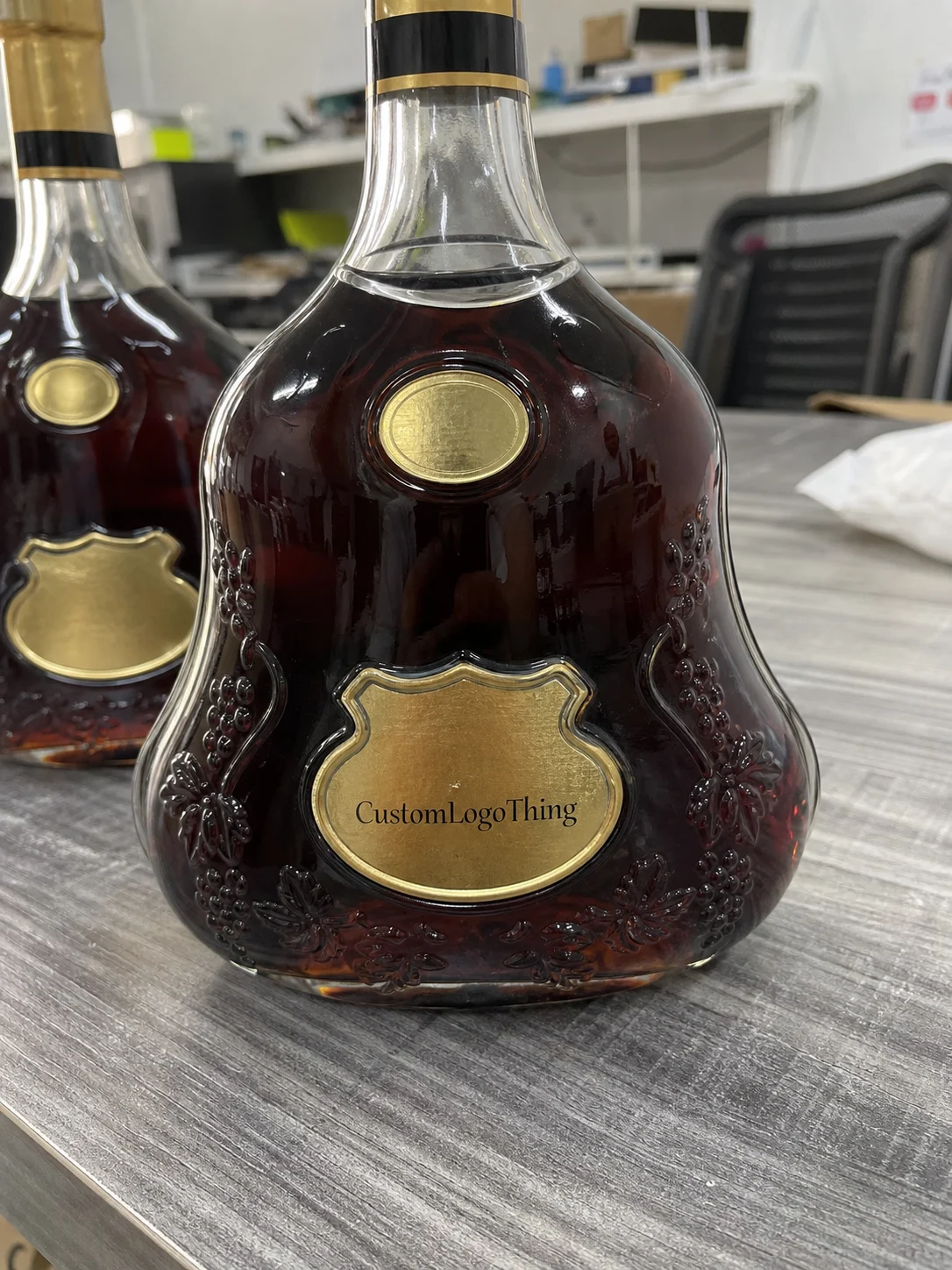
A curved glass bottle does not behave like a flat sheet, and that is where many first-time buyers get caught. A design that looks centered on screen can shift visually once it wraps around the shoulder or follows a taper. On a straight mockup, a label can appear balanced; on the actual bottle, the same artwork may look too tall, too narrow, or too close to the seam.
That visual shift matters because labels are part of package branding, not just decoration. In practice, the label is often the first tactile point of contact after a customer picks up the bottle. If the stock feels thin, the edges lift, or the artwork lands slightly crooked, the whole piece loses credibility. If the stock is chosen well and the placement is clean, even a restrained design can feel deliberate and expensive.
Condensation is another practical factor that gets overlooked. Bottles that are chilled, iced, or stored in humid conditions put extra stress on adhesive and topcoat choices. A paper label may look fine on a shelf, then wrinkle or edge-lift after a bucket of ice or repeated handling. That is why the production question is tied to the use case, not just the print file.
If you are comparing custom printed boxes with bottle labels for a launch, the logic is similar: the packaging has to survive the environment and support the product story at the same time. The difference is that glass gives you fewer places to hide mistakes, so alignment and adhesive performance matter more than they do on cartons.
There is also a scale issue that is easy to miss. A label that is off by only a few millimeters may still pass a casual review, but on a premium bottle that small error reads as sloppiness. Thin borders, centered crests, and fine typography are unforgiving. Buyers who expect a luxury look need to think in tolerances, not just aesthetics.
How materials, adhesives, and finishes work
Material choice changes both appearance and performance. A coated paper stock gives you a classic, print-friendly surface with strong color reproduction. Film stocks, usually polypropylene or a similar material, are more resistant to moisture and scuffing. Metallic stocks can create a sharp premium effect, while textured papers add a tactile feel that works well for limited runs or gift packaging.
The adhesive matters just as much as the face stock. A permanent adhesive is usually the safer choice if the bottle may be chilled, handled often, or stored for a longer period. Removable adhesive sounds flexible, but on glass it can be a poor match if the bottle will see cold, condensation, or friction from transport. Once the label starts to slide or curl, the finish is already compromised.
Finishes change the visual read of the label in a big way. Gloss gives you shine and high contrast. Matte softens the look and can make typography feel more refined. Soft-touch adds a velvety feel, although it should be used carefully if the label may rub against other bottles or cartons. Foil accents can lift a simple layout, but they work best when the design leaves enough breathing room for reflective areas to stand out.
For paper-based labels, sourcing can matter as much as print quality. If the project calls for a more responsible material story, ask about FSC options and verify the chain rather than assuming it is there by default. For shipping or handling validation, organizations like ISTA are useful reference points because they focus on transport testing, drop performance, and packaging durability. If you want background on packaging materials and industry practices, Packaging School / packaging.org has solid educational resources.
Here is a practical way to think about the main options:
| Material | Look | Moisture Resistance | Best Use Case |
|---|---|---|---|
| Coated paper | Clean, traditional, print-rich | Moderate | Dry storage, classic presentation, lower-cost runs |
| Film | Sleek, durable, crisp edges | High | Chilled bottles, frequent handling, condensation risk |
| Metallic stock | Reflective, premium, attention-grabbing | Moderate to high | Special editions, gifting, strong shelf presence |
| Textured paper | Tactile, upscale, more artisanal | Moderate | Boutique presentation, restrained graphics, premium feel |
One more point matters: art size alone is never enough. You need bleed, safe area, and a realistic understanding of the bottle’s curve. A label that is perfectly dimensioned on a flat PDF can still look crowded once it bends over glass. That is where the production spec, not the artwork alone, decides how good the bottle will actually look.
For buyers who want a cleaner premium read, the finish should support the artwork rather than compete with it. Heavy foil on a busy layout can start to feel noisy. A restrained type lockup on better stock often performs better than a complicated design on a mediocre substrate.
Pricing, MOQ, and the real cost drivers
The cost of a custom hennessy label is usually driven by five things: stock, print method, finish complexity, die cutting, and quantity. A simple one-color label on coated paper is very different from a multi-pass design with foil, soft-touch lamination, and a custom cut shape. The artwork may look similar on a mockup, but the production path is not the same.
Minimum order quantity has a direct effect on unit price. Small runs carry more setup burden per piece, so the cost per label is higher even if the design is straightforward. In practical terms, a run of 250 labels will almost always cost more per unit than 2,000 or 5,000 labels because the press setup, cutting, and quality checks are spread across fewer pieces. That is normal, not a sign of bad pricing.
Typical pricing can vary widely, but buyers can use rough ranges to sanity-check quotes. A standard paper label with basic print may land around $0.18-$0.28 per unit at 5,000 pieces, while a film label with specialty finish can move into a higher band depending on coverage and die work. Smaller quantities can push those numbers up quickly. Rush handling, extra proof rounds, and complex finishing can add to the total even if the print itself is simple.
If you are comparing vendors, ask exactly what is included. Does the quote cover dieline setup? Are proofs free or billable? Is the finishing inline or a second pass? Is the die a one-time charge? Is shipping separate? Those details matter more than the headline price because they change the real landed cost.
Buyers should also ask whether the quoted price assumes machine application or hand application. A label that runs cleanly through an applicator may still need slight adjustments for hand placement, especially on tapered glass. That can affect labor, yield, and the number of usable labels per roll.
Here is a simple comparison buyers can use before signing off on a quote:
- Low cost: coated paper, standard cut, one proof, larger quantity, minimal finishing.
- Mid cost: film stock, custom die, matte or gloss lamination, moderate quantity.
- Higher cost: metallic stock, foil, soft-touch, specialty shapes, tight turnaround.
That same logic shows up in other packaging categories too. A label order that looks inexpensive at first can become expensive once finishing, proofs, and shipping are added. The smartest buyers compare the full run, not the sticker price.
There is a second cost hidden inside rushed projects: reprints. A cheap quote is not cheap if the label peels, misregisters, or lands on the wrong dieline. The fastest way to waste money is to approve a spec that was never tested on the actual bottle.
Production steps and lead time from proof to shipment
The cleanest label projects follow a predictable sequence. First comes artwork review, then dieline confirmation, then the proof, then print setup, finishing, cutting, inspection, and packing. When that sequence is followed, the buyer has a better chance of catching problems early instead of discovering them after the whole run is complete.
Artwork review is where a lot of delays begin. Low-resolution logos, converted text, missing fonts, and vague placement instructions slow everything down. The same is true when bottle measurements are incomplete. If the printer has to guess at the usable area or seam position, they may need another proof cycle before production can start.
For a simple run with standard stock and uncomplicated finishing, lead time after proof approval is often around 12-15 business days. More involved jobs can take longer, especially if the label uses foil, textured stock, special dies, or multiple finishing steps. Rush orders are possible in some cases, but they are safer when the artwork is already finalized and the bottle dimensions are exact. A rush order with missing information is usually a bad trade.
The buyer should expect each stage to have a reason for existence. Proof approval confirms size and placement. Setup makes sure the press and die are correct. Quality checks catch color drift, cut issues, and registration errors. Packing protects the labels from edge damage or dust before shipment. None of that is glamorous, but each step prevents reprints.
For validation on the shipping side, standards from ISTA are a useful frame of reference because they focus on how packaging behaves under transit stress. That matters even for labels, because a perfectly printed run can still arrive damaged if the carton, roll core, or packing method is weak.
Lead time is also affected by how quickly the buyer responds. The gap between proof delivery and approval often matters more than the press schedule itself. A project with a clear decision-maker moves faster than one that waits on scattered feedback from three different people.
Specs that keep the label flat, aligned, and durable
Good specs are the difference between a label that behaves and one that frustrates everyone on the line. Start by measuring the bottle’s usable panel width, the visible height, and any taper or curvature that changes the effective contact area. Measure the wrap area separately from the flat face, because the label may need to shrink slightly to avoid bunching at the edges.
Do not rely on a photo alone. A bottle mockup is helpful for visual placement, but the real test is still the actual container. Glass curvature changes the way borders look, especially with thin rules, centered logos, and text lines near the top or bottom. A label can be technically correct and still look off if it was scaled for a flat surface.
Durability needs to match the environment. If the bottle will be chilled, put the spec in writing: moisture resistance, cold handling, and scuff tolerance should be part of the discussion. If the bottle will be gift boxed or packed tightly with other items, surface abrasion matters too. Soft-touch and matte finishes can look elegant, but they need the right top treatment if the label will be handled repeatedly.
A strong spec sheet usually locks down:
- Final label width and height.
- Bleed and safe area.
- Stock type and adhesive type.
- Finish, including gloss, matte, foil, or lamination.
- Application method, manual or machine.
- Quantity and ship date.
That level of detail reduces reprints because everyone is working from the same assumptions. It also helps keep the label aligned with the rest of your packaging design, whether the bottle is sold alone or as part of a larger branded package with cartons, inserts, or gift components.
Honestly, the best label specs are not fancy. They are specific. A clear spec sheet is boring in the right way.
One practical tolerance check can save a lot of trouble: confirm that the design still reads cleanly if the label lands slightly left or right of center. Perfect placement is ideal, but real production always has a little variation. Designs with enough margin for that variation tend to survive the line better.
Common mistakes that cause peeling, wrinkling, and reprints
The classic mistake is designing for a flat surface and then discovering the label starts to lift once it wraps around the bottle. That shows up as edge curl, a bowed baseline, or a slight wrinkle near the seam. If the label is too wide, it fights the curve; if it is too tall, it crowds the shoulder or foot of the bottle.
Low-resolution artwork is another frequent problem. A logo that looks sharp on a phone screen may print soft or muddy if the source file is weak. Thin lettering can also disappear when the finish adds glare or texture. If the design uses fine lines, those details need to be checked at actual size, not just zoomed in on a monitor.
Application method causes more trouble than many buyers expect. A clean bottle at room temperature gives the adhesive the best chance to bond. If the bottle is damp, dusty, or cold, the label can trap bubbles or shift during placement. Hand application also introduces skew if the operator starts at the wrong edge or smooths too aggressively before alignment is set.
Proof review is the last cheap place to catch mistakes. Once the full run is printed, a wrong date, wrong size, or misaligned graphic becomes expensive very quickly. I have seen buyers try to save time by skipping the proof cycle, only to lose a whole run because the label was too wide for the bottle they actually received.
For projects that will sit inside a larger retail packaging program, the label has to work with the carton, tray, or outer pack instead of against it. If the bottle is being sold with other components, the label finish should not clash with the rest of the presentation. That is why coordination across product packaging elements matters even for a single label order.
Another common failure is choosing the wrong finish for the environment. A premium matte look can be excellent on a dry shelf, then show wear quickly if the bottle is handled with wet hands or packed tightly for transport. Good-looking is not the same as durable.
What to prepare before you place the order
Before you request pricing, gather the bottle photos, exact measurements, and any existing label dimensions you already have. If there is a current label, measure it carefully and note whether it sits on a flat panel, a taper, or a fully curved wrap. That one detail can change the quote and the proof.
You should also have the logo file, copy, preferred finish, quantity, and target ship date ready. If the label will carry compliance text, ingredient info, or a barcode, include that early so the layout can be balanced around the real content instead of squeezed in later. Buyers often underestimate how much room a barcode, legal text, or small typographic note needs on a narrow bottle label.
The best habit is to ask for a digital proof with dieline marks, then confirm placement before approving print. If possible, test one sample on the actual bottle. That one sample often reveals what a mockup cannot: how the label sits on the curve, whether the finish looks too shiny, and whether the adhesive behaves cleanly on glass.
If you are organizing the order around a larger launch, tie the label to the rest of the packaging plan at the same time. A label that feels right on paper can still look off next to a carton, sleeve, or display piece if the finishes do not match. The best custom printed boxes and bottle labels usually share the same visual discipline, even if the materials are different.
Use this checklist before placing the order:
- Confirm bottle dimensions with actual measurements, not estimates.
- Choose stock and adhesive based on moisture, handling, and storage.
- Review the proof at full size, then inspect placement on the bottle.
- Approve only after the fit, finish, and copy are all correct.
A custom hennessy label should look like it belongs on the bottle from the first glance, and that happens when the measurements, materials, adhesive, and proofing all line up. If you treat it as both a design piece and a production spec, you avoid expensive mistakes and end up with a label that feels clean, deliberate, and ready to ship.
FAQ
How do I measure a custom hennessy label for the right fit?
Measure the usable flat area and the curved wrap area separately, because the bottle shape changes the visible size. Record width, height, and any seam or overlap allowance, then test the dimensions on an actual bottle before approving the run.
What material works best for a custom bottle label on glass?
Choose paper for a classic look, film for better moisture resistance, and textured or metallic stock when the design needs a stronger premium feel. Match the finish to the environment, and use the right adhesive so the label stays put without wrinkling or sliding.
What does a custom bottle label usually cost, and what changes the price?
Price usually moves with quantity, material, finish complexity, die cutting, and whether the design needs special setup. Smaller runs cost more per label because the setup work is spread across fewer pieces, and rush timing or extra proofing can raise the total.
How long does production take once artwork is approved?
Simple runs can move quickly after proof approval, while complex materials or finishes add setup and finishing time. The longest delays usually come from artwork changes, missing measurements, or slow proof approval from the buyer.
Can I apply the labels myself without bubbles or wrinkles?
Yes, but the bottle should be clean, dry, and at room temperature before application. Start at one edge, align carefully, and smooth gradually so air can escape; a test label on one bottle is the safest way to confirm the adhesive and placement method.