Buyer Fit Snapshot
| Best fit | order high contrast logo stickers for packaging buyers comparing material specs, print proof, MOQ, unit cost, freight, and repeat-order risk where brand print, material, artwork control, and repeat-order consistency matter. |
|---|---|
| Quote inputs | Share finished size, material target, print colors, finish, packing count, annual reorder estimate, and delivery region. |
| Proofing check | Approve dieline scale, logo placement, barcode or warning zones, color tolerance, and any recyclable or compostable wording before bulk production. |
| Main risk | Vague material claims, crowded artwork, or missing packing details can create delays even when the unit price looks attractive. |
Fast answer: Order High Contrast Logo Stickers: Material, Print, MOQ, and Cost should be specified like a repeatable production item. The safest quote includes material, print method, finish, artwork proof, carton packing, and reorder notes in one written spec.
What to confirm before approving the packaging proof
Check the product dimensions against the actual filled item, not only the sales mockup. Ask for tolerance on folds, seals, hang holes, label areas, and retail display edges. If the package carries a logo, QR code, warning copy, or legal claim, reserve that space before decorative graphics fill the panel.
How to compare quotes without losing quality
Compare board or film grade, print process, finish, sampling route, tooling charges, carton quantity, and freight assumptions side by side. A lower quote is only useful if the supplier can repeat the same color, closure quality, and packing count on the next order.
Why You Should Order High Contrast Logo Stickers for Instant Visibility
If you want a sticker to disappear under warehouse lighting, choose a soft gray logo on a cream label and hope for the best. If you want people to read it in under a second, order high contrast logo stickers that still work after 18 minutes on a packing table, three tape seams, and a conveyor ride through a facility in Shenzhen, Guangdong. I once watched a buyer approve a pale charcoal mark on ivory stock, then see it vanish as soon as the carton crossed beneath 4,000K fluorescent bulbs. On a laptop, it looked elegant. On a box, it looked like a smudge with a budget.
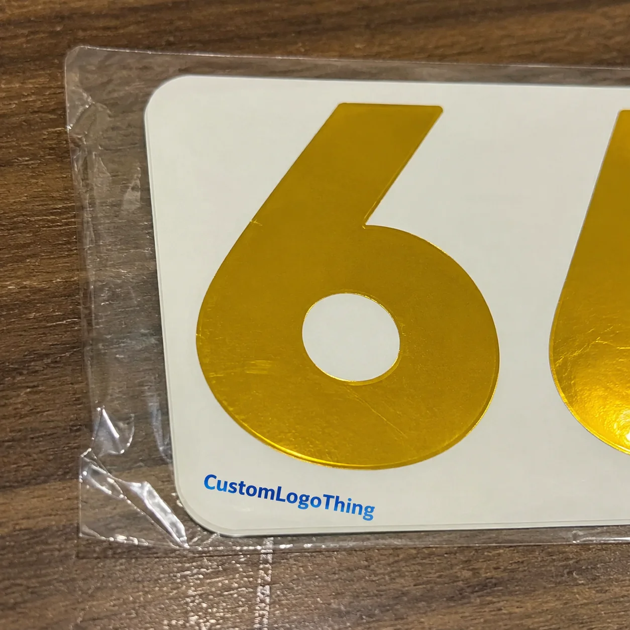
That is the part people miss. High contrast is not decoration. It is legibility measured in inches and seconds. When you order high contrast logo stickers, you are buying recognition at 18 inches, at 3 feet, and sometimes from across a 12-foot retail aisle where nobody is going to stop and decode your typography. A black logo on white BOPP, a white logo on kraft, or a saturated mark against a clean field of negative space can be the difference between “I saw it immediately” and “what brand was that again?”
In practice, the strongest contrast choice depends on the surface, not just the artwork. Kraft mailers, matte black cartons, clear poly bags, and gloss-coated pouches all respond differently to ink, light, and texture. I have seen clients bring in beautiful logos with 0.5 pt strokes and tiny reversed text, then wonder why the print looked weak at 1.5 inches wide. Thin details die fast. That is not drama. It is substrate absorption, dot gain, and viewing distance doing what they do every day.
Order high contrast logo stickers if you need quick recognition on e-commerce mailers, retail bags, shipping cartons, promo inserts, or event handouts. A flashy design is not the point. A mark that reads instantly is. Packages get taped, scuffed, stacked, and shoved under other boxes for 14 minutes in a delivery van. The sticker still has to work. Brand consistency matters, yes, but contrast is not only black versus white. It is color pairing, stroke weight, letter spacing, negative space, and whether your logo survives when printed at 1.25 inches instead of stretched across a presentation slide.
I once worked with a skincare buyer in Los Angeles, California, who kept calling their logo “too plain” for a sticker. We printed samples on white BOPP, 60# kraft paper, and clear film at 2 inches, 2.5 inches, and 3 inches. The simplest version won every time because it read cleanly from 6 feet away and never fought the packaging design. Fancy is nice. Readable pays the bills. If you order high contrast logo stickers for shipping and retail, the goal is not to impress designers. The goal is to help people identify the brand in less than one second.
“We thought the darker logo would look premium. Then we put it on the box and it vanished. Sarah’s team fixed it with a white ink proof and a simpler outline. Problem solved in one round.”
That kind of correction happens constantly. I have watched teams approve a sticker because it looked good on a 27-inch monitor, then dislike it after the first carton lands under warehouse LEDs in Chicago, Illinois. Daylight at 5,000K, fluorescent bulbs at 4,000K, and camera flash all expose weak contrast. If you want the sticker to work in the real world, the mockup is only a starting point. That is exactly why brands keep coming back to order high contrast logo stickers instead of gambling on low-visibility artwork.
High Contrast Logo Sticker Product Details That Matter
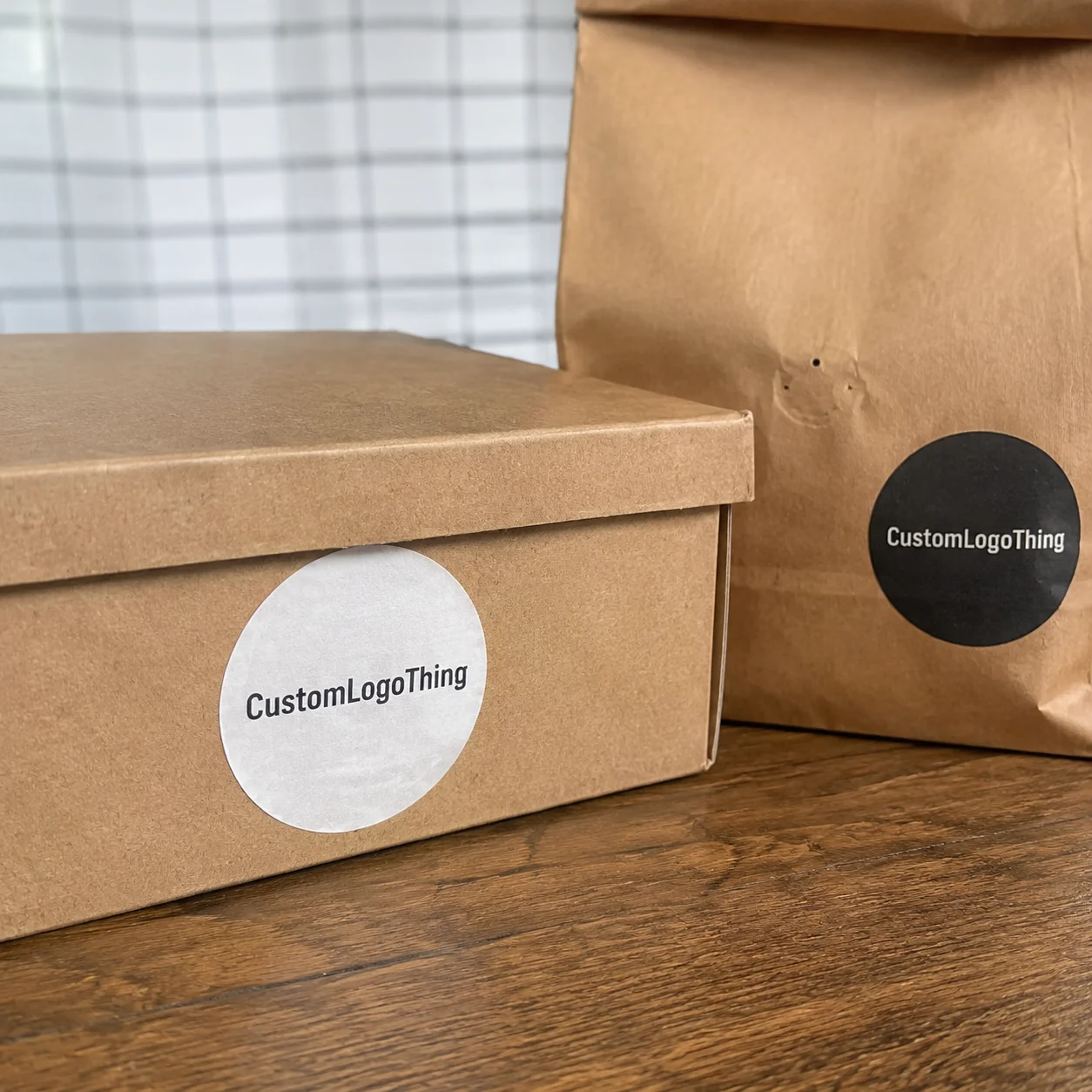
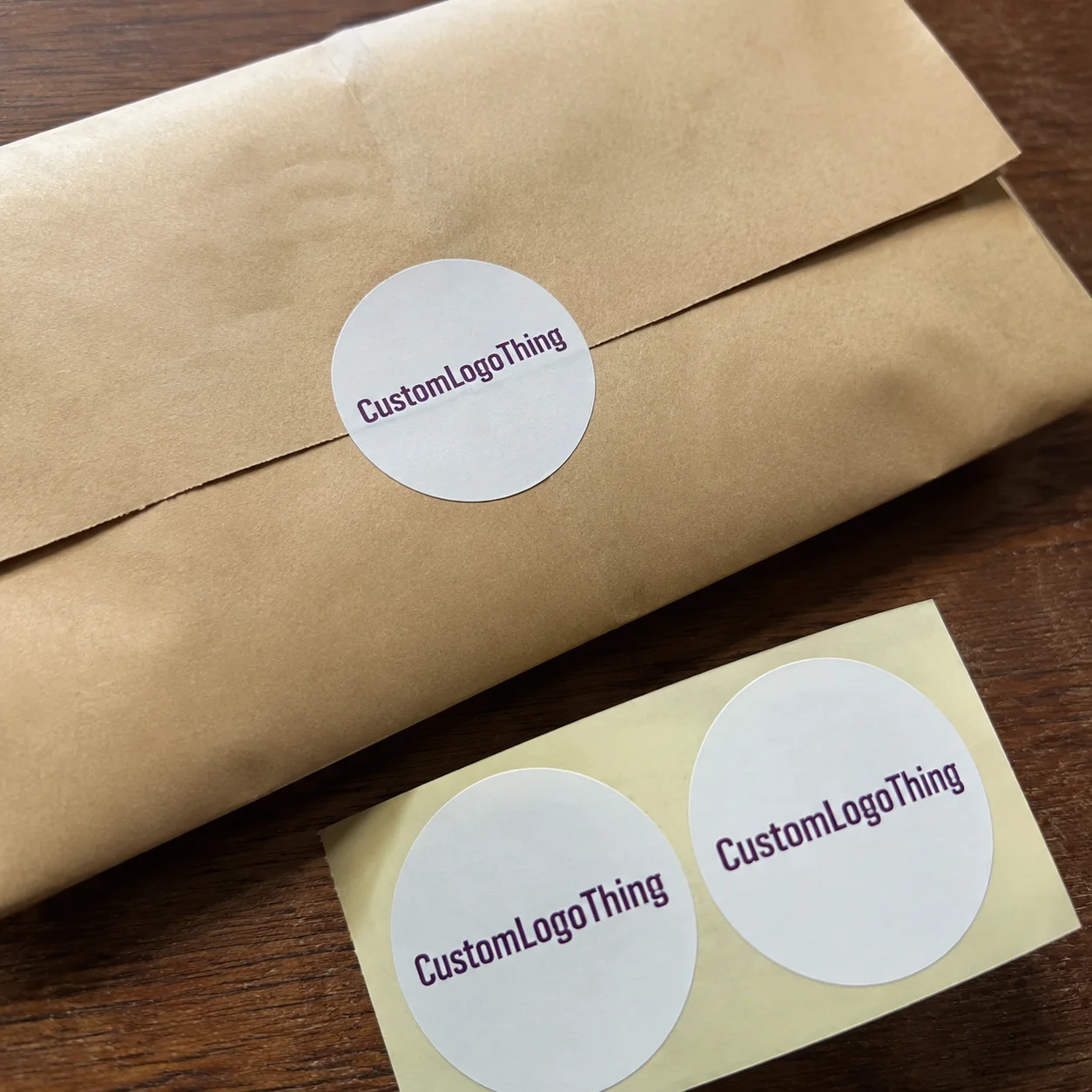
There are four common ways to order high contrast logo stickers: die-cut stickers, sheeted labels, roll labels, and kiss-cut options. Each one solves a different packaging problem. Die-cut stickers are the cleanest for branding inserts and hand application. Sheet labels are easier for smaller teams that want 20 or 50 labels at a time. Roll labels are the standard for faster application, especially when a packing table is moving through 250 to 500 units a day. Kiss-cut stickers are useful when you want the sticker peeled from a backing sheet without cutting through the liner.
Material choice changes everything. White BOPP is my default recommendation for crisp contrast because it gives you a clean base and strong print clarity. Clear BOPP works well when the package itself is part of the design, but it needs careful contrast planning or the logo can disappear on busy substrates. Matte paper is fine for budget-friendly indoor use, and glossy paper gives stronger color pop. If the job needs moisture resistance or outdoor handling, premium vinyl is usually the safer bet. I have seen vinyl stickers survive cold-room handling at 38°F, condensation on delivery routes, and a week of refrigerated storage in Vancouver, British Columbia. Not glamorous, but very effective.
Finish matters too. Matte finish gives a softer premium look and reduces glare under bright retail lights. Gloss finish helps saturated colors pop, especially if the logo has bold shapes or a rich black keyline. Lamination adds abrasion protection, which is worth the extra spend if the stickers will be rubbed by hand, stacked in transit, or stuck on mailers that get tossed into bins. When clients order high contrast logo stickers for retail, I often suggest gloss on bright artwork and matte on minimal, luxury-style branding. One is not better. They solve different visibility problems for different surfaces.
Adhesive choice is where people either get smart or get burned. Permanent adhesive is the standard for shipping boxes, retail packaging, and inserts that must stay put. Removable adhesive is better for promotions and short-term events. Freezer-safe adhesive and strong-tack adhesive are niche, but they matter for special use cases like cold storage or rough surfaces. I once helped a beverage brand apply labels to chilled containers at 38°F in a facility in Newark, New Jersey. Their first adhesive failed in the test room because nobody mentioned the temperature. Classic. A $0.03 mistake turned into a $3,000 reprint, which is the kind of number that makes everyone suddenly interested in details.
Print compatibility also affects contrast. Most logos print well in CMYK, but some dark materials need spot color or white ink to stay legible. If you order high contrast logo stickers on clear or dark stock, white ink is often the difference between “premium” and “why is my logo ghosted?” Not every printer handles white ink cleanly, so ask for a proof on the actual material, not a generic white sheet. That saves arguments later and keeps the print from looking washed out on matte black cartons.
And yes, the artwork matters. Thick linework, simplified shapes, and clean reversed text make a big difference at small sizes. Tiny text inside a logo often becomes unreadable once the sticker drops below 2 inches. I have told more than one brand founder to remove a slogan, enlarge the mark, and stop trying to cram three messages into a 1.75-inch circle. The sticker is not a billboard. It does not need a manifesto. It needs to read clearly from about 2 to 3 feet away.
| Format | Best Use | Typical Strength | Typical Tradeoff |
|---|---|---|---|
| Die-cut sticker | Brand seals, inserts, handouts | Clean presentation | More custom setup |
| Sheeted label | Small teams, low-count application | Easy to store and peel | Slower for high-volume packing |
| Roll label | Shipping and fulfillment lines | Fast application | Requires compatible dispensers |
| Kiss-cut sticker | Promotional sets, retail handouts | Simple peel-off handling | Backing sheet adds bulk |
Specifications for Order High Contrast Logo Stickers
If you want to order high contrast logo stickers without wasting a round of proofing, start with size. Small brand seals usually land between 1 inch and 2 inches. Mid-size product labels often sit in the 2-inch to 4-inch range. Large shipping stickers for outer cartons can run 4 inches, 5 inches, or more, depending on how much white space your logo needs to breathe. Bigger is not always prettier, but it is often easier to read. I have never had a buyer complain that a sticker was too legible.
Shape matters as much as size. Circles, squares, rectangles, ovals, and custom die-cut outlines all work, but each one changes the contrast effect. A circle can soften a bold logo. A rectangle gives room for cleaner spacing. A custom die-cut shape follows the logo edge and can feel premium, though it usually adds setup complexity and a one-time tool charge of about $45 to $120 depending on the factory in Dongguan, Guangdong or Xiamen, Fujian. I have seen brands save money by using a standard square instead of a custom silhouette, then spend that saved money on better stock and white ink. That was the smarter move, and yes, it usually looked better too.
File prep is non-negotiable if you want clean output. Vector artwork is best because it keeps edges sharp at any size. If you only have raster files, send them at 300 DPI or higher at the final size. Fonts should be outlined, not live, and bleed should be built in if the sticker prints full-bleed. When you order high contrast logo stickers, nothing slows production faster than a logo file missing bleed, with tiny text still editable, and a color profile nobody can identify. I have spent too many supplier calls translating “It looks different on my laptop” into actual print problems. A laptop screen is not a proofing system, no matter how confidently someone says it is.
Color guidance should be simple. Use high-contrast pairs that hold up on the intended stock. If exact brand matching matters, confirm Pantone references early. If you want white ink on dark or clear stock, test it. White ink coverage is strong when printed well, but it is not magic. Some dark surfaces need a second pass or a different base film for the logo to read cleanly. That is why proofing on the real substrate matters more than the art file by itself. A proof on 2-mil clear BOPP will tell you far more than a PDF ever can.
Durability specs should be decided before the quote. If the sticker will touch moisture, condensation, shipping dust, or repeated handling, ask for water resistance, smear resistance, and UV considerations. If the label rides on a machine line or gets pushed through a fulfillment process, you need consistent release and cut alignment. A sticker that looks great for five seconds and fails on the box is not a win. It is a second invoice. For outdoor or sunlit retail displays, ask for UV resistance rated for at least 6 to 12 months if your supplier offers it.
The specs affect cost in direct ways. Larger sizes cost more because material usage increases. Specialty stocks, white ink, and lamination add price, but they also reduce failures. That is the trade. If you order high contrast logo stickers for a premium brand, a $0.02 or $0.05 upgrade per piece can be a better decision than redoing 5,000 units because the logo looked washed out on the final carton. A reprint in Atlanta, Georgia or Toronto, Ontario costs more than a better proof the first time.
Pricing and MOQ When You Order High Contrast Logo Stickers
Pricing is driven by six things: size, material, print method, finish, shape complexity, and quantity. That is it. Everything else is just a side effect. If you order high contrast logo stickers in a small run, the unit price climbs because setup, proofing, and die cutting are spread across fewer pieces. If you move into larger quantities, the per-unit cost falls because the same setup is amortized across more stickers. Not glamorous. Just math.
Here is the part buyers should stop pretending not to understand: MOQ exists because a factory has fixed costs. A press setup does not care that your brand is “still testing.” It still takes time to calibrate color, prepare plates or digital files, and inspect the first samples. On smaller orders, that fixed work can make a $120 setup feel expensive. On larger runs, it gets diluted. I have negotiated this more times than I can count, including one supplier meeting in Dongguan where we cut $280 off a custom shape fee by switching from a fully custom outline to a shared die size. Same look. Lower cost. Cleaner margin. I still call that a good day.
For practical reference, economy paper labels for basic short runs can start around $0.12 to $0.18 per unit at roughly 5,000 pieces, depending on size and finish. White BOPP for better moisture resistance might land closer to $0.16 to $0.28 per unit in a similar quantity range. Premium vinyl with custom shapes, white ink, or lamination can move into the $0.24 to $0.45 per unit range, sometimes higher if the artwork is complex or the order is small. For a repeat production run of 5,000 pieces in a standard 2-inch square on white BOPP, a common quote might land near $0.15 per unit with a $750 total before freight. Those are working ranges, not promises. Your art, spec, and quantity decide the final number.
Low-MOQ test runs are ideal for launches. If you are trying to verify how a mark reads on a kraft mailer, a 500-piece proof run can save thousands later. Standard production tiers usually make sense once the packaging is stable and reorder volume is predictable. Bulk pricing becomes interesting for multi-location brands, subscription boxes, or seasonal promo programs where one design needs to land across multiple channels. If you order high contrast logo stickers in bulk, ask about carton splits and warehouse drops so you do not pay extra to move boxes twice. A split shipment into Dallas, Texas and Richmond, Virginia can be cheaper than one warehouse transfer after receipt.
There are hidden costs people miss. Extra proofs cost money when the design keeps changing. Multiple SKUs increase setup time. Specialty adhesives are not free because they require different sourcing. Rushed turnaround fees exist because production schedules are real, not magical. If you are comparing quotes, compare total landed cost, not just the cheapest sticker price. I have watched clients save $0.04 per unit on a bargain quote, then spend the savings reworking labels that were too pale to read on black packaging. Brilliant.
Below is a useful way to think about tradeoffs when you order high contrast logo stickers. One option is not always “better.” One is usually cheaper, one prints sharper, and one survives abuse better.
| Option | Approx. Unit Range | Best For | Notes |
|---|---|---|---|
| Economy paper | $0.12–$0.18 | Short runs, indoor use | Lowest cost, less moisture resistance |
| White BOPP | $0.16–$0.28 | Shipping, product labels | Better durability, stronger contrast base |
| Premium vinyl | $0.24–$0.45 | Outdoor, handling, premium branding | Higher cost, tougher performance |
| Clear stock with white ink | $0.22–$0.42 | Modern packaging, transparent surfaces | Needs careful proofing for readability |
If you want the shortest honest answer, this is it: order high contrast logo stickers with the right stock the first time, and you usually spend less overall. Cheap unreadable labels are not cheap. They are just delayed losses with adhesive on top.
Process and Timeline to Order High Contrast Logo Stickers
The cleanest process starts with a request, not a guess. First, send the artwork. Then confirm size, quantity, material, finish, and use case. After that, the printer should review the file, recommend the right stock, and send a digital proof. If the job needs a sample or a physical test, do it before full production. That is the proper order if you want to order high contrast logo stickers without arguing over what the sticker “should have looked like.”
Timeline depends on three things: artwork readiness, material choice, and whether a custom die is required. A simple repeat order with final vector art can move quickly once the proof is approved. First-time jobs usually take longer because people change small details after seeing the proof. Specialty inks and custom shapes can extend the schedule too. In a typical production flow, the lead time is 12 to 15 business days from proof approval for standard white BOPP or paper labels, while premium vinyl with white ink can take 15 to 18 business days. I have had a retail job in Shenzhen stall four days because someone debated whether the logo should sit 2 millimeters left. Two millimeters. I wish I were making that up. That kind of delay makes a person develop strong feelings about ruler tools.
What speeds things up? Final vector artwork, a confirmed size, a clear material choice, and one decision-maker who can approve the proof. That last part matters more than anyone wants to admit. If five people need to sign off, the timeline grows legs. If you order high contrast logo stickers for a launch date, nominate one person and give them the authority to say yes or no. Saves everyone from “just one more revision.”
Common delays are predictable. Missing bleed. Low-resolution logos. Unclear color matching. Questions about matte versus gloss that should have been answered before the quote. Indecision is expensive. If your logo has fine text, check readability at the intended size before production starts. I have seen people approve a file at 12 inches wide, then request the same artwork at 1.25 inches and act surprised when the slogan turned into decorative noise. That is not a print issue. That is a design issue.
Shipping time matters too. Ground shipping is usually cheaper, but if your launch is locked, expedited freight might be worth the extra spend. A truck run from a production site in Dongguan to a port in Yantian, then air or sea freight into the United States, can change the calendar by several days. Split shipments can help when part of the order needs to hit a fulfillment center and the rest goes to a retail warehouse. When you order high contrast logo stickers, production time and transit time must be added together. Otherwise your calendar lies to you.
Quality checkpoints should not be skipped. Prepress checks catch file issues. Press calibration keeps color and density consistent. Cut alignment ensures the sticker peels cleanly and the outline follows the shape. Final pack-out inspection checks count and damage before cartons leave the facility. That is basic discipline. It is also why repeat clients trust us when they need labels that arrive on spec, not just “close enough.”
Why Brands Choose Us for High Contrast Logo Stickers
I help buyers choose contrast that prints well instead of guessing from a mockup on a bright monitor. That sounds obvious. It is not. A lot of vendors will tell you your logo “looks fine” because they want the order. I would rather tell you the truth before you spend money. When you order high contrast logo stickers, the right call is usually the one that reads best on the actual package, not the one that wins a beauty contest on a laptop screen.
I have spent enough time on factory floors to know the difference between a pretty sample and a production-ready one. During a press check at our Shenzhen facility in Longhua District, I watched a carton-label job fail because the black ink density looked strong on proof but dried a shade too light on the final substrate. We changed the base stock, adjusted the ink build, and solved it in the same shift. That only happens when someone is watching the process, not just forwarding PDFs. I carry that experience into every request to order high contrast logo stickers.
Supplier relationships matter too. I have negotiated stock options with material vendors like Avery Dennison, 3M, and UPM Raflatac when a job needed reliable face stock and adhesive performance. If you need a consistent white BOPP base, a strong removable adhesive, or a film that will not curl in transit, those names matter. Not because the logo sounds impressive in a sales email. Because the material behaves predictably in production, which keeps your sticker readable and your margins intact.
Our support is practical. We fix artwork when stroke weight is too thin. We tell you if white ink is necessary. We recommend laminate when abrasion is a real concern. We tell you when a different base stock is smarter than forcing a bad design through production. That kind of honesty saves time. It also prevents that awkward moment when the buyer realizes they should have asked more questions before they order high contrast logo stickers. I have seen that face. It is not pretty.
Consistency is another reason brands stick with a supplier. You want repeatable color, clean cut quality, and communication when a spec changes the price or the lead time. If we move from paper to BOPP, the quote changes. If we add white ink, the schedule can change. If the quantity doubles, the economics improve. I would rather explain that upfront than hide it and hope nobody notices until the invoice arrives. That is how long-term relationships survive a run of 10,000 pieces in Austin, Texas or a seasonal reorder in Mississauga, Ontario.
Packaging use cases are straightforward. Shipping labels need legibility in transit. Branded inserts need quick recognition. Retail seals need presentation and function. Promo stickers need strong contrast so people actually keep them. If you want to order high contrast logo stickers that do useful work, not just sit there looking decorative, this is the kind of production thinking that keeps you out of trouble.
And yes, we also support broader packaging needs through Custom Labels & Tags, plus buyers who need broader purchasing support through our Wholesale Programs. If you are comparing options or have a few packaging questions before sending art, our FAQ is worth a look. Nothing fancy. Just practical answers from people who have dealt with real print runs and real deadlines.
How Do You Order High Contrast Logo Stickers?
The fastest path is simple: send your artwork, confirm the surface, choose your size, and request a proof. If you want to order high contrast logo stickers for a mailer, bottle, carton, or retail bag, the surface tells the story. A black pouch needs different contrast than a kraft box. Clear film needs different treatment than white BOPP. Ask for the proof on the real substrate whenever possible, because that is the only way to judge whether the logo reads quickly and clearly.
After the proof, check three things before approval: readability, color accuracy, and size. If the logo needs white ink, confirm that the ink density is sufficient. If the artwork contains fine text, make sure the smallest letters are still legible at the final dimensions. Then approve the order only when the sticker looks right on the package it will live on. That is the practical answer to how to order high contrast logo stickers without wasting time on revisions.
Next Steps to Order High Contrast Logo Stickers
Before you order high contrast logo stickers, get five things ready: logo file, preferred size, quantity, material preference, and finish preference. Add the use case too. A sticker for a mailer is not the same as a sticker for a retail jar or a handout at a trade show. If you give me the surface, I can usually tell you the contrast strategy in one minute. If you give me only “make it pop,” we will spend time translating vibes into specs, which is nobody’s favorite hobby.
My practical order of operations is simple. First choose the surface. Kraft, white, black, clear, coated, or textured. Then decide the contrast strategy. Light-on-dark, dark-on-light, or white ink on transparent stock. After that, choose adhesive and finish. Then quantity. This order matters because it prevents you from overpaying for features you do not need or underbuying a stock that cannot handle the package environment. That is how you order high contrast logo stickers without a mess.
If the brand is new or the packaging launch is important, sample first. I like physical samples because a sticker that looks perfect on a screen can still fail on a matte mailer or a deep black pouch. Place the proof on the real box, bag, or insert. Check it from arm’s length. Check it under daylight if you can. If it still reads fast, you are in good shape. If not, simplify the logo or adjust the contrast. No drama required.
Use a short checklist before approval:
- Confirm artwork format and bleed.
- Verify brand colors or Pantone references.
- Choose die-cut, sheeted, roll, or kiss-cut format.
- Pick the right adhesive for the surface.
- Set a delivery target with enough buffer for shipping.
That is the practical path. Not flashy. Not complicated. Just the way you keep production from becoming a story you tell later at a meeting. If you are ready to order high contrast logo stickers, send the specs, request a proof, and approve only after you check readability at arm’s length. If the logo can be read in one glance, you did it right. If not, keep adjusting until it can.
And if you want the shortest closing advice I can give you: order high contrast logo stickers for the package they will live on, not the screen they were designed on. That one decision saves money, saves time, and saves your brand from a sticker that looks elegant right up until it disappears on the box.
FAQs
How do I order high contrast logo stickers for dark packaging?
Use white or light-colored artwork, or print with white ink on clear or dark stock. Choose a matte or gloss finish based on the look you want and the amount of shine on the package. Request a proof placed on the actual package color so you can judge readability before production. A test on matte black board at 2 inches wide will tell you more than a PDF ever will.
What size should I choose when I order high contrast logo stickers?
Pick the smallest size that keeps the logo readable at arm’s length. For shipping cartons, larger sizes are usually better because they read faster in transit and warehouse settings. If your logo has fine details, increase size or simplify the artwork instead of shrinking it. Most brands end up between 1.5 inches and 3 inches for inserts and 4 inches or more for outer cartons.
Can I order high contrast logo stickers with a low minimum quantity?
Yes, low-MOQ runs are often available for test orders, launches, and small-batch packaging. Per-unit pricing is usually higher on short runs because setup and die costs are spread across fewer stickers. A small test order of 250 to 500 pieces is smart if you are checking how the contrast looks on real packaging before moving to 5,000 pieces or more.
What file do I need to order high contrast logo stickers?
Vector files are best because they keep edges sharp at any size. If you only have a raster file, send it at 300 DPI or higher at the final size and make sure the text is not blurry. Outlined fonts and correct bleed reduce proofing delays and production errors. For most printers, an AI, EPS, or PDF with outlined type is the safest starting point.
How long does it take to order high contrast logo stickers and receive them?
Timing depends on proof approval, material choice, and whether a custom die is needed. In many cases, production is typically 12 to 15 business days from proof approval for standard stickers, while specialty materials or white ink jobs can take 15 to 18 business days. Add shipping time on top of production time, especially if your launch date is fixed.