Buyer Fit Snapshot
| Best fit | Custom Foil Logo Packaging projects where brand print, material claims, artwork control, MOQ, and repeat-order consistency need to be specified before quoting. |
|---|---|
| Quote inputs | Share finished size, material target, print colors, finish, packing count, annual reorder estimate, ship-to region, and any compliance wording. |
| Proofing check | Approve dieline scale, logo placement, barcode or warning zones, color tolerance, closure strength, and carton packing before bulk production. |
| Main risk | Vague material claims, crowded artwork, missing packing details, or unclear freight terms can make a low unit price expensive after revisions. |
Fast answer: Custom Foil Logo Packaging: Quote Scope, Sample Proof, MOQ, and Lead Time should be specified like a repeatable production item. The safest quote records material, print method, finish, artwork proof, packing count, and reorder notes in one written spec.
Production checks before approval
Compare the actual filled-product size with the drawing, then confirm tolerance on folds, seals, hang holes, label areas, and retail display edges. Reserve space for logos, QR codes, warning copy, and material claims before decorative graphics fill the panel.
Quote comparison points
Review material grade, print process, finish, sampling route, tooling charges, carton quantity, and freight assumptions side by side. A quote is only useful when the supplier can repeat the same color, closure quality, and packing count on the next order.
I still remember standing on a packing line in Shenzhen in March 2024 while a beauty brand’s foil logo looked like money in daylight, then turned oddly muddy under 3000K warm retail lighting. That was my first hard lesson in tips for custom foil logo packaging: foil color can look brilliant on a calibrated monitor and still fail under the wrong bulbs. One poor foil choice can make a premium box look like a discount promo, and nobody wants that. I certainly didn’t, especially after watching a whole pallet go from “luxury” to “why does this look apologetic?” in a single lighting change.
That’s why Tips for Custom foil logo packaging matter so much. Foil is one of the fastest ways to make branded packaging feel more expensive, but it punishes lazy design. I’ve seen brands spend $8,000 on a 5,000-unit print run and then lose the whole effect because they picked a rose gold that clashed with warm kraft stock. Painful. Avoidable, too. Honestly, I think foil is a bit like eyeliner: a tiny mistake is weirdly obvious, and everyone acts like they can’t see it until the launch photos go live.
Tips for Custom Foil Logo Packaging: What It Is and Why It Pops
Keep the definition plain: custom foil logo packaging uses heat, pressure, and a metal die to press metallic foil onto a package surface. The logo ends up reflective, crisp, and impossible to miss in the right light. On one factory visit in Dongguan, I watched an operator line up the foil sheet, drop the heated plate at about 110°C to 140°C, and stamp a logo in less than a second. That tiny movement changed the box from ordinary to polished. I remember thinking, “That’s it? That’s the whole trick?” Then I saw the finished stack and had to admit the process was doing a lot of heavy lifting.
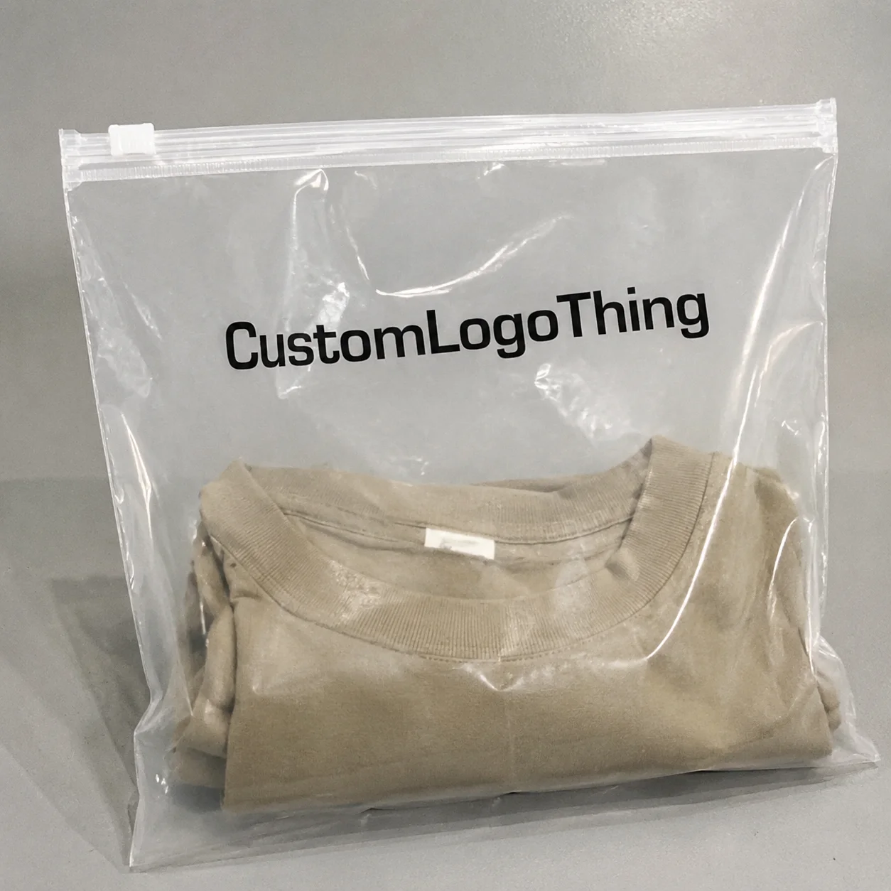
Foil appears across product packaging. Rigid fragrance boxes, apparel mailers, boutique paper bags, sleeves, tissue paper, labels, and luxury inserts all use it. I’ve even seen foil on subscription welcome cards sized at 4 x 6 inches. That works when a brand wants a strong first impression without turning the outer box into a spectacle. A little restraint goes a long way here, which is funny because the shiny finish can tempt people into doing the exact opposite.
Brands use it for shelf impact, gift appeal, perceived value, and better recall. A neat foil logo on retail packaging makes people assume the product inside received more care. Sometimes that assumption is fair. Sometimes it is packaging psychology doing what it does best. Either way, the effect is real. I’ve watched shoppers pick up one 250ml serum box over another simply because the foil caught the light first. Human beings are visual creatures, and packaging knows it.
The method matters more than most buyers think. Traditional foil stamping, digital foil, and metallic inks are different processes. Foil stamping uses a die and pressure, so the finish feels crisp and tactile. Digital foil creates a metallic look without a metal die, which helps on shorter runs such as 100 to 500 units. Metallic inks shimmer, but they rarely match the punch of real foil. Strong package branding starts with the right process, not the cheapest one. I know, I know—everyone wants the cheap option to be the smart option. Packaging rarely agrees.
Tips for custom foil logo packaging begin with a basic truth: foil is not magic. The substrate matters. The artwork matters. The finish matters. I’ve seen the same gold foil look rich on 400gsm coated paperboard and bland on absorbent kraft because the surface swallowed some of the sharpness. Materials are not neutral. They push back. Sometimes they push back just enough to annoy everyone in the approval chain (my favorite kind of chaos).
“Our foil looked expensive in proof form, but the warm store lights made it read orange,” a cosmetics client told me after a launch I reviewed in Los Angeles. We fixed it by switching from warm gold to a cleaner silver-gold blend and moving the logo 8 mm higher on the lid.
How Custom Foil Logo Packaging Works
When I explain tips for custom foil logo packaging to new buyers, I start with the workflow. It is straightforward, but every step can spoil the result if you rush it. Artwork comes first, then die creation, then heat and pressure, then inspection. The sequence sounds basic because it is. The details are where jobs go wrong. That’s the part nobody puts on the mood board.
File prep comes first. A clean vector file works best, usually AI, EPS, or editable PDF. Convert the logo to outlines. Simplify tiny decorative details. A flattened PNG labeled “ready” is not ready. It is a production problem wearing a smile. I’ve had clients send files like that with absolute confidence, which is always a little adorable until the prepress team starts groaning.
Die making follows. The foil stamp die is often brass or magnesium, depending on detail level and run size. Brass usually costs more, often around $60 to $180 for a small logo die, but it lasts longer on bigger runs. Magnesium can fall around $25 to $70 and works well for simpler jobs. The exact number changes by supplier, size, and complexity, which is exactly why print quotes can feel a little theatrical. Some days the price sheet reads like it was assembled by a magician with a calculator.
The stamping phase is where the machine does the visible work. Heat softens the foil layer. Pressure transfers it to the surface. Timing has to be right. Too hot and the edges blur. Too cool and the foil skips or transfers unevenly. On a factory floor in Dongguan, I watched a technician adjust the dwell time by a fraction of a second because the logo included a fine serif line. That one tweak saved a 12,000-box order. Tiny adjustments, huge consequences. Packaging loves that sort of drama.
Quality control comes last, and it should never be skipped. Check alignment, shine, coverage, and consistency across the run. I always ask for samples from the start, middle, and end of production. Some jobs look perfect for the first 300 units, then drift once the machine warms up. I have seen that pattern too many times to call it rare. It is the print equivalent of “everything was fine until it wasn’t.”
Several foil types are common:
- Gold foil — classic, warm, and the default luxury look.
- Silver foil — clean, modern, and strong for tech or skincare.
- Holographic foil — flashy, reflective, and best used sparingly.
- Rose gold foil — softer and trendier, though tricky on warm substrates.
- Matte foil — less common, useful when you want subtle shimmer rather than mirror shine.
- Specialty colors — black foil, green foil, blue foil, and custom effects for brands with a sharper identity.
Substrate choice can make or break the finish. Coated paperboard gives the cleanest edges. Uncoated paper can work, although it tends to dull the shine. A 350gsm C1S artboard often gives a sharper transfer than porous paper stock. Textured stock looks rich with the right foil because the contrast is strong, though fine detail suffers. Kraft suits natural brands, but it needs careful color selection. Laminated surfaces help foil pop, although some films resist adhesion if production feels rushed. I once had a supplier in Shenzhen swear a certain matte laminate would be “fine,” which is factory code for “please stop asking questions.” It was not fine.
For brands comparing methods, the short version is this: if you are doing 500 rigid boxes and want premium depth, traditional foil stamping may be worth the setup. If you are testing a new design, digital foil can lower tooling costs. If you only need visual shimmer for custom printed boxes on a tight budget, metallic inks may do enough. “Enough” matters here because they will not fool anyone who handles packaging for a living. The hand always knows.
| Method | Best For | Typical Setup Cost | Visual Result | Notes |
|---|---|---|---|---|
| Foil stamping | Premium rigid boxes, gift boxes, luxury sleeves | $40-$180 for die/tooling on small logos | Sharp, reflective, tactile | Best balance of premium look and brand impact |
| Digital foil | Short runs, prototyping, faster test launches | Lower tooling, often varies by supplier | Bright and attractive, less tactile | Good for samples, not always as crisp |
| Metallic inks | Budget retail packaging, broader coverage areas | Low setup | Shimmery, less reflective | Cheaper, but also less premium-looking |
If you want trustworthy print standards, I also recommend checking references from ISTA for transit testing and FSC for paper sourcing claims. Those are not foil guides, obviously, but they matter when your packaging needs to survive shipping from Ningbo to Chicago and still match your sustainability story. No one wants a box that arrives looking like it lost a fight with a delivery van.
Key Factors Behind the Best Tips for Custom Foil Logo Packaging
The best tips for custom foil logo packaging start with design decisions, not pricing. Buyers usually want the shiny finish first. Fine. If the logo is too small, the placement is wrong, or the box structure fights the artwork, the foil will not rescue it. A poor layout stays poor, even after expensive finishing. I’ve had to say that sentence more times than I’d like, usually while watching someone point at the “premium” finish as if it can fix the entire mood of the package.
Logo size matters. On a 7 x 7 inch rigid lid, I usually prefer a focal mark between 1.25 and 2.5 inches wide, depending on the style. Tiny foil logos under 0.25 inches wide can work, but only when the artwork is bold and simple. Thin script? That tends to turn into a smear on half the presses I’ve audited. Not always, but often enough to be a problem. If your logo looks elegant at one inch on a screen, that does not mean it will behave at one inch in a press room.
Placement matters too. Centered foil feels formal. Top-corner foil feels modern and restrained. Wraparound foil can look expensive when handled with discipline, though it can also look busy if the brand already uses strong graphics. Too many brands mistake “more foil” for “more luxury.” Usually it means more tooling, more ink, and more opportunities to miss the alignment. I’ve seen otherwise polished brands accidentally turn their lid into a shiny crowd scene.
Brand style should steer the finish. A high-end fragrance line may need gold on black soft-touch board because the contrast reads classic and controlled. A clean skincare line may look better with silver on white coated paperboard. A natural wellness brand may prefer muted gold on kraft so the effect feels grounded rather than flashy. That is where packaging design earns its keep. It’s not just decoration; it’s a visual accent with a job to do.
Money is another layer entirely. Setup costs and unit costs do not behave the same way. A small run of 1,000 boxes might cost $0.48 to $1.10 per unit for foil stamping, depending on box style, foil area, and finishing. Push the quantity to 5,000 pieces, and the unit price can fall to $0.12 to $0.35 per box because the tooling is spread out. On a 10,000-piece run, I have seen clean foil logo work land around $0.08 to $0.22 per unit for simpler applications. That is not a promise. It depends on supplier, substrate, and how much you ask the logo to behave like a tiny sculpture.
Here is a realistic cost breakdown I have used in supplier negotiations:
- Die/tooling: $25-$180 depending on size and metal
- Setup fee: $30-$120 for machine preparation
- Foil upgrade: $0.01-$0.08 per unit for specialty finishes
- Soft-touch laminate: often adds $0.06-$0.25 per unit
- Embossing with foil: usually adds another tooling step and higher setup
Timing catches buyers off guard more often than design does. A good foil job is not “just print it.” Artwork approval, die production, press setup, sampling, finishing, inspection, and shipping all take time. Simple projects may take 12-15 business days after proof approval. More complex jobs, especially custom printed boxes with embossing, can take 20-30 business days or longer. Add ocean freight from Shenzhen, Ningbo, or Dongguan to Los Angeles or Rotterdam and the wait stretches further. That is logistics, not drama. And yes, it always feels longer when someone on the brand team keeps asking, “Can’t they just run it today?”
Supplier choice changes the whole experience. A local converter in Guangzhou may cost more but can react faster to revisions. An overseas factory in Dongguan may quote lower, especially at larger volumes, but precision becomes nonnegotiable. When I negotiated with a supplier in Shenzhen, I asked for minimum line thickness, foil swatch photos under daylight, and a pre-production sample before mass production. They grumbled. Then they sent it. Good. That is how it should work. Polite, firm, and slightly inconvenient for everybody involved.
Surface finish also shapes the result. Matte laminate softens reflections and can make foil feel more upscale. Gloss surface boosts shine but can make the package feel louder. Spot UV adds contrast around the logo, though I would not stack too many effects unless the brand already has visual discipline. Foil, emboss, soft-touch, spot UV. One strong choice often beats three competing ones. I’m opinionated about that because I’ve seen too many packages trying to “do the most” and ending up with visual exhaustion.
Step-by-Step Tips for Custom Foil Logo Packaging
If you want the most practical tips for custom foil logo packaging, follow the process in order. Every time I have seen a project go sideways, somebody skipped a step and expected the press room to fix it. The press room is not a miracle shop. It can do a lot. It cannot rescue bad planning and wishful thinking.
Step 1: Define the packaging goal. Decide whether the box needs premium unboxing, shelf presence, gifting appeal, or seasonal promotion. A candle brand I worked with in Bath wanted the foil logo to feel giftable, not flashy, so we reduced the foil area by 40% and moved it to the lid edge. The result looked more expensive, not less. Counterintuitive, yes. Effective, also yes. A little understatement can be louder than a full-blown shimmer attack.
Step 2: Choose the package format first. Structure should be locked before the foil is finalized. Rigid boxes, mailers, sleeves, and folding cartons all behave differently. Foil on a magnetic closure rigid box is not the same as foil on a tuck-end carton. The shape changes what the logo can do. Smart product packaging planning starts with structure. If the box is still changing, the foil spec is basically a moving target, and moving targets are where budgets go to sigh.
Step 3: Simplify the artwork. Clean vector files are non-negotiable. Convert text to outlines. Remove hairline strokes. Avoid micro-details. If your logo has a thin crown, a delicate script, and a tiny starburst, the foil version may need a redesign. Designers dislike that conversation. Production likes it better than a warehouse of unusable boxes. I know which side I’d rather hear from at 6 p.m. on a Friday.
Step 4: Request proofing early. Ask for a digital proof, a foil swatch, or a physical sample if the budget allows. Inspect the foil color, alignment, and contrast. One client once showed me a proof on a backlit monitor in New York and said it looked “perfect.” We printed it and found the gold too green against the ivory stock. Screens lie. Paper does not. I’ve become mildly suspicious of any proof that only exists on a glowing rectangle.
Step 5: Check lighting conditions. Review the sample under natural light and store-style lighting. Warm LEDs can flatten silver foil and make some golds look orange. Cool white lighting can make rose gold appear less rich. If the packaging will sit in retail packaging displays, test it there. If it will ship in subscription boxes, check it in a home setting. Different light, different story. Same box, wildly different personality, which is frankly rude but also very real.
Step 6: Lock production details. Confirm quantities, dimensions, foil placement, and ship date. Build in buffer time for revisions and transit. A two-day delay in proof approval can become a ten-day delay in production. That is not drama. That is a factory schedule. I’ve watched one “quick correction” turn into a full-week delay because someone changed the logo placement after tooling had already started. That was a fun email chain. For no one.
Step 7: Inspect the sample in real use. Hold it. Open it. Stack it. Ship it. If the foil scratches when rubbed against another box, the finish may need adjustment. If the logo disappears when the box is held at an angle, the foil color may be too subtle for the use case. Packaging has to survive handling, not just a glamorous still life shot under studio lights.
One client in apparel thought their foil mailers were ready after a digital proof. At the launch meeting in San Francisco, I took one box to a window and another under the conference room lights. Same foil. Different personality. The one they approved in bright light looked rich. The one under warm LEDs looked brownish. We changed the foil spec and saved the rollout from looking tired. That moment still sticks with me because it was such a blunt reminder: lighting is not a footnote. It is half the design.
For teams building a larger packaging lineup, pair the foil choice with the rest of the system. If inserts, sleeves, and boxes need to feel connected, review Custom Packaging Products before locking the foil artwork. It is easier to coordinate the whole brand kit than to patch each piece separately. I’ve seen enough mismatched packaging systems to know that “we’ll fix it later” usually means “we’ll notice it forever.”
Common Mistakes to Avoid with Custom Foil Logo Packaging
The worst mistakes in tips for custom foil logo packaging are usually ordinary ones. Tiny text. Poor foil color. No sample approval. People imagine a dramatic failure. Most failures are quiet and expensive. The kind that show up as “why does this run feel slightly off?” and then linger for months in storage.
First mistake: using tiny type or hairline strokes. If the line is thinner than the die can hold, it breaks up or fills in. A supplier in Guangzhou once told me bluntly, “This font is for screens, not stamping.” He was right. I dislike it when the factory has stronger design judgment than the client, but there it is. Nothing humbles a brand presentation quite like a technician casually diagnosing your font choice in 12 seconds.
Second mistake: choosing foil color from a screen mockup. Screens are glow boxes. Paper is not. Gold on screen may look pale champagne in real life. Silver may look blue on white board. Rose gold can read peach if the substrate runs warm. Real swatches matter more than polished renderings. I will happily admire a beautiful mockup, but I do not trust it until I can touch the sample and stare at it under bad lighting.
Third mistake: overcrowding the design. Foil works best when it has room. A logo buried under too much text, too many icons, or a busy background loses its premium effect. A restrained layout usually wins. That is one of the most useful tips for custom foil logo packaging I can give you, and it costs nothing. Cheap advice, expensive results—my favorite ratio.
Fourth mistake: ignoring substrate compatibility. Textured stocks, porous kraft, and certain laminated films all affect transfer. I once saw a beautiful uncoated paper sleeve in Manchester chew up the edges of a silver foil logo because the surface absorbed heat unevenly. From three feet away it looked fine. From one foot away it looked tired. In packaging, one foot is where the truth lives. Nobody opens a box from three feet away and calls it a day.
Fifth mistake: skipping proofing and hoping for the best. If the logo sits off-center by 2 mm, you notice. So does the customer. If the foil is too dull, the package loses lift. If it is too bright, the brand can look louder than intended. Proofing is not ceremony. It is where money gets saved. It is also where you avoid having a whole team pretend not to notice a crooked logo at the launch table.
Sixth mistake: underestimating timelines. Tooling, sampling, revision loops, and shipping all take time. A buyer once asked for a “rush foil box” in five days from a factory in Dongguan. I laughed, then apologized, then explained that die production alone could consume half that time. Rush fees exist because physics exists. I’m not saying the request was ridiculous. I’m saying it was extremely optimistic, which is a nicer way to say ridiculous.
For anyone building an eco-conscious brand, there is also a compliance issue. If you mention recycled paper, FSC sourcing, or low-waste production, make sure the supplier can document it. If transit testing matters, ask about ISTA protocols. For broader packaging impacts, the EPA recycling guidance remains a solid place to sanity-check material choices. Sustainability claims are only useful if they can survive a polite question from a buyer or retailer.
Expert Tips for Custom Foil Logo Packaging That Actually Work
After years around presses, mills, and buying offices, here are the tips for custom foil logo packaging I trust most. One strong focal point beats five weak shiny zones. Every time. If the logo is the hero, let it stay the hero. Do not make it compete with every other element on the box. Packaging can have confidence without shouting.
I usually recommend foiling only the brand mark or main wordmark first. That creates a premium signal without cluttering the surface. A lot of high-end brands do exactly that. They use foil like punctuation, not wallpaper. Smart. Maybe understated. Definitely effective. And yes, it makes my job easier because I don’t have to talk anyone out of adding foil stars, foil borders, and foil side panels “just because we can.”
Pairing foil with embossing or debossing can add depth if the budget allows. Soft-touch lamination makes the contrast feel richer because the matte finish absorbs light while the foil reflects it. Spot UV can work too, especially on dark boxes, but I would avoid stacking all three effects unless the launch truly supports the spend. Fancy finishes are not free, and every extra step adds risk. I’ve seen one too many “luxury” boxes that looked more like a finishing department stress test.
Choosing the Right foil color is part art, part positioning. Gold usually signals classic luxury. Silver feels cleaner and cooler. Black foil can look striking on pale stock, especially for minimal brands. Rose gold suits beauty and gifting, though it can age quickly if the brand shifts away from trend-led aesthetics. Ask what the package should say in 18 months, not just this quarter. The packaging has a longer shelf life than most launch decks.
One truth from supplier negotiations still holds: ask for approved foil swatches, minimum line thickness, and actual press tolerance. Do not rely on “we can do it.” Every supplier says that. Not every supplier can do it well at your size. I have had better results when I asked for a 50 to 100 piece sample run before approving a full batch. That extra spend, often $60 to $250 in Guangzhou or Shenzhen, saved me from larger losses later. Cheap sampling is still cheap compared with replacing a bad production run.
Testing 2-3 design variants is smarter than debating one idea for two weeks. Variant A with centered gold foil. Variant B with smaller silver foil. Variant C with embossed logo and no foil fill. Put them side by side. The winner usually appears fast. That is one of the most practical tips for custom foil logo packaging because it turns opinions into evidence. And in a room full of opinions, evidence is a relief.
If you are building a family of branded packaging pieces, keep the system consistent. A foil logo on a rigid gift box can echo the same foil on tissue paper, a paper bag, or a sleeve. Do not repeat the effect so often that it stops feeling special. I have seen brands turn premium into noisy in one season flat. Money spent. Taste lost. I still think packaging should feel curated, not like every surface got invited to the same shiny party.
Sourcing matters too. If you are making sustainability claims, review Packaging World and packaging industry resources for broader education on material and design choices, then verify supplier claims with documents. Pretty boxes are nice. Truthful boxes are nicer. And far less awkward when a retailer asks for proof.
For anyone trying to connect foil work with the rest of the packaging lineup, browse Custom Packaging Products to compare box styles, mailers, inserts, and finishing combinations before you order. That keeps packaging design from turning into a pile of disconnected decisions. It also keeps your team from discovering, three days before production, that the fancy lid and the actual base are having completely different conversations.
Next Steps for Better Custom Foil Logo Packaging
If you are ready to act on tips for custom foil logo packaging, start with a simple audit. Pull your current box, bag, sleeve, or mailer. Ask three questions: What is the hero area? What is the foil supposed to communicate? What is the one thing customers should remember? If you cannot answer those in one sentence, the design needs work. And yes, I mean one sentence, not the executive version of a sentence that somehow becomes a page and a half.
Next, collect your logo files. You want vector artwork, brand colors, and any old packaging files you already used. I like to keep a small comparison sheet with substrate, foil color, quantity, budget, and timeline. Nothing fancy. A spreadsheet works fine. Fancy does not make better choices. In fact, fancy often just means somebody spent an hour formatting cells instead of making a decision.
Then request quotes from two or three manufacturers in Shenzhen, Dongguan, and Guangzhou. Compare setup fees, unit pricing, turnaround time, and sample policy. One supplier may quote $0.22 per unit and another $0.31, but if the cheaper one needs extra revisions and slower shipping, the “cheap” option is fake cheap. I have watched companies save $400 and lose two weeks. Not impressive. The savings vanish the second someone has to explain why the launch box is still in transit.
Order one sample or prototype before placing the full run. Check readability, shine, and durability in real conditions. Put it under daylight. Put it under warm store lights. Rub it lightly. Pack it in a shipper. Open it again. That is the actual use case. Everything else is theater. Beautiful theater, maybe, but still theater.
If the sample passes, lock the schedule and production quantity. If it fails, adjust the foil color, logo size, or substrate before you commit. Many people want an instant answer. Packaging works better when it is measured. That is why strong tips for custom foil logo packaging usually save money, not just improve appearance. Careful work now beats apologizing later.
My honest advice: keep the design disciplined. Let the foil do one job well. One mark. One message. One premium cue. That is how brands create packaging people remember without wasting money on finish effects they do not need. Good custom foil logo packaging should make the product feel worth opening before anyone even touches the item inside. If the package already feels special, the product gets to benefit from the glow-up.
So if you take only one thing from these tips for custom foil logo packaging, take this: small design choices drive big perception changes. The right foil color, the right substrate, and the right placement can make a $2 box feel like a $20 experience. The wrong ones can do the opposite. And yes, the customer notices. Usually faster than the brand does.
FAQ
What are the best tips for custom foil logo packaging on a tight budget?
Keep the foil area small and focus on the logo only. Choose standard gold or silver instead of specialty foils. Use a packaging style with lower tooling complexity, such as a straight tuck box or mailer. Increase quantity if possible because setup costs spread out better over larger runs. On a 5,000-piece order, a simple foil logo can sometimes drop to about $0.15 per unit, depending on the substrate and die size.
How long does custom foil logo packaging usually take?
Simple projects often take 12-15 business days after proof approval because artwork, tooling, and proofing are separate steps. Sample approval and die creation are the most common schedule bottlenecks. Add buffer time for revisions, especially if the foil is being applied to a textured or nonstandard substrate. If ocean freight is involved from Shenzhen or Ningbo, the total timeline can stretch by another 15-30 days.
Which foil color works best for luxury packaging?
Gold usually signals classic luxury and performs well for beauty, jewelry, and gift packaging. Silver feels modern and clean, which suits tech, skincare, and minimalist brands. Rose gold works when you want a softer, more trend-driven premium look. The best option depends on the stock: gold on black soft-touch board reads differently than gold on 350gsm C1S artboard.
Can custom foil logo packaging be used on kraft boxes?
Yes, but the foil effect depends on the surface finish and ink coverage. Kraft can create a premium contrast when the foil color is chosen carefully. Testing a sample is important because uncoated kraft can affect sharpness and shine. In many cases, a muted gold or black foil on kraft gives better contrast than bright silver.
What file do I need for custom foil logo packaging?
A clean vector file such as AI, EPS, or editable PDF is usually best. The logo should be simplified for stamping if the details are too fine. Keep text converted to outlines so the manufacturer can prepare the die accurately. If the foil line is thinner than 0.25 mm, ask the factory to confirm press tolerance before production.