Personalized jute bags keep turning up in brand orders because they do a lot of things well at once. They have a natural look that feels more considered than a standard promo tote, enough structure to carry real weight, and a presentation that works for retail packaging, events, and gifting without feeling disposable. Buyers like them because they read as practical rather than flashy, which is often exactly what a brand wants.
There is also a practical reason they stay popular: reuse. A well-made jute bag gets carried again, then again, and the logo keeps moving through offices, cars, kitchens, conference halls, and shop floors long after the original handoff. That repeated visibility is hard to beat for a package that also does useful work. It is not a slogan. It is how people actually use bags.
Still, the material has limits. Jute is textured, fibrous, and naturally uneven, so it rewards simple artwork and careful specification more than elaborate design ideas. A good bag can look premium; a poorly planned one can look rough very quickly. The difference usually comes down to the print method, the weave, the handle build, and how well the buyer understands what the material can realistically do.
Why personalized jute bags keep showing up in smart brand orders
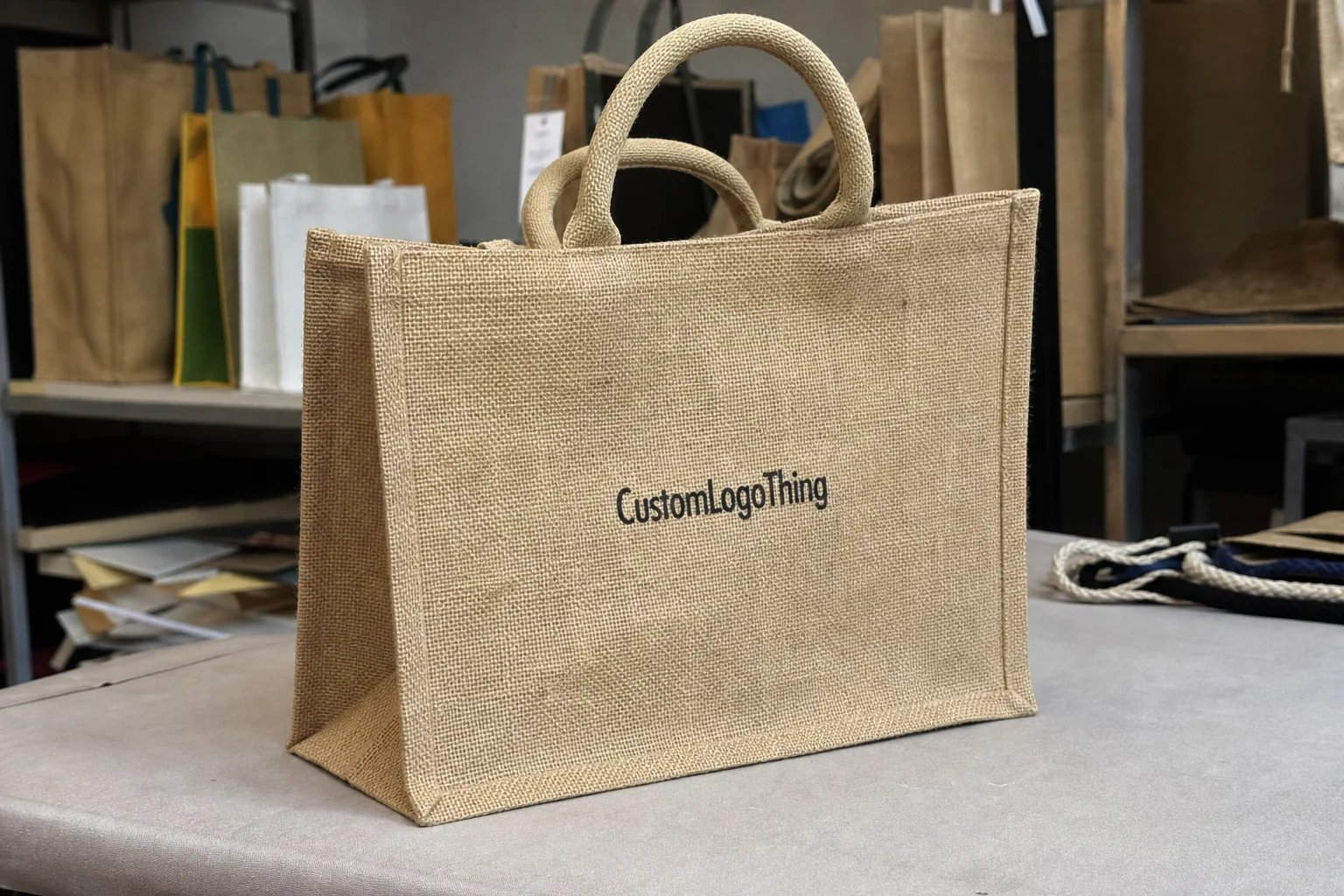
Jute has a tactile, earthy quality that immediately signals something more substantial than a thin nonwoven tote or a basic paper carrier. That matters because packaging is often judged before it is even touched. The surface texture, the natural color, and the weight of the fabric all influence how the brand feels in the hand, which is why jute tends to work especially well for products that want a grounded, thoughtful presentation.
The material also works across more use cases than many buyers expect. A single tote style can serve as Retail Packaging One week, an event giveaway the next, and a corporate gift bag after that, provided the dimensions and build are chosen sensibly. For brands running several campaigns at once, that flexibility is valuable because it reduces the need to spec a completely new bag for every scenario.
Durability is part of the appeal, but it is not automatic. A jute bag with a loose weave, weak stitching, or undersized handles may still look attractive in a product photo while failing in real use. That is why buyers should think beyond appearance and ask what the bag is supposed to hold, how often it may be reused, and whether it will be packed flat, stacked, or displayed before distribution.
The best fit depends on the job. For retail, jute adds shelf appeal and feels more premium than a plain carrier. For conferences, it can hold catalogs, samples, and notebooks without collapsing into a heap. For client gifting, it adds a presentable outer layer that feels intentional rather than improvised. For subscription or bundled product packs, it can work well, although the cost makes more sense when the contents justify the extra packaging layer.
“A jute bag can look expensive or sloppy with the same logo. The difference is usually in the spec, not the artwork.”
How custom jute bag printing and finishing works
Most jute tote builds start with a woven jute body, then add handles, seams, and whatever structure the use case needs. Common options include side gussets for extra volume, base reinforcement for better load support, inner lining for a cleaner interior, and closures such as zippers, button loops, or tie tops. Those details are not just cosmetic. They determine whether the bag feels like a throwaway giveaway or a real carrying solution.
Decoration is usually handled through screen printing, heat transfer, embroidery, or woven labels. Screen printing remains the most common choice because it handles simple logos well and keeps unit costs reasonable on larger runs. One or two colors generally print more cleanly than complex artwork, especially on a coarse fabric. Heat transfer can reproduce more detail in some setups, though it depends heavily on the supplier’s equipment and the jute surface. Embroidery adds a more finished look but increases both production time and cost. Woven labels are useful when the branding needs to be understated, or when the main logo should remain simple while a small label handles the identity work.
The texture of the material changes the outcome more than many first-time buyers expect. Jute is not a smooth surface, so tiny text, hairline strokes, and delicate gradients are risky. They can fill in, break apart, or disappear into the weave. A logo that looks perfect on a website banner may need simplification before it can be printed on a bag that people will view from arm’s length.
Color matching has its own quirks. The base fabric is naturally tan or brown rather than white, and that background affects how inks read. Light colors can wash out, especially if the artwork is small. Darker ink colors usually hold better, and high-contrast designs are easier to reproduce with consistency. If brand colors are critical, Buyers Should Ask for a proof and be realistic about how much adjustment the fabric tone will require.
Before production begins, the usual approval points include:
- Artwork placement and exact print size
- Bag dimensions and gusset depth
- Handle style and handle length
- Decoration method and color count
- Proof or sample, if the finish needs close review
Skipping that step is a good way to discover the wrong logo position or the wrong scale after the bags are already in production. On textured materials, small assumptions tend to become expensive mistakes.
Key factors that affect quality, cost, and order fit
Three variables shape most buying decisions: size, material quality, and branding complexity. The rest usually flows from those. A small gift bag with a single print color is a very different order from a large retail tote with lining, gussets, reinforced handles, and branding on both sides. One is straightforward. The other needs more planning, more proofing, and more realistic pricing.
Bag size and structure come first because the intended contents should dictate the build. Small bags are suitable for jewelry, cosmetics, candles, gift cards, and compact gift sets. Medium sizes are often better for apparel, books, product bundles, and event materials. Larger tote styles suit grocery-style use, multiple products, or heavier boxed items. If the bag must stand upright, carry bottles, or support awkward shapes, gussets and base reinforcement become functional requirements rather than optional extras.
Material quality affects both the look and the longevity of the bag. Weave density influences how sharp the print appears. A tighter weave generally gives cleaner results and feels more refined in the hand. Handle construction matters just as much, especially if the bag will be reused or loaded heavily. Lightweight sewing may be fine for a one-day giveaway, but it will not feel right for retail use where customers expect the bag to last.
Branding complexity changes not only the cost but also the risk of production issues. A one-color logo on one side is simpler than a multi-color print, a wraparound layout, or artwork that has to align across seams. Fine detail can be done, but it needs the right method and a more careful proofing process. Some buyers try to fit an entire identity system onto a tote, then wonder why the artwork starts looking crowded. A bag is useful branding space, but it is still a textile product with manufacturing limits.
Order quantity is where pricing usually starts to move. Higher volumes spread the setup cost across more units, so the per-bag price often drops. Smaller runs cost more per piece because screens, prep work, and production setup do not become cheaper just because the order is small. The challenge is balance: ordering too few may leave you short, but ordering too many creates storage and cash-flow pressure. A mid-sized test order is often wiser if the bag is being introduced for the first time.
Purpose and audience should guide the spec rather than the other way around. A premium client gift deserves cleaner stitching, stronger handles, and better finishing. A conference giveaway can be more basic if the budget is tight. A bag that will be photographed, handed out publicly, and reused often should be specified more carefully than one used only for a single event.
| Use case | Typical spec | Typical unit cost range | Best print method |
|---|---|---|---|
| Trade show giveaway | Medium tote, basic gusset, no lining | $1.20-$2.40 | Screen printing |
| Retail packaging | Stiffer build, cleaner stitching, optional lining | $2.20-$4.80 | Screen print or woven label |
| Corporate gifting | Premium finish, reinforced handles, better presentation | $3.50-$7.50 | Embroidery or print plus label |
| High-volume promo order | Simple structure, one-color artwork | $0.90-$1.80 | Screen printing |
Those figures are working ranges only. Material weight, print coverage, freight, and packaging details can move the final quote in either direction.
Personalized jute bags pricing: what drives unit cost and MOQ
Pricing comes down to a handful of levers, and the first quote rarely tells the full story. The obvious ones are size, material weight, decoration method, and color count. Less obvious details include reinforcement, lining, custom closures, packaging, and whether the factory needs special setup for a nonstandard shape. Those items do not always show up prominently in the first email exchange, but they absolutely show up in the final cost.
Material weight is one of the biggest drivers. A heavier jute weave generally feels better and lasts longer, but it costs more and adds shipping weight. A lighter bag may be suitable for a short-run event handout, while a sturdier weave makes more sense for retail or repeated use. Handle construction matters too. Simple stitched handles are cheaper, but reinforced or padded handles improve comfort and reduce the chance of failure under load.
MOQ tends to frustrate buyers because it is tied directly to setup economics. A small order has to absorb the same artwork prep, screen preparation, and production staging as a larger one, so the price per unit climbs. Larger runs improve the unit price, but only if the inventory can be used in a reasonable time frame. For many buyers, a few pricing tiers are enough to show where the breakpoints sit and whether a modest increase in quantity actually makes sense.
There are also costs that buyers overlook until they are already committed:
- Setup fees for screens, plates, or artwork prep
- Sample charges if a pre-production reference is needed
- Freight, which can matter a lot because jute bags are bulky
- Rush fees for compressed schedules
- Special packaging such as inserts, tissue, or individual polybags
The cheapest quote is not always the best business decision. If the bags are meant for internal event use, a lighter spec may be fine. If they will sit on retail shelves or be handed to high-value clients, the details are visible enough to matter. A lower unit price that causes weak stitching or messy printing is not really a saving.
For sustainability claims, the conversation should stay grounded in the actual specification. Natural fiber alone does not make a product automatically responsible. Buyers who need stronger sourcing documentation can ask whether the fabric or packaging components carry recognized chain-of-custody or sourcing support, and whether the supplier can document what is being used rather than relying on vague language. For broader packaging durability and transit planning, resources from the Packaging Machinery Manufacturers Institute and test references from ISTA can help frame the conversation. The product should support the claim, not the other way around.
Ordering process and timeline: from artwork to delivery
The cleanest orders follow a predictable sequence. Start by confirming the dimensions, fabric, handle style, and decoration method before sending artwork. That order matters. A quote based on unfinished assumptions is only useful in the narrowest sense, and it usually creates more revision work later.
Artwork should be submitted in vector format whenever possible. AI, EPS, and PDF files are preferred because they keep edges sharp and scale properly. If raster artwork is the only option, the file should be high resolution and large enough for print without pixelation. Pantone references or clearly defined brand colors are helpful when color accuracy matters. On jute, exact matching is less predictable than on coated paper, but the closer the reference, the easier the approval process.
Proofing deserves real attention. This is where print placement, size, spacing, and text details get locked in. It is also where many buyers skim too quickly and miss a problem that would have been easy to fix earlier. Check the logo size, the distance from seams, the orientation of handles, and any wording on labels or inserts. Once production starts, the cost of changing those details rises fast.
After approval, the factory moves into production. A typical schedule for standard personalized jute bags is often 12-15 business days from proof approval, although custom construction, sample requests, and busy production periods can add time. Finishing, quality checks, packing, and shipping come after the main build. Rush orders are possible in some cases, but they usually come with higher pricing and fewer customization options. Short deadlines reduce flexibility, and that is true in packaging as well as in most other manufactured goods.
The easiest way to keep the order moving is to keep the core information together in one place:
- Final artwork file
- Bag size and structure
- Print method and color count
- Target quantity
- Delivery address and deadline
That simple reference sheet cuts down on back-and-forth and helps production work from one clean set of instructions.
Common mistakes buyers make with jute tote specifications
The first mistake is sending low-resolution artwork and expecting crisp results on a coarse weave. Jute does not hide bad files. It makes them more obvious. Thin fonts, tiny taglines, and detailed line work often need cleanup before they can be printed with any consistency.
The second mistake is choosing the decoration method without matching it to the artwork. A complex design with multiple tones may not suit screen printing, while embroidery can be overkill for a basic one-color logo. Buyers sometimes ask for the most expensive finish because it sounds premium, not because it fits the actual design. That can waste budget without improving the final bag in any meaningful way.
The third mistake is guessing at the size instead of checking how the bag will be used. It is surprisingly easy to fall in love with a tote shape and forget to measure the products going inside. The result is a bag that looks good but cannot comfortably hold the intended contents. The internal dimensions matter more than the mood board.
The fourth mistake is underestimating handle length and load needs. Short handles can look neat in a mockup, but they may be awkward over the shoulder. Handles that are too lightly built can stretch or fail once the bag is filled with books, bottles, or boxed products. If the bag is going to carry anything heavier than folded apparel, handle reinforcement deserves attention early in the process.
The fifth mistake is skipping the proof or sample because the order seems straightforward. That is the moment when placement problems, spacing issues, and color surprises are easiest to catch. On a material like jute, a digital mockup is not enough to judge the final finish. A small amount of review time can prevent a much larger production headache.
- Ask for a proof with exact dimensions
- Confirm stitch lines and logo clearance
- Check how the bag sits when filled
- Review whether the finish matches the brand mood
Expert tips for better-looking branded jute bags
Keep the design bold and readable. Thick typography, simple icons, and strong logo marks tend to print far better on jute than intricate artwork with lots of fine detail. If the logo includes a small tagline, it is often better to leave that off the bag and use only the main mark. Packaging has to work at a glance, not under a magnifying glass.
Use contrast intentionally. Dark inks usually read well against the natural background of jute, especially black, deep brown, navy, and forest green. Pale colors can work, but they need more care and a cleaner print area to avoid looking washed out. If the material is uneven, contrast becomes even more important because the base tone is doing part of the visual work whether you want it to or not.
Match the build to the campaign instead of trying to make every order premium by default. A one-day event does not need the same construction as a retail bag that a customer will use repeatedly. Premium gifting often benefits from lining, stronger handles, and cleaner finishing. Short-term promo use can usually stay simpler. Overbuilding every order is a quick route to higher costs without much practical payoff.
Ask for print-safe margins and stitch-safe placement. Logos placed too close to seams, corners, or handle anchors can distort when the bag is sewn and turned. A few millimeters of adjustment can make a noticeable difference in the final appearance. Good production teams pay attention to those details because they know the bag will be judged in the hand, not on a design board.
If sustainability is part of the message, the full specification should support it. That includes the bag material, the lining if one is used, the inserts, and the shipping approach. A natural-look bag that arrives wrapped in heavy extra packaging sends a mixed message. Buyers notice that more quickly than brands expect.
For broader sourcing conversations, programs and standards from organizations such as FSC can help frame the discussion when the bag is part of a larger packaging system that includes paper components or inserts.
What to do next before you place an order
Before requesting pricing, gather the basics: logo files, target quantity, preferred bag size, and the intended use. That is enough to get a meaningful quote rather than a rough estimate built on assumptions. It also helps to decide early whether the priority is lowest unit cost, a better presentation, or faster delivery, because those three goals rarely line up perfectly in one order.
Ask for quotes at two or three quantity levels. That reveals the breakpoints and shows whether a slightly larger run is genuinely worth the savings. If the bag finish matters to the customer experience, request a sample, proof, or swatch rather than relying on a screen image alone. Jute’s texture, stitching, and color behavior need to be seen in real material, not just in a mockup.
Keep the approval notes, artwork, and spec sheet together once the order is moving. That prevents confusion if multiple people are involved in sign-off or logistics. For personalized jute bags, the best results usually come from clear specifications, realistic expectations, and enough time to inspect the proof before production starts.
Are personalized jute bags durable enough for repeat use?
Yes, if the weave weight, stitching, and handle construction match the intended load. They work well for retail, events, and gifting, although very heavy daily use may call for stronger reinforcement or a different material blend.
What is the best printing method for personalized jute bags?
Screen printing is usually the most cost-effective choice for simple logos and higher quantities. Embroidery and woven labels can create a more finished look, while heat transfer may suit certain detailed designs if the supplier’s setup supports it.
Why do personalized jute bags cost more at small quantities?
Setup work, screens, and production preparation have to be absorbed across fewer units, so the unit price rises. Minimum order requirements and special finishing options also have a strong effect on smaller runs.
How long does it take to make personalized jute bags?
Many standard orders take about 12-15 business days after proof approval, but custom construction, sampling, and shipping can extend that timeline. Rush schedules are possible, though they often reduce flexibility and add cost.
What artwork works best on personalized jute bags?
Bold logos, thicker lines, and high-contrast designs usually print best on woven jute. Fine text, gradients, and very intricate artwork can lose clarity in the texture and may need to be simplified.

