Personalized self stick address labels look small, but they solve a surprisingly expensive problem: wasted time, messy returns, and packaging that feels inconsistent from one shipment to the next. For clothing brands, these labels sit at the intersection of operations and presentation, which is why the right version can improve both workflow and brand perception without adding much complexity to the pack-out.
Used well, personalized self stick address labels do more than display a name and street line. They can speed up packing, reduce handwriting errors, and make every mailer, thank-you card, or return envelope look intentional. Used badly, they peel, smudge, or distract from the rest of the package. The difference usually comes down to material, adhesive, and format rather than the basic idea itself.
That is why buyers who treat labels as a simple stationery item often end up disappointed. A label is part print product, part packaging component. It has to survive handling, storage, temperature swings, and the pace of a busy packing table. If it is going to sit on a kraft mailer, a coated envelope, or a folded insert, it needs to look right and stay put.
Why personalized self stick address labels still matter
A tiny label can do what a lot of digital tools cannot: make a physical shipment easier to sort, easier to return, and easier to trust at a glance. That matters because shipping labels, return addresses, and branded inserts are often handled in a hurry. The less ambiguity there is on the package, the fewer delays and misroutes you invite.
For apparel businesses, the use cases are broader than many buyers expect. Personalized self stick address labels show up on outgoing mailers, folded clothing boxes, garment tags, packaging inserts, thank-you cards, and return envelopes. If you send wholesale samples, influencer kits, or event mailers, they also help keep your brand presentation consistent even when the contents change.
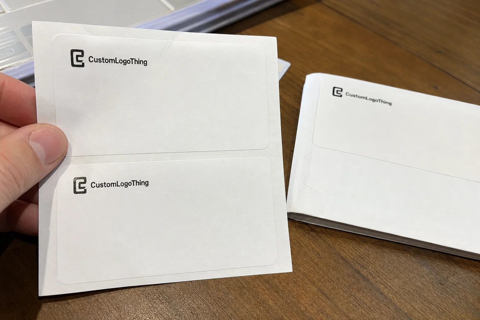
In plain language, these are adhesive labels printed with your business name, return address, logo, or design details. They are built to stick directly to paper, envelopes, tissue, poly mailers, or other packaging surfaces. That sounds simple. It is not always simple in practice.
Why? Because a label that looks fine on screen may perform very differently on a coated mailer, a textured kraft envelope, or a glossy insert. A permanent adhesive, a removable adhesive, a matte stock, and a gloss stock all behave differently. Even the same artwork can feel more premium, or more cluttered, depending on finish and size. A label that is too large can make a package feel crowded. A label that is too small can make the address block hard to scan or difficult for staff to read during a rush.
From a buyer’s point of view, the value is practical: faster packing, fewer handwriting mistakes, more consistent branding, and less cognitive load for the person assembling orders. If one person packs 60 parcels a day and another packs 400, that consistency starts to matter quickly. The label becomes a small standard that keeps the rest of the process from drifting.
“Small branding decisions tend to compound. If the address label is neat, readable, and reliable, the whole package feels more deliberate.”
How the label format works on packaging and mail
Most labels are built from three layers: a printable face stock, an adhesive layer, and a backing liner. The face stock carries the print, so it influences color, sharpness, and finish. The adhesive determines how well the label bonds to the surface. The liner matters because it affects peel speed, especially in high-volume packing. Strip one of those layers out of spec, and the label becomes a headache instead of a help.
The workflow is usually straightforward. A buyer or designer creates the artwork digitally, then the labels are printed in sheets or rolls. A packer peels each label by hand or uses a dispenser, then applies it to the package, card, or envelope. That is a simple process, but speed and consistency improve a lot when the label size, backing format, and adhesive match the actual packing line.
Self-stick labels outperform handwritten addressing once volume rises for one simple reason: legibility never slips when the shift gets busy. Handwriting can be charming on a gift note. It is less charming when a return address gets misread and the parcel comes back or stalls in transit.
For clothing brands, the format also supports different sending scenarios without forcing a presentation change. Direct-to-consumer orders may need a return address on the mailer. Wholesale sends may need branded inserts that still list company details clearly. Event packaging might need a clean, minimal label that does not fight the rest of the design. The label format gives you that flexibility.
Compatibility matters, too. Some brands print in-house using laser or inkjet devices. Others outsource production and choose a finish that matches their packaging system. Thermal printing is common for shipping labels, but not all address labels are meant for thermal use. If you need variable data, ask whether the supplier supports sheet-fed, roll-fed, or print-on-demand setups before you approve the file. That question sounds minor, but it often decides whether the first production run is smooth or full of small corrections.
For broader packaging standards and testing language, the ISTA site is useful. It is not about label design specifically, but it does help frame how packaging should survive handling, vibration, and transit stress.
Key factors that affect durability, look, and fit
The first decision is size. Standard address labels work well for basic return information, but custom dimensions make sense when you need to fit a logo, a second line of messaging, or a narrow envelope flap. Smaller labels are useful for internal packaging, hang tag inserts, and minimal return-address use. Larger labels give you more breathing room and reduce the chance of crowding. If the label is meant to carry a logo and a full return address, leave enough room for the type to breathe instead of forcing everything into a compact block.
Adhesive choice is where many buyers make their first mistake. Permanent adhesive is the default for most shipping and packaging tasks because it stays put on paper, card, and many films. Removable adhesive can work for temporary internal labeling or short-lived promotional use, but it is less common for mailers. If the surface is textured, coated, or slightly uneven, adhesion testing matters even more. A label can appear fine immediately after application and still lift at the corners after a few hours in a warm packing area.
Finishes affect both appearance and readability. Matte stocks are usually easier to read under bright light and faster for staff to inspect. Gloss can feel more premium, but glare can make small type harder to read. Weather-resistant or moisture-tolerant options are worth considering if the package may face condensation, light rain, or rough transit conditions. The right call depends on the actual route the parcel takes, not just how it looks on a mockup.
Design details deserve more respect than they usually get. Typography size should be large enough to read at arm’s length; contrast should be strong enough to hold up on uncoated kraft, white paper, or colored stock; logo placement should not crowd the address block. White space is not wasted space here. It improves scannability and reduces the risk of a label looking overworked. A cleaner composition also tends to reproduce more reliably across paper lots and print methods.
Material choice matters in a more practical sense than many buyers expect. Uncoated paper is easy to read and economical, but it can be less forgiving if moisture is present. A coated face stock can improve print sharpness, though it may change how the adhesive behaves on rough packaging. For labels that are handled often before application, the liner release and adhesive tack become just as important as the print quality. A fast peel can save time; a liner that tears or curls creates friction for the packer.
Ordering format also matters. Sheets are easy for low to moderate volumes and desktop workflows. Rolls can be faster in a busy packing environment. Minimum quantities vary by printer and material, and they can affect the economics of small apparel brands that want to test a new look without committing to a large run. If you already use other branded materials, it helps to make the label match your existing packaging system rather than treat it as a one-off.
| Option | Best for | Typical strengths | Watch-outs |
|---|---|---|---|
| Matte sheet labels | Small runs, office packing, handwritten-style brand systems | Easy to read, tidy finish, simple to store | Slower in high-volume workflows |
| Gloss roll labels | Faster packing lines, premium presentation | High visual impact, efficient dispensing | Glare can reduce readability |
| Weather-resistant labels | Transits with moisture or rough handling | Better durability, stronger surface performance | Higher material cost |
| Removable labels | Temporary internal use | Less residue, flexible applications | Not ideal for shipping and returns |
Personalized self stick address labels: process, timeline, and turnaround
The ordering process is usually simple, but small errors create delays. Start by choosing the size and shape, then upload artwork or enter address details, approve the proof, and move into production. If the label is variable-data, such as many different addresses in a batch, confirm the file format early. CSV and spreadsheet structures often save time later, but only if the data is clean.
Typical turnaround depends on whether the job is digital, offset, or a specialty print run. Short-run digital labels can move quickly once proofs are approved. More decorative finishes, custom shapes, or laminated stocks may add time. In general, buyers should expect faster production when artwork is final, logos are vector-based, and the address list is standardized.
What slows projects down most often? Missing fonts, low-resolution logos, unclear quantity requirements, or a proof that gets revised three times because the address block was never settled internally. Those issues are boring, but they are the ones that push delivery dates.
Short-run orders are often better for testing. Larger runs can lower unit cost, but they also lock you into a visual system. If you are preparing for a seasonal clothing drop, a trade show, or a holiday mailing, give yourself a buffer. Standard production windows vary, but many buyers build in 12 to 15 business days from proof approval, then add shipping time on top. Rush options may be available, though they often come with an additional charge. If a supplier quotes a faster window, ask whether that time includes proofing, print, finishing, and outbound shipping or only the press schedule.
There is also a practical difference between a label that is “approved” and a label that is ready for production. A proof may show the layout correctly, but it will not always reveal edge bleed, finish glare, or how the adhesive behaves on the final packaging surface. That is why a physical sample, even a small one, is so valuable before a larger reorder.
If you are checking broader material claims, labels made with paper from responsibly managed forests can align with FSC-certified sourcing. The FSC organization explains how that certification works and what it does, and does not, cover.
Cost, pricing, and MOQ: what buyers should compare
Price is driven by five main factors: quantity, material, adhesive, finish, and whether the labels are standard printed pieces or variable-data labels. The more custom the job, the more likely the price reflects setup and handling as much as the paper itself. Buyers sometimes focus only on unit price and miss the bigger picture: total cost against labor saved.
Per-unit cost usually drops as quantity rises. That said, premium stocks and specialty coatings can flatten those savings. For example, a simple paper matte label in a larger run may land far below a laminated or moisture-resistant version, even if both look similar from a distance. The right comparison is not just between suppliers; it is between your current packing method and the time a label system can save.
MOQ, or minimum order quantity, matters because it shapes both testing and storage. A small apparel brand may not want 5,000 labels sitting in a drawer if its branding is still evolving. On the other hand, ordering too little can make reordering inefficient, especially if you already know the design will stay stable through multiple drops.
Watch for hidden costs. Proof fees, setup charges, shipping, and reprints caused by artwork mistakes can quietly inflate a quote. Some suppliers bundle those items; others do not. Ask for the full landed cost, not just the base print price.
Here is a practical budgeting lens: if labels save even 20 to 30 seconds per package, the labor value can become meaningful fast. Multiply that by 100 orders, then by a month of shipping days, and the savings can offset a modest premium for a better stock or cleaner finish. That is especially true for brands that pack in-house rather than through a third-party fulfillment center.
For small brands, price sensitivity is real, but so is the cost of inconsistency. A label that smudges or peels may look inexpensive on paper and expensive in practice once returns, reprints, or manual corrections enter the picture. A buyer comparing three quotes should separate actual print cost from the operational cost of using the label every day.
| Price factor | Lower-cost choice | Higher-cost choice | Buyer impact |
|---|---|---|---|
| Quantity | Small test run | Large batch | Higher volume usually lowers unit price |
| Material | Standard paper stock | Durable or weather-resistant stock | More durability, higher cost |
| Finish | Matte | Gloss or specialty coating | Premium look, possible readability trade-off |
| Format | Sheet labels | Roll labels | Rolls can improve speed in busy workflows |
Step-by-step ordering checklist for clothing brands
Step 1: Audit the use case. Are you printing shipping return addresses, internal packaging labels, thank-you card seals, or event mailers? The answer determines the size, finish, and adhesive you need. A label that works on an envelope may not be ideal for a poly mailer with texture.
Step 2: Gather the essentials before you Request a Quote. That means logo files, exact address text, preferred label dimensions, color palette, and any regulatory or postal needs. If your brand uses multiple SKUs, decide whether the labels need to support one address or several. The cleaner the input, the faster the proof stage.
Step 3: Decide on quantity and format based on monthly order volume and storage space. If you ship 80 parcels a month, a massive run may be unnecessary. If you ship hundreds, a roll format may save enough handling time to justify the purchase. This is where personalized self stick address labels start to become an operations tool, not just a branding item.
Step 4: Review the proof with a production mindset. Check spelling, line breaks, logo sharpness, color accuracy, and whether the address will remain readable when applied to the actual packaging. If there is a barcode or postal line, confirm quiet space and contrast. One small typo can ruin a whole batch.
Step 5: Test a small sample on real packaging before scaling up. That means the actual envelope, mailer, tissue wrap, or box, not a random sheet on your desk. You want to see how the adhesive behaves after a few minutes, whether the corners lift, and whether the finish matches the rest of the brand presentation.
Step 6: Build a reorder note for your team. Record the final size, stock, adhesive, finish, and approved artwork version so the next purchase does not rely on memory. That one habit prevents a lot of avoidable mismatches between old and new runs.
A simple pilot order can prevent a lot of avoidable waste. The goal is not perfection on paper. The goal is performance in your packing area.
Common mistakes and expert tips for better results
One common mistake is choosing a finish because it looks great in a mockup, then discovering it gets hard to read under warehouse lighting or with shipping labels layered nearby. Gloss can do that. So can overly dark backgrounds. Readability should win over decoration.
Another mistake is picking an adhesive that is too aggressive for delicate packaging or too weak for textured surfaces. If the label is going on coated stock, poly mailers, or rough kraft, ask how the adhesive behaves on each. There is no universal answer, which is why sample testing matters.
Buyers also overload the label. More information does not always improve function. In many cases, the best design is the one that prioritizes the business name, return address, and brand mark, then leaves room around the type. That white space helps the label feel cleaner and easier to scan.
Contrast is another easy fix that gets overlooked. Dark text on a light field tends to work best for quick recognition. If your branding relies on a dark background, increase font size and simplify the layout. Decorative type has a place. The return address field is not it.
My strongest practical tip: standardize one label template across SKUs whenever possible. That makes replenishment easier, reduces reorder errors, and keeps the packaging system predictable. It also helps small teams train faster because there is one process, not five.
Keep print tolerances in mind as well. Small fonts, thin hairlines, and tightly stacked logos are the first things to suffer if the artwork is not prepared correctly. A clean vector file, sensible margins, and enough contrast usually produce a better result than any amount of decorative detail.
For buyers who want a broader packaging system, pairing labels with other branded components can tighten the overall presentation. If you are refreshing your mailers, inserts, or hang tags, it can make sense to keep Custom Labels & Tags aligned with the same visual rules.
You can also use packaging best practices from organizations like the EPA when choosing materials with a lower environmental burden. Their packaging guidance is broad, but useful if you are comparing material claims or waste reduction strategies: EPA waste reduction guidance.
Next steps: choosing the right label spec and placing the order
The decision path is straightforward if you keep it practical. Confirm the use case, Choose the Right size and finish, select an adhesive based on the actual packaging surface, and set the quantity according to reorder frequency. Then compare suppliers on price, MOQ, turnaround, and material notes, not just on a single line item.
A simple comparison sheet can save time. List each supplier option side by side with cost, proofing process, production window, stock type, and whether the labels work in sheet or roll format. The best quote is not always the cheapest; it is the one that fits your workflow without creating extra handling or reprint risk.
If you are unsure, place a small pilot order first. Test print clarity, peel speed, and adhesion on the real packaging you use every day. That small test usually reveals more than a polished mockup ever will.
From a brand standpoint, the right label should feel like part of the system. That includes the mailer, the insert, the hang tag, and the address block. Personalized self stick address labels should save time, reduce errors, and keep every shipment looking deliberate. If they do that, they have earned their place in the pack-out.
What makes personalized self stick address labels different from regular mailing labels?
They are usually branded and customized with your return address, logo, or design elements instead of being plain utility labels. Buyers can also choose materials and finishes that better match clothing packaging and presentation. In addition, they may be ordered in sheets, rolls, or variable-data formats, depending on workflow.
How do I choose the right size for personalized self stick address labels?
Match the size to the amount of information you need to display and the surface area of the package or envelope. Smaller sizes work well for minimal return-address use, while larger labels help if you want a logo plus address text. Testing a sample on the actual packaging is the safest way to confirm readability and placement.
What adhesive should I use for clothing packaging and mailers?
Permanent adhesive is best for most shipping and packaging applications where the label must stay in place. Removable adhesive may suit temporary internal labeling, but it is less common for mailing. Surface texture matters, too, because coated, glossy, or uneven packaging can change how the adhesive performs.
How much do personalized self stick address labels usually cost?
Cost depends on quantity, material, finish, and whether the labels are standard or custom-shaped. Per-unit pricing usually drops as order size increases, but specialty stocks or finishes raise the total. Buyers should also factor in setup, proofing, shipping, and the labor saved by faster packing.
How long does the process usually take from proof to delivery?
The timeline depends on artwork readiness, proof approval speed, printing method, and shipping distance. Simple orders can move quickly, while custom materials or revisions add turnaround time. Planning extra time is smart for seasonal launches, trade shows, and high-volume clothing mailings.
Can these labels be used on textured or coated packaging?
Yes, but the adhesive and face stock need to be chosen with the surface in mind. Textured kraft, coated mailers, and glossy inserts all behave differently, so a sample test matters before you commit to a full run. The same artwork can perform well on one package and fail on another if the material match is poor.

