Buyer Fit Snapshot
| Best fit | Poly Mailers Design projects where brand print, material claims, artwork control, MOQ, and repeat-order consistency need to be specified before quoting. |
|---|---|
| Quote inputs | Share finished size, material target, print colors, finish, packing count, annual reorder estimate, ship-to region, and any compliance wording. |
| Proofing check | Approve dieline scale, logo placement, barcode or warning zones, color tolerance, closure strength, and carton packing before bulk production. |
| Main risk | Vague material claims, crowded artwork, missing packing details, or unclear freight terms can make a low unit price expensive after revisions. |
Fast answer: Poly Mailers Design: Film, Print, MOQ, and Carton Packing should be specified like a repeatable production item. The safest quote records material, print method, finish, artwork proof, packing count, and reorder notes in one written spec.
Production checks before approval
Compare the actual filled-product size with the drawing, then confirm tolerance on folds, seals, hang holes, label areas, and retail display edges. Reserve space for logos, QR codes, warning copy, and material claims before decorative graphics fill the panel.
Quote comparison points
Review material grade, print process, finish, sampling route, tooling charges, carton quantity, and freight assumptions side by side. A quote is only useful when the supplier can repeat the same color, closure quality, and packing count on the next order.
Cheap packaging gets judged in about two seconds, and in a Shenzhen warehouse I watched a retailer toss a flimsy gray mailer into the trash before the parcel was even opened, then saw the customer do the same thing later on camera. That single moment said more than a dozen strategy decks ever could. It is exactly why Poly Mailers Design Tips are not about making a bag “pretty”; they are about making a product feel worth opening, even when the bag costs only $0.14 to $0.22 per unit on a 5,000-piece run.
I’ve spent years on factory floors in Dongguan, in proofing rooms in Ningbo, and in supplier meetings in Yiwu where one extra color added $0.03 to $0.05 per unit on a 10,000-piece order and suddenly the margin plan started wobbling. That is where a lot of brands panic, then overcorrect in the wrong direction and end up paying more for a worse result. So yes, poly mailers design tips matter because they shape brand perception, shipping cost, production quality, and whether your mailer looks premium or like a last-minute bargain-bin decision.
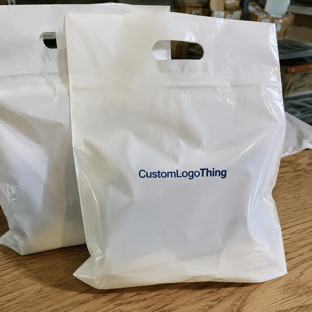
For Custom Logo Things, I’d describe a poly mailer as simple on the surface and surprisingly technical underneath. It is usually a lightweight shipping bag made from polyethylene film, often LDPE, LLDPE, or co-extruded film, used for apparel, accessories, soft goods, and other non-fragile items. A common production spec is 2.5 mil to 3.5 mil thickness, with matte, glossy, or recyclable film options depending on the factory in Shenzhen, Guangzhou, or Suzhou. Design matters because the mailer is usually the first physical thing a customer touches, and if it looks sloppy, the relationship starts on the wrong foot.
The basic options are plain mailers, printed mailers, and fully branded custom mailers. Plain mailers are cheap and functional, which works if your brand voice is deliberately invisible. Printed mailers usually show a logo, a single brand color, or a repeating pattern, while custom mailers are built around your logo, brand palette, size, finish, and shipping workflow. Good poly mailers design tips help you Choose the Right level without paying for decorative flourishes you do not need, especially when a simple one-color print can stay around $0.15 per unit for 5,000 pieces while a more complex two-color run can climb closer to $0.24 or $0.31 depending on the film and the supplier in Guangdong.
Most people get it backward. They start with artwork before they decide on the mailer size, print method, or budget, and that is how they end up redesigning a bag three times and paying for setup twice. Smart poly mailers design tips focus on five things: print method, color count, placement, sizing, and production cost. In a real factory quote from Quanzhou or Dongguan, those five inputs usually explain 90% of the final result, and everything else hangs off those decisions.
Poly Mailers Design Tips: Why Good Packaging Gets Noticed
I once sat with a DTC apparel founder who ordered glossy black mailers with tiny silver text because “minimal” sounded premium. The problem was that under warehouse lighting in Guangzhou, the silver text vanished at a glance, so customers saw a black bag with faint decoration, not a luxury brand. That meeting cost her a reprint, a two-week delay, and a long explanation about contrast that was probably less painful than the invoice. Good poly mailers design tips start with visibility, not mood boards.
A poly mailer is a shipping bag, but it also acts like a tiny billboard on a porch, in an apartment lobby, or on a warehouse shelf. If a customer sees it before opening the parcel, the design can trigger brand recognition in less than a second, and that matters for ecommerce branding, repeat purchases, and social sharing. People absolutely judge a bag by its exterior, especially when the package is traveling through Los Angeles, Dallas, or Chicago and may be photographed before the tape is even cut.
Plain mailers are the bare minimum because they do the job and disappear. Printed mailers usually show a logo, a brand color, or a pattern, while branded custom mailers go further with tailored sizing, special finishes, and artwork placement that fits the customer journey. Strong poly mailers design tips help you move from “generic shipping” to “intentional brand touchpoint” without turning the bag into a magazine cover that costs $0.20 more per unit for no practical reason.
There is a trap here. A lot of founders think “premium” means more graphics, more shine, and more messaging, but that is usually wrong. Premium often means cleaner spacing, stronger color discipline, and fewer distractions. I saw one fashion brand switch from a six-color print to a two-color layout on a matte 3 mil film sourced from a factory outside Shenzhen, and the packaging looked more expensive even though the unit price dropped by about $0.05. That is the kind of result good poly mailers design tips can create.
Set your expectations properly, because design is not just artwork. It is print behavior, film finish, adhesive closure, tear resistance, and whether the packaging survives conveyor belts, rain, and rough handling from the carrier. If a mailer tears at the seam during a 1,200-mile transit route, nobody cares how elegant the logo was. I’ve had buyers try to rescue a weak bag with a better graphic, and that never works because UPS or USPS will not be impressed by beautiful typography.
For basic reference, ISTA packaging test standards are worth knowing if your shipments are fragile or experience rough transit, and the Packaging School and PMMI ecosystem is full of practical packaging education. I am not saying every ecommerce brand needs to memorize standards, but the shipping world does not care about your nice design if it fails transit between the factory in Zhejiang and the customer in Atlanta.
How Poly Mailers Design Tips Work in Real Production
Artwork does not magically become a mailer; it moves through a production path, and every step can change the outcome. The usual flow is artwork file, supplier review, proof, plate or print setup, production, inspection, packing, and shipment, and if you skip a step the factory will remind you with a mistake you will pay for. In Dongguan and Ningbo, I have seen more than one order delayed because someone approved a mockup without checking the real dieline and the seal area.
Most suppliers ask for vector files because vector artwork stays crisp at any size, usually in AI, EPS, or a print-ready PDF with outlined fonts. If you send a low-resolution JPG of a logo pulled off your website, the edges can blur and the letters can break apart near the trim line. The factory can sometimes clean it up, but that is a favor, not a standard service, and the same goes for bleed margins and safe zones because machine cutting in Guangzhou is not telepathy.
Printing method changes what your design can do. Flexographic printing is common for large-volume mailers and works well for simple logos, solid colors, and repeat patterns, especially on runs of 10,000 pieces or more. Gravure printing handles rich coverage and consistent results on bigger volumes, but tooling costs are higher and setup can take 7 to 10 business days before the first usable proof. Digital printing is useful for shorter runs or designs with more detail, though the unit cost can rise quickly on larger quantities. Good poly mailers design tips always match the artwork to the print method instead of forcing a trendy design into the wrong process.
If you want tiny gradient shadows, hairline text, and photographic detail on a 5,000-piece run, expect a difficult conversation in Dongguan or Xiamen. I have had that conversation while staring at a proof that looked gorgeous on a monitor and impossible on film. The printer is not being dramatic when they say the design is too complex for the film and the chosen method; they are protecting your money from being wasted on a batch that would only look good at arm’s length on a screen.
Material finish matters too. A matte film absorbs light differently than glossy film, so the same Pantone color can look deeper or flatter depending on the substrate. Thickness matters as well: a 2.5 mil mailer feels noticeably lighter than a 3.5 mil mailer, and opacity can affect how the underlying film tone changes the print. That is why good poly mailers design tips always include material specs, not just artwork advice, because the material and the artwork are partners, not strangers.
Suppliers ask for Pantone references because “bright blue” is not a color spec. I once negotiated a run where the client wanted a “clean luxury white” on a recycled film that had a slight gray cast, so we shifted the artwork one step darker to keep it from looking muddy under the fluorescent lights in the Shanghai sample room. That kind of adjustment is routine in real production, and it usually takes one proof cycle of 3 to 5 business days to get right. It is not a defect. It is the job.
| Print Method | Best For | Typical Setup | Design Limits | Cost Impact |
|---|---|---|---|---|
| Flexographic | Simple logos, repeat patterns, solid fills | Plate setup, proof review | Fine gradients and tiny text may lose clarity | Good for larger runs; setup is moderate |
| Gravure | High-coverage branding, consistent color output | Higher tooling investment | Best with planned artwork and stable volumes | Higher upfront cost, better efficiency at scale |
| Digital | Short runs, variable designs, quick testing | Lower setup, faster proofing | Can raise unit price on larger quantities | Flexible, but not always cheapest |
One more practical point: if your supplier cannot explain the bleed, color mode, and printable area in plain language, keep shopping. You need a partner who can tell you why a 2 mm shift in artwork placement matters, because that tiny change can decide whether the logo sits cleanly above the seam or gets clipped by the cutter. That is not pedantry. That is how you avoid boxes of unusable inventory in a receiving bay in Long Beach or Newark.
Key Factors That Shape Poly Mailers Design Tips
Brand consistency comes first. Your logo size, font choice, color palette, and layout should feel like they came from the same company that built your website, inserts, and thank-you cards. If your site uses warm beige and deep charcoal but your mailer screams neon teal, the package feels disconnected, even if the print itself is sharp and the factory in Foshan did excellent work. Clean poly mailers design tips keep the brand story tight.
Usability comes next. A mailer needs room for the shipping label, return address, barcode, and sometimes a tear strip or double adhesive seal. If you print over the label area, the carrier may cover your logo with a white sticker the size of a sandwich, and that is not elegant. Practical poly mailers design tips always account for label placement before artwork placement, especially on a 9 x 12 or 10 x 13 format where the front panel is already doing a lot.
Cost is the part everyone wants to ignore until the quote arrives. More colors usually mean more setup or more production complexity, and larger print coverage means more ink plus stricter register control. Custom sizing can also change the die or film usage. If you order 5,000 pieces, a mailer might land around $0.18 per unit in a simple one-color format, while a more complex two-color full-coverage version could move closer to $0.24 to $0.31 per unit depending on the supplier, film thickness, and whether the run is coming out of Shenzhen or Quanzhou. Those numbers are not universal, but they are real enough to shape decisions.
Volume changes everything. A 3,000-piece order can look expensive because setup is spread across fewer units, while a 20,000-piece order often brings the per-piece cost down sharply. I negotiated one order where the price fell from $0.29 to $0.16 per unit just by moving the customer from 4,000 pieces to 18,000 pieces and simplifying the print from three colors to two. That is the economics behind smart poly mailers design tips, and the arithmetic is boring but undefeated.
Timeline matters too. Sampling, proof approval, plate setup, printing, inspection, and freight can take longer than a founder expects. I have seen “urgent” launches stall because the design file had missing fonts and the supplier needed another round of proofing, which pushed a nominal 10-business-day schedule into 12 to 15 business days from proof approval before freight even started. If you need a seasonal drop, do not start the artwork conversation two days before the launch event, because panic has terrible project management skills.
Durability and compliance round out the list. Ink adhesion should hold through normal handling, and moisture resistance matters if your parcels might sit on a wet dock or porch in Miami, Seattle, or Liverpool. If sustainability is part of your pitch, ask about recycled content, recyclable film options, and how those choices affect print performance. The EPA recycling guidance is a useful baseline if you are comparing material claims and local recycling realities.
Here is a simple decision checklist I use with clients:
- Logo visibility: Can someone identify the brand from 6 feet away?
- Label space: Is there a clean area for shipping labels and barcodes?
- Color count: Can the design be simplified without losing the brand feel?
- Size fit: Does the mailer match the product, or is it oversized?
- Transit durability: Will the seal and film survive rough handling?
Those five items sound basic, and that is exactly why they get skipped so often. Good poly mailers design tips are usually boring in the best way because they reduce risk, protect margin, and make the package look intentional.
Step-by-Step Poly Mailers Design Tips for Better Artwork
Step 1: define the job of the mailer. Is this packaging meant to feel luxury, playful, minimalist, eco-conscious, or purely functional? I ask that question first because it changes everything else. A luxury beauty brand in Seoul and a warehouse supply company in Houston should not be using the same visual language, and the same applies to poly mailers design tips because the design approach must match the product category and customer expectation.
Step 2: choose the size before the layout. People love designing a mailer in Photoshop and then discovering their actual product needs a larger gusset, a different width, or a stronger seal zone. Measure the product, include any inserts, then choose a finished mailer size. If you are shipping apparel, the folded dimensions matter; if you are shipping books or flat accessories, thickness matters. Design around reality, not around a mood board created at 11 p.m. in a rush.
Step 3: keep the logo bold and readable. Your mailer is not a billboard on Sunset Boulevard. It is a package that may be viewed at arm’s length or from a hallway camera in an apartment building in Brooklyn or Austin. Strong contrast and simple logo placement usually work better than delicate decoration. One of my favorite poly mailers design tips is to make sure the logo can survive being printed at 60% of the bag width and still remain crisp. If it looks fuzzy at proof stage, it will look even more tired on the finished bag.
Step 4: use a limited palette. Two colors can look more expensive than five if the art direction is strong. I once helped a skincare brand move from a three-color gradient to a black-and-cream system on matte film sourced from a factory in Dongguan, and the result looked cleaner and more premium. The quote also dropped by about $0.06 per unit. Sometimes the most attractive design is the one that prints well and costs less, which is inconvenient for people who believe more color automatically means better design.
Step 5: respect the safe zone, bleed, and print boundaries. Most factories will give you a dieline or layout guide, and you should use it. Do not place important text too close to the trim edge, and keep critical elements away from seams, adhesive areas, and label zones. If the supplier says the top 20 mm may be affected by sealing, believe them because they have probably seen 500 people ignore that warning. I have seen the result, and it is not pretty.
Step 6: build the file in print-safe format. That means vector logos, outlines on fonts, color values set correctly, and images at proper resolution if photos are involved. If you are using images, 300 DPI at final size is the common benchmark, while anything below 150 DPI usually starts to look soft on film. Strong poly mailers design tips reduce that risk before production starts, which is much cheaper than discovering the problem after 8,000 bags have been printed.
“The best custom mailer is the one that looks simple because all the hard decisions were made before printing.”
Step 7: request proofing the smart way. A digital proof is helpful for layout, but not always for exact color, especially on matte recycled film or glossy co-extruded material. A physical sample is better if you care about color fidelity, texture, or how the label area works in practice. I always tell clients to check the proof under real lighting, not just on a phone screen, because the same color can read differently under 4,000K warehouse LEDs and daylight near a dock door.
Step 8: approve production only after confirming the logistics. Ask for carton count, bag count per carton, shipping method, and lead time. If your order is 10,000 pieces in 500-piece cartons, you should know how many cartons are coming and where they will land. I learned that the hard way on a client project where the cartons arrived split across two pallets and nobody had reserved receiving space in the warehouse outside Philadelphia. A simple question would have saved two hours of chaos and a lot of muttering at the dock.
If you want to browse additional packaging options while planning your mailers, our Custom Packaging Products page is a good place to compare materials, formats, and finishing styles. And if you are already locked into the mailer format, our Custom Poly Mailers page shows what can be customized without overcomplicating the order.
One practical rule I use: if your design cannot be explained in one sentence, it is probably too busy for a poly mailer. “Black mailer, white logo, centered placement, shipping label on the right” is easy to produce in a factory in Shenzhen or Yiwu. “A diagonal gradient with tiny taglines and decorative borders” is usually where the trouble starts. Simple wins more often than designers want to admit, and that is one of the most useful poly mailers design tips I can give you.
Common Poly Mailers Design Mistakes to Avoid
The biggest mistake is stuffing too much text onto the bag. Mailers are not brochures, and customers do not want your mission statement, your return policy, your customer service hours, and your holiday promo all on the front panel. I saw one brand try to print a 48-word paragraph on a 10 x 13 mailer produced in Jiangsu, and it looked like a legal disclaimer got lost in a design meeting. Keep the message focused.
Weak contrast is another classic problem. Light gray on translucent white film can disappear, and pale gold on glossy silver can look elegant in a mockup while becoming invisible in transit lighting. If you want the packaging to read from a distance, choose contrast that survives warehouses, porches, and bad camera exposure in places like Phoenix, Toronto, or Birmingham. Strong poly mailers design tips always prioritize readability over designer ego, and I say that with love and a little scar tissue.
Another mistake is ignoring the shipping label. If the main front panel is already crowded, the label will cover something important and the mailer will look like it was assembled by somebody in a hurry. Put your label zone into the design plan from day one, not after the artwork is finished and not “we’ll figure it out later,” because later is how mistakes become inventory sitting in a storage unit for six months.
Overcomplicated graphics cause problems too. Tiny lines, delicate shadows, and complex gradients can break down during print setup. Flexographic and gravure processes both have limits, and thin details can muddy on film when the press in Dongguan is running at speed. I remember one accessory brand that wanted a watercolor border, but the printer called twice because the detail was too soft on the sample. We simplified it to two solid bands, and the final bags looked better anyway.
Skipping sample checks is a costly habit. A proof on screen can hide issues with scale, opacity, and alignment, while a physical sample can reveal that your logo sits too close to the bottom seal or that the adhesive strip overlaps the printed design. That is the kind of mistake that burns cash at scale, especially if the run is 15,000 pieces and the factory is already scheduled for another job. Good poly mailers design tips always include a sample stage, even if the client is impatient.
Ordering the wrong quantity or wrong size is the last big one. If the first run is too small, you pay more per piece and may have to reorder quickly at higher rates. If the mailer is too large, the product swims in it and the customer notices; if it is too small, packing becomes annoying and the seal gets stressed. I have watched teams pay for a second redesign just because nobody measured the folded garment width, which is painful, completely avoidable, and absolutely noticeable to the packing crew.
Here is the blunt version of the mistake list:
- Too many words on the mailer.
- Low-contrast colors that fade visually.
- Artwork that conflicts with label placement.
- Details too fine for the print method.
- No physical sample before production.
- Wrong bag size or wrong order quantity.
If you avoid those six errors, your chances of getting a clean, premium-looking result go way up. Not because the process is fancy, but because the process is disciplined. That is the unglamorous heart of strong poly mailers design tips.
Expert Poly Mailers Design Tips From Factory Visits
After enough factory visits, you start noticing the same patterns. The best-looking mailers are usually not the most complex, they are the most considered. A smart design uses fewer colors, stronger contrast, and a layout that respects how the mailer is actually handled by workers, machines, and carriers in warehouses from Shenzhen to Los Angeles. I have seen a one-color bag outshine a five-color bag simply because the one-color version had better balance.
Keep your logo bold and centered unless your brand identity genuinely needs a different arrangement. Centered placement gives the bag a strong visual anchor, and it also helps if the mailer gets folded, stacked, or partially covered by labels. I learned that during a negotiation with a supplier in Zhejiang who suggested moving the logo lower to reduce print waste, but when we tested both versions, the centered layout looked better and made the brand easier to identify at a glance.
Do not cram every brand detail onto the front panel. One strong message is enough. If your customer opens the parcel and sees a clean logo, a matching insert, and a sensible return label, they already understand the brand, and you do not need to shout through the packaging. I have watched brands oversell on the outside and underdeliver on the inside, which is exactly backwards. A quiet, clean mailer can feel more premium than a noisy one, especially at a landed cost of $0.16 to $0.23 per unit on mid-size orders.
Ask early about MOQ, setup fees, and plate charges. That conversation saves time and embarrassment. I once reviewed quotes for a startup that compared a $0.14 per unit number from one supplier to a $0.21 per unit number from another and assumed the first quote was cheaper, but the lower quote excluded setup and sample fees that added another $280 on a small run. The second supplier was actually the better deal, and real poly mailers design tips include price transparency, not just artwork advice.
Lead times deserve respect. Even a straightforward mailer can need a proof, a color check, and production scheduling before it ships. If a supplier says 12 to 15 business days after proof approval, that is not a marketing line, it is the window, and you should still add freight time on top. I have seen launch timelines collapse because someone assumed production would start before the artwork was signed off, but factories in Qingdao or Shenzhen are not psychic and they wait for approval.
Sustainability claims should be treated carefully. If you want recycled content, ask exactly how much PCR material is in the film and whether it affects print quality or seal performance. Recycled films can sometimes have more visual variation, which is not a defect if you expect it, and if the goal is to support a lower-impact story, ask for specifics and documentation. FSC applies more to paper packaging, but if you are combining paper inserts or cartons with poly mailers, the certification chain still matters.
“Premium packaging is not about spending the most. It is about removing the parts that make the package look cheap.”
One more thing from the floor: check the mailer in real light, not studio light or a design software preview. Factory fluorescents, warehouse LEDs, daylight near a loading dock, and the hallway outside a customer’s apartment all tell the truth about a print. I’ve literally held samples up near a rolling door at 3 p.m. because that is where the customer will eventually see them, and that habit has saved more than one job. It is a very unglamorous version of quality control, but it works.
Next Steps to Apply Poly Mailers Design Tips Correctly
Start with an audit of your current mailer. Measure the finished size, note the film thickness, check the print clarity, and ask whether the design matches your current brand voice. If you are using a generic white bag with a small black logo, that may be fine, but if your brand is trying to feel premium and the mailer still looks like office supplies, you have a gap to close. Practical poly mailers design tips begin with honest assessment.
Next, write a one-page design brief. Keep it tight. Include your logo files, Pantone references if you have them, preferred bag size, target quantity, must-have features, and any label placement rules. If you want recycled material, say that too, and if your product includes inserts, mention the insert dimensions. A clean brief prevents three unnecessary email loops and at least one annoyed supplier reply, which is a useful win when you are trying to keep a project moving in Guangzhou or Ningbo.
Then request quotes from at least two suppliers. Compare not only unit price, but also setup fees, plate charges, sample costs, shipping method, and lead time. I have seen clients chase the lowest number and regret it after hidden charges showed up, because a quote for 10,000 units at $0.17 per unit means something very different if another supplier is $0.19 per unit but includes proofing, carton labeling, and faster turnaround. Good poly mailers design tips include cost comparison, not just artwork advice.
Ask for a proof or sample before you commit. If the supplier cannot provide one, you are taking on more risk than you need. Check logo placement, color accuracy, seal area, and label compatibility, then inspect it under normal lighting and handle it the way the warehouse will handle it. I know that sounds obvious, but somehow it still gets skipped, and humans love skipping the obvious and then acting surprised later.
Finally, lock the production schedule and create a reorder plan. If the mailers work well, you do not want to start from scratch every time, so save the final dieline, the approved color specs, the supplier contact, the carton count, and the production notes. That way, the next round is quicker and usually cheaper. My favorite clients are the ones who treat packaging like an asset instead of a one-off purchase, because that is where smart poly mailers design tips pay back.
For brands building a broader packaging system, it helps to think beyond the mailer itself. The insert card, tissue, label, and outer shipper should all support the same visual language, and if you want to compare formats or build a fuller packaging stack, our Custom Packaging Products page can help you map the pieces together without guessing.
And if you are ready to move from plain shipping bags to branded packaging, our Custom Poly Mailers page is a solid starting point for sizing, artwork planning, and production options. The right mailer does not have to be expensive; it just has to be designed with enough discipline to avoid the usual mistakes.
That is the real value of poly mailers design tips: better branding, fewer production errors, lower waste, and a package that feels intentional the second it lands in someone’s hands. Keep the design clean, keep the specs realistic, and do not approve a glossy proof without checking how it looks on the actual film from the factory in Shenzhen, Dongguan, or whichever region is making your order.
FAQs
What are the best poly mailers design tips for small brands?
Start with a bold logo, one main brand color, and a clean layout, then keep text minimal so the mailer looks polished instead of crowded. Choose a size that fits your product tightly enough to feel intentional, whether that is a 9 x 12 mailer for apparel or a 10 x 13 bag for bulkier items. If you can make the bag look like it belongs to your brand without shouting, you are already ahead of a lot of bigger names.
How do poly mailers design tips affect cost?
More colors, larger print coverage, and custom sizing usually raise unit price, while higher order quantities often lower the per-piece cost. A simple one-color 5,000-piece order may land near $0.15 to $0.18 per unit, while a fuller two-color design can rise into the $0.24 to $0.31 range depending on film thickness and supplier location. In other words, a beautiful design that prints like a headache will usually cost more than the cleaner version the factory can actually run without drama.
How long does the poly mailers design and production process take?
Artwork prep and proofing can take a few days depending on revisions, and production often runs 12 to 15 business days from proof approval for a standard order. Shipping time adds extra days, especially if the order is moving from a factory in Guangdong to a warehouse on the East Coast. If you leave it too late, the calendar will not feel sympathy, and it never does.
What file format is best for custom poly mailers?
Vector files are usually best because they stay sharp at any size, and suppliers often prefer AI, EPS, or PDF files with outlined fonts. High-resolution images are needed if your design includes photos or textures, and a 300 DPI file at final size is the common benchmark. If you are unsure, ask the supplier to confirm the file specs before you send anything final.
Can I use poly mailers design tips to make cheap packaging look premium?
Yes, by using strong contrast, clean typography, and limited colors on a material with a decent matte or glossy finish. A simple layout with good material quality can look more premium than cluttered artwork, especially when the print is aligned properly and the label zone is respected. Consistent branding across mailers, labels, and inserts improves the overall experience, and honestly, “premium” is often just “well edited.”