A bakery can nail the recipe, the insert, and the brand colors, then still disappoint the customer before the first cookie is tasted. That is why a Printed Padded Mailers for bakery packaging print finish comparison deserves more attention than many buyers give it. The finish is the first thing customers see on the porch, the surface packers handle all day, and a big part of whether the package looks polished or worn after a rough trip.
Print finish shapes perceived freshness and gift value almost as much as the graphics themselves. A glossy mailer can make a macaron assortment feel lively and celebratory. A matte surface can make the same order feel quieter, more curated, and more premium. Soft-touch can signal luxury, though that benefit fades quickly if the surface scuffs early and starts looking tired before the box inside is even opened.
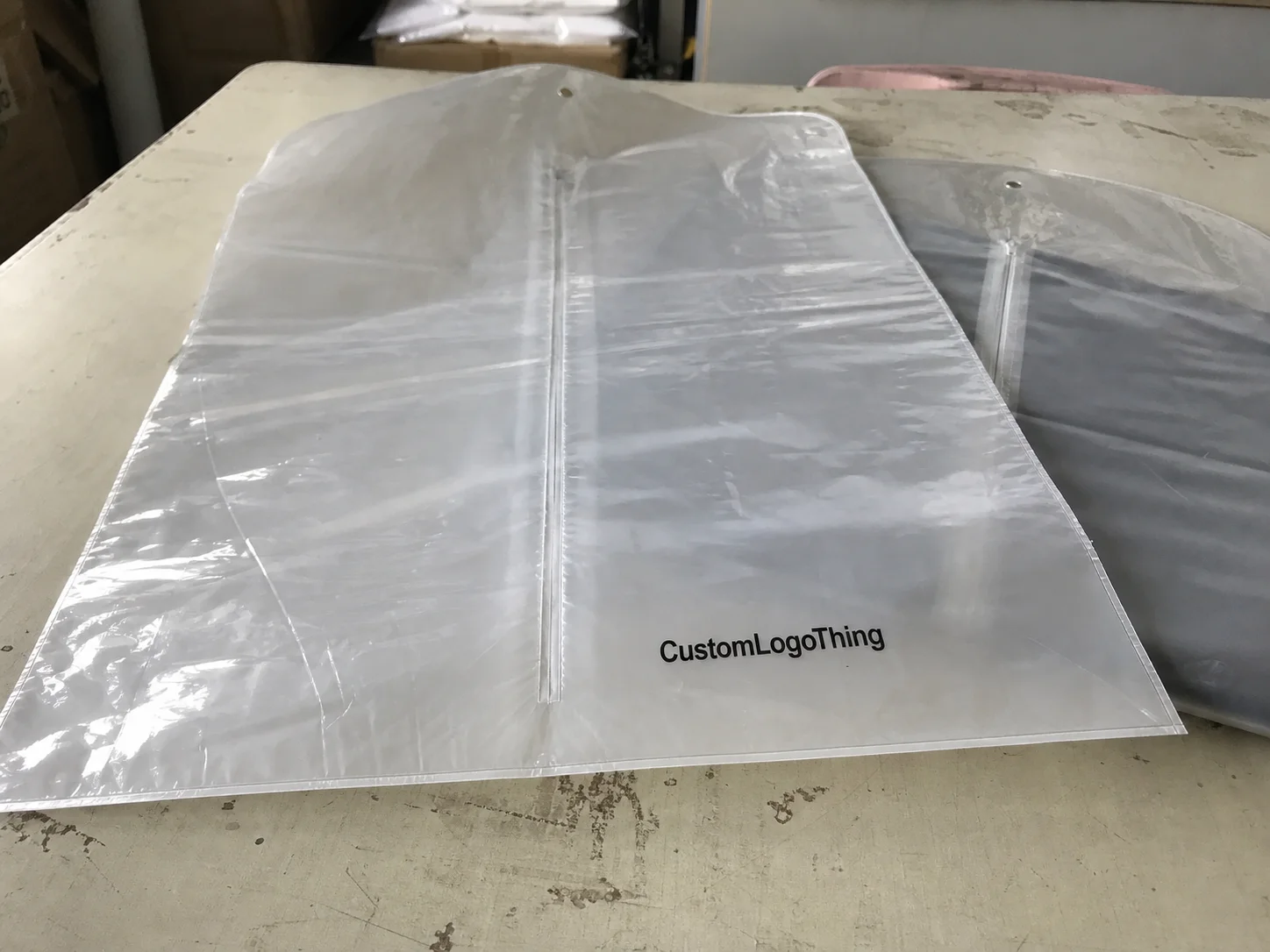
For bakeries, Printed Padded Mailers usually act as the branded outer shipper around sealed inner food packaging. Think cookie drops in heat-sealed pouches, brownie assortments in tuck-top cartons, macaron sleeves inside slim inserts, sample packs for wholesale outreach, or seasonal mailers built to travel well and photograph cleanly. The padding does not replace food-safe barriers. Its job is to protect presentation, soften minor impact, and support the inner structure during shipment.
Bakery mailers pass through a strange mix of conditions. Packing benches collect flour dust and butter residue. Courier bins create constant abrasion. Porches add light, heat, or damp exposure. Then comes the unboxing moment, which often doubles as a photo or video. A finish that looks great in a digital mockup can pick up fingerprints by midday or show rub marks before the first production batch is done.
Most buyers compare five categories: gloss, matte, soft-touch, satin or semi-gloss, and occasional specialty spot effects such as spot UV on logos or patterns. None is automatically the best option. The right finish depends on grease risk, brand position, shipping distance, reorder frequency, and whether the mailer supports everyday orders or higher-value gifting.
What changes from one finish to another is not only appearance. Protection against marks, print behavior, cost, lead time, and the way colors read under real light all shift with the surface choice. Buyers comparing broader Custom Packaging Products or weighing lighter outer shippers such as Custom Poly Mailers can use the same logic: test the whole packaging system, not a swatch by itself.
Printed Padded Mailers for Bakery Packaging Print Finish Comparison: What Matters First

The first question is rarely “Which finish looks nicest?” A better question is “What will this package look like after 24 to 72 hours of handling?” That is the real test. In practice, bakery buyers usually care about four things first: appearance after transit, feel in hand, resistance to scuffs and marks, and cost per shipped order.
Printed padded mailers for bakery orders often combine an exterior printable layer, a cushioning layer such as bubble or paper padding, a pressure-sensitive seal strip, and sometimes a tear strip for easier opening. The print finish sits on the outside and carries much of the visual load. It also affects how darker inks hold up, how pastel branding reads under indoor light, and whether the package feels mass-market or boutique.
Gloss usually increases color saturation and contrast. Matte cuts glare and can make minimalist branding feel more expensive. Soft-touch adds a memorable tactile quality. Satin lands in the middle. Specialty spot effects can add contrast and depth, though they make more sense on promotional or gift-heavy runs than on routine replenishment orders.
Many buyers make the same mistake here: they compare finishes on flat sample chips rather than on filled mailers. A flat chip tells you very little about corner rub, handling on a packing line, shipping-label adhesion, or how the surface looks after other parcels have been stacked on top of it.
How Printed, Padded Bakery Mailers Work in Real Shipping Conditions
A padded bakery mailer is not the main protective layer for cookies, brownies, or macarons. It is the outer shell in a larger packaging chain. The bakery product should already be sealed inside food-appropriate pouches, trays, sleeves, or cartons. The mailer then adds branding, a buffer against minor impact, and a cleaner arrival experience.
Most custom bakery mailers include the same core parts:
- Outer printable face, often film-based or made to resemble paper
- Printed graphics layer, produced through flexographic, offset, or digital printing depending on run size and finish requirements
- Cushioning layer, usually bubble or paper padding
- Permanent seal strip, typically peel-and-seal adhesive
- Optional tear strip for easier customer opening
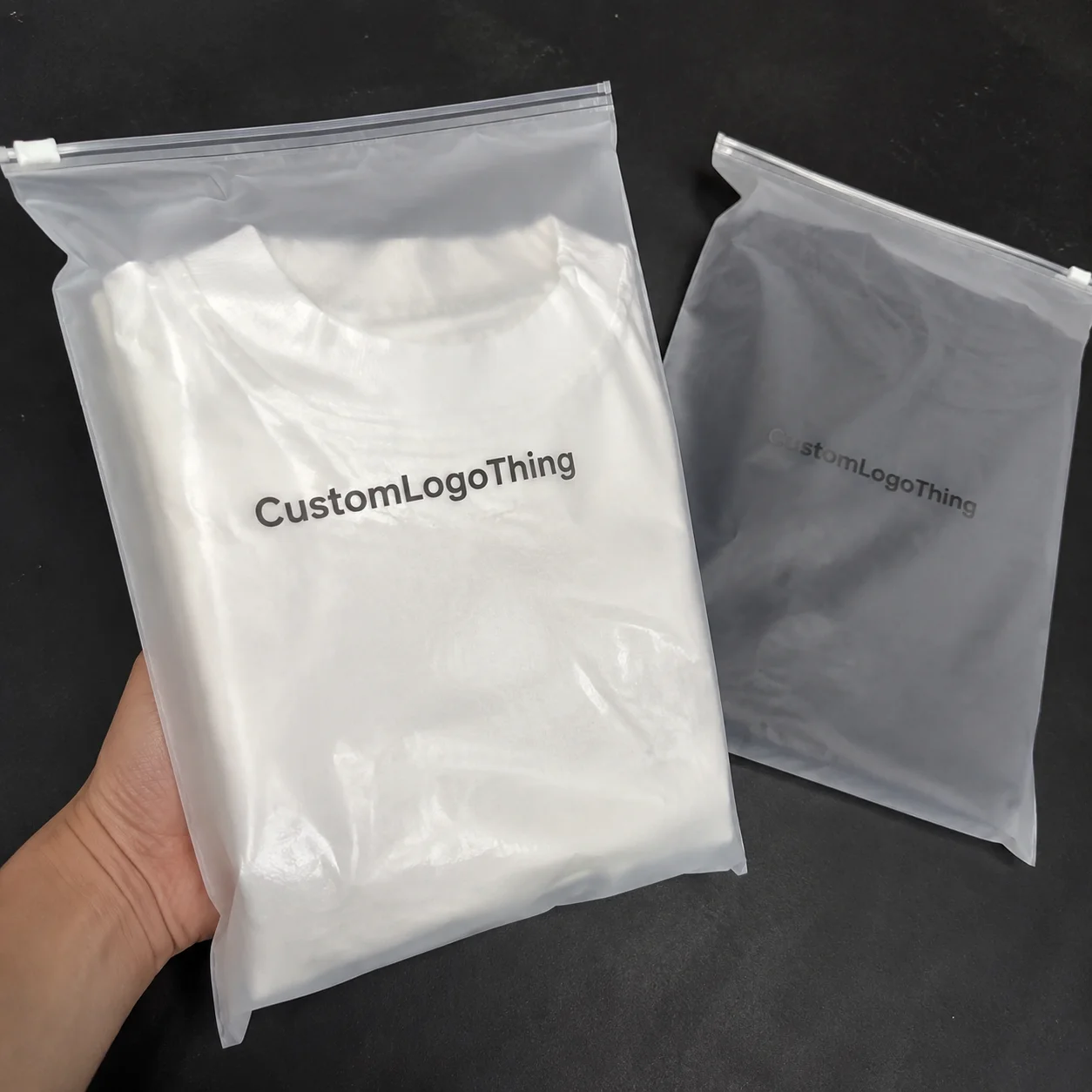
The finish does not change cushioning in any major way. It changes surface behavior, and that difference matters. A glossy outer face may wipe cleaner if a fast-moving packing station transfers a bit of oil onto the package. A matte surface may hide glare but show rub marks faster on dark navy, charcoal, or black backgrounds. Soft-touch feels expensive but can be more vulnerable to repeated friction if the route includes several handoffs.
Shipping conditions for bakery brands are rarely gentle. Cold packs can introduce condensation risk. Stacked parcels create abrasion. Quick fulfillment means flour dust, sugar particles, and glove drag across the print. A cream-and-gold mailer may look beautiful in a render, then collect visible marks after a short production run on a busy bench.
Ink coverage behaves differently by finish too. Gloss often deepens contrast and makes colors read brighter. Matte can soften that contrast while giving fine typography a more refined look if registration is sharp. Pastels often feel airy under matte but stronger under satin. That is one reason design decisions need physical testing instead of screen-only approval.
Customer perception starts before the seal is broken. A clean, intact mailer suggests freshness, care, and stronger package branding. A scuffed mailer can quietly lower perceived quality even if the baked goods inside arrive in perfect condition.
Finish Performance Factors: Gloss vs Matte vs Soft-Touch for Bakery Brands
Set these finishes side by side and the tradeoffs show up quickly.
Gloss
Gloss is often the baseline finish for Custom Printed Mailers. It usually delivers the strongest color pop, cleaner contrast, and a more energetic overall look. Playful cookie brands, birthday treat drops, and high-color seasonal campaigns often do well with gloss. It can also be easier to wipe during packing if light residue reaches the surface. The tradeoff is glare, which can reduce readability under some lighting conditions, especially on small QR codes or pale text reversed out of bright backgrounds.
Matte
Matte is a common choice for premium bakeries because it reads modern, restrained, and gift-oriented. The lower shine helps photography and gives creams, blush tones, muted greens, and taupe palettes a refined feel. The practical drawback shows up on darker artwork. Matte surfaces with deep solid coverage often reveal scratches, pressure lines, or rub marks faster. A fast fulfillment line and a dark background are exactly the combination that deserves testing first.
Soft-Touch
Soft-touch, sometimes called velvet-touch, creates the kind of tactile effect customers remember. Luxury patisserie brands and influencer mailers often like it for that reason. The economics shift, though. Unit cost rises, lead time can stretch, and the surface may show friction wear more clearly than expected, especially near edges and seals where hands make repeated contact. Used selectively, soft-touch can elevate gifting. Used on a low-margin everyday SKU, it can be hard to justify.
Satin or Semi-Gloss
Satin is the middle-ground finish more buyers should sample. It offers more life than matte, less glare than gloss, and a practical feel for daily shipping. Subscription dessert boxes and broader branded shipping programs often benefit from satin because it balances presentation with lower risk.
Specialty Spot Effects
Spot gloss or spot UV can create contrast on logos, patterns, or selected brand elements. The effect can be striking, especially on simpler layouts. From an operations standpoint, these finishes are usually a better fit for higher-value promotional runs than for standard bakery replenishment mailers.
Legibility deserves its own check. Outer mailers now carry social handles, reorder prompts, handling notes, QR codes, and simple care messaging. Finish affects how those details read and scan. Fine lines, small sans-serif text, or low-contrast graphics should be tested under daylight, warehouse fluorescents, and porch lighting rather than approved from a proof alone.
Sustainability perception can also be misleading. Matte or paper-look surfaces often feel more natural, though that does not automatically mean lower impact or easier recyclability. Material construction matters more than surface mood. Supplier documentation should be reviewed carefully, along with guidance from groups such as FSC and the EPA if sustainability claims are part of the brief.
Brand fit is usually fairly clear once the handling requirements are known:
- Luxury patisserie: matte or soft-touch, with abrasion testing before approval
- Playful cookie brand: gloss or satin for stronger color energy
- Subscription dessert box: satin for repeat-use practicality
- Wholesale sample program: gloss or matte, depending on cost discipline and presentation goals
Cost, Pricing, and MOQ: What Changes When You Upgrade the Finish
Finish changes the quote even when the artwork stays the same. Newer buyers often miss that. Price is shaped by size, film or paper gauge, cushioning type, print coverage, color count, finish application, order quantity, and freight. Add proofing rounds or rush timing and the difference widens quickly.
For many standard Custom Padded Mailers in moderate volumes, gloss is the base price. Matte usually adds a modest premium. Soft-touch and specialty effects push higher because they add process steps and reduce production simplicity. At 5,000 units, a bakery might see a rough range such as $0.38 to $0.62 per unit for a standard printed padded mailer, with finish upgrades adding $0.03 to $0.12 per piece depending on size and coverage. At 25,000 units, those premiums often narrow on a per-piece basis, though setup costs and freight still matter.
Minimum order quantities vary, but custom printed padded mailers often begin around 1,000 to 3,000 pieces for simpler runs and move higher for more specialized finishes or constructions. Seasonal launches make that question more important. Ask about split deliveries, warehousing, or repeat-order pricing on the same artwork so too much cash is not tied up in a single campaign.
| Finish | Typical Visual Effect | Relative Unit Cost | Best Use Case | Watch-Out |
|---|---|---|---|---|
| Gloss | Bright, high contrast, vivid color | Baseline | Promotional cookie drops, colorful branding | Can create glare on text and codes |
| Matte | Muted, premium, modern | +5% to +12% | Gift-oriented pastry and macaron lines | Dark solids may scuff more visibly |
| Soft-Touch | Velvety, luxury tactile feel | +12% to +25% | High-AOV gifting and influencer kits | Higher cost and friction sensitivity |
| Satin | Balanced sheen, practical finish | +3% to +8% | Subscription and everyday premium shipping | Less dramatic than gloss or soft-touch |
Hidden costs deserve the same attention as unit price:
- Plate or setup charges
- Proof revisions after color changes
- Freight and fuel surcharges
- Rush fees
- Sample approval rounds
The better comparison is landed cost per shipped order, not just price per mailer. If a premium finish lifts repeat purchase rate, improves gift perception, or reduces complaints about arrival appearance, the extra cents may be justified. If it is attached to a low-margin snack pack, probably not.
Process and Lead Time: From Artwork Approval to Packed Bakery Orders
Production timing is usually less mysterious than buyers expect. The sequence is fairly straightforward:
- Choose size and construction
- Receive dieline
- Place artwork and confirm print coverage
- Review prepress files and color notes
- Approve proof
- Confirm material and finish
- Run printing
- Apply finish
- Convert, seal, and pack mailers
- Ship to your facility or 3PL
For standard runs, production after proof approval often falls in the 12 to 18 business day range, plus transit time. Sample timing is usually separate. A digital proof may arrive within 24 to 72 hours, while physical finish samples often take 5 to 10 business days depending on whether they are stock references or fully branded preproduction pieces.
Delays usually come from ordinary issues rather than dramatic ones: low-resolution logos, missing dieline bleed, late color corrections, switching from matte to soft-touch after proof approval, or failing to specify whether shipping labels need an adhesive-friendly area. Specialty finishes can add several business days because they require extra process steps and quality checks.
Bakery calendars make timing tighter. Holiday mailers, wedding favor programs, product launches, and collaborations all compress schedules. If the mailer needs to coordinate with custom printed boxes, inserts, cold packs, labels, or other product packaging components, extra buffer is a smart move. A good-looking mailer that arrives after launch week is still late inventory.
Physical finish samples are especially useful in a few situations:
- Your artwork uses pastels, black fields, or metallic effects
- Your brand depends on a premium tactile cue
- Your order value is high enough that unboxing affects retention
- Your fulfillment environment is fast, dusty, or grease-prone
Fast turnarounds are easier when the structure stays simple, the finish is finalized before prepress, proof revisions are limited, and shipping specs are confirmed early. That alone prevents a surprising number of avoidable problems.
How to Choose the Right Finish Step by Step for Your Bakery Mailer
Start with the product rather than the mood board. Macarons are fragile. Cookie packs are sturdier. Chilled pastries bring condensation concerns. Dry gift assortments usually allow more flexibility. Once that is clear, define what the outer mailer actually needs to do.
Some bakeries need pure function: survive courier handling and arrive clean. Others need the mailer to elevate gifting, support photo-heavy campaigns, or hide wear across longer transit distances. That requirement should shape the finish choice from the beginning.
A simple decision tree can narrow the field:
- Bold and bright brand: start with gloss, then compare satin
- Understated premium look: start with matte, then test scuff performance
- Tactile luxury gifting: trial soft-touch on limited runs first
- Practical everyday shipping: satin is often the safest middle ground
Sample testing should mimic the way a fulfillment team actually works. Rub two filled mailers together. Stack them under light pressure for 24 hours. Apply shipping labels. Wear gloves. Move quickly, as a real packing station would. If possible, send a few through an actual parcel route. Formal distribution testing can follow standards from ISTA, but even simple in-house handling checks reveal a lot early.
Light changes the result more than many buyers expect. Creams, blush tones, pale yellow, black, and metallic accents can all shift depending on finish and setting. That matters for bakery brands because softer color palettes are common, and subtle branding can lose presence if the finish dulls contrast too much.
The financial side needs the same level of honesty. If the finish upgrade adds $0.07 per order and your average order value is $42, the increase may be minor if customer perception improves. If your average order value is $12 and shipping is already tight, that same upgrade may be difficult to defend.
Operational details should be confirmed before the order is placed:
- Closure strength and peel performance
- Print placement around seams and edges
- Barcode and QR readability
- Label and stamp compatibility
- Fit with inner trays, cartons, or sleeves
Accurate quoting depends on a clear brief. Buyers should provide size, quantity, fill product, inner pack format, target finish, artwork coverage, shipping destination, and whether the mailer supports retail packaging, e-commerce, or both. Cleaner information at the start usually means fewer surprises later.
Common Mistakes Bakery Buyers Make When Comparing Mailer Finishes
The biggest mistake is choosing by appearance alone. A finish that looks impressive in a supplier PDF can perform poorly under abrasion, finger contact, tape drag, or stacking pressure. Packaging passes through people, bins, belts, vans, and porches. It has to survive all of them.
A close second is assuming padded mailers are enough protection by themselves. They are not. Delicate bakery items still need proper inner support, whether that means a partitioned carton, molded tray, or compact rigid insert. If the inner pack fails, no surface finish will rescue the customer experience.
Another common problem is ignoring the relationship between finish and artwork style. Matte with dense black coverage can mark easily. Gloss with fine, pale text can lose readability in glare. Minimalist branding only looks elegant if the print stays crisp after handling.
Over-upgrading is easy to do. A premium finish on a low-margin SKU can quietly drain profit, especially at higher volume and frequent reorder cycles. The opposite mistake happens too: a gift-heavy product line shipped in a budget finish that weakens the whole brand story.
Timing errors are expensive. Switching finish types close to a holiday drop can add days that are no longer available. Comparing quotes with different material thicknesses or different print coverage can make one supplier look cheaper when the specifications are not truly equal. Storage conditions matter too. Warehouse temperature, stack height, and label adhesion all influence real-world performance.
Skipping a trial run is often the costliest mistake of all. For a first order, a smaller test batch is usually cheaper than discovering problems through a full MOQ purchase.
Practical takeaway: if scuff resistance, label adhesion, and filled-pack handling have not been tested, the finish comparison is still theoretical rather than commercial.
Expert Next Steps for Sampling, Quoting, and Launching the Best Bakery Mailer
The strongest next move is usually simple. Shortlist two or three finishes. Request matched samples in the same size, or as close to it as possible. Then test them with actual packed bakery orders rather than empty shells.
A basic scorecard helps keep the decision grounded. Rate each sample from 1 to 5 for:
- Scuff resistance
- Color appearance
- Tactile feel
- Label adhesion
- Landed cost
- Lead time confidence
Supplier questions should be direct. What is the MOQ by finish? How consistent is repeat-order color? Does the finish tend to mark on dark solids? Can stock samples and preproduction references be provided? Is the print method digital or offset for your volume? Answers to those questions reveal far more than a polished sales sheet.
Photographing samples in daylight and indoor light is time well spent. That step changes opinions quickly, especially with softer bakery palettes. If the mailer will support a broad line of SKUs, a small regional or limited launch before full standardization can protect margin and give operations cleaner feedback.
Once the winner is chosen, document the final specification internally: exterior dimensions, gauge, padding type, finish, artwork version, print coverage, seal format, and approved color targets. Reorders tend to run more smoothly when that information is stored clearly, especially across seasonal campaigns and staff changes.
A careful printed Padded Mailers for Bakery Packaging print finish comparison is not about chasing the fanciest surface. It is about matching finish to handling reality, brand promise, order economics, and customer expectations. Test with real products, compare landed cost instead of headline unit price, and choose the finish that still looks good after transit. That usually leads to a far better buying decision than choosing on appearance alone.
FAQ
Which finish is best for printed padded mailers for bakery packaging?
Gloss works well for bright colors and easier wipe-downs, matte suits premium branding
Related Articles
Buy Padded Mailers: Lead Time and MOQ Explained
Jun 22, 2026
