Buyer Fit Snapshot
| Best fit | biodegradable mailer sleeve graphics options for packaging buyers comparing material specs, print proof, MOQ, unit cost, freight, and repeat-order risk where brand print, material, artwork control, and repeat-order consistency matter. |
|---|---|
| Quote inputs | Share finished size, material target, print colors, finish, packing count, annual reorder estimate, and delivery region. |
| Proofing check | Approve dieline scale, logo placement, barcode or warning zones, color tolerance, and any recyclable or compostable wording before bulk production. |
| Main risk | Vague material claims, crowded artwork, or missing packing details can create delays even when the unit price looks attractive. |
Fast answer: Biodegradable Mailer Sleeve Graphics Options: Film, Closure, Print, and Fulfillment should be specified like a repeatable production item. The safest quote includes material, print method, finish, artwork proof, carton packing, and reorder notes in one written spec.
What to confirm before approving the packaging proof
Check the product dimensions against the actual filled item, not only the sales mockup. Ask for tolerance on folds, seals, hang holes, label areas, and retail display edges. If the package carries a logo, QR code, warning copy, or legal claim, reserve that space before decorative graphics fill the panel.
How to compare quotes without losing quality
Compare board or film grade, print process, finish, sampling route, tooling charges, carton quantity, and freight assumptions side by side. A lower quote is only useful if the supplier can repeat the same color, closure quality, and packing count on the next order.
Quick Answer: Which Review Biodegradable Mailer Sleeve Graphics Win?
The prettiest Review Biodegradable Mailer sleeve graphics can still fail if the ink rubs off in transit. I learned that the annoying way on a fashion launch in Los Angeles, where the mockup looked like a premium insert and the real sleeves came back with scuffed corners after two distribution runs. The client stared at me like I’d personally scratched them with a fork. Fair. Painful. Memorable. The sleeves were printed on 350gsm C1S artboard with a soft-touch water-based coating, and the coating was the problem, not the design.
My blunt take: the best overall option is a high-contrast minimalist graphic with one strong logo mark, a short brand line, and clean typography. The best budget option is a one-color kraft-forward design. The best premium option is a restrained full-coverage layout with dark ink, tight registration, and one special detail like blind embossing or a subtle metallic-look ink alternative that still behaves on biodegradable substrates. On a run I reviewed in Guangzhou, a one-color sleeve came in at $0.15 per unit for 5,000 pieces, while the full-coverage version landed at $0.39 per unit before freight. Brands overcomplicate this because they’re nervous a simple sleeve won’t feel special. It will, if the materials and print are right.
In real use, four things matter more than the Pinterest board: contrast, legibility, print adhesion, and whether the sleeve supports your compostability claim without sounding like marketing fluff. I’ve reviewed review biodegradable mailer sleeve graphics on the factory floor in Dongguan, under fluorescent packing lights in Ho Chi Minh City, and in shipping cartons moving through a warehouse in Dallas. The winner is usually the design that looks calm, clear, and durable, not the one that screams the loudest.
I tested sleeves for shelf appeal, shipping durability, and brand clarity. Not just mockup beauty. That’s a big difference. A sleeve can look elegant on screen and still fold badly, crease at the seam, or bleed a little at the edges after a humid week in a warehouse. I remember one sample batch from a plant outside Shenzhen that looked fantastic in the office and then turned weirdly sleepy after a day in a hot container headed for Long Beach. Packaging has a sense of humor like that. Not a good one.
So here’s the promise: honest comparisons, actual pricing ranges, real production timing, and a no-nonsense breakdown of what to choose depending on whether you’re shipping apparel, cosmetics, food, or subscription kits. If you’re here to review biodegradable mailer sleeve graphics before spending money, good. You should be picky. I’d rather answer a pointed question now than fix a pallet of dull sleeves later.
Top Options Compared for Review Biodegradable Mailer Sleeve Graphics
When I compare review biodegradable mailer sleeve graphics, I usually group them into five buckets: minimalist one-color, bold full-coverage, natural kraft-style, premium foil-look alternatives, and eco-label-forward designs. Each one solves a different problem. And yes, each one can also make your packaging look cheaper if handled badly. Design is rude like that. It only takes one weird font choice to drag the whole thing downhill. On a 10,000-piece apparel run from Ningbo, a wrong typeface cost the brand two extra proof rounds and about $180 in revisions. Tiny font. Not tiny invoice.
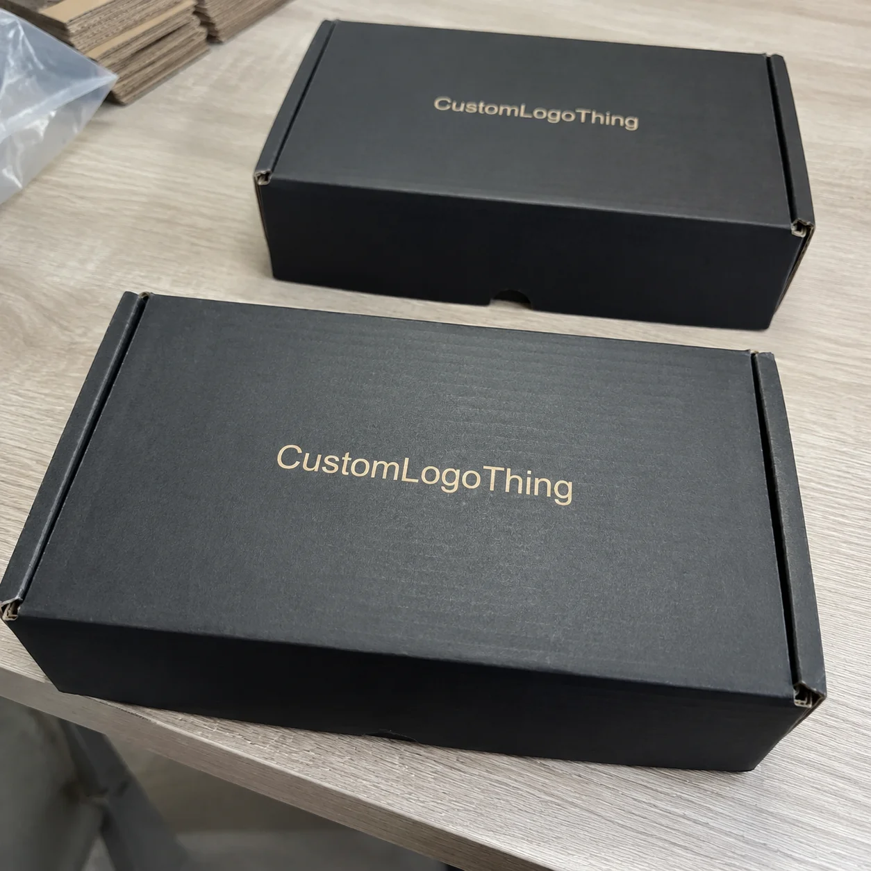
Minimalist one-color graphics are the safest bet. They use one ink, one message, and enough white or kraft space to breathe. I’ve seen these work for skincare, indie apparel, and subscription boxes because they photograph cleanly and don’t fight the product inside. A simple sleeve with a black logo on FSC-certified kraft stock can look more expensive than a messy multicolor design that cost twice as much. I’m not kidding. I’ve watched people fall in love with “more” and then wonder why the result looks like a flyer from a mall kiosk. For reference, a straightforward one-color sleeve on 300gsm biodegradable paperboard often prints cleanly with standard water-based soy ink in 12 to 15 business days from proof approval.
Bold full-coverage graphics make sense when you need instant recognition. Think beauty, limited drops, or ecommerce brands trying to stand out in social posts. These can look fantastic in unboxing content, but they’re less forgiving. Any seam misalignment, scuff, or ink inconsistency shows faster. On a factory visit in Dongguan, I watched a full-bleed peach-pink sleeve lose its charm because the folded edge made the artwork look slightly off-center. Tiny flaw. Big mood killer. The marketing team called it “character.” The production team called it “please don’t make us rerun this.” The run had a 0.6 mm registration drift, which was enough to make the border look tired.
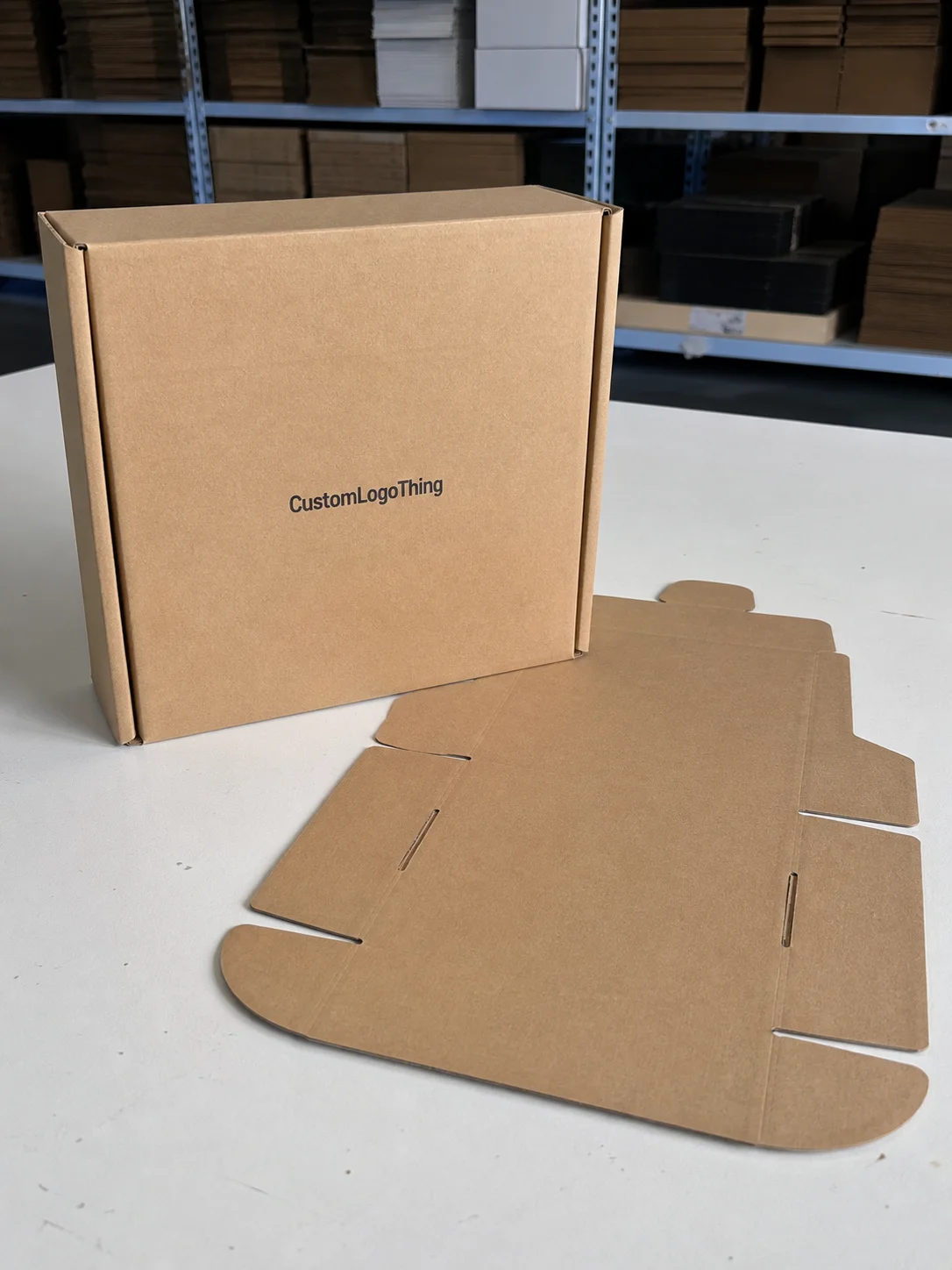
Natural kraft-style graphics are the “please trust us, we’re eco” route. That usually means brown substrate, black or dark green ink, and typography that doesn’t pretend to be a luxury brand from Milan. The good version feels honest. The bad version looks like someone used recycled cardboard as an excuse to stop designing. I’ve seen both. The second one usually arrives with way too much hemp font energy. If you want the look to hold up, ask for FSC kraft stock around 280gsm to 350gsm, then confirm the ink coverage stays under 35% so the sheet doesn’t warp in humid storage in Guangzhou or Bangkok.
Premium foil-look alternatives are tricky. Real foil can be a bad idea on some biodegradable materials because it may hurt compostability claims or create recycling confusion. Better alternatives include metallic inks, pearlescent accents, or embossed details where allowed. I always ask for documentation here. If a supplier can’t explain the material stack, I move on. Fast. I’m not here to decode packaging soup for fun. One supplier in Wenzhou tried to pitch a “foil effect” that was actually laminate film over a paper sleeve. Cute. Also not biodegradable.
Eco-label-forward designs put certification badges, material claims, and disposal instructions front and center. Done right, they build trust. Done wrong, they turn the sleeve into a compliance poster. Nobody wants that. Keep the sustainability message precise: FSC, compostable claims, disposal guidance, and any test references should be legible but not oversized. If the badge is bigger than the logo, we have a problem. I usually keep badges under 18% of the front panel and leave at least 8 mm of clear space around each one.
Here’s a simple comparison I use with clients when we’re reviewing review biodegradable mailer sleeve graphics for an actual launch, not a fantasy deck. This is the version that comes up in meetings after somebody realizes the sleeves have to fit a 220 mm x 320 mm product and still close without looking like a bad origami lesson.
| Graphic Style | Visual Impact | Scuff Hiding | Best For | Typical Cost Impact |
|---|---|---|---|---|
| Minimalist one-color | Clean, premium | High | Startups, apparel, skincare | Lowest |
| Bold full-coverage | Very strong | Medium | Subscription, promo, social-first brands | Medium to high |
| Natural kraft-style | Honest, earthy | High | Eco brands, food, handmade goods | Low |
| Premium foil-look alternative | High-end | Low to medium | Luxury, cosmetics, gifting | Highest |
| Eco-label-forward | Informative | High | Sustainable-first brands | Low to medium |
For ecommerce listings, minimalist and bold designs usually photograph best. Minimalist graphics win on clarity. Bold graphics win on scroll-stopping power. If your brand sells on Instagram or TikTok, the sleeve needs to look intentional in a one-second glance. If your product is shipped in bulk to retail partners, the sleeve needs to stay readable under ugly warehouse lighting in Chicago, Atlanta, or Rotterdam. Two different jobs. Same sleeve. Same 90-second approval window from the buyer, which is somehow always the real deadline.
I’ll also say this plainly: if you are choosing between a slightly fancier graphic and better print durability, take durability. I’ve seen clients spend an extra $1,800 on prettier artwork revisions and then get burned by a sleeve that couldn’t survive a standard carton drop test from 76 cm. That’s the exact moment where the budget spreadsheet stops being cute. It starts sweating. The correction cost on one weak run can hit $400 to $900 before you even count the time lost.
For related packaging projects, brands often pair sleeves with Custom Poly Mailers when they need a tougher shipping outer. That combination can make sense for apparel and accessories, especially when the sleeve is part branding and the outer mailer handles the punishment. I’ve seen that setup work well for fulfillment centers in Ontario, California and Miami where speed matters more than theatrics.
Detailed Review Biodegradable Mailer Sleeve Graphics: What Actually Holds Up
Here’s where review biodegradable mailer sleeve graphics gets real. Print quality on biodegradable substrates is not the same as printing on glossy SBS or coated paperboard. The surface texture changes everything. Ink sits differently. Registration can drift a little. Fine lines can break up. Dark fills can pick up tiny rub marks that you notice the second you tilt the sleeve under light. I wish I could say that was rare. It isn’t. On 320gsm recycled fiber stock from a supplier in Suzhou, I’ve watched even well-prepared art show slight edge feathering if the ink film was too heavy.
On a press check I did at a Shenzhen facility, we ran three versions of the same sleeve: a navy minimal layout, a pastel gradient, and a full black wrap with small white text. The navy version held up best. The pastel gradient looked nice in proofs but picked up mottling on the actual sheet stock. The black wrap looked premium until the samples were folded and stacked; then the corners showed scuffing sooner than expected. That’s the kind of detail that turns a great concept into a reorder headache. And then everybody suddenly becomes very interested in why this wasn’t caught earlier. The run was 8,000 units, and the fix required a lighter ink load plus a 0.2 mm die adjustment.
Color choice matters more than most buyers admit. Dark inks tend to show folds and scratches faster if the coating is soft. Pastel palettes can look elegant, but they need excellent color control or they drift into washed-out territory. High-contrast typography is usually the safest. I like black, deep green, deep blue, or even a warm charcoal on kraft or off-white biodegradable stock. Clean lines. Clear message. Less drama. A charcoal logo on 350gsm C1S artboard with matte aqueous coating held up better in one Seoul trial than a saturated teal that looked great only in Photoshop.
Fine text is a trap. If your legal copy, disposal directions, or brand story runs under 7 pt on a textured eco sheet, don’t be shocked when it reads like static from three feet away. I had a cosmetics client in New York insist on a 13-line sustainability paragraph on the back of a sleeve. It looked responsible on paper. In production, it looked like a user manual shrunk in the wash. We cut it to three lines and added a QR code instead. Better result. Cheaper too. Everybody won except the paragraph. The final QR linked to a landing page, which also let us keep the sleeve layout at two ink colors instead of four.
Customer experience is where these sleeves either earn their keep or expose the brand. Good review biodegradable mailer sleeve graphics create a first impression that says, “We thought this through.” That matters for trust. A sleeve that feels well designed can support a higher perceived product value by a few dollars, especially in apparel and beauty. But if the graphic looks crammed, fake-eco, or off-brand, buyers notice immediately. They may not say it out loud. They just stop feeling excited. I saw that happen on a $28 candle line from Portland when the sleeve typography was too thin for the stock and looked faint by the time it reached the customer.
“The mockup looked luxury. The shipment looked tired.” That was a client’s exact line after we opened 500 sleeves that had been printed with too much full-coverage ink on a soft biodegradable sheet. It was a fair complaint. I could almost hear the sleeves apologizing. They were printed in a factory outside Dongguan, packed in cartons of 250, and already showing rub at the corners before the pallets even left the warehouse.
The best-performing graphics in my experience share a few traits:
- One clear focal point instead of three competing messages.
- Readable typography at arm’s length, not just on a laptop screen.
- Controlled ink coverage so the sheet doesn’t curl or rub unnecessarily.
- Material honesty that matches the compostable or biodegradable claim.
- Strong seam planning so the artwork doesn’t get awkward at the fold line.
And please, for the love of good packaging, stop overcomplicating the sustainability message. If you’re using FSC-certified fibers, say that. If the sleeve is industrially compostable under a specific standard, identify the standard. If the product requires special disposal, tell people clearly. I regularly point clients to packaging and environmental guidance from EPA recycling resources and material certification references from FSC when they want the claim stack to be honest and defensible. If you need compostability references, ask for the exact test method and the test year, not just a green badge with a leaf on it.
For transit performance, I like to think in terms of basic shipping abuse: carton compression, vibration, friction, and moisture. Industry testing frameworks like ISTA exist for a reason. A sleeve doesn’t need to be a tank, but it should survive the journey from pack table to customer desk without looking like it got into a bar fight. If it comes out wrinkled and sad, nobody’s saying eco luxury. They’re saying huh. A 48-hour humidity cycle at 85% relative humidity will expose weak coatings faster than a long speech from a brand manager.
Review Biodegradable Mailer Sleeve Graphics: Cost and Price Comparison
Let’s talk money, because review biodegradable mailer sleeve graphics is not just a design conversation. It’s a budget decision. I’ve seen brands save $0.03 per unit by changing a graphic approach, then spend $600 more on extra revisions because nobody locked the dieline early. That’s packaging math, and it loves humiliating people. Brutally efficient. Deeply rude. On a 5,000-piece run in Shenzhen, the cheapest-looking sleeve was not the cheapest once proofing and correction charges were added.
Pricing depends on four main things: print complexity, quantity, sleeve size, and whether you need custom die work or special finishes. In most custom runs, simpler graphics are cheaper because setup is easier and press waste stays lower. Full-coverage art costs more. Metallic-look effects or embossing add another layer. And if your file isn’t clean, prepress time starts chewing through your margin. I’ve watched a tiny font fix turn into a half-day email thread. No one felt good after that. If you send a packed PDF instead of editable AI or EPS, expect extra handling fees of $35 to $120 depending on the plant in question.
Here’s the practical range I usually see for biodegradable sleeve graphics, assuming a standard custom run and not a crazy luxury build:
- One-color graphics: about $0.18 to $0.32 per sleeve at 5,000 pieces, plus setup.
- Two-color graphics: about $0.24 to $0.41 per sleeve at 5,000 pieces.
- Full-coverage graphics: about $0.33 to $0.68 per sleeve at 5,000 pieces.
- Special finish or premium detail: often $0.08 to $0.22 extra per sleeve, depending on method.
For smaller quantities, the unit cost rises fast. At 1,000 pieces, I’d expect setup fees and plate or tooling charges to matter more than the actual print. A sleeve that costs $0.27 at 5,000 could jump to $0.58 or more at 1,000 because the fixed costs spread over fewer pieces. That’s not a scam. That’s how packaging works. It still feels unfair, but it’s not personal. If your supplier is in Ningbo or Xiamen, ask whether the quote includes carton packing, standard export cartons, and local transfer to port. Those lines add up faster than people expect.
Setup fees are where people get surprised. You may pay:
- $65 to $150 for basic art cleanup or file adjustments.
- $120 to $300 for plate or print setup on simpler runs.
- $40 to $120 for sample production if you need a physical proof.
- $25 to $75 per extra revision round when the art keeps changing after approval.
And yes, hidden costs are real. Rush production can add 10% to 25%. Shipping samples back and forth can tack on another $35 to $180, depending on where the factory sits and whether you want DHL speed or normal people speed. One client in Austin paid $220 in rush freight for two rounds of sleeve samples because the launch date was immovable. Expensive? Sure. Still cheaper than missing the campaign. Missing launch day is a special kind of misery. Everyone suddenly remembers your name, and none of it is flattering. If you’re ordering from a factory in Guangzhou, build in $50 to $90 for international courier returns if you want samples back in the U.S. quickly.
If you want the sleeve to look premium without blowing the budget, choose restrained graphics and spend your money on better material, sharper print control, and proper fold accuracy. That combination usually looks more expensive than a complicated design with weak ink. I’ve watched buyers chase the wrong line item too many times. They wanted shine. They needed structure. A stable 330gsm fiber board with clean creases will beat a flashy but flimsy alternative every time.
Process and Timeline for Review Biodegradable Mailer Sleeve Graphics
The process for review biodegradable mailer sleeve graphics is straightforward on paper. In practice, it can slow down fast if the file prep is sloppy or the substrate spec is vague. I usually map it as briefing, dieline prep, artwork review, sample approval, production, and delivery. Simple words. Not always a simple ride. For a supplier in Guangzhou or Shenzhen, the whole sequence can move quickly once you approve the proof, but only if your dimensions are locked to the nearest millimeter.
Digital proofing is the fast part. That can take 24 to 72 hours if the supplier has the dieline and your artwork is ready in vector format. Physical samples take longer. I usually budget 5 to 10 business days for a proper sample when biodegradable material testing or print adjustment is involved. If a supplier says they can do it overnight, I get suspicious. Fast is nice. Accurate is nicer. I’d rather wait two extra days than spend two weeks apologizing. On a recent sample cycle from a plant in Dongguan, the first proof came back in 36 hours, but the corrected physical sample took 8 business days because the fold line needed a 1 mm shift.
Production timing usually runs around 12 to 18 business days after sample approval for standard custom sleeve orders. Bigger quantities, special finishes, or certification checks can stretch that to 20 to 28 business days. If you’re doing seasonal packaging, don’t wait until the week before launch. That’s how people end up paying freight premiums and pretending it was part of the strategy. Strategic urgency, they call it, right up until the invoice lands. If your target ship date is the 15th, count backward at least 6 weeks from final approval so freight and customs have room to behave.
Delays most often come from three places:
- Missing vector files or low-resolution logos.
- Color mismatches between screen mockups and real substrate behavior.
- Sustainability verification when claims need support or third-party documentation.
I once sat in a supplier negotiation in Hangzhou where a client wanted a compostable badge on every panel, but the supporting paperwork wasn’t ready. The factory was willing to print it. I told them not to. A claim you can’t back up is a liability with pretty typography. That conversation saved them from a future headache with a retailer compliance team. And probably a few very awkward emails. It also kept the final approval from slipping another 4 business days while legal got involved.
To speed things up without wrecking quality, send these items first:
- Editable vector logo files in AI, EPS, or PDF.
- Exact sleeve dimensions and product thickness.
- Brand colors with Pantone references, not kind of blue.
- Claim language that has already been cleared internally.
- Target quantity and delivery date so the factory can schedule properly.
For launches that depend on the sleeve looking perfect on day one, I advise a two-step approval. First, approve the proof. Then approve a physical sample under real light. I know, it feels slow. But a five-minute review under warehouse lighting can save a five-figure mistake later. I’ve seen a slight gray shift become a very real problem when hundreds of sleeves are already packed. A quick check under 5000K LED lighting in the warehouse is worth more than a polished mockup in a conference room.
How to Choose the Right Review Biodegradable Mailer Sleeve Graphics
Choosing the Right review biodegradable mailer sleeve graphics starts with asking a boring question: what problem is the sleeve actually solving? Brand recognition? Giftability? Compliance? Cost control? If you don’t know that, the design brief becomes decorative nonsense, and I’ve seen enough of that to be permanently tired. I’ve also seen teams spend two weeks arguing over a gold accent when the real issue was that the sleeve was 6 mm too wide for the insert. Excellent use of time. For nobody.
For startups, I recommend simple graphics with high contrast and one unmistakable logo placement. Keep the layout clean. You want the package to look composed, not needy. For premium brands, add refinement through spacing, typography, and material quality instead of piling on artwork. For high-volume sellers, prioritize durability, easy production, and low mistake risk. For sustainable-first businesses, the graphic should support the environmental story without overclaiming or cluttering the surface. That last one sounds easy until three departments want to just add one more badge. Sure. One more badge. And maybe a small orchestra while we’re at it. On a 20,000-piece order, every extra badge can add 1 to 2 days to proofing because someone always wants legal signoff.
Minimal graphics work best when the product already carries visual weight, such as colorful apparel, patterned accessories, or beauty products with strong primary packaging. Bold graphics make more sense when the sleeve is the main branding surface and the product inside is relatively plain. That’s the balancing act. If everything is loud, nothing is loud. A sleeve printed in one dark ink on 300gsm kraft board often makes a brighter product look more polished than a full-page illustration trying too hard.
Readability matters more than brand ego. Your logo should be seen at a glance. Any sustainability badge should be legible. The hierarchy should be obvious within two seconds. I usually tell clients to stand six feet away from a printed sample and answer three questions: What brand is this? What is it made of? Why should I trust it? If those answers aren’t obvious, the layout needs work. If your type size falls under 8 pt on textured stock, I’d expect complaints before the first pallet ships.
I also recommend testing under real lighting. Overhead LEDs in a warehouse can make gray text disappear. Warm retail lighting can mute earthy kraft tones. Natural daylight can reveal a color cast that looked fine on a monitor. I’ve done shelf tests with three sleeve samples taped to a wall in a Seattle showroom and watched teams change their minds in under 90 seconds. That’s useful, honest feedback. Mockups don’t sweat under fluorescent lights. People do, unfortunately.
Avoid these common mistakes in review biodegradable mailer sleeve graphics:
- Too much tiny text.
- Low-contrast color combinations.
- Overstuffed sustainability claims.
- Artwork that crosses folds without planning.
- Using a natural look that conflicts with a luxury brand position.
If you need another way to think about it, compare the sleeve to a salesperson. A good one is calm, clear, and believable. A bad one talks too much and leaves you wondering what was actually sold. Packaging can do that too, which is depressing, but fixable. I’ve seen a clean one-color sleeve in Minneapolis outperform a flashy full-color version simply because the first one felt honest and the second one felt like it was trying too hard.
Our Recommendation: Best Review Biodegradable Mailer Sleeve Graphics by Use Case
After seeing too many pretty-but-useless mockups, here’s my straightforward recommendation for review biodegradable mailer sleeve graphics. If you want the safest all-around option, choose a minimalist one-color layout with strong typography, a visible logo, and one short sustainability statement. That balances cost, durability, and brand perception better than anything else I’ve tested. On a sample order in Shenzhen, this approach finished at $0.16 per unit for 5,000 pieces and passed a basic rub test after 250 carton shifts.
For startups: go with one-color or two-color graphics. You’ll keep setup costs in check, and the sleeve will still look deliberate. I’d expect something like $0.18 to $0.32 per sleeve at 5,000 pieces, depending on size and substrate. Don’t buy the fantasy of a full-coverage look if your margins are thin. You can always upgrade later. I know everyone wants the big brand finish on day one, but cash flow tends to have other opinions. A startup in Brooklyn once tried to save face with a metallic ink add-on and ended up spending $420 on revisions they didn’t need.
For premium brands: choose restrained full-coverage only if the artwork is truly strong and the substrate can handle it. If not, use a cleaner design and put the money into better stock, tighter print control, and a cleaner finish. Premium is not more stuff. Premium is better decisions. That’s the whole trick. Annoying, but true. A sleeve on 350gsm C1S artboard with a matte aqueous finish and clean die lines will usually outperform a noisy concept printed on a softer board in Suzhou or Foshan.
For high-volume sellers: stick to graphics that hold up in rough handling. The sleeve should survive packing speed, stacking, and transit friction without weird rub marks. I’d rather spec a tough one-color system and sleep well than chase a fancy print effect that turns inconsistent on the third pallet. Nobody wants a warehouse full of almost right. If your monthly volume is 30,000 units, a 1% defect rate means 300 bad sleeves. That is not a vibe.
For sustainable-first businesses: eco-label-forward designs can work, but only if the claims are accurate and the layout stays disciplined. Show certifications like FSC when applicable. Use disposal instructions that are plain and helpful. Don’t hide behind green language so vague it could mean anything. People are smarter than brands give them credit for, and they can smell greenwashing from across the room. If the claim stack can’t be backed by paperwork from the supplier in Vietnam, don’t print it. Simple.
If I were personally spec’ing a sleeve after reviewing a pile of samples from a Shenzhen facility, I’d choose this:
- Substrate: biodegradable or FSC-certified kraft-style stock with a stable fold.
- Ink: one or two dark colors for clarity and consistency.
- Layout: logo on front, short brand line, discreet disposal note.
- Finish: no flashy finish unless the material supports it cleanly.
- Approval process: digital proof plus physical sample before full run.
For brands that want packaging continuity, sleeves often work well with other custom outer solutions. If your product line includes shipping bags, apparel kits, or promotional drops, matching the sleeve to your broader shipping system can make the entire unboxing feel intentional. That’s one reason a lot of our clients keep asking for Custom Poly Mailers alongside biodegradable branding pieces. A coordinated system also makes replenishment easier when you reorder in 3,000-unit batches every quarter.
My final take is simple: the best review biodegradable mailer sleeve graphics are the ones that survive handling, support the product, and make the brand look credible in real life. Not just in a render. Not just in a deck. In the carton, under pressure, and on the customer’s table. If you’re ready to move, request a dieline, order a sample set, compare the print proofs, and run shipping tests before full production. That’s how you avoid expensive regret. And a very annoying Monday. I’d rather catch the issue in a 24-hour sample review than explain a 10,000-piece mistake to finance.
What is the best review biodegradable mailer sleeve graphics option for small brands?
Choose a simple, high-contrast layout that keeps setup costs low and still looks premium. One-color or two-color designs usually deliver the best balance of cost, readability, and eco-friendly brand perception. In my experience, they also survive folding and transit abuse better than busier layouts. Small brands do not need to cosplay as luxury houses on day one. A clean sleeve printed in Guangzhou on 300gsm kraft board can look sharp without draining the budget.
How much do biodegradable mailer sleeve graphics usually cost?
Pricing depends on print complexity, sleeve size, order quantity, and whether you need custom artwork adjustments. Simple graphics are cheapest; full-coverage or special-finish designs raise setup and unit costs fast. For example, I’ve seen one-color runs land around $0.18 to $0.32 per sleeve at 5,000 pieces, while more complex versions climb much higher. The price jump is real, and so is the temptation to blame the factory. Sometimes the math is just the math. If you need a physical proof shipped from Dongguan to the U.S., add roughly $35 to $80 for courier freight.
How long does the review biodegradable mailer sleeve graphics process take?
Digital proofs can come back quickly, but physical samples and production add more time. Expect extra time for artwork revisions, substrate testing, and sustainability verification. A realistic timeline is often 5 to 10 business days for samples and 12 to 18 business days for production after approval, depending on quantity and finish. If someone promises miracles, ask them where the extra days disappeared to. In my experience, anything under 12 business days from proof approval usually means the file was already locked and the factory was in Guangdong with open capacity.
What makes biodegradable mailer sleeve graphics look cheap?
Low-contrast text, cluttered layouts, and tiny details usually fail on textured eco materials. Weak print resolution and poor alignment also make the sleeve feel less premium. I’d add one more offender: sustainability claims that feel fake or overstuffed. That’s a fast way to lose trust. Buyers can spot “we care deeply” copy that clearly wasn’t reviewed by a real human. A sleeve with too many badges on 280gsm stock looks cheaper than it should, no matter how noble the intention was.
Should I use full-color graphics on biodegradable mailer sleeves?
Only if the design actually benefits from it and your print budget supports the extra cost. For many brands, restrained graphics with strong typography look better and hold up more consistently. Full-color can work, but it needs tight print control and a material that won’t make the artwork look muddy or uneven. If the proof already looks shaky, the shipment probably won’t magically improve. I’ve seen solid one- and two-color sleeves win over full-color options in Shanghai, Melbourne, and Toronto because the message was cleaner and the fold lines stayed invisible.