Snapchat Custom Stickers can be a small line item, but they are rarely a small decision once production starts. A buyer wants a neat little logo sticker; the file arrives cropped too tightly, the finish is not specified, the surface is unknown, and suddenly the project needs rescue. That is where cost creeps in. Sticker work only looks simple from a distance. In practice, it is a mix of print method, adhesive choice, material behavior, and how the final piece will actually be handled.
For Custom Logo Things, the better approach is to match the sticker to the real use case instead of treating every order like a generic promo item. A sticker for a creator mailer, a retail package, and a laptop giveaway all live in different conditions. One may need short-term visual impact, another needs durable adhesion, and another just needs to look clean in a flat envelope. The difference shows up fast once the order is in hand.
What Snapchat Custom Stickers Actually Are
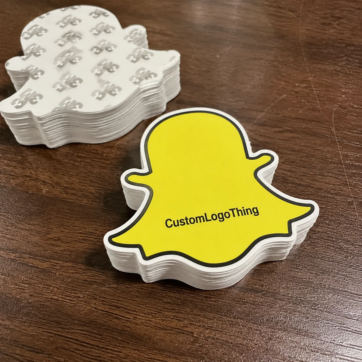
Despite the name, Snapchat custom stickers are not limited to one platform or one style of promotion. They are branded adhesive pieces used for social giveaways, creator kits, event packs, product inserts, and packaging add-ons. The value comes from turning a digital mark into something tactile, visible, and easy to place. If the design is thoughtful and the construction is right, a small sticker can carry a surprising amount of brand recognition.
The format matters as much as the artwork. Die-cut stickers follow the outline of the design and work well for logos, icons, and character art. Kiss-cut stickers stay on a larger backing sheet, which makes them easier to hand out or bundle. Clear stickers work nicely on glass and smooth plastic, though they often need white ink to stay legible on darker surfaces. Holographic stickers add shine and motion, but busy artwork can disappear into the effect. Paper stickers are usually the budget-friendly choice for short-term indoor use, while vinyl stickers are better when moisture, rubbing, or handling are part of the job.
The real question is not which version looks best in a mockup. It is which version holds up on the exact surface the buyer plans to use. A sticker for a shipping insert has very different requirements from one that will be slapped on a reusable bottle or a coated carton. Those details sound small until the adhesive starts failing or the finish hides the artwork.
Common use cases include:
- Product packaging and shipping inserts
- Influencer mailers and creator kits
- Event swag and street-team handouts
- Laptop, bottle, and notebook merch
- Retention packs bundled with branded packaging
Sticker buyers often get better results when the decal is planned alongside the rest of the packaging system. A sticker that coordinates with Custom Labels & Tags or fits into a broader set of Custom Packaging Products usually feels intentional rather than leftover. That matters for retail presentation, where every piece is part of the same visual story.
Material responsibility is part of the conversation too. Paper facestocks, recyclable liner options, and FSC-certified materials can support a more considered sourcing choice, although not every finish or adhesive combination offers the same environmental profile. If sustainability is a buying requirement, ask for documentation rather than assuming the material claims are standard. Recycling guidance from organizations such as the EPA and packaging standards from groups like ISTA are useful references when you are evaluating the full package, not just the print face.
How the Production Process Works
Sticker production is straightforward only when the artwork is ready and the specifications are clear. A normal order moves through artwork submission, proofing, print setup, finishing, cutting, inspection, packing, and shipping. Each step is routine on its own, but any unclear instruction can push the job back a day or two. That is why the file review stage tends to matter more than the actual press time.
Good print files are usually vector-based: AI, EPS, or print-ready PDF. Those formats keep the edges sharp and the cutline clean. If raster art is the only option, it should be high resolution at final size, normally 300 dpi or better, with bleed built in so the trim does not clip the artwork. Small files stretched too large are one of the fastest ways to end up with soft edges and blurry type.
“A clean proof prevents most sticker problems before ink ever hits the material.”
The proof is where production problems should be caught, not after the run is complete. A proper proof should show the final dimensions, cutline, safe area, and placement of the artwork. It should also make it easy to spot type that sits too close to the edge or a shape that cuts through an important element. Rushing through approval is expensive because the press will reproduce the mistake exactly as submitted.
A typical sequence looks like this:
- Preflight artwork for resolution, bleed, and color setup
- Generate a digital proof with cutline and dimensions
- Review and approve the proof
- Print on calibrated equipment
- Apply laminate or specialty finish if required
- Die-cut or kiss-cut the sheets
- Inspect, count, and pack the order
- Ship with the selected service level
Most delays come from a few predictable places: revisions, missing size information, special finishes, or unexpected questions about the adhesive. White ink is another production detail that should be decided early. Clear, metallic, and dark materials often need a white underbase so the artwork stays visible. Adhesive strength also matters more than many buyers expect. Some applications need a standard permanent adhesive; others need a stronger bond for coated cartons or a more forgiving hold for short-term promotion.
Production timelines vary, but a simple sticker order can move quickly once proofing is finished. Specialty materials, custom shapes, and added finishes usually extend the schedule. If the order is tied to a launch date or event, that deadline should be stated before quoting, because rush work often means higher cost and less room for revision.
Cost, Pricing, and MOQ Factors
Sticker pricing is shaped by quantity, material, size, finish, shape complexity, and any special effects. A plain round paper sticker and a custom holographic die-cut are not close substitutes, even if they seem similar on a screen. Buyers often focus on the artwork first, but the construction drives most of the price difference.
Minimum order quantity, or MOQ, is the smallest run a vendor will produce at a workable price. That number exists because setup takes time whether the order is 100 pieces or 5,000. Smaller runs usually carry a higher cost per piece because those setup steps are spread across fewer units. As the run grows, the unit price often drops quickly. A 250-piece order may look manageable at first glance, but the per-piece economics usually improve sharply at 1,000, 2,500, or 5,000 pieces.
Typical pricing behavior looks like this:
- Paper stickers: lowest cost, best for dry indoor use and short campaigns
- Vinyl stickers: higher cost, better for durability and moisture resistance
- Specialty finishes: clear, holographic, metallic, or soft-touch often add cost
- Custom shapes: die-cut or complex outlines usually increase setup time
For practical budgeting, the biggest difference is often between simple and specialty construction. A plain paper label and a laminated vinyl decal can serve very different purposes, and the quote should reflect that. If one price is dramatically lower, check whether the cheaper option is missing a laminate, using thinner stock, or skipping a finishing step that will matter later.
| Option | Typical Use | Relative Cost | Durability |
|---|---|---|---|
| Paper | Indoor promos, short-term inserts | Low | Low to moderate |
| Vinyl | Merch, packaging, handling, and moisture exposure | Moderate | High |
| Clear or holographic | Premium branding and display pieces | Higher | Moderate to high |
| Specialty die-cut | Creator merch and branded kits | Higher | Depends on material |
There are also hidden costs that deserve attention. Shipping can be significant on smaller orders, especially if the pieces are bulky or needed quickly. Proof revisions can slow the project, and rush charges can move a budget fast. When comparing quotes, ask for the total landed cost, not just the print price. That should include freight, setup, special inks, and any white underbase work. The cheapest quote is not always the cheapest order once everything is counted.
Choosing the Right Material, Finish, and Size
Material choice should start with use, not style preference. Paper stickers are fine for dry, short-life applications, especially if they are going into insert cards, internal kits, or packages that will not be handled much. Vinyl is the safer option when the sticker may face rubbing, outdoor air, or moisture. If the sticker has to stick to a curved or textured surface, vinyl also tends to give more forgiveness during application.
Finish changes both appearance and readability. Gloss tends to make colors look richer and sharper. Matte cuts glare and can feel quieter or more premium, though it can soften the visual punch of a bold design. Soft-touch offers a velvety hand feel but is not always the best pick for high-rub handling. Clear materials work when the artwork should appear to float, and holographic can create strong shelf appeal, provided the design can still read clearly against the shifting surface.
Size is where a lot of orders drift off course. Too small, and the logo loses impact or becomes hard to read. Too large, and the sticker becomes awkward to place or expensive to ship in volume. For packaging inserts, medium sizes often work best because they are easy to store and simple to include in a mailer. For merch, a larger sticker can make sense because it functions more like a collectible piece than a label. The right answer depends on where it will live.
Cut style changes the experience as well. A full die-cut gives the cleanest single-piece presentation. Kiss-cut sheets are better when a buyer wants several stickers on one backing or wants the items to be easier to peel. Sheet format is practical for handouts, while loose singles feel more retail-ready and more like product than collateral.
The practical rule is simple: match the build to the environment. A striking finish does not help if the text becomes unreadable or the adhesive fails after a few days. Good sticker work balances visual appeal with the boring details that determine whether it still looks right after shipping, handling, and application.
Step-by-Step Ordering Guide
Start with the use case. Is the sticker going into a mailer, onto retail packaging, inside a welcome kit, or on a product people will keep using? That answer sets the foundation for everything else. A short-life insert does not need the same durability as a reusable merch sticker, and a box seal does not need the same finish as a giveaway item.
Then define the build:
- Format: die-cut, kiss-cut, sheet, or roll
- Size: final dimensions based on placement
- Material: paper, vinyl, clear, or specialty stock
- Finish: matte, gloss, soft-touch, holographic, or clear
- Quantity: enough to reach a sensible unit price
After that, prepare the artwork with print in mind. Vector files are still the safest option, and fonts should be outlined before submission. Bleed should be built around the artwork so the trim does not clip important edges. Fine lines, thin type, and small icons all need extra caution because what looks sharp on a monitor can become muddy once it is reduced to sticker size. Tiny details on tiny stickers are a bad pairing.
Ask for a proof and review it closely. Check the cutline, the safe area, and the spacing around text and logos. Confirm whether the chosen stock supports the colors you need, especially if the design includes white elements on clear or dark material. Once the proof is approved, the schedule should be considered locked. If the order has a launch date, event deadline, or package release tied to it, that needs to be clear before production begins.
It helps to compare more than one build if the budget allows it. One sticker may be cheaper because it uses a lighter adhesive or a thinner face stock. Another may cost more but hold up better on the actual surface. That tradeoff is where buyer experience starts to matter. The lowest line on the quote is not always the best value if the sticker fails on arrival.
Practical buy tip: If the order is tied to packaging, request a sample of the finish or material first when possible. A quick side-by-side check can save a full run from looking dull, lifting early, or clashing with the rest of the branded packaging.
Common Mistakes That Waste Budget
The first mistake is using web artwork and expecting print-quality results. A logo downloaded from a site is often too small, too compressed, or both. If the source file is weak, printing will not fix it. The file has to be good before it ever reaches production.
The second mistake is choosing a finish based only on appearance in a mockup. Matte can improve readability, but it can also mute colors that were designed to pop. Holographic finishes bring attention, yet they can overwhelm a logo that depends on clean contrast. Clear materials look sharp on the right surface and nearly disappear on the wrong one. The finish has to support the artwork, not compete with it.
The third mistake is ignoring the surface. Smooth coated cartons, textured paper, plastic mailers, glass, and curved containers all behave differently. A sticker that holds beautifully on a flat box may not stay put on a rougher carton or rounded bottle. Adhesive selection should be based on the final surface, not just the graphic design.
Another common miss is underestimating how the print method changes the result. Some artwork needs white ink. Some colors need more contrast on dark stock. Some cutlines should avoid fine details. If those choices are not checked before approval, the press will faithfully produce a weaker version of the design.
And yes, proof review still saves the most money. It is easy to skim a proof and move on, but that is how sizing errors, clipped letters, and awkward cutlines make it into the finished run. A careful proof review takes a few minutes and avoids a much more expensive remake.
- Use vector or high-resolution artwork
- Match adhesive to the actual surface
- Check finish against readability, not just style
- Confirm cutline placement before approval
- Budget for shipping and revision risk
Buyers who care about packaging performance should treat stickers with the same discipline used elsewhere in the packaging process. Ask about material consistency, look for recycling or certification evidence where it matters, and confirm that the production method fits the application. Small format does not mean small standards.
FAQ
What makes Snapchat custom stickers different from regular stickers?
They are usually ordered for social promotion, creator kits, and packaging rather than simple labeling. The main difference is the combination of format, finish, and intended use, which affects how they look and how well they hold up.
How much do Snapchat custom stickers usually cost?
Price depends on quantity, material, shape, finish, and turnaround time. Small runs usually cost more per piece, while specialty effects and rush production increase the total quickly.
What file format is best for custom sticker printing?
Vector files such as AI, EPS, or PDF are the safest choice because they keep edges crisp and cutlines accurate. If raster art is used, it should be high resolution and prepared with bleed.
How long does the sticker production timeline usually take?
Timelines depend on proof approval, material availability, and shipping distance. Specialty finishes or custom shapes usually add production time before the order ships.
What’s the biggest mistake people make when ordering custom stickers?
Picking the wrong material or finish for the surface is the biggest one. The next most common mistake is approving a proof too quickly and missing cutline or sizing issues.

