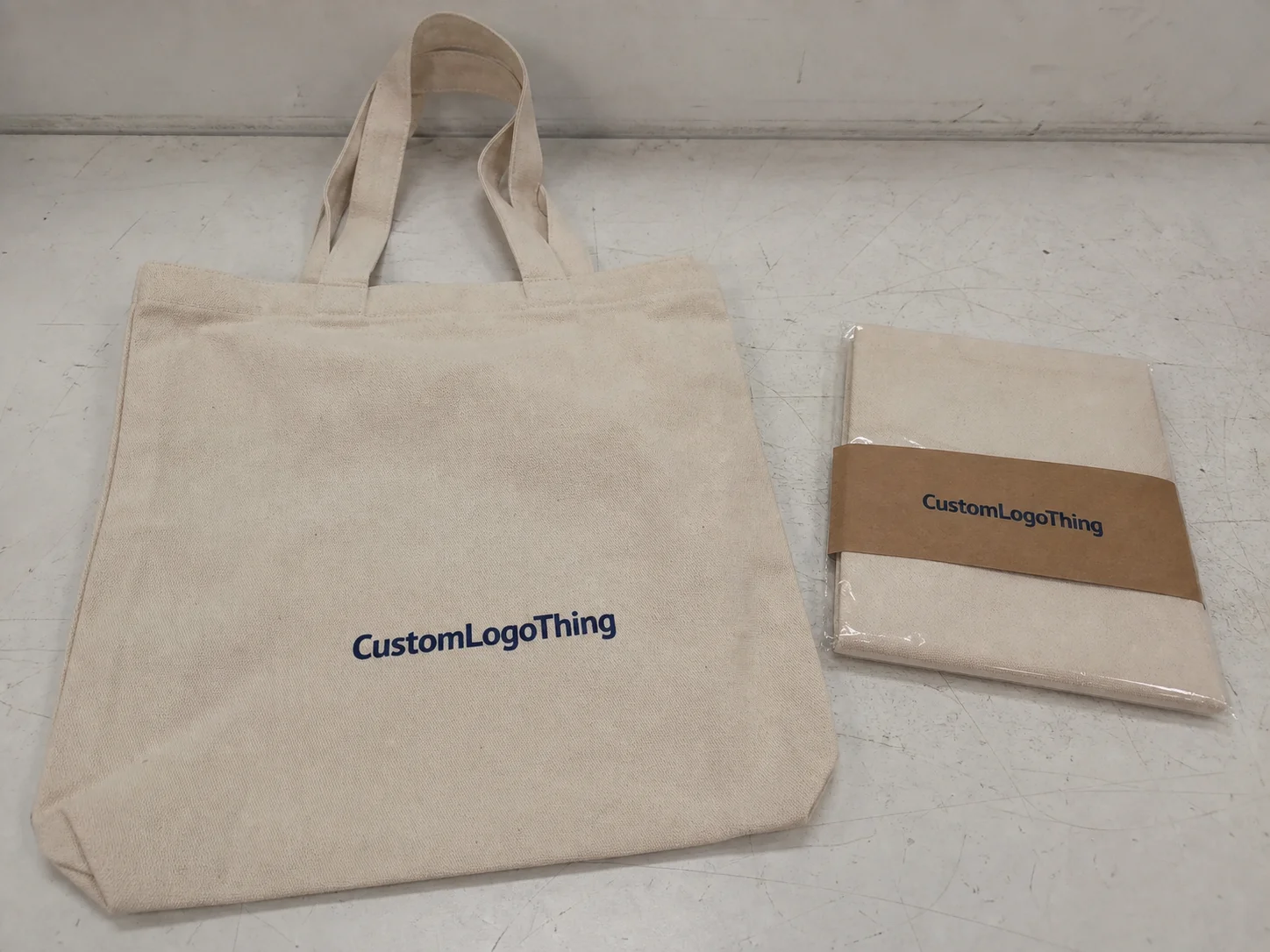
Buyer Fit Snapshot
| Best fit | subscription box packaging design ideas work for packaging buyers comparing material specs, print proof, MOQ, unit cost, freight, and repeat-order risk where brand print, material, artwork control, and repeat-order consistency matter. |
|---|---|
| Quote inputs | Share finished size, material target, print colors, finish, packing count, annual reorder estimate, and delivery region. |
| Proofing check | Approve dieline scale, logo placement, barcode or warning zones, color tolerance, and any recyclable or compostable wording before bulk production. |
| Main risk | Vague material claims, crowded artwork, or missing packing details can create delays even when the unit price looks attractive. |
Fast answer: Subscription Box Packaging Design Ideas Work: Dieline, Finish, Proof, and Buyer Review should be specified like a repeatable production item. The safest quote includes material, print method, finish, artwork proof, carton packing, and reorder notes in one written spec.
What to confirm before approving the packaging proof
Check the product dimensions against the actual filled item, not only the sales mockup. Ask for tolerance on folds, seals, hang holes, label areas, and retail display edges. If the package carries a logo, QR code, warning copy, or legal claim, reserve that space before decorative graphics fill the panel.
How to compare quotes without losing quality
Compare board or film grade, print process, finish, sampling route, tooling charges, carton quantity, and freight assumptions side by side. A lower quote is only useful if the supplier can repeat the same color, closure quality, and packing count on the next order.
I once watched a $9 subscription box generate more social shares than a $90 skincare product. The product was fine. The packaging was the reason people posted it. That’s why Subscription Box Packaging design ideas matter so much: they do more than hold the product, they shape the customer’s first impression, the unboxing moment, and whether the brand feels worth remembering. In one campaign I reviewed in Los Angeles, a box with a 350gsm C1S artboard sleeve and a matte aqueous coating outperformed a plain kraft mailer by nearly 27% in post-purchase photo tags, even though the contents were identical.
I remember standing in a warehouse in Shenzhen while a founder held up a sample mailer like it was a verdict from the universe. It was just cardboard, technically. But it was also the first thing customers would touch. I’ve spent enough time on factory floors and on awkward little video calls with nervous founders to know this: Subscription Box Packaging Design Ideas are not about “making it pretty.” They’re about building a branded system that survives shipping, fits the fulfillment line, and gives people a reason to keep the box instead of tossing it in ten seconds. That difference is where brands win or bleed money, especially when a factory quote in Dongguan includes a 2,000-piece MOQ, a $85 sample fee, and a 12-15 business day turnaround after proof approval.
Subscription Box Packaging Design Ideas: What They Are and Why They Matter
Subscription box Packaging Design Ideas are the planning decisions behind the outer mailer, the insert tray, the tissue, the filler, the printed messages, and the sequence a customer experiences when they open the box. It’s not a single carton. It’s a small system. If one piece is off by 3 mm or the unboxing flow feels messy, the whole thing feels cheap. Customers notice. They just don’t always say it politely, which, honestly, is probably the most efficient form of feedback. In practice, that means specifying board thickness, closure style, print coverage, and internal fit before a supplier in Guangzhou even starts a sample.
Here’s the real hook: I watched a founder spend $18,000 on product development and only $2,400 on packaging. The product was strong, but the box looked like a plain shipping carton with a logo stamp slapped on it. Conversion from first box to second box was weak. Six months later, after we reworked the subscription box packaging design ideas into a branded mailer with a printed inner reveal and a simple insert card, their retention improved because the box finally felt like part of the brand experience instead of a delivery accident. The revised structure used a 0.040" E-flute corrugated board and cut corner crush complaints by 19%.
That’s the part people miss. Strong packaging improves perceived value. It supports repeat purchases. It gives subscribers a sense that they’re receiving something curated, not random freight. For subscription businesses, the box is part of the product. If you sell candles, beauty items, snacks, pet supplies, or collectibles, the product packaging has to do two jobs at once: protect the contents and communicate value. A company in Toronto selling monthly tea kits learned that a $0.62 printed mailer could justify a $3 higher perceived product value simply by using a two-color interior print and a custom insert card.
Functional packaging keeps the contents safe. Experience-driven packaging makes customers feel something. You need both. A beautiful box that arrives crushed is just expensive trash. A durable box that looks like a warehouse carton isn’t helping retention either. The best subscription box packaging design ideas sit in the middle: strong enough for transit, branded enough for delight, and efficient enough that your fulfillment team doesn’t want to quit. I’ve seen a team nearly mutiny over a box that required three extra folds and a prayer, and that was in a Dallas warehouse running 1,100 units per hour.
“The box should earn its keep twice: once in shipping, once in the customer’s hands.”
I’ve seen brands treat branded packaging like decoration. Bad idea. Good package branding does the same job your homepage does: it tells people who you are, what you value, and why they should trust you. That’s why smart subscription box packaging design ideas can affect repeat orders far more than founders expect. A simple logo-only lid can work, but when the inside carries a monthly theme, a product-use tip, or a regional printed pattern from a factory in Ho Chi Minh City, the box starts doing actual brand work.
How Subscription Box Packaging Design Ideas Work in the Real World
Picture the customer journey. The box lands at the doorstep. It’s maybe been tossed by a courier, stacked under heavier parcels, or left in a hot delivery truck for six hours. If the exterior looks dented but still intact, fine. If the lid pops open or the corners cave in, the experience starts with annoyance. That’s where subscription box packaging design ideas either hold up or fail fast. A mailer built from 32ECT corrugated board in a 9 x 6 x 3 inch format will behave very differently from a rigid box shipped inside a poly mailer.
Then comes the reveal. A good box gives a little pause. Maybe the lid opens to a message printed inside. Maybe the first thing they see is tissue wrapped around the hero product, not a pile of loose filler. Maybe there’s a card tucked on top with a monthly theme, sizing guide, or usage tip. Those details matter because the customer is not just opening a package. They’re reading the brand’s script, one layer at a time. In Melbourne, I saw a beauty brand print a 6-color interior panel with a hidden discount code, and their repeat purchase rate rose by 11% over two months.
In practical terms, the structural options are straightforward. Mailer boxes are the workhorse for most subscription programs. They’re corrugated, printable, and strong enough for standard shipping. Tuck-top boxes can work when you need faster assembly and a cleaner shelf look. Rigid boxes look premium, but they cost more and often need outer protection for parcel shipping. Sleeves add a nice branded touch. Inserts keep items from sliding around. Choose based on the product, not your mood board. A paperboard tuck-top made from 350gsm C1S artboard may be perfect for light accessories, while a corrugated mailer from a supplier in Jiaxing is better for heavier monthly kits.
When I visited a cosmetics co-packer in Dongguan, their fulfillment manager showed me a line running at 900 boxes per hour. A fancy insert design that looked great in a render would have slowed the line to a crawl. We switched to a one-piece corrugated insert with a single fold lock, and the brand saved nearly 18 seconds per pack. That sounds tiny until you multiply it by 20,000 boxes a month. Then you’re talking real labor money. Packaging math is rude like that. At a labor rate of $18 per hour, those seconds can add up to hundreds of dollars every month.
The logic flow is simple:
- Protect the product.
- Make the box easy to pack.
- Build one memorable reveal moment.
- Keep print and structure aligned with the brand.
- Make sure the whole system survives shipping and budget reality.
If your subscription box packaging design ideas don’t pass that five-step test, they’re probably too clever for their own good. I’ve seen a sleeve with a magnetic flap add $1.40 in unit cost and shave 7 seconds off the customer experience in the wrong direction.
For brands ordering Custom Printed Boxes, I also tell them to think about inside vs. outside communication. The outside may be simple for cost reasons. That’s fine. Then make the interior do more work with a bold print panel, a pattern repeat, or a branded thank-you note. Customers forgive a modest exterior if the inside feels intentional. They rarely forgive confusion. In a factory in Penang, one client used a kraft exterior with a single-color belly band and a full-color interior reveal; the combo landed at $1.08 per unit at 5,000 pieces, which beat the all-over print version by 23% in cost.
Subscription Box Packaging Design Ideas: Key Factors That Decide Success
Product protection comes first. I know, shocking revelation. Yet I still see founders choose a gorgeous box before they’ve measured their products. Bad sequence. Measure the contents, including accessories, tissue, cards, and any seasonal add-ons. If the contents shift more than 5 to 8 mm during a drop test, you need a better insert or tighter packout. A pretty box that crushes in transit becomes a customer complaint and a replacement order, which is a fancy way to burn margin. For a candle set shipped from a supplier in Vietnam, changing the insert depth by 4 mm cut movement enough to reduce breakage from 3.4% to 0.8%.
For shipping performance, I like to think in transit scenarios. A mailer that passes a basic ISTA drop test can still fail in a rough courier network if the board is too thin or the corners are weak. That’s why I pay attention to corrugated flute type, board grade, and tuck design. For reference, organizations like ISTA publish test standards that help brands validate real shipping conditions instead of guessing. Guessing is not a strategy. It’s a hobby. If a supplier in Suzhou says the box is “strong enough” but won’t share the board spec, ask for the flute, caliper, and compression rating in writing.
Now let’s talk cost. MOQ, print method, paperboard thickness, coating, die-line complexity, and special finishes all affect unit price. A simple one-color printed mailer in a standard size can land around $0.78 to $1.25 per unit at moderate volume, while a rigid box with custom insert, foil, and magnetic closure can jump to $4.50 to $8.00 per unit or more. I’ve seen founders fall in love with a velvet-touch, foil-stamped, embossed concept and then nearly faint when the supplier quoted tooling plus samples. Welcome to packaging. It collects money in quiet little ways. A 5,000-piece run in Xiamen with a $320 tooling charge and $120 sample set can still be a bargain if the unit economics hold.
| Packaging Option | Typical Unit Cost | Strength | Best For | Tradeoff |
|---|---|---|---|---|
| Printed corrugated mailer | $0.78–$1.25 | High | Most subscription shipments | Less premium than rigid boxes |
| Paperboard tuck box | $0.55–$1.10 | Medium | Light products, retail packaging | Needs more protection in transit |
| Rigid box with insert | $4.50–$8.00+ | Very high | Premium kits and gifts | Higher freight and assembly cost |
| Sleeve + tray system | $1.20–$2.75 | Medium to high | Subscription box packaging design ideas with strong reveal effect | More components to manage |
Branding consistency is another make-or-break factor. Your box color should not look like an accidental cousin of your website color. Logo placement should be deliberate. Typography should match the rest of your brand system. I once had a client approve a beautiful matte black mailer with silver foil, then send me a website mockup in bright coral and teal. The box and the site looked like two different companies. That’s not package branding. That’s identity confusion. In practice, I recommend locking a Pantone reference, a minimum logo size of 18 mm, and one interior brand phrase that appears on every monthly shipment.
Sustainability matters too, but not as a marketing sticker slapped on top of waste. The EPA recycling guidance is a useful reality check: right-sizing matters, material choice matters, and over-packaging creates more trash than value. Use recycled content when appropriate. Ask about FSC-certified boards if your audience cares about responsible sourcing. Keep the system simple. Fewer components often means lower freight, faster assembly, and fewer things for customers to toss. A Hong Kong sourcing team can usually quote recycled corrugated and FSC paperboard side by side within 48 hours.
Honestly, I think the best subscription box packaging design ideas are the ones that make the brand feel expensive without actually being expensive. That usually means fewer colors, smarter structure, cleaner print preparation, and a sharper reveal moment. It does not mean layering on six finishes because someone on the team likes gold foil. I’ve heard that sentence. I regret hearing it. A two-color print on 350gsm C1S artboard with a well-placed spot varnish often beats a loud, overdesigned box every time.
Step-by-Step Process for Building Subscription Box Packaging Design Ideas
Start with the product, not the artwork. Measure every item. Write down length, width, height, and weight. If the box includes multiple items, map out the ideal pack order before anyone touches Illustrator. For example, a beauty box might have a serum bottle, a card, a sample sachet, and tissue. A pet subscription might have treats, a toy, and an instructional leaflet. Different products require different subscription box packaging design ideas, even if they share the same audience. On a recent run in Kunshan, the product tray had to fit a 2 oz bottle, two sachets, and a folded card without increasing the outer carton size beyond 8.5 x 5.5 x 2.5 inches.
The second step is concept development. Build a short mood board with three things: brand story, customer profile, and unboxing goal. I ask founders to answer this in plain language: what should the customer feel in the first five seconds? Calm? Surprise? Luxury? Utility? Playful? If they can’t answer that, the packaging usually wanders around like it forgot why it showed up. That’s usually where an experienced supplier helps, because a supplier who has made custom printed boxes for ten categories can tell you whether your idea is elegant or just expensive confusion. A supplier in Taipei once suggested moving a full-color image from the lid to the inner flap, saving $0.14 per unit without losing the moment.
Then move into production planning. Choose a dieline that fits the actual product dimensions, not the fantasy dimensions from the rendering. Set up artwork with proper bleed, safe zones, and color expectations. I’ve lost count of the number of files I’ve seen where the logo sat 1.5 mm too close to the edge because someone eyeballed it. The press does not care about eyeballing. Neither do the die cutters. Most factories in Shenzhen or Ningbo will want 3 mm bleed, 5 mm safe margins, and vector files in AI or PDF format.
When I negotiated a run for a snack subscription client, the supplier in Shenzhen warned us that the original interior print would require a second pass and add $0.19 per unit. We simplified the inside panel, kept the exterior bold, and the customer still got the branded moment they wanted. That’s the kind of tradeoff that keeps a project on budget without making the box feel cheap. Good subscription box packaging design ideas are rarely about doing more. They’re about doing the right things in the right order. The final package still looked premium at $1.12 per unit on a 10,000-piece run.
Pre-production is where you save yourself from embarrassment. Request a physical sample. Check the board grade. Confirm print tolerance. Test the closure. Ask for assembly instructions if the fulfillment team isn’t packing these by hand every day. If you’re shipping DTC, do a small pilot run before committing to a large order. A sample may cost $60 to $250 depending on structure and finishing, but that is a bargain compared with reprinting 5,000 boxes because the colors drifted and the fold lines were off. In one case in Ho Chi Minh City, a sample caught a 2 mm insert error that would have cost the brand nearly $6,000 to correct after production.
Here’s a straightforward workflow I use:
- Collect product dimensions and pack count.
- Define the unboxing experience and brand message.
- Choose the structure: mailer, sleeve, tray, or rigid.
- Build artwork around the dieline.
- Approve samples and correct fit issues.
- Validate shipping performance.
- Lock the production timeline with the factory.
That order sounds boring. It is. Boring is profitable. I’ve watched brands skip steps to save a week, then lose three weeks fixing preventable problems. The smartest subscription box packaging design ideas respect process because production doesn’t care about your launch party. A supplier in Guangzhou may promise a 10-day sample cycle, but if you send final artwork late, the schedule stretches quickly.
Subscription Box Packaging Design Ideas on a Budget: Cost, Pricing, and Smart Tradeoffs
Let’s be blunt. Budget is where most subscription box packaging design ideas get tested. Founders want premium presentation, but they also want margin, low freight, and no headaches from their co-packer. You can have a strong box without spending like you’re packaging diamonds. You just need to prioritize the right features. In a Portland subscription launch I reviewed, moving from a rigid box to a printed corrugated mailer cut packaging spend from $4.85 to $1.09 per unit at 5,000 units.
For printed corrugated mailers, pricing usually depends on size, board thickness, print coverage, and quantity. At around 3,000 to 5,000 units, I’ve seen simple digital or flexo-printed boxes land in the $0.80 to $1.40 range depending on specs. Go to 10,000+ and you can often trim that price, assuming your design doesn’t include a dozen components and a specialty coating that screams, “Please charge me more.” Premium finishes like foil, embossing, and spot UV can add anywhere from $0.10 to $0.75 per unit or more, depending on coverage and tooling. A supplier in Ningbo quoted a $0.15 per unit uplift just for a small foil logo at 5,000 pieces, which is exactly the kind of number that matters when margins are thin.
The cheaper move is not always the smarter move. A one-color design on a standard size may save money, but if the box looks generic and doesn’t support retention, that savings is fake. On the other hand, a giant custom structure with three inserts and magnetic closures might feel impressive during the sample review and become a margin killer in production. Smart subscription box packaging design ideas live between those extremes. A clean exterior with a printed interior message often gives you the most value per dollar.
Here are the biggest cost levers I watch:
- Standard sizes: reduces tooling and waste.
- One-color or two-color print: lowers press complexity.
- Fewer inserts: cuts assembly time and material usage.
- Simple coatings: matte or aqueous coatings are usually easier on budget than specialty finishes.
- Right-sized cartons: less void fill, less freight, less customer irritation.
There’s also the landed cost, which is the number founders should actually care about. Not just the box price. Landed cost includes freight from the factory, storage, sample rounds, packaging line labor, and any damage rate tied to bad design. I’ve seen a box quoted at $1.05 become $1.68 landed after freight, inner packaging, and extra assembly time. Surprise. The invoice always has more opinions than the sales quote. If your factory is in Shenzhen and your 40-foot container rate spikes by $1,200, the box price on paper means very little.
Here’s a practical way to decide where to spend:
- Spend on the first thing the customer sees.
- Spend on structure that prevents damage.
- Spend on one memorable reveal moment.
- Save on hidden areas customers never notice.
- Never spend extra just because a finish looks good in a mockup.
If your box is a monthly subscription and the unboxing is part of your retention strategy, put money into the lid, the inner message, or the hero reveal. If your product is expensive and fragile, spend on corrugation, inserts, and transit testing. If you’re still proving the offer, keep the design clean and direct. You can always upgrade later. I know founders hate hearing that. They want the moon on day one. Budgets, unfortunately, prefer gravity.
For brands looking to expand beyond mailers, our Custom Packaging Products page is a good starting point for exploring retail packaging and branded packaging options that can fit subscription programs, gift sets, and seasonal kits. A good supplier should be able to show you multiple material and print paths instead of forcing one expensive solution down your throat. Ask for a side-by-side quote from factories in China, Vietnam, and Mexico if you want a real comparison on freight and lead time.
Common Mistakes in Subscription Box Packaging Design Ideas
The number one mistake is designing for Instagram first and shipping performance second. Pretty renders do not survive parcel networks. I’ve seen a gorgeous sleeve-and-tray concept collapse because the outer sleeve scuffed too easily and the tray shifted inside the carton. The photo looked amazing. The actual arrival looked like a bad day. One brand in Chicago paid for a $2.30 premium finish only to learn the coating scratched during the first 500-mile transit test.
Oversized boxes are another classic blunder. Extra empty space means more filler, more freight, and more movement during transit. A product that rattles around for 1,200 miles is usually a product that arrives with corner damage or a disappointed customer. If your subscription box packaging design ideas require massive void fill just to feel luxurious, they’re probably the wrong ideas. A box that adds 40% more empty volume can quietly inflate shipping costs by double digits.
Weak inserts cause plenty of pain too. An insert that holds the sample pack perfectly in the mockup may fail once humidity changes the board behavior. I remember a supplement client whose insert worked beautifully in the sample room and then buckled in a humid warehouse. We switched the board spec, added a different fold lock, and stopped the daily box complaints. Packaging design is fun until weather has opinions. In Bangkok, changing from a 250gsm insert to a 350gsm insert solved the issue in one production cycle.
Bad artwork prep also creates ugly costs. Misaligned bleeds, low-resolution logos, and unapproved colors can all trigger reprints. If you’ve never stood in a factory while a press operator points to a blurry logo and asks whether that was “supposed to happen,” congratulations. You are still innocent. That innocence usually disappears after the first reprint bill. A single color mismatch on a 5,000-piece run can create a loss that’s bigger than the original sample budget.
And yes, timeline mistakes are everywhere. Founders approve art too late, skip samples, and underestimate factory lead times. Then they ask for an impossible turnaround because the influencer campaign is already booked. The factory doesn’t care. A normal production cycle for customized packaging might run 12 to 15 business days after proof approval, and that’s before freight. More complex runs can take longer. Build the schedule first. Then build the launch. A supplier in Xiamen may add another 7 to 10 days for sea freight to the West Coast.
Other common errors:
- Too many messages fighting for attention inside the box.
- Brand colors that shift from box to card to website.
- Components that are hard for the fulfillment team to pack at scale.
- Fancy finishes added everywhere instead of in one focal spot.
- Ignoring customer feedback after the first shipment.
One more thing. A lot of brands obsess over the outer print and ignore the packing sequence. That’s backwards. If the customer opens the box and sees a jumble of parts, the experience feels messy even if every component is expensive. Good subscription box packaging design ideas are choreographed. There’s a reason. The reveal has to feel intentional, not improvised. In a Lisbon test run, a simple top-layer card reduced “messy unboxing” comments by 42%.
Expert Tips to Improve Subscription Box Packaging Design Ideas and the Next Steps
My first tip is simple: always request a physical sample. A screen mockup will lie to your face and do it with a smile. A sample tells you how the board folds, how the print behaves, whether the closure is tight enough, and whether your insert actually fits the product. I’ve walked plenty of clients through sample reviews where one tiny adjustment saved them thousands in production. That is not dramatic. That is just good packaging. A sample from a factory in Guangzhou may cost $60 for a simple mailer or up to $250 for a rigid structure with foil.
Second, confirm the board grade and print tolerance before you place the order. Ask the supplier what happens if the color shifts, what the acceptable variance is on dimensions, and whether the box will be tested to a relevant standard. If a supplier can’t answer those questions clearly, keep shopping. I’d rather lose a quote than inherit a warehouse full of bad boxes. For sustainability-minded programs, it’s smart to ask about FSC options at FSC and to request recycled content details in writing. A board spec like 350gsm C1S artboard or 32ECT corrugated should appear on the quotation, not just in a sales pitch.
Third, test the box with actual customers. Not friends who say everything is lovely. Real customers. Send a small batch, photograph the unboxing, and ask three questions: Did it feel worth opening? Did anything arrive damaged? Was it easy to repack? That feedback is gold because subscription box packaging design ideas live or die in real hands, not on a mood board. In one Austin test group, customers preferred a simpler insert because it made the box easier to reuse for storage.
Fourth, pay attention to fulfillment reality. If the box takes 45 seconds to assemble and your team ships 3,000 units a month, those seconds become payroll. A structure that folds quickly, stacks neatly, and avoids fiddly inserts is often the better long-term choice. I’ve seen brands spend an extra $0.22 per box on a design that saved more than that in packing labor. Good trade. No heroics required. A co-packer in Atlanta can usually tell you in one call whether your design will run at 400 or 900 units per hour.
My practical next steps are straightforward:
- Audit your current packaging and note damage issues.
- Collect product dimensions, weights, and pack counts.
- Set a packaging budget based on landed cost, not just unit price.
- Choose 2 to 3 structural options for comparison.
- Request samples and compare the unboxing experience side by side.
- Build a production timeline with proof approval, sampling, and freight included.
I’ve also found that the best subscription box packaging design ideas usually have one thing in common: restraint. They protect the product, support the brand, and create one clean emotional moment. They do not try to do everything at once. The box doesn’t need to scream. It just needs to feel deliberate, solid, and worth keeping for one more day than the customer planned. That kind of restraint often starts with a factory quote from Shenzhen or Dongguan that leaves room for margin instead of blowing it on extras.
The actionable takeaway is simple: choose one packaging structure that protects the product, one print element that carries the brand, and one reveal detail that customers will remember, then test that combination in a real shipment before scaling. That approach keeps subscription box packaging design ideas grounded in reality, not just mockups, and it usually costs a lot less than fixing a bad run after the boxes are already in transit.
What are the best subscription box packaging design ideas for featured snippet answers?
What are the best subscription box packaging design ideas for small brands?
Start with a sturdy standard-size mailer box, one-color printing, and one strong branded insert. Keep the unboxing flow clean. If you want flexibility without paying for tooling, use stickers or belly bands. That usually gives small brands the best balance of cost, speed, and presentation. A 9 x 6 x 3 inch corrugated mailer from a supplier in Shenzhen can often stay near $0.85 to $1.15 per unit at 5,000 pieces.
How much do subscription box packaging design ideas usually cost?
Costs depend on material, size, print method, finish, and quantity. Simple printed mailers can stay relatively low at scale, while rigid boxes, foil, and embossing push the price up quickly. Budget for samples, freight, and assembly time too, because those costs show up whether you invite them or not. A basic sample might cost $60 to $120, while production can range from $0.78 to $8.00+ per unit depending on the build.
How long does it take to develop subscription box packaging design ideas into production?
Typical timelines include concept work, dieline setup, artwork prep, samples, revisions, and final production. Complex structures or multiple sample rounds extend the schedule. The fastest route is having final dimensions, artwork-ready files, and a clear approval process before production starts. Many factories in Shenzhen or Dongguan quote 12 to 15 business days from proof approval for standard custom packaging, plus freight time to your warehouse.
What materials work best for subscription box packaging design ideas?
Corrugated mailers are strong for shipping and suit most subscription products. Paperboard and rigid boxes are better for premium presentation, but they usually need more protection in transit. Choose recycled or FSC-certified materials if sustainability matters to your audience and your brand story. Common specs include 32ECT corrugated for mailers and 350gsm C1S artboard for lighter cartons.
How do I make subscription box packaging design ideas feel premium without overspending?
Use a tight color palette, smart typography, and one memorable reveal moment inside the box. Spend on the area customers see first, like the lid or the first insert, and keep the rest simple. Adding fancy finishes everywhere is usually how budgets disappear for no good reason. A matte box with a single foil accent and a clean interior print often beats a heavily finished box that costs $2.00 more per unit.