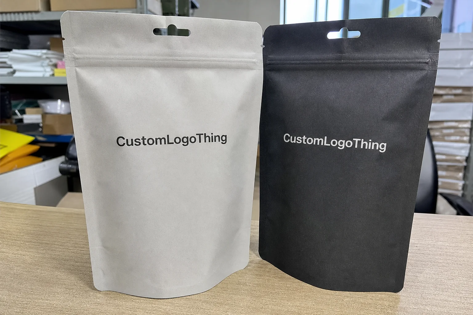
Buyer Fit Snapshot
| Best fit | Cohesive Label Sleeve Design Work projects where brand print, material claims, artwork control, MOQ, and repeat-order consistency need to be specified before quoting. |
|---|---|
| Quote inputs | Share finished size, material target, print colors, finish, packing count, annual reorder estimate, ship-to region, and any compliance wording. |
| Proofing check | Approve dieline scale, logo placement, barcode or warning zones, color tolerance, closure strength, and carton packing before bulk production. |
| Main risk | Vague material claims, crowded artwork, missing packing details, or unclear freight terms can make a low unit price expensive after revisions. |
Fast answer: Cohesive Label Sleeve Design Work: Material, Adhesive, Artwork, and MOQ should be specified like a repeatable production item. The safest quote records material, print method, finish, artwork proof, packing count, and reorder notes in one written spec.
Production checks before approval
Compare the actual filled-product size with the drawing, then confirm tolerance on folds, seals, hang holes, label areas, and retail display edges. Reserve space for logos, QR codes, warning copy, and material claims before decorative graphics fill the panel.
Quote comparison points
Review material grade, print process, finish, sampling route, tooling charges, carton quantity, and freight assumptions side by side. A quote is only useful when the supplier can repeat the same color, closure quality, and packing count on the next order.
The first time I saw a brand eat a $12,000 reprint because of weak sleeve coordination, the artwork looked fine on a monitor and awful on shelf. Individually, each SKU was decent. Together, they fought like three sales reps in one elevator. I’ve seen that mistake happen in our Shenzhen facility, where the line was running 120,000 sleeves a day, and honestly, it happens more often than people admit because nobody checks the full range under retail lighting, at a real 6-foot viewing distance, on actual PET bottles or jars.
If you’re trying to build Tips for Cohesive label sleeve design into a real packaging system, not just a pretty mockup, you need more than matching colors. You need visual rules, structure, and a little discipline. The good news? It’s fixable. I’ve helped brands straighten out sleeve programs with budgets from $0.15 per unit for 5,000 pieces all the way up to premium runs with soft-touch lamination, metallic ink, and tighter registration. In Guangdong and Jiangsu factories, the difference between a workable sleeve and an expensive one is often 2mm of bleed, not a grand design theory. The trick is knowing what actually matters, and what is just decorative noise pretending to be strategy.
What Cohesive Label Sleeve Design Actually Means
Tips for cohesive label sleeve design start with one idea: the sleeves have to act like a family. Not clones. Family. Same bones, same tone, same structure, but with enough variation that each SKU still has a job. That means the color system, typography, hierarchy, finish, and brand voice all need to work together across bottles, jars, boxes, or tubes, whether the line is produced in Shenzhen, Dongguan, or Ho Chi Minh City.
I had a client once bring me six flavor sleeves that looked gorgeous in isolation. One had a brushed copper accent. One had a neon gradient. One used a condensed serif, and another used a chunky sans with 14 words crammed into the front panel. On the shelf, it looked like six different brands arguing over who rented the space. We rebuilt it with a tighter grid and three color families, and the shelf read in under two seconds. That’s the whole point of tips for cohesive label sleeve design: recognition first, decoration second, especially when the package is only visible for 3 to 4 seconds in a grocery aisle.
Cohesive does not mean identical. That’s where a lot of teams go sideways. Matching is copy-paste. Cohesion is system thinking. A protein line can use one master layout and still shift accent colors for vanilla, chocolate, and salted caramel. A beauty brand can keep the logo in the same position while changing imagery, scent cue, and shade family. Tips for cohesive label sleeve design are really about consistency in the rules, not sameness in every detail. If the system is clean, you can launch a new SKU in roughly 7 to 10 business days of artwork updates instead of rebuilding the whole family from scratch.
The package also has to work with the object itself. A sleeve on a round 500ml PET bottle is not the same as a sleeve on a square 250ml jar or a tapered 30ml tube. Curvature changes how the eye reads logos, borders, and small text. Seams can cut through artwork. Shrink ratios can distort faces, icons, and fine lines. If your design only looks good flat, it is not ready. That’s not me being dramatic. That’s me saving you a call from a plant manager at 8:30 a.m. after the heat tunnel in Suzhou has already distorted the front panel.
“We thought the artwork was perfect until the seam landed right through the product name. That was a fun Monday.” — a brand manager I worked with after a rushed approval cycle
Good tips for cohesive label sleeve design also improve shelf scanning. Shoppers do not read every sleeve. They skim. They look for a shape, a color family, a logo placement, maybe one claim, then they move. The more unified your line is, the faster people understand what belongs together and what is different. That matters in grocery, beauty, supplements, and private label. Retail is visual math, not poetry. I wish it were poetry sometimes, but shelf sets have zero patience for that kind of romance.
One more thing: cohesion builds perceived value. A line that looks coordinated tends to feel more premium, even if the material cost is modest. A sleeve using 350gsm C1S artboard with soft-touch lamination on a carton can feel more expensive than a chaotic design with five finishes and no hierarchy. I’ve watched buyers pay higher shelf prices for cleaner packaging. Not always, but often enough to make the lesson expensive. In London, New York, and Singapore, the same principle shows up in premium private-label aisles: cleaner systems read as better-managed systems.
How Cohesive Label Sleeve Design Works Across a Line
Scaling tips for cohesive label sleeve design across multiple SKUs is mostly about locking the system before anybody starts arguing about flavor colors. You define what stays fixed and what can flex. That fixed layer usually includes logo placement, type scale, layout grid, core icons, legal text zones, and finish strategy. The flexible layer is where each SKU gets its own accent color, scent band, flavor cue, size callout, or secondary illustration. In a 10-SKU line, I usually recommend no more than 3 core accent families to keep production and reorder management sane.
In one beverage project, we used the same front-panel architecture across 12 cans. The only changes were a color strip, a bold flavor name, and a small icon system. The result was tight enough for retail, but not boring. That’s the sweet spot. If every SKU shouts, none of them get heard. Strong tips for cohesive label sleeve design keep the lineup legible from six feet away and attractive at arm’s length, whether the cans are on a refrigerated shelf in Toronto or a warm shelf in Dubai.
Here’s how I usually break the structure down when clients need tips for cohesive label sleeve design that hold up in production:
- Fixed elements: logo position, brand mark size, core typography, and mandatory regulatory copy.
- Flexible elements: flavor colors, scent cues, tier labels, pattern accents, and promotional badges.
- Production-sensitive elements: seam placement, barcode zone, white ink usage, and shrink distortion allowances.
The sleeve’s shape matters more than people think. On a shrink sleeve, the artwork is printed flat but viewed after heat application. That means circular graphics can become ovals, thin borders can wobble, and text near the edge can look pinched if the shrink profile is ignored. I’ve seen brands approve artwork from a digital PDF and then act surprised when the physical sleeve curves like a stubborn piece of tape. On a 70mm diameter bottle with a 78% shrink ratio, a 1mm border can visibly shift, so dieline-aware design should happen before approval, not after the first test run.
That’s why tips for cohesive label sleeve design should always be tied to specs. You want the printer involved early enough to flag film gauge, shrink percentage, seam tolerance, and required bleed. For example, if a sleeve is going onto a 60mm bottle with a 78% shrink ratio, the central branding area cannot sit too close to the edges or it will distort during tunnel application. These are not creative preferences. They are physics with a bill attached. In practice, many converters ask for at least 3mm bleed on each side, while some high-shrink formats need 4mm to 6mm depending on container curvature.
A clean design system also helps with future line extensions. If the brand launches a new scent or flavor, the design team does not need to start from zero. They follow the same master template, swap the accent color, update the callout, and keep moving. That saves time, prevents brand drift, and reduces the chances that a new SKU ends up looking like a mistake. A well-built system can cut redesign time from 3 days to 3 hours for a small extension.
If you need a parallel product system, I usually recommend pairing sleeve work with Custom Labels & Tags so the packaging voice stays aligned across every format. I’ve seen brands use one visual language on sleeves and another on inserts, and it instantly makes the whole system feel cheaper. Like, dramatically cheaper. One glance and you can almost hear the budget leaking out. In practice, that mismatch often shows up when sleeves are printed in Dongguan and inserts are ordered from a separate supplier in Kuala Lumpur with no shared style guide.
Key Factors Behind Cohesive Label Sleeve Design
There are a few factors that make or break tips for cohesive label sleeve design, and color is the first fight in the room. Your brand palette should do the heavy lifting, not a random rainbow because marketing wanted “more energy.” Too many colors split the shelf story. Too few and the line can feel flat. I usually push clients toward one primary brand color, two support colors, and one accent family, unless the product architecture genuinely needs more. Most do not. In a 6-SKU range, that usually means 1 dominant hue, 2 secondary tones, and no more than 1 metallic accent.
Typography is the next trap. I once sat in a supplier meeting where a brand wanted five fonts on one sleeve. Five. That’s not hierarchy. That’s a ransom note with a budget. Good tips for cohesive label sleeve design use one primary type family and, at most, one secondary family for contrast. The hero product name should be larger than the descriptive copy, and the legal copy should be quiet but readable. On shelf, point size matters. If your ingredient list is 5.5 pt in a curved sleeve and the shopper needs a magnifying glass, something has gone wrong. For most consumer shelves, I recommend keeping key claims at 10 pt or larger after shrink, with legal text no smaller than 6 pt unless your compliance team says otherwise.
Image style and iconography need the same discipline. If your illustrations are hand-drawn, keep them hand-drawn across the range. If they’re geometric line icons, keep the line weight consistent. Don’t mix watercolor fruit art with flat vector badges unless there is a very clear reason. The fastest way to make a lineup look messy is to combine styles that never met each other at a brand meeting. Strong tips for cohesive label sleeve design keep visual language steady from SKU to SKU. A line weight of 0.75 pt on one sleeve and 1.5 pt on another is enough to make the family feel split.
Structure also influences cohesion. A sleeve wraps around a container, which means the seam can interrupt important content. I’ve had print buyers ask me why a logo “moved” when the real issue was seam placement. On a 360-degree sleeve, the seam should avoid the logo, key claims, and barcodes whenever possible. If the seam has to land in a visible area, the design should anticipate it and build a quieter zone there. The best cohesive systems treat the seam like a technical boundary, not an afterthought. Most converters in Foshan and Xiamen will ask for a seam-safe zone of at least 6mm to 10mm, depending on the diameter.
Now the part nobody likes discussing until the invoice lands: cost. The pricing for tips for cohesive label sleeve design changes fast depending on print method, film choice, finish upgrades, and MOQ. A basic PVC or PETG sleeve with standard four-color print might come in around $0.12 to $0.22/unit at mid-volume, while adding metallic ink, matte varnish, or soft-touch laminate can push the figure much higher. Setup fees, plate charges, and tooling for unusual die lines also affect the total. Here’s a simple comparison I’ve used with buyers more than once:
| Option | Typical Cost Impact | Visual Effect | Best Use Case |
|---|---|---|---|
| Standard 4-color sleeve | Lowest setup; often $0.12-$0.22/unit | Clean, practical, flexible | Large SKU families, tight budgets |
| Soft-touch + spot gloss | Moderate cost increase | Premium feel, controlled contrast | Beauty, wellness, premium beverage |
| Metallic ink or foil effect | Higher ink and press cost | High shelf shine, stronger pop | Hero SKUs, gifting, limited editions |
| Special die line or complex shrink profile | More pre-press and tooling cost | Tailored fit, but more risk | Unusual containers, custom bottles |
If you’re negotiating with suppliers like Berry Global or CCL, ask specific questions. What is the Minimum Order Quantity? What substrate do they recommend for your container shape? How many proof rounds are included? What registration tolerance can they hold on your artwork? How do they handle seam placement for curved containers? Those questions save money faster than vague requests for “best quality.” I know that sounds blunt, but vague requests are how packaging budgets go to disappear behind the break room door. If a vendor can’t tell you whether they can hold ±0.25mm registration on fine text, they are not ready for a precision sleeve line.
For brands that care about sustainability and want their packaging story to hold up, I also point them toward FSC certification standards when paper components are involved, and toward guidance from EPA packaging and waste resources when material reduction matters. If your line includes cartons or secondary packaging, those references can help keep the entire system aligned, not just the sleeve. In Europe, some teams also check local EPR rules before approving final materials so the design does not create a compliance headache in Germany, France, or the Netherlands.
My honest opinion? Strong tips for cohesive label sleeve design are 40% design skill and 60% decision discipline. The art team can create a beautiful layout, but if three departments keep changing the font size, the accent color, and the copy hierarchy, the final result will look like a committee made it. Because it did. And committees, bless them, can turn a crisp concept into oatmeal.
What Are the Best Tips for Cohesive Label Sleeve Design?
The best tips for cohesive label sleeve design are the ones that keep the full family readable before they ever make it to a press check. Start by setting a single visual system for the line. Then decide what can vary without breaking that system. If the logo moves, the type shifts, and the accent colors wander every time somebody opens a new file, the shelf becomes a guessing game. A clean line should answer one question fast: “Which products belong together?”
I like to ask brands to test cohesion from three distances: arm’s length, six feet, and across a store aisle. That sounds simple because it is. Yet the difference between a decent sleeve and a disciplined sleeve often shows up in those tiny perception shifts. A strong brand mark, a consistent grid, and a restrained color strategy can do more than five extra effects ever will. If the package reads quickly, it sells more easily. That’s not philosophy. That’s retail behavior.
Another of the most useful tips for cohesive label sleeve design is to keep your finish strategy under control. One finish can elevate a line. Three finishes can turn it into visual static. Matte plus spot gloss? Often smart. Matte plus gloss plus foil plus raised ink? Usually too much unless the SKU is a hero product with a real reason to stand out. The cleaner the contrast, the easier it is for shoppers to parse the shelf.
Finally, check the system on actual containers, not just mockups. A sleeve that looks tidy on a flat comp can distort badly once it wraps a bottle. Shrink ratio, seam placement, and curvature all change the way the artwork lands. The best tips for cohesive label sleeve design always include a physical test, because the press and the heat tunnel do not care how pretty the PDF was.
Step-by-Step Process for Cohesive Label Sleeve Design
The cleanest way I’ve found to apply tips for cohesive label sleeve design is to build the process around decisions, not revisions. Start by auditing what already exists. Pull the current SKUs, website visuals, trade show banners, product photography, and any old print files. I did this with a client in personal care, and the biggest surprise was that their e-commerce images used a different blue than their packaging. No wonder the shelf looked off. Their own assets were arguing with each other, and the retailer in Chicago noticed within the first week of launch.
Step one is a brand rules audit. Write down the logo usage rules, approved typefaces, color values in CMYK and Pantone, icon style, and tone of voice. If a product line already exists, mark which elements cannot change and which can be standardized. That becomes your sleeve system. Good tips for cohesive label sleeve design always start with a system, because random creativity is expensive. A single PMS color change after print approval can add 2 to 5 business days, depending on how far the vendor has progressed.
Step two is to build the master template. This is where you define the locked zones and the flexible zones. The locked zones include the product family name, brand mark, mandatory claims, barcode, and any required icons. The flexible zones are where the flavor, scent, or tier can vary. I like to sketch this before a designer starts polishing anything. It keeps everyone from designing a beautiful mistake. A good master template should include a 3mm safe zone, a barcode quiet zone, and a seam map before any color work begins.
Step three is prototyping. Do not skip the physical sample. A digital proof is useful, but it does not tell you how the sleeve behaves on the actual bottle under actual lighting. The best chain is usually digital proof, material sample, press check, and fit test on the real container. When we tested sleeves on a 250ml curved bottle for a client in cosmetic skincare, the front panel looked strong in PDF but became too busy once wrapped. The fix was simple: reduce the copy by 18%, widen the top margin by 2mm, and move the logo 4mm higher. Cheap corrections. Expensive lesson. In that case, the first sample round took 4 business days, and the second round took 2 because the template was already tight.
Typical timeline and where delays happen
For most projects, design-to-production takes 12 to 15 business days from proof approval if the artwork is clean and the vendor is responsive. That can stretch fast if nobody agrees on the final dieline, if barcode revisions come late, or if the client keeps changing one SKU after another. I’ve watched a two-week schedule become a five-week headache because three departments approved different versions of the same sleeve. That is not a printing problem. That is a process problem. In practice, plant scheduling in Vietnam or southern China can also slip by 2 to 3 days if film stock needs to be reordered.
Here’s the usual order of operations for tips for cohesive label sleeve design that actually keep the job moving:
- Audit existing brand assets and packaging.
- Set the master sleeve layout and visual rules.
- Confirm dieline, container measurements, and seam location.
- Prepare artwork with bleed, shrink allowance, and barcode space.
- Approve digital proof and material sample.
- Run a fit test on the actual container.
- Approve the press-ready file and production run.
Step four is pre-press. This is where most avoidable mistakes live. Check the bleed, usually at least 3mm, although your converter may specify more depending on the sleeve geometry. Verify seam placement. Confirm regulatory copy. Make sure the barcode is sized correctly for scanning at the retailer’s checkout system. Test legibility on a curved surface. These are not optional details. They’re the difference between a clean launch and a panic shipment. If the packaging is for a beauty line sold in Seoul, the same artwork may need different language panels and a tighter character count, which is why pre-press matters so much.
If you want stronger cohesion, approve a single style guide before printing. I mean one PDF, one source of truth, one file every supplier uses. Not four versions buried in email threads. I’ve seen the same line printed from two “final” files because someone renamed a folder and nobody noticed. The printer was not the problem. The workflow was. And yes, I still cringe a little when I think about it. A style guide can save 6 to 8 hours of revision time on a 10-SKU line, which is not glamorous, but it is real money.
A lot of tips for cohesive label sleeve design also depend on substrate choice. PETG, PVC, and OPS all behave differently in print and shrink. If the package is going into an FDA-regulated product or a food environment, material selection becomes even more important. Talk with the converter before final approval, not after your marketing director has already written the launch email. Saves everyone a bruise. For food-contact or supplement projects, I’ve seen clients request migration testing and supplier declarations from plants in Malaysia and mainland China before they sign off.
My best advice here? Treat the sleeve as a production object first and a design object second. That sounds less glamorous, sure. It also keeps your budget from exploding. Good tips for cohesive label sleeve design are grounded in what the press can actually hold. A design that prints cleanly at 1,000 units should also print cleanly at 50,000, whether the run comes out of Ningbo or Monterrey.
Common Mistakes That Break Cohesion
The biggest mistake I see is simple: brands design each SKU in a vacuum. One team handles strawberry, another handles vanilla, another handles mint, and by the time they’re done, the lineup looks like three different companies. That is the fastest way to kill tips for cohesive label sleeve design. A family should feel intentional. A pile of unrelated sleeves feels cheap, even if the unit cost is high. A retailer can spot that inconsistency from 10 feet away.
Too many finishes can also wreck the look. I like a matte base with one accent finish if the product needs premium signaling. But when every sleeve has gloss, foil, spot UV, emboss-style graphics, and three different gradients, the packaging starts looking noisy. Retail shelves already have enough visual clutter. Your job is to reduce friction, not add more of it. In practice, one matte finish and one gloss highlight often outperform four competing effects.
Hierarchy is another common failure. If the scent name is as big as the brand name, and the marketing claim is bigger than both, the package has no anchor. I’ve had to walk a client through this with a ruler and a printout because they couldn’t see that their “bold” design had no focal point. Strong tips for cohesive label sleeve design give the eye a clear path: brand first, product type second, variant third, details last. On a 120mm-tall sleeve, that usually means the brand mark occupies the top 20% and the variant cue stays in the middle zone.
Another issue people ignore is shelf lighting. Under bright retail LEDs, some metallic effects glare hard. Dark sleeves can lose detail. Gloss over deep navy can make tiny copy vanish at a six-foot distance. When I visited a contract filler in Ohio, the line manager showed me exactly where glare from overhead lights made one batch look darker than the proof. We adjusted the ink density by 8% and softened the finish. Small fix. Big difference. The same thing happens in refrigerated cases in Minneapolis and Amsterdam, where cold white light can flatten contrast even further.
Production errors are brutal because they’re expensive and completely avoidable. Seam over logo? Bad. Missing bleed? Bad. Assuming screen color equals print color? Also bad. Your monitor is not Pantone. It’s a suggestion box with a backlight. If your supplier doesn’t ask about shrink allowance, registration tolerance, and fit test samples, that’s a warning sign. A decent converter will care about the details because they’ve seen what happens when nobody does. On fine text, even a 0.5mm shift can turn a crisp line into a fuzzy one.
Here are the mistakes I’d put on every pre-launch checklist for tips for cohesive label sleeve design:
- Designing SKUs separately instead of as one visual system.
- Using more than two font families without a strong reason.
- Ignoring seam placement and shrink distortion zones.
- Overloading the sleeve with accents, textures, and claims.
- Skipping physical samples on the actual container.
One more ugly truth: people often approve sleeves from a screen that’s nowhere near the conditions of a real store. If your product sells under cold white LEDs, near glass, or in a refrigerated case, test it there. I’ve seen beautiful artwork disappear in cooler doors because the contrast was too weak. Good tips for cohesive label sleeve design account for the environment, not just the file. A sleeve that looks strong at noon under office lights may look muddy at 7 p.m. under fluorescent grocery lighting.
Expert Tips for Cohesive Label Sleeve Design on a Budget
You do not need a giant budget to get solid tips for cohesive label sleeve design. You need a tighter system and fewer unnecessary extras. That starts with one master template. Build the sleeve once, then swap only what has to change. That reduces art time, proof time, and the chance that one SKU wanders off-brand. On a small line of 4 products, this can cut revision rounds from 3 to 1 if the team agrees early.
Spend money where shoppers actually notice it. If the product is sitting on a shelf with heavy competition, invest in a clean layout, good contrast, and one premium finish on the hero SKU. Save money by keeping the rest of the line simple. I usually tell brands to reserve metallic ink, spot gloss, or textured effects for the flagship item, not every single variant. Nobody wins a shelf war by turning all 14 SKUs into little disco balls. In a 5000-piece run, that restraint can be the difference between a $0.15 and a $0.28 unit cost.
For print vendors, ask practical questions. Not fluffy ones. Ask whether they can hold the same color across reorders, what their minimums are, and whether they provide fit samples before production. If you’re talking to large converters like Berry Global or CCL, also ask how they handle material consistency between lots. That can affect color appearance more than people expect. I’ve had a supplier save a client $3,800 by switching from a higher-cost specialty film to a more stable standard film that still hit the visual brief. In some cases, the better option is a 25-micron film with a consistent shrink profile instead of a fancier but temperamental one.
There’s also a smart middle path for premium cohesion. Standardize the dieline. Standardize the logo zone. Standardize the copy block. Then let each SKU flex within those rules. That gives you line-wide consistency without forcing every package to look identical. It also makes reorders less painful. The more repeatable the system, the less time you waste fixing the same problems three times. A supplier in Taichung once told me repeatable templates cut their press setup by 20 minutes per SKU, which adds up fast on a 12-SKU line.
If you want a quick way to test shelf impact before full production, print one set of digital comps at actual size, wrap them around sample containers, and place them side by side under store-like lighting. I’ve done this with a dozen start-ups. It’s not fancy. It works. Put them three feet away, then six feet away. If the brand disappears at six feet, the hierarchy needs work. If the family looks unrelated, the color logic needs tightening. This is one of the cheapest tips for cohesive label sleeve design you can use. A test like this costs under $50 in printouts and sample wraps, and it can save thousands later.
Here’s a simple budget framework:
| Budget Area | Where to Spend | Where to Save |
|---|---|---|
| Design | Master system, legibility, shelf tests | Overly decorative extras |
| Reliable substrate, color control | Excess finishes on every SKU | |
| Sampling | One real fit test on the container | Multiple rounds of tiny visual changes |
| Production | Stable vendor with clear specs | Rush jobs caused by bad approvals |
And yes, this is where experience matters. The cheapest quote is not always the cheapest final cost. If a vendor saves you $0.02 per sleeve but causes a reprint, your “savings” just became a very expensive souvenir. I’ve watched that happen, and the face on the finance lead when the second PO lands is not a face I’d wish on anyone. One reprint on a 30,000-unit job can erase a month’s worth of savings in a single afternoon.
For teams that also need matching inserts, outer cartons, or hang tags, I’ll often point them toward Custom Labels & Tags as part of one packaging system, because cohesion is easier when every printed piece is speaking the same language. A brand in Amsterdam, for example, may use sleeves, cartons, and hang tags from three different vendors, but if the same grid and type scale apply, the shelf still feels coherent.
Next Steps to Apply Cohesive Label Sleeve Design
If you want to put tips for cohesive label sleeve design into action this week, start with a simple audit. Gather every current SKU, place them side by side, and ask one blunt question: do these look like they belong together? If the answer is no, mark the differences. Logo size. Color temperature. Font pairings. Finish. Copy density. That list becomes your cleanup plan. I usually recommend doing this with prints at actual size, not thumbnails on a laptop, because a 2mm spacing error hides easily on screen.
Then split your design elements into two buckets: fixed and flexible. Fixed elements are the things you will not change across the range. Flexible elements are the SKU-specific details. Write that down before any artwork moves. The brands that do this well move faster, approve cleaner, and spend less time arguing about whether a sleeve “feels right.” Feelings are nice. Structure gets print done. A crisp rules sheet can shave 1 to 2 review cycles off a project, which is a real advantage when production slots are booked in advance.
Order samples on the actual substrate before you approve the full run. Not a render. Not a PDF. Real material. That one sample can show you issues with glare, shrink, seam placement, and color drift that a screen will hide every time. I’ve saved clients from expensive mistakes by making them touch a sample, wrap it around the bottle, and look at it under store lighting for ten minutes. Magic? No. Just basic due diligence. In some plants, that sample arrives in 3 business days; in others, especially cross-border jobs, it can take 7 to 9 days depending on freight and customs.
Also, check cost, timeline, and line-wide consistency together. Not one at a time. If a finish upgrade raises your price beyond budget, adjust the system before you approve. If your timeline is tight, reduce revisions and lock the dieline earlier. If one SKU is off-brand, fix the template. The strongest tips for cohesive label sleeve design are the boring ones, because boring is repeatable, and repeatable is profitable. In manufacturing terms, a repeatable sleeve system reduces surprises across a run of 10,000 to 50,000 units.
I’ll say it plainly: the best packaging systems are easy to recognize, easy to scale, and easy to reorder. That’s what I look for after years of factory visits, supplier negotiations, and too many late-night proof reviews. If your sleeves can survive a busy shelf, a seam, a shrink tunnel, and a buyer who glances at them for two seconds, you’ve done it right. Keep the system tight. Keep the rules clear. And keep using tips for cohesive label sleeve design as a working tool, not a style slogan. If you need one practical takeaway, it’s this: lock the master template before variant design starts, then test the printed sleeves on the real container under store lighting before anything goes to press. That one habit prevents most of the ugly surprises.
FAQs
What are the best tips for cohesive label sleeve design across multiple SKUs?
Use one shared system for logo placement, typography, and layout. Then change only a few SKU-specific elements like color accents, naming bands, or icons. I always tell brands to test the full lineup together, because sleeves that look fine one by one can look like strangers when they sit next to each other on shelf. A side-by-side test under 4000K retail lighting can reveal problems in less than 10 minutes.
How do I keep label sleeves cohesive when sizes or shapes change?
Lock in a core grid and only adjust the container-specific zones, like seam placement and copy fields. Keep critical brand elements in the same visual positions whenever possible. Dieline-aware design matters here. A 500ml bottle and a 150ml bottle should feel related, not like they came from different factories with different ideas about branding. If the diameter changes by more than 10mm, I usually re-check the logo scale and safe area before anything goes to print.
What affects the cost of cohesive label sleeve design the most?
Special finishes, extra print colors, and complex die lines tend to raise cost the fastest. Higher minimums and more proof rounds can add more pressure too. If you keep one master template and limit embellishments to the hero SKU, you usually control pricing much better. That’s the boring answer. It’s also the true one. A basic sleeve might stay near $0.12 to $0.22 per unit, while premium effects can push higher by several cents per sleeve.
How long does the label sleeve design and production process usually take?
Design, proofing, and sampling often take longer than teams expect, especially when approvals bounce around between departments. Fit testing and print corrections can add days or weeks depending on revisions. The fastest path is a clear brief, one decision-maker, and a pre-press checklist before sampling. That alone cuts a lot of nonsense. In many factories, final production runs typically take 12 to 15 business days after proof approval if the artwork is locked and materials are in stock.
What’s the biggest mistake to avoid in cohesive label sleeve design?
Designing each product like it belongs to a different brand. Also bad: ignoring how the sleeve wraps, where the seam sits, and how the print looks on the real container. If too many styles, colors, and finishes fight for attention, the lineup stops feeling intentional. And intentional is the whole reason you’re reading tips for cohesive label sleeve design in the first place. One missed seam or a 5.5 pt legal line can undo an otherwise strong packaging system.