Buyer Fit Snapshot
| Best fit | Designing Branded Poly Mailers projects where brand print, material claims, artwork control, MOQ, and repeat-order consistency need to be specified before quoting. |
|---|---|
| Quote inputs | Share finished size, material target, print colors, finish, packing count, annual reorder estimate, ship-to region, and any compliance wording. |
| Proofing check | Approve dieline scale, logo placement, barcode or warning zones, color tolerance, closure strength, and carton packing before bulk production. |
| Main risk | Vague material claims, crowded artwork, missing packing details, or unclear freight terms can make a low unit price expensive after revisions. |
Fast answer: Designing Branded Poly Mailers: Film, Print, MOQ, and Carton Packing should be specified like a repeatable production item. The safest quote records material, print method, finish, artwork proof, packing count, and reorder notes in one written spec.
Production checks before approval
Compare the actual filled-product size with the drawing, then confirm tolerance on folds, seals, hang holes, label areas, and retail display edges. Reserve space for logos, QR codes, warning copy, and material claims before decorative graphics fill the panel.
Quote comparison points
Review material grade, print process, finish, sampling route, tooling charges, carton quantity, and freight assumptions side by side. A quote is only useful when the supplier can repeat the same color, closure quality, and packing count on the next order.
Most brands obsess over homepage banners and checkout buttons, then ship orders in a plain white mailer that does nothing for recognition. That’s backwards. I remember one client call in Chicago where everyone was arguing over a button color, and the shipping bag was treated like a line item to be filed away later, even though it would touch every order leaving the warehouse. In my experience, tips for designing Branded Poly Mailers matter because the package is often the first physical interaction a customer has with your brand, and that moment can either feel intentional or accidental.
At a fulfillment center I visited outside Dallas, a warehouse supervisor told me customers were photographing the outer bag before they even opened it. Not the product. The bag. That was a reminder I’ve carried into dozens of client meetings since then: a mailer is not just packaging, it is marketing, protection, and logistics working at the same time. If you treat tips for designing branded poly mailers as an afterthought, you leave that attention on the table, whether you are shipping 500 units or 50,000.
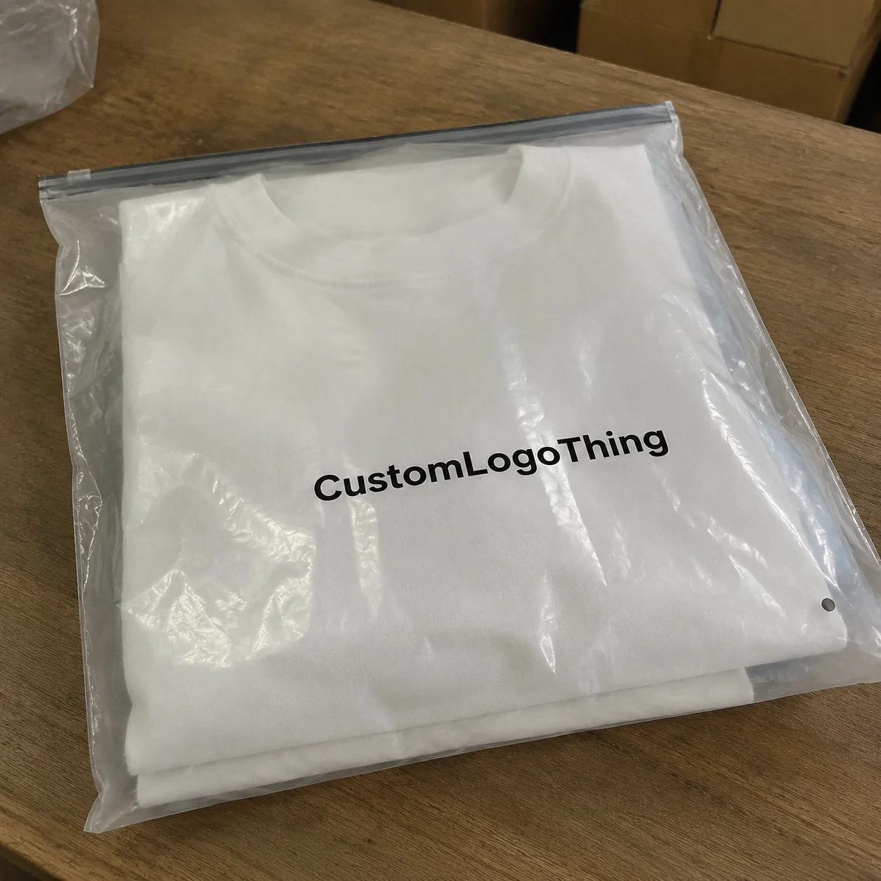
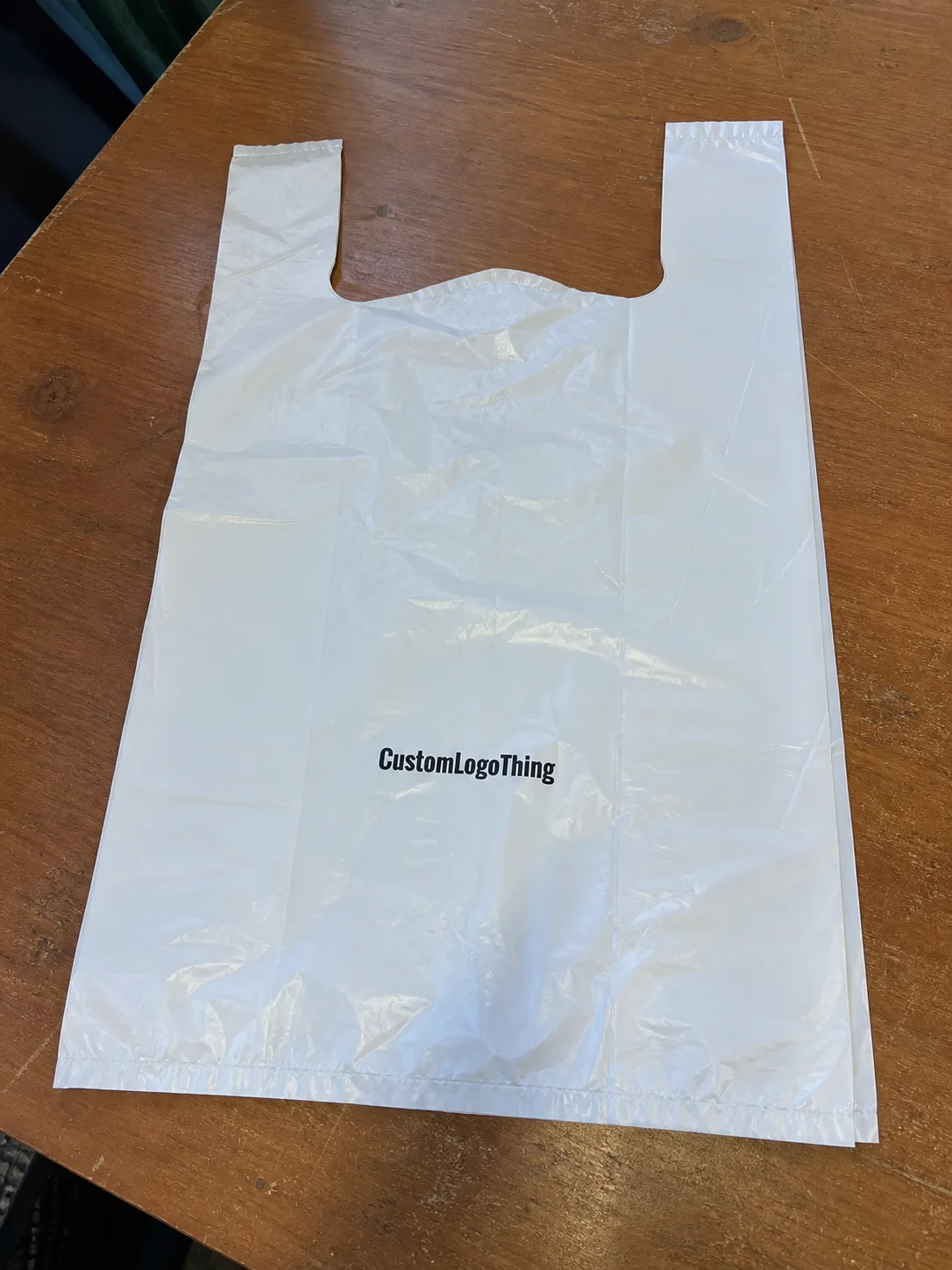
Here’s the plain-language version. Branded poly mailers are lightweight plastic shipping envelopes printed with logos, colors, patterns, taglines, or QR codes. They protect garments, accessories, books, samples, and other soft goods while turning every shipment into a branded touchpoint. The smartest tips for designing branded poly mailers are not about making them loud; they are about making them memorable, readable, and practical, even on a 10 x 13 bag with a 3.0 mil film and a self-seal strip.
That is the real opportunity. A good mailer can make a small ecommerce brand feel established, make repeat orders easier to recognize at the door, and create the kind of unboxing moment people actually share. I’ve seen a 20,000-unit run of branded film lift perceived value more than a $2 swing tag ever could, especially for apparel shipped from Los Angeles or Austin. Weird? Maybe. True? Absolutely.
This piece is for the teams who want more than a pretty outer bag. The best tips for designing branded poly mailers balance appearance with durability, print constraints, postage realities, and the hard economics of production. Attractive is fine. Effective is better, and the difference can be measured in damaged orders, scan failures, or a quote that lands at $0.15 per unit for 5,000 pieces instead of $0.31.
Tips for Designing Branded Poly Mailers: Why They Matter
One thing most people miss: the mailer often beats the website to the customer’s hands. Your product may take three days to arrive, but that outer envelope is the first physical brand signal. In a supplier review I sat through in Shenzhen, a founder spent 40 minutes debating a homepage hero image and 8 minutes on shipping packaging. That ratio made no sense to me then, and it still makes no sense now. The package can travel farther than the ad, literally and psychologically, from a warehouse in Guangdong to a doorstep in Denver.
Branded poly mailers work because they sit at the intersection of brand and operations. They are part printed media, part protective shipping material, part fulfillment tool. If you get the tips for designing branded poly mailers right, you reinforce recognition before the box is opened. If you get them wrong, the package looks generic, the artwork peels, or the courier label fights your design for space. A bad label zone on a 12 x 15 mailer can create more friction than a weak headline on a website.
There is also a perception effect. A mailer with a clean logo, consistent color, and readable type makes a business look more established, even if the order volume is only 500 units. I’ve seen this in meetings with emerging apparel brands in New York and Toronto: once they switched from plain poly to custom-printed bags, retailers and influencers treated the shipments differently. Same shirt. Different signal. That effect can show up before a customer ever sees a product insert or return card.
And yes, branded mailers can reduce confusion. When customers see a distinctive outer bag on the porch, they know which order arrived. That can cut down on those “Where is my order?” messages because the package is visually easy to spot, especially if your brand uses a vivid PMS 2945 C blue or a high-contrast black-and-white lockup. It’s not a replacement for tracking emails, but it helps, and the savings in customer service time can be real.
The point is not decoration for decoration’s sake. The best tips for designing branded poly mailers make the package work harder: marketing, protection, and operations, all in one shell. That is exactly why teams in ecommerce hubs like Shenzhen, Dongguan, and Columbus spend so much energy on a bag that may cost less than the cardboard insert inside it.
How Branded Poly Mailers Work in the Real World
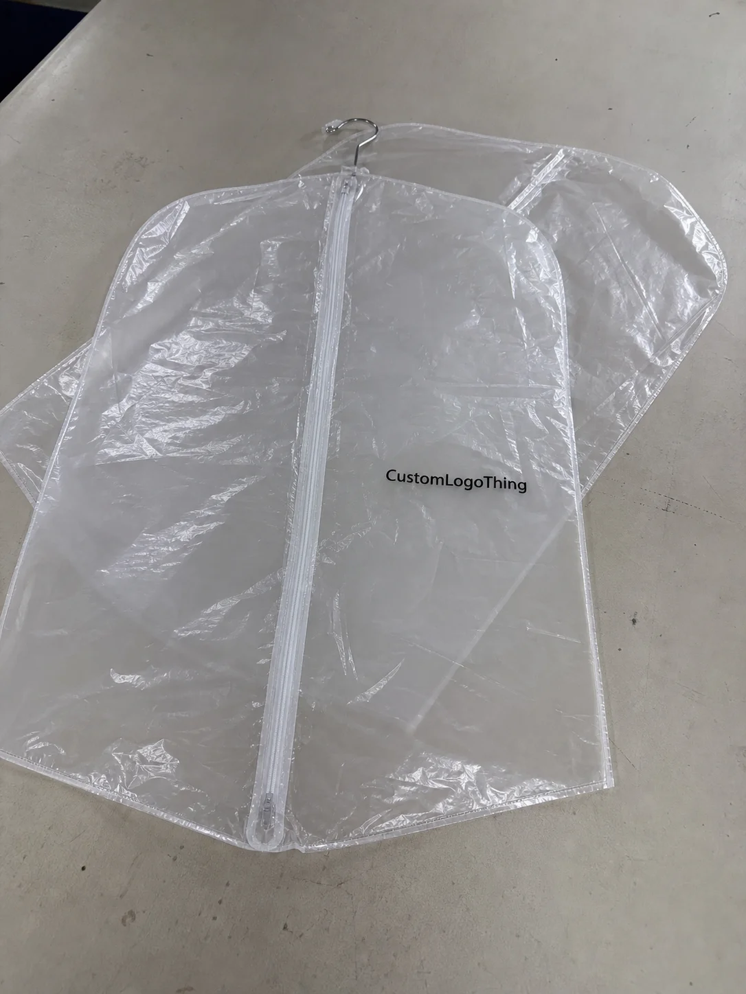
A standard poly mailer is simpler than people think. Most are made from a polyethylene film, sometimes a mono-layer and sometimes a multi-layer structure, with a self-seal strip, a tear notch, and printed graphics applied to the outside surface. Thickness is usually measured in mils; for soft goods, I often see 2.5 mil to 3.5 mil used for a good balance of cost and puncture resistance. That spec matters because flimsy film can wrinkle badly, and once that happens, even strong artwork looks cheap. A 3.0 mil bag can feel very different from a 2.0 mil bag in hand, much like 350gsm C1S artboard feels sturdier than a thinner sheet.
The customer journey starts at the packing table. A picker folds the item, inserts it, closes the adhesive strip, and hands it into the carrier stream. From that point to the doorstep, the mailer may be stacked, slid, tossed, or compressed. In that rough trip, design choices affect three things: visibility, durability, and recall. That’s why the most useful tips for designing branded poly mailers always account for handling, not just the mockup. A proof that looks elegant in Adobe Illustrator may still fail after 600 miles in a UPS trailer.
Finish plays a bigger role than many brands expect. Matte films tend to look softer and more premium, while glossy surfaces make color pop harder under bright warehouse lighting. I’ve watched a deep navy print look elegant on matte and a little louder on gloss. The same logo. The same PMS target. Different mood. Honestly, I think the finish is one of the most underpriced decisions in packaging, especially when the difference is only $0.02 to $0.04 per unit at 10,000 pieces.
Social sharing is another factor. Influencers and customers often photograph packaging at arm’s length, usually with the mailer partly crumpled and the brand logo tilted. That means your design has to survive imperfect angles. A tiny slogan or a thin script font may read beautifully on a screen but vanish in a real unboxing post. Good tips for designing branded poly mailers assume the package will be photographed, not just delivered, and that a creator in Miami or London may hold it under uneven indoor light.
There are limits too. A poly mailer offers less real estate than a carton, so overdesigned layouts become noisy fast. Too many icons, too many colors, too many claims. I’ve seen brands cram sustainability language, a URL, a social handle, a slogan, and a full repeat pattern onto a 10 x 13 bag. The result looked like a trade-show banner shrunk by a copier. On a 2.5 mil film, that clutter can also make the print look visually muddy.
For teams comparing format options, I often point them toward Custom Poly Mailers and nearby packaging formats in Custom Packaging Products. The right choice depends on what you ship, how often, and how much real surface area your brand needs. A subscription box brand in Atlanta may need a different outer shell than a boutique label shipping scarves from Portland.
If you want a technical benchmark, courier durability tests and packaging performance references from groups like ISTA help define how a mailer should survive distribution. For sustainability claims, the EPA is a good source for general waste and materials guidance, though local recycling rules still vary a lot by municipality. That variation matters more than most branding decks admit, whether the bags are produced in Guangdong, Ho Chi Minh City, or suburban Los Angeles.
Key Design Factors Before You Order
Start with visual hierarchy. If everything is loud, nothing is. The eye should find one primary anchor first, usually a logo or signature color, then a support message, then any secondary pattern or URL. I prefer designs that can be understood in under two seconds from arm’s length, because most customers are moving when they first see the package. That is the real test for tips for designing branded poly mailers. Can the package communicate before the customer stops walking?
Typography needs more discipline than people expect. Sans serif fonts with medium-to-bold weight usually perform best on flexible film, especially when the bag will bend during transit. Thin script fonts, hairline serifs, and tiny legal text tend to disappear once the mailer is folded or scuffed. One client insisted on a 7-point tagline in a light italic. On the proof, it looked elegant. On the finished run, it looked like a smudge. On a glossy black 3.0 mil bag, the problem was even worse.
Material selection matters just as much. Standard poly is the budget baseline. Recycled-content films can improve a sustainability story, though you should confirm the actual post-consumer or post-industrial content percentage rather than assuming every green-sounding film is identical. Thickness changes the hand feel and tear resistance. A 3 mil film usually feels more substantial than a 2 mil film, even before the customer opens it. That tactile cue can shape how premium the shipment feels, just as a 400gsm business card signals more weight than a 250gsm one.
Here is a practical pricing snapshot I use when clients ask where the money goes. Numbers move with film price, print method, and freight, but these ranges are realistic for a quote conversation from suppliers in Shenzhen, Yiwu, or Foshan.
| Option | Typical Unit Cost | Best For | Notes |
|---|---|---|---|
| 1-color print, 2.5 mil standard film | $0.15/unit at 5,000 pieces | Startups, subscription orders | Lowest setup complexity, limited artwork detail |
| 2-color print, 3 mil film | $0.24/unit at 5,000 pieces | Growth-stage ecommerce brands | Better visibility and stronger brand contrast |
| Full-coverage print, 3.5 mil film | $0.31/unit at 10,000 pieces | Premium apparel and influencer shipments | Higher impact, more ink coverage, more proof scrutiny |
| Recycled-content film with custom print | $0.28/unit at 10,000 pieces | Sustainability-led brands | Confirm actual content percentage and performance claims |
Order quantity changes the math quickly. A first run of 2,500 units can feel expensive because setup costs are spread over fewer bags. At 10,000 units, the per-unit price usually drops. That does not always mean bigger is better, though. If your branding changes every quarter, overordering can trap you in outdated packaging for months. I’ve seen brands in Seattle and Manchester sit on pallets of obsolete bags because they printed the holiday line too early.
Sizing is another trap. Too large, and the mailer wastes material while the product slides around inside. Too small, and the seam takes unnecessary stress or the product arrives creased. For a folded T-shirt, I usually like to see a little breathing room around the item and any insert card, but not so much slack that the package looks underfilled. It should feel intentional, not floppy. A 9 x 12 bag for a slim sweater may work, but a 10 x 13 or 12 x 15 option may be safer depending on thickness and fold style.
Compliance and shipping realities deserve their own line item. Carrier labels need a clean, flat zone. Barcodes should not sit over heavy graphics or glossy patches that can interfere with scan reliability. If you work with third-party logistics teams, ask them exactly where labels go on their packing line. I’ve seen a gorgeous custom print ruined by one poorly planned label window. Aesthetics lose every time to a bad scan rate, especially when a warehouse in Ontario or Texas is moving 2,000 parcels a day.
For many teams, tips for designing branded poly mailers are really about solving these tradeoffs early. Brand ambition is fine. Operational discipline keeps it from becoming expensive art.
Step-by-Step Tips for Designing Branded Poly Mailers
Start with brand goals before opening Illustrator. Are you trying to increase awareness, signal premium quality, reduce customer anxiety, or make influencer mailings more photogenic? Those are different jobs. A mailer for a luxury beauty brand should not be designed like a discount apparel shipment. One is meant to whisper. The other can be bolder. The best tips for designing branded poly mailers begin with the business objective, not the artwork, and they work better when the team agrees on the actual print method before sketching the first concept.
Step 1: Choose the Right size. Build around your top-selling products, not your least convenient one. If 70% of your orders are one hoodie size and one insert card, size the mailer for that package profile. I’ve watched teams pick a “one-size-fits-all” bag that fit nothing well. The result was wasted film, increased void space, and awkward packing speed. A 10 x 13 bag may be right for folded tees, while 14 x 19 may fit bulkier apparel better.
Step 2: Set the visual hierarchy. Place the primary logo where the eye naturally lands, often the center third or upper third of the bag. Add brand color fields or a repeat pattern to create recognition from a distance. If you want a tagline, make it short enough to read in one glance. Two to five words is usually enough. Longer statements can live on inserts or thank-you cards printed on 300gsm coated stock.
Step 3: Build the artwork in layers. Think in this order: logo, support text, pattern, functional marks. QR codes should only go in if they actually do something useful, such as track orders, show care instructions, or drive loyalty sign-ups. A QR code that just points to a homepage is wasted space. I’ve heard customers say they ignore those because they feel like marketing homework, especially when the code sits on a busy patterned background.
Step 4: Check proofing details carefully. Color matching, bleed, and safe zones can make or break the final result. Film printing is not paper printing. Colors can shift slightly based on substrate, ink system, and finish. Ask for a digital proof and, when possible, a physical sample. If your brand relies on a specific Pantone match, state that clearly in the spec sheet. Do not assume the factory knows your exact shade of coral or forest green, even if they produced your last run in Shenzhen or Ningbo.
Step 5: Confirm production timing. A typical timeline includes concept development, proof revisions, sampling, production, and shipping. Simple orders may move through artwork setup and proof approval in 3 to 5 business days, then production in 12 to 15 business days after sign-off. Specialty finishes or complex artwork can extend that. I’ve had a delayed launch before because a client approved a proof without checking the return-address panel. That tiny oversight cost a week, and I still remember the email chain with a kind of emotional exhaustion I wouldn’t wish on anyone. If freight is moving from East Asia to the West Coast, add another 7 to 18 days depending on ocean or air service.
Step 6: Test before scaling. Run a small batch first, then review customer feedback, warehouse feedback, and any damage reports. Ask the people on the packing line if the mailer seals easily. Ask customer service whether complaints change. Ask marketing whether the package is showing up in social posts. The most useful tips for designing branded poly mailers are the ones that turn feedback into a revised spec, not just a nice presentation. A 500-unit pilot often reveals label placement issues that never appear in a mockup.
One client in Austin sent me photos from the warehouse after a pilot run: five bags, each with a slightly different label position because the artwork left too little margin. The design looked fine on screen. On the line, it became a daily annoyance. That kind of mistake is invisible until you watch a real team pack 800 orders in one shift, usually under fluorescent lights at 6:30 p.m. on a Thursday.
Quick decision checklist
- What are the top two product sizes?
- Will the bag carry a shipping label, return label, or both?
- Is the brand relying on color, logo, or pattern for recognition?
- Do you need recycled-content film or standard film?
- Will the mailer need to survive moisture, abrasion, or long-zone shipping?
Common Mistakes That Make Poly Mailers Look Cheap
The fastest way to make a mailer look low-end is to crowd it. Too many icons, too many slogans, too many colors. A surface that is trying to say five things usually says none of them well. I’ve seen brands include Instagram handles, discount codes, three badges, a pattern, and a giant logo on one side. It read like a clearance flyer taped to a grocery bag, and not the good kind of grocery bag either.
Low contrast is another killer. Light gray on silver film. White on translucent film. Thin text on a glossy black bag. Those choices can disappear once the package bends or the light changes. The fix is simple: contrast first, decoration second. If the design cannot survive warehouse lighting and porch daylight, it is not ready. A white logo on an icy silver mailer may look elegant on a monitor and vanish in a Florida afternoon.
Ignoring shipping function is an expensive mistake. Barcode placement, seam strength, label adhesion, and tear notches all matter. A beautiful design with a barcode crossing a dark stripe may scan poorly. A strong adhesive label may still fail if the surface has a slick coating in the wrong place. These details are boring until they cost you time and re-ships, especially during a peak week when every lost scan creates a customer service ticket.
Another issue is brand mismatch. A luxury skincare line printed on flimsy 2 mil film can create trust problems. Customers notice inconsistency faster than marketers think. The outer bag says “premium,” but the hand feel says “budget.” That gap is hard to erase. My honest view: if your product price sits in the upper tier, your shipping bag should not feel disposable unless disposability is part of the brand promise, such as a trial-size sampler shipped for $8 or less.
The hidden cost of skipping proof review is brutal. One misplaced phone number, one misspelled slogan, one cut-off corner mark, and that error repeats across thousands of units. I once saw a batch with a barcode zone printed 4 mm too low. Four millimeters. That tiny miss forced a manual workaround on the packing line and turned a clean order into a nuisance for weeks. I still get annoyed thinking about it, which probably says more about me than I’d like. A similar mistake in a 25,000-piece run can cost far more than the original print difference.
These failures are exactly why tips for designing branded poly mailers need to be practical, not just creative. The pretty version is easy. The production-safe version is where experience shows up, and where a supplier in Foshan or Xiamen earns their fee.
Expert Tips for Better Branded Poly Mailers
Use one unmistakable brand anchor. That might be a bold logo, a signature color, or a repeat pattern customers already associate with your products. If you try to communicate everything at once, the package gets noisy. Simplicity does more heavy lifting than people expect, especially on a flexible substrate with limited print area. This is one of the most durable tips for designing branded poly mailers I can give, and it holds up whether the bag is produced in Hangzhou or a plant outside Nashville.
Design for the camera angle, not the mockup sheet. The mailer will be photographed by a customer holding it one-handed, or sitting on a porch in imperfect light. What looks balanced on a desktop screen may look crowded in a real unboxing shot. If you want the package to perform socially, test it at three angles: front-facing, tilted, and partially folded. A 6-inch logo can look large in proof and just right once the mailer is wrinkled in transit.
Limit seasonal variants until the core design is stable. I like special runs for holidays, product launches, or influencer drops, but only after the main mailer has proven itself. Otherwise, you spend more time managing exceptions than building recognition. A strong base design can carry subtle seasonal changes, such as a badge, a message line, or a limited-color accent. For example, a Valentine’s run might swap the accent color from navy to magenta without changing the pack structure.
Sustainability messaging should stay honest. If you use recycled-content film, say what the content actually is. If the film is lightweight to reduce material use, explain whether that affects puncture resistance or not. Customers do notice eco claims, but they also notice if a bag tears in transit. That contradiction kills trust faster than silence ever could. If your film is 30% post-consumer recycled content, state 30%, not “eco-friendly” with no backing detail.
“We thought the bag was secondary,” one apparel client told me after a packaging test, “but customer photos kept featuring the mailer before the hoodie.” That sentence changed their entire packaging budget.
QR codes deserve a job. Not a decorative corner. Use them for order tracking, care guidance, size exchange instructions, or a loyalty offer with a clear next step. If the code does not improve the customer experience, remove it. White space is not wasted space; often it is the thing that makes the whole design feel expensive. A 1.25-inch QR code with a simple callout can do more than a full paragraph of marketing copy.
Test by product line if you can. A heavy knit sweater may call for a calmer outer design than a limited-edition streetwear drop. A beauty sample may benefit from a cleaner, more premium look than a value bundle. Different categories behave differently. The most effective tips for designing branded poly mailers are rarely one-size-fits-all. A bag shipping jewelry from Brooklyn should not look identical to one shipping gym apparel from Phoenix.
What Are the Best Tips for Designing Branded Poly Mailers?
The best tips for designing branded poly mailers are the ones that balance brand identity, print clarity, and shipping performance without forcing the customer or warehouse team to work around the design. Start with one clear visual anchor, keep the message short, and make sure the mailer still looks good when it is bent, stacked, or photographed in imperfect light. That means choosing a size that fits your most common products, using high-contrast colors, and reserving clean space for shipping labels and barcodes.
It also means thinking about production reality, not just aesthetics. A design may look strong on a screen and still fail if the font is too thin, the film is too glossy for the carrier label, or the artwork leaves no margin for the seal edge. I’ve seen brands spend hours perfecting artwork and then lose the benefit because the final bag scans poorly at the warehouse. The best tips for designing branded poly mailers do not treat those details as minor. They treat them as the difference between a package that works and one that creates friction.
If you want a simple rule, use this: make the mailer recognizable in two seconds, readable from arm’s length, and durable enough to survive the trip. That approach usually beats trend-chasing. A clean logo, a thoughtful finish, and a label-safe layout can carry a brand much farther than a crowded, overdesigned bag ever will. In practical terms, that is the core of strong branded mailer design.
Next Steps for Designing Branded Poly Mailers That Perform
Before you order, build a short internal checklist. Include product dimensions, budget range, required print elements, target quantity, finish preference, and whether you need a shipping label zone. That sounds basic, but the best projects I’ve seen started with a one-page spec instead of a 40-slide mood board. Clear specs save time and money, and they make supplier quotes easier to compare between Guangdong, Ohio, and California.
Then gather two or three references and study what works in each one. Maybe one design has a strong color block, another handles spacing well, and a third uses a subtle repeat pattern effectively. Do not copy the whole look. Extract the useful parts. That is how design teams avoid accidental imitation while still learning from good examples. A useful comparison might be a 3-color print on a matte 3.5 mil bag versus a single-color print on a glossy 2.5 mil version.
Request a physical sample or at least a high-resolution digital proof and review it under warehouse lighting, not just office light. I’ve stood in packing rooms where warm bulbs made one color look richer than it really was. Lighting changes perception. So does texture. So do fingerprints on glossy film. Real conditions matter, especially if your fulfillment team in Toronto, Phoenix, or Manchester is packing after sunset.
Compare supplier quotes only after standardizing the specs. Same size, same mil thickness, same print count, same quantity, same shipping terms. Otherwise, the quotes are not comparable and the cheapest line item may be hiding a weaker material or a larger setup fee. I’ve watched buyers save $300 on the quote and lose $1,200 in miscommunication later. One factory may quote a 12-day turnaround and another 18 days, but if one uses a 2.5 mil film and the other a 3.0 mil film, the prices are not truly equal.
Launch with a test order if the run is significant. Give yourself a feedback window of 2 to 4 weeks. Ask customers, warehouse staff, and marketing to weigh in. Then make one revision before scaling. That process may feel slower, but it protects you from thousands of units of avoidable compromise. Good tips for designing branded poly mailers always include a test phase, because a 1,000-piece learning run is cheaper than fixing a 25,000-piece mistake.
If you want more packaging context, browse Case Studies to see how different brands approached branding and shipping differently. Patterns emerge quickly once you compare apparel, supplements, and subscription kits side by side. A beauty brand in Los Angeles may prioritize a soft matte finish, while a hardware accessory brand in Dallas may care more about abrasion resistance and barcode clarity.
In practice, the best mailers are the ones that do three jobs well: they protect the product, reinforce the brand, and fit the workflow. That is the standard I use. Not perfection. Performance. The strongest runs usually come from factories that can turn a proof into production in 12 to 15 business days after approval and ship on a schedule the warehouse can actually support.
And yes, I still think many teams underinvest here. The outer mailer is not a side character. It is the first line in the customer’s hands. The smartest tips for designing branded poly mailers treat it that way, especially when the difference between a forgettable shipment and a memorable one may be just a few cents per unit.
FAQs
What are the best tips for designing branded poly mailers for small businesses?
Keep the design simple and instantly readable. Use one strong brand color or logo element instead of crowding the surface, and choose a size that fits your most common product so you avoid wasted space and higher shipping costs. For a small brand, clarity usually beats complexity, and a 2.5 mil to 3.0 mil film is often enough for everyday apparel or accessories.
How much do branded poly mailers usually cost?
Price depends on size, thickness, print complexity, and order volume. Single-color or simple designs are usually more affordable than full-coverage, multi-color artwork. Larger orders typically reduce the per-unit cost, so compare quotes using the same specifications. A realistic example is $0.15 per unit for 5,000 pieces on a simple one-color bag, while full-coverage runs can rise to $0.31 per unit at 10,000 pieces.
How long does it take to produce custom branded poly mailers?
Timeline usually includes artwork setup, proof approval, production, and shipping. Simple jobs move faster than projects with multiple revisions or specialty finishes. Build in extra time for proof checks so color, sizing, and barcode placement are correct before production. In many cases, production takes 12 to 15 business days from proof approval, plus shipping time from factories in Shenzhen, Ningbo, or Dongguan.
What should I avoid when designing branded poly mailers?
Avoid tiny text, low-contrast colors, and overly busy layouts. Do not forget shipping labels, barcodes, and seam placement. Skip trendy design choices that weaken brand recognition or make the package look generic. A design that looks good in a proof but fails at 4 mm barcode margins or on a glossy 2.5 mil film is not ready for production.
How do I make branded poly mailers look more premium?
Use clean spacing, strong contrast, and consistent brand colors. Select a material thickness and finish that feels sturdy in hand. Add one thoughtful detail, like a subtle pattern, quality tagline, or useful QR code, instead of overdecorating. A matte 3.0 mil finish with a centered logo and one clear message often looks more refined than a crowded full-bleed layout.
If you want the short version: the best tips for designing branded poly mailers are the ones that respect both the customer and the packing line. Make it readable. Make it durable. Make it worth remembering. Before you place the order, check one last thing: the mailer should fit your most common product, leave room for the label, and still look recognizable when it’s wrinkled in transit. That’s the combination that turns a shipping bag into a brand asset instead of just another cost.