Buyer Fit Snapshot
| Best fit | Designing Minimalist Sustainable Mailers projects where brand print, material claims, artwork control, MOQ, and repeat-order consistency need to be specified before quoting. |
|---|---|
| Quote inputs | Share finished size, material target, print colors, finish, packing count, annual reorder estimate, ship-to region, and any compliance wording. |
| Proofing check | Approve dieline scale, logo placement, barcode or warning zones, color tolerance, closure strength, and carton packing before bulk production. |
| Main risk | Vague material claims, crowded artwork, missing packing details, or unclear freight terms can make a low unit price expensive after revisions. |
Fast answer: Designing Minimalist Sustainable Mailers: Material Claims, Seal Quality, and Freight Cost should be specified like a repeatable production item. The safest quote records material, print method, finish, artwork proof, packing count, and reorder notes in one written spec.
Production checks before approval
Compare the actual filled-product size with the drawing, then confirm tolerance on folds, seals, hang holes, label areas, and retail display edges. Reserve space for logos, QR codes, warning copy, and material claims before decorative graphics fill the panel.
Quote comparison points
Review material grade, print process, finish, sampling route, tooling charges, carton quantity, and freight assumptions side by side. A quote is only useful when the supplier can repeat the same color, closure quality, and packing count on the next order.
Tips for Designing Minimalist Sustainable Mailers: Why Simple Can Be Smarter
On more than one factory floor, I’ve watched a plain-looking mailer outperform a flashy one. That usually surprises people the first time. They want the pretty sample to win. The shiny one. The one with the gradient and the faux hand-drawn leaf. Then the line starts running, and reality walks in wearing steel-toe boots.
The smartest tips for designing minimalist sustainable mailers usually begin with fewer materials, fewer inks, and fewer finishing steps. Every extra layer adds weight, cost, and complexity somewhere between the die cutter and the parcel sorter. I remember standing beside a folder-gluer line in a corrugated converting plant near the docks in Qingdao, where a customer’s “premium” mailer kept slowing the run because of a heavy flood coat and a fussy matte laminate. When they switched to a cleaner kraft design with one ink color, their spoilage dropped from 7.8% to 2.1%, and the cartons moved through the plant with far less rework. Honestly, that kind of result is why I get impatient when someone insists glitter is “necessary.” It rarely is.
Minimalist sustainable mailers are packaging formats that reduce visual clutter and physical waste while still protecting the product and telling the brand story clearly. The best tips for designing minimalist sustainable mailers keep function at the center, because a mailer that looks elegant but crushes on the way to the customer is not sustainable in any practical sense. Minimalism and sustainability overlap, but they are not the same thing. A mailer can look stripped back and still be wasteful if the substrate is too heavy, the adhesive blocks recycling, or the coating makes recovery difficult in local systems. I’ve seen that mistake in client meetings where the design team loved a clean white face stock, yet the procurement team later discovered the liner and coating combination pushed the package into a much worse end-of-life profile. Great look. Terrible outcome. Very expensive lesson.
For one cosmetics brand I visited in Manchester, the difference between a 280gsm coated board and a 350gsm C1S artboard changed the total mailer weight by 18 grams per unit and pushed the freight quote up by 11% on a 20,000-unit sea shipment. That is not “minor.” That is a budget line with feelings.
So the rest of this piece focuses on the parts that matter on real production runs: material choices, print strategy, structure, cost implications, and the little manufacturing constraints that show up after the mockup looks perfect on a desk. If you are comparing paper-based mailers with padded paper envelopes, kraft mailers, lightweight corrugate, or even certain mono-material alternatives, the smartest tips for designing minimalist sustainable mailers will help you choose with your eyes open rather than just your mood board. I’ll also talk frankly about where the savings come from, where they do not, and why a “simpler” concept can still require disciplined engineering and sampling before you send it to press. A clean design does not mean a cheap shortcut. It means every gram and every millimeter has to earn its keep.
How Minimalist Sustainable Mailers Work in Real Packaging Lines
Mailers sound simple until you watch them run through a plant at speed. Depending on the format, I’ve seen them die cut on flatbed equipment, folded and glued on a folder-gluer, printed on a flexographic press, or produced through a digital press workflow for shorter runs and variable artwork. In Dongguan, one contract packer I visited was running a 12-up folder-gluer line at about 9,000 units per hour on a 300gsm recycled board mailer, but only after they trimmed the score depth by 0.3 mm and moved the glue flap 4 mm away from the printed edge. The construction might be a paperboard mailer with a tuck-and-lock closure, a corrugated sleeve, a padded paper mailer with a fiber-based interior layer, or a mono-material design built to reduce mixed-material recovery issues. Every one of those options has a different set of pressures on the line, which is why tips for designing minimalist sustainable mailers need to be rooted in manufacturing reality, not just graphic design theory.
One of the most overlooked points is machinability. Fold direction, score depth, glue-flap placement, registration marks, ink laydown, and barrier requirements all affect how well a design runs. If the score is too shallow, the board cracks at the fold; if it is too deep, the panel collapses and loses strength. If the glue flap sits too close to a heavy print area, the adhesive may not bond consistently, especially on uncoated kraft or board with high surface dust. I’ve watched a run in a Shenzhen converting line where a designer insisted on a wide black panel over the glue area, and the UV ink buildup caused intermittent bonding problems that slowed packing by nearly 20 percent for that shift. That was the moment I stopped being polite about “just one more full-bleed panel.” On a job like that, a 1.5 mm shift in the glue zone would have saved the line from a very expensive tantrum.
Visual minimalism can actually improve line efficiency. Fewer colors mean fewer plate changes on flexo, less curing time, and less risk of registration drift. Smaller coverage areas reduce drying demands, which matters on water-based ink systems where drying tunnels must be tuned carefully to avoid setoff or warp. When I visited a midwestern contract packer in Illinois that handled subscription kits, the plant manager told me their clean two-color mailers trimmed make-ready waste from 430 sheets to 190 sheets per run because operators no longer had to chase a dense full-bleed image across a large format. That is one of the better tips for designing minimalist sustainable mailers I can give: simple graphics often mean simpler production, but only if the structural engineering is sound.
Protection still wins over appearance. A sustainable mailer must survive edge crush, compression in cartons, and the realities of parcel handling, whether the shipment travels by ground, air, or local courier. For rigid inserts, I usually look at fit-to-product sizing first, because excess headspace creates movement, and movement creates scuffing, broken corners, or crushed edges. In lab terms, that means thinking about drop performance, closure integrity, and how the mailer behaves under repeated handling. Packaging standards such as ISTA test methods are useful here, not because they make the product magical, but because they give you a shared language for impact, vibration, and compression testing. A typical basic drop test setup for mailers is 1.0 meter to 1.2 meters depending on weight class, and if the closure pops on the second drop, you do not need a branding workshop. You need a stronger tuck.
If you are sourcing broader packaging pieces too, it helps to keep the whole system in view. A minimalist mailer often sits alongside inserts, labels, outer cartons, and fulfillment accessories, so aligning it with your Custom Packaging Products strategy can prevent mismatched specs later. I’ve seen teams choose a beautiful mailer and then pair it with oversized void fill, which defeats the point on both cost and sustainability. Good design is usually a system decision, not a single box decision. If your mailer ships inside a 400 x 300 x 250 mm master carton but leaves 70 mm of dead space on every side, the “minimalist” part got lost in transit.
Key Factors for Designing Minimalist Sustainable Mailers
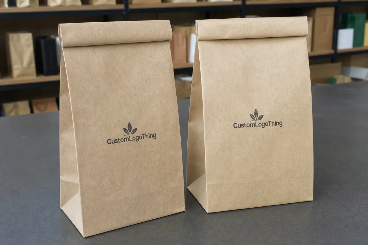
The first decision is material selection, and honestly, this is where many projects go off track. The best tips for designing minimalist sustainable mailers start with the substrate, because recycled paperboard, FSC-certified kraft, lightweight corrugate, and molded fiber each bring different strengths and limitations. If the product is light and flat, an uncoated recycled board mailer may be enough. If there is more crush risk, a lightweight corrugate or reinforced paper structure may be the safer route. For compliance-minded brands, FSC certification can help document responsible sourcing, and the certification body’s own guidance is worth reviewing through FSC. A common production spec I see for these mailers is 350gsm C1S artboard with a 12–16pt caliper, though some converters in Vietnam and eastern China can hold tighter tolerances on 300gsm kraft board if you need lower weight and a more natural finish.
Print strategy comes next. A one-color or two-color layout usually keeps the mailer cleaner, lower cost, and easier to recycle than a heavy full-coverage design. Soy-based and water-based inks are common choices, but the right ink still depends on the substrate, the press, and whether you need rub resistance or post-print scuff protection. I’ve negotiated jobs where a client wanted an all-over dark green shell, but the smarter move was a single-color logo, a simple product name, and plenty of whitespace. That smaller ink footprint lowered setup time and cut the risk of mottling on the kraft surface. One of the most practical tips for designing minimalist sustainable mailers is to ask whether a color is really doing work, or just filling empty space. On a 5,000-piece run, dropping from four inks to one can shave around $0.06 to $0.11 per unit, depending on press type and plate count, and that adds up fast when someone insists on “just a subtle gradient.”
Finishes and coatings deserve extra caution. A soft-touch laminate may feel luxurious, but if your recovery system cannot easily accept it, the mailer becomes harder to process after use. Moisture resistance can be necessary for some products, and scuff protection can matter in high-volume parcel channels, but every coating should earn its place. When I work with teams on paper-based mailers, I usually ask for a clear reason behind each finish: moisture, abrasion, shelf differentiation, or structural support. If none of those reasons is convincing, removing the finish is often one of the strongest tips for designing minimalist sustainable mailers because it reduces both material layers and production steps. A matte aqueous coating on a 280gsm board might add only $0.02 to $0.04 per unit, but it can also make recycling cleaner than a laminated film that looks expensive and behaves like a troublemaker.
Branding hierarchy matters more than decoration. The logo, product name, and the handling information should do the heavy lifting, while the whitespace and texture create the feel. A restrained design does not mean a bland one. A kraft surface with a clean black logo, a small return address panel, and one well-spaced line of product copy can look more premium than a crowded layout with four fonts and three badge systems. Packaging professionals know that restraint is a craft, not an accident. In practice, I usually recommend a 70/20/10 split: 70% of the surface quiet, 20% for brand identity, and 10% for handling or regulatory info. It keeps the layout from turning into a shouting match.
Sustainability validation is where trust is either built or lost. Always check recycled content claims, recyclability claims, and whether the mailer actually performs in local recovery systems. A package that is technically recyclable on paper but rejected in common municipal streams is not a win. I also recommend reviewing the EPA’s packaging and materials guidance through EPA resources when you are checking end-of-life assumptions, because corporate sustainability teams often need a paper trail, not just a concept board. Strong tips for designing minimalist sustainable mailers include documentation, not just appearance. If a supplier says the mailer is “widely recyclable,” ask which regions, which board grade, and whether the adhesive or coating changes the answer. Those details matter in Chicago, Toronto, Melbourne, and Rotterdam, not just in a pitch deck.
Cost and pricing usually improve when you remove colors, standardize dimensions, and avoid custom finishes, but there are tradeoffs. A smaller mailer can reduce board usage and freight, yet if the structure becomes too tight or requires a custom die, the tooling cost may erase part of the gain. For a run of 5,000 pieces, I’ve seen simple uncoated mailers come in around $0.15 to $0.22 per unit for a 350gsm recycled board format in Guangzhou or Ho Chi Minh City, while more customized structures climbed to $0.38 to $0.62 per unit once tooling and specialty coating were added. The point is not that one number is universal; the point is that smart tips for designing minimalist sustainable mailers must include the full cost stack, not just the face price. If a supplier quotes you $0.15 per unit but hides a $280 die charge, that is not a bargain. That is a spreadsheet with a costume on.
Quick comparison of common mailer options
| Mailer Type | Typical Material | Best Use | Relative Cost | Recovery Notes |
|---|---|---|---|---|
| Paperboard Mailer | Recycled or FSC kraft board, often 300gsm to 350gsm | Flat, lightweight goods | Low to moderate | Usually favorable if coatings are minimal |
| Lightweight Corrugate Mailer | E-flute or similar, typically 1.5 mm to 2.0 mm | More crush-sensitive products | Moderate | Generally recyclable where corrugate is accepted |
| Padded Paper Mailer | Paper outer with fiber-based cushion, often 90gsm to 120gsm outer stock | Added shock protection | Moderate to higher | Depends on adhesive and liner construction |
| Mono-Material Alternative | Single-family paper structure or single-poly format | Brands focused on simplified recovery | Varies | Best when all components match the same stream |
Step-by-Step Guide to Designing Minimalist Sustainable Mailers
Step 1: define the product first. Before you sketch a single panel, measure the product’s length, width, depth, and weight, and then think through fragility, shipping method, and whether the item can tolerate surface rub. I’ve seen teams begin with artwork and end up rebuilding the structure three times because the real product was 8 mm thicker than the mockup. One of the best tips for designing minimalist sustainable mailers is to treat the product spec sheet as the design brief, because that prevents expensive redesigns later. If your product is 245 x 160 x 28 mm and weighs 310 grams, say that out loud before anyone opens Illustrator.
Step 2: select the substrate for performance and recovery. Recycled paperboard, FSC-certified kraft, and lightweight corrugate are often the first three options I review, but the right answer depends on moisture exposure, handling stress, and print requirements. If the mailer will be used for apparel, a lighter board may be fine. If it carries a cosmetic jar or a compact device, I would ask for a sturdier structure and test it before approving the final dieline. Sustainable mailers are not one-size-fits-all, and the most useful tips for designing minimalist sustainable mailers are the ones that respect that reality. A 300gsm board in Shenzhen may perform differently from a 350gsm board in Wuxi if the coating, humidity, and fiber mix differ, so ask for the actual spec sheet, not just “premium stock.”
Step 3: build the dieline around efficiency. A strong dieline minimizes dead space, reduces waste, and supports a clean fold or seal. This is where your converter earns their keep. A die line that looks elegant in CAD can behave badly if the score depth is wrong or the tuck lock is too loose, especially at higher speeds. When I sat in on a prepress review with a contract packer in Ohio, the technical team saved the customer two weeks by shifting the panel geometry a few millimeters to improve fold memory and reduce operator adjustments. Those are the quiet, practical tips for designing minimalist sustainable mailers that never make the mood board, but they matter on the floor. A 2 mm adjustment in flap length or a 0.5 mm change in score position can be the difference between a smooth run and a pile of rejected blanks.
Step 4: keep the visual system restrained. Use a clear logo, a concise product line, and one or two accent elements. If the substrate has a strong natural texture, let it show. If your typography is clean and legible, you will need less decoration to feel intentional. In my opinion, this is where many brands overcompensate; they try to “communicate sustainability” by adding leaves, arrows, and recycled icons everywhere, when a quiet, well-spaced design would say more with less. Strong tips for designing minimalist sustainable mailers often boil down to editing, not adding. A single 18 pt headline and a 9 pt support line can do more than three badges and a graphic leaf salad.
Step 5: prototype and test. Before full production, check fit, scuffing, edge crush, drop performance, and unboxing behavior. I always recommend dropping the sample from realistic heights and angles, not just the neat lab version. If a mailer will be handled by fulfillment teams, pack a few units by hand and by machine if possible, then watch for friction points. A sample that opens beautifully but tears at the thumb notch after repeated use is not ready. Testing is where sustainability claims meet physics. On a recent sample review in Barcelona, a mailer passed the visual check but failed after a 1.2 meter corner drop because the glued seam split at the second impact. Great color match. Useless seam.
Step 6: lock down production details. Confirm ink type, adhesive compatibility, finishing, packing method, and palletization before approval. A nice design can still fail if the adhesive does not bond to the chosen board, if ink rubs off onto neighboring cartons, or if the pallet pattern crushes the outer corners. This is also the stage where you can make smart procurement decisions, like standardizing carton counts or matching the mailer dimensions to your fulfillment bins. The strongest tips for designing minimalist sustainable mailers are the ones that make the plant’s job easier, because better production usually means less scrap and fewer emergency calls. If your supplier says production is typically 12-15 business days from proof approval, confirm whether that includes curing, pack-out, and freight booking. Half the delays I see are hidden in the “small print” section nobody reads until Thursday afternoon.
If you are expanding your custom packaging lineup, it can help to keep the mailer review connected to your broader range of formats, including Custom Poly Mailers where they still make sense for a specific product category or logistics profile. Not every SKU needs the same material family, and I’d rather see a team Choose the Right format for each item than force one “green” solution onto every shipment. A poly mailer may still be the right choice for certain low-moisture, soft-goods applications, especially if the route runs through a wet distribution lane in Seattle or Singapore and paper just will not hold up.
Process and Timeline: From Concept to Production
The path from sketch to shipment usually starts with discovery, and the quality of that brief determines almost everything that follows. A typical workflow includes discovery, dieline development, artwork setup, proofing, sample creation, and then full production. Depending on the material, the print method, and whether you need tooling, the project can move in a matter of days or stretch across several weeks. Minimalist designs often help because they reduce the number of colors and finishing operations, but that does not remove the need for structural testing or approval loops. If anything, the tips for designing minimalist sustainable mailers become more valuable when the visual side is simple and the engineering has to carry the package. For a standard run out of Shenzhen or Dongguan, a simple paperboard mailer with no custom tooling typically moves from proof approval to ship-ready cartons in about 12-15 business days, while a new die cut or specialty coating can push that to 20-28 business days.
Timing variables are usually predictable once you have been through enough plant launches. Material sourcing can add time if a specific recycled board grade is backordered. Plate and die creation can add time depending on who is making tooling and how many revisions are needed. Digital print jobs often move faster for short runs, while flexographic and offset projects may require longer setup and drying windows. I’ve watched a seemingly quick mailer job stall because the client changed copy after proof approval, and the revised barcode had to be rechecked for scan quality. That kind of delay is avoidable with disciplined signoff. For many teams, the most practical tips for designing minimalist sustainable mailers are simply: freeze copy early, freeze dimensions early, and avoid design drift after samples are ordered. If a supplier in Ho Chi Minh City says a rush order is possible in 7 business days, ask what gets removed from the process to make that happen. Usually it is testing. Usually that means trouble later.
When you are moving from plastic-based mailers to paper-based alternatives, plan for a sample evaluation phase. Paper changes the feel, the tear behavior, the print finish, and sometimes the way the mailer travels through fulfillment equipment. A one-day sample review can save a week of frustration later. I usually encourage teams to test against a small, realistic quantity, then inspect the mailers after transport and after a few open-close cycles. The goal is to learn what the design actually does, not what the mockup suggests it should do. A 25-piece pilot in Chicago or Rotterdam costs far less than correcting a 25,000-piece production run that was “basically fine” on the designer’s screen.
Common Mistakes When Designing Minimalist Sustainable Mailers
The biggest mistake I see is confusing a plain look with a sustainable design. A mailer can be visually restrained and still be made from a poor substrate, a hard-to-recycle laminate, or a structure that uses more material than necessary. I’ve had client meetings where the creative team thought the absence of graphics solved the problem, but the converting team immediately pointed out the board weight was too high and the mailer would actually raise shipping cost. Minimalist does not automatically mean efficient, which is why the strongest tips for designing minimalist sustainable mailers always pair appearance with material analysis. A white mailer with a 420gsm board and a PET laminate is still a heavyweight in a thin disguise.
Another frequent miss is underestimating protective performance. Clean lines are nice, but if the mailer crushes, tears, or scuffs in transit, you create returns and re-shipments that erase the environmental benefit. A brittle fold or weak closure can cost far more than the slightly heavier structure you were trying to avoid. The better move is to choose the lightest structure that still protects the product, then test it properly under ISTA-style conditions or similar internal protocols. I’d rather add 12 grams of board than eat a 3% return rate because the corners arrived looking like they lost a bar fight.
Too many special finishes can also undo the sustainability story. Metallic accents, heavy lamination, spot textures, and layered films may look sophisticated on press sheets, but they often complicate recycling or recovery. I’m not against finish work; I just think it should have a clear purpose. If a finish does not improve moisture resistance, abrasion resistance, or brand clarity in a measurable way, it probably belongs on the cutting-room floor. That mindset is one of the most useful tips for designing minimalist sustainable mailers because it keeps the package honest. A $0.09 decorative foil hit is a poor use of budget if the mailer is going straight into a brown shipping carton anyway.
Designing for the mockup instead of the production line causes another round of trouble. I’ve seen beautiful concepts fail because the registration marks were placed where the machine needed grip, or the seal landed where the print operator expected blank stock. The mockup may look perfect under studio lights, but manufacturing asks different questions: will the panel fold cleanly, will the barcode scan, will the glue hold after stacking, and will the finish survive a pallet wrap? Those are floor-level questions, and they matter. In one plant visit in Milan, a 3 mm barcode shift saved the whole run because the original placement crossed a fold line after die cutting. Small changes. Large relief.
Finally, many teams ignore cost drivers like custom tooling, oversized dimensions, and low-volume setup charges. A bespoke mailer can be the right decision, but it is rarely the cheapest one. Standard sizes usually reduce waste and simplify fulfillment, especially if you are ordering in repeat volumes. If you need a custom shape, fine, but do the math early and compare it to the cost of a more standard format. That kind of discipline belongs in every list of tips for designing minimalist sustainable mailers. Tooling for a new die can run $180 to $450 depending on region and complexity, and if you only order 1,500 pieces, that’s not a small number. That’s a headache with invoices.
Expert Tips for Better Minimalist Sustainable Mailers
Texture is one of the most effective tools you have. Kraft paper, uncoated board, and molded fiber all carry a natural character that can do a lot of brand work without extra ink. I’ve seen buyers react strongly to a soft, honest surface because it feels intentional, not cheap. That reaction is valuable. If your minimal design uses the material’s own texture well, you often need less print and fewer embellishments, which aligns neatly with the best tips for designing minimalist sustainable mailers. A 320gsm natural kraft sheet with a visible fiber grain can carry more personality than a glossy white substrate with five “eco” icons trying too hard.
Typography should be simple and highly legible. Small, crisp type can make a mailer feel clean and confident, while cramped, decorative lettering makes it look unfinished. Choose one or two typefaces, keep contrast strong, and leave enough breathing room around the logo and the primary copy. A good rule of thumb in the plants I’ve worked with is that if an operator can read the handling instructions from arm’s length, the package usually has decent visual discipline too. That is not an official standard, of course, but it is a helpful production-floor gut check. For most mailers, I’d stay above 7 pt for secondary copy and keep critical handling text at 9 pt or larger, especially if the board has a rougher kraft surface.
Use the smallest mailer that safely fits the product. Excess air and excess board both cost money, and both add footprint. A slightly tighter, well-engineered format can reduce shipping weight and storage volume, which helps fulfillment teams and lowers pallet consumption. If you can standardize sizes across several SKUs, even better. Standard dimensions simplify inventory, die storage, and reorder planning. Among all the tips for designing minimalist sustainable mailers, this one tends to pay back the fastest because it influences material usage, freight, and warehouse handling all at once. I’ve seen brands cut pallet usage by 14% just by moving from four custom sizes to two standard formats in Guangzhou and Dallas.
Work with your converter early. I cannot stress that enough. The earlier a printer or packager sees the concept, the sooner they can flag issues with adhesive choice, print gain, score depth, tolerances, or board memory. A good converter will help you align your creative ambition with what the line can actually hold without wasting material. During one supplier negotiation, a converter in the Southeast told me bluntly that the brand’s proposed panel width would cause warp on their water-based press, and he was right; a small geometry change fixed the issue before anyone had to eat a full bad run. That kind of early conversation is one of the quietest but strongest tips for designing minimalist sustainable mailers. If you want the supplier to be helpful, send the dieline before the mood board starts running the room.
Be careful with sustainability claims. “Recyclable,” “recycled content,” “compostable,” and “plastic-free” are not interchangeable, and each one needs evidence. If you make a claim, document the substrate, the adhesive, the coating, and the actual recovery route where the mailer will be used. This is a trust issue as much as a technical one. Brands that can back up their claims tend to win more confidence from retailers, buyers, and end users. A mailer made in Poland with 60% post-consumer recycled fiber is a solid claim; a vague “earth-friendly” badge is just marketing wearing hiking boots.
“The cleanest mailer I ever approved was also the one that had the fewest surprises on the line. It used a recycled kraft board, one ink color, and a die line we tested twice before production. That’s what good packaging looks like to me.”
That quote came from a production manager I worked with on a subscription program in Leeds, and it stuck with me because it captures the whole point. The best tips for designing minimalist sustainable mailers are not about style for its own sake. They are about making a package that feels restrained, survives transport, and can be explained honestly to the people who buy it and the people who sort it after use. A mailer that does those three things is doing its job.
What Are the Best Tips for Designing Minimalist Sustainable Mailers?
The best tips for designing minimalist sustainable mailers are the ones that keep the package honest from the start. Define the product size and fragility first, choose the lightest substrate that still protects it, limit colors and finishes to what actually helps, and test the structure in real shipping conditions before you approve production. Minimalist design works best when every element has a job. If it does not protect, identify, or recover better, it probably does not belong there. That simple filter saves time, material, and a lot of annoying supplier emails.
For featured-snippet purposes, the short version is this: start with fit, pick a recyclable material family, use fewer inks, avoid unnecessary coatings, and validate the mailer with drop and compression tests. Those five moves capture most of the value in the process. The rest is execution, which is where too many “eco” ideas go to die in a very expensive way.
Next Steps for Applying Tips for Designing Minimalist Sustainable Mailers
Start with a simple audit of your current mailer. Ask three questions: how much material does it use, how well does it protect the product, and how easily does it recycle or recover in your target market? If the answer to any of those is weak, you have a candidate for redesign. Then make a short list of priorities, such as lower board weight, fewer inks, tighter fit, or more reliable closure. That list keeps the project from drifting into wishful thinking. It also gives you a concrete way to apply the tips for designing minimalist sustainable mailers without trying to solve everything at once. If your current mailer is 24 grams and your target is 18 grams, that 6-gram gap is a real design problem, not a vibes problem.
Next, request samples in two or three substrate options and test them in actual shipping conditions. Don’t just hand them to the design team; put them into fulfillment bins, conveyor trays, parcel bags, or carton packs the way they will really be used. Compare the results after vibration, stacking, and a few opens. If one option performs just as well with 10 percent less material or one fewer finishing step, that is the version worth moving forward. Practical test data tends to beat opinion every time. In my experience, a 15-minute fit test in a warehouse in Houston tells you more than a 45-slide deck with five sustainability badges.
From there, compare pricing with and without special finishes, custom sizing, and extra color work. You may find that a slight format change drops your unit cost from $0.41 to $0.29 at a 10,000-piece level, or that standard sizing eliminates a tooling charge that would have taken months to recover. Those numbers vary by supplier and by region, but the direction of change is usually consistent. Minimalist work can be economical, but only if you study the tradeoffs instead of assuming them. If a supplier tells you “it’ll probably be fine,” I’d ask for a sample before celebrating. I have learned that one the hard way. A good benchmark is simple: if the quoted lead time is 12-15 business days from proof approval and the supplier can’t explain the bottleneck, you should be skeptical.
Before approval, review the final dieline with production, fulfillment, and sustainability stakeholders. The production team will spot manufacturability issues, the fulfillment team will catch packing frustrations, and the sustainability team will verify claims and recovery assumptions. That cross-check might sound tedious, but it prevents the sort of late-stage correction that burns time and budget. If you are rolling the design across multiple SKUs, I would strongly recommend starting with one product first. Prove the concept, learn from it, then scale. That is one of the most reliable tips for designing minimalist sustainable mailers I can offer from years of seeing what works on the floor and what does not. One SKU in a pilot run in Taipei beats five SKUs and a regret spiral.
If you keep the process grounded in function, keep the graphics restrained, and keep the claims honest, you will end up with packaging that serves the product instead of distracting from it. The strongest tips for designing minimalist sustainable mailers are really a reminder to respect the material, respect the production line, and respect the customer who opens the package at the end of the journey. Clean, simple, properly built. That’s the whole job.
FAQ
What are the best tips for designing minimalist sustainable mailers for fragile products?
Start with protection first by choosing a stronger board, a tighter fit, or an internal locking structure before you reduce graphics. For fragile products, a clean look works best after the mailer has passed basic drop and compression checks, because a stripped-back design that fails in transit is not a real win. For example, a 350gsm C1S artboard with a reinforced lock tab may protect a 280-gram device better than a thinner 300gsm sheet, even if both look similar on a render.
How do tips for designing minimalist sustainable mailers help reduce packaging cost?
Fewer print colors, standard sizes, and simpler finishing often lower setup and production costs, especially on repeated runs. You can also reduce shipping weight and storage volume by trimming excess board or unnecessary cushioning, which usually helps fulfillment expenses as well. On a 5,000-piece job, I’ve seen a move from three colors to one save about $0.05 to $0.09 per unit, and shaving 4 mm off the mailer depth saved a full carton layer on the pallet.
Which materials work best for minimalist sustainable mailers?
Recycled kraft paperboard, lightweight corrugate, and FSC-certified uncoated boards are common choices for many brands. The best option depends on product weight, moisture exposure, scuff risk, and whether the mailer needs to fit a specific curbside recycling stream. A 300gsm kraft board may be enough for apparel, while a 1.5 mm E-flute structure is often better for items that need more crush protection during parcel handling.
How long does it usually take to produce sustainable mailers?
Simple projects can move quickly once artwork and dielines are approved, while custom structures or testing can add more time. Timelines depend on material availability, tooling needs, proof approvals, curing or drying time, and whether samples are required before the full run. For a straightforward paper mailer produced in Guangdong or Ho Chi Minh City, production is often 12-15 business days from proof approval, while a Custom Die Cut can push the timeline to 20-28 business days.
What is the biggest mistake to avoid when following tips for designing minimalist sustainable mailers?
The most common mistake is prioritizing looks over function, which can lead to crushed products, returns, and wasted materials. A good minimalist mailer has to balance visual restraint, structural strength, and end-of-life considerations all at once. If the design uses a premium finish, a heavy board, and a complicated adhesive system just to look “eco,” the package is doing a lot of talking and not much else.