Buyer Fit Snapshot
| Best fit | Transparent Sleeve Branding Sell projects where brand print, material claims, artwork control, MOQ, and repeat-order consistency need to be specified before quoting. |
|---|---|
| Quote inputs | Share finished size, material target, print colors, finish, packing count, annual reorder estimate, ship-to region, and any compliance wording. |
| Proofing check | Approve dieline scale, logo placement, barcode or warning zones, color tolerance, closure strength, and carton packing before bulk production. |
| Main risk | Vague material claims, crowded artwork, missing packing details, or unclear freight terms can make a low unit price expensive after revisions. |
Fast answer: Transparent Sleeve Branding Sell: Material, Print, Proofing, and Reorder Risk should be specified like a repeatable production item. The safest quote records material, print method, finish, artwork proof, packing count, and reorder notes in one written spec.
Production checks before approval
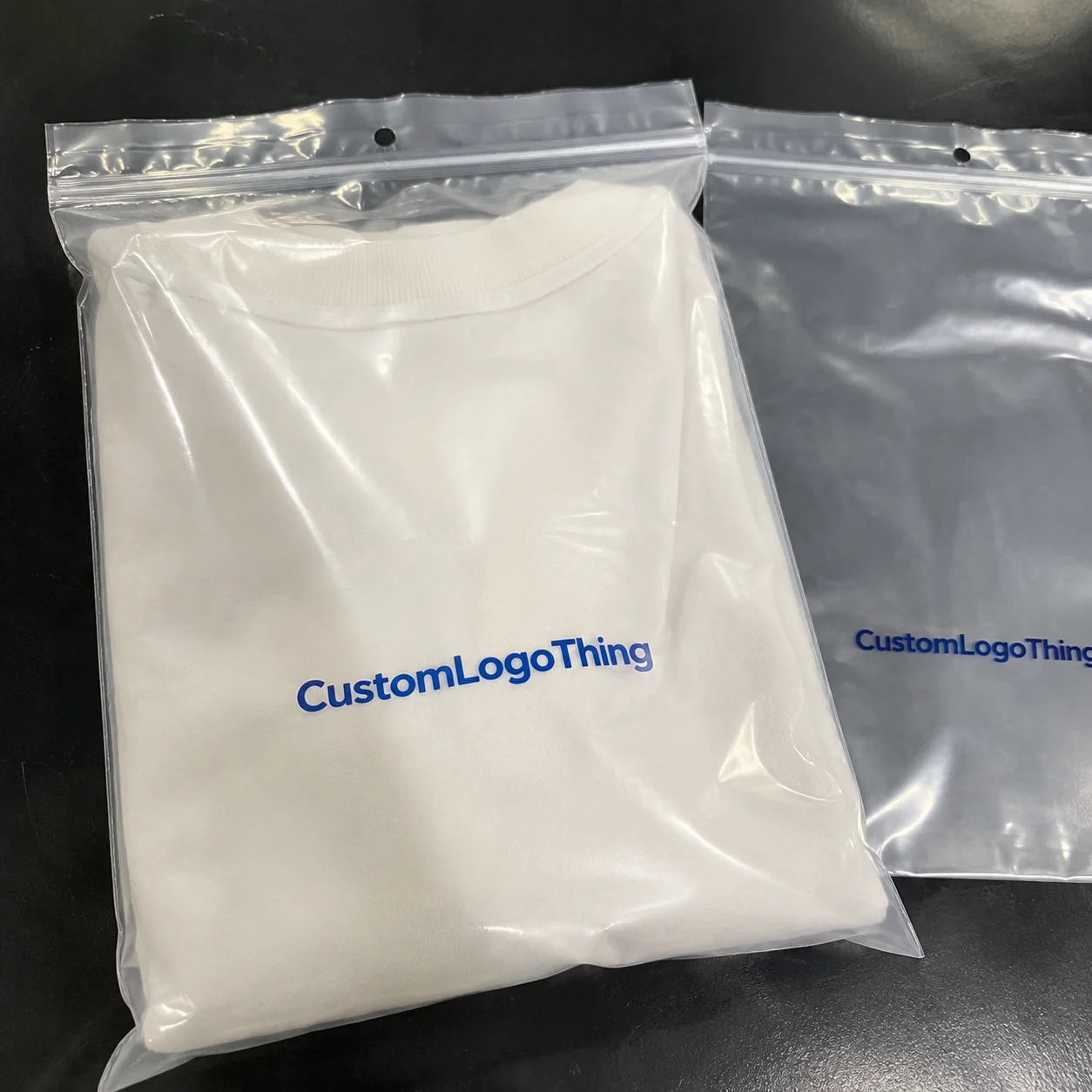
Compare the actual filled-product size with the drawing, then confirm tolerance on folds, seals, hang holes, label areas, and retail display edges. Reserve space for logos, QR codes, warning copy, and material claims before decorative graphics fill the panel.
Quote comparison points
Review material grade, print process, finish, sampling route, tooling charges, carton quantity, and freight assumptions side by side. A quote is only useful when the supplier can repeat the same color, closure quality, and packing count on the next order.
Some of the best tips for transparent sleeve branding came from a nasty little surprise on a factory floor in Shenzhen, where a 120ml skincare bottle with a clear PET sleeve and soft-touch carton looked gorgeous in the sample room and terrible under 5000K warehouse lights. The issue was one bad ink choice: a pale gray logo printed without a white underlay on 30-micron film. I still remember holding the sample next to a pallet stack and thinking, “Well, that just murdered the brand.” The product itself was good. The packaging looked cheap. That’s exactly the kind of mistake tips for transparent sleeve branding are meant to prevent.
For Custom Logo Things, I’d rather give you the ugly truth than packaging fairy dust. Transparent sleeves are not magic. They make good products look cleaner, sharper, and more intentional when the specs are right: 0.35mm PET, centered seam placement, and text that still reads at 3 feet in a retail aisle. They also expose weak design, bad contrast, sloppy fit, and questionable taste with zero mercy. If you want tips for transparent sleeve branding that actually help sell, you need to understand how the sleeve, the product, and the shelf all work together. Honestly, people skip that part because they want the “easy” version. Packaging rarely cooperates with wishful thinking. Kinda annoying, but true.
Tips for Transparent Sleeve Branding: Why It Works
Plain version first. Transparent sleeve branding uses a clear printed sleeve or decorated film wrap around a carton, bottle, tube, tray, or gift box so the product stays visible while the brand still has room to show up. Part packaging, part stage lighting. The sleeve is not the star. The product is. Good tips for transparent sleeve branding start there, ideally before anyone spends $800 on a render that ignores the actual bottle shape.
Why do brands keep asking for it? Visibility, trust, shelf impact, and that simple “I can see what I’m buying” effect. Shoppers hate guessing, especially in cosmetics, supplements, food gifting, candles, and boutique retail. A transparent sleeve says: “We have nothing to hide.” That works for customer perception, but only if the execution is disciplined. Lazy artwork on clear film looks like someone forgot to finish the job. And no, a vague “minimalist concept” note does not save it. I’ve watched a buyer in Guangzhou reject a whole run because the logo vanished under LED lighting. Brutal? Yes. Correct? Also yes.
In my experience, transparent packaging works best when the brand already has a clear point of view. Minimal logos, careful typography, clean color control, and a bit of restraint. If your brand identity is messy, a clear sleeve won’t save it. It just gives the shopper a clearer view of the chaos. Honest, but brutal. I saw this firsthand on a candle project in Dongguan where the box artwork had six fonts, three icon styles, and one very confused gold foil accent. The clear sleeve didn’t fix it. It made the mess feel more expensive.
“The sleeve was technically fine,” one buyer told me after a 2,000-piece test run. “But it made the product look smaller and less expensive.” He wasn’t wrong. Clear packaging can magnify everything, including mistakes.
The best tips for transparent sleeve branding always include this warning: transparency is an amplifier. If the jar shape is awkward, if the carton print is noisy, if the product color clashes with the artwork, the sleeve will highlight all of it. On the other hand, when the visual branding is calm and the hierarchy is tight, transparent sleeves can improve brand recognition fast. A 40-micron PET sleeve on a 250ml bottle will show the contents, the label, and every alignment problem. That’s not a flaw. That’s the job description.
I’ve seen them used beautifully on 120ml skincare bottles with 30-micron clear PET sleeves, small gift candle sets wrapped in 250gsm cartons, and supplement jars that needed the regulatory panel visible without burying the branding. I’ve also seen them used badly on bakery boxes where the sleeve sat crooked by 3mm and suddenly the whole thing looked like a rushed private-label job. Same material. Different discipline. Same factory, too, which is always humbling. One missed 3mm tolerance in a Suzhou line can undo an otherwise polished design.
So yes, tips for transparent sleeve branding matter because the format is unforgiving. It rewards strong product presentation and punishes sloppy thinking. That’s why smart brands test it, prototype it, and compare it under real retail lighting before they bet the launch on a shiny render. I’ve watched a “great idea” collapse the second it got near a fluorescent shelf in a Shenzhen showroom. Fancy render, sad reality.
How Transparent Sleeve Branding Works
The basic structure is straightforward: a clear film sleeve wraps the product or carton, graphics are printed on the film, and the product itself becomes part of the final design. That’s the whole trick. Except the “simple” part usually turns into a dozen decisions about material, ink, fit, and finishing. Good tips for transparent sleeve branding always cover the mechanics, not just the art. A sleeve built on guesswork is just a clear mistake with a barcode.
Common film choices are PET, PP, and PVC. PET is popular because it gives strong clarity and a premium feel. A typical clear PET sleeve might run 0.35mm to 0.50mm depending on the application, while a more flexible PP option can work at around 30 to 40 microns for lighter packs. PVC is still around, but I only recommend it when the supplier, compliance requirements, and end-use case make sense. Otherwise, you’re creating future headaches for a short-term price save. That’s not smart procurement. That’s just coupon shopping with consequences.
Print methods matter more than people think. Flexo printing is efficient for larger runs and consistent graphics. Digital printing works well for shorter runs, versioned artwork, and faster sampling. Screen printing can be used for bold opaque effects, especially when you want heavier white ink or strong spot coverage. The right choice depends on order quantity, artwork complexity, and whether you need dense white underlay. Some of the best tips for transparent sleeve branding come down to this: print method decides what you can actually see. On one run in Dongguan, a digital proof looked elegant until the flexo production sample shifted the white by 0.4mm and changed the whole mood.
Opacity is the real boss here. A clear sleeve with no white underlay can look elegant, but only if the product behind it provides enough contrast. Add white ink and the entire visual story changes. Matte varnish softens reflections. Gloss makes the sleeve feel brighter and more polished under retail lights. Spot finishes can push certain elements forward, but don’t overdo it. I’ve watched brands spend $0.22 extra per unit just to add a fancy finish nobody noticed at three feet away. Lovely waste of money. If the premium effect doesn’t show up under 4000K lighting in a Guangzhou showroom, it’s probably not worth the surcharge.
Dielines and seam placement are another part of the puzzle. A sleeve that looks centered on a PDF can land terribly in production if the seam hides the logo or cuts through a key panel. Orientation matters too. If the main panel ends up on a side seam, congratulations, your “front” is now decorative confusion. One of my favorite tips for transparent sleeve branding is to mark the seam location on the artwork proof before anything gets approved. Saves arguments later. Saves eye-rolls, too. It also saves reprints, which at $0.15 per unit for 5,000 pieces can still turn into real money fast.
Tension is the final piece. Too loose and the sleeve looks wrinkled or cheap. Too tight and you risk warping, scuffing, or stress on the carton edges. On one project for a candle line, the first sample hugged the box so tightly it curled the corners during insertion. We adjusted the tolerance by 1.5mm and the whole thing settled down. Tiny change. Big difference. That’s manufacturing for you: annoyingly precise and completely unforgiving. The factory in Qingdao even measured the carton lip twice because the first pass was off by 0.8mm.
For buyers who like standards, I always point them toward the basics from organizations like ISTA for distribution testing and Packaging School and industry resources for packaging fundamentals. If your sleeve has to survive shipping, retail handling, and display, you need more than a pretty mockup. You need performance thinking. Pretty pictures do not protect cartons from courier abuse, unfortunately. A carton from Shenzhen to Dallas will find every weak seam you forgot to test.
Key Factors That Shape Transparent Sleeve Branding
The first factor is design hierarchy. What must the shopper see first, second, and third? If everything screams, nothing gets heard. Good tips for transparent sleeve branding usually start with one visual job: the product name on the front, the supporting cue nearby, and the legal text somewhere that doesn’t ruin the aesthetic. That sounds basic because it is. Basic is profitable. I’ve seen a 350gsm C1S artboard carton with a transparent sleeve outperform a more expensive pack simply because the front panel was readable in two seconds, not twelve.
Contrast strategy comes next. Clear sleeves need help. Dark type on a light carton works. White ink under black text works. Gold foil over a pale product can work beautifully. But light gray text over a busy multicolor background? That’s decorative sabotage. I once reviewed a serum line where the creative team used a barely-there silver on a translucent bottle. It looked sophisticated in the studio. On shelf, it vanished. No one buys packaging they can’t read. That’s not a branding statement. That’s a blindfold. In practical terms, 70% black on a light background beats “designer gray” every time.
Material selection should match the product shape, the shelf life, and sustainability goals. A rigid product can usually support a firmer sleeve. A curved bottle needs a more forgiving film or the panel areas will distort. If you’re chasing recyclability, ask about resin identification, local recycling streams, and whether the sleeve interferes with the base package. Sometimes a beautiful clear sleeve makes downstream recycling messier. Not always, but often enough to ask the annoying question before production. A supplier in Guangzhou once tried to sell me a “recyclable” sleeve that still used mixed laminates. Nice slogan. Bad waste stream.
Finish choices affect how the sleeve reads under store lighting. Gloss reflects a lot and can boost sparkle on premium skincare or gifting. Matte looks quieter, less flashy, more deliberate. Emboss-style effects can be simulated with print or varnish, though actual embossing on sleeve film is a different beast. In a boutique retail setting, the wrong finish can turn “minimal” into “flat.” The right finish can make a simple pack feel expensive without shouting about it. That balance is harder than it looks, which is probably why people keep overdoing it. I’ve seen matte sleeves look dead on a shelf in Singapore because the room lighting was too cool and the artwork had no contrast.
Regulatory and label-space concerns are where good intentions go to die if nobody plans ahead. Ingredient panels, barcode zones, safety marks, net contents, and distributor info all need room. For supplements and food products, that space can get tight fast. I’ve seen brands redesign the whole sleeve because the barcode ended up under a curve. That’s not a design problem anymore. That’s a packaging planning problem. The best tips for transparent sleeve branding always include compliance early, not after the artwork is “final.” If you need 1.0mm barcode quiet zones and a 13-digit UPC, plan for them before the pretty stuff starts.
Brand consistency matters across the entire package system. The sleeve should match the carton, shipper, website visuals, and even the product photography. If your sleeve is clean and refined but your shipper box looks like a different company made it, customer perception gets fuzzy. Strong brand identity comes from repetition with control, not random prettiness. I tell clients to think in systems: sleeve, carton, label, and unboxing experience all need the same voice. Otherwise, the whole thing feels like a committee met in a hurry and nobody checked the result. A clear sleeve on a premium bottle from Hangzhou should still feel like the same brand as the mailer box in Texas.
Related checks I always run
- Color mapping: verify Pantone targets and how they shift on transparent film.
- Line weight: keep fine text legible at actual production size, not just on screen.
- Seam logic: move high-value graphics away from seam folds.
- Lighting test: review samples under warm and cool LEDs.
Step-by-Step Process for Transparent Sleeve Branding
Here’s the process I use when a client wants tips for transparent sleeve branding that won’t blow up in production. Step one: audit the product and shelf conditions before anyone opens design software. Measure the package with calipers if needed. Check curvature, corners, and display orientation. If the item is going to sit under 4000K retail lighting, that matters. If it’s going into a luxury gift set, that matters too. Packaging choices are physical, not theoretical. I know that sounds obvious. Then I watch teams ignore it anyway. On one line visit in Shenzhen, the designer measured the wrong carton edge by 2.5mm and everyone somehow acted shocked when the sleeve didn’t fit.
Step two: build a dieline around actual dimensions, not “close enough” numbers from a spreadsheet. I once visited a facility in Dongguan where the buyer sent a dieline that was off by 4mm because someone copied the old carton size and forgot the new closure. The result was a sleeve that looked okay on the file and awful on the box. Four millimeters sounds tiny until you’re staring at 10,000 unusable sleeves. Precision pays. Sloppiness invoices itself. If the carton is 68mm wide, measure 68mm, not “about 70.”
Step three: prototype with printed mockups and test readability from 3 to 6 feet away. That distance matters because shelf scanning is fast. Shoppers don’t stand there studying your typeface like a design professor. I’ve had clients fall in love with details that disappeared the moment we backed up three steps. Good tips for transparent sleeve branding always include distance testing. If it can’t be read at aisle distance, it’s decorative noise. Pretty decorative noise, maybe. Still noise. A 9pt font that looks elegant in Adobe is still 9pt in a store, which is basically invisible on a busy shelf.
Step four: choose materials, ink systems, and finishes based on production reality and budget. A clear sleeve on a 250ml cosmetic bottle may need a different film gauge than one on a rigid candle jar. If your budget is $0.08 per piece, don’t ask for five special effects and a white underbase with metallic accents. Could it be done? Sometimes. Should it? Usually no. Be honest about volume, because the cost structure changes fast. For 1,000 pieces, a digital sleeve proof might be worth $1.20 per unit; for 10,000 pieces, a flexo run might land closer to $0.16 or $0.19 depending on coverage.
Step five: approve a pre-production sample and review seam placement, fit, and color accuracy. This is where you catch the ugly little surprises. Is the seam hiding the logo? Does the color drift under fluorescent lights? Does the sleeve rotate on the pack? I’ve seen a sleeve pass digital approval and fail physical inspection because the printed area looked centered until it was wrapped around the bottle. Flat art lies. Curved surfaces tell the truth. One client in Shenzhen approved a proof at noon and rejected the same sleeve at 6 p.m. under cooler LED strips. Same sample. Different reality.
Step six: confirm packing, insertion method, and application speed so the final line doesn’t bottleneck. If the sleeve needs hand insertion and the line only handles 400 units per hour, you need that fact before launch, not after the first overtime bill. Factory managers care about throughput more than the mood board. So should you. Transparent sleeve branding is beautiful right up until it slows the line by 30 percent. I’ve seen a 3-person insertion station become the bottleneck on a 12,000-unit candle order in Suzhou. That’s not a design problem. That’s a production problem.
One supplier in Dongguan gave me a blunt but useful line during a negotiation: “Your design is easy. Your application is not.” He was right. The sleeve fit was fine. The insertion method needed a fixture. We added one, paid $1,200 for the tooling tweak, and saved weeks of production pain. That’s the kind of trade most brands miss because they focus only on graphics. A supplier being brutally honest is annoying in the moment, but also weirdly refreshing. Better that than finding out on day three of production that your pretty sleeve needs two extra hands per carton.
Transparent Sleeve Branding Cost and Pricing Tips
Let’s talk money, because everyone loves to pretend packaging is aesthetic until the invoice lands. The biggest pricing drivers for tips for transparent sleeve branding are film type, print coverage, ink count, special finishes, and order quantity. A simple clear sleeve with minimal one-color print can be dramatically cheaper than a sleeve with white ink, multiple spot colors, and a matte varnish. No mystery there. More process means more cost. A project in Guangzhou with 5,000 sleeves and only one color can sit near the low end, while a 10,000-piece run with white underlay and spot gloss can move fast in the wrong direction.
For a rough sense of scale, I’ve seen simple clear PET sleeve runs start around $0.12 to $0.18 per unit at 5,000 pieces when specs are clean and coverage is light. Add white ink, multiple print stations, or custom finish work, and you can jump into $0.24 to $0.45 per unit pretty quickly. Shorter runs can land much higher because setup charges don’t care about your optimism. If you only need 1,000 pieces, the per-unit math gets rude fast. Packaging pricing has a talent for that. One Shanghai supplier quoted me $0.15 per unit for 5,000 pieces on a plain PET sleeve, then added another $0.06 once we asked for white ink and seam registration. That’s not a surprise. That’s the invoice telling the truth.
Low-volume runs cost more per unit because the setup doesn’t shrink just because your order did. Plates, make-ready, proofing, color matching, and material handling still happen. On one supplement project, the print setup alone was quoted at $650, which made sense on 20,000 units and felt annoying on 2,000. But that’s how the game works. The factory doesn’t absorb setup costs out of kindness. If they did, I’d still be waiting for free samples and unicorns. Even a simple proof approval cycle usually takes 2 to 4 business days before production can start.
Hidden costs are where budgets get ambushed. Proofing charges, tooling adjustments, freight, and rework from bad specs are the usual suspects. A cheap quote that skips these line items isn’t necessarily cheaper. It may just be incomplete. I always tell clients to ask for the ugly details: seam adjustment, artwork revision limits, sample courier fees, and whether color correction after approval triggers a second charge. Those little questions save real money. They also save you from that special brand of rage that shows up when accounting asks why the “cheap” packaging isn’t cheap anymore. A second sample can add $35 to $120 before freight, and no one enjoys discovering that after the PO is signed.
| Option | Typical Unit Cost | Best For | Watch Out For |
|---|---|---|---|
| Plain clear sleeve | $0.12–$0.18 | Simple retail packs, clean branding | Weak contrast, too much product visibility noise |
| Printed sleeve with one or two colors | $0.18–$0.28 | Cosmetics, candles, boutique gifting | Seam placement, color shift on clear film |
| Printed sleeve with white ink and finish | $0.24–$0.45 | Premium visual branding, stronger shelf pop | Higher setup cost, tighter proofing needs |
| Short-run digital prototype sleeve | $0.50–$1.20 | Sampling, launch tests, A/B shelf checks | Not a true production cost, but useful for validation |
When you compare supplier quotes, make them apples-to-apples. One factory in Guangzhou once quoted me a nice-looking price that omitted the white underlay, forgot the seam allowance, and excluded carton insertion. On paper, it looked $0.07 cheaper. In reality, it was more expensive once the missing items got added back. That’s why tips for transparent sleeve branding always include a quote checklist. If you don’t make the supplier spell it out, the missing pieces will magically appear as “extras.” Funny how that works. Ask for a quote that names the film gauge, print method, carton dimensions, and whether packing is manual or machine-assisted.
Here’s the budgeting advice I give every time: reserve 10 to 15 percent of the packaging budget for sample iterations. Not because you’re indecisive, but because packaging reality tends to have opinions. If you spend everything on the first round, you have no room for course correction. And course correction is usually where the money gets saved. A $4,000 sleeve project should probably keep $400 to $600 aside for revisions, especially if the launch date is fixed and the shelf date is not forgiving.
For brands managing multiple packaging components, I often recommend pairing sleeve work with Custom Labels & Tags so the visual system stays consistent across the range. Sometimes the sleeve carries the hero message and the label carries the compliance copy. That split can be a smart way to protect shelf appeal without giving up legibility. It also helps when your compliance panel needs more room than the front panel can spare.
Common Mistakes in Transparent Sleeve Branding
The biggest mistake is weak contrast. People think clear means invisible, then they act surprised when shoppers can’t read the brand name. If your artwork needs heroic effort to decode, it’s already failing. Good tips for transparent sleeve branding always push readability first. Fancy comes later. A pale silver logo on a translucent bottle in a 4000K supermarket aisle is not “premium.” It’s just hard to sell.
Overloading the sleeve is another classic. Transparent packaging is best when it feels edited. If you cram in every award badge, ingredient claim, QR code, and brand manifesto, the clarity disappears and the product starts looking noisy. I had a client who wanted seven callouts on a single side panel. Seven. On a clear sleeve. The result looked like a gas station flyer wearing a tuxedo. I laughed, then I had to explain why it was a terrible idea twice. A clean sleeve around a 100ml serum bottle needs maybe one claim and one barcode zone, not a marketing manifesto.
Ignoring seam placement is a silent killer. The seam can hide logos, split headlines, or create a crooked visual axis that makes the whole pack look off by a few degrees. Shoppers won’t know why it feels wrong. They just know it does. One small misalignment can ruin customer perception faster than a long explanation can fix it. I’ve seen a seam land 2mm over a brand mark and make a $12 product look like a factory reject. Nobody needed a lecture to notice that.
Choosing the wrong film thickness creates wrinkles, curl, or tearing. Too thin and the sleeve feels flimsy. Too thick and it becomes hard to fit, especially on odd-shaped containers. I’ve seen 25-micron film used where 40-micron was needed, and the result was a glossy little disaster that wouldn’t sit flat. It’s the packaging equivalent of buying shoes two sizes off because the color was nice. A better match for a curved bottle in Jiangsu might be 38 to 45 microns, not whatever was cheapest that morning.
Forgetting barcode and legal text placement until the last minute is another one. Supplement and food packs often need multiple compliance elements, and transparent sleeves don’t magically create extra space. You need to plan for them. If you don’t, the design gets ugly in a rush, which is usually how rushed work earns the word “acceptable” from nervous managers. Not ideal. Not even close. A late-stage barcode move can easily push artwork revisions by 3 to 5 business days, and nobody likes that after the launch calendar is locked.
Skipping prototyping is the most expensive mistake. A sleeve can look brilliant on a render and fail in the real world because the product color clashes with the print, the glass reflectivity washes out the type, or the shelf lighting changes everything. That’s why I always insist on real samples. Tips for transparent sleeve branding are only useful if they survive contact with the shelf. Otherwise, they’re just pretty opinions with a file name. I’d rather find the flaw in a 20-piece sample run than a 20,000-piece production batch in Dongguan.
There’s also the human factor. I once sat in a client meeting where marketing loved the minimalist sleeve, operations hated the insertion step, and finance only cared that the sample budget had already hit $4,800. Everyone had a valid point. The compromise was a simpler print setup, a slightly wider tolerance, and a cleaner application jig. That’s the real world. No one gets everything. Good packaging gets enough. The version we shipped used a 0.5mm wider seam allowance and saved the line from constant jams.
If you want a stronger operational lens, Case Studies can help because seeing how other brands solved the same packaging headaches is usually more useful than another mood board. Theory is nice. Evidence is better. Especially when you’re choosing between a sleeve that looks beautiful on screen and one that actually wraps correctly around a 68mm bottle.
Expert Tips for Transparent Sleeve Branding That Sells
My first piece of advice: use the product itself as part of the design. Don’t fight the bottle color, carton pattern, or tray shape unless you absolutely have to. Some of the strongest tips for transparent sleeve branding come from restraint. Let the package breathe. Let the product show through. The sleeve should guide attention, not compete with the thing inside it. On a 120ml serum bottle, a clean clear sleeve with one strong logo and one accent line often outperforms a busy wrap with five claims and three icons.
Keep the front panel stupidly clear. One message. One focal point. One reason to pick it up. That’s it. If the sleeve needs a paragraph to explain the value proposition, it’s already too busy. In retail, speed matters. A shopper should understand the offer in under two seconds if you want real shelf impact. Anything longer and they drift to the next option. I’ve seen a premium candle line in Chengdu gain attention just by cutting the front copy from 18 words to 6. Fewer words, higher conversion. Fancy math, boring reality.
Test under multiple lighting conditions. Showroom lighting, warehouse lighting, and retail LEDs behave like three different species. Warm light can make a clean white underlay look creamy. Cool light can flatten metallic accents. I’ve seen “perfect” samples lose their charm the moment we moved them from the sample table to the store shelf. That’s why I tell clients to review clear sleeves under at least two light temperatures, ideally 3000K and 4000K. If your brand only looks good in one light, it doesn’t really look good. A supplier showroom in Shanghai will lie to you with flattering bulbs. Assume that. Plan for it.
Ask suppliers about print tolerances, seam registration, and minimum line weights before you approve artwork. If your type is too thin, the print process may fill it in or break it apart. If your seam tolerance is loose by even 2mm, your hero panel may drift. These aren’t exotic concerns. They’re everyday production realities. The factories know this. You should know it too. I’ve had suppliers act shocked that the designer wanted legible text on a clear sleeve, which is... a choice, honestly. For most sleeve projects, I won’t approve hairline type below 4pt unless the print method and substrate have already been tested.
Run a small A/B shelf test if you’re unsure which contrast treatment wins. One version with stronger white underlay, one version with more transparent space. Put them next to actual competitors, not just on a white table in the office. Brands love to trust internal opinions right up until the shelf proves them wrong. That’s why tips for transparent sleeve branding should always include field testing, even if it’s small. A two-hour mock shelf test in a retail bay can save a $2,000 reprint. Cheap lessons are the good ones.
Lean into intentional restraint. Transparent packaging looks expensive when it is edited hard. That means fewer fonts, fewer claims, fewer colors, and cleaner spacing. In one of my favorite projects, a boutique tea brand used a clear sleeve with only black type, one small copper accent, and a simple botanical illustration. The sleeve cost a little more because of the copper pass, but the visual branding felt premium enough to justify a higher retail price. The buyer increased the retail tag by $6.00 per set and still got pushback only on supply, not on value. That’s the kind of math I can live with.
Match the sleeve to the whole package system. If the outer shipper is plain kraft, the sleeve shouldn’t look like it belongs to another brand. If the ecommerce photos show a matte carton and the shelf sleeve is ultra-glossy, the customer will notice the gap. Brand consistency isn’t a buzzword to me. It’s the reason a product looks like a serious business instead of a random SKU. Good tips for transparent sleeve branding always include the full ecosystem, from the 350gsm C1S artboard insert to the shipper carton in Shenzhen or Ningbo.
And yes, sustainability matters. If you’re claiming FSC or recycled content anywhere in the brand story, make sure the packaging claim is real and traceable. Check supplier documentation. Ask for resin details. If the sleeve impacts your recycling story, be honest about that too. The FSC standards matter when paper components are involved, and sustainability claims should always be backed by documentation, not wishful thinking. Same with shipping performance. If your pack needs testing, use standards from groups like ISTA. Packaging doesn’t get bonus points for sounding noble. I’ve seen too many “eco” claims collapse the moment someone asks for the actual supplier certificate.
“We thought the clear sleeve would make it look premium by default,” a brand manager told me after a failed pilot. “Instead, it made the product look unfinished.” That’s the trap. Transparency only helps when the rest of the package is already doing its job.
If you’re still building the broader packaging system, a clear sleeve can work well beside a label-led component strategy. I’ve seen a sleeve carry brand name and visual branding while a separate printed label handles ingredients, instructions, and barcode placement. That kind of split keeps the front panel clean without sacrificing compliance. It’s not glamorous. It is effective. And, frankly, it saves everyone from arguing over where the barcode should live. On one project in Suzhou, splitting the duties cut the front-panel clutter by half and shaved 4 business days off artwork approval because nobody had to cram everything into one spot.
To me, the strongest tips for transparent sleeve branding are the boring ones. Measure properly. Test under real light. Keep the text readable. Don’t clutter the artwork. Check the seam. Confirm the application method. Boring rules save expensive launches. Sexy doesn’t. I wish that sentence sounded cooler, but packaging has a way of humbling everyone. Also, boring usually beats expensive when the pack is sitting on a shelf in Chicago at 8 a.m. under cold LEDs.
FAQ
What are the best tips for transparent sleeve branding on small products?
Prioritize high contrast and one strong message on the front panel. Use smaller text only for required details, not the hero branding. Test legibility at actual shelf distance because small packs disappear faster than brands admit. On tiny products, a 1.5mm type shift can matter more than a whole extra color. For a 50ml bottle or a slim candle tube, keep the front panel simple and let the product color do some of the work.
How do I choose the right material for transparent sleeve branding?
Pick PET for strong clarity and a premium look, PP for lighter applications, or PVC only if your supplier and compliance needs make it necessary. Match thickness to the product shape so the sleeve stays smooth without warping. Ask for samples under store lighting before approving final material, because material transparency changes under LEDs more than people expect. A 0.35mm PET sleeve often works well for rigid cartons, while a thinner PP film may suit lighter, more flexible packs.
How much does transparent sleeve branding usually cost?
Cost depends on film type, print complexity, finish, and order size. Simple clear sleeves are cheaper than sleeves with white ink, multi-color print, or special coatings. Expect setup and proofing to matter more on smaller runs than on larger production volumes. A $650 setup fee can be a nuisance on 2,000 units and barely noticeable on 20,000. For many projects, pricing starts around $0.12 to $0.18 per unit at 5,000 pieces and can move up to $0.24 to $0.45 per unit once you add white ink and finish work.
How long does the transparent sleeve branding process take?
Simple projects can move quickly if artwork is ready and measurements are accurate. Sampling and revisions add time, especially if seam placement or contrast needs adjustment. Production timelines also depend on material availability and factory scheduling. A clean job might move in 12 to 15 business days after proof approval, but custom changes can stretch that out. If the sample needs a second revision, add another 3 to 5 business days before mass production starts.
What are the most common transparent sleeve branding mistakes?
Weak contrast, cluttered layouts, and ignoring the product background are the big three. Bad sizing and poor seam placement can make the whole pack look off. Skipping samples is how brands end up paying twice. I’ve watched a brand burn $3,200 on a reprint because they approved a file instead of a physical sample. Painful, predictable, avoidable. A 2mm seam shift or a 25-micron film choice made in the wrong context can be enough to wreck the result.
If you want your packaging to sell, not just sit there looking polite, follow the right tips for transparent sleeve branding and treat the sleeve like a design system, not a decorative afterthought. A clear sleeve can sharpen brand identity, strengthen customer perception, and improve the unboxing experience when it’s built with discipline. It can also embarrass a brand in public if the contrast is weak or the fit is sloppy. Choose wisely. I’ve seen both outcomes, and trust me, the second one is a lot less fun. The difference between a sleeve that helps and one that hurts is often just a few millimeters, one proof cycle, and a factory in Shenzhen that actually listens.