Buyer Fit Snapshot
| Best fit | Ai Generated Poly Mailer Artwork for Better Branding projects where brand print, material claims, artwork control, MOQ, and repeat-order consistency need to be specified before quoting. |
|---|---|
| Quote inputs | Share finished size, material target, print colors, finish, packing count, annual reorder estimate, ship-to region, and any compliance wording. |
| Proofing check | Approve dieline scale, logo placement, barcode or warning zones, color tolerance, closure strength, and carton packing before bulk production. |
| Main risk | Vague material claims, crowded artwork, missing packing details, or unclear freight terms can make a low unit price expensive after revisions. |
Fast answer: Ai Generated Poly Mailer Artwork for Better Branding: Film, Print, MOQ, and Carton Packing should be specified like a repeatable production item. The safest quote records material, print method, finish, artwork proof, packing count, and reorder notes in one written spec.
Production checks before approval
Compare the actual filled-product size with the drawing, then confirm tolerance on folds, seals, hang holes, label areas, and retail display edges. Reserve space for logos, QR codes, warning copy, and material claims before decorative graphics fill the panel.
Quote comparison points
Review material grade, print process, finish, sampling route, tooling charges, carton quantity, and freight assumptions side by side. A quote is only useful when the supplier can repeat the same color, closure quality, and packing count on the next order.
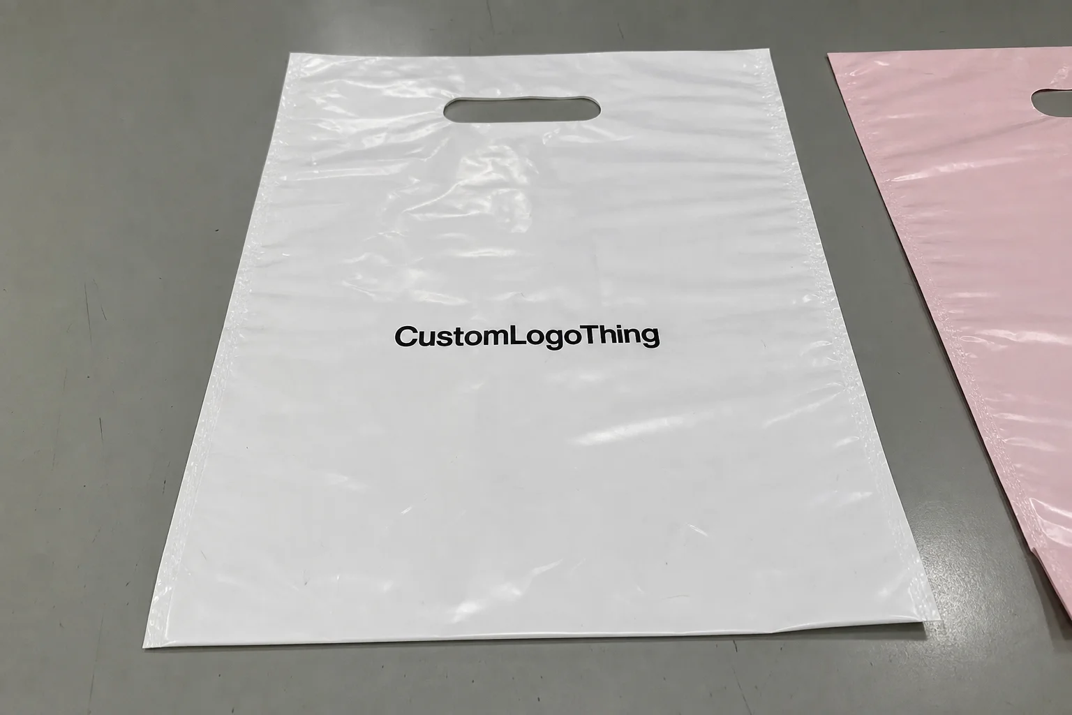
AI generated poly mailer artwork tips are drawing attention for a blunt reason: AI can mock up a polished shipping bag in 10 minutes, while a factory proof in Dongguan or Ho Chi Minh City can expose every tiny mistake by the next morning. I remember watching a brand team celebrate a gorgeous concept on a laptop, then lose two full days because the repeat pattern collided with a side seam and the logo dropped into an adhesive zone. That gap between “looks great” and “prints cleanly” is exactly why ai generated poly mailer artwork tips matter, especially when a 5,000-piece run is already booked at $0.15 per unit.
In my experience, the best packaging teams use AI as a fast sketchbook, not as the final authority. In practical terms, AI-generated artwork means concept generation, layout ideation, color exploration, pattern building, and mockup creation for Custom Poly Mailers. It can help a startup compare 12 design directions before lunch and still leave time for a supplier call in Shenzhen or Ningbo. It can also create trouble if nobody checks the technical side. So I’m going to walk through ai generated poly mailer artwork tips the way I’d explain them to a client standing on a factory floor in Shenzhen with a sample bag in one hand and a magnifier in the other.
Here’s the bigger point. Poly mailers are not poster boards. They have folds, seams, seal flaps, print limits, and material behavior that changes with gloss level and ink coverage. A common production spec is 60–100 micron LDPE film, though premium mailers may use co-extruded 80 micron film with a matte surface and black inner layer for opacity. The art has to survive volume shipping, not just a single mockup. If you want ai generated poly mailer artwork Tips That Actually improve branding, you need to understand where AI helps, where it fails, and how to turn a visually clever concept into something a printer in Guangzhou, Vietnam, or Los Angeles can run at scale.
AI Generated Poly Mailer Artwork Tips: Why They Matter
The reason ai generated poly mailer artwork tips matter is that packaging teams are now expected to move faster without becoming sloppy. I’ve seen creative directors ask for six concepts before a supplier meeting in Toronto, and AI can produce those sketches in seconds. But the packaging manager still has to worry about a 10 mm safe zone, logo edge clarity, and whether the artwork will survive a high-contrast print on 60-micron film. Speed is useful. Precision pays the bills, especially when a reprint in Chicago can add $450 in freight and one lost week.
When people say AI-generated artwork, they usually mean a mix of concept generation and design support. In practice, ai generated poly mailer artwork tips cover five jobs: layout ideation, pattern development, color exploration, mockup creation, and presentation graphics. That makes it easier to test ideas early. I’ve seen a fashion client in Los Angeles use AI to compare a minimal black-on-white mailer against a dense botanical pattern with brand initials woven through it. The pattern looked beautiful on screen. On press, it was too busy for a 3-color flexo run. The lesson was simple: good concept, wrong production logic.
Why does this matter more for poly mailers than for, say, a carton sleeve? The printable area is large, the branding is visible to warehouse teams and customers, and the mailer itself is part of the unboxing experience. You’re not decorating an insert tucked inside a box. You’re branding the shipping skin. A 14 x 19 inch mailer can sit on a porch, in a truck, and on a packing bench before anyone opens it. That means the art has to read from three feet away, survive crinkles, and still look intentional when stacked 200 high on a pallet in a warehouse near Atlanta or Dallas.
Set expectations early. AI speeds up ideation, but it does not replace prepress judgment, bleed rules, or material-specific adjustments. I tell clients the same thing I tell junior designers: if the tool creates the first 80%, great. The remaining 20% is where the actual money is made or lost. That 20% includes seam placement, ink coverage, logo scaling, and the boring but essential file checks that keep a 12-15 business day production schedule from slipping into three weeks.
One more practical point. ai generated poly mailer artwork tips are useful because they reduce the gap between marketing and procurement. Marketing wants a fresh visual. Procurement wants a file that runs cleanly and stays inside budget. Production wants a repeatable spec. AI can make those conversations happen faster, but only if the team agrees on the rules before the first prompt is typed. A clear agreement on 1-color, 2-color, or 4-color printing can prevent a quote from jumping from $0.12 to $0.28 per unit on the same size mailer.
If you’re also evaluating broader packaging formats, I’d keep an eye on Custom Packaging Products so the mailer design stays aligned with labels, tapes, inserts, and shipping materials. A pack system built around a 350gsm C1S artboard insert, for example, will need different color matching than a simple kraft mailer sleeve produced in Manila or Nashville.
How AI Generated Poly Mailer Artwork Tips Work in Practice
The basic workflow behind ai generated poly mailer artwork tips is straightforward: prompt creation, concept generation, refinement, export, and prepress cleanup. That sounds neat on paper. In the room, it’s usually messier. A brand manager types “clean luxury mailer with gold accents,” gets 18 pretty options, then realizes none of them include a logo lockup that respects the actual film width. So the process works, but only if the prompt includes packaging constraints from the start, such as a 13 x 15 inch finished size, 8 mm edge clearances, and a 2-color maximum for flexo printing.
AI tools can outpace traditional mood boards because they generate visual directions immediately. Instead of cutting together 30 reference images from packaging blogs and competitor sites, a designer can request a set of compositions: geometric, editorial, organic, minimalist, or pattern-led. For ai generated poly mailer artwork tips, that speed is a real advantage when a client in London asks for multiple directions in a short window and the supplier in Guangzhou needs a proof by 4 p.m. local time. I remember a supplier negotiation where the customer wanted “something premium, but not too premium” by the end of the call. We used AI concepts to narrow the tone in 15 minutes, which would have taken a half day with manual sketches.
The distinction between AI-assisted design and final production files is where many teams slip. An attractive raster mockup is not the same as a production-ready vector file. A mockup can hide issues such as thin typography, muddy gradients, and decorative elements too close to the edge. For mailers printed in flexographic or gravure processes, those issues become expensive fast. If the artwork relies on delicate brush strokes or hairline outlines, you may need to simplify it before approval, especially if the printer is using a 150 lpi screen or a narrow 1-color ink palette.
Better prompts produce better packaging concepts. I’ve had the cleanest results when clients give AI four kinds of input: brand colors, logo files, target audience, and mailing size. Adding the print method helps too. “13 x 19 inch mailer, two-color print, matte film, no small text under 6 pt” is a much stronger brief than “make it stylish.” The second prompt may sound creative, but it usually returns generic packaging visuals that look fine and print badly. A prompt that includes “manufacturing in Shenzhen, China” or “digital short-run in Austin, Texas” can also steer the artwork toward the right level of detail.
Human review still matters because AI often misses the details that matter most on a production line. Tiny type can disappear. Repeating motifs can drift. Light contrast can flatten on glossy poly. A clever illustration can land right on a side seam. The machine doesn’t care. Your plant operator does. That’s why ai generated poly mailer artwork tips work best when a designer, a production person, and a brand owner all check the same proof, ideally on a hardcopy output measured against the actual bag width in millimeters.
I once reviewed a sample with a cosmetics client in New Jersey who loved a watercolor background created by AI. On the screen, it felt airy and premium. On the bag, the lower third was too light against a translucent white film, and the logo vanished unless the light hit it at an angle. We fixed it by deepening the contrast 18% and pulling the logo up 12 mm. That’s the sort of practical adjustment that separates a clever concept from a usable mailer, especially when the final run is scheduled for 8,000 pieces in a plant outside Ho Chi Minh City.
Key Factors That Shape AI Generated Poly Mailer Artwork Tips
Material behavior comes first. Glossy and Matte Poly Mailers respond very differently to artwork. A glossy film can make saturated colors pop, but it can also exaggerate reflections and reduce perceived sharpness in smaller details. A matte surface tends to soften the image slightly, which can help a simple logo feel more refined. In ai generated poly mailer artwork tips, I always tell teams to design for the finish they actually ordered, not the one they hoped would be available. A matte white mailer and a clear glossy one need different contrast targets by at least 10% to 15%.
Size and layout shape the artwork more than most people expect. A front-only printed mailer has a different rhythm from a full-wrap piece. So does a design with a center logo versus a repeating pattern. Seam-safe placement is non-negotiable. If a graphic crosses a gusset or adhesive fold, it can look misaligned by a few millimeters, and that is enough to make an otherwise good design feel off. I’ve stood next to a press operator in Dongguan who measured that shift with a ruler and said, very calmly, “The design is fine. The placement isn’t.” He was right.
Print method matters because each method has limits. Flexographic printing often favors bold shapes, stable color blocks, and cleaner line work. Gravure can hold more detail, depending on the setup. Digital printing gives more freedom with shorter runs, but even then, resolution and file preparation still control the outcome. Good ai generated poly mailer artwork tips always account for the print method before anyone falls in love with a concept. For example, a 4-color digital mailer in 500-piece quantities can support finer gradients than a 20,000-piece flexo job in a plant near Mumbai.
Cost is part of the equation too. AI can reduce early concept-development hours, but it doesn’t erase the work of revisions, prepress cleanup, and proofing. A simple one-color AI-assisted concept may be quicker to adapt than dense artwork with gradients, layered icons, and multiple rounds of changes. On real quotes, I’ve seen AI shorten design time by 30% to 50% on the front end, while the final production file still took almost the same time if the file was messy. That’s not a criticism of AI. It’s just how print works, and a 2-hour concept sprint can still lead to a 36-hour prepress correction cycle if the artwork is overcomplicated.
Here’s a useful comparison I often share with buyers and brand teams:
| Artwork Type | Typical Production Complexity | Approximate Design Adaptation Cost | Best Use Case |
|---|---|---|---|
| Simple one-color logo layout | Low | $80–$150 per concept refinement | High-volume shipping, clean branding |
| Two- to three-color branded pattern | Medium | $150–$350 per concept refinement | Retail-forward unboxing, lifestyle brands |
| Full-color AI-assisted illustration | High | $300–$700+ per prepress cleanup | Premium campaigns, seasonal launches |
Brand consistency is the other factor that gets underestimated. A mailer should feel like part of the same brand system as your website, inserts, label sheets, and social graphics. If the color palette shifts too far, customers notice even if they can’t explain why. Honestly, I think this is where many teams get it wrong. They treat the shipping bag like a one-off canvas instead of a physical extension of the brand. A shipping bag in Miami should look like it belongs to the same company as the checkout page in Brooklyn.
For technical and sustainability references, I also recommend checking packaging and testing guidance from ISTA and material responsibility basics from EPA packaging waste resources. Those sites won’t design your art, but they do help teams think beyond the graphic alone. If your supplier offers recycled-content film, you may also want to ask for data on PCR percentages, often 30% to 50% in common mailer blends.
Step-by-Step AI Generated Poly Mailer Artwork Tips Process
Step 1: Define the packaging goal. Before you ask AI for anything, decide what the mailer is supposed to communicate. Luxury? Playful? Minimal? Eco-conscious? Promotional? A mailer for a skincare subscription should not look like a skateboard brand’s shipping bag. I’ve sat in client meetings in Chicago where everyone liked the same image but disagreed on the objective. Once the goal was written down in one sentence, the artwork choices got much easier, and the team stopped drifting between “premium” and “fun” every five minutes.
Step 2: Build a prompt with production in mind. This is where many ai generated poly mailer artwork tips start to pay off. Include dimensions, brand colors, logo rules, and a few hard limits. Example: “13 x 19 inch matte poly mailer, 2-color print, bold sans-serif logo, no small text under 7 pt, no art crossing seal edges.” That prompt will usually return better ideas than “make it modern.” The more specific the brief, the less cleanup later. If you already know the film is 70 micron LDPE, say so in the prompt so the design does not rely on ultra-fine detail.
Step 3: Generate multiple concepts. Don’t settle on the first nice-looking output. Compare bold, minimal, and pattern-led options. I’ve found that the “middle” version often wins: not too sparse, not too busy, just enough visual rhythm to feel deliberate at shipping speed. Good ai generated poly mailer artwork tips encourage choice, not instant approval. A team in Seattle once asked for three variants and ended up approving the simplest one because it reproduced cleanly at 12 inches wide.
Step 4: Convert the strongest idea into usable artwork. This is where a designer earns their keep. Typography needs spacing. Icons need simplified geometry. Repeating elements need alignment. If the concept uses a pattern, test how that pattern behaves across the full panel. If it uses photography, test the image at actual print size, not on a tiny screen preview. A mockup that looks crisp at 800 pixels can collapse when scaled to a 14-inch bag. This is also where a file built in Adobe Illustrator or Affinity Designer usually outperforms a flattened PNG.
Step 5: Preflight the file. Check bleed, resolution, safe zones, file format, and seam placement. For most custom mailers, I like to see at least 300 dpi for raster elements and vector art whenever possible. Keep key branding away from folds and adhesive areas. If there’s a zipper or tear notch, that matters too. I’ve seen perfectly good artwork ruined because a barcode sat 4 mm too close to a fold line and turned into a headache for the warehouse team in Dallas. A 3 mm bleed is common, but some factories in Vietnam ask for 5 mm, so confirm the spec before export.
Step 6: Request a proof and inspect it like a production manager. Look at the visual impact, then look at the mechanics. Is the logo centered on the actual finished bag? Does the contrast hold on matte film? Is the repeat clean from panel to panel? A proof is not a formality. It is the moment you prevent a 5,000-piece mistake. If the supplier is in Ningbo, ask for both a PDF proof and, when possible, a physical sample mailed by express courier in 3 to 5 business days.
Some teams also like to compare concept direction by use case. Here’s how I’d summarize the tradeoffs:
- Minimal layouts work well for high-volume shipments and lower ink coverage.
- Pattern-based layouts hide scuffs better and can feel more premium if the repeat is clean.
- Illustrated layouts are memorable, but they need more cleanup and proofing.
- Typographic layouts are easiest to control, especially with one or two ink colors.
In one supplier negotiation, a client insisted on a complex gradient background because the AI mockup looked expensive. The printer quoted a 22% higher price because the file needed extra screening and color matching. We simplified the background to a two-tone pattern and kept the same brand feel. That saved money and reduced press risk. That’s the practical side of ai generated poly mailer artwork tips: creative freedom is good, but production efficiency usually wins, particularly when the target cost is below $0.20 per unit at 5,000 pieces.
AI Generated Poly Mailer Artwork Tips — Common Mistakes to Avoid
The biggest mistake is treating AI output like final print art. Pretty mockups can hide technical flaws. A composition may look balanced, but if the file is low resolution or the text is too thin, it will fail the moment it meets a real production workflow. I’ve seen teams approve files based on screen appearance alone, then scramble after a proof exposed banding, muddy edges, or a logo that had been flattened into a fuzzy image. In one case, a 2,000-piece order in Chicago had to be delayed by 4 business days because the exported art was only 96 dpi.
Another common error is overloading the design with text. Mailers move fast. They’re seen by warehouse staff, couriers, and customers in seconds. Dense copy, small legal notes, or intricate slogans often disappear in transit. Keep the main idea simple. If your brand message needs 20 words, consider moving the full explanation to an insert card or landing page. A 4 x 6 inch insert printed on 350gsm C1S artboard can hold the details far better than the outside of a mailer.
Contrast is often ignored until it is too late. Dark art on a dark mailer can look rich on screen but weak on film. Pale art on glossy material can disappear under overhead lights. In ai generated poly mailer artwork tips, readability should outrank decoration. The customer should identify the brand instantly. If they have to squint, the artwork is doing too much or too little. A good check is to view the proof from 2 meters away under office LED lighting at 4000K.
“We loved the concept, but the seam ate the logo.” That was the exact line a retailer’s packaging lead said to me after reviewing a pilot run. It was a simple fix: move the mark 14 mm left and rebuild the repeat. Small change, huge difference.
Seam placement, folds, and adhesive zones are easy to forget when you’re working on a flat screen. A centered graphic can look excellent in a mockup and become awkward when wrapped around a finished bag. That’s why ai generated poly mailer artwork tips always need one person to think like a press operator, not just a designer. The file has to obey the bag, not the other way around. If the mailer is 12 x 16 inches finished size, the artwork should reflect the actual fold map, not a generic rectangle.
Skipping file checks is another expensive habit. Low resolution, missing bleed, and unsupported file types cause delays. A 24-hour revision can turn into a 6-day back-and-forth if the printer has to request a rebuild. And yes, originality matters too. AI can produce similar-looking outputs from similar prompts, so brand-specific refinement is essential. Otherwise your “unique” mailer risks looking like ten others in the same category, especially in crowded categories like beauty, apparel, and supplements.
One last mistake: assuming AI understands your business rules. It doesn’t know your channel mix, your SKU complexity, or your warehouse handling requirements. It cannot infer that your mailer must survive 3 weeks in a fulfillment center in Phoenix and still look premium when the customer opens it. You have to tell it. If you are shipping in humid regions like Miami or Bangkok, also ask your supplier whether the ink and film combination has been tested for rub resistance after 72 hours in elevated humidity.
Expert AI Generated Poly Mailer Artwork Tips for Better Results
Use AI for concept speed, not final certainty. That is the best single piece of advice I can give on ai generated poly mailer artwork tips. Let it generate options quickly, then apply the judgment that comes from seeing hundreds of printed bags on a line. I’ve watched AI open up creative possibilities that would have taken a team half a day to sketch manually. I’ve also watched it produce lovely but unusable artwork. The tool is fast. Your standards still matter more, especially if the supplier in Shenzhen quotes a 12-15 business day turnaround from proof approval.
Keep the design simple if the mailer will ship in high volume. Simpler artwork usually prints cleaner and scales better across product lines. If you’re mailing 50,000 units a month, you want a design that survives ink variation, film stretch, and real-world handling. A clean logo, a strong repeat, and one accent color often outperform a crowded illustration. That isn’t boring. It’s disciplined. A black-and-white layout with one PMS accent can also keep plate costs lower than a full four-color build.
Ask for versioned concepts. I like to request three paths: a bold version, a minimal version, and a pattern-led version. That makes it easier to compare readability and brand fit. One client thought they wanted a busy floral system until they saw the minimal version beside it. The minimal one carried the logo better and cost less to adapt. The prettier concept did not win. The smarter one did, and the finished mailer stayed within a quoted $0.18 per unit on a 10,000-piece order.
Feed AI your brand kit. Approved palette. Typography direction. Logo file. Tone of voice. If you have one, a packaging style guide. The more structured the input, the less the output drifts into generic territory. This is one of the most practical ai generated poly mailer artwork tips because it saves revision rounds. I’ve seen revision counts drop from four cycles to two when the brand kit was added to the prompt set, and that can shave 2 to 3 days off a launch schedule.
Think in systems, not one-offs. A poly mailer should coordinate with labels, inserts, tape, and even the ecommerce product page. If the mailer feels disconnected from the rest of the customer journey, it weakens the brand story. A strong shipping system can make a $3 product feel like a $30 experience. A weak one can do the opposite. That contrast is sharper than most marketers expect, especially in categories where the mailer is the first physical touchpoint after an online checkout.
Save a design log. Keep the prompts, revisions, proof notes, and final approvals in one place. The next time you reorder, that record saves time and money. It also helps when someone asks why a certain type size was chosen or why the repeat started 25 mm lower than expected. Documentation is not glamorous. It is efficient. A shared folder with dated PDFs, Pantone notes, and supplier comments from Guangzhou or Ho Chi Minh City can prevent hours of guesswork later.
For teams working with FSC-certified paper inserts or mixed-material packaging systems, it can help to cross-check responsibility and chain-of-custody details at FSC. Poly mailers themselves may not be FSC products, but the surrounding packaging often is, and the brand story needs to stay consistent across the full pack. If you are pairing the mailer with an insert, a 350gsm C1S artboard sheet is a common choice for a sturdy, premium feel.
Next Steps for Turning AI Generated Poly Mailer Artwork Tips into a Real Production File
Start by auditing your current mailer artwork against the actual print surface. Measure the panel width, note the finish, and check where the seams fall. Then ask a simple question: does the current artwork still read clearly at arm’s length? If the answer is no, you have the foundation for a redesign. If the answer is yes, AI may only need to support a refresh rather than a full rebuild. A 13 x 19 inch mailer with a 10 mm seam zone has very different design constraints than a 9 x 12 inch mailer with a narrow flap.
Next, draft a production-aware prompt using your brand assets, target style, and technical limits. I’d include dimensions, print count, color count, and any content restrictions. For example: “14 x 20 inch matte poly mailer, three-color print, bold logo, no fine lines below 0.5 pt, keep key art 15 mm from edges.” That level of detail makes ai generated poly mailer artwork tips useful instead of decorative. If the order is for a supplier in Ho Chi Minh City, add the target language, file type, and preferred proof format so the handoff is not vague.
Then choose one design direction and build a proof checklist. Mine usually includes bleed, resolution, safe zones, seams, text size, color contrast, and barcode legibility if applicable. If you are shipping at scale, review the proof from both marketing and production. One person checks the brand story. The other checks the press logic. You need both. A proof review conducted in both PDF and printed form catches more mistakes than screen review alone, especially on matte mailers where colors can look 8% darker than expected.
Get a sample or digital proof before the full run. Even a small pilot batch of 250 pieces can save a 10,000-piece mistake. I know that sounds cautious, but the cost of a wrong run is rarely just ink and film. It’s time, shipping delays, storage headaches, and sometimes a rushed reprint that costs more than the original order. A corrected rerun from a factory in Shenzhen may take 12-15 business days from proof approval, so catching an error early is cheaper than explaining a delay to customers.
Use the final approved artwork as a reusable template. That is where the compounding value shows up. Future orders become faster to launch, easier to quote, and less likely to drift off-brand. A documented template also makes it simpler to brief another supplier if you need backup capacity. In my experience, that kind of file discipline is one of the quietest cost savers in packaging, and it is especially useful if your unit price needs to stay near $0.15 at 5,000 pieces or below $0.10 at 20,000 pieces.
If you want a supplier that can help translate design ideas into production-ready mailers, explore Custom Poly Mailers and compare them with your broader pack lineup. The best ai generated poly mailer artwork tips are the ones that improve both creative quality and manufacturability. That’s the point. Not just a prettier mockup. A better-running package, built to print cleanly in cities like Shenzhen, Ningbo, or Los Angeles and still hold up once it lands on a customer’s doorstep.
FAQ
What are the best AI generated poly mailer artwork tips for beginners?
Start with a clear brand style and a simple prompt that includes the mailer size, color count, and print method. Use AI for concept ideas, then refine the artwork manually so it respects bleed, seam placement, and readability. I always recommend checking a proof before approving any run, even if the supplier says the turnaround is only 3 to 5 business days.
Can AI generated poly mailer artwork tips help lower design costs?
Yes, AI can reduce early concept and brainstorming time, especially when a team needs several directions quickly. Final costs still depend on revisions, file cleanup, and proofing. The biggest savings usually come from fewer back-and-forth design rounds and a cleaner first brief, which can keep a 5,000-piece order from creeping above $0.20 per unit.
How do I make AI generated poly mailer artwork tips work for full-color printing?
Use strong contrast, avoid overly fine details, and check whether your print method supports gradients or photographic effects. Then convert the concept into a print-ready file before approval. A beautiful AI image is not enough if the actual print process cannot hold the detail, especially on 70-micron film or matte bags with higher ink absorption.
What timeline should I expect when using AI generated poly mailer artwork tips?
Concept creation can be very fast, sometimes the same day. Prepress review and proof approval usually take longer than the AI concept stage. The timeline depends on revisions, artwork complexity, and whether you need a physical sample for final sign-off. For overseas production, a typical schedule is 12-15 business days from proof approval to completed run, plus 3 to 7 days for freight depending on destination.
What should I check before sending AI generated poly mailer artwork tips to production?
Confirm resolution, bleed, file format, logo placement, text size, and seam-safe areas. Review a proof to catch color, contrast, and layout issues before the full run. I’d also check whether the artwork still reads clearly when the bag is folded, stacked, and handled in transit, and whether any inserts or labels use matching specs like 350gsm C1S artboard or the same Pantone targets.
AI generated poly mailer artwork tips are most valuable when they speed up good decisions instead of merely producing more visuals. That’s the part I keep coming back to after years of reviewing print files, standing beside press operators, and fixing preventable mistakes with clients who were moving too fast. Use AI to explore. Use packaging judgment to decide. If you do both well, your next mailer will look sharper, print cleaner, and support the brand the way it should, whether the job runs in Shenzhen, Guangzhou, or a small digital shop in Austin.