A branded hang tags for jewelry Packaging Print Finish comparison is not really about the mockup. The real test happens under retail lighting, next to polished metal, and after the tag has been handled, tied, retied, and touched a few times. A finish that looks balanced on screen can look washed out, overbright, or strangely expensive in person. The reverse happens too: a plain matte tag can read richer than gloss once glare is removed from the equation.
That is why finish choice matters as much as artwork placement. The coating or laminate changes color, texture, glare, and the way a customer reads the brand. On jewelry packaging, those small shifts influence perceived value fast. A tag also sits close to the product, so its surface has to support the jewelry, not compete with it. If the brand also uses custom printed boxes or other branded packaging pieces, the finish has to fit the entire system rather than stand alone.
"The strongest finish is not the most expensive one. It is the one that still looks deliberate after the tag has been cut, threaded, shipped, and handled in a store."
For buyers, the decision usually comes down to five practical options: matte, gloss, soft-touch, foil, and spot UV. Each one changes the tag differently. Some are built for restraint. Some are built for shine. A few can do both, but only if the rest of the layout stays under control.
Branded hang tags for jewelry packaging print finish comparison
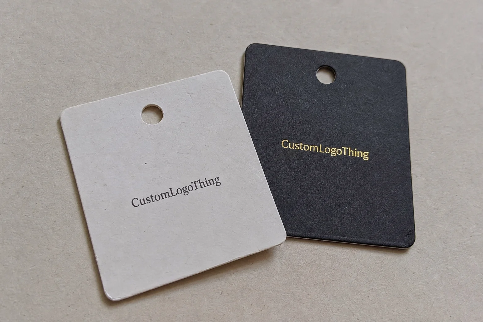
Jewelry tags are small, which makes finish choice more visible, not less. A tiny card has fewer places to hide weak typography, overworked backgrounds, or cheap-looking reflections. On a larger package, a glossy surface can be absorbed into the design. On a jewelry tag, it sits right in the customer’s face.
Here is the practical split. Matte and soft-touch finishes usually support understated luxury. Gloss is brighter, louder, and more reflective, which can help fashion jewelry or youth-oriented lines. Foil and spot UV are accent treatments. They create contrast and emphasis, but they are not substitutes for a good base surface. If the foundation is wrong, the special effect just makes the problem more obvious.
There is also a handling issue that gets overlooked. Jewelry tags are tied, clipped, folded, and touched more often than most buyers expect. Corners show wear first. Hole areas show wear next. A finish that looks clean out of the box may still fail once it is packed, shipped, and moved around a display. That is why the most useful comparison includes not only appearance, but friction resistance, readability, and how the surface behaves at the edges.
If you are ordering Custom Labels & Tags together with a broader set of Custom Packaging Products, keep the finish language consistent. A matte jewelry tag next to a glossy insert card and a soft-touch box can feel accidental. A clear finish system looks more deliberate and usually more expensive, even if the materials are similar.
How print finishes change color, texture, and durability
Matte cuts glare and softens contrast. It makes small type easier to read and gives logos a calmer, more controlled look. That is useful for fine jewelry, minimalist branding, and tags that need to sit quietly beside polished stones or metal. Matte is not flashy, but it is predictable, which matters in production and in store.
Gloss does the opposite. It increases color saturation, sharpens darks, and gives the tag more energy. On fashion jewelry, that can be the right answer. On fine jewelry, it can feel too loud unless the rest of the layout is very restrained. The main drawback is glare. Under direct spotlights, gloss can hide small text and make the tag harder to photograph cleanly for ecommerce.
Soft-touch lamination adds a velvety surface that people notice immediately when they pick it up. It reads premium because it engages touch as well as sight. That tactile quality is useful for higher-end retail packaging, but there is a tradeoff. Soft-touch usually costs more, and it can scuff if the tags rub together in transit or if the design has tight folds and sharp corners.
Foil stamping is for controlled emphasis. Gold, silver, rose gold, or colored foils can lift a logo fast, especially on a quiet stock. The effect works best when it is used with restraint. A single foil mark on a small jewelry tag often looks stronger than a full foiled background, which can turn a premium tag into a noisy one.
Spot UV creates selective gloss. It is most effective over matte or soft-touch stock because the contrast is what makes the detail visible. A monogram, border line, or logo can gain depth without changing the whole tag into a reflective surface. For brands that want subtle premium cues, spot UV usually feels more disciplined than foil.
Durability depends on the substrate as much as the finish. A 350gsm C1S artboard with matte varnish does not behave the same way as a thicker FSC-certified board with lamination. If the tag needs to survive frequent handling, ask about edge wear, scuffing at the hole, and whether the finish remains intact after folding or threading. Sustainability is part of the decision too. FSC standards are a useful reference point at FSC.
Packaging programs that ship as part of a launch kit should also consider transit stress. Jewelry tags are small, but they still move through the same supply chain as the rest of the order. If the tags are packed with boxes, inserts, or retail sets, the same discipline used for distribution testing still applies. The ISTA framework is a sensible benchmark when the order includes multiple components.
| Finish | Look | Typical unit price at 5,000 pcs | Best use | Notes |
|---|---|---|---|---|
| Uncoated or matte | Soft, low glare, easy to read | $0.05-$0.12 | Minimalist or premium jewelry tags | Simple setup, good writing surface |
| Gloss aqueous | Brighter color, reflective surface | $0.06-$0.14 | Fashion jewelry, bold branding | Can reflect hard under spotlights |
| Soft-touch laminate | Velvety, tactile, muted sheen | $0.12-$0.22 | Premium branded packaging | More expensive, more surface-sensitive |
| Foil stamping | Metallic highlight, strong contrast | $0.18-$0.35 | Logo emphasis, luxury accents | Best as an accent, not full coverage |
| Spot UV | Selective gloss contrast | $0.16-$0.30 | Subtle premium detail | Works best on matte or soft-touch stock |
Those figures move with quantity, paper stock, coverage area, and how many setup steps are involved. Digital printing usually makes more sense for lower quantities. Offset printing becomes more efficient as volume rises, especially when the same artwork is repeated across multiple SKUs. Neither method is inherently cheap. One simply becomes more efficient when the run is large enough to absorb the setup.
If you are comparing quotes across suppliers, ask for a line-by-line breakdown. Separate print, finish, die cutting, hole punching, and any reinforcement. Otherwise you are comparing totals, not specifications. That makes it impossible to know whether a lower quote is actually better or just stripped of detail.
Cost, pricing, MOQ, and unit cost tradeoffs
Finishing adds cost because it adds material and labor. That is the part buyers usually feel first. The next jump comes from setup: foil dies, spot UV plates, lamination handling, die cutting, and extra inspection all create work that does not shrink just because the tag is small. A simple matte tag with a standard rectangle shape is one thing. A custom-shaped tag with foil, soft-touch, and a reinforced hole is a different order entirely.
The price ladder is fairly consistent. Plain matte or uncoated tags are usually cheapest. Gloss is often only a small step above that. Soft-touch pushes the number up. Foil and spot UV add another layer of setup and finishing labor. That is why two tags that look almost identical in a mockup can differ by 30% to 70% in unit cost once the full spec is included.
MOQ behavior matters as well. Lower quantities usually carry a higher per-unit price because the setup does not shrink much. A 500-piece run might land around $0.25-$0.45 per tag depending on finish and packaging, while 5,000 pieces can sit much closer to the ranges in the table. If a supplier offers a very low number on a complex finish, check what is missing. Freight, setup, or rework is often hidden in the fine print.
Budget for the small extras that change the landed cost. String, elastic loop, cotton cord, grommets, rounded corners, hole reinforcement, packing by SKU, and shipping weight all matter. A heavy soft-touch tag with metal eyelets can cost more to move than the design suggests. This is where total landed cost beats sticker price. A lower quote is not always the better quote if the packing method is awkward or the freight lands high.
For cleaner pricing, ask the supplier to separate these items:
- Size and stock thickness
- Print method: digital printing or offset printing
- Base finish and any special effect
- Hole size, grommet, or reinforcement
- Attachment style and packing method
- Target quantity and reorder assumption
The list is basic because the job depends on basic facts. When the inputs are vague, the quote usually is too. If the finish choice is still undecided, asking for a second quote with only the finish changed is often the fastest way to see the real cost difference.
Production steps, proofing, and turnaround
The production path is straightforward, but every finish adds another checkpoint. First comes size, stock, hole placement, and whether the front and back need different treatment. Then comes layout, color review, proofing, and finish confirmation. If the tag includes a barcode, care text, or price area, the back side deserves the same attention as the front.
Proofing is where many orders either get corrected or delayed. A digital proof confirms structure, text, and placement. It does not fully show how matte, gloss, soft-touch, foil, or spot UV will look under real light. For finish-heavy work, a physical sample or press proof is the safer option. That matters more when the tags have to match other branded packaging pieces in a launch kit.
Turnaround depends on how many finishing stages are involved. Simple printed tags can move quickly. Once lamination, foil stamping, spot UV, or custom die cutting enters the job, there are more steps and more time for curing or inspection. For standard orders, 7-12 business days after proof approval is common. For more complex work, 12-18 business days is a more realistic planning window. Rush jobs are possible, but only when the spec is final and the artwork is clean.
File prep affects the schedule too. Vector logos, correct bleed, safe zones around the hole, and accurate color references reduce back-and-forth. Small serif typefaces and thin lines should be tested before production because some finishes make them harder to hold cleanly. A good finish can improve the tag. It cannot rescue weak files.
If the tags are part of a broader rollout, packaging by SKU or by collection can save real labor on the receiving side. That kind of detail is not glamorous, but it often decides whether the launch feels controlled or chaotic. The best production spec includes design, finish, packing, and delivery together rather than treating them as separate decisions.
Step-by-step: compare finishes before you order
Start with the jewelry tier. Fine jewelry usually calls for restraint, more white space, and softer surfaces. Fashion jewelry can carry more gloss and stronger contrast. Gift sets often sit in the middle and benefit from a finish that feels polished without becoming stiff. The goal is not to pick the most expensive surface. The goal is to make the tag feel like it belongs to the product.
Then narrow the options. Asking for six finishes rarely helps. It slows the decision and turns it into sample fatigue. For a useful branded Hang Tags for Jewelry Packaging Print Finish Comparison, choose one matte option, one gloss or soft-touch option, and one special-effect option if the budget allows. That gives enough contrast to make the tradeoff visible.
Ask for samples built with the real logo color, actual stock, the intended hole size, and the cord or string you plan to use. A finish that looks fine loose on a sheet can change once it is tied to a necklace card. If the tag will hang from a display peg or sit in a tray, test it in that setup. Real use reveals more than a polished presentation board.
Lighting changes the result more than most buyers expect. Compare samples under warm retail lighting, daylight, and the kind of light used for product photography. Gloss can look energetic in one setting and distracting in another. Matte is usually more forgiving. Soft-touch often looks richer in hand than in a flat image, which is one reason physical samples still matter.
Handling matters too. Check whether the tag smudges, scratches, or shows edge wear after a few minutes of use. Readability should be tested at full distance and close up. Tiny text, SKU codes, and care instructions need to stay legible if the tag is doing real work in the retail workflow. If the surface looks expensive but makes the information hard to read, the finish is working against the package.
If the order is tied to a launch, build in sample time before final approval. That one step avoids reprints, and reprints usually cost more than the sample ever did. Fast approval is useful only when the sample actually proves the finish choice.
Common mistakes that make good tags look wrong
The first mistake is choosing from screen renders alone. A render does not show glare, paper tooth, tactile feel, or how the finish behaves around the punched hole. That is how buyers end up with tags that look flat, overbright, or cheaper than expected once they arrive.
The second mistake is layering too many effects on a small surface. A jewelry tag has limited real estate. If the design adds foil, spot UV, heavy borders, small text, and a busy background all at once, the result usually looks cluttered. Good packaging design typically relies on one clear focal point. Too many cues create noise instead of hierarchy.
The third mistake is ignoring readability. On dark or glossy tags, small logos, barcodes, care instructions, and SKU zones can disappear quickly. If the tag has to serve store staff as well as the brand, the finish should support legibility first. Fancy is fine. Illegible is wasteful.
The fourth mistake is treating the back side like a spare part. Many tags need pricing, care details, retail information, or handwritten notes. Some brands use the reverse for product specifics or store instructions. If the back will be handled often, it needs a practical surface choice, not just a decorative one.
The fifth mistake is approving before the spec is complete. Missing paper thickness, reinforcement, attachment style, or finish coverage can change both cost and lead time. A shiny render is not a production spec. If the order is approved on appearance alone, there is a good chance the quote, the sample, and the final job will not line up.
The fix is simple enough: ask for the full spec before approval. That means artwork, stock, finish, quantity, packing, and delivery window. The checklist is unglamorous, but it usually separates a clean launch from a lot of avoidable back-and-forth.
Expert tips and next steps for a cleaner finish decision
Pick one hero effect and let the rest stay quiet. One strong finish usually looks more expensive than three average ones fighting for attention. If the logo is the focal point, foil or spot UV can work well. If the brand story is restraint, matte or soft-touch usually carries it better.
Match the finish to the message. Matte works for understated luxury and clean typography. Gloss suits energetic fashion jewelry and stronger color palettes. Soft-touch is the tactile premium option when the tag needs to feel as considered as the product. None of them is universally best, which is inconvenient but true.
Ask for quotes that separate print, finish, setup, and shipping. You want to see where the money is going. A low unit price can hide high freight. A higher unit price can still be the better deal if it reduces setup waste or packaging labor. Compare landed cost, not just the tag number.
If the tags are part of a wider retail rollout, keep them aligned with the box, insert, and label system. Mixed surfaces can make the whole shelf look less deliberate. That matters even more if the line already includes custom printed boxes or other branded packaging pieces. A consistent finish language gives the brand a clearer visual rhythm.
For sourcing, coordinate jewelry tags with Custom Packaging Products rather than treating them as an isolated add-on. Planning the components together reduces surprises in production, packing, and replenishment. It also makes it easier to keep finish, stock, and color aligned across the range.
For most brands, the practical path is simple: choose a finish based on the product tier, request one physical sample, and compare it under the retail lighting you will actually use. That is the useful version of a Branded Hang Tags for jewelry packaging print finish comparison. It controls cost, reduces rework, and produces a tag that looks intentional instead of accidental.
What finish works best for branded hang tags for jewelry packaging?
Matte is usually the safest default for premium or minimalist jewelry because it cuts glare and keeps text readable. Gloss works better when you want stronger color and a more fashion-forward look, but it can reflect light hard. Soft-touch is the most tactile option, so it makes sense when the tag needs to feel as premium as the jewelry itself.
Is foil worth it on jewelry hang tags, or is spot UV enough?
Foil gives the clearest metallic hit and works best when the logo or brand mark needs to stand out immediately. Spot UV is subtler and usually better when you want texture contrast without making the tag look flashy. If the budget is tight, spot UV often delivers a cleaner premium effect at a lower cost than full foil coverage.
How does finish choice affect cost and MOQ on branded jewelry tags?
Special finishes increase setup time and usually raise the MOQ or the per-unit price. Simple matte or uncoated tags are normally the cheapest route for smaller runs. Always compare unit price plus setup and freight, because a low sticker price can hide the real cost.
How long do finished jewelry hang tags usually take to produce?
Basic printed tags are usually faster than orders with foil, lamination, or spot UV. Complex finishes can add proofing, setup, and curing time before the job is ready to ship. If the order is tied to a product launch, build in extra buffer instead of assuming the fastest timeline.
Can I use different finishes on the front and back of a jewelry hang tag?
Yes, but it needs to be planned carefully because the finish change can affect cost and production steps. A common setup is a premium front with a more writable or scannable back for pricing or care details. The back should stay readable and practical, even if the front carries the brand statement.