A butter-rich pastry box can look expensive in one finish and oddly flat in another. That contrast is why Custom Hang Tags for bakery packaging print finish comparison matters so much: the coating, sheen, and texture do more than alter appearance. They influence how customers read the brand, how the tag holds up in real handling, and how the product feels before anyone takes the first bite.
Bakery tags get judged quickly. They hang from sourdough loaves, cookie sleeves, and gift boxes, then pass through flour dust, chilled display cases, oily fingers, and checkout counters. A finish that seems attractive in a proof can disappoint in practice if it dulls color, creates glare, or makes ingredient copy harder to scan.
What Print Finishes Do for Bakery Hang Tags
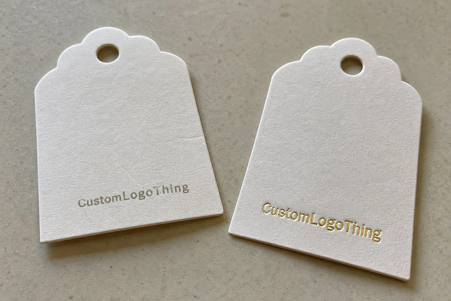
Finish is the last visual and tactile decision in bakery hang tag printing. It changes how light lands on the surface, how the tag feels in hand, and how well the printed area resists wear. The same layout can tell two different stories depending on whether the tag is matte, gloss, soft-touch, uncoated, or embellished with foil or spot UV.
That is the practical side of the Custom Hang Tags for bakery packaging print finish comparison question. Coating, texture, and sheen affect more than style. They affect legibility, grease resistance, and perceived value. A high-sheen tag may look vibrant on a design file, then become difficult to read under warm bakery lighting if the copy is small and the tag swings on a string.
Bakery tags carry product names, weights, allergen notes, pricing, seasonal messages, and brand cues. They are part of the package branding, not just an accessory. A loaf of artisan bread may need an honest, earthy look. A dessert gift box may need something polished enough to feel presentable as a gift. Same category, different job.
The most common finish families are matte, gloss, soft-touch, uncoated, foil accents, spot UV, and laminated surfaces. Matte reduces reflection. Gloss increases color saturation. Soft-touch adds a velvety feel. Foil and spot UV create emphasis. Lamination adds protection, though it changes the tactile character more than many buyers expect.
Packaging finish is not decoration only. It influences readability, grease resistance, perceived value, and how long the tag survives on the shelf, in a delivery bag, or in a customer’s hand.
If your team is also planning Custom Packaging Products or coordinating Custom Labels & Tags, the finish decision should sit alongside the rest of the packaging design rather than being chosen after artwork is already approved.
How Print Finishes Work on Hang Tags
The production sequence is straightforward, but each step affects the final result. First comes substrate selection. Then the design is printed, usually through digital printing for shorter runs or offset printing for larger quantities with tighter color consistency. After printing, the finish is applied. Cutting, drilling, and stringing come last.
Common tag stocks include coated paper, kraft, recycled stock, and thicker premium board. Coated stock usually delivers sharper detail and stronger color because the surface sits more predictably under ink and coating. Kraft absorbs more, which softens the look and supports a handmade or natural story. Premium board adds stiffness, which can make the tag feel more substantial on retail packaging or gift items.
Light reflection is where the difference becomes obvious. A matte surface scatters light, so text usually reads more cleanly. Gloss reflects more directly, which boosts saturation but can create hotspots on white backgrounds or fine type. Soft-touch sits between those extremes visually, but it stands out tactically. In bakery packaging, that tactile cue matters because the customer’s thumb often touches the tag before the eyes finish reading it.
Some finishes are chosen mainly for protection. Others are chosen for storytelling. A laminated tag can hold up better on refrigerated bakery items. A foil accent can elevate a logo or seal. A spot UV layer can create contrast without making the entire tag loud. The key is to match the finish to the use case, not the mood board.
For quality and sourcing questions, many buyers look at the ISTA testing standards for distribution durability and the FSC system for responsibly sourced paper. Those references do not choose the finish for you, but they help frame durability and material responsibility in a more practical way.
Key Factors That Change Finish Performance
The best finish is rarely the prettiest sample on a flat sheet. It is the one that survives the actual working environment. For bakery tags, that usually means moisture, grease, and handling. A tag attached to a refrigerated cream dessert faces condensation. A tag tied to a warm loaf or butter cookie box may meet oily fingers. A display tag can be touched dozens of times in one shift.
Readability matters just as much. High gloss can feel energetic, but under LED lighting it may glare enough to interfere with small text, QR codes, or allergen panels. Matte usually improves legibility because the surface diffuses light. That makes it especially useful for tags with ingredient callouts, weight information, or variable pricing.
Brand perception adds another filter. Kraft plus matte often signals rustic, farm-market, handmade, or small-batch positioning. Foil and spot UV can push a bakery toward premium gifting, especially when used sparingly. A bakery selling $4 cookies and a bakery selling $48 celebration cakes do not need the same visual language, and their hang tags should not pretend they do.
Sustainability is more complicated than many buyers expect. Recycled papers, FSC-certified stocks, and water-based coatings can support environmental goals, but some laminated constructions are harder to recycle depending on the build. That does not make lamination a bad choice; it just means the decision should account for the product’s full life cycle. The EPA recycling guidance is a useful reference if your team is comparing coated and non-coated paper options.
Design complexity changes the result too. Dark backgrounds can make matte look elegant, but they may also show scuffs sooner. Fine type needs enough contrast to stay readable. Barcodes need consistent print density. Ingredient callouts and promotional bursts should not compete with the brand mark. In packaging, the finish should support the layout, not fight it.
- For refrigerated goods: prioritize moisture resistance and low smudge risk.
- For artisan breads: prioritize legibility and a natural texture.
- For luxury desserts: prioritize tactile feel and a premium visual cue.
- For high-volume retail: prioritize cost stability and reliable print reproduction.
Finish Comparison by Use Case
Here is the practical side of Custom Hang Tags for bakery packaging print finish comparison: different bakery products need different finish behavior. A finish that works well for a wedding cake box may be the wrong answer for a flour-dusted baguette sleeve. The table below is built around common bakery use cases, not theoretical print-room conditions.
| Finish | Best for | Strengths | Tradeoffs | Typical cost impact |
|---|---|---|---|---|
| Matte | Rustic breads, artisan pastries, everyday retail | Low glare, easy readability, refined but understated | Can show scuffs more than heavier coatings | Usually low to moderate |
| Gloss | Colorful retail displays, photo-heavy branding, bright gift packaging | High color impact, vivid contrast, strong shelf presence | Glare can hide fine text | Usually low to moderate |
| Soft-touch | Premium cakes, dessert boxes, gifting programs | Distinct tactile feel, premium perception | Often costs more; can show fingerprints on dark designs | Moderate to higher |
| Uncoated | Handwritten notes, rustic lines, short-run bakery tags | Natural texture, easy writing, honest look | Lower protection against smudging or moisture | Usually low |
| Kraft with light coating | Farm-to-market, organic, handmade positioning | Warm texture, eco-forward appearance, flexible branding | Color fidelity is less punchy than white stocks | Low to moderate |
| Foil or spot UV accents | Seasonal gift boxes, premium seals, limited-edition runs | Strong visual hierarchy, luxury cue, focused emphasis | Best as accents, not full coverage | Moderate to high |
Matte finish for rustic bakery branding
Matte is often the most practical choice for bread tags and artisan lines. It works well with kraft, recycled stocks, and simple black or dark-brown typography. If the brand story is “small batch, handmade, fresh from the oven,” matte usually reinforces it without trying too hard. It also helps when the tag includes ingredient notes or weight details because the surface cuts glare.
Gloss finish for color-forward retail packaging
Gloss belongs to brands that want visible pop. Think berry tarts, macarons, bright seasonal assortments, and bakery counters with strong visual merchandising. The finish can make photographs and bold color blocks look punchier. The catch is copy density: if the tag carries too much text, gloss can work against the layout. Larger type and shorter lines make a big difference.
Soft-touch for premium dessert boxes
Soft-touch is the finish that feels expensive before the box is opened. It pairs well with thick stock, minimal layouts, and restrained color palettes. For bakeries offering premium cake slices, dessert sets, or seasonal gifting, that tactile cue can support a higher price point. It is less persuasive on crowded layouts, where the effect gets lost.
Uncoated and kraft for natural positioning
Uncoated stock is useful when the brand wants a handwritten or farmer’s-market feel. It also handles custom notes, date stamps, and variable information better than many coated options. Kraft adds texture and warmth. For short runs, this is one of the easiest ways to keep the line flexible while still looking intentional.
Foil stamping and spot UV as accents
These are accents, not default choices. A thin foil logo, a small seal, or a spot UV mark on a premium emblem can lift the tag without overwhelming it. The best results usually happen when the effect stays confined to one focal point. Too much shine and the tag starts competing with the pastry instead of supporting it.
Cost, Pricing, and MOQ Tradeoffs
Pricing rises as the finish becomes more complex. Basic matte or gloss coatings are usually the most economical. Add foil, spot UV, multi-layer lamination, or specialty soft-touch and the unit cost climbs. That is not arbitrary; it reflects extra setup, more handling, and sometimes higher production waste.
For a buyer, the better question is not “What is cheapest?” It is “What finish gives the best total value for this product tier?” A slightly higher-cost tag can save money if it reduces reprints caused by smudging, moisture issues, or unreadable copy. That is especially true for refrigerated bakery items or tags that stay on the package through local delivery and storefront handling.
Typical cost drivers include quantity, stock thickness, number of print colors, custom shapes, double-sided printing, and the finishing method. Short runs often work well with digital printing. Larger orders usually benefit from offset printing, especially when color control and per-unit cost matter. MOQ also shifts with finish complexity. Premium treatments generally make more sense at higher volumes, while simple coated tags are easier to justify on smaller bakery runs.
It helps to think in broad price bands. For example, 5,000 standard hang tags in a basic coated finish may fall into a relatively modest per-unit range, while the same quantity with foil and heavier board can move significantly higher. Exact numbers depend on size, number of colors, and substrate choice, so an artwork-based quote is more reliable than a generic estimate. The main point is simple: do not overspend on finish if the product tier cannot support the premium.
- Basic coated matte or gloss: best when you need clean branding and a controlled budget.
- Soft-touch or laminated premium tags: best when the perceived value is high enough to justify them.
- Foil and spot UV accents: best when the tag is part of a seasonal or gift-focused program.
Process, Timeline, and Production Steps
The workflow starts with a brief: product type, target audience, budget, and how the tag will be used. Then comes artwork setup, finish selection, and proofing. If the tag includes a special shape or hole placement, a die line is created before production begins. For bakery buyers, that detail matters because a small error can change how the tag hangs from ribbon, twine, or a clipped fastener.
After proof approval, the job moves through prepress, print, coating or finishing, cutting, hole punching, quality check, and packing. That sequence sounds standard, but specialty effects slow it down. Color matching, foil registration, custom die lines, and proof revisions all add time. A basic matte tag may move faster than a soft-touch tag with foil accents and a custom shape.
Schedule pressure is real in bakery work. Seasonal promotions, holiDay Gift Packaging, and rebrands rarely leave much slack. A common production window for simple tags is often around 12–15 business days from proof approval, while specialty work can take longer. If the project depends on a grand opening or holiday shelf set, build in buffer instead of assuming the fastest timeline.
Ask for a sample that shows the actual substrate and finish, not just a digital mockup. A screen preview cannot show glare, texture, or tactile weight. That matters more than many teams realize. Two finishes can look almost identical online and behave very differently once they are printed, cut, and hung on a package.
Common Finish Mistakes Bakery Brands Make
The first mistake is choosing gloss for tiny text. Under retail lighting, glare can make ingredient lists, pricing, or QR codes harder to read. It may look vivid in the studio and frustrating on the shelf. For bakery tags, readability usually matters more than shine.
The second mistake is pairing a premium finish with a low-price line without adjusting the rest of the packaging. A soft-touch tag on a no-frills baguette sleeve can feel inconsistent. Buyers notice mismatches even when they cannot explain them. Packaging works as a system, not a single component.
Another common error is ignoring the handling environment. Tags attached to refrigerated or oily items need more resistance than a dry, shelf-stable cookie tag. If the product is cold, wet, or touched often, uncoated paper is usually a risky choice unless the use case is tightly controlled.
Overuse of special effects is also common. A foil logo, spot UV, heavy pattern, and loud background can turn the tag into a visual contest. Then the product name loses authority. The brand mark should lead, not shout over everything else on the page.
Finally, too many teams skip physical samples. That matters because finish can dull colors, change contrast, or alter the tone of a brand palette. A warm red on screen is not always the same red on kraft stock with matte coating. In packaging design, those differences are not minor; they are the difference between “exactly right” and “close enough.”
Expert Tips for Choosing the Best Finish and Next Steps
Match the finish to the product tier first. Rustic breads and everyday pastries often do best with matte, kraft, or uncoated stocks. Luxury cakes and Holiday Gift Boxes usually justify soft-touch, foil accents, or a laminated premium feel. Wholesale bakery lines may need a simpler finish that keeps costs predictable across larger runs.
Test two options side by side under real bakery lighting. Not studio light. Real light. Use the same counter, the same shelf, and the same handling conditions the tag will face in service. If one version disappears under glare or makes the colors look dull, that shows up immediately.
Think through the buyer’s path. What do they see first? What do they read second? What do they touch third? If the logo is the hero, the finish should support it. If the product name is doing the selling, legibility matters more than a decorative tactile effect. That order turns finish selection into a practical decision instead of a subjective debate.
Ask for a proof that shows the actual substrate and finish combination. A digital mockup is useful, but it cannot show how matte changes contrast or how soft-touch alters perceived color depth. The real thing is the only reliable reference.
Then narrow the decision to a short list: define the use case, compare two finishes, confirm budget and MOQ, review a sample, and approve production with a clear timeline. That process keeps the project grounded and reduces revision churn. It also helps your branded packaging stay consistent across product lines, whether you are working with hang tags, bakery sleeves, or custom printed boxes.
For a bakery buyer, the best finish is usually the one that fits the product, the price point, and the customer’s hand. That is why Custom Hang Tags for bakery packaging print finish comparison should be part of the packaging plan rather than an afterthought. Choose well, and the tag does more than hang there. It quietly tells the customer the product is worth picking up.
What is the best finish for custom bakery hang tags if I want a premium look?
Soft-touch or matte with foil accents usually creates the strongest premium feel. Spot UV can work too if it is used only on a logo, seal, or small highlight. A thicker stock helps the tag feel more substantial in hand, which supports the premium impression.
Are matte or gloss hang tags better for bakery packaging readability?
Matte is usually better for readability because it reduces glare. Gloss works well when you want vivid color, but it can make small text harder to scan. If you use gloss, increase font size and keep the layout simple.
How do finish choices affect cost for bakery hang tags?
Simple matte or gloss finishes are typically more economical than foil, spot UV, or laminated premium treatments. Higher quantities can lower unit cost, especially for standard finishes. Complex finishes add value, but only when the branding and product price support them.
What finish holds up best for refrigerated or handled bakery items?
A coated or laminated finish generally resists scuffs, moisture, and smudging better than uncoated stock. Gloss and matte coatings can both work; the best choice depends on how much glare you can tolerate. Ask for a sample test if the tags will touch cold packaging or be handled frequently.
How do I choose a finish if my bakery uses both rustic and gift packaging?
Use a flexible system: one finish for everyday retail and a richer finish for gift boxes or seasonal sets. Keep the logo and brand colors consistent across both versions. Select finishes that share the same design language so the line still feels unified.