Buyer Fit Snapshot
| Best fit | Branded Packaging Design That Strengthen Your Brand projects where brand print, material claims, artwork control, MOQ, and repeat-order consistency need to be specified before quoting. |
|---|---|
| Quote inputs | Share finished size, material target, print colors, finish, packing count, annual reorder estimate, ship-to region, and any compliance wording. |
| Proofing check | Approve dieline scale, logo placement, barcode or warning zones, color tolerance, closure strength, and carton packing before bulk production. |
| Main risk | Vague material claims, crowded artwork, missing packing details, or unclear freight terms can make a low unit price expensive after revisions. |
Fast answer: Branded Packaging Design That Strengthen Your Brand: Material, Print, Proofing, and Reorder Risk should be specified like a repeatable production item. The safest quote records material, print method, finish, artwork proof, packing count, and reorder notes in one written spec.
Production checks before approval
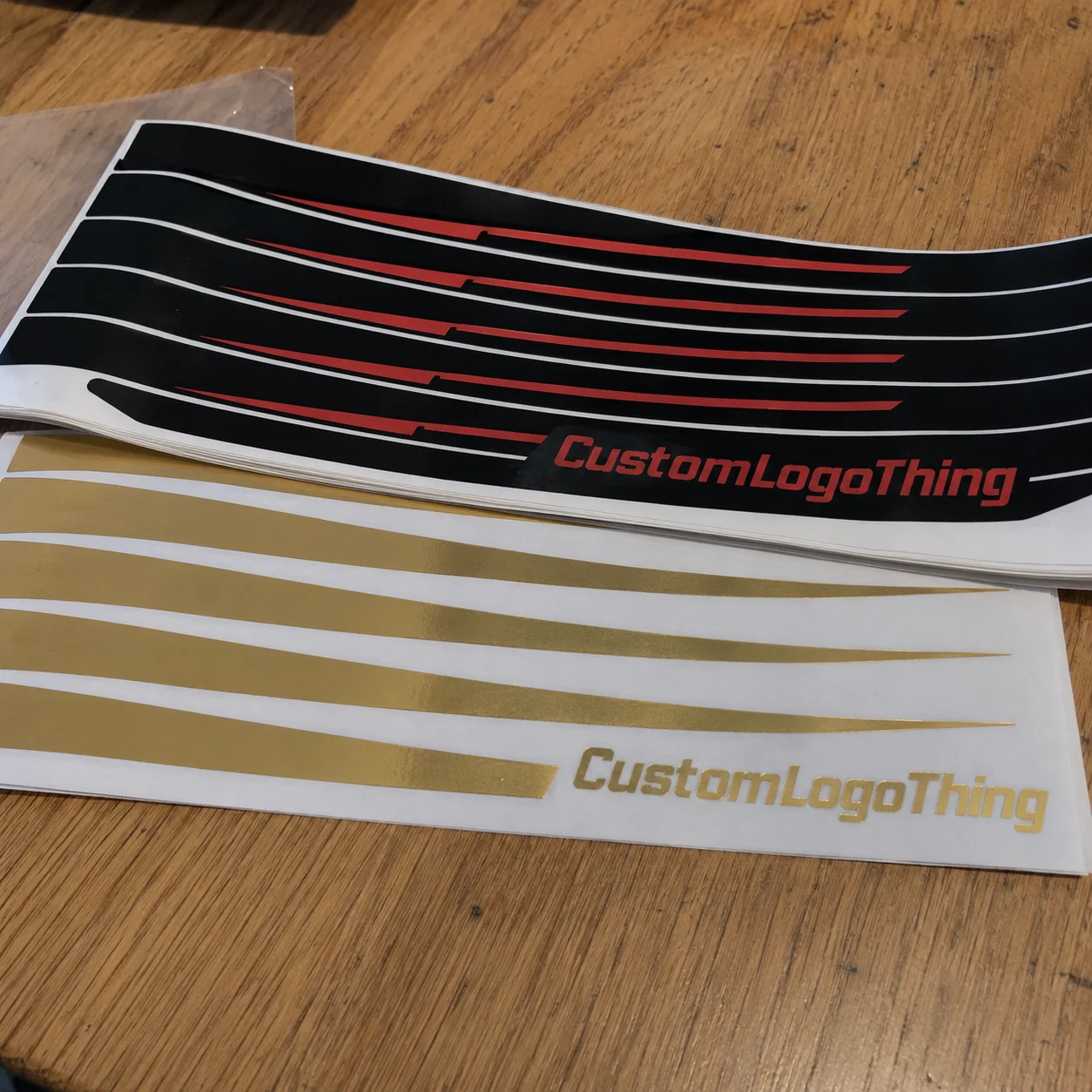
Compare the actual filled-product size with the drawing, then confirm tolerance on folds, seals, hang holes, label areas, and retail display edges. Reserve space for logos, QR codes, warning copy, and material claims before decorative graphics fill the panel.
Quote comparison points
Review material grade, print process, finish, sampling route, tooling charges, carton quantity, and freight assumptions side by side. A quote is only useful when the supplier can repeat the same color, closure quality, and packing count on the next order.
Branded Packaging Design Tips that strengthen your brand start with a plain fact from the plant floor: people judge the product before they ever touch it. The box, mailer, wrap, or insert is the first physical signal of quality. If it looks sloppy, the product inherits that problem for free. Not ideal.
The package starts speaking before the product does. If the structure feels flimsy, the color is off, or the opening experience feels careless, the brand has already done most of the talking.
That is why branded packaging matters so much in product packaging and retail packaging. A buyer may forget the copy. They will remember whether the carton felt sturdy, whether the graphics lined up cleanly, and whether the unboxing sequence made the product feel worth the price. Strong package branding usually comes from a few smart decisions made early, not from piling on decoration at the end like a panic move. Good branded Packaging Design Tips keep the whole thing grounded in reality.
I have watched teams fall in love with a render, then discover the box will not fold cleanly or the insert is off by a few millimeters. That kind of miss is gonna show up fast once the product ships. The fix is almost always less glamorous than people hope: tighter structure, cleaner hierarchy, and fewer assumptions.
Branded packaging design tips: what actually makes the first impression stick
The first impression is not just visual. It is tactile, structural, and emotional too, which is why so many branded packaging design tips focus on details that look tiny on a screen and feel huge in a customer's hands. Matte versus gloss changes how light hits the surface. Rigid board versus corrugated changes how much confidence the package communicates. Full-coverage printing feels loud and expressive, while a restrained logo on a natural substrate can feel quieter, more premium, and more self-assured. The difference shows up fast.
I see this mistake all the time. Teams start with a pretty mockup, then try to force the product and budget to fit after the fact. Better branded packaging design tips begin with a sharper question: what should this package make people feel before they even open it? Luxury, freshness, durability, sustainability, simplicity - pick one lead emotion. The package needs one clear job, not five competing personalities.
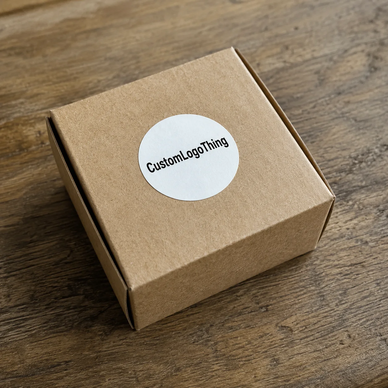
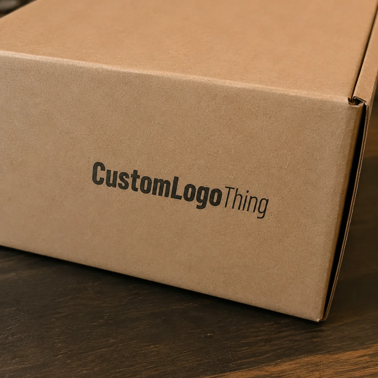
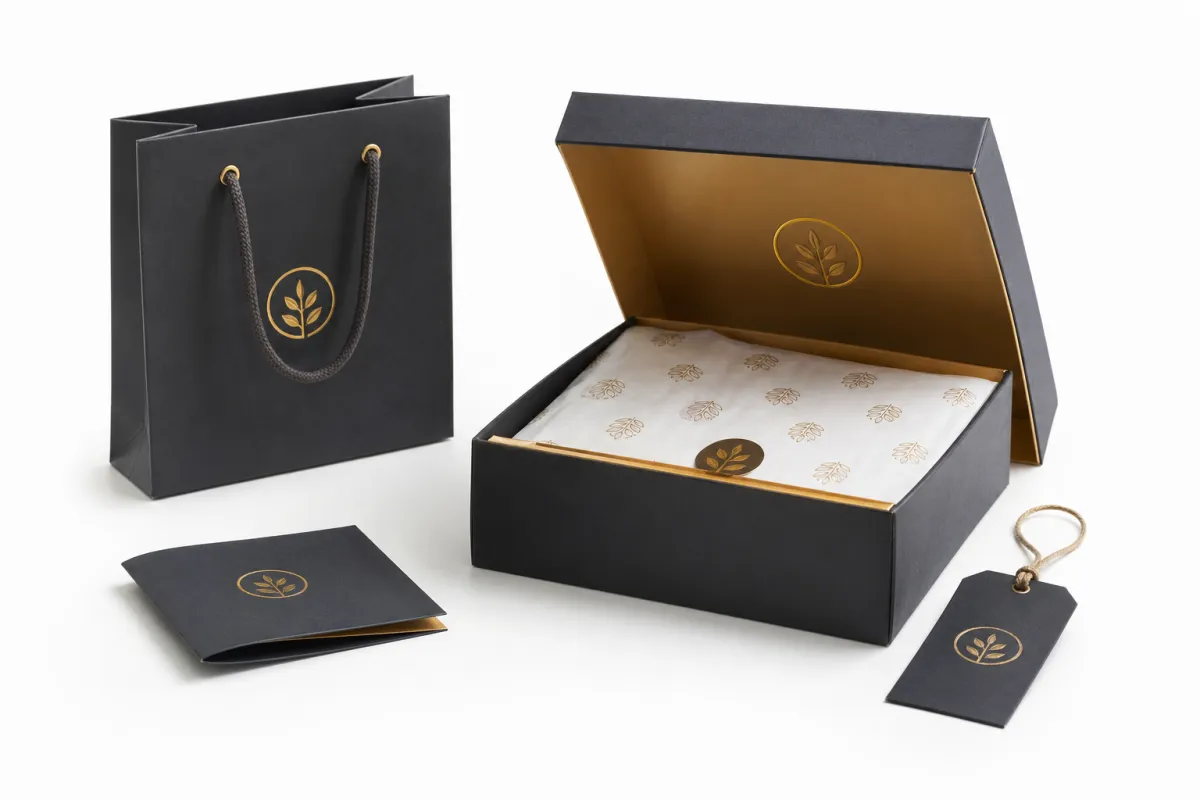
Branded packaging also has to match the product category. A skincare jar, a subscription kit, and a heavy hardware part may all need custom printed boxes, but they do not need the same visual language. A clean white carton with one foil-stamped mark can signal precision and control. A kraft mailer with bold black typography can signal natural, practical, and grounded. A rigid setup box with a printed insert can communicate ceremony and lift perceived value fast. That is package branding doing its job.
Small choices matter because customers read them as clues. A matte coating can soften glare and make a logo feel more refined. Gloss can make saturated colors pop, but it can also make fingerprints and scuffs more visible. A full-coverage black box may look dramatic in a render, yet it can show rub marks during transit if the coating is not chosen carefully. These are the kinds of branded packaging design Tips That Save a project from looking good only in a presentation deck.
Good design also protects the budget. If the package is overbuilt, oversized, or overprinted, the brand may spend more than it needs to on materials, freight, and labor. If it is too plain, the product may feel cheap even when the contents are excellent. The sweet spot is usually a package that uses just enough visual discipline to feel premium, while the structure and material choices do the heavy lifting. A box that feels intentional usually outsells a box that merely looks busy.
There is also a trust factor here. Customers do not have a lab bench or spec sheet in their kitchen or office. They have the package in their hands. If the lid squeaks, the ink rubs off, or the opening feels fussy, they notice. Maybe not consciously. But the feeling sticks.
How do branded packaging design tips work from concept to shelf?
Branded packaging design tips only become useful when they are tied to a real workflow. The usual path starts with the brand brief, then moves into measurements, structure selection, dieline setup, artwork development, proofing, sampling, and final production. Skip one of those steps and the package may still look attractive in concept, but it can fail during assembly, shipping, or shelf display. Pretty is not the same thing as production-ready.
The structure has to support the brand story. That sounds abstract until it gets concrete. If the lid opens awkwardly, the inner tray catches, or the closure flaps fight the fold lines, the customer feels friction. If the board thickness is too light, the box can collapse or telegraph dents. If the board is too heavy, the package may become expensive and harder to ship. Strong branded packaging design tips always account for these real-world constraints before the artwork is finalized.
A dieline is not a background file. It is the operating system of the package. Every panel, fold, glue area, cut line, and bleed zone affects what can be printed and where. That is why branding should be built into the dieline early, not layered on after the fact. Logo placement, copy hierarchy, panel orientation, and seam placement all need to be checked against the structure so the design reads correctly once the box is folded and filled.
Sampling is where the work gets honest. A proof on a monitor cannot tell you how ink behaves on a coated SBS board versus a kraft liner. It cannot show you if the logo lands too close to a seam or if a foil element disappears in low light. Physical samples often expose issues with color shift, panel misalignment, insert fit, and usability. Good branded packaging design tips always make room for that learning stage.
For shipping programs, the package should also be tested against the reality of parcel handling. Transit vibration, drop height, compression, and scuffing can change how the customer sees the product on arrival. Industry references such as ISTA testing standards and relevant ASTM test methods are useful when the box has to survive real movement, not just a static shelf display. That does not mean every project needs a full lab program, but it does mean the design should respect the forces the carton will face.
When sustainability matters, sourcing should be part of the workflow too. If the brand wants paperboard with responsible forestry documentation, FSC-certified materials are often worth considering early, not after artwork approval. That choice can influence board selection, print behavior, and customer perception, especially for brands that put environmental claims front and center.
If you are comparing formats or planning a line refresh, it helps to look at actual packaging options side by side. Our Custom Packaging Products page can be useful for seeing how different structures and finishes translate into a finished box, while our Case Studies show how similar decisions play out across real product categories.
One practical rule: do not let the mockup outrun the production plan. A beautiful render is useful, but if the board caliper, print method, and fold sequence are not locked in, the final package can drift away from the original idea fast. The best branded packaging design tips keep concept and manufacturing in the same conversation from day one.
Key factors that shape branded packaging design
Every package is a set of tradeoffs, and that is where branded packaging design tips become especially useful. The most important decisions usually come down to format, material, typography, color system, logo placement, and white space. Each one changes how the package feels in the hand and how it reads from a distance, on a shelf, or in a shipping thumbnail.
Material choice is one of the most visible signals. Kraft board often communicates natural, earthy, or handmade positioning, especially when paired with simple black or white ink. Coated paperboard can carry brighter color, tighter detail, and more polished imagery. Rigid stock can signal a premium presentation experience, especially when paired with inserts or a lift-off lid. Corrugated board brings strength and shipping durability, which is why it dominates e-commerce and mailer programs. These are not just packaging design preferences; they are brand cues.
Typography does a lot of heavy lifting. If the font hierarchy is too busy, the box feels crowded and the brand message gets diluted. If the type is too light or too small, it can disappear on textured stock or in low light. Good branded packaging design tips usually favor a clear hierarchy: one dominant brand element, one supporting line of copy, and enough breathing room so the package does not feel like every surface is trying to sell something at once.
Color deserves the same discipline. A deep navy on coated stock can feel elegant and controlled. The same color on kraft may look muted because the substrate absorbs some of the ink. Dark backgrounds can look premium, but they also reveal scuffs faster and may require a finish that protects the surface. High-contrast designs can be easier to recognize from a distance, which matters in retail packaging and fulfillment centers alike.
Finish options can change the whole story. Foil stamping can elevate a logo, embossing can add depth, spot UV can create contrast, and soft-touch coating can make a carton feel more tactile and refined. None of these are magic by themselves. They work best when the brand has already decided what it wants the package to say. A finish should support the message, not rescue a weak layout.
Function matters just as much as appearance. If the package does not protect the product, branding eventually suffers because damaged goods undermine trust. Stack strength, closure reliability, opening ease, and insert fit all influence whether the customer sees the package as thoughtful or frustrating. That is why branded packaging design tips should always include shipping performance and assembly logic, not just graphics.
Consistency across SKUs is another point people underestimate. A brand with three box sizes, two accessory mailers, and a gift sleeve needs a system, not a one-off design for each item. That system can stay flexible, but it should still feel related through color, typography, or structure. If every package looks unrelated, the brand loses recognition. If every package is identical, the line can feel rigid and hard to scale. The sweet spot is a family resemblance that leaves room for variation.
One more detail: white space is not wasted space. It gives the eye a place to rest, helps hierarchy read faster, and often makes the whole package feel more premium. A lot of good branded packaging design tips sound deceptively simple, but restraint is usually what separates a package that feels designed from one that feels decorated.
Branded packaging design tips for cost, pricing, and material choices
Packaging budget questions usually arrive early, and they should. Branded packaging design tips are most useful when they help the team understand what Actually Drives Cost. The biggest variables are board type, print method, number of colors, special finishes, labor, tooling, and quantity. Size matters too, because larger boxes use more material and more freight space, which raises the total landed cost even when the print itself is simple.
Simple layouts can reduce cost without feeling cheap. A package with one strong logo placement, a disciplined color palette, and a smart material choice can look more premium than a crowded design that uses every available panel. Strong typography and thoughtful contrast often do more for perceived value than expensive decoration. That is one of the most practical branded packaging design Tips for Brands trying to protect margins.
Custom sizing can save money in more ways than one. When the carton fits the product closely, the brand may need less void fill, fewer inserts, and less risk of product movement during shipping. That can reduce damage claims and cut down on wasted shipping volume. It also improves the opening experience because the product arrives where it should, rather than rattling around inside an oversized box.
Premium upgrades are worth it in some places and unnecessary in others. A high-contact presentation box, such as a gift box or launch kit, often justifies better board, tighter print control, and a finish that feels more tactile. A secondary shipping carton may not need the same treatment. The best branded packaging design tips help a brand spend where the customer will notice the difference and save where the package is mostly structural.
The table below gives a rough sense of how format and finish choices can affect cost. These are not quotes, because size, coverage, and order quantity change everything, but they are useful for planning.
| Format | Typical impression | Approx. cost impact at 5,000 units | Best use |
|---|---|---|---|
| Printed corrugated mailer | Practical, clean, reliable | $0.85-$1.75 each | E-commerce shipping, subscription kits, lighter products |
| Folding carton on coated paperboard | Polished, retail-ready, easy to brand | $0.35-$0.90 each | Cosmetics, supplements, small consumer goods |
| Rigid presentation box | Elevated, giftable, premium | $2.25-$5.50 each | Launch kits, luxury items, high-margin products |
| Sleeve plus inner tray | Structured, flexible, visually layered | $0.65-$1.60 each | Limited editions, retail packaging, bundled sets |
| Custom insert with printed carton | Organized, protected, thoughtful | $0.20-$0.85 added for insert | Kits, fragile items, products with multiple components |
Those ranges move with quantity, board choice, print coverage, and finishing. A foil-stamped rigid box at 1,000 units can land very differently from a simple two-color corrugated mailer at 10,000 units. That is why branded packaging design tips should always be paired with a sourcing conversation, not treated as purely creative advice.
Minimum order quantities also affect the total picture. A small brand might want premium packaging but cannot tie up too much cash in inventory. In that case, a design that uses standard structures, controlled print coverage, and selective finishing often gives the best balance of impact and risk. The project should scale with the business, not outrun it.
For teams comparing options, the key is to decide whether the package is meant to sell, ship, protect, or all three. A box that does three jobs usually needs a more careful budget split than one that only handles presentation. That is where disciplined branded packaging design tips can keep the project grounded.
Step-by-step branded packaging design process and timeline
A realistic timeline keeps a packaging project from turning into a scramble. The best branded packaging design tips follow a sequence that respects the work involved: briefing, concept development, dieline selection, artwork setup, proofing, sample approval, and production scheduling. Each stage depends on the one before it, and each stage needs specific information from the brand.
Briefing starts with the basics, but those basics matter more than people expect. Final product dimensions, weight, closure style, shipping method, regulatory copy, SKU count, and target quantity should all be clear before design work gets serious. If any of those change later, the artwork and structure may need to be reworked, which can add days or even weeks.
Concept development should be shaped by the product and the brand goal. If the goal is premium perception, the design may lean on heavier board, a restrained palette, and a refined opening sequence. If the goal is retail visibility, the layout may need more contrast and stronger shelf recognition. If the goal is speed and efficiency, the package may need to stay close to existing formats so production can move faster. Those are all valid directions, and branded packaging design tips work best when they match the intended outcome.
Proofing is where people often get impatient, but that is usually the wrong moment to rush. A digital proof can catch spelling errors, panel orientation problems, and barcode issues, while a physical sample can reveal much more subtle issues like seam placement, insert fit, and how the finish behaves under lighting. That is also the stage where logo scaling problems and panel misalignment become obvious. Fixing them before production is much cheaper than fixing them after a run has started.
Timing pressure usually comes from three places: artwork revisions, sample feedback, and material sourcing. If the artwork is still moving while the sample is already in motion, the project can drift. If a specialty board or finish has long availability, that can affect the schedule too. A realistic plan should include buffer time for corrections, freight, and quality checks rather than assuming the first proof is automatically production-ready.
Here is a straightforward production flow that works well for many custom printed boxes and retail packaging programs:
- Confirm product dimensions, quantity, and budget range.
- Choose the box structure and board type.
- Place artwork onto the dieline and confirm print boundaries.
- Review digital proofs for layout, copy, and color intent.
- Approve a sample or prototype for fit and finish.
- Schedule production and final inspection.
- Plan freight, receiving, and assembly if inserts or kitting are involved.
That sequence sounds basic, but it prevents a surprising number of problems. The more complex the package, the more important the sequence becomes. Good branded packaging design tips are not just about what the box looks like; they are about how the box moves through a real production calendar.
One practical habit: keep all files organized early. Final logo art, product claims, ingredient statements, warning copy, and any legal marks should be collected before prepress starts. If the team is still chasing files after the design is approved, the schedule usually slips. A small amount of discipline up front can save a lot of back-and-forth later.
Common mistakes that weaken branded packaging
Overcrowding is one of the fastest ways to weaken branded packaging. When every panel is full, the package feels noisy instead of polished, and the customer does not know where to look first. The design may technically contain more information, but it often communicates less because nothing has space to stand out. Strong branded packaging design tips usually favor hierarchy over volume.
Another common issue is choosing finishes that look impressive on a screen but become less effective in real light. A heavy gloss might look striking in a mockup, yet it can flatten contrast or show wear too easily. Deep foil can feel luxurious, but if it covers too much area it may overpower the logo or make the box harder to read. The finish should support the story, not drown it.
Structural fit is another place where good intentions go sideways. A gorgeous design on the wrong box size can crush the product, leave too much void space, or make opening feel awkward. The package should cradle the product, not fight it. When the fit is off, the customer senses that something is wrong even if they cannot name it.
Color on the wrong substrate can also create surprises. Ink behaves differently on kraft, coated paperboard, and corrugated board. A bright brand color may soften on uncoated stock, while dark fields can absorb detail or reveal handling marks. That is why samples matter so much. They show how the actual material behaves under normal production conditions, not just how the art file behaves on a monitor.
Skipping samples and physical tests is probably the most expensive mistake because it compounds every other one. A rushed project can still look fine in a render, then arrive with color drift, a loose insert, or a closure that does not hold. That costs money twice: once to fix the packaging, and again if the product suffers in transit. Honest branded packaging design tips always make room for testing.
There is also a subtler mistake: treating every SKU like a different brand. If a company has multiple sizes or product lines, the system should feel connected. Without that connection, the packaging line loses recognition. If every package is forced into one rigid template, the system becomes hard to use. The best packages have structure without turning stiff and joyless.
A package does not need to shout to feel premium. It needs to look deliberate, fit well, and survive the journey from packing table to customer hands.
Finally, some teams try to solve weak branding with more decoration. That usually backfires. Better branded packaging design tips focus on clarity, consistency, and product fit first. Decoration can help, but it cannot rescue a box that lacks a clear purpose.
Expert branded packaging design tips and next steps
If a project feels stuck, the fastest way forward is usually a simple brand audit. Gather the current packaging, look at what feels off, and decide whether the main goal is premium perception, stronger protection, lower cost, or faster production. A team cannot solve all four at once in the same way, and trying to do so often creates confusion. The best branded packaging design tips begin with a clear priority.
From there, build a packaging checklist before speaking with a supplier. Include final dimensions, target quantity, artwork hierarchy, preferred materials, finish budget, shipping method, and any compliance text. That checklist turns a vague request into a usable brief. It also makes it much easier to compare quotes because each option is being judged against the same requirements.
Test one core format first if the brand is still refining its direction. A single sample run can show whether the box feels right, whether the print reads clearly, and whether the product holds securely. Once that physical sample is working, it becomes much easier to scale the system across other sizes and product lines. That is one of the most practical branded packaging design tips for growing brands: solve the flagship package first, then adapt the rules.
Keep the branding system flexible. Boxes, mailers, inserts, and sleeves do not need to be identical, but they should share a visual logic. That can come through color, typography, panel rhythm, or finishing. A flexible system makes it easier to launch new SKUs without redesigning from zero every time. It also helps the brand stay recognizable across retail packaging and e-commerce packaging alike.
There is real value in documenting what works. If a certain board grade holds up well, write it down. If a specific finish scuffs too easily, note that too. If an insert needs an extra millimeter to fit properly, keep that measurement. Those notes may feel small, but they save time on the next project and improve consistency across the line. In packaging, small lessons tend to become big efficiencies.
For teams that are ready to move, the next step is simple: apply these branded packaging design tips to one package, review the physical sample, and use that result to guide the rest of the lineup. One solid prototype teaches more than a stack of mood boards ever will. If the box feels right in hand, ships well, and speaks clearly for the brand, the rest of the system has a much better chance of doing the same.
That is the real payoff of branded packaging design tips: they help a brand look more credible, protect the product better, and spend money with more control. Good branded packaging does not happen by accident, and it does not need to be overcomplicated. It needs the right structure, the right material, and a design decision made with the customer's first touch in mind.
So here is the move: pick one package, lock the structure before polishing the art, and test a physical sample before you greenlight production. If that sample holds up, the rest of the line has a much better shot. If it does not, fix the structure first. Fancy graphics cannot save a bad box. They just make the bad box more expensive.
What are the best branded packaging design tips for small businesses?
Start with one strong logo placement, a clear color system, and a package structure that fits the product securely. Use simple finishes first, then add premium details only where they make the biggest impression and where the budget can support them. Small brands usually win by being disciplined, not by trying to look expensive everywhere at once.
How do branded packaging design tips help improve perceived value?
They make the product feel more intentional through better materials, cleaner layout, and a more polished opening experience. They also help the packaging communicate quality before the customer even sees the product itself, which is a big part of package branding. People notice effort faster than they admit.
Which materials work best for branded packaging design tips?
Rigid board often works well for premium presentation, while corrugated board is strong for shipping and e-commerce. Kraft and coated stocks each send different brand signals, so the best choice depends on the product, audience, and the kind of experience the brand wants to create. Material choice is never just a technical decision.
How much do branded packaging design tips affect pricing?
Pricing changes based on size, quantity, print complexity, finishes, and whether the box needs custom tooling or inserts. Keeping the design efficient and reducing unnecessary decoration can lower cost without hurting brand impact, especially on repeat production runs. A cleaner package is often cheaper to make and easier to keep consistent.
How long does a branded packaging project usually take?
Timing depends on artwork readiness, sampling, approval speed, and material availability, so lead time can vary by project. A realistic schedule should include review time for proofs and samples before production starts, plus a buffer for shipping and final quality checks. Rushing packaging rarely saves time in the end.