Buyer Fit Snapshot
| Best fit | Logo Packaging Design for Sharp, Memorable Boxes projects where brand print, material claims, artwork control, MOQ, and repeat-order consistency need to be specified before quoting. |
|---|---|
| Quote inputs | Share finished size, material target, print colors, finish, packing count, annual reorder estimate, ship-to region, and any compliance wording. |
| Proofing check | Approve dieline scale, logo placement, barcode or warning zones, color tolerance, closure strength, and carton packing before bulk production. |
| Main risk | Vague material claims, crowded artwork, missing packing details, or unclear freight terms can make a low unit price expensive after revisions. |
Fast answer: Logo Packaging Design for Sharp, Memorable Boxes: Board, Finish, Dieline, and Unit Cost should be specified like a repeatable production item. The safest quote records material, print method, finish, artwork proof, packing count, and reorder notes in one written spec.
Production checks before approval
Compare the actual filled-product size with the drawing, then confirm tolerance on folds, seals, hang holes, label areas, and retail display edges. Reserve space for logos, QR codes, warning copy, and material claims before decorative graphics fill the panel.
Quote comparison points
Review material grade, print process, finish, sampling route, tooling charges, carton quantity, and freight assumptions side by side. A quote is only useful when the supplier can repeat the same color, closure quality, and packing count on the next order.
Logo Packaging Design Tips for Sharp, Memorable Boxes
If your logo looks crisp in a mockup and then loses its shape on a carton, pouch, or mailer, you have already met packaging reality. I have watched that happen in press checks more times than I can count: the PDF looked elegant, the mockup looked expensive, and the first printed sheet exposed every weak line weight and lazy assumption. The first useful logo Packaging Design Tips start long before final art approval, and long before anyone argues whether matte feels premium enough. From a packaging buyer's point of view, the goal is plain: your mark has to read cleanly, resist distortion, and survive the production path without triggering a recolor, redo, and reorder loop. That practical mindset is exactly what packaging teams should design against. If that sounds blunt, good. Packaging rewards bluntness because it is unforgiving.
On the business side, logo Packaging Design Tips that look beautiful only on screen are a polite way to waste budget. Good branding decisions happen on the actual surfaces where products are touched, opened, shipped, and stored. If you are looking for logo packaging design tips that hold up across mailers, boxes, and retail packaging, start here. Teams usually get value not from adding layers, but from removing uncertain assumptions. The highest-ROI version is often the one with fewer surprises and cleaner constraints. That sounds almost boring, and honestly, boring is profitable in packaging.
Search for this topic usually means a team already felt friction: reruns, unreadable marks, a launch date that keeps moving, or a supplier saying "close enough" when close enough is not close enough. That is exactly where a realistic set of logo Packaging Design Tips helps. Think in terms of packaging print specs, not inspiration boards. Your logo only earns premium perception when the production system can execute it consistently.
Logo Packaging Design Tips: What It Actually Means
The uncomfortable truth is simple: a logo that is technically correct in brand guidelines can still fail once it is printed. It can look expensive at 100%, and still look cheap at 20% on a folded carton. That mismatch is often dismissed as bad luck until someone pays for a rerun. Logo packaging design tips are not decoration tricks. They are production-aware decisions: spacing, ink behavior, fold placement, orientation, and finish control working together on the same surface.
Why this is not "logo paste"
People often treat packaging like a giant sticker. It is not. Your logo on packaging belongs to a full branded packaging system. The mark competes with panel text, legal copy, barcodes, shipping labels, closures, and sometimes a subscription message. That is where teams get burned. The logo is not a single isolated object. It is one layer in a shelf strategy, and a surprisingly fragile one.
The same brand mark that performs well on a website header can need a different lockup on a flexible pouch. Fonts that are too thin at 12pt on screen may vanish once the pouch is heat sealed and printed in one pass. A small icon may need simplification. A full-color gradient can turn muddy on uncoated paper stock. The first of the logo packaging design tips is to design for the substrate first, then adjust for style.
How this differs from normal packaging design
On digital and signage work, white space often stays flexible. On packaging, every square millimeter is a mechanical decision. If your dieline says there is a flap overlap 12mm from the side and your logo touches that line, consistency is gone. If a hot glue seam lands under part of the wordmark, the eye still catches the seam shadow. That is why the strongest logo packaging design tips always begin with structure. You do not place art and then ask what can bend around it. You design around folds, seams, perforations, clear windows, zipper pulls, and closures.
That is not romantic. It is packaging engineering with brand consequences. Strong shelf impact means the brand reads in 2 seconds, not 20. Better unboxing means assembly teams can align prints faster. Fewer production headaches mean your launch stays on a schedule you can defend in front of sales, not only design.
What you get from the best logo packaging design tips
If you follow this guide, your packaging should do three things consistently: hold brand consistency, pass retail scrutiny, and reduce reprints. A good outcome from smart logo packaging design tips is not a glossy press release. It is fewer surprises in press checks and fewer frantic calls saying, "The logo is too faint on the top panel."
Use these principles as a filter. If the package choice makes the logo hard to read, makes production more expensive, or creates last-minute revisions, it is wrong for the run. That is not only an aesthetic failure. That is margin. Time. Credibility.
How Logo Packaging Design Works Across Materials
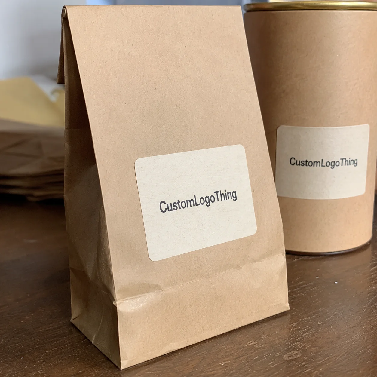
Strong logo packaging design tips are material-specific. Corrugated mailers, folding cartons, flexible pouches, rigid boxes, sleeves, and labels all bend ink and color differently. Literally. You can see it when a black logo on kraft seems elegant on paper, then turns dull gray on uncoated stock. You can see it again when a foil spot on a matte pouch feels expensive, but not readable under shelf lighting. Same logo. Different result.
Corrugated, folding carton, pouch, rigid, sleeve, and label behavior
Corrugated mailers are forgiving in shape but tricky in surface consistency. Texture, absorbency, and moderate detail tolerance all matter. Hairline strokes below about 0.4 mm often break apart at production scale. For a standard 32 ECT mailer, plan for stronger contrast, cleaner edges, and avoid long diagonal fine lines crossing scoring lines.
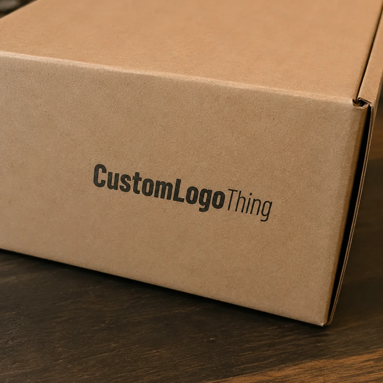
Folding cartons handle detail better, especially with coated C1S or duplex board. Typical carton marks at 250gsm to 400gsm can hold crisp type and thinner lines better than many flexible formats. Coating changes color saturation, though. A white-coated carton can make cobalt and teal jump forward, while recycled brown board may darken and muddy cool tones. Test under the light profile you actually sell in, including 3000K indoor retail and a daylight mix.
Flexible pouches are fast and often cost-effective, especially for liquids and food-adjacent goods, but they stretch. If the logo sits near the top or side seam, movement can distort visual balance after fill and heat seal. Keep a version that leaves enough safe margin from the seam and zip edge, and keep gradients restrained. In my experience, this is where teams are most likely to say the artwork was "fine" before fill and then wonder why it looks slightly off after production. It was not fine. It was only untested.
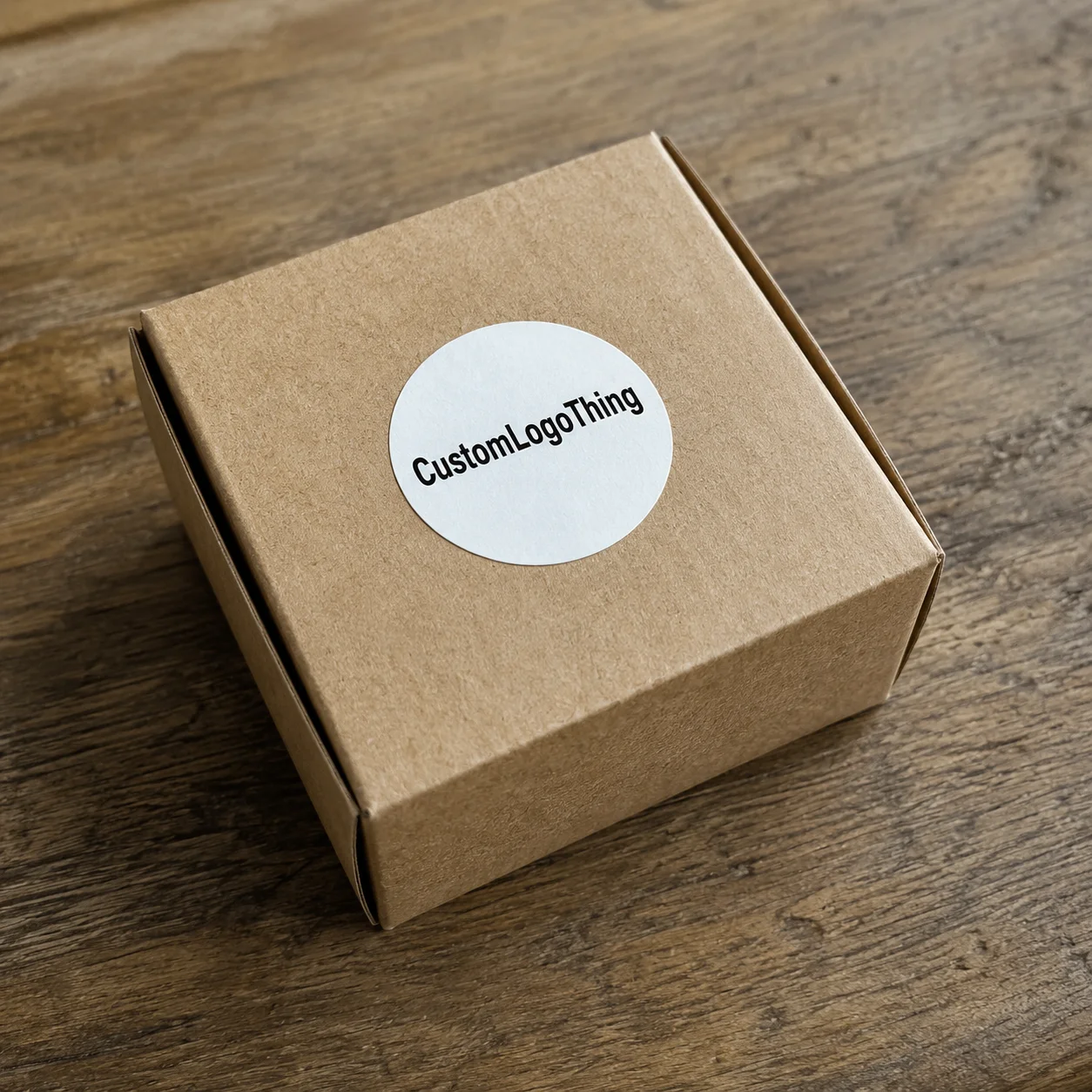
Rigid boxes are visually strong but expensive. They reward premium treatments like deboss and soft-touch, but every added finish costs money. If the logo contains micro-details, rigid stock can carry them, but too many colors increase complexity. On rigid board, a simple two-color hierarchy usually prints cleaner than six-color micro-art unless the brand genuinely depends on exact gradients.
Sleeves and labels are small but highly visible. Because wraps are often applied after container production, registration can drift. Treat the artwork with 2-4 mm bleed and preserve logo clear space after thermal compression distortion. That little buffer matters more than people think, especially on high-speed applicators where the wrap is not perfectly centered every single time.
Translation rules before creativity
This is the practical checklist side of logo packaging design tips. Use vector files. Keep line weight within workable minimums. Define a minimum logo size for each format: for small labels, 15-18 mm width can be a hard floor for any complex lockup. For a 1 oz-style product, anything under that often becomes brand noise.
If the current logo needs more than one simplified version, define them now. One full-color lockup for marketing boxes, one single-color emboss-safe lockup for pouch side walls, and one simplified mark for tiny bottles or sachets. That is not heresy; it is what production teams call survivability. A good packaging system is allowed to have variants. It is not a confession of weakness.
Print method choice changes everything
Digital printing is flexible for short runs and personalization. It handles variable data and small edits well. On large runs, especially with heavy coverage, cost per unit rises quickly. Offset gives predictable color and sharpness at scale and is often cheaper above roughly 5,000 units, though the crossover point depends on coverage, substrate, and setup. Flexographic performs well on thin flexible materials and is common in high-volume pouch work. Screen printing is strong for bold flat colors and tactile ink. Foil stamping and embossing are high-impact tools, but they add setup time and quality checks.
Spot UV can make a logo look modern; it can also create glare that destroys legibility at certain angles. If your shelf uses LED lighting and glass covers, test matte and gloss varnish samples side by side. The same finish can read as refined in a design studio and oddly harsh on a store fixture. That is the sort of mismatch that costs launches, not just aesthetics.
Structure beats mockup
A packaging dieline is not decoration. It is a mechanical map. If the logo lands over an edge fold or a hidden seam, no amount of mockup wizardry fixes that. That is where many teams fail. One side of the structure may show perfectly; the opposite side may be nearly impossible to print around a closure. Packaging design is real-world geometry, and the logo has to move with it.
Proofing: the non-negotiable phase
Mockups are planning tools, not final proof. You want three layers of validation: vector check, printed soft proof, and physical sample. Mockups can hide registration drift. Dieline review catches die alignment issues. Physical samples reveal how dark tones and varnish sit on the real substrate. A solid sample approval removes guesswork and keeps the timeline honest.
Use references from credible industry practice, including distribution performance frameworks like packaging.org guidance and the tests you align with in production planning. It does not matter whether a supplier looks perfect on screen. It matters whether the carton survives handling from pallet to truck. I am always a little suspicious of teams that only review a package on a laptop; laptops are great at hiding real-world friction.
When teams apply these principles as a repeatable process, logo packaging design tips become less like advice and more like an operational rulebook. The result is fewer calls for "one tiny correction" that later turns into a major change order. You are no longer guessing what print will do. You are managing it.
What logo packaging design tips prove themselves before full production runs?
Before pressing 5,000 pieces, teams should expect clear proof before full commitment. A practical test is to isolate two versions: a maximum-clarity hero mark and a production-safe fallback. You can run both through a short press-ready artwork check and compare what changes between press-ready artwork and camera-ready proof. The version that stays stable under shrinkage, heat, and fold tension is usually your true winner.
The most useful logo packaging design tips in this phase are measurable. Ask three questions: Is the mark readable at distance? Does it hold contrast after varnish, lamination, and shipping wear? Do production notes match across all suppliers? If the answer to any question is no, you do not need another visual direction meeting. You need a tighter technical decision.
Think in terms of real decision points: packaging print method, package format, and finish stack. If the logo must pass strict ecommerce scanning environments, prioritize contrast and edge stability over ornamental effects. If the SKU is shelf-first, prioritize shelf impact, then test under the retailer's lighting and angle range. If the pack is gift-led, the finish may move forward, but never at the cost of logo legibility.
Another reason this checkpoint matters: it catches expensive assumptions. One logo file can look "good" on one substrate and fail on another because ink laydown, transparency, and fold behavior differ. The logo packaging design tips mindset says you test before commit, then lock the winning setup. It is a simple sequence with compound returns.
Key Factors That Shape Strong Logo Packaging Design
Many teams think they already know the answer here. Shipping usually proves otherwise. You are not only choosing a logo style. You are choosing how that style behaves under pressure, light, and cost constraints. Good logo packaging design tips live in the middle ground: quality and practicality.
Material choice and ink interaction
Material is the first invisible design input. Kraft gives warmth and story, but it can absorb ink and darken tones. Coated paper and white C1S board improve color pop. Uncoated stock often feels premium and natural, yet it can make high-detail logos fuzzy. Plastic films allow strong saturation but can reflect light and flatten contrast. Rigid board adds structure and durability and supports premium texture. Specialty papers can be excellent, but they usually need precise ink control.
Color contrast and field conditions
Your logo does not live under studio light. It lives under fluorescent retail strips, daylight, and warehouse lighting. The real target is contrast. Keep it strong enough to remain legible after coating and varnish. If the logo is only 10-15% lighter than the background in print mode, it may pass QA and still fail shelf impact. On real shelves, 3:1 contrast is a safer target for quick readability. For dark logos on dark backgrounds, add a reverse lockup and preserve fine white margins where possible.
In many categories, package branding failures are not caused by a weak logo design, but by weak contrast under practical viewing conditions. A strong set of logo packaging design tips includes checking contrast against each distribution route and each camera orientation you can reasonably test. A package can look polished in a studio and flat in a warehouse for reasons that have nothing to do with taste.
Scale and visual hierarchy
Decide whether the logo is hero, support, or secondary identity on each surface. On a 220x300 mm carton front panel, the logo can dominate. On a 20 mm height sleeve section, the logo may be a signature only. That is package branding done properly: one visual system, multiple scales.
For one SKU family, many teams use a two-level hierarchy: full logo + short descriptor + ingredient or category bar. For multi-format operations, define a third level for tiny parcels where only the icon and word mark remain. Skip that step and the packaging ends up either unreadable or inconsistent.
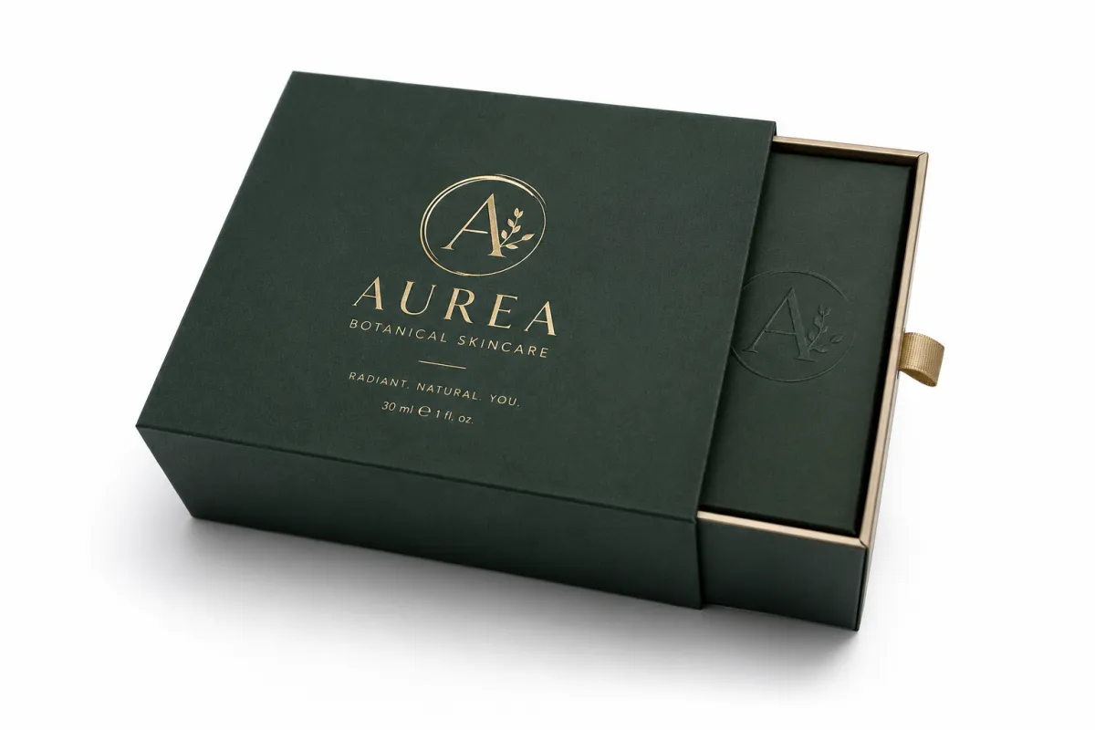
Finish selection: useful or self-sabotage?
Matte, gloss, soft-touch, foil, emboss, deboss, and varnish are all usable tools. Each one carries a readability trade-off. Matte reduces glare but can flatten metallic effects. Foil pops on premium items but can overpay for low-margin campaigns. Soft-touch feels expensive but can trap fingerprints and reduce scannability if the contrast gets too busy.
Overusing effects creates the opposite of premium: confusion. If the logo is already complex, add at most one tactile or optical enhancement per format. A logo half hidden by a UV flood and low-contrast text is not premium. It is weak printing management, plain and simple.
Brand consistency without rigidity
Branded packaging does not mean cloned artwork across everything. It means logo spacing, color anchors, and typography rhythm stay recognizable. Your logo on a small pouch can lose a secondary strip as long as the core proportions remain stable. The danger is total sameness, which makes products forgettable. A consistent brand still needs functional variation.
In practical terms, this is where logo packaging design tips become a strategic advantage: they preserve recognizability while adapting to different panel sizes, closures, and carton geometry.
Production limits and technical thresholds
When a design includes gradients under 10% tonal transition, tiny dots, or ultra-thin strokes, the risk score rises. Most commercial presses cannot guarantee those details at 5,000 pieces with uniform results, especially if the material batch changes. Keep minimum stroke weights practical, and avoid details that look sharp at 600 dpi preview but lose 25-40% contrast after print.
If you handle compliance or food-adjacent materials, align colorants and coatings with your supplier's stack and safety specs. If you need sustainability claims, verify supplier certification and avoid loose claims. FSC claims deserve scrutiny: use verified labels from FSC documentation rather than logo-like badges copied from somewhere else.
“Most buyers do not notice your design talent. They notice whether the logo is readable in five seconds and whether the package shows up intact after shipping.”
Logo Packaging Design Tips for Cost and Pricing
This is where budgets often implode. People think in line items: color, stock, finish. They forget setup, make-ready, waste, and rerun risk. Logo packaging design tips for pricing are really about total landed cost, not the first unit quote that lands in your inbox.
The biggest cost drivers are material, box style, number of colors, finishing stack, quantity, tool setup, and special dies. A tiny one-color carton can be much cheaper than a glossy two-color rigged box with edge paint and embossing. That glossy package may still win attention and lose money if the job needs two revision cycles because the logo edges fail at trim. I've seen projects where a "premium" finish raised cost by 18% and created no measurable lift in sell-through. That is not premium. That is expensive theater.
More colors usually mean more complexity. More complexity usually means more setup. More setup usually means more time and waste. That does not mean two colors always costs less overall than one, but it does mean complexity has a price, especially if the file is unstable.
Where brands overspend
Most waste shows up in three places:
- Heavy finishes on small runs, especially foil or metallic varnish without a production gain.
- Artwork packed with micro-elements that force manual corrections.
- Specs that require supplier-side adjustments because the design team ignored lockup limits.
When teams run 5,000 units with unstable files, they often lose 10% of the job to color correction and short-run reprints. That can erase the "discount" they thought they won.
Typical price bands (practical reference points)
| Format and print setup | Typical unit cost @1,000 | Typical unit cost @5,000 | Typical setup cost | Best use case |
|---|---|---|---|---|
| 1-color kraft mailer, simple full-size logo | $0.35 - $0.50 | $0.18 - $0.30 | $150 - $250 | Lean campaigns, trial volumes, utility-driven shipping |
| 2-color folded carton, coated stock | $1.20 - $1.70 | $0.82 - $1.20 | $250 - $450 | Small retail launches needing stronger shelf presence |
| Full-color custom printed boxes, spot varnish | $1.80 - $2.60 | $1.10 - $1.90 | $350 - $700 | Mid-range branded packaging with photo-ready visuals |
| Premium rigid packaging with foil + emboss | $4.50 - $7.00 | $3.20 - $5.80 | $500 - $1,400 | Gift and premium gifting presentations |
| Flexible pouch with premium clear-window + hot foil | $0.95 - $1.50 | $0.60 - $1.05 | $300 - $650 | Food, beauty, and subscription formats with visibility goals |
These numbers are directional, not promises. They change with country, finish chemistry, freight, and whether the printer bills setup and shipping separately. Still, they are close enough to stop the fantasy-budget trap. The useful comparison is not exact pennies; it is how fast complexity multiplies.
How to spend smarter without getting cheap-looking
Most brands overestimate the cost of simplification and underestimate the cost of complexity. The better move is often counterintuitive: reduce ink hits, keep one strong color family, and increase negative space. Use one high-contrast treatment and no more than one secondary effect. The package still reads as premium, but repeatability improves.
If this is a one-off launch with low margin, design to the budget you actually have, not the mood-board budget. If you are building a flagship packaging line, spend more on structure and finish where the return is visible. Margins matter more if logistics and returns improve by one percent. A cleanly designed logo on a sturdy package can reduce returns and speed assembly, lowering total cost by the equivalent of one extra SKU.
For teams scaling, standardize sizes. Moving from random dimensions to repeatable carton profiles reduces plate changes and setup time. If you ask for five odd formats plus one premium finish, you pay like a chaos project. If you ask for two core formats and controlled artwork constraints, you pay like a disciplined operation.
Practical rule: if your redesign creates more than 20% additional prep time for the print partner, question the decision. If the logo and structure still carry the position well, keep it simple and production-friendly.
Where logo packaging design tips affect margin directly
A cleaner artwork set can lower total cost by reducing:
- color correction loops, often 1-2 extra proofs
- waste from misregistered print
- assembly line stoppages from confusing logo placement
- damage rates from labels peeling or ink transfer
Those are real money leaks. If your process reduces even one of them, your logo packaging design tips are doing business work, not just making slides prettier.
Step-by-Step Logo Packaging Design Process and Timeline
Here is the reliable workflow, stripped of fluff. In practice, it is where brands stop arguing and start shipping.
Step 1: Define the packaging job
Ask the obvious question first: is this for retail packaging, ecommerce, gifting, or subscription fulfillment? It changes everything. A heavy retail front panel needs instant recognition and scan-safe contrast. Ecommerce mailers need high readability under courier scan conditions and fast fold speed. Gifting tolerates slower fulfillment and usually rewards texture-heavy finishes. Subscriptions need consistency across repeat drops.
This step usually takes 1 day for a small team, up to 2 business days for cross-stakeholder review. Skip it and you may finalize a design only to discover it cannot support the distribution path.
Step 2: Gather brand assets and technical files
Pull the right source files: logo AI/EPS, high-res vectors, CMYK specs, font files, color approvals, package dimensions, and legal copy. You do not want to find out the licensed font is unavailable after the press is already waiting. A full asset package can save 2-5 days.
If the logo includes a lockup with claims, verify legal copy, trademark placements, and recycling marks. If the packaging is meant for specific regions, check regulatory symbols and required language. For international shipments, coordinate shipping test standards too, especially if the structure is borderline on drop resistance.
Include one press-ready artwork gate here and map color separations before design sign-off. This is where many teams lose speed because they confuse creative approval with production readiness.
Step 3: Choose format and dieline early
Do this before the final art pass. Many teams waste time because they design on a made-up mockup and then retrofit to final dimensions. Dielines are not decorative lines. They are instructions for survival. The structure decides where the logo can live, where the panel folds, and where a seam will interrupt visual rhythm.
For custom boxes, choose whether the front panel is uninterrupted. If not, shrink the logo or move it to the center dead zone away from side folds. For sleeves, confirm adhesive overlap and heat application. For labels, confirm adhesive bleed and wrap edge tolerance. Freeze the dieline before final copy for a 3- to 5-day stability window.
Step 4: Build and test hierarchy
Decide what people see first, second, and third. First should be logo + product category. Second should be the supporting benefit line. Third can be certification and details. For complex brands, the temptation is to throw everything in. Do not.
If the logo must work in close-up and at distance, create a priority ladder. For example: hero logo at 40% visual weight, product name 25%, trust badges 10%, legal 25%. Adjust per format. Keep a version where the logo is the first read within 1.5 seconds from full shelf distance. Real testers often use 2-3 seconds as a practical benchmark. It is not an exact law, just a useful one.
Step 5: Proof and review before lock-in
Use digital proofing for broad feedback, then physical samples for the final call. One physical proof separates guessing from knowing. Use it for registration checks, color shifts, clear space, finish feel, and seam behavior. For foil and embossing, request at least one full-size pull at final material stock.
If sample approval is delayed because brand owners are waiting on internal review, the timeline slips hard. Build this in: two review rounds are realistic for clean teams; third rounds are where costs start to rise.
Step 6: Approve production and lock timing
Simple packaging can move in under 10 business days after final art if proofing is clean. Custom structures and premium finishes can stretch to 20-30 business days depending on complexity and material lead time. If speed matters, use known formats and avoid late change requests after dieline lock.
Industry reality check: if you are shipping globally or doing a high-touch premium line, add buffer. Good teams usually include 3-5 business days for unexpected corrections plus 2-4 days for freight staging. It sounds boring, but that is exactly why projects avoid emergency premiums.
Timeline risk summary
Most delays come from three sources: late asset handoff, vague approvals, and redesigning after lock. One project brief, one spec sheet, and one named version history prevent all three. A logo packaging design tips checklist and a locked print method do more for delivery than motivational design sessions.
At this stage, the winning teams run one final logo packaging design tips pass for readability, one for structure, and one for cost. Three passes can sound strict; in practice, it is what keeps a launch from becoming a postmortem.
Common Mistakes in Logo Packaging Design
You do not need more ideas. You need fewer errors. The strongest packaging teams are excellent at what they remove, not only what they add.
Low-resolution or non-vector files
If the logo is rasterized at low resolution, especially under press plate conditions, the edges blur. You will see fuzzy outlines around curves and weak registration. Use native vector files whenever possible. Raster should be avoided for main marks unless there is no alternative and the print scale is already controlled.
Overcrowding every surface
Clutter is the anti-brain trick. Too much text and too many graphics make a package feel busy but not memorable. If the logo is buried in a billboard-like layout, customers will not remember it after one glance. Use disciplined spacing. The logo should never fight decorative patterns, seasonal stickers, or long story copy.
Ignoring clear space
Clear space is not optional. The smallest no-man's-land around your logo is what keeps it from feeling cramped. If the logo sits too close to copy, folds, or edges, you get a cheap feel no matter how good the print is. Keep a measured breathing room equal to at least half the logo height in compact versions; more for premium formats.
Choosing finishes for trend instead of product fit
Trendy finishes can backfire. High gloss on dark cosmetics packaging can create mirror glare. Soft-touch in a high-heat environment can grab fingerprints and reduce readability. Spot UV on a high-contrast logo can create moir-like hotspots. If the product category is clinical or utilitarian, a clean matte with solid contrast often outperforms over-styled variants.
Design first, production rules last
This one hurts. You create a beautiful mockup, then discover the print house needs a manual correction because of color profile mismatch, bleed issues, or die misalignment. That delay costs real money. The rule is non-negotiable: logo packaging design tips must be checked against machine limits early.
“A good production-friendly design is not a compromise. It is a competitive advantage.”
One-size-fits-all thinking
A pouch, mailer, and rigid box are different animals. The same logo may need size and treatment changes for each. Treating them as identical saves a few minutes in software and costs days in operations. Build an approved variant map, especially for multi-format lines.
Skipping real sample review
Digital previews do not show registration drift, tactile mismatch, or color shifts under different lights. Physical samples show how much varnish pools in panel corners and whether emboss depth reads on the actual board grade. Skipping this step means trusting probability over certainty.
When a logo packaging design tips framework is missing from preflight, even a strong brand can become an expensive proofing case. Keep a simple approval order: print-ready, sample, QA, then final sign-off.
Logo Packaging Design Tips You Can Use Next
Stop reading and start operating. If you want results, action beats research. These are practical next steps you can run tomorrow morning, including for teams with mixed material libraries and tight timelines.
Run a packaging audit in one hour
Create a simple list: current structure, print method, logo file type, and top three visual weaknesses. Keep it honest: blurriness, poor contrast, wrong placement, or inconsistent spacing. If three issues recur across SKUs, you already have enough diagnostic data to choose the first fix.
Test logo variables one at a time
Do not test size, placement, contrast, and finish in one batch. You will never know which change caused the outcome. Start with logo size. Then test contrast. Then test placement and finish. Track outcomes with quick internal mockups and, when possible, one physical compare sample. In short: isolate variables. That is the unglamorous part, and it is usually the part that saves the project.
Build a packaging spec sheet your team can follow
Use a single sheet listing color values, minimum sizes, file formats, clear space, approved lockups, and finish limits. If that sounds bureaucratic, it is still cheaper than arguing on production day. Good specs reduce revisions and protect your brand across teams, suppliers, and runs.
Always request at least one sample on target material
If your logo has fine line detail or subtle tones, a sample can show whether a line disappears and whether contrast survives matte film. That matters even more for transparent windows and pouch laminates. Do not use a different stock sample and hope it generalizes. Test the exact material you intend to buy.
Standardize size families and lockups
If you operate multiple packaging sizes, define hierarchy by size bands: large retail front, medium carton, and mini replacement size. For each band specify one logo width range, one safe margin, and one approved finish. That preserves recognition while reducing error rates and supplier confusion.
Approve before mass production
The final action plan is straightforward: choose your structure, lock your print method, simplify your logo if needed, and approve real samples. Then start production. If that process feels strict, remember that strictness saves cash and prevents panic. There is no reward for fast failure in packaging.
Need practical templates to test? Browse custom printed boxes and compare the structures with your planned lockup. If your use case is specific, check the Custom Packaging Products options side by side and align the design to one consistent system before touching style.
From a practical logo packaging design tips perspective, the best systems combine readability, manufacturability, and consistency. Fancy designs are easy to describe in mood boards. Reliable designs are hard to reverse engineer after shipping starts. If your package works in real use, you are done.
Conclusion: sharp logo packaging design for real-world shipping and retail
The core truth is not exciting, and that is exactly why it works. Packaging can make or break trust faster than a sales deck. If a logo is inconsistent across surfaces, too intricate for the chosen materials, or expensive to produce because production rules were ignored, your brand pays the tax. The brands that win are not always the loudest. They are the ones that use repeatable logo packaging design tips and keep the mark readable, scalable, and production-ready from first proof to final pallet.
Build with product packaging constraints in mind, not screenshots. Use retail packaging logic for shelf-facing versions and faster workflows for ecommerce versions. Validate with standards and tests where relevant, keep clear records of color and file versions, and choose finishes that support your package branding strategy. If you want stronger outcomes with less stress, keep it practical: one logo strategy, one print path, one clear spec. That is the part people skip, and it is usually why they end up back in revision hell.
The most actionable takeaway is simple: pick one packaging format, test the logo on the real substrate, and lock the smallest version that still reads cleanly under shipping, lighting, and handling. If it survives those three conditions, you have a package that is ready for production instead of just pretty on a screen. That is the difference between packaging that photographs well and packaging that actually performs.
Frequently Asked Questions
What are the best logo packaging design tips for small brands?
Keep the logo simple, readable, and high-contrast first. Small brands usually win with one strong finish and one strong color family, not with extra effects. Start with a clear dieline and a physical sample, then approve what can be repeated across batches before adding complexity. That keeps momentum without blowing budget.
How do I choose the right logo placement on packaging?
Put the logo on the most visible uninterrupted area, usually the front panel for cartons and the main panel for pouches. Avoid seams, folds, heat-seal lines, and closures. Then test the placement on the actual structure file. A layout that looks centered on a flat PDF can feel cramped once it follows the real shape.
How much does logo packaging design usually cost?
Cost depends on material, print colors, finish stack, quantity, and tooling. One-color print runs are usually lowest, while foil, embossing, and multiple color separations add setup and production cost. The lowest cost path is not always fewer colors; it is the cleanest approved design that avoids revision loops and reruns.
How long does logo packaging design take from concept to production?
Simple concepts can move quickly in about 1-2 weeks if assets are ready. Complex structures or premium finishes can take longer. Build in review time for physical proofs and approvals because that is where most preventable errors appear. Late feedback and missing files are the fastest way to add delay.
Should I redesign my logo before putting it on packaging?
Not always. Many times, a simplified lockup, better spacing, or a different print treatment is enough. Redesign only when the current mark fails at small sizes, loses detail in print, or no longer matches your brand position. Test a packaging-ready version before committing to a full brand redesign.