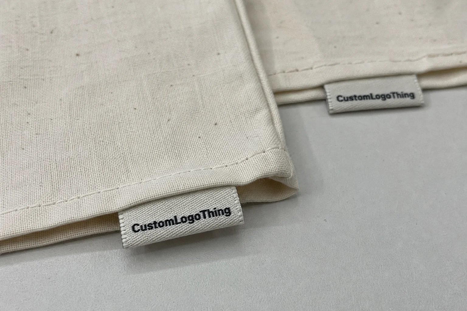
Cheap Custom Woven Labels are one of those sourcing items where the lowest quote can either be a smart buy or a warning sign. If the label is going into a neck seam, side seam, waistband, or accessory lining, the real test is not whether it costs less than the competition. The test is whether it still looks intentional, survives washing, and fits the garment without adding bulk or irritation. A label that meets those conditions supports the rest of the product packaging system instead of fighting it.
That matters more than many buyers expect. A woven label is small, but it sits in a visible location and gets handled more than most brand components. It can make a tee feel finished, or it can make a good garment feel rushed. The best low-cost choice is usually the one that removes waste from the spec rather than stripping out the quality that customers can actually see and feel.
Cheap custom woven labels: where lower cost still looks premium
Cheap should mean efficient, not flimsy. The cost comes down when the artwork is designed for weaving, the size is practical, and the finishing is simple enough to run without unnecessary handling. A label with a clean silhouette and a readable mark will usually outperform a crowded design that tries to do too much in a small area.
The fastest way to waste money is to force fine detail into a tiny format. Thin serif type, micro text, and complex line art can look crisp on screen and then collapse once translated into thread. In real production, simple shapes often read better because they preserve edges, spacing, and contrast. That is one reason the cheapest label is not always the one with the fewest dollars on the quote sheet. It is the one that avoids expensive corrections later.
For a launch run or a restock, buyers usually want the same three things at once: a label that looks premium, a price that fits the margin, and a spec that does not cause delays in sewing. Those goals are compatible if the design is kept realistic. A small adjustment to artwork density often saves more than squeezing the label size down another few millimeters.
If the brand is also building a broader package branding system, the label should match that system in tone and quality. Custom printed boxes, hang tags, tissue, and inserts do not need to be luxurious to be consistent. They do need to look like they belong to the same brand. A woven label that feels engineered rather than improvised helps that entire presentation hold together.
Weave types, thread count, and edge finishes that change the final look
Woven labels are not all built the same. The weave structure affects how much detail the label can hold, how soft it feels, and how cleanly the artwork reads at small size. Damask is usually the preferred option for sharper detail because it can reproduce tighter lettering and finer outlines than a looser weave. Taffeta is more economical and works well for simpler marks, size tabs, and care labels where the artwork does not depend on precision line work.
Thread count matters, but it should be treated as a tool rather than a trophy number. Higher density improves detail, yet it only helps if the design actually needs it. A simple logo with broad shapes does not always benefit from a premium density upgrade. In some cases, the artwork is so basic that the buyer pays for detail that never gets used. That is why the correct spec is the one that fits the art, not the one with the biggest feature list.
Color count plays a similar role. Every additional color adds complexity to production and can push the quote upward. If the brand mark can work in one or two colors, the label usually becomes easier to produce and easier to read. Multi-color designs are fine when the image genuinely depends on them, but they are often the first place to simplify if the budget is tight.
Edge and fold choices matter because they affect both appearance and sewing behavior. Centerfold and end fold are common for apparel because they sit cleanly in seams and are easy to attach in production. Miter fold can produce a neat finished edge for some side placements. Straight cut works when the label is sewn on all sides or used in a patch-like application. Merrowed edges are more common on emblem-style pieces and patches than on standard sewn-in labels, so that finish only makes sense when the garment application calls for it.
- Damask: best for sharper detail and small text.
- Taffeta: useful for simple marks and tighter budgets.
- Centerfold: common for neck seams and straightforward sewing.
- End fold: works well for seam insertion and cleaner edges.
- Straight cut: practical when the label is sewn on all sides.
There is a quiet tradeoff here. The more complicated the artwork, the more you need the label to do. That pushes cost upward. The more the artwork is simplified, the more room there is to keep the spec lean without making the label look cheap. In production terms, less can genuinely be more.
Size, fold, backing, and material specifications buyers should lock in
The quote becomes easier to compare once the core specs are fixed. Finished size, folded size, color count, orientation, and attachment method should be decided before the first proof. If those details are still moving, the order will drift between versions, and the final label may not sit correctly in the garment.
For apparel, practical size ranges tend to be fairly predictable. Neck labels often sit around 0.5 in. x 2.5 in. to 1 in. x 3 in. Side seam labels are commonly closer to 0.75 in. x 2 in. Accessory labels are often smaller, because bulk matters more when the item is lightweight or narrow. A heavier hoodie can handle a wider label. A light tee usually looks cleaner with something slimmer.
Backing affects both cost and handling. Sew-in is the standard choice for durable apparel and usually the simplest option for repeat production. Iron-on can help for samples or temporary placement, but it is not the strongest answer if the garment will be washed often. Adhesive support is generally for positioning during sewing rather than final wear. If the label needs to stay comfortable and survive laundering, the attachment method should be chosen with that use case in mind.
Material choice matters too. Most buyers are comparing soft hand-feel, clarity, and wash resistance. Damask tends to balance those factors well for premium labels. Taffeta is less refined but perfectly acceptable for simple content or internal-use labels. If the label sits directly against skin, the edge finish and overall thickness matter as much as the artwork itself. A technically correct label can still feel wrong if it is stiff or scratchy in a neck seam.
There is also the question of what content has to fit. Some labels only carry a logo. Others need size marks, care instructions, fiber content, or country-of-origin text. That can work, but only when the label has enough space to keep the copy legible. Tiny legal text crammed into a small woven label is one of the fastest ways to make a budget-friendly spec look careless.
A label is doing its job when it disappears into the garment and still feels deliberate. If the buyer notices the thread before the brand, the spec usually needs another pass.
For brands managing a complete package branding system, that same discipline applies across the line. The label should align with the garment, the hang tag, and the outer pack, whether the rest of the order includes Custom Packaging Products or a simpler retail packaging setup.
Cost, pricing, and MOQ: what actually moves the unit price
Most pricing differences come from a handful of variables: quantity, number of colors, label size, weave complexity, fold style, and any extra finishing step. As quantity rises, setup cost gets spread across more pieces, so the unit price generally drops. That is why a label order for a launch run and a reorder for the same design rarely price the same way.
Here is a practical ballpark for cheap Custom Woven Labels. These numbers are not universal, but they are useful for budget planning and for spotting quotes that are too vague to compare fairly.
| Run size | Typical unit price | What usually fits the tier |
|---|---|---|
| 1,000 pcs | $0.18-$0.35 | Simple artwork, 1-2 colors, standard fold, basic sew-in finish |
| 3,000 pcs | $0.10-$0.22 | Small brand launch, 2-4 colors, clean folded label, normal proofing |
| 5,000 pcs | $0.07-$0.16 | Common reorder tier, better setup efficiency, stable artwork |
| 10,000 pcs+ | $0.05-$0.12 | Evergreen SKU programs, repeat runs, lower cost per label |
The cheapest label is not always the smallest label. A larger label with simple art may cost less than a tiny label that needs tight detail, multiple thread changes, and more careful finishing. If the logo can be simplified early, the savings often beat the value of shaving a fraction of an inch off the width.
MOQ deserves attention as well. Some suppliers quote a minimum because loom setup and finishing have a floor cost. Others bury those charges in the unit price. Ask for the MOQ, the price at each tier, and what changes if the order increases by 20 percent. That gives a better read on the real economics, especially for brands balancing product packaging costs across labels, boxes, and inserts.
If a quote looks unusually low, check what is missing: proofing, folding, shipping, or the exact attachment method. Missing line items are how a cheap quote becomes an expensive order.
Freight matters too. A low ex-factory price can stop being attractive once shipping, duties, and delivery timing are added. For a small order, freight can distort the economics more than the label itself. For a larger run, the label unit price often matters more than shipping per piece. The smart comparison is the landed cost, not the headline number.
Production process and turnaround: from art proof to shipment
The workflow is usually straightforward: artwork submission, spec review, digital proof, approval, weaving, finishing, inspection, packing, and shipment. What changes the schedule is not the existence of those steps but how complete the order is when it starts. If the buyer sends final artwork, exact size, fold choice, quantity, and target ship date in one clean request, the order moves faster and with fewer revision rounds.
Approval timing matters almost as much as machine time. A straightforward run can often finish in about 10 to 15 business days after proof approval, though that depends on quantity, finishing, and freight method. If a sample run or revised proof is needed, the timeline extends. That is normal. It is better to build that into the plan early than to discover it after the launch date has already been fixed.
Delays usually come from preventable issues: missing dimensions, artwork that is not vector-ready, last-minute changes to the fold, or color corrections after the proof has already been issued. Thin type and complex gradients also create extra back-and-forth because woven labels work best when the art is direct and legible. The process is faster when the design is built for the medium instead of being forced into it.
Quality checks should happen at more than one stage. A clean digital proof is only the first checkpoint. The production sample, if ordered, is where the buyer can verify readability, fold behavior, and feel in hand. Then the finished batch should be checked for consistent trim, clean edges, correct stitch alignment, and accurate color placement. A label can pass a screen review and still fail in real handling if the corners are rough or the fold is off by a few millimeters.
For brands that coordinate labels with cartons, tissue, or inserts, transit testing for the outer pack matters as well. If the package has to survive distribution, the standards used by the International Safe Transit Association are a useful reference point. They are not woven-label standards, but they do matter to the wider retail packaging system.
A pre-production sample is worth the added time when the design is tight, the label will appear across a larger seasonal range, or the buyer needs confidence before committing to volume. For a simple reorder with unchanged art, a good proof may be enough. For a flagship launch, the sample often pays for itself by catching small errors before they multiply.
How to compare suppliers without paying for the wrong features
Supplier comparison is where buyers either save money or create problems. A fair quote should reflect the same size, the same fold, the same backing, the same quantity, and the same shipping assumption. If one supplier quotes a folded label and another omits fold handling, the lower number is not a real comparison. It is just a different spec.
Good suppliers are specific. They identify the weave type, the proof format, the attachment method, and the reorder path. That matters for brands that need consistent package branding across multiple collections. The best partner is not just cheap on paper. It is the one that produces a usable label on time and does not force the buyer into repeated correction rounds.
Ask how artwork is archived for reorders. If the supplier can store the exact spec, saved proof, and color notes, the next run becomes easier and less error-prone. That is a small operational detail, but it is one of the simplest ways to keep cheap custom woven labels consistent across seasons without rebuilding the order from scratch each time.
It also helps to look at how the supplier handles tolerance. A good quote should make clear what counts as acceptable variation in size, color placement, and trim. Woven labels are not digital prints. A small amount of variation is normal, but the supplier should still be able to explain where the limits sit. If they cannot, the buyer is left guessing about quality until the boxes arrive.
For brands that use paper components alongside the label, sustainability claims should be checked at the material level rather than assumed from marketing language. Paper hang tags or insert cards can often be sourced as FSC-certified, which supports a more consistent retail packaging story. That detail is small, but customers do notice when the components feel aligned instead of random.
- Compare like-for-like specs only.
- Ask what is included in setup and proofing.
- Check how reorders are handled.
- Confirm whether freight is included or separate.
- Make sure the supplier understands garment placement and end use.
Quality checks that prevent a cheap run from becoming an expensive mistake
A low-cost label order still needs a proper quality check. The simplest checks catch the problems that create the most pain later. Start with text clarity. If the type is too small to read on the proof, it will not get better in thread. Then check the fold direction, because a reversed fold can cause sewing issues and place the logo upside down in the garment.
Next, look at edge finish and trim. Frayed edges, uneven cuts, or loose threads usually point to a process problem rather than a design issue. The buyer should also check color balance, especially when the artwork depends on contrast between the background and the text. On woven labels, a color that seems close enough on screen can look too flat once it is made in thread.
Hand-feel is another practical checkpoint. A label can meet the artwork spec and still fail if it feels stiff in the neck seam. That is especially relevant for lightweight tees and anything worn close to the skin. If the label is for a hoodie, the tolerances are a little more forgiving. If it is for a fine-gauge top, softness matters more than buyers sometimes expect.
Finally, confirm sewing behavior on a test garment if possible. A label may look good flat and still pucker once stitched into a curved seam. That kind of issue is easiest to catch before the full batch is attached. The cheapest correction is always the one that happens before production, not after garments are already boxed and ready to ship.
Next steps: what to send for a fast quote and clean proof
If the goal is a fast quote, send the complete spec in one message. That should include artwork, finished size, fold style, quantity, backing preference, and target delivery date. The more complete the brief, the less time gets lost in clarification.
- Send final logo artwork in vector format if possible.
- State the finished size and the exact fold type.
- Confirm color count and whether you need woven text or symbols.
- Tell the supplier where the label will be placed: neck seam, side seam, waistband, or accessory lining.
- Add the reorder expectation if this is not a one-time run.
Placement detail matters because the quote should reflect the actual use case. A neck label and a waistband label do not behave the same way, and a small accessory tag may need a different fold or backing than a shirt label. If the supplier knows the garment and the attachment point, the proof is more likely to be accurate on the first pass.
Ask for a proof that shows scale, fold, and color layout before approval. That is especially useful when the label contains small type, a fine icon, or a two-line message. Once the proof is right, save the exact spec and file set so the next run can move faster.
The most efficient path to cheap custom woven labels is simple: keep the design readable, lock the spec early, check the proof with care, and approve promptly so the order can move without avoidable back-and-forth. That is how the label stays affordable and still looks like it belongs on a finished garment.
What makes cheap custom woven labels actually cheaper?
Lower cost usually comes from simpler artwork, fewer thread colors, a standard fold, and a quantity that spreads setup cost across more pieces. The cheapest option is not always the smallest label; it is the spec that matches the design without unnecessary finishing steps.
Are cheap woven labels still durable after washing?
Yes, if the weave is specified correctly and the label is sewn or backed for the intended garment use. Durability depends more on construction and attachment method than on price alone, so wash performance should be checked against the exact spec.
Which fold style is best for affordable custom woven labels?
Centerfold and end fold are common choices because they are easy to sew into seams and work well on apparel. The best fold is the one that fits the garment placement with the fewest extra finishing steps.
What MOQ should I expect for custom woven labels?
MOQ varies by supplier, but it is usually tied to the setup needed for the weave and finishing process. For a quote that makes sense, ask for the MOQ, unit price at different tiers, and what changes if you order a larger run.
What should I send to get a fast quote for woven labels?
Send final artwork, finished size, fold style, color count, quantity, backing choice, and your needed ship date. If the label will be sewn into a specific garment location, include that detail so the quote and proof match the real application.