The first parcel in a skincare launch sets the physical impression of the brand. If the product arrives safely but the mailer is scuffed, too glossy, or off-brand, the packaging weakens the launch before the product is opened.
That is why a Branded Padded Mailers for skincare launches print finish comparison belongs early in packaging planning. The mailer has to protect bottles or jars, hold color through parcel handling, and still feel consistent with the launch position. Those requirements often conflict once real fulfillment conditions are involved.
Skincare exposes packaging weaknesses quickly. Glass carries weight, pumps and droppers add leak risk, and premium orders leave little room for a poor first impression. Finish choice is not just visual. It affects readability, abrasion visibility, handling tolerance, and whether the pack still looks intentional at delivery.
Why finish comparison matters for skincare launch mailers
Padded mailers sit between plain courier envelopes and full boxes. They are lighter and easier to store than rigid or corrugated formats, but offer better protection and more branding area than unprinted shipping envelopes. For single products, discovery kits, replenishment sets, samples, and many PR sends, they are often the most efficient format if weight stays within range.
Finish changes more than appearance. Matte tends to read clean, quiet, and clinical. Gloss pushes saturation and contrast, which helps colorful artwork and campaign-led launches. Soft-touch adds premium tactility but usually marks faster in rough handling. Metallic accents can add emphasis, though they require tighter production control.
A padded mailer for skincare is part shipper, part retail surface, and part campaign asset.
The practical question is not which finish looks best as a flat proof. It is which finish still looks on-brand after sealing, scanning, stacking, and delivery.
How custom padded mailers perform in skincare shipping
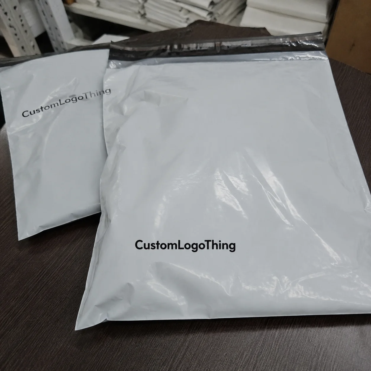
Most Custom Padded Mailers combine three elements: a printable outer layer, interior cushioning, and a pressure-sensitive closure. The outer layer may be paper- or film-based. Inside, cushioning is usually bubble-lined or padded paper. Some formats also include a tear strip, which can improve the opening experience for premium skincare.
Fit matters as much as finish. A mailer that is too loose allows products to move, increasing abrasion and impact concentration. One that is too tight can stress seams, distort print, and create an overpacked feel. For many skincare orders, the best result is a close fit that controls movement without forcing the structure.
Structure and branding should be specified together. A strong gloss design can still disappoint if the chosen size leaves excess empty space and the surface shows wear from internal movement. Finish affects the final look, but packed fit shapes it just as much.
Compared with a folding carton inside an unbranded shipper, a custom padded mailer gives earlier brand impact. Compared with a rigid box, it saves storage space, often packs faster, and can reduce dimensional weight. The tradeoff is presentation: it is efficient, but it will not stage the same reveal as a fitted box with inserts.
Print method matters too. Flexographic printing is common for longer runs and simpler graphics. Digital printing is useful for shorter runs, launch testing, or variable artwork. Some projects use offset-printed material converted later when tighter graphics or specialty effects are needed. Spot colors help protect exact brand shades; CMYK is more flexible for image-heavy art. Finish should support those choices, not fight them.
For a broader view of substrate options and mailer formats, see Custom Poly Mailers and the wider Custom Packaging Products range.
| Finish | How it reads | Typical strength | Main caution | Best fit |
|---|---|---|---|---|
| Matte | Clean, controlled, modern | Lower glare, easy readability | Can feel flat if artwork relies on high contrast | Clinical, minimalist, clean beauty |
| Gloss | Bright, energetic, giftable | Strong color saturation | Dark solids can show scuffs quickly | Bold launches, colorful kits, campaign mailers |
| Soft-touch | Velvety, premium, tactile | High-end hand feel | Marks and rub lines show sooner if handling is rough | Prestige skincare, PR sends, hero launch packs |
| Metallic or foil-style accents | Editorial, high contrast, event-driven | Strong visual emphasis | More registration and production sensitivity | Limited drops, influencer kits, seasonal launches |
What actually changes finish performance
Flat sample cards can mislead. A finish that looks good on a swatch may behave differently once wrapped around a flexible mailer, folded at seams, compressed under pack weight, and sent through a parcel network.
Substrate is the first variable to check. Paper-faced and film-faced constructions handle abrasion differently, and the same coating can react very differently on each. Matte on one substrate may look refined; on another it may show whitening at fold points. Gloss can deliver strong color depth but may highlight scratches more quickly on flexible packs.
Color choice also changes real-world performance. Black, navy, plum, and dark green often look premium at approval stage, then reveal edge wear faster in routine handling. Pale neutrals, white, muted sage, and beige usually hide wear better. Dark palettes are workable, but they need harder testing.
Soft-touch needs especially honest review. It can feel exactly right for prestige skincare, but it gives less margin for rough packing benches, tape-gun contact, stacked bins, or repeated handling. If the launch will ship through a busy fulfillment environment, test soft-touch under those conditions before approval.
Metallic accents and foil-style details can lift a mailer, especially for PR kits and first-order campaigns, but they demand cleaner registration and tighter QC. Small accent areas usually perform better than trying to make the whole mailer a special effect.
Artwork density matters too. Sparse typography on matte can look polished. The same finish under heavy image coverage may lose energy. Gloss can help imagery and saturated blocks, but too much shine on text-heavy layouts can reduce readability under direct light. Finish should match the graphic system rather than act as a generic upgrade.
For outside benchmarks, ISTA transit protocols are a practical reference for parcel testing at ista.org. If certified paper sourcing is part of the brief, FSC guidance is available at fsc.org.
Best print finish for branded padded mailers for skincare launches
There is no universal winner, but there are clear use cases.
Matte is usually the safest all-around choice. It suits clinical positioning, minimalist systems, and clean beauty aesthetics. It reduces glare, keeps typography readable, and generally handles visible wear more gracefully than high gloss. If one finish has to work across launch orders, replenishment, and multiple SKUs, matte is often the most practical answer.
Gloss is strongest when the launch needs energy. It increases saturation, gives higher contrast, and often photographs well with bold artwork. Vitamin-led lines, colorful routines, giftable bundles, and campaign-heavy launches often benefit from gloss more than restrained clinical programs do. The tradeoff is that dark full-bleed designs can show rub and scratches faster.
Soft-touch is best where tactile feel is central and handling quality can be controlled. It suits prestige skincare, anti-aging launches, and curated PR sends. For everyday high-volume replenishment, many teams find the tactile gain does not justify the narrower handling margin.
Metallic accents are usually strongest in small doses. They can frame a logo or highlight a campaign message without forcing the whole mailer into a higher-risk construction. For short-run launch mailers they can be effective; for broad ongoing use, a stable matte or gloss system often makes more sense.
- Choose matte for clinical, minimalist, ingredient-led, or scalable brand systems.
- Choose gloss for stronger color pop, giftability, or social-first visuals.
- Choose soft-touch for prestige hero packs and carefully handled PR sends.
- Choose metallic accents for selective emphasis, limited editions, and campaign moments.
If the decision is mainly practical, matte usually gives the best balance of brand flexibility, readability, and transit tolerance. Gloss gives the strongest color impact. Soft-touch gives the richest hand feel, but with the highest handling sensitivity.
Production timeline from artwork to packed orders
Many schedules slip before production starts because artwork is approved before the real packed size is approved. Dimensions should be based on the actual order configuration, including inserts, sample sachets, sleeves, and any inner wrap.
Once size is fixed, finish and print method need to match fulfillment reality. A black soft-touch mailer with fine metallic detail may fit the brand, but operations may already know the pack will be processed quickly, stacked tightly, and handled in mixed inventory areas. Those conditions should shape the spec before proofing.
Proofing is where expensive problems are easiest to catch. Check barcode readability, copy placement, seam areas, dark solid coverage, closure performance, and the main customer-facing panel. Physical proofs are especially useful for pale neutrals and subtle finishes because screens distort sheen and warmth.
Typical lead times vary by construction and quantity, but the general pattern is consistent:
- 1–2 weeks for structure selection, quoting, and artwork prep
- 1–3 weeks for sampling, proof review, and revisions
- 2–5 weeks for production, depending on finish complexity and run size
- 1–4+ weeks for freight, depending on shipping method and destination
Specialty coatings, custom dimensions, multiple proof rounds, and slower freight can extend that timeline. A metallic-accent launch mailer should not be planned against the same schedule as a standard matte reorder.
Transit testing should happen before the full order is packed. Use filled product, then check seal integrity, corner wear, abrasion, and how the front panel looks after handling. A mailer can pass protection tests and still fail the brand test if it arrives looking tired.
For more examples of how packaging specs translate into finished projects, browse the Case Studies section.
Cost, MOQ, and unit economics
Custom mailer pricing is usually shaped by material, size, print method, print coverage, finish, quantity, and freight. Freight is often underestimated until late in the process.
In general, simple custom-printed mailers become economical at higher quantities, while short runs with specialty finishes push unit cost up quickly. Exact benchmarks vary too much by market and region to treat any number as fixed, but the cost pattern is consistent: lower volume and more ambitious finishing create the steepest price increases.
MOQ also changes with production method. Digital programs can support shorter runs, though the unit price may remain higher. Flexographic or more setup-heavy programs usually reward larger quantities. Buyers need to balance lower unit cost against inventory risk, especially in skincare where claims, assortments, and branding can change after launch.
The hidden cost is often poor fit, not premium finish. An oversized mailer may require extra void fill, raise dimensional shipping cost, slow packing, and allow more movement inside the pack. Rush freight and multiple proof rounds can also wipe out savings from choosing a cheaper spec.
A practical quoting method is to request three versions in the same size:
- Basic: standard substrate, simple print, no premium finish
- Upgraded: stronger color treatment with matte or gloss
- Hero: soft-touch or selective metallic detail for launch or PR use
This makes tradeoffs clearer and helps teams decide whether one premium mailer is really needed for every shipment. In many cases, the better approach is a stronger first-order or PR mailer and a more efficient replenishment version.
Mistakes to avoid when comparing mailer finishes
The most common mistake is approving from digital mockups alone. Screens do not show tactile drag, fold whitening, scuff sensitivity, or how glare affects readability. Finish decisions need physical samples.
Another problem is testing appearance without testing fulfillment. A mailer can look excellent fresh from sample production and much worse after sealing, binning, and line packing. If a fulfillment partner will pack the launch, the sample should be handled the same way.
Dark full-bleed artwork causes avoidable disappointment when teams do not budget for visible wear. Black, navy, plum, and forest green can look strong on skincare mailers, but they expose scratches faster than pale or mid-tone backgrounds.
One-size-fits-all sizing is another expensive shortcut. It may simplify purchasing, but it often creates excess movement, higher shipping cost, and weaker presentation. Two or three sizes usually cover actual order patterns better.
Brands also overestimate what padded mailers can protect on their own. Light skincare orders often work well in this format. Heavy glass, wide jars, and mixed kits may still need inner wraps, sleeves, or compact inserts.
Building a sampling and test plan
Start with real product data: filled dimensions, filled weights, closure types, and likely order combinations. That prevents guesswork around sizing.
Build a comparison sheet that tracks finish type, substrate, MOQ, lead time, unit cost at two or three quantity breaks, color performance, scuff resistance, tactile feel, packing speed, and fulfillment notes. Once those points are visible side by side, the choice becomes easier to defend internally.
Then test samples with live product, not empty dummies. Run a simple handling simulation and check seal performance, internal movement, visible rub, and the condition of the customer-facing panel afterward. If social content matters, photograph tested packs under natural and indoor light rather than relying on pristine approval shots.
Set acceptance criteria before anyone picks a favorite. Define acceptable abrasion, target damage rate, packing speed, and landed unit cost. That keeps the launch from drifting toward a mailer that is attractive in isolation but weak in production.
For many brands, the best answer is a tiered system: a hero mailer for PR, influencer drops, or first-purchase campaigns, and a more efficient standard mailer for repeat orders. Used properly, a finish comparison is not cosmetic. It is how teams align protection, appearance, budget, and operational reality before issuing the purchase order.
Which print finish is best for branded padded mailers for skincare launches?
Matte is usually the most versatile choice because it suits clinical and minimalist branding, keeps glare down, and tends to hide visual wear better than high-gloss surfaces. Gloss is stronger for bright graphics and gift-oriented presentation. Soft-touch works well for prestige launches if handling conditions are controlled.
Do padded mailers protect glass skincare bottles well enough for e-commerce shipping?
They can for lighter bottles, compact kits, and well-fitted orders. Protection depends on fill weight, bottle shape, closure security, internal movement, and whether additional inner wrap is used. Heavier glass or mixed bundles often need extra support beyond the mailer lining alone.
How do MOQ and unit cost change with custom skincare mailer finishes?
Specialty finishes usually add setup complexity, which can raise unit cost on short runs and sometimes increase MOQ. Larger orders spread those setup costs better. Many brands reserve soft-touch or metallic details for PR, launch, or first-order use rather than everyday replenishment shipments.
What is the typical lead time for branded padded mailers for skincare launches?
A common working range is several weeks from artwork approval to delivered inventory, with added time for sampling, revisions, specialty finishes, and freight. Standard matte or gloss constructions usually move faster than custom-sized mailers with embellishments.
Are matte or gloss padded mailers better for clean beauty and clinical skincare brands?
Matte is usually the better fit for clean beauty, dermatologist-led, and minimalist skincare because it feels controlled and understated. Gloss works better if the brand depends on vivid color, stronger contrast, or a more giftable campaign look. The better option is the one that still fits the brand after real shipping wear appears.