Custom Circle Labels: Order the Right Finish for Clothing
The smallest label on a garment can change how the entire piece is read. Custom circle labels do that with very little visual noise: one round mark on a folded tee, tissue wrap, poly mailer, or insert card can make a basic item feel more considered, more retail-ready, and less improvised.
From a packaging buyer’s perspective, the appeal is not just shape. A circle is tidy, easy to place, and less likely to fight the rest of the layout. It works as decoration, but it also functions as a seal, a product cue, a logo carrier, or a batch identifier. If you are comparing them with other branding tools, the real question is not what looks attractive in a mockup. It is what will hold up in production, ship at the right cost, and behave on the actual surface.
That distinction matters more than most people expect. A decorative label is there to elevate presentation. A functional label still has to peel, stick, or close cleanly. A production label may need to track a SKU, carton count, or batch. The same round format can handle all three jobs, but the stock, adhesive, and finish should shift with the purpose. That is where buyers keep control of packaging quality, or lose it.
Custom Circle Labels: What They Are and Where They Work
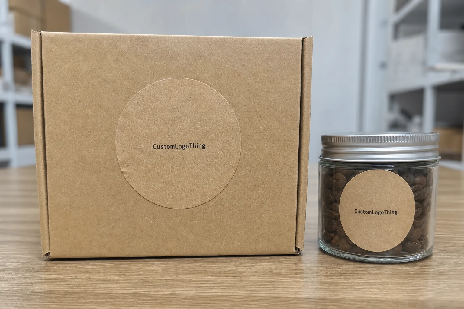
Round labels are simple on paper and useful in the press room. A circle has no corners to lift, catch, or crease, which is one reason custom circle labels show up so often on folded apparel, tissue wraps, and retail mailers. They feel finished without looking overdesigned. That balance is harder to get with rectangles, especially on small surfaces where every millimeter matters.
In practice, they are used on garment folds, hang tags, box seals, poly bags, inserts, and cartons. A circle can hold a logo, a short product claim, or a small run indicator without overwhelming the surface. It also helps when the brand needs a consistent cue across different packaging materials. The same visual mark can sit on a box, a card, and a mailer without forcing the same format everywhere.
There is a useful split to keep in mind. Decorative labels are there to be seen. Functional labels must still look good, but they also need to perform. Batch labels are usually part of internal logistics and can be less polished, but they still need to scan, stick, or survive handling. If you know which category you are ordering for, the rest of the specification gets easier fast.
For apparel brands building packaging from the ground up, round labels are often the quickest way to create consistency across a mixed pack of materials. They can unify an insert card, tissue wrap, and mailer without requiring a complicated print system. That makes them especially useful for smaller Clothing Brands That want a sharper retail impression without adding unnecessary production complexity.
They are not a cure-all, though. If the surface is textured, dusty, cold, or heavily handled, the label choice needs more testing. A label that looks perfect on a flat proof can fail on a real garment fold or a glossy poly surface. The shape is the easy part. Surface behavior is where the order succeeds or falls apart.
“If the label fails after folding, shipping, or the first customer touch, the problem is usually the stock or adhesive, not the artwork.”
How the Production Process and Turnaround Work
The production sequence is straightforward, but the delays are predictable. It usually starts with spec review: size, stock, adhesive, quantity, finish, and intended surface. Then comes artwork prep and proofing. After approval, printing or converting begins, followed by die-cutting, slitting, finishing, inspection, packing, and shipping. The round format is rarely the bottleneck. Missing details are.
Most slowdowns happen before the press starts. Low-resolution artwork, missing bleed, unclear revisions, and a diameter that does not match the requested size all create extra rounds of proofing. If a buyer sends only a logo file and says “make it fit,” the proof stage turns into guesswork. A better brief includes the finished diameter, preferred file format, quantity, and a photo of the packaging or garment where the label will be used.
Quality control is where the practical differences show up. In a proper run, the team should check cut consistency, color drift, adhesive release, edge lift, and whether the finish scuffs too easily during packing. Those checks sound ordinary, but they catch the problems that actually create waste. A clean-looking proof can still fail if the die-cut tolerance is loose or the adhesive grabs the wrong way.
Turnaround depends more on complexity than on the round shape itself. A standard paper label with common adhesive can move through a normal production window. Specialty stock, foil, layered finishes, or unusual adhesive often adds a few business days. Rush orders are possible, but they are usually limited by proof approval and material availability, not by whether the label is round.
A practical benchmark is 7 to 15 business days after proof approval for standard runs, with 3 to 7 business days possible for simpler rush jobs when the line is open and the material is in stock. That is not a promise; it is a useful range for planning. If the order needs to move through retail distribution, basic shipping tests aligned with ISTA methods can help catch edge lift, scuffing, and carton abrasion before a larger run ships. If sustainability claims matter to the brand, paper tied to FSC-certified materials can support that story without changing the visual system.
Quantity affects lead time less than many buyers expect unless the order is large enough to require extra converting or split shipping. The bigger schedule drivers are proof revisions, specialty stock, and the time needed to check the final cut. A small order with unclear instructions can take longer than a larger order with a disciplined brief.
Cost, MOQ, and Unit Price Factors
Pricing for custom circle labels comes from several small decisions, and each one matters. Material sets the baseline. Print method changes setup and ink costs. Finishing adds another layer. Then there is labor, packing, and shipping. Buyers often focus on one line item and miss the stack underneath it.
Lower minimums almost always carry a higher unit price because setup costs get spread across fewer pieces. That is normal, not a penalty. A 250-piece test run may cost more per label than a 5,000-piece order, even if the bigger order feels expensive upfront. The tradeoff is cash flow versus efficiency. If you are testing a new garment line or a packaging refresh, the small run is often worth the premium.
Here is a useful pricing frame for common buy levels. These are broad ranges rather than firm quotes, because stock, coverage, and finish can move the number more than most buyers expect.
| Option | Typical Use | Approx. Unit Price at 5,000 | Notes |
|---|---|---|---|
| Economy paper, standard adhesive | Basic branding, light handling | $0.05-$0.09 | Best for short shelf life and simple print coverage |
| Coated paper, matte or gloss varnish | Retail presentation, stronger color density | $0.08-$0.15 | Good middle ground for apparel and inserts |
| Synthetic film, specialty adhesive, or foil accents | Moisture exposure, premium package branding | $0.16-$0.32 | Higher durability and more finishing cost |
Those figures can move quickly if the buyer adds proof fees, white ink, unusual sizes, split shipments, or packaging and kitting charges. A quote can look low until those items appear. This is why experienced buyers ask for two or three scenarios: a budget version, a middle option, and a premium option. That comparison usually shows where the real value sits.
There is also a point where the cheaper label costs more overall. If a low-grade adhesive leaves residue on apparel packaging, or a flimsy stock scuffs in transit, the labor needed to fix it wipes out the savings. A better label is not always the more expensive one. It is the one that matches the use case without creating a second problem.
For brands buying labels alongside other packaging assets, compare the label quote with the rest of the order cycle through Custom Packaging Products. A circle label that coordinates with box stock, insert cards, and shipping mailers often delivers more perceived value than a standalone upgrade that does not match anything else in the pack.
Sizing, Materials, and Adhesives That Actually Hold Up
Size changes everything. A 1-inch circle can work as a seal or a small icon. A 2-inch label is often better for folded tees, insert cards, or mailers. Move to 2.5 inches or 3 inches and visibility improves, but so does the amount of space the label occupies. The right diameter depends on what the customer sees first and how much blank surface the package gives you.
Material choice should follow the surface and the handling conditions. Plain paper is fine for light-duty uses and short-lived retail packaging. Coated paper improves sharpness and color density. Vinyl and other synthetic films handle moisture, abrasion, and extended storage better. If the label needs to survive shipping without losing its edges or looking worn by the time it arrives, synthetic stock usually earns its place.
Adhesive matters just as much as face stock. Temporary seals need clean peel behavior. Semi-permanent branding may need stronger tack without damaging the substrate. Freezer or cold-chain programs need adhesives that stay responsive at lower temperatures. If the label has to come off a garment bag or folded tissue without residue, test that exact surface before you place a full order. The label can be visually correct and still fail if the adhesive is wrong.
For apparel, the finish also needs to respect the garment. An aggressive adhesive can wrinkle fabric or leave marks on delicate surfaces. A weaker adhesive may lift on textured poly bags. So the right choice is rarely strongest or cheapest. It is the one that matches the removal moment.
Requesting a sample on the actual surface is the fastest way to avoid trouble. A paper proof gets you close on size and layout, but only a real substrate test shows peel strength, residue, and edge lift. That matters more than most buyers think, and it is much cheaper than discovering a bad match after a full run arrives.
There are also a few production tolerances worth checking. If the die-cut is too tight, the label can feel cramped or pick up irregular edges. If the stock is too thin, the label may curl after packing. If the adhesive is too cold-sensitive, it may fail during winter shipping. None of these are dramatic problems on their own. Together, they are what separate a polished order from a frustrating one.
Artwork, Color, and Finish Decisions That Change the Result
Simple artwork usually wins on a small round label. Dense detail can look strong on screen and disappear in production, especially if the label is only 1 to 2 inches wide. A clear logo, one or two supporting lines, and enough contrast will often outperform a busier layout. That is not a design compromise. It is a production reality.
Color strategy should start with readability. Dark type on a light field is the easiest route, but brand consistency still matters. If the packaging system already uses a strong color palette, the label should connect to it rather than compete with it. On coated stocks, inks usually look richer. On uncoated papers, they look softer and more muted. That shift can help or hurt depending on the tone the brand wants.
Finish choices also change the final read. Matte feels restrained and quiet. Gloss adds contrast and makes color feel more assertive. Soft-touch creates a more tactile, upscale impression, though it costs more and is not always the best fit for labels that need quick legibility. Foil can sharpen a logo mark, but on a circle label it is easy to overdo. One accent is usually enough.
Varnish is underrated. It can add durability without changing the whole visual language. For retail packaging that gets handled often, a light varnish can protect the face while keeping the order more economical than a full premium laminate. That is often a smarter move than jumping straight to a specialty finish.
File prep matters more than many buyers expect. Keep bleed outside the finished circle, preserve a safe area inside the edge, and check resolution before sending the art. If the design puts text close to the perimeter, the curve can make it feel cramped. A clean center lockup usually looks better than trying to push too much information into the edge of the label.
Circles can also distort perception. A design that looks balanced in a square mockup may feel crowded once it is wrapped inside a round boundary. That is why the proof should be reviewed at actual size, not only on a screen. Small labels reward restraint, and they expose overdesign very quickly.
There is a final detail that gets overlooked: finish affects handling as well as appearance. High-gloss surfaces can fingerprint more easily. Soft-touch may scuff if packing is rough. Foil can crack if the application surface is flexed too much. These are small production realities, but they influence whether the final result feels polished or merely expensive.
Common Ordering Mistakes That Waste Time and Money
The most expensive error is approving the wrong size before checking placement on the actual garment or package. Buyers often measure the artwork, not the surface. Those are not the same thing. A 2-inch label may be fine on paper and awkward on a folded shirt sleeve, a narrow mailer, or a small insert card. Measure the use case first.
Another common mistake is a vague brief. If the quote request leaves out stock, adhesive, finish, quantity, and target use, the back-and-forth starts immediately. That wastes time and usually weakens the final spec because each revision answers one question and opens another. Strong briefs save money because they reduce interpretation.
Late proof changes are another trap. Once production is scheduled, a small wording change can force a reproof, a delay, or waste. Buyers sometimes assume a minor edit is harmless. In reality, a change after scheduling can affect the whole queue. If the approval is not final, do not release the job.
Underordering is the quiet budget killer. If you guess low and run out, the reorder may cost more per unit, and the second run may not match perfectly if stock or ink conditions change. For branded packaging, consistency matters as much as price. A slight variation between batches can make a line feel less controlled than it should.
There is also a habit of treating labels as isolated objects. They are not. They sit inside a wider system of product packaging, shipping handling, retail display, and customer perception. If the label finish clashes with the box, tissue, or insert, the whole package feels less deliberate. The cheapest label can become the most expensive visual problem.
Finally, do not skip testing just because the order is small. Small runs still reveal the same faults as large ones: poor peel, weak tack, color drift, or a finish that marks too easily. A short pilot is often the cheapest insurance a buyer can buy, especially when the label is tied to a new garment line or an updated package design.
Next Steps: Build a Quote-Ready Spec Sheet
If you want a clean quote, send the supplier a spec sheet that answers the obvious questions before anyone has to ask them. For custom circle labels, that means final size, quantity, stock, adhesive, finish, artwork file type, and the delivery date you actually need. Not “sometime next month.” The real date.
A good brief also includes photos or a sample of the garment, mailer, insert card, or box the label will touch. That gives the supplier a way to judge scale and placement, which is especially useful for apparel and retail packaging where the visual balance matters. If you are ordering alongside custom printed boxes or other branded packaging pieces, include those dimensions too. The more context, the fewer revisions.
When you ask for pricing, request two or three scenarios rather than one. For example:
- Standard paper stock with matte finish
- Coated stock with gloss or varnish
- Synthetic stock with specialty adhesive for tougher handling
That comparison usually shows where the smart tradeoff sits. Sometimes the middle option is the best buy because it improves durability without pushing the order into a premium tier. Sometimes the premium version is the correct choice because it protects the label from moisture, abrasion, or frequent customer handling.
Once the spec is clear, the artwork is restrained, and the use case is defined, custom circle labels stop being a guessing exercise and become a controlled part of packaging design. They are small, but they influence how the whole package feels. For buyers who want tighter presentation without overcomplicating the order, that is the point.
What size should custom round labels be for T-shirts?
Start with placement, not artwork. A label that looks small on screen can crowd a folded shirt or hang tag in real life. For apparel branding, the useful range is often large enough to read at arm’s length but small enough to feel like a design detail rather than a billboard. If you are unsure, print a paper sample at actual size and place it on the garment before approving production.
Are circle labels better than sewn-in tags for branding?
Circle labels are usually stronger for fast visual branding because they sit where the customer sees them first: on packaging, folds, seals, or inserts. Sewn-in tags are better for permanent care or compliance information, while circle labels are better for promotional or retail presentation. Many apparel brands use both, one for identity and one for required garment information.
Which material lasts best on clothing packaging?
Synthetic or coated stocks generally handle handling and moisture better than plain paper, especially if the labels move through shipping and retail storage. If the label needs to peel cleanly, adhesive behavior matters as much as face stock. Ask for a sample test on your actual packaging surface before locking the order.
How does MOQ affect the price of round labels?
Lower quantities usually raise the unit price because setup work gets spread across fewer pieces. Higher quantities lower the per-label cost, but they also raise upfront cash needs and the risk of overordering the wrong spec. If you are testing a new design, ask for two price breaks so you can compare a pilot run with a larger replenishment order.
What should I send with a quote request for custom circle labels?
Send the exact size, quantity, material, adhesive preference, finish, and the deadline you actually need, not a loose target window. Include print-ready files if possible, plus examples of where the label will be used on the garment or packaging. The clearer the brief, the faster the quote and the fewer revision rounds before production starts.


