Most jam jars do not win on taste alone. They win in a few seconds, before the lid even turns. That is why custom jam labels matter more than many small producers expect: they carry the flavor cue, the trust signal, and the retail finish that changes a jar from homemade-looking to shelf-ready.
Jam is a deceptively hard packaging problem. Glass curves, condensation happens, refrigerated display adds moisture, and the label still has to read cleanly after shipping and handling. A good label is not just decoration. It is the part of the package that has to survive real use while still doing the quiet work of selling the product.
Custom jam labels: why a small label changes shelf appeal
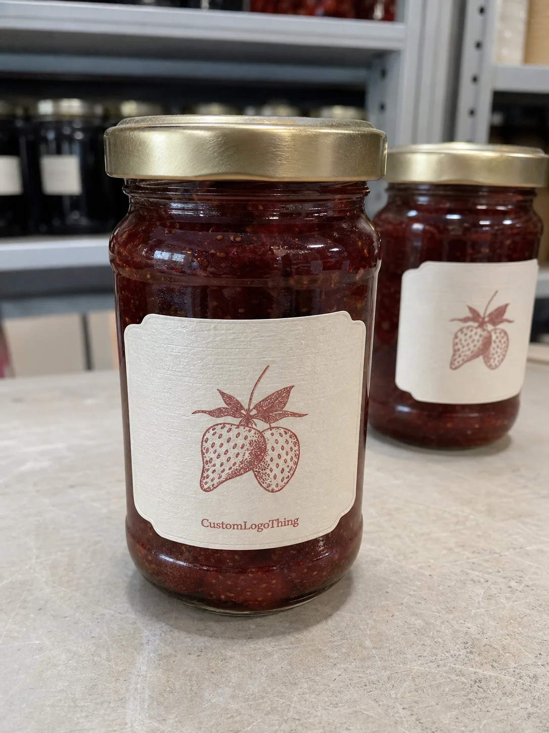
Buyers usually decide between jars quickly. The front panel has to identify the flavor, signal quality, and justify the price without looking crowded. If the design feels improvised, the product is often treated as a novelty. If it feels deliberate, it reads as a brand.
That shift matters because jam rarely sits on its own. It may be part of a broader packaging system with lids, cartons, gift sleeves, shipper boxes, or seasonal bundles. The label is the smallest visible piece, but it often carries the strongest buying signal. One weak label can make an otherwise solid product line feel unfinished.
The physical constraints matter as much as the graphics. A label that works on a straight-sided jar can fail on a tapered one. A layout that looks balanced on-screen can wrap poorly around glass. A paper stock that looks great in a dry studio can start lifting once the jar is chilled. In practice, the best custom jam labels respect the jar first and the mockup second.
From a buyer’s point of view, the label has to answer three questions fast:
- What flavor is this?
- Why should I trust it?
- Why is this jar worth the price?
That is the real job. Identification, confidence, and shelf appeal in a small space.
Materials, adhesives, and finishes that hold up on jars
Material choice should follow storage conditions, not taste alone. Paper labels are usually the most economical option for dry pantry storage and short runs. They can look warm and handcrafted, which suits small-batch preserves. They are less forgiving if the jars will be chilled, moved through humid storage, or handled frequently.
BOPP is usually the safer option when moisture is part of the equation. It resists water better than standard paper and holds up well on curved glass. If the product may be refrigerated, or if condensation is likely during display or transport, film labels deserve serious attention. The unit cost is higher, but so is the cost of a run that curls, smears, or peels at the edge.
Textured paper stocks sit in the middle. They can create a premium, craft-forward look, especially for gift jars or seasonal flavors. The tradeoff is practical: the surface can scuff more easily, and some finishes show wear faster than smooth film. That is acceptable for a short shelf life or special event packaging. It is less acceptable for jars that will be handled repeatedly in store.
Adhesive selection matters just as much as the stock. A label that uses the wrong adhesive may look fine for a week and then start lifting after a few cold cycles. For chilled jars, ask whether the adhesive is rated for cold application and curved glass. If the supplier can explain peel performance, moisture behavior, and edge lift without hand-waving, they understand the use case.
Finish changes both appearance and readability. Gloss brings shine and stronger color pop, but it can reflect store lighting. Matte cuts glare and often feels more restrained and premium on natural products. Soft-touch adds a tactile layer, though it is usually better reserved for gift packaging or higher-margin lines than for everyday grocery jars.
For buyers comparing options, the rough guide below helps frame tradeoffs:
| Label Type | Best Use | Typical Strength | Tradeoff |
|---|---|---|---|
| Paper | Dry pantry jars, short runs, craft look | Lower cost, warm appearance | Less moisture resistance |
| BOPP | Refrigerated or humid conditions | Water resistance, scuff resistance | Higher unit cost |
| Textured stock | Gift sets, artisan lines, premium branding | Distinct feel, high perceived value | Can wear faster under handling |
| Soft-touch finish | Premium retail or seasonal jars | Tactile, refined look | Usually not the lowest-cost choice |
If your jam line also uses Custom Labels & Tags for other SKUs, keep the materials consistent where possible. It helps the line feel intentional rather than assembled piece by piece.
Ask about test conditions before approving a run. Adhesives and films can behave differently depending on room temperature at application, moisture on the glass, and how the jars are packed for transit. For products moving through distribution, it helps to know whether the label and shipper were checked against common transit expectations, including ISTA test methods. For paper sourcing, FSC certification is worth asking about. See ISTA and FSC for the standards context.
Cost, pricing, MOQ, and variables that shape quotes
Label pricing is straightforward once you know what drives it, but it is easy to misread a quote. The main variables are quantity, label size, stock, finish, number of colors, die-cut shape, and whether you are ordering one flavor or several. A low quote usually means the supplier is assuming a standard shape, limited finish work, and minimal proofing. A high quote is often just a sign that the job is more specific than it first looked.
For small to mid-size runs, these ranges are common enough to use as a planning benchmark:
- Paper labels: about $0.08-$0.18 per label at 5,000 pieces, depending on size and coverage.
- BOPP labels: about $0.12-$0.28 per label at 5,000 pieces, depending on finish and color count.
- Textured or specialty finishes: often $0.18-$0.35 per label, especially on smaller orders.
MOQ changes the math. Small orders usually carry a higher per-label cost because setup is spread across fewer units. That does not make them a bad decision. For seasonal flavors, farmer’s market tests, or pilot retail programs, a smaller MOQ can reduce inventory risk. You pay more per label, but you also avoid tying up cash in a flavor that may not sell through.
Compare quotes line by line. Ask whether the price includes proofing, plates or dies, finishing, and shipping. Some suppliers hide cost in add-ons. Others package setup into the first order and come down on repeat runs. If you are comparing Custom Packaging Products across multiple suppliers, that structure matters more than the headline number.
There are only a few places where cutting cost makes sense. Standard shapes help. Fewer special finishes help. Consolidating SKUs helps if the artwork can share the same label size and stock. The places not to cut are moisture resistance, adhesive quality, and legibility. Saving $40 on a run that fails in cold storage is not a savings.
| Quote Factor | Lower Cost Option | Higher Cost Option | Buyer Impact |
|---|---|---|---|
| Quantity | Shorter run | Higher volume | Higher unit cost at low volume, lower inventory risk |
| Shape | Standard rectangle or oval | Custom die-cut | Custom shapes improve shelf differentiation |
| Stock | Paper | BOPP or textured stock | Specialty materials improve durability or perceived value |
| Finish | No special finish | Matte, gloss, or soft-touch | Finish changes glare, feel, and shelf presence |
Process and turnaround: from artwork check to delivery
Good label jobs follow a simple sequence. Measure the jar. Build the label around the usable panel, not the fill volume. Set up the artwork. Review the copy. Approve the proof. Print, finish, ship. The sequence is basic because it has to be. Most delays happen when one of those steps is rushed.
The most common problem is weak source material. Low-resolution artwork, missing barcodes, missing ingredient copy, or jar dimensions taken from memory will slow the job down. A proof can only be as accurate as the information behind it. If the jar is tapered, measure the actual wrap area. If the lid overlaps the top edge of the front panel, account for it. A half-inch error on curved glass changes the entire look.
Turnaround depends on complexity, but a straightforward run is often 12-15 business days from proof approval to shipping. Simple paper jobs can move faster. Specialty materials, foil accents, and Custom Die Cuts usually add time. Rush orders are possible, but they compress the margin for error, and that margin matters more than first-time buyers usually expect.
A practical timeline keeps the launch honest:
- Day 1-2: confirm jar specs and final copy.
- Day 3-4: review the digital proof and request corrections.
- Day 5-10: production and finishing.
- Day 11-15: ship and receive, depending on distance.
If the label is part of a larger launch that includes cartons, sleeves, or product packaging for gift bundles, build extra buffer into the schedule. A finished proof is easier to wait on than a pallet of jars sitting idle because the labels are late.
Design choices that make flavors easier to buy
The best front panel hierarchy is simple. Brand name first, flavor name second, then the detail that helps the shopper decide. That detail might be organic ingredients, low sugar, small batch, local fruit, or a limited seasonal release. If the front panel tries to say everything, it often says nothing clearly enough.
Typography needs special care on a curved jar. Decorative scripts can look charming in a mockup and become hard to read at shelf distance. That does not mean scripts are off-limits. It means they work better as accents than as the only voice carrying essential information. If the flavor name matters most, give it the strongest contrast and the largest size that still fits safely.
Color should support scanability. Dark type on a light field is usually easier to read. High contrast matters more than trendy combinations. White space matters too. A crowded label can make a small-batch product look less trustworthy, not more artisanal. Clean layouts often feel more premium because they give the buyer room to process the information quickly.
If the flavor name takes two seconds to find, the label is doing the wrong job.
Retail sales add another layer. Ingredient statements, allergen disclosures, net weight, barcode placement, and batch code space all need to fit without damaging the front panel. If the label has to carry both branding and compliance, the back or side panel should absorb the detail-heavy copy. That keeps the shelf view clean while still leaving room for retail requirements.
For brands building a fuller shelf story, the same logic applies across jar labels, cartons, and any package branding system attached to the line. Consistency does not mean making every piece identical. It means making the family look like it belongs together.
Common mistakes that make jars look homemade
The first mistake is sizing by guesswork. A label that is too tall can crowd the shoulder of the jar. One that is too wide can wrap awkwardly around the seam. On curved glass, even a small measurement error becomes obvious fast. The fix is simple: measure the usable panel and mock it up on the actual jar shape before you approve the run.
The second mistake is using a generic template that does not separate the product from competitors. Jam labels do not need to be loud, but they do need a point of difference. If the jar could belong to any brand, the buyer has no reason to remember it. A small change in color blocking, type hierarchy, or finish often does more than a complicated graphic system.
The third mistake is treating the front label like a brochure. Too much text makes the flavor harder to scan. It also lowers confidence. Buyers do not need every story on the front. They need a reason to pick the jar up. The rest can go on the back panel or in supporting packaging design elements elsewhere in the line.
The fourth mistake is approving artwork without a physical proof or a test on the jar itself. Screens lie. Ink on matte paper does not always look like ink on film. A label can be aligned digitally and still sit crooked on the curved surface. A short test run or a careful prototype catches problems that would otherwise appear after the full order ships.
There are smaller issues that add up: mismatched finishes between flavors, weak adhesion after chilling, barcodes placed too close to the curve, or copy that changes from one SKU to the next. Each one is easy to miss by itself. Together they make a line look less disciplined than it should.
Practical next steps for a cleaner label order
Start with the jar audit. Measure the body diameter, the flat label panel, the shoulder curve, and the lid size. If the container is tapered, note where the taper begins and how much room you actually have for the front panel. This takes ten minutes and saves a surprising amount of back-and-forth later.
Then gather the copy before you ask for a quote. Final flavor names, net weight, ingredient list, allergen statements, barcode, batch code placement, and any claims such as organic or low sugar should be settled early. If those details are still moving, the proof will move too, and the schedule will drift with it.
Ask for a digital proof, and if there is any risk from condensation, handling, or the container shape, ask for a physical sample or short test run. Check color in daylight, check legibility at arm’s length, and check whether the label stays put after a few hours in the refrigerator. That kind of practical test is more useful than a polished render.
For brands that also Order Custom Printed boxes or other secondary packaging, line up the artwork and specs together. That keeps the launch coherent and reduces rework. If the label, carton, and shipper share a consistent design language, the product feels planned rather than assembled.
Custom jam labels work best when they are treated as part of a system, not an afterthought. Measure carefully, Choose the Right stock, check the quote line by line, and test the finished piece under real conditions. Do that, and the next order is far more likely to land on shelf looking intentional, durable, and ready to sell.
What size should custom jam labels be for standard glass jars?
Measure the flat label panel instead of guessing from jar volume, because two 8 oz jars can have very different usable surfaces. Leave room for the seam, the curve of the glass, and any wrap-around margin. A physical mockup on the actual jar shape is more reliable than a template alone, especially if the container is tapered.
Which material works best for refrigerated jam labels?
Choose a moisture-resistant stock such as BOPP or another film label if condensation is likely. Pair it with an adhesive meant for cold, curved glass so the corners do not lift after chilling. If possible, test the label after a few hours in the refrigerator before approving the full run.
How much do custom jam labels usually cost per label?
Unit cost depends on quantity, stock, finish, shape, and whether one design or multiple flavors are included in the run. Smaller orders usually cost more per label, but they reduce upfront inventory risk. The most useful quote breaks out setup, finishing, and shipping separately so you can compare the numbers properly.
How long does the label process usually take?
Most timelines depend on proof approval, production complexity, and shipping distance. Straightforward jobs move faster when artwork is final and jar specs are accurate before the order is placed. Rush orders are possible, but specialty materials and Custom Die Cuts usually add time.
How do I make jam labels look professional instead of homemade?
Use a clear hierarchy, strong contrast, and one obvious focal point for the flavor name. Keep the front panel simple and move detail-heavy content to the back label when needed. The fastest way to catch spacing and readability issues is a proof on the actual jar. For a clean retail presence, custom jam labels should feel precise, not crowded.


