Custom Knitting Labels: How to Order the Right Fit
Custom knitting labels do more than identify a maker. They change how a piece is read before anyone checks the stitch work. A clean label can make a sweater feel retail-ready; a poor one can make even well-made knitwear look unfinished. That judgment happens fast, and usually without comment. Buyers notice the details that sit closest to the hand, the neck, and the eye.
For brands that also use Custom Labels & Tags, the label is part of the larger packaging system, not a separate concern. The garment, the hangtag, the insert, and the outer pack all send the same message or they work against each other.
Custom knitting labels: what they are and why they matter
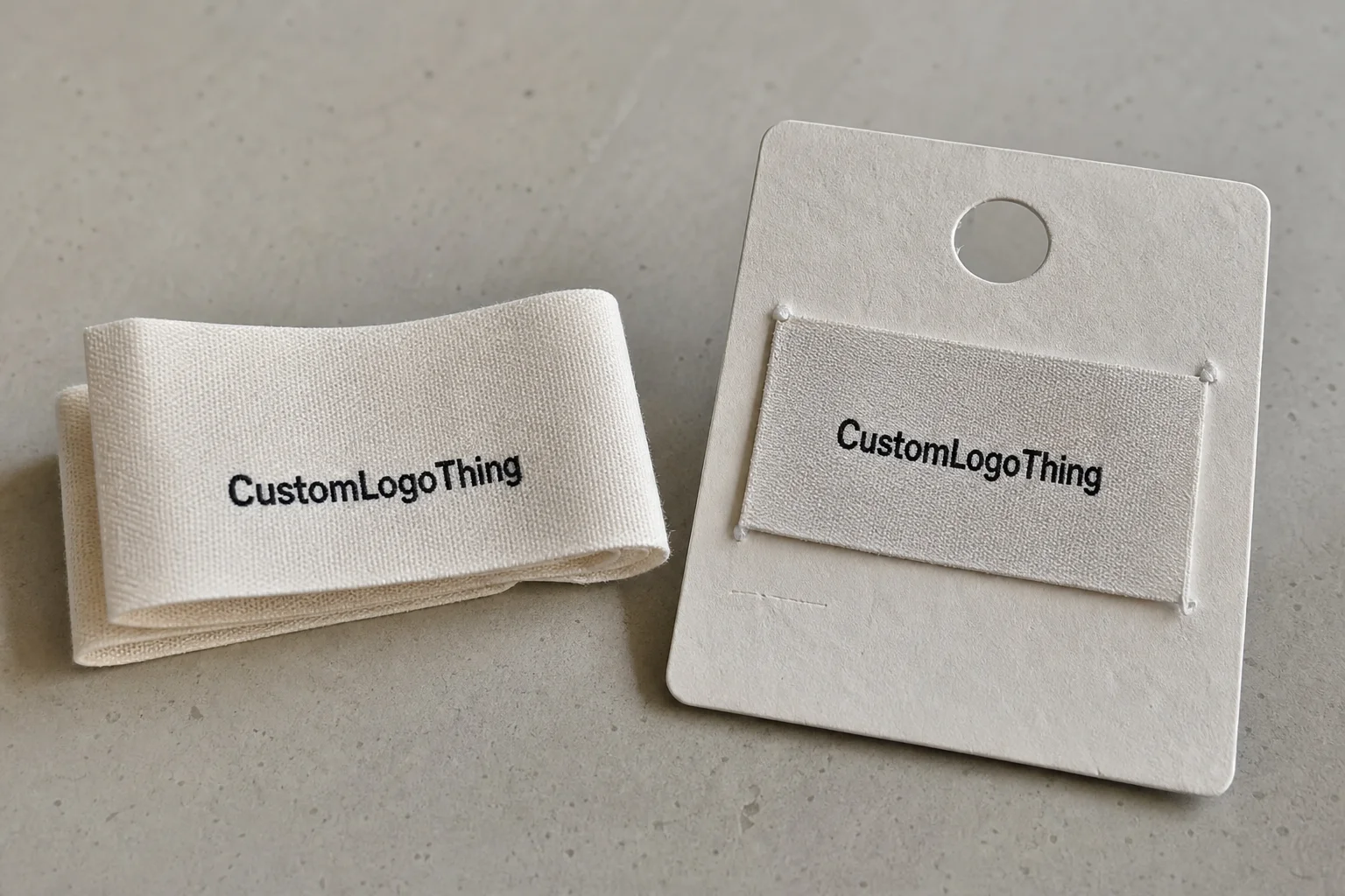
At the practical level, labels for knitwear are branded identifiers attached to sweaters, scarves, hats, blankets, and similar goods. They can be woven sew-in labels, printed satin labels, cotton tape, faux leather patches, or heat-applied options. Each format behaves differently once it meets fabric, washing, and wear. The job stays constant: identify the maker, support the brand, and finish the product without creating visual clutter.
That last part matters more than it sounds. A label is small, but it has an outsized effect on perceived value. If it sits flat, reads clearly, and feels comfortable, the garment looks more deliberate. If it scratches, curls, or hangs awkwardly, the product can feel cheap no matter how good the knitting is. That disconnect is expensive because it can lead to returns, complaints, or a quiet decision not to reorder.
For small brands, the label is one of the cheapest ways to signal consistency. It does not change yarn quality or fit. It changes confidence. Buyers use that signal as shorthand for how much care went into the rest of the item. A neat label suggests a brand that understands finishing. A messy one suggests the opposite, even if the construction underneath is solid.
A label is not decorative trim. It sits against the product, so comfort, wash resistance, and placement matter as much as the visual identity.
That is why good ordering starts with use case, not artwork. A label for a chunky winter sweater needs different specs than one for a child’s cardigan or a soft scarf. The same logo can work in all three, but the material and finish should not be identical.
How labels are built, attached, and read on knitwear
Construction determines how a label performs over time. Woven jacquard labels are the standard for a reason: they hold detail well, stay readable after repeated laundering, and usually feel more substantial than a printed tag. Printed satin labels have a smoother handfeel and can suit soft garments, but the print contrast needs to survive a small format. Cotton tape gives a more natural, handmade look, though edge quality matters because poor finishing can fray. Faux leather patches add stronger visual weight and work well on outer layers, but they are not the first choice for anything worn close to skin.
Attachment method changes the result just as much as material. Sewing into a side seam is common because it keeps the label anchored and reduces visual noise. Top-stitching onto a hem or neckline can work, but it needs tighter placement control. Heat-applied attachment may suit some production setups, although it should be tested carefully on stretch fabrics. If the fabric stretches more than the bond can handle, the label becomes the weak point.
Readability is a design problem, not just a print problem. Tiny fonts disappear in knit texture. Thin rules blur. Small icons can vanish once the label is folded, stitched, and washed. If the garment is close to skin, comfort has to outrank decoration. If it is outerwear, abrasion resistance matters more. The right format depends on the garment structure, not the mood board.
That is why buyers should look at labels the same way they look at other packaging elements. Material choice, print method, and placement all shape the experience. The logic is the same as with retail packaging: a good design works because it supports the product without drawing unnecessary attention to itself.
Material, size, and finish: the specs that change the result
Most quote surprises come from small details that looked harmless on screen. Material is the obvious one. Polyester Woven Labels usually give the best balance of cost and durability. Cotton feels softer and more natural, which suits artisan brands or heritage positioning. Satin reads more polished and can work well for linings or baby items. Specialty finishes such as faux suede or embossed patches push the label toward a premium look, but they also change the handfeel and production price.
Size is even more sensitive on knitwear than on flat textiles. A label that looks balanced in a mockup can feel oversized once it sits on a chunky collar. Too large, and it can interrupt drape or create a bump. Too small, and it disappears into the texture. The useful space is narrow: enough surface for the brand to be legible, not so much that the label competes with the garment.
Edge finish also changes both appearance and durability. Heat-cut edges are common on synthetic woven labels because they help control fraying. Folded edges create a softer finish and are often preferred for sew-in placement. Center fold and end fold each change how much of the artwork remains visible after stitching. A generous sew margin helps production, but it reduces visible area. That tradeoff should be planned, not discovered after the sample arrives.
One reliable way to keep the spec honest is to write it like a product brief. List the dimensions, fold type, color count, attachment method, and garment type. That gives the production side enough context to spot problems early. A logo file alone rarely tells the full story.
Here is a practical comparison:
| Label Type | Best Use | Feel on Skin | Typical Cost Impact | Notes |
|---|---|---|---|---|
| Woven polyester | Everyday sweaters, hats, blankets | Low to medium | Lowest to moderate | Good detail retention and wash durability |
| Printed satin | Soft garments, lining labels, baby items | Low | Moderate | Smoother handfeel, but print contrast must be checked |
| Cotton tape | Handmade, natural, or heritage positioning | Low | Moderate to higher | Strong fit for artisan brands if edge control and wash testing are handled well |
| Faux leather patch | Outerwear, beanies, statement branding | Medium | Moderate to higher | Visual impact is strong, but close-to-skin use needs review |
More colors usually mean more complexity. Bigger logos often need more stitch detail. Care symbols, fiber content, origin text, and website lines all consume space. If the label is trying to do too many jobs at once, readability drops first. The cleanest results usually come from brands that decide which information belongs on the garment and which belongs elsewhere in the packaging set.
Cost, pricing, and MOQ: what changes the quote
Label pricing looks simple until the spec changes. In most cases, the final number is shaped by five variables: material, size, color count, fold style, and quantity. Finishing method matters too, especially if the label needs heat cutting, woven borders, or a particular back finish. Two quotes can look far apart for reasons that have nothing to do with supplier quality. More often, the products are simply not identical.
MOQ deserves a straightforward explanation. Smaller runs usually cost more per unit because setup time is spread across fewer pieces. That is not a penalty. It is how production works. A brand ordering 500 labels may pay more per piece than one ordering 5,000, but the smaller run carries less inventory risk. For seasonal lines or untested designs, that trade often makes sense.
Sampling and artwork preparation can also move the total. Some suppliers build proofing into the unit price. Others separate digitizing, setup, or sample charges. A quote that looks inexpensive can become less attractive once those extras appear. Compare only after the specs match line for line. Otherwise the numbers are misleading.
There is a broader purchasing lesson here. The cheapest label is not always the lowest-cost option. A slightly more expensive piece that survives washing, feels better against skin, and reduces rework can save more over a season than a bargain version that fails early. That logic applies to product packaging as well, where one weak material choice can create avoidable waste after the first order ships.
For brands that track sourcing in the rest of the package, FSC certification can matter for paper components. If outer packs or mailers are part of the program, ISTA testing is a useful reference for transit performance. Those standards do not decide label quality, but they help connect the label to the rest of the delivery system.
| Order Profile | Typical MOQ | Unit Cost Trend | Best For | Risk Level |
|---|---|---|---|---|
| Test run | 250-500 pieces | Higher | New designs, market testing | Low inventory, higher unit price |
| Core line | 1,000-3,000 pieces | Moderate | Stable SKUs, repeat sellers | Balanced cost and stock |
| Scale order | 5,000+ pieces | Lower | Seasonal volume, multi-channel sellers | Lower unit cost, higher inventory commitment |
If you are also ordering the rest of the branded presentation, keep the label spec aligned with Custom Packaging Products. Swing tags, inserts, and outer packaging should feel like one system. A polished label paired with disconnected packaging creates a mixed signal that customers feel immediately, even if they cannot name the problem.
Production timeline and turnaround: from artwork to delivery
The typical workflow starts with a brief, moves to artwork approval, then sampling, production, finishing, quality check, and shipping. The delays usually happen between those steps. An unclear logo file, a late color correction, or a missing approval can add days. Revisions after sampling can add more. The process is predictable only if the approvals are tight.
Lead time depends on complexity and quantity. A simple repeat order can move quickly. A first-time custom build almost never does. Complex folds, specialty materials, or multiple color passes usually slow things down. Rush service may exist, but it often narrows the available material or finish options. Faster is possible, but usually not for free.
Seasonality changes the planning horizon. A winter knit line that launches in September should not start label ordering in late August. The label timeline needs room for sampling, garment finishing, photography, and listing prep. A late label can stall the whole launch, even if the garment itself is ready. That is one of the least glamorous ways to lose sales momentum.
A practical buffer is at least one extra week beyond the supplier’s stated timeline, and more if the order includes sampling. That is not pessimism. It is a buffer for normal production friction. If the labels are part of a larger launch kit, align them with the approval calendar for inserts, hangtags, and the outer shipper. The package should arrive as a set, not as a collection of separate problems.
Designing labels that survive wear and washing
Durability starts with legibility at real size. A layout that looks clean on a monitor can become hard to read once it is folded, stitched, washed, and rubbed against yarn. That is especially true for small type. If the label needs to carry a brand name, size, care cue, and origin line, the hierarchy should be planned deliberately. The most important line should not be the smallest one.
Color strategy matters too. High contrast improves visibility and usually helps with readability. Tone-on-tone can look refined, but it works best when the brand is comfortable with a quieter read. A black mark on deep navy may look premium in a mockup and disappear in daylight. A white or light mark on a warm neutral usually performs better.
Wear testing should happen before a full order. For knitwear, that means checking seam stress, skin contact, friction, and laundering. Handle the sample, wear it briefly, and wash it using the garment’s normal care method. If the label scratches, curls, twists, or lifts, it is not ready. Standards such as ASTM abrasion testing and ISO laundering methods are useful references, but the sample in hand still matters most.
There is also a packaging lesson here. A label can be excellent on its own and still feel wrong if the rest of the presentation is inconsistent. Customers notice the combined effect of product packaging, inserts, tags, and the garment itself. Consistency makes a small label feel like part of a larger brand system rather than an isolated accessory.
Check the sample in natural light before approving it. Artificial light hides some flaws. Daylight exposes them quickly. If the label still reads well after folding, stitching, wear, and a wash test, the design is probably doing its job.
Common mistakes that lead to reorders and wasted stock
The most common mistake is overloading the label with text. Brand name, website, size, fabric content, care symbols, origin, and a slogan can fit on one label only if the format is large enough and the layout is disciplined. On small labels, more information usually means less clarity. If the buyer has to squint, the label is working against the garment.
Size errors come next. Oversized labels can overwhelm delicate knits and create stiffness where the garment should move. Tiny labels can disappear into chunky texture and fail as branding. Both problems usually come from judging the mockup on a screen instead of against the actual knit structure. Screens flatten texture. Garments do not.
Approval mistakes are expensive because they are easy to avoid. Teams approve artwork without checking fold direction, stitch placement, seam allowance, or how the front and back will read after finishing. Then production starts, and the result is technically correct but visually wrong. A flat proof is not the same thing as a sewn sample.
Another error is keeping the same spec across different garment types. A label that works on a structured sweater may feel irritating on a soft scarf. A patch that looks right on a beanie can create bulk on a fine-gauge knit. The supplier may be the same, but the garment is not. The label spec should change with the textile.
Skipping samples is risky whenever the label is visible on the outside or touches skin. The cost of a sample is small compared with the cost of a reorder. It is also small compared with the brand damage that comes from a label that feels cheap once it reaches customers. In this part of the process, caution is cheaper than confidence.
Next steps: how to place a smarter order
The fastest way to get a usable quote is a one-page spec sheet. Include the material, size, fold, color count, quantity, attachment method, and target garment type. Add a note on whether the label will touch skin or sit on the outside. That one detail changes recommendations more often than most buyers expect.
Ask for a sample or mockup before committing to a full run. If the label will be used across several knit styles, test it on all of them. One format may work on a sweater and fail on a scarf. That is normal. It just means the label is doing actual work, not decorative work.
Compare two or three quotes from the same spec sheet. Only then does price mean anything useful. Otherwise the lowest quote may simply be quoting less visible area, a different weave density, or a missing finish. That is how buyers end up comparing different products while thinking they are comparing suppliers.
Build the reorder plan around launch dates, seasonality, and buffer stock. Labels should never hold up a collection release. If garments are ready but the branding is late, the whole launch feels unfinished. If the labels are ready early, they can be staged with the rest of the packaging, from inserts to outer mailers, without last-minute pressure.
The short version is simple: treat labels as part of the product system, not an afterthought. The right spec supports comfort, keeps the garment sale-ready, and fits into the wider branding set. The wrong one creates waste, awkward wear, and reorders that could have been avoided.
How do I choose the right custom knitting labels for handmade items?
Match the label material to the garment. Softer knits usually need softer labels, while heavier outerwear can handle more structure. Start with comfort, readability, and wash durability. Then ask for a sample so you can judge how the label feels against the fabric before placing a larger order.
What affects custom knitting label pricing the most?
Quantity, material, size, fold style, and color count usually have the biggest effect on price. Setup and sampling can also change the total if the artwork or finish is complex. The comparison only works if every quote uses the same spec.
What is a typical MOQ for custom knitting labels?
MOQ varies by supplier and construction type, but lower quantities usually cost more per piece. If you are testing a new collection, ask whether a short run is possible. Use MOQ to balance cash flow against the risk of holding too much stock.
How long does production usually take for custom knitting labels?
Timeline depends on artwork approval, sampling needs, quantity, and finishing complexity. Simple repeat orders can move faster than first-time custom jobs. Build in extra time for revisions and shipping so the labels arrive before the garments are finished.
Can custom knitting labels be made for scarves, hats, and sweaters?
Yes, but the best format can change by product because stretch, thickness, and skin contact all affect the spec. Scarves and baby items usually need extra softness, while hats and sweaters can often use more durable construction. Placement should follow comfort and visibility, not symmetry alone.

