Custom kraft mailer boxes tend to look modest on a screen and much better in real use. That is part of the appeal. A well-made kraft mailer gives a product a clean arrival, holds shape in transit, and keeps the packaging honest enough that the box does not become the whole story.
They are used everywhere for a reason: subscription shipments, ecommerce orders, sample kits, onboarding packs, and lightweight retail packaging all benefit from a carton that folds flat, assembles quickly, and prints cleanly without requiring a lot of extra material. A good mailer should not need a sleeve, tissue stack, and filler just to feel finished. It should do its job with sensible structure and a restrained print approach.
The strongest programs usually start with product fit, transit conditions, and pack-out speed. Branding matters, but it sits behind those basics. If the carton is the wrong size, uses the wrong flute, or prints badly on natural kraft, the rest of the design work does not rescue it. That is where many buying decisions go sideways: the mockup looks polished, but the real box is loose, slow to pack, or too soft for the route it has to survive.
What custom kraft mailer boxes actually do
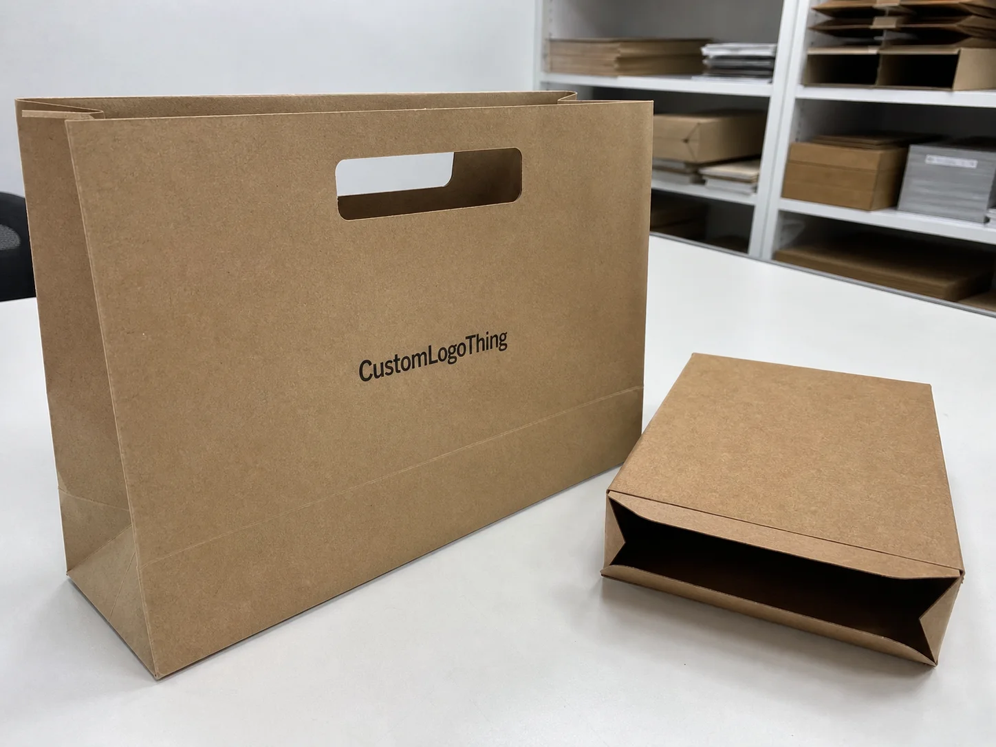
A kraft mailer is a foldable corrugated carton with a kraft-facing liner, usually shipped flat and assembled by hand or on a packing line. The structure is simple, but the use cases are not. Some businesses need a presentation box that still behaves like a shipper. Others want a shipping carton that looks cleaner than a plain brown mailer. The box can support either goal, provided the board and print choices match the job.
That balance explains why the format shows up in so many programs. The exterior feels natural and warm, which suits brands that want a softer visual tone without going heavy on decoration. At the same time, the box can carry a logo, a short message, or a restrained pattern without turning the package into an ad. The best versions are quiet, not empty. They give the product a frame and let the packaging feel deliberate.
There is also a sustainability angle, but it should be treated carefully. Kraft faces often suggest recycled fiber or a lower-impact presentation, and many runs can be produced with FSC-certified materials. That is a useful option if your sourcing standards call for it, but the material claim should be documented rather than assumed. If you need to verify certification language, the FSC standard is available directly at fsc.org.
The limits are just as real as the benefits. Kraft stock does not hide poor artwork. Tiny text, faint colors, and dense gradients tend to soften or lose clarity on brown board. Simple graphics usually look stronger, print more predictably, and age better across reorders. That is not a creative failure. It is a material choice guiding the design.
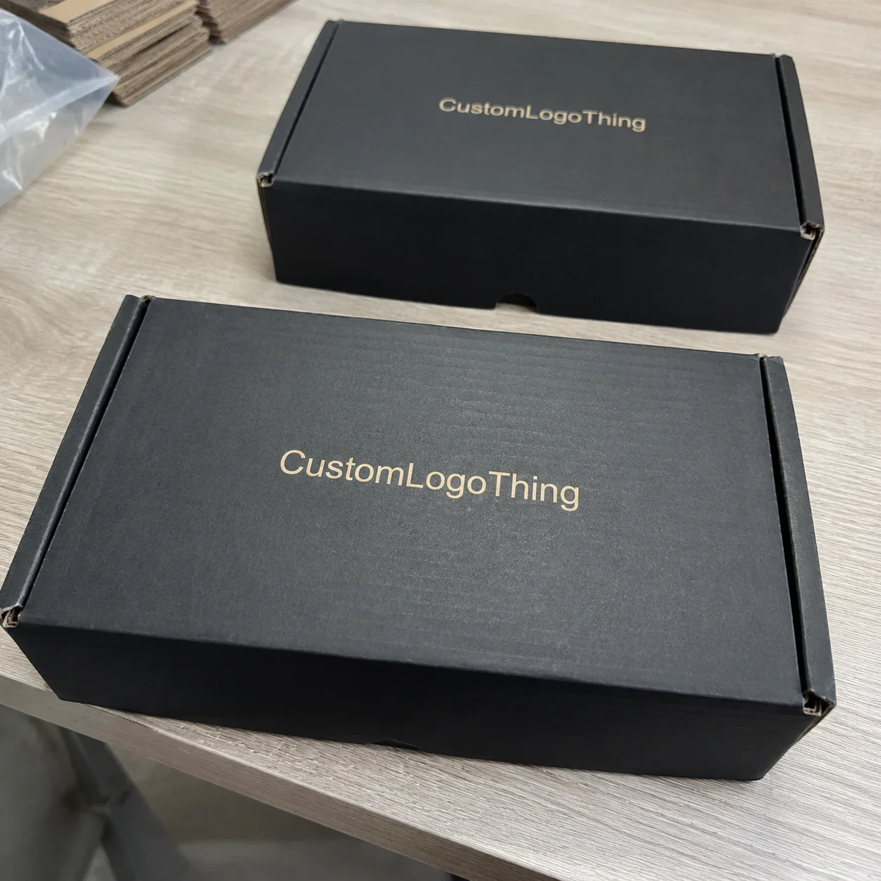
“The cleanest kraft mailers usually rely on restraint: a strong logo, a short message, and enough space for the material to breathe.”
If the packaging program is still taking shape, it helps to step back and look at the wider assortment instead of trying to force one format to do every job. A broader set of Custom Packaging Products can be useful when one box is meant to serve both shipping and presentation needs. The right structure is often the one that keeps the packing line moving while still feeling intentional on arrival.
How the box structure and print method work
Most custom kraft mailer boxes are built from corrugated board, so the structure includes an outer liner, a fluted medium, score lines, tuck flaps, and often a front-lock tab or dust flap arrangement. Those details are not cosmetic. They affect how the box folds, how flat it ships, how square it holds under load, and how fast a packer can close it. A carton that feels slightly awkward in a mockup can become a labor problem once it is used hundreds or thousands of times.
Board selection is usually the first real technical decision. E-flute is common for lighter products because it offers a slimmer profile and a cleaner surface for print. B-flute brings more thickness and a little more cushioning, which helps when the item is heavier or when the shipping route is less forgiving. Double-wall board has its place, but many buyers jump to heavier construction before confirming they need it. That adds material cost, freight weight, and bulk to the program without automatically improving the customer experience.
That is why the first question should be about the product, not the box aesthetic. If the item is light, not brittle, and not stacked high in transit, a lighter structure may be enough. If the product has sharp edges, higher density, or real crush risk, the board should be upgraded before money is spent on special print effects. Strength first. Finish second.
Print method changes both appearance and price. One-color flexographic printing is often the most economical choice for simple logos, repeated graphics, and utility-focused shipping programs. Digital printing is useful for shorter runs or artwork that changes frequently. Offset printing can give stronger color control when the run size and setup justify it. On kraft, the brown stock changes the way ink appears, so white, pastels, and fine line work need extra scrutiny. They can work, but they are less forgiving than the same artwork on white board.
That is why simple artwork often looks better than crowded artwork on kraft. A good logo placement, a short line of copy, and enough negative space usually read as more refined than a panel full of detail. Dense graphics can look heavy, and thin rules can disappear. If the brand design depends on tiny type or delicate color shifts, a different substrate may be the more practical choice.
Shipping performance should also be part of the decision, not an afterthought. Distribution routes introduce vibration, compression, and occasional impact, even when the carton is only carrying a lightweight product. Many packaging teams use ISTA-related testing as a reference point for evaluating how a pack behaves in transit. That does not mean every order needs a formal lab program, but it does mean the box should be judged on handling reality, not only on how it looks in a render. The ISTA standards are a useful place to start if you need a common language for testing and validation.
Size, fit, and material choices that change performance
The most common sizing mistake is still the simplest one: quoting from the outside dimension instead of the internal fit. Internal dimensions matter because inserts, tissue, sleeves, and protective wrap all consume space. A carton that seems correct on paper can end up loose in the hand, which leads to movement in transit and extra filler in the pack-out. That extra filler is usually a sign that the box was never sized to the actual load.
Start with the product itself. Measure length, width, height, and weight. Then add only the clearance needed for the packaging method. A rigid item that drops into a simple mailer may need very little tolerance. A fragile kit with printed inserts, tissue, or a sleeve needs more room, but not so much that the item floats inside the box. If the carton will be packed by hand, leave room for speed and consistency. If it will be packed by machine, the tolerance has to be tighter and repeatable.
A practical sizing routine usually looks like this:
- Measure the product at its widest and tallest points.
- Add only the space needed for inserts, cushioning, or presentation pieces.
- Check the closed stack height, not just the open cavity.
- Request a flat sample or mockup before production approval.
Material choice affects more than durability. A recycled kraft liner can look excellent, but the shade can vary more from run to run than a bleached white liner. That is normal, and it is one reason print approvals matter. If visual consistency is critical, keep an approved sample and use it as the reference for future reorder checks. If the carton is supposed to feel rugged and natural rather than showroom-polished, a little variation is usually acceptable.
It also helps to match the carton to the product category. Heavy goods need stronger board, not just prettier artwork. Fragile goods may need tighter fit, corner support, or a simple insert to prevent motion. Premium goods often benefit from a cleaner print area and tighter control of the graphics. A box that looks expensive for one day but crushes in shipment is still a poor box.
For programs that serve both ecommerce and retail, the same mailer may need to function as both a shipper and a presentation piece. That is a real packaging design problem, not a styling exercise. A restrained exterior can still support retail packaging goals if the construction, artwork placement, and opening experience are planned together rather than adjusted one at a time.
Cost, MOQ, and quote drivers
Pricing for custom kraft mailer boxes usually comes down to a short list of variables: size, board grade, print coverage, quantity, and any special finishing. Tooling and die cutting can matter too, especially if the structure is new or unusually shaped. When a quote feels off, one of those pieces is usually the reason.
MOQ matters because setup costs get spread across the order. Smaller quantities tend to have a higher unit price, while larger volumes usually lower the per-box cost until the curve levels off. That does not mean buying more cartons is always better. It means the landed cost should be reviewed, not just the unit line on the quote. A cheap box that is oversized or underbuilt can create higher freight, higher damage, or more filler downstream.
For a practical range, simple printed kraft mailers may land around $0.35 to $0.75 per unit at moderate quantities, depending on size and print coverage. Short runs, heavier board, inside print, specialty finishes, and custom inserts can move that number higher. If a quote arrives very low and does not clearly specify board, print method, and freight, there is usually a catch somewhere in the structure of the offer.
Here is a simple comparison buyers can use to frame the conversation:
| Option | Best for | Typical cost impact | Notes |
|---|---|---|---|
| One-color flexo on kraft | Simple logos, utility shipping, high-volume orders | Lowest setup cost, lower unit cost at scale | Best when the design stays bold and simple |
| Digital print on kraft | Short runs, multiple versions, artwork changes | Higher unit cost, lower setup burden | Useful for launches and seasonal kits |
| Offset print with special finish | Premium branded packaging and presentation-heavy kits | Highest setup and finish cost | Worth it only if the box is part of the experience |
| Heavier board or double-wall | Fragile or dense products | Raises material and freight cost | Reduces damage risk and can lower returns |
Extra charges often matter more than buyers expect. Samples cost money. Plates or dies can cost money. Freight costs money. Warehousing finished cartons costs money. Reprints caused by a wrong size or an unclear approval path can cost much more than the original carton order. That is why a quote should be read as a system, not a single number.
If you are comparing custom printed boxes across multiple programs, ask for pricing at three quantities and request a breakdown for setup, unit cost, and shipping. That is the only clean way to see what actually drives the budget. Otherwise, the quotes are too easy to compare on the wrong basis.
Production steps and lead time
The production sequence is usually straightforward: artwork prep, dieline confirmation, proofing, sample approval, print production, die cutting, folding and gluing if needed, packing, and shipment. The process only looks simple if the front end is settled. If artwork keeps changing after the dieline is approved, the schedule shifts. If the sample does not fit, the schedule shifts again. Most delays are not technical failures; they are late decisions.
The most common problems are familiar. Low-resolution artwork slows proofing. Missing dieline changes create rework. Color approvals drag because too many people are reviewing the same file at once. Structural changes made late in the process can add days or even a full additional cycle if tools need to be adjusted. Indecision can be just as expensive as a bad spec.
For a simple run, a realistic production window is often 12 to 15 business days after proof approval, with longer timelines for custom structures, specialty coatings, or peak production periods. Sampling adds time before production, and freight adds time after it. If a supplier gives a fast lead time, ask whether it includes sampling, proofing, and transit. Those details change the real schedule more than people expect.
It also helps to ask how the finished cartons will ship. Flat-packed mailers save space, but the carton counts, palletization, and assembly requirements should be clear before the order is placed. If the boxes arrive in a way that slows the packing team, that cost shows up later as labor, not as a line on the quote. Packaging has a habit of moving the expense around rather than removing it.
For buyers who need a practical reference for transit confidence, test methods tied to real shipping risks are more useful than general reassurance. Compression, vibration, and drop behavior should be thought about early, especially if the item is fragile or the route is rough. A box can be visually correct and still be the wrong carton if it fails under the kind of handling it will actually receive.
Common mistakes that make mailers expensive or flimsy
The first mistake is choosing the box by appearance alone. A polished mockup does not tell you whether the corners will crush, whether the closure will stay shut, or whether the pack line will struggle with the fold sequence. Many brands spend money on artwork before they have confirmed the board grade that protects the product. That reverses the order of priorities.
The second mistake is overprinting kraft with artwork that does not suit the substrate. Tiny text, thin rules, low-contrast colors, and busy gradients all become less dependable on brown board. Sophisticated design is still possible, but it has to respect the surface. Bold shapes, clear hierarchy, and controlled color use usually print better and cost less than a crowded layout that tries to do too much.
The third mistake is weak dieline planning. If the folds are awkward or the closure is fussy, the box becomes a labor problem even if the unit price is fine. A carton that saves a fraction of a cent on paper but wastes seconds on the pack line is not saving money. It is moving it into operations, where it is harder to see.
The fourth mistake is ignoring the fulfillment environment. A mailer that looks elegant on a design desk may be annoying in a warehouse if it stacks badly, needs too much precision to close, or opens too easily in transit. Packaging needs to work where it is touched every day, not only where it is approved. That is where production reality usually corrects the design brief.
One more issue comes up often: not every program needs the same level of branded packaging. If the box goes directly to the customer and unboxing matters, spend on print quality and structural neatness. If the carton is only a transit shell, put the money into strength and consistency and keep the branding minimal. Matching spend to function is how margins stay sane.
Actionable next steps before you request samples
Before requesting quotes, gather three things: the product dimensions and weight, the shipping method, and the experience you want the box to create. That list looks basic because it is. Still, many bad packaging quotes start with missing inputs. A vague brief produces a vague box, and vague boxes usually cost more once the order is in motion.
Write a short spec sheet before sending files out. Include internal dimensions, product weight, preferred board if you have one, print colors, any insert or sleeve, and whether the box must ship flat. If the carton has to support retail packaging as well as ecommerce, say so directly. That changes how the structure, print placement, and opening behavior should be handled.
Then request at least one sample or flat mockup. Test the fit with the actual product, not a substitute. Check assembly speed. Read the print under ordinary lighting. Stack a few units. If the item is delicate, test the carton under a realistic drop scenario. Sampling is not about admiring a prototype. It is about catching the problems that matter before the order is locked.
Finally, compare three quotes rather than one: a utility-first version, a presentation-first version, and a price-first version. That gives a real spread across strength, appearance, and cost. Most teams learn quickly that the cheapest carton is rarely the cheapest outcome. The better choice is the one that fits the product, the fulfillment flow, and the brand without creating hidden costs later.
If you are building a larger packaging mix, compare these mailers with lighter formats such as Custom Poly Mailers or with the broader set of Custom Packaging Products used for kits, inserts, and retail-ready packs. For custom kraft mailer boxes, the most reliable path is still the simplest one: clear dimensions, honest sampling, and artwork that works with the material instead of fighting it.
Common questions
How do I choose the right size for custom kraft mailer boxes?
Measure the product first, then add only the clearance needed for tissue, inserts, or cushioning. Use internal dimensions for quoting and approval, not the outer size on a spec sheet. Test with an actual sample before production, because even small fit changes affect packing speed and protection.
What affects the price of custom kraft mailer boxes the most?
Size and board strength are usually the biggest drivers, followed by print coverage and order quantity. Setup costs matter more on short runs, while unit cost drops as volume increases. Extra finishes, custom inserts, and freight can change the final landed cost more than buyers expect.
What is a realistic lead time for custom kraft mailer boxes?
Simple printed runs usually move faster than fully custom structural jobs or special finishes. Expect extra time for sampling, artwork correction, and approval rounds if the design is new. Always confirm whether the quoted timeline includes production only or production plus shipping.
Can custom kraft mailer boxes be printed clearly on natural kraft?
Yes, but simple artwork usually prints cleaner than dense gradients or tiny light-colored text. Dark inks and bold shapes tend to hold up better on brown kraft than delicate details. If brand color accuracy matters, ask for a printed sample before approving the full order.
What should I ask a supplier before ordering custom kraft mailer boxes?
Ask for board type, internal dimensions, MOQ, unit price at multiple quantities, and total lead time. Request a dieline, a sample, and a written note on whether setup charges or freight are included. Confirm how the boxes will ship flat, how many fit per carton, and whether any assembly is required.