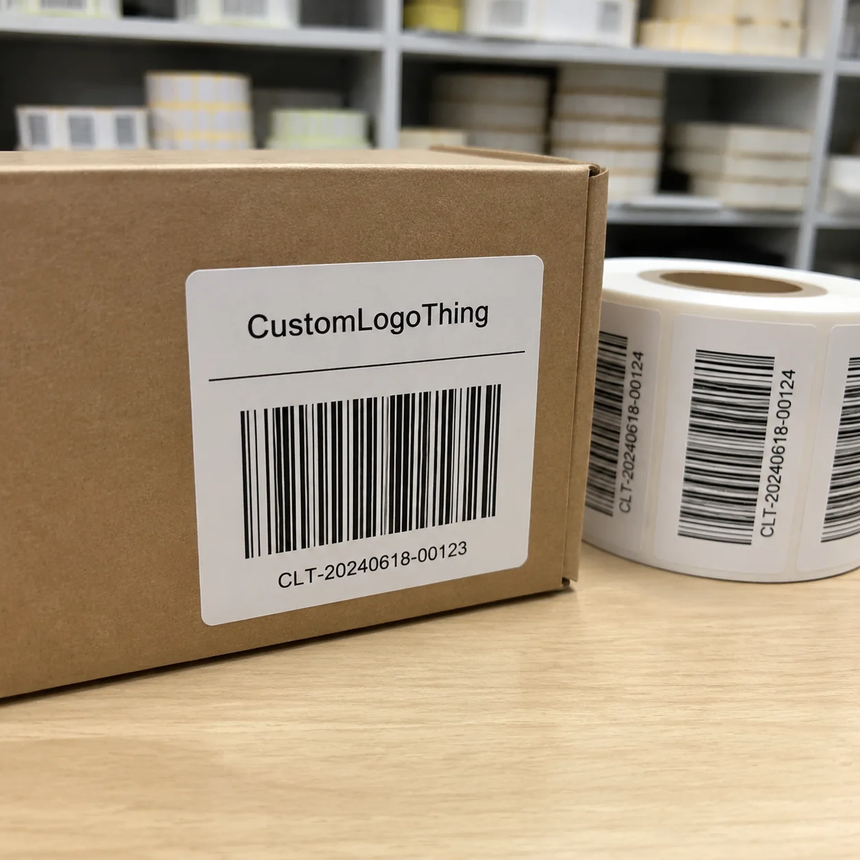
Buyer Fit Snapshot
| Best fit | Custom Labels Design for Better Branding projects where brand print, material claims, artwork control, MOQ, and repeat-order consistency need to be specified before quoting. |
|---|---|
| Quote inputs | Share finished size, material target, print colors, finish, packing count, annual reorder estimate, ship-to region, and any compliance wording. |
| Proofing check | Approve dieline scale, logo placement, barcode or warning zones, color tolerance, closure strength, and carton packing before bulk production. |
| Main risk | Vague material claims, crowded artwork, missing packing details, or unclear freight terms can make a low unit price expensive after revisions. |
Fast answer: Custom Labels Design for Better Branding: Material, Adhesive, Artwork, and MOQ should be specified like a repeatable production item. The safest quote records material, print method, finish, artwork proof, packing count, and reorder notes in one written spec.
Production checks before approval
Compare the actual filled-product size with the drawing, then confirm tolerance on folds, seals, hang holes, label areas, and retail display edges. Reserve space for logos, QR codes, warning copy, and material claims before decorative graphics fill the panel.
Quote comparison points
Review material grade, print process, finish, sampling route, tooling charges, carton quantity, and freight assumptions side by side. A quote is only useful when the supplier can repeat the same color, closure quality, and packing count on the next order.
Good custom labels design tips are not about making a label “look nice.” They’re about making sure a buyer can read it in three seconds, the printer can run it without costly adjustments, and the product can survive the shelf, the cooler, or the shipping box. I’ve watched brands spend $8,000 on a logo refresh and then undo the investment with a label that printed dull, cramped, and off-center on a 3-inch-wide wrap. That hurts more than a bad font choice ever could, especially when the production cost was only $0.11 per unit on 10,000 pieces.
After years in print shops and on production floors in Shenzhen, Dongguan, and Guangzhou, one pattern stands out: people design for a laptop screen and forget the label has to live on a curved bottle, a greasy pouch, or a cold jar coming out of a warehouse at 42°F. I remember one launch in Dongguan where a client swore the design was “absolutely perfect” until we put it on the actual bottle and the text wrapped like it was trying to escape. That’s where custom labels design tips matter: on press, in finishing, and on the shelf. If you want Custom Labels & Tags that support package branding, the real work starts with the file, the dieline, and the material spec.
Custom Labels Design Tips: Why Small Details Win
I once stood in a facility outside Shenzhen while a client’s $12,000 product launch got delayed because the label looked clean on screen but turned muddy in print. The blues collapsed into a gray-green mess under the shop lights, and the tiny white type disappeared on the matte stock. Nobody had a magical fix. We reran the file, adjusted the contrast, and lost five days on a schedule that was supposed to ship in 14 business days. That’s the sort of expensive lesson that makes custom labels design tips worth taking seriously.
A custom label does two jobs at once. It sells the product, and it tells the buyer what the product is, how to use it, and whether it belongs in their cart at all. That means packaging design decisions affect shelf appeal, compliance, and trust. The wrong label can make a premium product look cheap. The right one can make a $9 item feel like $19, especially when the stock is upgraded from standard 60# paper to a 350gsm C1S artboard or a 2-mil BOPP film with gloss laminate. I’ve seen that shift happen with nothing more than better hierarchy and a cleaner border treatment.
Labels also sit inside a wider product packaging system. They need to match the bottle shape, the carton, the shipping case, and the website visuals. If your brand uses custom printed boxes with warm kraft tones from a facility in Ningbo, a bright neon label may feel like it came from another company entirely. That mismatch is one of the fastest ways to weaken brand packaging consistency, and it can cost you a repeat purchase even if the first sale was strong.
People overcomplicate labels because they focus on decoration instead of function. Honestly, I think that’s where a lot of packaging budgets go to die. Smart custom labels design tips are not about stuffing in every special effect. They’re about readability, printability, and profit. If the label scans well, sticks well, and sells well, it did its job. Pretty is just the bonus round, and bonus rounds should never require a $600 tooling charge unless they truly move the product.
“The best label is the one people can understand instantly, even under bad store lighting and with one hand full of groceries.” — what I told a skincare client after their first proof came back with six fonts and three foil colors
For brands that sell through retail packaging, the label is often the first touchpoint before the buyer ever opens the package. That means a few millimeters matter. A 9 pt font may look fine in Illustrator, but on a rounded bottle with a glossy coating, it can become a headache. Good custom labels design tips protect you from that kind of preventable mess by forcing decisions about font size, contrast, and adhesive type before the press run begins.
How Custom Labels Design Works From File to Finished Roll
Label production does not start with printing. It starts with the file. In a proper workflow, concept comes first, then artwork setup, then proofing, then material selection, then print, finishing, and delivery. If one step is sloppy, the final roll usually reflects that. Printers are not mind readers, and no, a screenshot from Canva is not a production file. I know people love Canva for a quick social post, but a press-ready label for a 5,000-piece run in Chicago or Monterrey needs vector text, bleed, and the right color mode.
When I visited a label converter in Dongguan, the prepress team showed me a stack of rejected files from the same week. Missing bleeds. Wrong dielines. RGB gradients. One file had a logo placed right over the cut path, which is adorable if you enjoy $250 in reproof charges. This is where custom labels design tips save time: build for the machine, not just for the mood board. If the label is meant for a 2.5-inch jar, set the trim size at 2.625 inches with at least 0.125 inch bleed on every side.
Here’s the usual flow:
- Concept — decide the label’s job: retail, compliance-heavy, promotional, or informational.
- Artwork setup — place the logo, text, barcodes, and legal copy on the dieline.
- Proofing — check spelling, size, color notes, and cut position.
- Material selection — choose paper, BOPP, clear film, textured stock, or specialty materials.
- Printing — digital, flexographic, or offset depending on run size and finish.
- Finishing — varnish, laminate, die-cut, roll slit, sheet cut, or specialty effects.
- Delivery — packed by roll count, core size, and application method.
Shape matters more than most beginners expect. A square label on a curved bottle can wrinkle at the edges. A narrow label may work perfectly on a tube but look weak on a jar. Adhesive matters too. A freezer-grade adhesive for chilled goods is not the same as a standard permanent glue for dry goods. For a label used on yogurt cups in Denver or protein shakes in Toronto, a permanent adhesive rated for 35°F to 104°F is a very different specification from a standard indoor label. These details belong in your custom labels design tips checklist, not in the “we’ll figure it out later” folder.
Turnaround changes based on complexity. A simple one-color label on white BOPP with no coating might be ready in 5 to 7 business days after proof approval. Add foil stamping, embossing, or variable data and you may be looking at 10 to 15 business days, sometimes longer if tooling is needed. A straightforward 5,000-piece paper label run from proof approval to shipment is often quoted at 12 to 15 business days in facilities near Shenzhen or Suzhou. That is not a delay. That is physics and setup time doing their job. Packaging never cares how urgent your email was, which is rude but true.
Key Factors in Custom Labels Design Tips That Actually Matter
The best custom labels design tips usually come down to five things: readability, brand consistency, material choice, compliance, and cost. If those five are handled well, everything else gets easier. If they’re ignored, you end up with a beautiful label that fails in the real world. That is not a win. That’s expensive decoration, often at $0.18 per unit when a simpler version would have cost $0.07.
Readability comes first
On a shelf, people don’t read every word. They scan. That means font size, contrast, spacing, and hierarchy are doing the heavy lifting. I like to keep the product name dominant, the benefit statement secondary, and the legal or technical copy smaller but still legible. For most labels, I avoid going below 6 pt for critical text unless the format absolutely forces it. Even then, I’d rather redesign than squeeze. On a 2-inch by 4-inch label, 8 pt body text usually prints cleanly, while 5 pt type can blur on coated paper and disappear on textured stock.
Strong contrast matters more than fancy typography. Dark gray on black looks elegant in a mockup and terrible in a grocery aisle. White text on textured kraft stock can work, but only if the ink density is strong enough and the material cooperates. A clean hierarchy is one of the simplest custom labels design tips that pays off fast, especially under retail lighting in stores with 3,500K to 4,500K LED fixtures.
Brand consistency without repetition
Your label should feel like your website, your ads, and your branded packaging had a sensible conversation. Same logo style. Same tone. Same color family. But don’t turn every product into a clone. A coffee label and a lip balm label can belong to the same family while still serving different shelf jobs. That balance is where good package branding lives, whether the product ships from Los Angeles, Vancouver, or a contract packer in Guadalajara.
I once negotiated with a client who wanted every SKU to use the exact same layout, down to the same wording block. The result was technically consistent and visually dead. We adjusted the hierarchy for each flavor, kept the logo and color system intact, and sales improved after the next print run. Consistency matters, but so does differentiation. That is one of those custom labels design tips people only appreciate after they see the shelf and compare sell-through data from stores in Dallas versus Portland.
Material changes everything
Paper labels are cost-effective and feel familiar, but they can scuff or absorb moisture. BOPP is a workhorse for durability and moisture resistance. Clear labels create a sleek, transparent look, but they need careful ink handling because white ink and opacity affect everything. Textured stocks can add a premium tactile feel, though they may soften fine detail. If you’re comparing materials for Custom Packaging Products, start with the product environment, not just the mood. A tea jar in a dry warehouse in Phoenix has very different needs from a cold-pressed juice bottle stored at 38°F in Seattle.
For example, a 2-inch by 3-inch paper label on a dry candle jar might cost around $0.04 to $0.09 per unit at higher volumes, while a similar BOPP label with laminate might land closer to $0.07 to $0.16 per unit, depending on quantity and finish. On a 5,000-piece run, a 350gsm C1S artboard hang tag or product label insert can average about $0.15 per unit before finishing, while a clear label with white ink and gloss laminate can reach $0.19 to $0.24 per unit. Add foil or spot UV and the cost climbs again. That does not mean avoid upgrades. It means spend where buyers will actually notice. That is one of the most practical custom labels design tips I can give.
Compliance and function
If your product needs an ingredient list, warning text, barcode, or regulatory statement, the label has to make room for it. For food, cosmetics, and household items, compliance is not optional. I always tell clients to check relevant guidance and standards before they finalize the layout. For shipping or durability testing, groups like ISTA and industry references like EPA can also matter depending on the application. If your packaging must perform in transit, test it like it matters, because it does, especially if cartons move through humid hubs in Memphis, Atlanta, or Hong Kong.
Never assume the label can “fit later.” That phrase has caused more redesigns than I care to count. If the ingredient panel is too long, redesign the structure. If the barcode is too small, expand the label or simplify the front panel. Compliance is one of the less glamorous custom labels design tips, but it protects your brand from expensive mistakes and from reprints that can cost $300 to $1,200 depending on the supplier and quantity.
Cost and pricing realities
Pricing changes based on size, material, colors, finishing, and quantity. One-color labels on standard paper stock are usually the cheapest. Clear labels with white ink, soft-touch laminate, or foil accents cost more because they require extra steps or setup. Setup charges, plate fees, and die costs can also show up depending on the process. A client once tried to compare a plain thermal label quote against a foil-stamped pressure-sensitive label quote and called it “unfair.” Sure. And comparing a bicycle to a truck is also unfair.
| Label Option | Typical Use | Estimated Unit Cost | Notes |
|---|---|---|---|
| Paper pressure-sensitive label | Dry goods, candles, simple retail packaging | $0.04–$0.09 | Best for lower budgets and standard finishes |
| BOPP label with laminate | Moisture-resistant product packaging | $0.07–$0.16 | Durable, clean look, strong for personal care |
| Clear label with white ink | Premium bottles and minimal branding | $0.09–$0.20 | Needs careful contrast and print control |
| Foil or specialty finish label | Premium retail packaging | $0.14–$0.35+ | Looks impressive, but do not overdo it |
One more truth: bigger quantities usually bring down the unit price, sometimes sharply. I’ve seen 1,000 labels cost nearly double the per-piece price of a 10,000-unit run. A 500-piece pilot might run at $0.22 per unit, while 5,000 pieces of the same size can drop to $0.08 to $0.11 depending on the stock and finishing. That is why custom labels design tips should include a production plan, not just a pretty concept. If you know you’ll reorder three times this year, design for the 10,000-piece price break instead of the emergency 1,000-piece quote.
Step-by-Step Custom Labels Design Tips Process
Good label design gets much easier when you treat it like a sequence. I’ve sat in enough supplier meetings to know that random revision cycles waste money. If you follow a clear process, you reduce errors and keep the printer from chasing clarifications across seven email threads. Here’s the version I recommend when clients ask for custom labels design tips that are actually usable and not just aesthetic advice.
Step 1: Define the goal
Ask a blunt question: what should this label do? Sell premium? Look playful? Meet strict compliance? Support subscription shipments? If the goal is unclear, the design will drift. A high-end serum label needs a different visual system than a kids’ snack pouch. I’ve seen teams spend two meetings arguing about color before they could answer that one question, which is a hard way to discover the project brief was missing one sentence.
Step 2: Gather the content
Before design starts, collect the logo, product name, claims, ingredients, warnings, barcode, SKU, website, and any required legal copy. If you’re missing one of those pieces, you’re guessing. Guessing is how label revisions multiply. This is one of the simplest custom labels design tips and still one of the most ignored, especially on launches handled from New York offices while production happens in Ho Chi Minh City or Shenzhen.
I usually tell clients to keep a content sheet in one document with version numbers. That way, when marketing changes a claim from “fast absorb” to “quick-dry,” the printer sees the revision immediately. Clean content management saves more time than any fancy software, and it keeps the approved proof from being overwritten by someone’s desktop copy dated three weeks earlier.
Step 3: Build around the shape
Do not design a label as if it were a flat poster. A round bottle, a squeeze tube, and a square jar each distort differently. Curves eat text space. Corners affect the eye path. A wrap label needs breathing room near the seam. If you ignore shape, the design may be handsome in a PDF and awkward on the actual package. That is why experienced custom labels design tips always start with dieline behavior, bottle diameter, and application method.
Step 4: Choose colors and finishes with the environment in mind
Lighting changes everything. Retail shelves with cold LEDs make some warm tones dull and some dark tones harsh. Refrigerated products can create condensation. Shipping environments can scratch soft coatings. If the label lives in a bathroom, moisture matters. If it lives under sunlight, UV resistance matters. A matte laminate may feel elegant, but a gloss or protective coating may be better if durability wins over texture. A label for a craft beer bottle in Portland needs different finish logic from a sunscreen bottle in Miami.
One time in our factory visit in Guangzhou, a client wanted a pale silver-gray label for a refrigerated drink. The sample looked refined on the table. Under store lighting, it vanished. We shifted to a deeper charcoal border, kept the silver accents, and suddenly the product read correctly from six feet away. That is why custom labels design tips need to be tested in the real setting, not only under a design team’s studio lights.
Step 5: Review the digital proof carefully
A proof is not the same as a finished label, but it should catch the obvious problems. Check spelling, margins, barcode placement, font sizes, crop marks, and color notes. If the supplier sends a proof with no bleeds, ask why. If your barcode sits too close to the edge, fix it now. A 20-minute proof review can prevent a 20,000-label mistake, and the difference between a clean 12-business-day delivery and a reprint that slips into next month can be just one missed comma.
If color is critical, ask for a physical sample or printed swatch. Screens lie. They lie a lot. That is why one of my best custom labels design tips is simple: never approve a color-sensitive job from a laptop alone. If possible, review a drawdown or press proof under D50 lighting before signing off.
Step 6: Confirm print-ready files and production details
Final files should usually be in vector format where possible, with outlines on fonts, bleed included, and images at suitable resolution. Confirm the trim size, roll direction, core size, and whether the labels will be hand-applied or machine-applied. A machine applicator may need tighter tolerances than a human hand. Not everyone remembers that. The printer will, and usually after you’ve already asked for a rush from a facility in Taipei or Foshan.
Before approval, I like to confirm three numbers: quantity, lead time, and packing method. For example, 5,000 labels might ship faster than 50,000, but only if the finishing is simple. A roll packed for automatic application is different from a sheet pack for manual use. That sounds obvious. Plenty of expensive mistakes happen at exactly this stage anyway, especially when a buyer assumes “one box” means the same thing as “one roll.”
Common Mistakes in Custom Labels Design Tips
Some label problems are so common they should have warning sirens. I’m not exaggerating much. The same errors keep showing up because people design with their eyes and forget the label has to print, cut, stick, survive, and sell. These custom labels design tips are partly about what not to do, and the mistakes usually show up before the first pallet leaves Shenzhen or Louisville.
Too many fonts is the first offender. Three or four typefaces on a 2-inch label is chaos. One strong family with weights does the job better. Too many effects is next. Foil, embossing, gradients, shadows, outlines, and textures all at once can make a label look like it lost a bet. A cleaner design usually performs better and costs less, often by $0.03 to $0.08 per unit when you remove unnecessary finishing.
Ignoring print limits is another big one. Tiny text on textured stock, thin lines on clear film, or pale ink on a metallic base can all fall apart. I once saw a wellness brand insist on 4 pt green text over a soft beige background. The printer warned them twice. The final roll looked elegant on screen and invisible in person. That is not a printer problem. That is a design problem, and it gets worse when the label is applied to a matte pouch or a condensation-prone bottle.
Forgetting real-world conditions is costly too. Moisture, refrigeration, handling, oil, UV exposure, and abrasion all change how a label behaves. A label for a shower product needs different adhesive and coating considerations than one for a dry candle box. If the package is part of a broader system with custom printed boxes, the label also has to hold its own visually under shipping stress and shelf handling in stores from Houston to Halifax.
Overpacking the label is probably the easiest trap. People want claims, icons, QR codes, certifications, social handles, a tagline, a website, and six product benefits on one face. The result is a wall of information. Buyers hate that. Keep the front tight. Push secondary details to another panel or an insert, and make sure the most important line can still be read at arm’s length in a 24-inch aisle.
Skipping proofing is the most avoidable mistake of all. Misspelled words, wrong barcodes, reversed artwork, and misplaced cut lines are boring errors with expensive consequences. One client once approved a label with the wrong SKU suffix. That tiny mistake caused a warehouse mismatch on 4,000 units in a facility outside Chicago. Very glamorous. Very avoidable. I still think about that one when someone says, “We can eyeball it.” No. We cannot.
Expert Custom Labels Design Tips From the Print Floor
After enough factory visits, you stop thinking like a designer alone and start thinking like a production manager. That shift matters. The prettiest label in the room means nothing if it can’t be run efficiently. These are the custom labels design tips I give when someone wants the straight version, not the polished sales pitch, and they usually come up during late-stage approvals in Dongguan, Dallas, or Eindhoven.
Use one focal point. Let the product name breathe. When a label has one clear hero, buyers understand it faster. If everything shouts, nothing gets heard. On shelf, I’ve seen a single strong focal point outperform a more ornate label because the message was immediate, even on a 4-foot-wide endcap display.
Pick one upgrade that sells. Foil, embossing, soft-touch coating, and matte laminate can all improve perception. You do not need all of them. Actually, stacking every finish usually looks desperate, not premium. One well-placed upgrade often does more than three competing effects. That is one of those custom labels design tips I wish more brand owners heard before they signed off on a bloated quote from a supplier in Suzhou or a domestic converter in Ohio.
Ask for a press check when color is critical. If you’re matching a lipstick shade, a beverage tone, or a hero brand color that already exists in retail packaging, ask whether you can review a press sheet or sample run. Not every project needs it, but when color is mission-critical, a press check can save you from an expensive mismatch. I’ve seen a deep burgundy shift two points warmer once it moved from screen to press on coated stock.
Budget with real numbers. A label quote is usually not just “print cost.” It can include die charges, setup fees, finishing costs, and shipping. I’ve seen quotes swing by $150 to $600 just because of tooling or plate charges. You should ask for the breakdown. If a supplier can’t explain the price, that’s a signal, not a mystery. A 10,000-piece order from a factory in Guangzhou can look cheap until you add a $240 die and $180 in packing upgrades.
Negotiate like a grown-up. Ask about reprint policies, setup fees, plate fees, and whether revisions after proof approval create new charges. I once negotiated a run where the client saved $420 simply by changing the pack-out format from mixed cartons to single-SKU cartons. Small operational details can make a real difference, and they matter even more when the shipment has to move through a distribution center in New Jersey or Birmingham.
For brands building a larger system, label design should fit the rest of the line. If your cartons, pouches, and shipping mailers all follow the same visual language, your brand packaging becomes easier to recognize. That is why I often pair label decisions with broader packaging design planning instead of treating them as isolated tasks. The label should strengthen the whole shelf presence, not fight it, whether the final packaging is assembled in Mexico City, Bangkok, or Kansas City.
“I’d rather approve a label that’s 10% simpler and 100% printable than one that looks fancy and causes rework.” — my usual response when a brand wants every possible finish on one SKU
If sustainability matters for your line, check material and supplier claims carefully. FSC-certified paper options may be available through certain converters, and information from FSC can help you understand certification basics. If your brand is trying to reduce waste, the label substrate and adhesive should be part of that conversation, not an afterthought. A 1.5-mil recyclable film with a water-based adhesive may be a better fit than a heavily coated paper if you’re shipping to customers who reuse jars or compost cartons.
What to Do Next After Finalizing Your Label Design
Once the design is approved, the job is not finished. This is where teams either stay organized or start losing files in random inboxes. A final checklist keeps production clean and protects future reorders. It also makes your custom labels design tips repeatable instead of one-off advice you forget by next quarter, especially when the next run is scheduled for a 7,500-piece order in the autumn.
Your checklist should cover size, bleed, color mode, fonts, linked images, barcode scannability, and cut-line placement. Save the final artwork in more than one place. I prefer a named folder with the version date, the approved proof, and the supplier’s production notes. If someone asks for a reorder six months later, you do not want to rebuild the file from scratch because the logo folder was “somewhere on the desktop.” One missed file can cost a two-day delay and a reproof charge of $75 to $150.
Order a short run or sample if possible. Even a 250-piece test can reveal whether the adhesive holds, whether the color reads correctly, and whether the label fits the actual container curve. That is especially useful for refrigerated products, textured containers, or anything with unusual application conditions. It is cheaper to learn on a small run than on a pallet. A pilot order from a converter in Texas or Guangdong can expose application issues before you commit to 20,000 units.
Build your timeline with a little realism. If the proof stage takes 2 business days, revisions take 1 to 3 more, printing takes 5 to 10, and shipping takes another 2 to 5, you already know the actual schedule. Add buffer if a launch date matters. Hope is not a production plan, and neither is “the vendor said it should be fine” when the product launch is set for a Friday in Berlin or Boston.
Then use the approved label everywhere it belongs: product photos, e-commerce listings, sales sheets, and internal brand assets. Good labels support the entire brand system. They should reinforce branded packaging, work with retail packaging, and stay consistent across your other assets. I’ve seen one polished label do more for perceived value than a full ad campaign because the product finally looked legitimate in the customer’s hands at the point of sale.
If you’re building out a broader line, coordinate labels with other packaging items at the same time, including mailers, inserts, cartons, and display-ready retail materials. That is where Custom Packaging Products can keep the visual system aligned instead of stitched together later by three different people with three different opinions. A single production calendar can save a launch team from two weeks of preventable back-and-forth.
The last piece of advice I’ll give is simple: keep learning from every run. The best custom labels design tips come from real jobs, real mistakes, and real supplier feedback. Every finished roll tells you something, if you bother to listen. A 10,000-piece run that ships from Shenzhen or Milan will teach you more than a dozen mockups ever will.
FAQs
What are the best custom labels design tips for small businesses?
Keep the label simple, readable, and focused on one main message. Use strong contrast, a clear font hierarchy, and materials that fit your budget and product environment. If you only remember three custom labels design tips, make them readability, durability, and consistency. For a small brand ordering 1,000 to 2,500 pieces, a paper label or standard BOPP label can keep the unit cost manageable while still looking polished.
How much do custom labels usually cost?
Pricing depends on size, quantity, material, color count, and finishing. A plain paper label might cost $0.04 to $0.09 per unit in larger quantities, while a clear or specialty finish can run higher. A 5,000-piece run of a 2-inch by 3-inch BOPP label with laminate may land near $0.08 to $0.12 per unit, while foil or soft-touch finishes can push the number higher. The more complex the label, the more setup and finishing usually cost.
How long does the custom labels design and print process take?
Simple label jobs can move in 5 to 7 business days after proof approval if artwork is ready. More complex projects may take 10 to 15 business days or longer, especially if samples, specialty finishes, or tooling are involved. A straightforward 5,000-piece order from proof approval to shipment is often completed in 12 to 15 business days at plants in Shenzhen, Dongguan, or Suzhou. Rush options exist, but they often cost more.
What file format should I use for custom label artwork?
Vector files are best for logos and clean scaling. Printers usually prefer print-ready artwork with bleed, outlined fonts, and correct color settings. PDF, AI, and EPS are common production formats, but always confirm the supplier’s preferred format before sending final files, because one shop’s “perfect” file can be another shop’s headache. A file built for a 3-inch label should include the exact dieline, not a screenshot.
How do I make sure my label design prints correctly?
Check resolution, bleed, margins, and color contrast before approval. Review a digital proof and, when needed, a physical sample on the actual package. Test barcode readability, confirm the adhesive suits the application, and make sure the smallest text remains legible after printing. Those are the custom labels design tips that save the most money, especially when the run is 10,000 pieces and the product is headed to retail shelves in several cities at once.
If you want custom Labels That Actually help your brand instead of quietly sabotaging it, start with the basics: clear hierarchy, realistic materials, and production files that a printer can run without guessing. That is the whole point of custom labels design tips. They are not about decoration. They are about making sure your label reads well, prints well, and sells well, whether the order is filled in Shenzhen, Chicago, or Valencia.