Buyer Fit Snapshot
| Best fit | Custom Labels Design for Branding projects where brand print, material claims, artwork control, MOQ, and repeat-order consistency need to be specified before quoting. |
|---|---|
| Quote inputs | Share finished size, material target, print colors, finish, packing count, annual reorder estimate, ship-to region, and any compliance wording. |
| Proofing check | Approve dieline scale, logo placement, barcode or warning zones, color tolerance, closure strength, and carton packing before bulk production. |
| Main risk | Vague material claims, crowded artwork, missing packing details, or unclear freight terms can make a low unit price expensive after revisions. |
Fast answer: Custom Labels Design for Branding: Material, Adhesive, Artwork, and MOQ should be specified like a repeatable production item. The safest quote records material, print method, finish, artwork proof, packing count, and reorder notes in one written spec.
Production checks before approval
Compare the actual filled-product size with the drawing, then confirm tolerance on folds, seals, hang holes, label areas, and retail display edges. Reserve space for logos, QR codes, warning copy, and material claims before decorative graphics fill the panel.
Quote comparison points
Review material grade, print process, finish, sampling route, tooling charges, carton quantity, and freight assumptions side by side. A quote is only useful when the supplier can repeat the same color, closure quality, and packing count on the next order.
I’ve watched a label change from a dull matte paper to a bright white BOPP sheet turn a private-label sauce jar from “house brand” to “premium specialty” in one afternoon, and that is exactly why Custom Labels Design Tips matter more than most teams realize. A label does far more than decorate a bottle or carton. It shapes product identity, supports compliance, improves retail visibility, and nudges the buying decision, often under harsh store lighting where every millimeter counts. On a 4 oz glass jar, even a 2 mm shift in type placement can change whether a shopper reads the flavor first or misses it entirely.
Too many brands spend their energy on the mood board and not enough on the substrate, the adhesive, and the press method. Practical custom labels design tips help you avoid expensive reprints, keep text readable at arm’s length, and make sure what looks sharp on a monitor still behaves correctly on glass, PET, corrugate, or a chilled jar pulled from a cold room. I still remember the first time I saw a label that looked flawless in the PDF and then looked vaguely like a tired gray sticker in a refrigerated aisle (honestly, it was a little heartbreaking). A $0.16-per-unit label can become a $9,000 lesson if the roll has to be scrapped after 5,000 pieces.
Why Custom Labels Design Tips Matter More Than You Think
On a warehouse visit in Columbus, Ohio, I stood beside a pallet of bottled marinades where the labels looked flawless in the proof deck. Under the store’s cool-white LEDs, the dark green text blended into the background and the product name vanished from three feet away. That was a costly lesson. The production run was already booked, and the brand team had to absorb a redesign plus another print slot. Good custom labels design tips start right there: with shelf visibility, not decoration. The label that wins at 48 inches from the shelf usually wins at the register too.
Custom labels are not just stickers. They are a branding tool, a functional communication panel, and, in many cases, a compliance surface that carries ingredient statements, barcodes, warnings, batch codes, or recycling marks. In packaging design, the label often becomes the fastest visual cue a shopper gets before making a choice, which is why custom labels design tips should always balance visual appeal with practical performance. A 12-point product name with 4.5:1 contrast may look subtle in a mockup, but in a refrigerated aisle it can disappear under condensation and glare.
A label is part of the package system, not a separate art project. If the container curves sharply, if condensation forms, if the adhesive has to survive freezer storage, or if the boardstock on a carton has heavy texture, the artwork will react differently than it does on-screen. Strong custom labels design tips are really about managing the relationship between design, materials, and production conditions. On a 500 ml amber bottle, for example, the same artwork can look premium on one substrate and muddy on another because the opacity, adhesive grab, and topcoat all change the final result.
One food client I worked with in Jersey City, New Jersey, had a beautiful gold foil concept for a premium dressing line, but their 750 ml glass bottles sat on a wet filling line for nearly 20 minutes before cartons were packed. The label looked expensive, yet the foil plus the wrong adhesive gave them edge lift within two weeks. After we switched to a wet-strength BOPP with a freezer-grade adhesive and simplified the metallic accent, their complaints dropped to almost nothing. That is the kind of practical thinking that sits behind smart custom labels design tips. It’s also the kind of lesson nobody wants to learn twice, especially when a reprint costs $0.22 per unit for 10,000 pieces.
How Custom Labels Design Works From Concept to Press
The best label projects move through a predictable flow: brand brief, dieline creation, artwork setup, proofing, press check, finishing, and final application. Skip one of those steps and the trouble usually shows up later as misregistration, barcode problems, or a label that looks fine on a flat proof but fails once it wraps around the container. Solid custom labels design tips always include the production sequence, not just the creative direction. In most converter shops around Chicago or Milwaukee, that sequence is mapped into a 7- to 10-step approval trail before a single plate is made.
I’ve sat in prepress rooms where a design team handed over a gorgeous PDF, but nobody had confirmed the neck diameter on the bottle or the glue panel dimensions on the carton. The result was predictable. The QR code landed too close to the seam, and the brand had to pause packing for a revised file. Before artwork starts, label converters usually need precise specs for the container and the environment, because custom labels design tips only work when the file and the package speak the same language. I’m not being dramatic here; I’ve seen one missing measurement cause three people to stare at a printer tray like it personally betrayed them. One missed seam allowance of 3 mm can undo a two-week schedule.
Print methods shape the final result
Digital printing is often the best fit for short runs, test launches, and designs with frequent artwork changes because it avoids plate costs and moves faster on small quantities. Flexographic printing becomes more efficient on higher volumes, especially when the artwork is stable and the brand needs consistent repeat jobs. Offset printing can be a strong choice for certain premium applications where sharp detail and smooth tonal work matter, although the exact setup depends on the converter’s equipment and finishing line. A digital run of 500 labels might cost $0.45 to $0.80 per unit, while a flexo order of 20,000 can drop to a fraction of that once setup is absorbed.
The point is simple: the print method affects color accuracy, line crispness, turnaround time, and cost structure. A brand asking for ten SKUs with 7-color artwork, white ink, and two spot varnishes will not get the same economics as a one-color paper label on a standard carton panel. That is why custom labels design tips need to account for press capabilities before the creative team gets too attached to a layout. Honestly, I think this is where a lot of “but it looked amazing in the mockup” conversations go to die. A press in Dallas, Texas will also handle white ink differently than one in Greenville, South Carolina, so printer capability matters as much as style.
Proofing saves money later
There are usually two proof types that matter most: a soft proof, viewed on screen or as a digital file, and a hard proof, printed on the actual substrate or a close match. A soft proof can catch spelling, layout, and many design issues quickly, but it will not tell you how the white ink behaves over clear film or how a navy blue will shift under a gloss finish. A hard proof costs more, yet it can save a full reprint when color, legibility, or wrap alignment needs confirmation. A hard proof for a 3-inch-by-5-inch label set might add $85 to $175 to the project, but that is still cheaper than redoing 8,000 rolls.
For regulated products, I like to push clients toward tighter review steps, especially when barcodes, legal copy, or ingredient panels are involved. In some cases, a press proof or a live press check is worth the extra coordination because it protects the schedule downstream. Good custom labels design tips do not treat proofing as a formality; they treat it as insurance. A label for an over-the-counter supplement sold in Phoenix, Arizona may need one more legal review than a craft beverage label in Portland, Oregon, simply because the compliance burden is heavier.
Production note: if you’re also planning Custom Packaging Products, it helps to align label artwork with cartons, inserts, and secondary packaging early, so the branding story stays consistent across the whole shelf set. A 350gsm C1S artboard carton and a BOPP pressure-sensitive label should not look like they came from two different companies.
Packaging teams also coordinate label specs with bottle, jar, pouch, or carton dimensions before production starts. That matters because a label designed for a 3 oz round jar may fail visually on a tapered container, and a carton panel that looks spacious on paper can become crowded once the compliance copy is added. I’ve seen more than one launch delayed because the packaging team and the label converter were working from different dimension sheets. That is exactly the kind of problem custom labels design tips are meant to prevent. In one Atlanta project, a 1.25-inch seam shift required a full artwork reset because the barcode had been sitting too close to the fold.
Custom Labels Design Tips for Materials, Colors, and Readability
Material selection changes everything. Paper labels can work beautifully on dry retail packaging and many carton applications, but they can fail in humid environments or on containers that need moisture resistance. BOPP is a common workhorse for cosmetics, beverages, and household products because it resists tearing and handles moisture better than standard paper. Vinyl can be useful for durable applications, though it is not always the first choice for food or premium consumer goods. Clear film supports a modern, “no-label” look, while textured stocks and specialty finishes can create a more tactile impression on branded packaging. For labels that need longer cold-chain performance, I often see 2.0 mil to 3.2 mil film stocks paired with a low-temperature adhesive.
In one supplier meeting at a converter in Racine, Wisconsin, the sales team kept pushing a textured paper because it looked rich on the table, but the actual product was a refrigerated yogurt cup that would sweat during loading and display. We ended up moving to a moisture-resistant film with a matte varnish, and the label stayed intact through distribution. That is the practical side of custom labels design tips: the material has to fit the container, the supply chain, and the customer’s hand, not just the brand mood board. The sample on the table is not the same as the package on the shelf. That difference matters more than people want to admit. In summer, a dock in Memphis, Tennessee can hit 95°F and 70% humidity, and paper will tell the truth fast.
Color strategy is not just taste
Color contrast is the first thing I check when I review a label concept. A light gray product name on a silver background may look elegant on a monitor, but on a store shelf it can disappear. Dark text on a clean white field is still one of the most reliable combinations for readable retail packaging, especially when the shopper only gives you two seconds of attention. On a 24-inch shelf run, that contrast can be the difference between a product being noticed and being skipped.
Brand consistency matters too, and that often means matching existing package branding across custom printed boxes, inserts, and labels. If the blue on the label does not resemble the blue on the carton, the whole product line can look disjointed. Metallic inks, foil stamping, and white underprints can all improve shelf presence, but they need to be used with restraint. Too much shine can create glare under LED fixtures, and glare makes small text harder to read. On a satin-finished label, a 60% tint can look clean where an 80% tint reads muddy.
I’ve also seen colors shift more than people expect because of substrate choice. A pale peach that looks soft on coated paper may turn muddy on a translucent film unless the printer uses a white underprint. On the shop floor, that one decision can decide whether a label looks premium or washed out. That is why custom labels design tips should include a real conversation about print behavior, not just palette selection. In one San Diego cosmetics run, the brand approved a blush tone that only looked right after a double-hit white base and a gloss overprint.
Typography should do the heavy lifting
For readability, font weight matters as much as font style. Thin serif fonts might feel elegant, but they can break apart on small labels or lose clarity when printed at low point sizes. As a rule of thumb, I get nervous when critical product information drops below 6 pt unless the surface is exceptionally clean and the print process is very tight. For small retail packaging, 7 to 9 pt often performs better for body copy, and 10 to 14 pt is usually easier to read for the product name or key claim. On a 2-inch-wide label, 8 pt often becomes the practical floor for anything the customer must actually read.
Line spacing matters too. Crowded lines feel cheap and create scanning problems, especially when a shopper is comparing several products at once. A good hierarchy might put the product name first, the benefit second, and the compliance details lower on the label in a calmer type treatment. That hierarchy is one of the most practical custom labels design tips I can give because it helps both the brand and the end user. If the pack has a 0.125-inch bleed, the typography still needs room to breathe inside the safe zone.
Finish choices change perception and performance
Matte finishes often feel understated and modern, while gloss can bring energy and sharpness to bright retail shelves. Soft-touch coatings create a velvety feel, which many premium beauty and specialty food brands like because it suggests care and detail. Foil and embossing can increase perceived value, but they also add production steps and cost, and they can complicate barcode placement if you are not careful. A soft-touch laminate may add $0.03 to $0.07 per label depending on quantity and size, while foil stamping can push the budget even higher.
One packaging buyer told me, “The label looked expensive, but I could not read the allergen statement without tilting the bottle.” That kind of feedback is priceless. If the finish makes the package harder to use, the design has gone too far. Smart custom labels design tips always leave room for real-world handling and scanning, especially in warehouses and on retail shelves where lighting conditions vary widely. A chilled bottle in Minneapolis, Minnesota under fluorescent light does not behave like a proof on a design team’s monitor.
| Material | Best Use | Typical Strength | Watch Out For |
|---|---|---|---|
| Paper | Dry goods, cartons, indoor retail packaging | Low cost, easy printability | Moisture, scuffing, edge lift |
| BOPP | Beverages, cosmetics, household products | Moisture resistance, tear resistance | Needs thoughtful adhesive selection |
| Vinyl | Durable, specialized applications | Flexibility, toughness | Not ideal for every brand or budget |
| Clear film | Minimalist, “no-label” looks | Modern appearance on glass and PET | Needs white ink underprint for legibility |
| Textured stock | Premium gifting, artisan products | Tactile brand feel | Fine text and barcodes can suffer |
If you want another practical reference point, I often suggest teams review broad packaging and materials guidance from industry groups like the Packaging Machinery Manufacturers Institute and sustainability practices through the EPA recycling resources. Those sites won’t design your label, of course, but they help anchor material decisions in real packaging requirements. A converter in Charlotte, North Carolina can also help translate those standards into actual substrate options, usually within 2 to 3 business days.
Step-by-Step Custom Labels Design Tips for a Better File Setup
The file setup stage is where a lot of projects either become easy or turn into a chain of revision emails. Start with the goal: is this label meant to win at retail, meet compliance requirements, support a product launch, or all three? Then collect the actual container specs, request the dieline from the label converter, and build the artwork to fit the true dimensions of the package. That sequence is at the heart of practical custom labels design tips. If the container is a 16 oz round jar, the label size should be drawn from the jar’s real circumference, not a guess from a sample photo.
I remember a meeting with a beverage startup in Austin, Texas that had built the whole file around a guessed label width. When we finally measured the bottle at the neck and shoulder, the logo had to move 12 mm to avoid the seam. That sounds small, but on a 2-inch label, 12 mm is the difference between clean and awkward. The best custom labels design tips are very often about respecting small measurements. Tiny changes can create huge headaches, which is a delightful little packaging joke nobody in prepress ever laughs at. A 1/8-inch error can look minor in a PDF and catastrophic in the packing room.
Bleed, safe zones, and trim lines
Bleed gives the printer extra artwork beyond the cut line so no unprinted edge shows after trimming. Safe zones protect important text and graphics from disappearing too close to the edge. Trim lines show exactly where the label will be cut. On flat labels those margins are manageable, but on curved bottles or tapered jars, the visible field can shift enough that a logo looks centered in the file and slightly off on the package. For most jobs, I keep at least 0.125 inches of bleed and 0.0625 to 0.125 inches of inner safety margin, then widen that buffer if the surface curves hard.
For narrow labels, I like to keep critical copy at least 1.5 to 2 mm inside the safe zone, and more if the container is highly curved. That buffer helps prevent distortion near the edges. Strong custom labels design tips always assume the label is going onto a physical object, not a flat artboard. On a 1.75-inch-diameter tube, the edge behavior can be surprisingly aggressive once the label wraps and settles.
File setup basics that save headaches
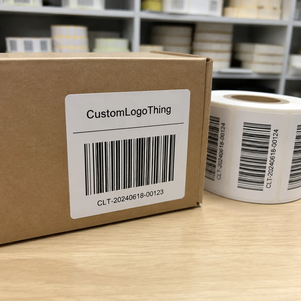
Use vector artwork for logos, line art, and icons whenever possible because it scales cleanly. Raster images should usually be at least 300 dpi at final print size for sharp reproduction, and sometimes higher if the image is very detailed. If the design includes barcodes, make sure the contrast is strong, the quiet zone is preserved, and the code size matches the scanner expectations for the distribution channel. A UPC that is 1.25 inches wide with proper contrast will scan better in a warehouse in Indianapolis than a tiny decorative barcode squeezed into a corner.
Work in the color mode your printer prefers, and confirm whether spot colors, CMYK, or a hybrid setup is best for the job. If the printer is producing a premium label with spot Pantone colors, those colors should be called out clearly in the file notes. I’ve seen change orders caused by font files not being outlined or by linked images missing from the final export package. That is not glamorous work, but it is exactly where solid custom labels design tips protect time and money. A clean file can shave 1 to 2 days off prepress review.
A simple production timeline
- Day 1 to 2: Brand brief, container specs, compliance copy collection.
- Day 2 to 4: Dieline review and first artwork draft.
- Day 4 to 6: Internal revisions and soft proof.
- Day 6 to 9: Hard proof or press proof, depending on method and quantity.
- Day 9 to 12: Final approval, plate or file release, and production scheduling.
- Day 12 to 15 business days from proof approval: Typical output window for many standard label jobs, though complex finishing or special materials can extend that.
Delays usually happen when the dieline changes after design has started, when compliance text is still under review, or when the brand team keeps asking for one more color adjustment after the proof stage. My advice is simple: designate one decision-maker and one production contact. That alone can shorten the process more than any fancy software. In my experience, the cleanest custom labels design tips are the ones that make approval easier, not harder. A converter in Los Angeles or Toronto will usually move faster when the artwork arrives complete, signed off, and dimensionally accurate.
Cost and Pricing Factors in Custom Labels Design Tips
Label pricing is shaped by material, size, quantity, print method, finishing, special inks, and the number of SKUs in the run. A 2-inch by 4-inch paper label in a single color will cost far less than a 4-color BOPP label with foil accents and variable data. If you change the label structure, the price can move quickly because setup time, tooling, and waste all shift too. That is one reason custom labels design tips should always include cost awareness from the beginning. In practical terms, a 5,000-piece run may price at $0.14 to $0.26 per unit for a simple paper label, while a laminated multi-effect version can more than double that.
For example, I’ve seen a customer move from a simple gloss finish to a soft-touch laminate plus gold foil accents, and the per-unit cost jumped from roughly $0.18 to $0.41 at 5,000 pieces. The design looked fantastic, but the real question was whether the extra shelf impact was worth 23 cents more per label. Sometimes it is. Sometimes it is not. Good custom labels design tips help brands make that call with clear eyes. If the product retails at $6.99, that price increase can eat a meaningful slice of margin.
How to reduce cost without flattening the brand
- Standardize label sizes across product families so you buy more consistently.
- Use one finish across several SKUs instead of mixing coatings on every item.
- Limit specialty inks unless they solve a real visibility or branding problem.
- Batch similar artwork changes together so proofing and setup are not repeated.
- Choose a substrate that fits the environment, not one that just sounds premium.
Small design changes can snowball into production cost. Add foil, increase the color count, or switch adhesives to a freezer-grade formula, and you may also increase setup complexity or waste during startup. That is not a reason to avoid premium branding. It is a reason to use custom labels design tips to balance appearance against the actual product packaging budget. A single extra spot color can add $0.03 to $0.08 per unit, depending on the plant and the run length.
Hidden costs also show up in proofing, plate setup, and change orders. A rushed design with three revision rounds can cost more than a carefully planned version that gets approved the first time. If you’re also coordinating Custom Labels & Tags for multiple lines, consistency in materials and formats can help reduce those hidden costs over time. A coordinated family of labels in one regional run, such as at a facility in Nashville, Tennessee or Grand Rapids, Michigan, can also cut freight and scheduling friction.
Common Custom Labels Design Mistakes to Avoid
One of the biggest mistakes I see is insufficient contrast. A label might feel subtle and sophisticated on a computer screen, but if the product name is too close in value to the background, shoppers will not read it quickly. The next mistake is overcrowding. People try to fit everything into a small label space, and the result is a wall of text with no hierarchy. Those are two of the fastest ways to lose shelf appeal, which is exactly why custom labels design tips stress readability first. On a 3-inch label, too much copy can turn a premium pack into a crowded flyer.
Another common error is ignoring container curvature. A tall jar, a tapered bottle, and a square carton do not accept artwork in the same way. On a curved surface, text and icons can distort near the edges, and barcode placement can become problematic if the label crosses a seam or wraps too far. I’ve seen a barcode fail on a distribution scan because it sat just a few millimeters too close to the fold line. That is the sort of problem that good custom labels design tips help you catch before production. In one Kansas City job, moving the barcode 4 mm to the left solved a three-day warehouse issue.
Designing without a physical sample is another trap. A mockup on a flat screen rarely reveals how the adhesive behaves on cold PET or how the label edge lifts after refrigeration. A sample bottle or carton can expose those issues in minutes. Too many teams rely on renderings and too few on real package handling. The package is the test, and the package is annoyingly honest. A label that holds on an office desk can fail fast in a 38°F cooler.
Missing compliance text, poor barcode contrast, and weak hierarchy can all create retail, warehouse, or regulatory trouble. Overusing special effects can also backfire. A label packed with embossing, foil, spot UV, and heavy color density may look expensive, but it can become difficult to manufacture and expensive to maintain. The smartest custom labels design tips are often the simplest ones: make it legible, make it fit, and make it printable. A design with two strong effects usually outperforms one with four competing ones.
“We thought the label only needed to look premium. Then we learned the hard way that premium still has to scan, wrap, and survive the line.”
Unapproved artwork revisions can also break dieline alignment and delay the whole schedule. If the brand team tweaks the logo after the layout is locked, even a small move can affect seam placement, fold panels, or the balance of the front face. Good custom labels design tips build guardrails so those late-stage changes do less damage. A simple approval log in New York, New York or Seattle, Washington can save an entire Friday evening reprint.
Expert Custom Labels Design Tips for Stronger Shelf Impact
I always recommend testing labels under multiple light sources before approving the final print. A design may look beautiful under neutral office lighting, then flatten under the cool white LEDs used in grocery aisles. Warm ambient light in boutique shops can make metallic accents look richer, while the same finish feels harsh in a warehouse club. If your product will be sold in multiple channels, custom labels design tips should include testing under at least two lighting conditions. A label that reads well at 3 feet and 8 feet usually performs best across stores from Denver, Colorado to Miami, Florida.
Compare mockups on the actual package, not just on screen. Put your label next to competitor products, set it on a shelf, and step back 3 to 6 feet. Ask whether the product name reads first, whether the benefit is obvious, and whether the package branding stays consistent across the full line. That shelf check tells you far more than a digital render ever will. I’ve seen a $0.12 paper label outperform a $0.40 premium version simply because its hierarchy was clearer from across the aisle.
Another advanced move is to build a modular design system. For families with different scents, flavors, or sizes, keep the core layout consistent and vary only one or two brand elements, such as a color band, icon, or flavor panel. That gives the line a unified look without making every SKU a separate design problem. It also keeps packaging design more efficient when the line grows. A six-SKU lineup can stay manageable if 80% of the layout remains fixed.
Create a print review checklist and use it every time. Mine usually includes typography, color proofing, barcode contrast, finish selection, adhesive requirements, and container compatibility. If the package also involves branded cartons or shipper boxes, I make sure the label and the outer packaging do not fight each other visually. This is where product packaging and label design need to speak with one voice. If the carton uses 350gsm C1S artboard and the label uses a bright matte film, the two surfaces still need to feel like one brand family.
Working early with packaging suppliers is another habit that pays off. I’ve had the best outcomes when the brand, the converter, and the packaging engineer are talking before artwork gets locked. That lets design choices support manufacturability from the beginning instead of forcing the line to adapt after the fact. Those are the kinds of custom labels design tips that keep projects moving without wasting material or time. In practice, that often means a 48-hour response from the printer and a final proof within 12 to 15 business days from approval.
For teams who like to benchmark standards, the ISTA testing standards can help frame how labels and packaging should hold up through handling, vibration, and shipping stress, while the FSC site is useful if your branding or substrate sourcing involves certified fiber-based materials. Not every label job needs certification language, but these references can help ground decisions in real supply chain requirements. A supplier in Atlanta, Georgia or Vancouver, British Columbia can usually translate those needs into an actual material spec within one review cycle.
What to Do Next With Your Custom Labels Design Tips
If you want better results on your next run, start with a quick audit of your current label. Pick one readability issue, one cost-saving opportunity, and one production risk you can fix right away. Maybe the product name needs stronger contrast, maybe the finish can be simplified, or maybe the barcode needs more quiet space near the edge. Those three moves alone can improve the next revision substantially. On a label sold through specialty retail in Austin or Boston, even one cleaner hierarchy change can raise shelf confidence fast.
Before requesting a quote or proof, gather your container specs, brand assets, and compliance copy in one folder. Include the label dimensions, the material preference, the intended adhesive use, and whether the product will live in ambient, refrigerated, or frozen conditions. That gives the converter a clean starting point and helps the pricing land closer to reality. It also keeps custom labels design tips tied to the actual application rather than a guess. A complete quote request can cut back-and-forth by 2 or 3 days.
For decision-making, I like a side-by-side comparison sheet with three label concepts. Put the product name, material, finish, estimated unit price, and key risk factors in a single view. It makes internal approvals faster and less emotional, which is always a win. I’ve seen teams spend two weeks debating one concept when a simple comparison sheet would have settled the issue in an afternoon. Less drama, fewer meetings, fewer muttered comments about “the one with the slightly better green.” A well-built sheet can also show whether one option costs $0.11 more per unit and still earns the extra margin through better shelf performance.
Final checklist before production:
- Confirm the dieline against the exact container.
- Proofread all copy, especially ingredients and legal lines.
- Check barcode placement and contrast.
- Approve finish, adhesive, and substrate together.
- Verify color expectations with a hard proof when needed.
- Lock the timeline and revision owner before release.
From my side of the industry, the best labels are rarely the flashiest ones; they are the ones that print cleanly, survive the line, and help the customer choose with confidence. If you apply these custom labels design tips early, you save time, reduce waste, and launch with a package that feels polished from the first glance to the last scan. That is good branding, and it is good operations too. It also keeps your run on schedule, whether the printer is in Cleveland, Ohio or in the Dallas–Fort Worth corridor. A label isn’t winning if it only looks good in a mockup. The real test is simple: does it read fast, survive the environment, and match the container without drama? Build for that, and the rest usually falls into place.
FAQs
What are the most important custom labels design tips for beginners?
Start with readability, contrast, and label size before adding decorative effects. Choose a material that matches the container and the environment, then design around the dieline so the final label fits the package properly. Keep the product name and key benefit visible from arm’s length, ideally with enough contrast to stand out under retail lighting. For a first run, a 2-inch by 3-inch BOPP label with a matte finish is often easier to manage than a multi-effect foil design.
How do custom labels design tips change for curved bottles or jars?
Use the correct wrap dimensions and leave safe zones near the edges to avoid distortion. Check how text, logos, and barcodes sit on the curve during a physical mockup, because a flat proof will not reveal the same movement. Select adhesives and materials that conform well and resist edge lift, especially on chilled or moisture-prone containers. A jar in a 40°F cooler in Minneapolis will behave very differently from a dry carton on an office desk.
What affects the cost of custom label design and printing?
Material, size, quantity, print method, finish, and special inks are the biggest cost drivers. Complex artwork and late changes can add setup and proofing expenses, and every extra revision tends to increase both time and waste. Standardizing sizes and simplifying finishes can lower costs without hurting branding if the layout is planned carefully. For example, a 5,000-piece order may land near $0.15 per unit for a simple one-color paper label, while a laminated foil version can move much higher.
How long does the custom labels design process usually take?
Simple projects can move quickly if artwork is ready and specs are confirmed early. Timeline often depends on proofing, revision rounds, material availability, and the chosen print method. Delays usually happen when dielines, compliance copy, or color approvals are still changing, which is why early coordination matters so much. For many standard jobs, the production window is typically 12 to 15 business days from proof approval.
What should I check before approving a custom label proof?
Verify copy, spelling, barcode quality, colors, finish, and placement against the dieline. Confirm the label fits the actual container and that nothing critical sits too close to trim or a seam. Review how the design will look under real lighting and from normal shopping distance, not just on a bright office monitor. If possible, check the proof against the exact bottle or carton, such as a 500 ml PET bottle or a 350gsm C1S artboard carton, before releasing the run.