What Custom Lenticular Stickers Actually Are
Most stickers sit there politely. Custom lenticular stickers move, flip, shift, or create depth when the customer tilts them. That small interaction can make a product label, merch drop, retail insert, or event giveaway feel noticeably more considered.
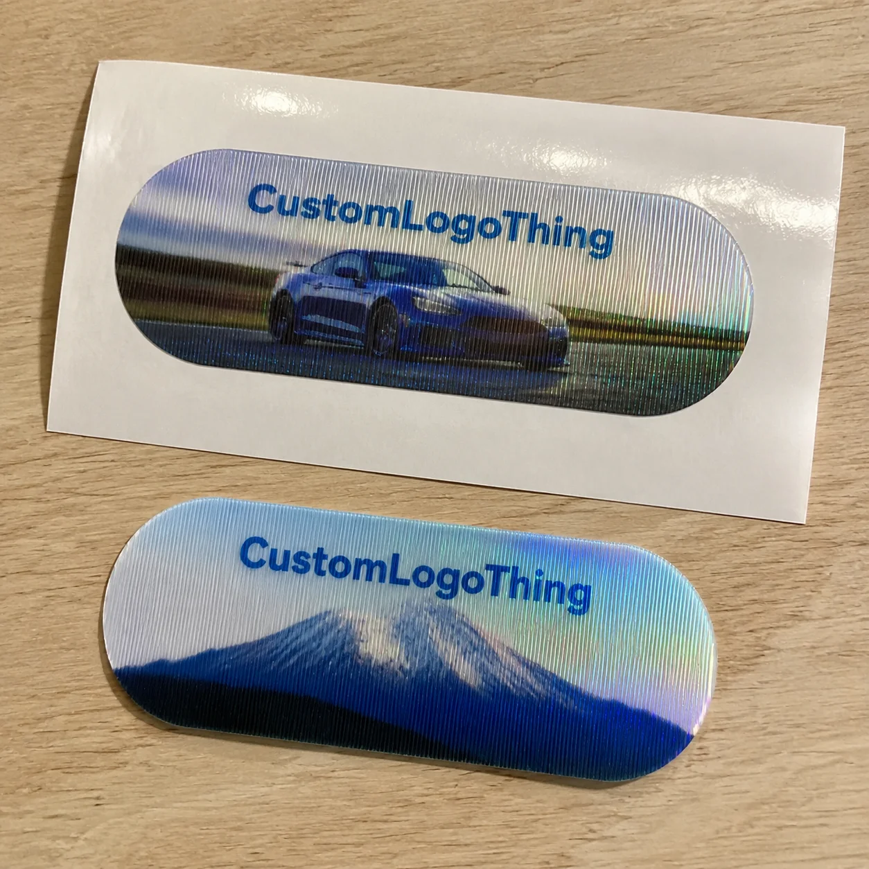
A lenticular sticker is made by printing interlaced artwork behind a ribbed plastic lens. Those ribs, called lenticules, control which part of the image the viewer sees from different angles. The result can be a two-image flip, short motion sequence, 3D depth effect, zoom, or morph. Fancy word, simple outcome: the image changes.
Flat stickers depend on ink, stock, adhesive, and finish. Holographic stickers use reflective films or foils to throw light around. Lenticular stickers rely on optical alignment. The print, lens, adhesive, die cut, and viewing angle all have to cooperate. If one part is sloppy, the sticker does not look premium. It looks like a cereal-box prize that lost confidence.
Best-fit uses include brand launches, limited-edition packaging, collectibles, kids’ products, entertainment promos, product authentication, retail packaging, event badges, and premium unboxing inserts. They can also pair well with Custom Labels & Tags when the goal is shelf attention rather than quiet elegance.
Set expectations early. Lenticular is not the cheapest sticker format, and it is not ideal for every design. Small text, subtle gradients, delicate line art, and overly busy layouts get punished quickly. The lens does not care about your brand guidelines. It cares about angle, contrast, pitch, and alignment. Annoying, but fair.
The practical goal is not “make it move.” The goal is to create a visual change customers notice in one tilt. That means choosing the right effect, simplifying the artwork, leaving safe space, and checking the actual physical result before committing to a large run.
How the Lenticular Effect Works Without the Jargon Soup
The basic mechanism is straightforward. Multiple images are sliced into narrow strips, arranged in a repeating sequence, printed behind a lenticular lens, and viewed through tiny ridges that direct each eye position to a different strip. Tilt the sticker, and a different strip becomes visible.
That ribbed plastic surface is not decorative texture. Each ridge acts like a tiny lens. It bends light so the viewer sees one part of the printed image from one angle and another part from a different angle. That is how a logo can flip into a message, a character can wave, or a product image can appear to have depth.
- Two-frame flip: Best for before-and-after visuals, logo-to-message reveals, limited-edition badges, or simple product transformations.
- Multi-frame animation: Useful for movement, though each extra frame reduces the visual space available for each image.
- 3D depth: Works by separating artwork into foreground, middle, and background layers.
- Zoom: Creates an impact effect, often strong for icons, badges, or product features.
- Morph: Changes one image into another, but needs clean structure to avoid visual mush.
Viewing angle matters more than most buyers expect. A sticker meant to be held in the hand can use a different setup than one stuck to a shelf display, bottle, mailer, or retail card. Distance changes the recommendation too. A small handout sticker viewed from 8 inches away is a different animal than a label on product packaging viewed from 3 feet away.
Lens pitch controls how many lenticules sit in a given inch or centimeter. Higher pitch can support smaller details, but it is usually less forgiving during print and alignment. Lower pitch can create bold effects, but it often needs larger artwork areas. Buyers do not need to become engineers. They do need to understand that pitch is a production spec, not a decoration.
Orientation matters as well. Vertical lens lines usually suit left-to-right flips or animations. Horizontal lens lines may work better for up-and-down viewing. Use the wrong orientation, and the effect can feel weak or awkward even if the artwork itself is decent.
Production reality: The printer, lens sheet, adhesive layer, die cut, and artwork file all have to line up. If one piece is off, the result looks muddy, jittery, or cheap. Amazing how physics refuses to accept vibes as a production method.
Key Design Specs That Make or Break the Final Sticker
Lenticular rewards decisive design. Bold shapes, clear focal points, strong contrast, and simple compositions usually outperform delicate detail. If your artwork needs a microscope and emotional support to be understood, simplify it.
Image count is one of the first tradeoffs. A two-image flip is cleaner and stronger because each image gets more visual room. A 4-frame or 6-frame animation can create motion, but sharpness and clarity drop as more frames compete for the same lens space. For small custom lenticular stickers under about 2 inches wide, a clean two-frame flip is often safer than a complicated animation.
Avoid tiny text, thin lines, low-contrast color shifts, and critical logos near the sticker edge. These are the usual crime scenes when a lenticular job goes sideways. Text can ghost. Thin strokes can buzz. Low-contrast changes can disappear. Edge elements can get clipped or distorted by cutting tolerance.
Size gives the effect room to breathe. A 3-inch by 3-inch sticker can carry a flip, simple animation, or layered 3D effect more comfortably than a 1-inch badge. Very small lenticular pieces can work, but the artwork needs to be brutally simple: one icon, one word, one clean transformation.
Shape decisions affect risk. Circles, rectangles, squares, rounded corners, and simple die cuts are safer. Complex custom shapes may be possible, but lens alignment and cutting tolerance become more demanding. If the die line slices close to a face, logo, QR code, or tiny message, expect trouble. The blade is not your design intern.
File setup deserves respect. Layered source files are helpful, especially for depth, motion, or morph effects. Final production usually requires interlaced artwork prepared to match the exact lens stock, pitch, and print setup. A regular PDF may be fine for quoting or review. It is not automatically production-ready.
Color choices should be direct. Bright colors and strong contrast usually perform better behind a lens. Subtle tonal changes, soft shadows, and quiet gradients may look elegant on a flat label but vanish in a lenticular construction. If package branding depends on ultra-muted colors, test before committing to thousands of pieces.
Adhesive and backing format are practical decisions, not afterthoughts. Permanent adhesive makes sense for product labels, merch, and applied packaging. Removable adhesive works better for temporary promos, event stickers, or short-term retail displays. Stickers can be sheeted, kiss-cut, individually cut, or packed into kits depending on distribution. If they are going into Custom Packaging Products such as mailer boxes or launch kits, decide early whether the sticker is applied to the packaging or inserted loose.
Proofing is where buyers should slow down. A digital proof checks size, layout, copy, color intent, and die line. A physical proof checks the actual lenticular effect: flip strength, motion, depth, clarity, ghosting, and viewing angle. Those are not the same thing. Anyone pretending otherwise is selling optimism.
Cost, Pricing, and MOQ Factors Buyers Should Expect
Custom lenticular stickers cost more than standard paper or vinyl stickers because they use specialty lens material, interlaced prepress, tighter registration, and more controlled finishing. There is more setup. There is more waste. There is less room for “just print it and see.”
The main pricing drivers are sticker size, lens type, effect complexity, number of frames, order quantity, die-cut shape, adhesive type, proofing method, packing format, and shipping speed. A basic 2-frame flip on a simple rectangle is not priced like a 3D morph sticker with a Custom Die Cut, individual bagging, and a panic deadline.
| Order Scenario | Typical Best Use | Cost Behavior | Buyer Watchout |
|---|---|---|---|
| Small specialty run | Prototype, VIP kit, limited promo | Higher unit cost because setup is spread across fewer pieces | Ask if a sample or short-run option is available before full production |
| Mid-size promotional run | Events, merch drops, retail inserts | More efficient unit pricing once prepress and calibration are absorbed | Keep the shape and effect simple to protect the budget |
| Large retail or launch run | Product packaging, national promos, collectibles | Best unit economics, but higher total project exposure | Use a physical proof and build time for quality checks |
Manufacturers may set higher minimum order quantities for lenticular work than for basic stickers. That is normal. Lens stock, setup sheets, calibration, testing, and trimming waste are harder to avoid. Small runs pay for the privilege of being small. Shocking, I know.
Real pricing varies by supplier, country of production, material, and finishing. For planning, a low-volume specialty run can be several times the cost of a standard vinyl sticker of the same size. Mid-size runs often become more sensible once quantities pass into the low thousands. Large retail or event orders usually get the best unit economics because setup and prepress are spread over more pieces.
Hidden cost triggers add up fast: multiple artwork versions, rushed production, unusual registration demands, complex die cuts, special adhesive, sample rounds, individual bagging, barcode labeling, carton sorting, and expedited freight. If the stickers need to meet a packaging distribution standard or survive parcel handling, review broader packaging tests such as ISTA transport testing guidance for the full shipment, not just the sticker.
Ask for quotes with complete specs. “How much for stickers?” is not a quote request. It is a scavenger hunt. Provide size, quantity, effect type, number of artwork frames, adhesive, finish, backing format, delivery location, and deadline. If sustainability claims matter for the surrounding branded packaging, reference material standards early; for paper-based components, FSC certification may be relevant.
There are times to downgrade. If the sticker is tiny, the budget is tight, or the message can be delivered with foil, spot gloss, metallic stock, or holographic material, lenticular may not be the smartest spend. Spend money where the interaction actually changes customer behavior.
Process and Timeline From Artwork to Finished Stickers
A clean ordering process prevents expensive surprises. Start by defining the effect. Then choose size and shape, prepare artwork, confirm material and adhesive, review the proof, approve production, inspect finished stickers, and ship. Basic sequence. Still ignored constantly.
- Define the visual effect: Flip, motion, depth, zoom, or morph.
- Confirm use case: Handout, applied label, retail display, insert, or collectible.
- Select size and shape: Keep cutting tolerance and lens direction in mind.
- Prepare artwork: Provide layered files when possible.
- Review proof: Check layout digitally and effect physically for important orders.
- Approve production: Confirm quantity, packing, address, and deadline.
The artwork review stage is where bad ideas should be caught. The manufacturer checks whether the desired effect is practical for the chosen size, lens, and viewing angle. If a buyer wants a tiny 1-inch sticker with 6-frame animation, legal copy, a QR code, and a dramatic 3D product shot, someone needs to say no before thousands of pieces exist.
Interlacing and prepress are technical. The artwork has to be converted for the exact lens pitch and print setup. The process is not the same as dropping two images into a template. Registration, angle, print resolution, color density, and trim placement all matter. Do not rush this step with someone who discovered Photoshop yesterday.
Digital proofing is faster and useful for layout approval. It can confirm copy, size, die line, rough image sequence, and general composition. A physical sample adds time but gives confidence in motion, depth, clarity, ghosting, and viewing angle. For cheap giveaways, digital proofing may be enough. For retail packaging, premium merch, or a major launch, physical sampling is the adult choice.
Typical timing depends on artwork readiness, sampling, material availability, quantity, die cutting, finishing, quality control, and shipping method. A straightforward order with approved artwork may move faster than a complex 3D depth job that needs asset cleanup and sample revisions. International freight, holidays, and customs can also add time. Because of course the calendar joins the meeting last.
Rush orders carry risk. Compressing the schedule reduces review time and increases the chance of weak effects, alignment issues, missed copy errors, or finish problems. If your launch date, trade show, retail reset, or influencer kit drop is fixed, build buffer time before production. Calendars do not care that marketing approved late.
Quality control should include more than a quick glance at the top sheet. Check the flip or motion from the intended viewing angle, not just straight on. Look for ghosting, muddy transitions, scratched lenses, adhesive lift, edge cracks, poor trimming, color shifts, and inconsistent effect strength across the batch. If the stickers will be applied to packaging, test them on the actual surface. Coated paperboard, textured stock, rigid boxes, glass, plastic, and flexible pouches do not behave the same way.
Good suppliers use clear checkpoints: quote approval, artwork approval, proof approval, production start, estimated completion date, quality control, and shipment tracking. If a supplier cannot explain those checkpoints, ask harder questions before paying.
Common Mistakes That Make Lenticular Stickers Look Cheap
The biggest mistake is trying to cram too much into one sticker. Lenticular effects need visual clarity. Five messages, three logos, tiny copy, and a QR code are not a strategy. They are a cry for help.
Poor effect choice is another common problem. A two-frame flip may be perfect for a simple reveal: standard logo to limited-edition badge, closed box to open box, plain product to decorated product. A multi-frame animation may fail if the artwork has too many details or the sticker is too small. Motion is only impressive if the viewer can understand it instantly.
Bad contrast weakens the entire piece. If the two images are too similar, the flip feels soft. If depth layers are not separated clearly, the 3D effect gets muddy. If the brand palette uses five shades of beige, the lens will not magically create drama. Packaging design still needs hierarchy.
Unreadable text is a predictable failure. Small type can blur, shift, ghost, or break under the lens. Keep text large, short, and non-critical where possible. A bold “Limited Drop” works better than a 34-word sustainability paragraph. Put detailed claims elsewhere on the product packaging or insert card.
Viewing environment also gets ignored. A sticker on handheld merch, a bottle label, a shelf card, and a Custom Printed Box may be viewed from different distances and angles. The same lenticular setup may not perform equally across all of them. Decide whether the customer is tilting the piece by hand or walking past it on a shelf.
Edge and bleed problems are another classic. Important design elements near the edge can be compromised by cutting tolerance or lens alignment. Keep logos, faces, product names, and readable text safely inside the trim. A common safe-zone target is at least 1/8 inch, though the exact number depends on the supplier’s die-cutting tolerance and sticker size.
Skipping samples is the expensive mistake. For low-stakes giveaways, a digital proof may be acceptable. For premium merch, collectible packaging, or retail programs, skipping a physical sample is gambling with extra steps. Custom lenticular stickers have a distinct look: dynamic, attention-grabbing, and slightly dimensional. Evaluate them for impact, not just static sharpness.
Next Steps Before You Request a Quote
Before contacting a supplier, gather six details: sticker size, shape, quantity, intended use, desired effect, and deadline. Those details let the supplier recommend a practical lens, proofing path, adhesive, and production format. Without them, everyone wastes time guessing. Very glamorous.
Choose one primary visual goal. Flip from logo to message. Animate a mascot. Show depth in a product image. Reveal a limited-edition badge. One strong idea beats four half-working tricks. Lenticular printing can do a lot, but it performs best when the concept is simple enough to read in one tilt.
Prepare artwork assets in layers whenever possible. For 3D depth, separate foreground, middle, and background elements. For animation, provide the frame sequence or source artwork. For a flip, provide two clean images that are visually different enough to separate. If all you have is a flat PNG, a supplier may still help, but options are more limited and prepress time may increase.
Decide how the sticker will be distributed. Rolls may suit machine or hand application, depending on construction. Sheets work well for giveaways and organized packing. Individually cut stickers feel more premium for merch, kits, and inserts. If stickers are applied to product packaging, confirm adhesive, surface material, application pressure, and storage conditions before production.
Ask specific supplier questions:
- What lenticular effect do you recommend for this size?
- Is a physical proof available before full production?
- What is the MOQ for this lens and construction?
- What affects lead time on this order?
- Can you advise on artwork changes before interlacing?
- What tolerance should we use for safe zone, bleed, and die line?
Use this quote checklist: size, quantity, lens effect, artwork files, adhesive, finish, backing format, delivery date, ship-to location, and sample requirements. Add whether the sticker is for branded packaging, a loose handout, a retail label, or an insert. That context changes the recommendation.
Custom lenticular stickers work best when the buyer treats them like a designed interaction, not just a shiny sticker upgrade. Nail the effect, simplify the art, confirm the timeline, and quote with complete specs. That is how you get the visual punch without paying for preventable production drama.
FAQ
Are custom lenticular stickers waterproof?
They can be water-resistant or waterproof depending on the lens material, adhesive, backing, and finishing method. For bottles, outdoor use, coolers, or wet retail environments, specify moisture exposure upfront so the supplier can recommend the right construction. Do not assume every lenticular sticker is outdoor-rated just because it has a plastic lens.
What artwork works best for lenticular sticker printing?
Bold artwork with high contrast, clear focal points, and limited text usually works best. Two-frame flips need two images that are visually different enough to read instantly. 3D effects work better when artwork can be separated into foreground, middle, and background layers.
How much do custom motion stickers usually cost?
Pricing depends on size, quantity, effect type, lens material, shape, adhesive, proofing, and shipping speed. Small runs usually have higher unit costs because setup and prepress are spread across fewer pieces. The fastest way to get accurate pricing is to provide size, quantity, artwork concept, desired effect, and deadline in the first quote request.
What is the minimum order quantity for lenticular labels or stickers?
MOQ varies by manufacturer, lens stock, sticker size, and production method. Lenticular projects often have higher minimums than basic paper or vinyl stickers because setup and material waste are more involved. If you need a small test run, ask whether a sample, prototype, or short-run option is available before committing to full production.
How long does lenticular sticker production take?
Timeline depends on artwork readiness, proofing, sampling, material availability, quantity, cutting, finishing, and shipping. A physical proof adds time but is smart for retail packaging, premium merch, or any order where the visual effect is critical. For event or launch deadlines, build in buffer time instead of treating rush production like a personality trait.


