A custom nutella label has a narrow window to succeed. It has to look premium on a glossy glass jar, stay attached through shipping and handling, and still read clearly after fingerprints, condensation, and cart abrasion. If the build is wrong, the package can fail even when the artwork is strong.
That risk is higher with rich spreads because the product, container, and environment all work against the label. Oil residue, chilled storage, and temperature swings can weaken adhesion. A jar label is not just decoration; it is a material choice, an adhesive decision, and an application problem.
Buyers usually discover that the mockup was the easy part. The real job is matching the label to the jar dimensions, storage conditions, and production method. When those specs are not aligned, the package stops behaving like branding and starts generating complaints.
For brands building branded packaging, the label is often the first physical touchpoint. That makes the substrate, finish, and cutline more important than most teams expect. A glossy curved jar does not hide weak specs.
Why a custom nutella label fails on rich spreads
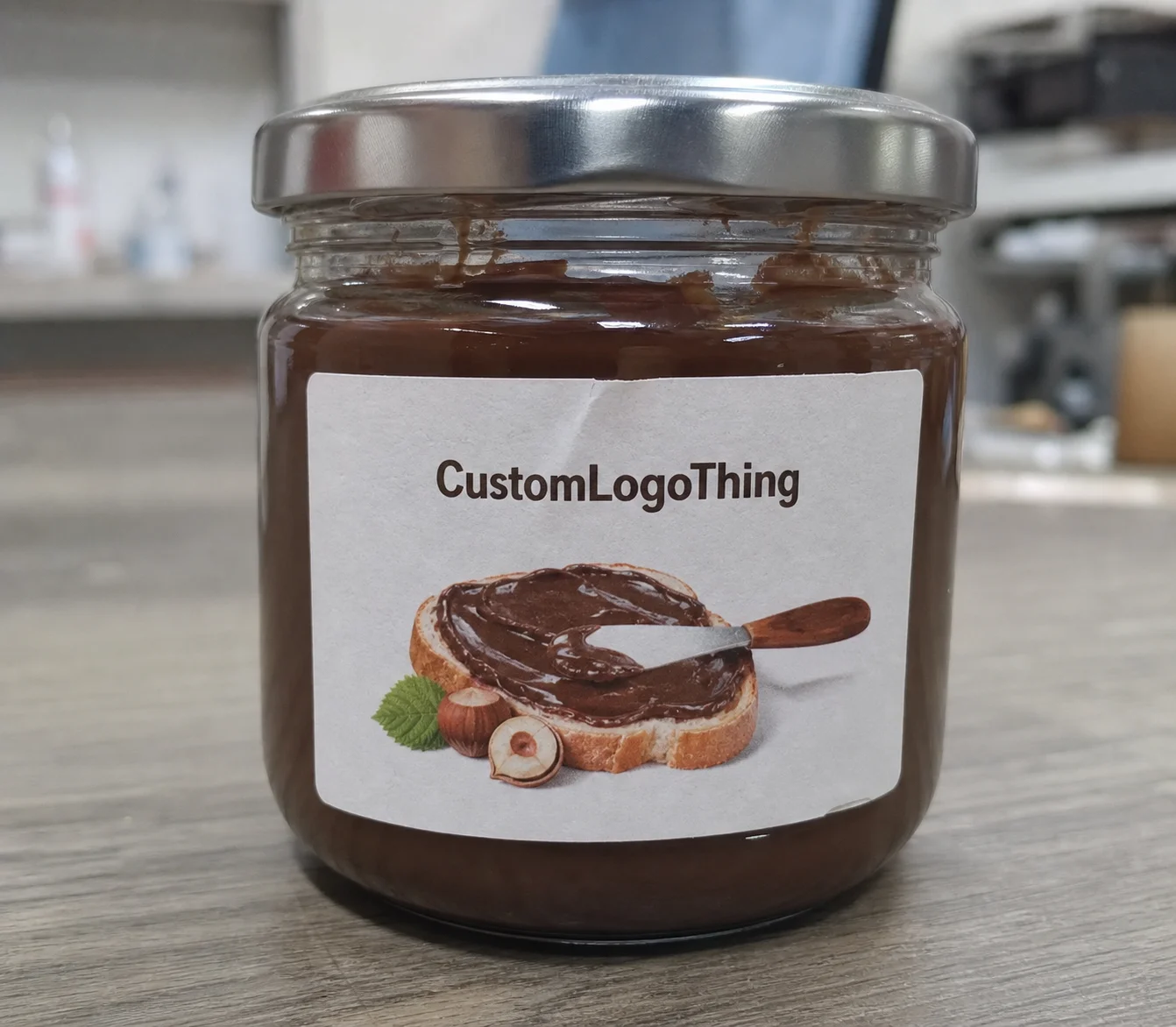
Spread jars are difficult because they combine a slick product with a slick surface. Filling residue, moisture, and normal handling can all reduce bond strength. A custom nutella label may pass proofing and still start lifting after a few shipping cycles.
Most failures are not design failures first. They are substrate, adhesive, or application failures. Even a light film on the glass can interfere with bonding. If labels are applied in a cool room and later exposed to warmer conditions, condensation can make the problem worse.
Once the edge lifts, dust gets in, the label curls, and the package looks old before it reaches shelf. The brand then pays twice: once for printing and again for the damaged impression.
That is why this kind of label should be treated as part of the product system, not as a last-minute graphic layer. In a crowded spread category, the jar either reads as deliberate or generic. There is little middle ground.
What the label must accomplish
A jar label has four jobs at once: attract attention, communicate the product, fit legal copy, and survive use. If one of those fails, the whole package feels weaker. The best labels usually rely on discipline, not decoration.
At shelf distance, contrast matters more than effects. Small type, thin strokes, and low-contrast color palettes can disappear on curved glass, especially under retail lighting. A strong front panel usually starts with the brand name, then the product type, then one or two claims that help the shopper decide.
Geometry matters just as much. A wraparound label that looks balanced on a flat proof can pinch at the seam, crowd the shoulder, or distort around the curve. The dieline has to be built from the real jar diameter and panel height, not from a generic template. If the jar has embossing or taper, that must be accounted for too.
There is also a trust factor. Buyers judge the product by the label before they read ingredients. A clean package suggests care. A sloppy one suggests shortcuts.
“The label did not fail because the artwork was weak. It failed because the jar spec was never translated into the design.”
For line extensions, the label should support the broader identity of the product range. Typography, finish, and copy tone need to sit comfortably with the jar, lid, and any outer packaging. A label that feels detached from the system makes the whole product look less finished.
Material, adhesive, and finish choices
Paper labels still work for dry storage and low-handling runs, but they are less forgiving on glossy food jars. Once humidity, refrigeration, or rough distribution enters the picture, film usually performs better.
Polypropylene or a similar film stock is often the safer choice for a custom nutella label. It resists moisture, scuffs less easily, and tolerates minor movement better than basic paper. It is not invincible; it is simply more realistic for Food Packaging That will be touched, shipped, and displayed.
Adhesive choice matters just as much. Permanent adhesive is the usual choice for retail jars because it stays put through storage and transport. Removable adhesive can work for short-term promotions, but it becomes risky when humidity or refrigeration are involved. If the label needs freezer performance or heavy condensation resistance, that is a separate spec decision.
Finish changes both appearance and wear. Gloss makes color feel brighter. Matte cuts glare and feels more restrained. Soft-touch gives a richer tactile feel, but it is not always the best choice if abrasion is likely. A laminate adds protection and is often worth it on a jar that will be handled often.
| Material option | Best use | Typical strengths | Indicative unit cost at 5,000 |
|---|---|---|---|
| Paper stock | Dry storage, short promotional runs | Lower cost, familiar print feel | $0.08-$0.16 |
| Polypropylene film | Glass jars, retail packaging, damp handling | Moisture resistance, better durability | $0.12-$0.24 |
| Film with laminate | Higher-end package branding | Scuff resistance, stronger shelf presentation | $0.16-$0.30 |
| Specialty finish | Premium launches, gift sets, seasonal SKUs | Higher perceived value, distinct texture | $0.20-$0.40+ |
If sustainability messaging matters, paper sourced through FSC certification standards can support that story without overcomplicating the pack. If the product will face vibration, drop risk, or parcel handling, it is worth checking the packaging against ISTA packaging test methods. Those tests expose weak specs faster than a design review.
The label also has to match the application method. Hand application is more forgiving than automation, but it introduces alignment variation. If the liner release is poor or the label is too stiff for the jar curve, application time rises and waste follows. Good specs save labor as well as aesthetics.
Production process and turnaround
The cleanest label orders follow a predictable sequence: jar measurements, dieline setup, artwork placement, proofing, approval, print, cutting, packing, and shipment. Most delays happen when the jar dimensions are still changing after art is nearly finished.
The container should be finalized before production starts. A few millimeters can change wrap length, seam placement, bleed, and barcode clearance. What looks balanced on screen can become awkward once it wraps a real jar, especially if the container has a taper or shoulder.
Turnaround depends on file readiness and construction complexity. A straightforward digital run can often move through proof approval and production in roughly 8 to 12 business days. Custom shapes, specialty films, and physical samples can push that to 12 to 15 business days or more. Shipping sits on top of production, and rush work usually costs more.
The fastest jobs are the ones with exact measurements, print-ready art, a signed proof, and a clear quantity target. Buyers who treat the label as part of a broader product packaging workflow usually get a cleaner result than buyers who send files and hope the rest sorts itself out.
Quality control should happen before the order is complete, not after the pallet is moving. Check the proof against the actual jar. Confirm seam location. Verify barcode clearance. If possible, request a sample on the real container. A flat proof can hide issues that become obvious once the label wraps around glass.
Also confirm the operating environment. A label for room-temperature shelf display is not the same as one for a chilled case or refrigerated back room. Moisture and cold change adhesive behavior, and that is expensive to fix after launch.
Cost, pricing, and MOQ realities
Price is usually driven by five variables: material, finish, quantity, print method, and shape complexity. A basic rectangular paper label with standard adhesive will cost less than a die-cut film label with laminate and specialty treatment. Comparing quotes without matching those specs creates false savings.
MOQ changes the math quickly. Setup work, proofing, and cutting are spread across every unit, so short runs carry a higher per-label price. A 500-piece order may look small on the total invoice, but the unit cost can be two or three times higher than a larger run because the fixed work is still there.
That is why the lowest quote is not always the best value. A label that wrinkles during application, lifts in humid storage, or needs reprinting because the finish was wrong ends up costing more than the better-spec option. Cheap failures are often annoying rather than dramatic, but they still cost money.
As a planning range, a small custom run may land around $0.35-$0.80 per unit, while larger quantities can drop lower depending on coverage and finish. Premium film, specialty adhesive, and unusual shapes can push that number up. Treat those figures as a starting point, not a promise.
If you are sourcing more than one component, keep the quote structure consistent. For example, if you are also buying Custom Labels & Tags for cartons or inserts, use the same assumptions when comparing prices. Otherwise, the spreadsheet starts lying by omission.
There is also a hidden cost in poor planning: application waste. If the labels are miscut, too tight on the wrap, or hard to align by hand, production slows down. Labor can matter as much as print cost on short runs.
Common mistakes on food jar labels
The first mistake is sizing by eye. A label that looks balanced on a screen can wrap badly on a jar. The second is ignoring readability at distance. Tiny type and low contrast disappear fast in a retail aisle, especially on a small front panel.
Another common problem is leaving compliance details too late. Ingredient space, net weight, barcode clearance, and legal copy all need room. If those items are added at the end, the design gets crowded and the strongest part of the label shrinks first. That is the wrong tradeoff.
Overdesign causes trouble too. Too many colors, too many claims, and too many finishes make the package feel busy. A spread jar usually works better with one clear focal point and a small set of supporting claims.
Teams also make mistakes when they approve the label before confirming fill level. A jar that looks half full in a mockup may read very differently once it is filled to spec. The design can be technically correct and still feel off because the product inside changes the visual balance.
The deeper mistake is confusing graphic design with packaging design. They overlap, but they are not the same thing. A nice layout does not automatically become a good retail package. Packaging has to work under lighting, on a machine, through shipping, and in the customer’s hand.
Expert tips for a cleaner order
Request a sample or proof on the exact jar before you commit to the full run. Flat artwork hides curvature problems, and curvature is where many label projects go sideways. Seam placement and panel height are hard to judge on a screen.
Build a one-page spec sheet before you ask for pricing. Include jar measurements, label dimensions, finish preference, adhesive preference, quantity, and storage conditions. If the product will be refrigerated or exposed to humidity, say so. That one page cuts down on back-and-forth and reduces the chance of the wrong construction being quoted.
Test the label under the conditions it will actually face. If the jars will be chilled, chill them. If they will move through parcel networks, inspect them after vibration and drop testing. If the labels will be applied by hand, time the application and watch for edge catch, liner drag, or crooked placement.
Keep the design system flexible. One core layout can support several flavors or variants if the copy and accent color change without rebuilding the whole label. That keeps the range coherent and reduces rework when the product line expands.
Next steps before you request a quote
Gather the details that affect the result: jar measurements, artwork files, quantity target, finish choice, and any moisture or temperature requirements. If the label needs to match a broader line of Custom Printed Boxes, share those specs too so the shelf presentation stays consistent across the set.
Compare two or three quotes on identical specs, not similar specs. That is the only way to see whether one supplier is pricing the same job or quietly swapping in a different material or adhesive. The sticker price alone tells you very little if the construction changes underneath it.
Check the proof against the actual jar, not just a screen preview. Wrap length, seam position, and curvature are easy to miss in flat artwork. If a supplier can provide a physical sample, use it. If not, inspect the dieline with the container in hand and measure twice before approval.
The practical sequence is simple: finalize the artwork, confirm the container, approve the proof, then run a small test order before scaling up. For a custom nutella label, that process protects the budget and the shelf presentation at the same time.
FAQ
What size should a custom Nutella label be for a standard jar?
Measure the jar diameter and label panel height first, because jars that look standard often vary by a few millimeters. Leave room for seam overlap, curvature, and any legal text that must stay readable. Ask for a dieline proof before printing so the label matches the actual container.
Which material works best for a custom Nutella label on glass jars?
A durable film label usually performs better than basic paper when humidity, refrigeration, or shipping are factors. Choose the adhesive based on storage conditions, especially if the jar may see condensation. A laminate or protective finish can improve scuff resistance and help the print stay premium longer.
How long does a custom hazelnut spread label order usually take?
Timing depends on proof approval, material availability, quantity, and whether the artwork is print-ready. Faster orders move quickest when measurements and files are finalized before quoting. Any change after approval can add time, especially if the shape or finish changes.
What affects the unit cost of a custom Nutella label the most?
Quantity is the biggest lever because setup costs are spread across more labels. Special finishes, specialty adhesives, and custom shapes raise the price relative to a standard flat label. Short runs often cost more per unit even when the total spend looks smaller.
Can I use one label design for different jar sizes?
Only if the dieline is adjusted for each container, because the wrap length and panel height change with size. A flexible design system can keep branding consistent while the actual label dimensions are customized. Test each version on the real jar before approving production.

