Custom Spice Labels: Materials, Costs, and Ordering
custom spice labels do more than identify a jar. They decide whether a blend looks deliberate, whether the ingredients feel trustworthy, and whether a shopper can find the same product again after it disappears into a pantry cabinet. On a shelf, or in a product photo, the label is doing most of the talking before the lid ever comes off.
That matters because spice packaging lives in a small format with very little room for error. A seasoning jar has to carry brand identity, product name, net weight, ingredients, and often storage or compliance copy. Put too much emphasis on decoration and the label becomes hard to read. Strip it down too far and the line starts to look generic. The useful middle ground is a label system that is clear first and attractive second, without sacrificing either.
For buyers, the decision usually comes down to material, finish, size, cost, and production timing. Those choices affect how the labels look on day one and how they hold up after a month of kitchen use. The cheapest quote can be the most expensive outcome if the labels scuff, peel, or force a reprint after launch.
Custom spice labels: the smallest change that makes a jar sell
Most people do not study a spice jar. They glance at it. They compare it with the next jar over. They grab the one that looks easiest to trust. That is why custom spice labels carry more weight than their size suggests. On a small container, a label has to perform the work of packaging design, merchandising, and compliance copy all at once.
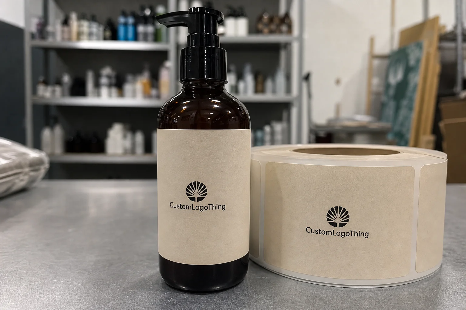
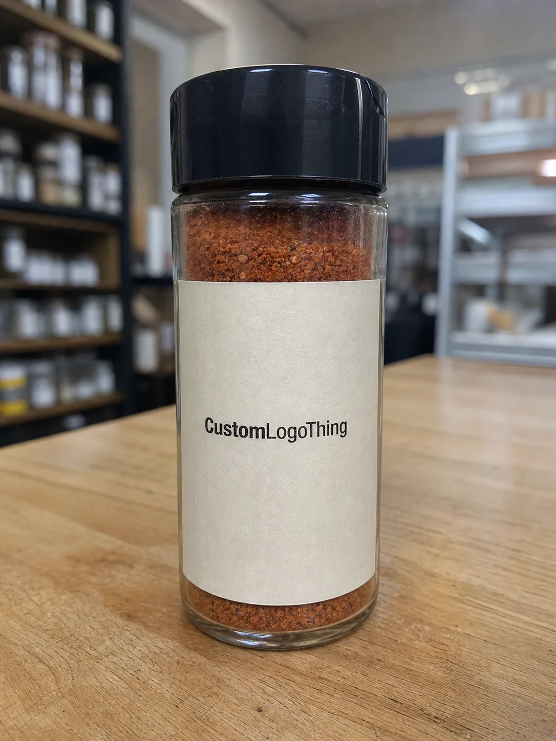
In practical terms, these are printed adhesive labels applied to glass jars, plastic spice containers, tins, sample packs, and occasionally resealable pouches. They identify the product, carry the brand, and provide required details such as ingredients or net weight. They also shape how the line feels in the hand. A clean, well-proportioned label makes a seasoning look finished instead of repackaged.
The same logic applies in ecommerce. On a screen, the label has to read in a thumbnail before it ever reads in detail. If a customer can spot cumin, paprika, or cinnamon without zooming in, the packaging is doing useful work. On shelves, clear label hierarchy improves scan speed and makes the brand line easier to browse. That is not decorative polish. It is a functional advantage.
Most label projects start with a handful of practical questions:
- Will the jar sit in a dry pantry or near steam, oil, or frequent wiping?
- Does the design need a matte, gloss, or premium tactile finish?
- Is the layout front-only, wraparound, or split across front and back?
- Will labels be applied by hand or with equipment?
- How much visual consistency is needed across the full spice range?
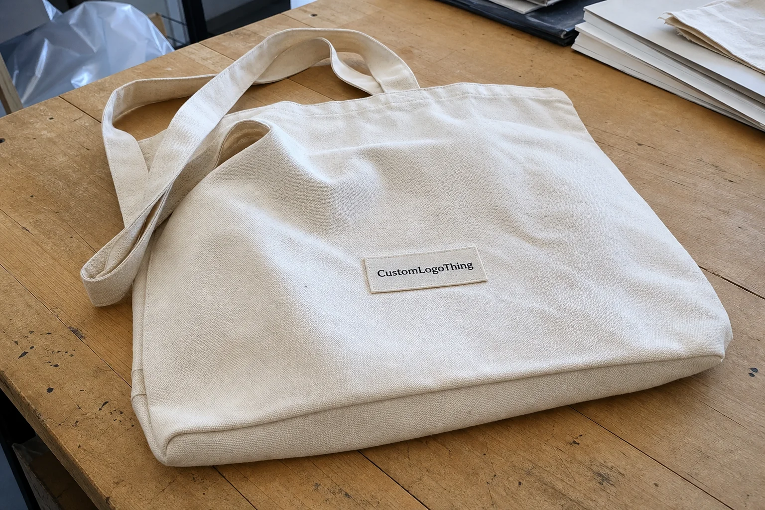
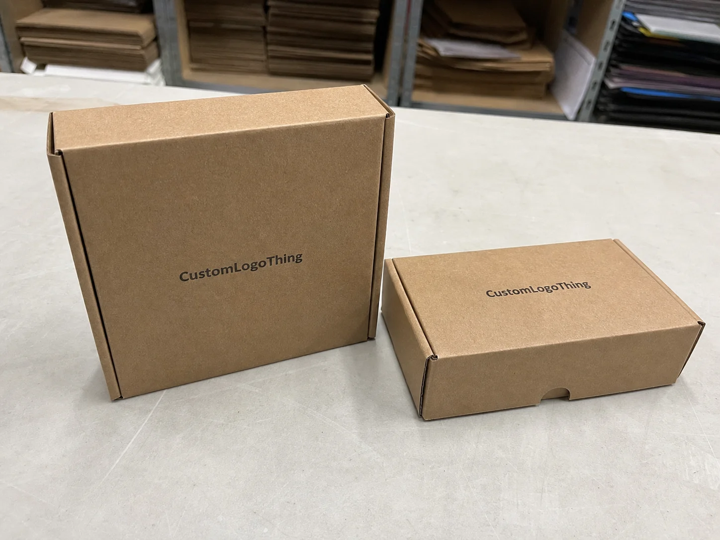
Standardizing a label system across SKUs usually produces the best result. That does not mean every flavor needs identical art. It means the brand can reuse the same core structure while swapping the product name, accent color, and mandatory copy. The line feels cohesive, and reorders are less painful. If you need adjacent packaging components, it can help to pair labels with Custom Labels & Tags or compare other Custom Packaging Products that match the same visual system.
How label materials, adhesive, and finish work
A label is not one thing. It is a combination of face stock, adhesive, and liner, and each layer has a job to do. If the stock looks great but the adhesive fails on a curved jar, the label still fails. If the adhesive holds but the finish smears under kitchen use, the product still looks compromised. Labels are small, but the tolerances are not forgiving.
Kitchen conditions are the real test. Spice jars get handled with oily fingers, wiped with damp cloths, stored near heat, and shifted around enough to scuff corners. That means the material has to match the environment instead of just looking good in a proof. A design that works in a studio mockup can break down quickly on a real shelf.
Common material choices:
- Paper: Best for dry storage, lower budgets, and short runs. It can look warm and natural, but it scuffs more easily and is less resistant to moisture.
- BOPP: A strong default for glass and plastic jars. It resists moisture and oil better than paper and usually performs well in kitchens, which is why it is a common choice for custom spice labels.
- Specialty stocks: Textured papers, metallic films, and other premium materials can improve shelf presence. They fit gift sets and high-end retail lines, but they add cost and often increase setup complexity.
Finish choices: Matte reduces glare and usually helps readability. Gloss intensifies color, but it can reflect light under store fixtures or in a kitchen with overhead lighting. Soft-touch can feel premium, though it is less common on food jars because buyers usually care more about durability and legibility than a velvety surface.
Adhesive selection deserves the same attention as artwork. A label that performs on a flat carton may lift on a curved jar shoulder. If the containers will be chilled, exposed to condensation, or handled often, ask for a permanent adhesive and verify it on the actual jar surface, not just on a sample sheet. That is one of the few places where testing on the real package saves money later.
If sustainability claims matter to the brand, ask whether the paper stock can be FSC-certified. The FSC provides a recognized standard for responsible sourcing. For broader packaging comparisons, the Packaging Association is a useful reference when you are weighing material performance, print expectations, and packaging design tradeoffs.
Size, shape, and information hierarchy that keep labels readable
Label sizing looks straightforward until the jar is in hand. A one-inch shift can change everything. Curves reduce usable space. Recessed shoulders complicate adhesion. Tall containers ask for a different layout than squat tins. The correct size is not just the biggest label that fits. It is the size that follows the container cleanly and leaves the copy readable.
The information hierarchy should be disciplined. The product name needs to be the first thing the eye finds. The brand should support it, not compete with it. Net weight, ingredients, and other required details come next. Optional copy, such as origin, heat level, or grind style, should stay subordinate unless it is central to the product story. When every element is given equal weight, the label becomes noisy and looks more expensive to make than it is to read.
A workable hierarchy usually looks like this:
- Product name in the largest type.
- Brand mark or logo in a supporting position.
- Net weight and ingredients in smaller but legible type.
- Secondary details such as origin, organic status, or flavor notes placed with restraint.
Typography matters more than many buyers expect. On a small jar, body copy often needs to stay above 6 pt, and in many real-world cases 7 to 8 pt is safer for anything that must be read quickly. Contrast matters just as much. Dark copy on a light field is still the most reliable choice for pantry readability. A decorative background can work, but only if it does not interfere with the text.
Placement also changes how finished the line feels. A front-only label is efficient and clean. A front plus neck label creates a more curated appearance. A lid label can help with top-down retail displays or drawer storage. A back label creates space for ingredients, sourcing notes, and regulatory text without crowding the front. The mistake is not choosing one format over another. The mistake is mixing formats without a consistent system.
Cost, pricing, and MOQ: what actually changes your quote
Label pricing is shaped by a handful of predictable variables: quantity, material, finish, shape, color count, and special requirements. Custom die-cuts, metallic inks, variable data, and extra proofing all add cost. So does anything that increases setup time or waste. The quote is not arbitrary. It usually reflects how much work the job requires before the first usable label comes off the press.
The part buyers sometimes underestimate is the relationship between fixed cost and quantity. Setup does not disappear just because the run is small. If you order fewer labels, the same setup is spread across fewer pieces, which pushes the unit price up. That is why a small order can look expensive per piece even when the total invoice is manageable.
MOQ means minimum order quantity. Lower MOQs are useful for testing a blend or launching a limited run, but they usually come with tradeoffs: fewer finishing options, higher per-label pricing, or a narrower material selection. If a vendor offers a very low minimum for a highly customized order, ask what was simplified. There is always a reason. Usually it is material choice, shape flexibility, or setup complexity.
| Label option | Typical use | Approx. unit cost at 5,000 pcs | Notes |
|---|---|---|---|
| Paper label | Dry pantry jars, lower-touch products | $0.08 to $0.14 | Lower cost, but weaker moisture and scuff resistance |
| BOPP label | Glass jars, plastic containers, kitchen use | $0.10 to $0.22 | Best balance of durability, print quality, and handling |
| Specialty stock | Gift sets, premium retail packaging, organic lines | $0.18 to $0.40 | Better shelf presence, usually more setup and finishing cost |
Small runs often land closer to $0.40 to $1.00 per label depending on size, stock, and whether the shape requires custom cutting. That range can feel high until you factor in setup, proofing, and waste allowance. It is not a markup trick. It is the cost structure of short-run print.
Hidden costs matter. Artwork cleanup, color corrections, proof revisions, shipping, and reprints caused by poor file prep all affect the real price. The lowest quote is not always the best value. The better question is which quote gets the job done cleanly with the fewest surprises.
Production process and turnaround from proof to delivery
Most label orders follow the same sequence: quote, file review, proof, approval, print, finishing, packing, and shipping. The details vary by vendor, but the order usually does not. If a supplier skips proofing or rushes file review, that is not efficiency. It is a delayed problem.
Artwork is the most common source of delay. Missing bleed, low-resolution graphics, color shifts between versions, and last-minute copy changes can all hold up production. New die shapes add another layer because tooling and setup have to be confirmed before the press starts. If the label needs a special adhesive or finish, availability can also move the timeline.
Typical turnaround for a repeat job is often 5 to 10 business days after proof approval. New custom work, specialty materials, or more complex die cuts often fall in the 10 to 15 business day range. Multiple SKUs extend the schedule because every file needs review. Rush work is possible in many shops, but it works best as a contingency, not a plan.
For food packaging, it helps to leave room for one correction cycle. A launch date is not the same thing as an order date. If the labels need to match filled jars, a photoshoot, a store reset, or a shipping window, build in extra time. Packaging schedules become brittle the closer they get to the deadline.
If the product will be packed, shipped, or handled heavily in distribution, ask whether the surrounding packaging has been tested under shipping and handling conditions such as ISTA methods. The label itself may not need formal transit testing, but the full package system should be evaluated as a unit. The label needs to survive the same abuse as the rest of the pack.
Step-by-step ordering guide for custom spice labels
The cleanest orders start with better input. A label project goes more smoothly when the buyer treats it like packaging development rather than a quick print request. The more complete the brief, the fewer surprises in proofing and production.
- Measure the jar first. Check diameter, labelable height, shoulder curve, and any recessed sections. A label that fits one container size may fail on another by only a few millimeters.
- Gather final copy. Product name, ingredients, net weight, brand name, and any required compliance details should be locked before layout starts.
- Choose the material and finish. Dry pantry storage can tolerate paper more easily. Handled, wiped, or humid conditions usually call for BOPP and a protective finish.
- Send print-ready artwork or ask for layout help. If the file is not finished, say so. Pretending a draft is final only slows the project down later.
- Review the proof carefully. Check spelling, line breaks, contrast, trim, barcode placement if needed, and how the design sits inside the die line.
- Test before scaling. A short run can expose adhesion issues, color drift, or application problems before you commit to a larger order.
The proof is the contract. If it looks cramped on screen, it will look cramped on press. Approving a layout that only works under ideal lighting is a bad bet.
If you are building a full line, create one master spec sheet and keep it current. Include jar dimensions, label placement, copy requirements, finish, quantity, and application method. That makes supplier comparisons easier and helps keep the branded packaging stable as the range expands. It also gives you a cleaner handoff if you later add matching retail packaging or custom printed boxes to the system.
Common mistakes that make spice jars look cheap or unreadable
The most common failures are not dramatic. They are boring, which is why they happen so often. The label is too small. The type is too tiny. The finish is too reflective. The layout is so dense that the eye has nowhere to rest. None of that sounds catastrophic in isolation. Together, it can make a premium spice blend look rushed.
Material mismatch is another recurring issue. Paper on a jar that gets wiped often will age badly. An adhesive that performs fine on a flat carton can lift on a curved bottle shoulder. A stock that does not like humidity will underperform in a kitchen, even if the product inside is perfectly dry. Labels have to survive where the product lives, not where the mockup was approved.
Weak hierarchy causes just as many problems. If the logo, product name, ingredient callout, and decorative elements all fight for attention, nothing wins. The label starts to feel expensive in the wrong way. You are not building a poster. You are building a readable package.
Watch for these problems:
- Overcrowded layouts on small jars.
- Low contrast between text and background.
- Gloss finishes that create glare under store lighting.
- Adhesives that fail on curved or chilled surfaces.
- Skipping sample checks and discovering the problem after a full run.
Skipping proof checks is costly because it creates two losses at once: time and inventory. A bad batch of labels can force a reprint and disrupt the launch schedule. That is especially painful if the labels have already been paired with filled jars, cartons, or a retail display that is supposed to hit the floor on a specific date.
Expert tips and next steps for a cleaner label order
If you want the order to land cleanly, test the label under real use conditions. Apply it to the jar. Wipe it. Hold it under bright light. Leave it near heat. If the line is meant for pantry storage, place the jars beside one another and check whether the set still reads as one family. A PDF preview cannot tell you that.
It also helps to keep one spec sheet per product line and update it after each reorder. Once the size, finish, adhesive, and copy structure are locked, future runs become easier to manage. You are not reinventing the job every time. You are maintaining a system.
For multi-flavor lines, keep the architecture stable and vary only what needs to change: product name, accent color, and required copy. That keeps the brand recognizable without turning every SKU into a clone. It is a simple way to strengthen package branding across the shelf while avoiding repeated redesign work.
Start with the container, not the artwork. Measure the jar. Decide where the label belongs. Gather final copy. Choose the material based on actual storage conditions. Request a proof. Compare pricing at two or three quantities. That sequence saves time, money, and correction cycles. It also gives your custom spice labels a better chance of looking intentional on the first run instead of after a reprint.
What material is best for custom spice labels on glass jars?
BOPP is usually the safest default because it handles moisture, oil, and regular handling better than paper. Paper can work for dry, low-touch pantry storage, but it is more likely to scuff or wrinkle. If the jars will be wiped often, choose a stronger adhesive and a finish that protects the print surface.
How much do custom spice labels cost per label?
Cost depends mostly on quantity, material, finish, and whether the shape needs custom cutting. Small runs usually cost more per label because setup is spread across fewer pieces. Ask for quotes at multiple quantities so you can see where the unit price drops enough to justify a larger order.
What size should spice jar labels be?
The right size depends on the jar diameter, the label location, and how much information has to fit. Small spice jars often use narrow front labels or compact wraparound layouts. Measure the readable area first, then leave enough margin so the label does not crowd the edges.
How long does production usually take for spice labels?
Simple repeat orders often ship in about 5 to 10 business days after proof approval. New custom jobs, specialty finishes, or die-cut shapes usually take longer. If you have a launch date, build in buffer time instead of relying on rush service to fix a late start.
Do I need a different label for each spice flavor?
Usually yes, because each flavor needs clear naming and often different ingredients or weight information. The efficient approach is to keep one template and swap only the product name, accent color, and required copy. That keeps the line organized without paying for a fresh design system for every SKU.