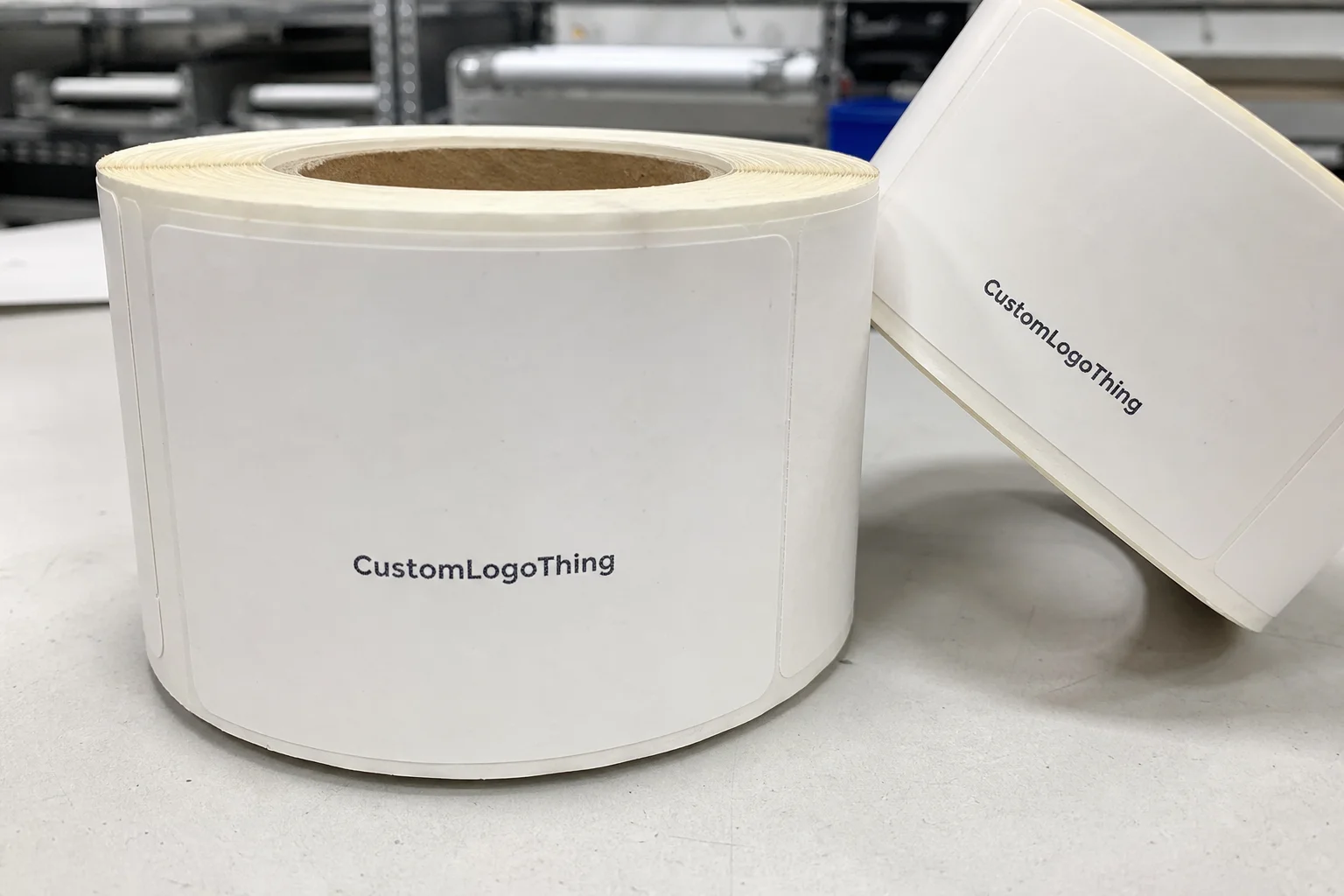
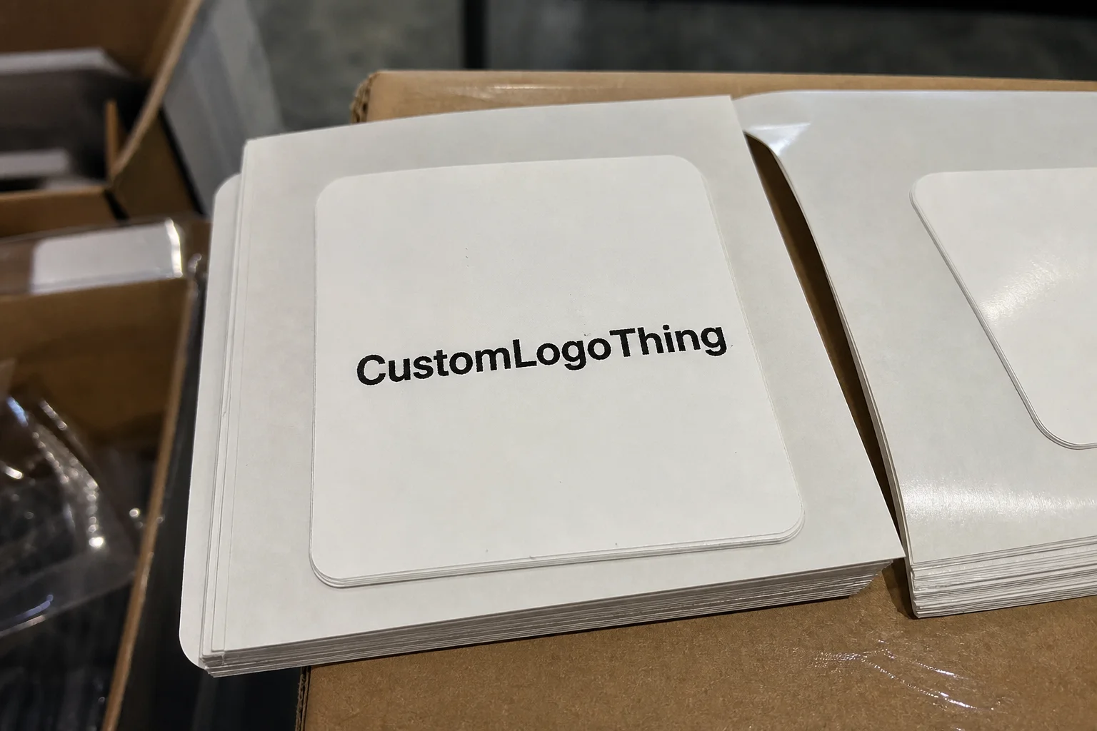
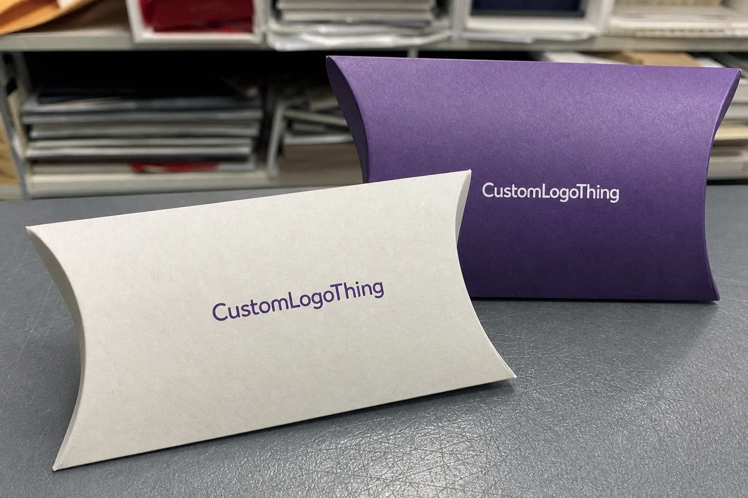
Custom square labels do a very specific job well: they give a brand a compact, balanced mark without asking for much space. On garments, accessories, and packaging inserts, that matters. A square shape reads cleanly, centers text and logos without visual drift, and can make a small brand cue feel intentional instead of squeezed in as an afterthought.
That is why the format shows up across premium basics, babywear, bags, caps, and small-batch apparel lines. The geometry is simple, but the effect is not. A square label can make a logo feel finished, especially if the artwork is short, the spacing is disciplined, and the edge treatment matches the product. It also works well alongside broader packaging design and package branding choices, particularly for brands that use coordinated hang tags, inserts, or carton graphics with Custom Labels & Tags and Custom Packaging Products.
Custom square labels: what they are and why they work
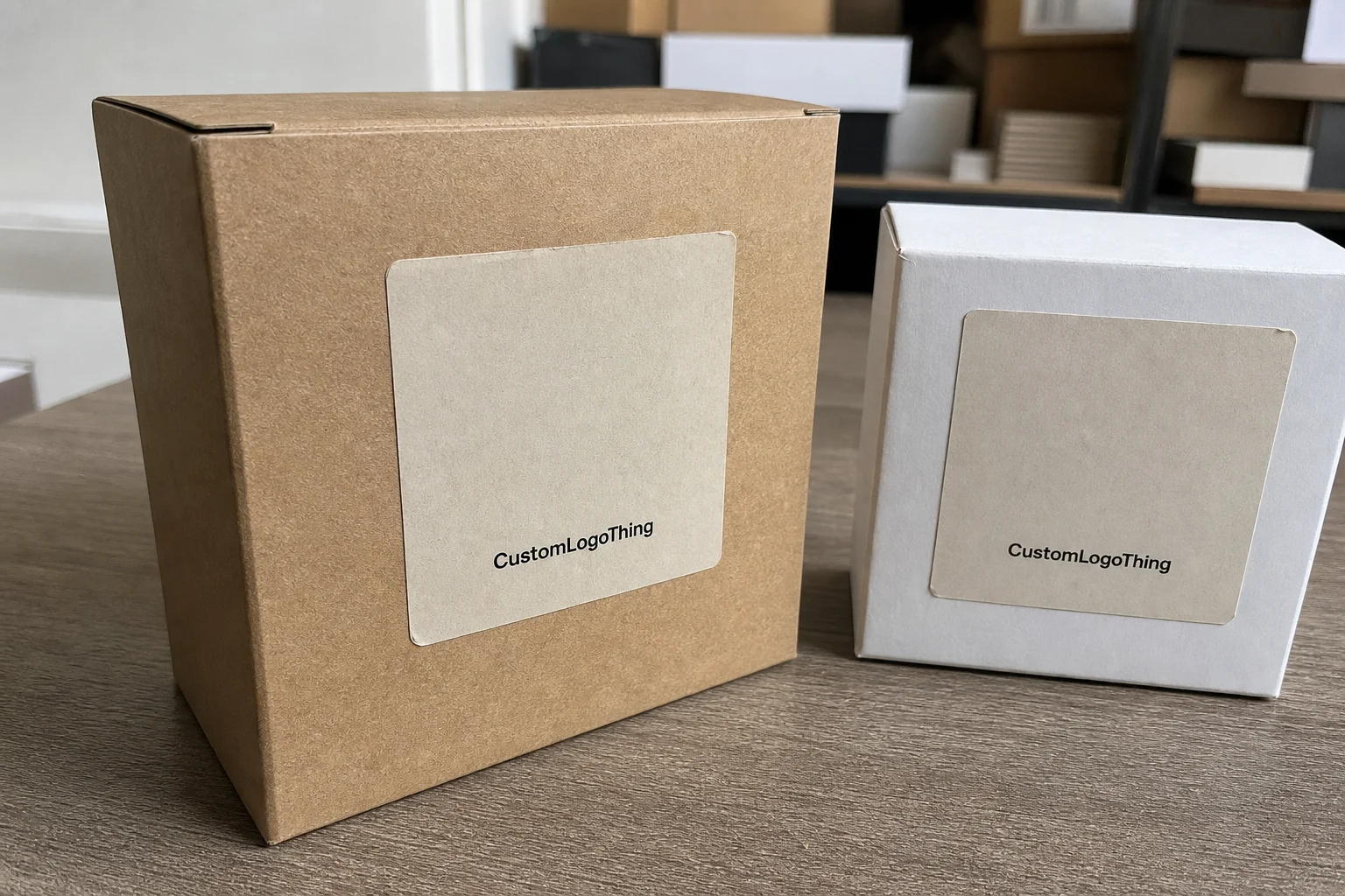
Square clothing labels are exactly what the name suggests: labels with equal sides, usually designed to hold a logo, brand name, size cue, short slogan, or a minimal graphic. The shape seems straightforward, but it changes how the artwork reads. Centered typography feels steady inside a square. A monogram feels anchored. A short brand mark can look more deliberate than it would on a long strip of material.
The format works best for compact artwork. Premium tees, sweatshirts, denim, tote bags, and accessories all benefit from labels that sit quietly and keep the visual language tight. A square can sit on a hem, seam, pocket, or interior panel without fighting the garment’s construction lines. That makes it a useful option for brands that want the label to support the product rather than dominate it.
There is also a perception advantage. A tidy square, with the logo properly sized and the border kept clean, often feels more expensive than the raw material cost would suggest. Buyers read precision as quality. That judgment happens fast, sometimes before the fabric is even touched. In retail settings, the label is one of the first physical proof points a customer sees, so the shape and finish matter as much as the artwork itself.
Square labels are especially effective for:
- Centered logos and monograms
- Short brand names with limited character count
- Minimal size or care references
- Geometric marks that need symmetry
- Products that need a clean, premium finish without extra decoration
A label does not need much surface area to work. It needs proportion, clean edges, and enough margin so the artwork still breathes after it is sewn, folded, or pressed.
That last part is where many first-time buyers run into trouble. A square gives less room to hide crowded type or oversized logos. If the artwork sits too close to the edge, the finished label can look clipped once it is attached. Small errors in spacing Stand Out Faster in a square than they do in a longer rectangular layout.
How the label is constructed and applied
Construction determines the feel, the durability, and how much detail the label can hold. For apparel, the common options are woven, printed, and heat-applied constructions. Each serves a different use case, and each behaves differently once it is attached to fabric and washed repeatedly.
Woven labels are the durable, traditional choice. They suit brand marks that need a textured look and strong wash resistance. They also handle repeated wear well, which matters for everyday apparel and products that will be laundered often. The trade-off is detail. Very fine lettering, thin lines, and tiny symbols can soften if the weave is too dense for the artwork.
Printed labels work better when color clarity and softer hand feel are the priorities. They are often used for garments where comfort matters, such as lightweight tees, baby items, or interior labels that sit against the skin. They can support more detail than a woven build in some cases, though the exact result depends on the print method and substrate.
Heat-transfer labels are useful for tagless applications and performance wear. They can create a cleaner interior finish and remove the bulk of a sewn-in tag. That said, they are more sensitive to press settings, fabric type, and application consistency. If the press temperature or dwell time drifts, the bond can suffer.
Application method affects the final appearance as much as the construction. A sew-in label is familiar and dependable, but it must be placed accurately so the square does not twist or buckle with the seam allowance. A fold-over label can hide raw edges and add structure. A heat-applied version can feel more modern, but only if the substrate and press process are controlled tightly.
Artwork setup deserves the same attention. Square layouts leave little room for imbalance, so centered elements, safe margins, and readable type are critical. A logo that looks fine on screen can feel crowded once it is reduced to finished size. Proofing is where those issues show up. It is not paperwork; it is the point where the label’s real behavior becomes visible.
Good proofing should check four things:
- Color accuracy against the fabric or brand palette
- Detail clarity at the actual finished size
- Fold, edge, or backing treatment
- Placement logic on the garment or accessory
If the label belongs to a larger packaging system, the same discipline applies. The label, hang tag, carton, and insert should share a visual logic so the brand feels consistent from first touch to unboxing. Buyers who are comparing packaging structure and material choices can also use resources like packaging.org for broader context on packaging standards, materials, and communication. For FSC-related paper components, fsc.org is the place to verify what certification actually covers. Transit testing guidance from ISTA is helpful if the labels travel inside retail kits or distribution cartons and need to arrive flat and clean.
Cost, MOQ, and unit price drivers
Pricing for custom square labels usually comes down to a short list of variables: material, size, color count, finish, quantity, and application method. A 1-inch woven label with one or two colors is not the same job as a 1.5-inch printed label with fold-over construction, backing, and multiple proof revisions. Setup is different. Labor is different. Waste is different. The quote should reflect that.
Small quantities cost more per unit because the setup burden is spread across fewer labels. That pattern holds across custom packaging components, not just labels. The machine still has to be prepared, the artwork still has to be checked, and the production line still has minimum waste. As quantity rises, the unit price usually drops. For simple woven runs, the decline can be steep once the order crosses the main production break point.
MOQ is not just a seller preference. It is usually tied to machine efficiency, repeat length, scrap allowance, and scheduling. Some woven jobs need enough repeats to justify loom setup. Printed jobs can be more flexible, but they still need a threshold that makes the run practical. If the order is a test batch, ask whether the supplier can separate prototype pricing from bulk pricing. Those are not the same thing, and they should not be quoted as if they were.
For practical budgeting, it helps to think in ranges rather than exact numbers. Very simple bulk labels may land in the low cents per piece. Short runs, specialty finishes, or complex construction can push costs into the higher cents range or beyond, especially when setup is spread across few units. The price gap between a straightforward woven mark and a more elaborate finish can be wider than buyers expect.
To compare quotes cleanly, ask each supplier to show the same variables:
- Exact finished size
- Construction type
- Color count
- Fold or backing style
- Application method
- Proof revisions included
- Sampling fee, if any
| Option | Typical Use | Relative Cost | Notes |
|---|---|---|---|
| Woven square label | Premium basics, outerwear, accessories | Low to medium at scale | Durable, familiar, and best for clean logos with limited fine detail |
| Printed square label | Soft tees, children’s garments, detailed art | Medium | Softer hand feel; color clarity depends on print method and substrate |
| Heat-transfer square label | Tagless applications, activewear, comfort-first garments | Medium to higher for small runs | Clean interior finish; needs careful press control and fabric testing |
Cost also depends on what the label must survive. A label destined for soft apparel has different demands than one that will ride inside an accessory or outerwear piece. If the end product includes paper inserts or retail-ready packaging, the durability question should extend to the whole pack-out. A label that curls in a carton, scuffs in transit, or picks up dust before packing is a production issue, not a cosmetic one.
Choosing the right size, stock, and finish
Size affects more than readability. It changes how the label sits on the garment, how it feels in the hand, and whether the final piece looks refined or overbuilt. A square label needs enough space for the artwork and enough margin to survive sewing or pressing without visual distortion. That balance matters most on small sizes, lightweight knits, and garments worn close to the skin.
For compact logos, sizes around 1 inch to 1.5 inches often work well. The exact dimension depends on the typeface, the stroke weight, and whether the label includes a logo only or a logo plus size information. Add more copy, and the square needs more breathing room. A monogram can be smaller. A label with multiple lines of text usually cannot be.
Material choice should follow use, not habit. Soft constructions suit neck areas and comfort-sensitive garments. Tougher builds are better for jackets, bags, and items exposed to more abrasion. Wash-heavy products need durability first. If the edges fray, the print fades, or the label curls after a few cycles, the visual design no longer matters.
Finish influences perception in a way many buyers underestimate. Matte surfaces feel quieter and more modern. Slight sheen can read as more polished. Woven texture signals an apparel-forward look, while sealed or folded edges change both the appearance and the wearing experience. The finish should support the brand position and the garment type, not fight them.
Here is a practical way to match finish to use:
- Matte or soft-touch for neck labels and comfort-sensitive garments
- Woven texture for heritage branding, denim, and everyday apparel
- Heat-applied finish for tagless comfort and sportswear
- Folded or sealed edges where raw edges must stay hidden
Placement matters just as much. A square label at an outer hem tells a different story from one hidden inside a seam or pocket. Visible labels need cleaner finishing because they are part of the product’s design language. Hidden labels can be more utilitarian, but they still need to be comfortable and durable. A label that irritates the skin or twists in the wash is a complaint waiting to happen.
Production steps and turnaround from proof to ship
The workflow is usually direct: submit artwork, confirm dimensions, review the proof, approve the final layout, produce, inspect, and ship. The jobs that move fastest are the ones where the buyer already knows the intended size, placement, and application method before proofing begins. That reduces back-and-forth and keeps the schedule under control.
Lead time depends on quantity, color count, whether samples are needed, and how busy the production queue is. A simple order with clean vector artwork can move quickly. A larger order with multiple revisions, special folding, or a new construction method takes longer. Many standard runs fall into a 12 to 15 business day window after proof approval, though that is a working range, not a promise. Rush jobs can shorten the clock, but they also reduce flexibility in revisions and sampling.
Delays usually come from the same few sources. Artwork arrives in a format that is hard to use. The fold directions are unclear. Text is too small to reproduce cleanly. Approval takes longer than expected because internal sign-off moves slower than the production calendar. None of that is unusual. All of it can push delivery if the label order is not tied to the garment schedule from the start.
That timing is the part that is easy to underestimate. Labels should arrive before sewing, folding, packing, or launch prep. If they are part of a larger garment program with hang tags, tissue, cartons, or insert cards, the label order needs to sit inside the same master timeline. Otherwise, the clothes may be ready while the identity pieces are still in transit.
Quality control should cover more than a quick visual scan. A strong supplier will usually confirm:
- Artwork dimensions before proofing
- Color and layout accuracy at actual size
- Edge quality, folding, or backing consistency
- Inspection before shipment
- Packing that protects labels from bending, dust, and scuffing
Packing is a small detail with a large effect. If the labels are going into retail kits, ask how they will be stacked and protected. A clean sleeve or carton insert can prevent curling and edge damage. The label may come out of production perfectly and still arrive looking poor if it is packed carelessly. That is avoidable, which is why it should be part of the quote discussion.
Common mistakes that make labels look off
Crowding is the most frequent error. If type or a logo sits too close to the edge, the square starts to work against the artwork. Once the label is sewn, folded, or heat-applied, that tight spacing becomes more obvious. Safe margins are not decorative. They keep the label from looking clipped or accidental.
Contrast is the next trap. Thin type, weak color contrast, and overly detailed graphics can disappear at small sizes or soften after repeated washing. A design that looks crisp on screen can fail at production scale. That is why physical proofing matters so much. It shows what the eye will actually see on fabric, not what a render suggests.
Another common mismatch is choosing a finish that fights the garment. A stiff label on a soft tee feels out of place. A fragile finish on a heavy jacket can look underbuilt. The label should feel like part of the product system. The same logic applies to package branding: the pieces need a shared visual language so the customer reads one coherent identity, not several unrelated parts.
Testing on the actual fabric is worth the time. Knit stretch, seam thickness, and surface texture all change how a square sits once attached. A label that looks perfect on a flat mockup may ripple or twist on the real item. Placement tests also catch comfort problems early. That matters on children’s items and athletic wear, where irritation shows up quickly and leads to returns or complaints.
Next steps before you request quotes
Before asking for pricing, gather the basics: artwork file type, target size, garment category, label placement, quantity, and the date the labels need to arrive. That seems obvious, but it cuts down on avoidable revisions and usually produces a more accurate quote on the first pass.
It also helps to define the job clearly. Is the label branding only? Does it need a size reference? Will it carry care information? A label that has to do three jobs needs a different layout than one that only carries a logo. The more the square has to say, the more carefully it needs to be designed so the hierarchy stays legible.
Do not compare suppliers on unit price alone. Proof support, sampling options, lead time, material guidance, and consistency from run to run all matter. A slightly higher quote can be the better business choice if it reduces mistakes, shortens approval time, or produces a cleaner result across the full apparel and packaging system.
If the brand is testing a new label direction, start with one garment family first. That tells you whether the square format fits the scale, fabric weight, and tone of the collection. If it works, roll it out wider. If not, the mistake was limited to a controlled test instead of a full production run.
For many brands, custom square labels end up being the most efficient balance of clarity, size, and presentation. They are compact, easy to place, and visually tidy when the artwork is designed for the format from the start. Used well, they support the garment instead of competing with it.
FAQ
What size works best for custom square clothing labels?
The best size is the one that keeps the logo readable without crowding seam allowances or fold space. For smaller garments, a compact label often looks cleaner than a large square that competes with the product. In many cases, 1 inch to 1.5 inches is a sensible starting point, but the artwork and placement should drive the final spec.
Are square labels better than rectangular clothing labels?
Square labels work well when the logo is centered, minimal, or geometric, because the shape feels balanced and controlled. Rectangular labels are usually better when you need more text, such as care details, longer brand names, or stacked information. The better shape is the one that fits the content without forcing it.
Which material is best for square garment labels?
Woven labels are strong for durable branding and cleaner edge definition, while printed or heat-applied styles can suit softer surfaces or smaller runs. The best choice depends on wash frequency, skin contact, and the feel you want from the finished label. If comfort is critical, test the material on the actual garment fabric before bulk ordering.
How long do custom square labels usually take to produce?
Lead time depends on quantity, artwork readiness, and whether sampling is needed before bulk production. A clean approval process moves faster, while artwork changes and late proof revisions are the most common causes of delay. Many standard runs fall into a 12 to 15 business day range after approval, although the production queue can shift that timeline.
What is a normal MOQ for square clothing labels?
MOQ varies by construction and production method because setup and machine efficiency affect the minimum order level. If you need a very small run, ask for a quote that separates unit cost, setup assumptions, and sampling fees. That makes it easier to judge whether the order makes sense for a pilot run or a full launch of custom square labels.