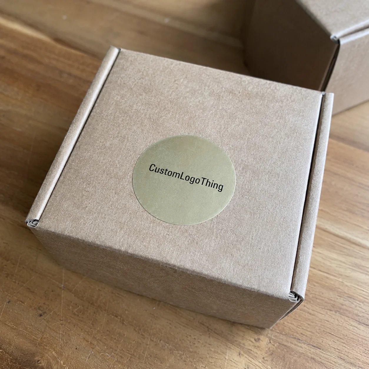
A plain 2-ounce jar can look unfinished at 9 a.m. and retail-ready by lunch with one well-placed 2-inch sticker. That is the quiet power of Custom Text Stickers: adhesive labels built around words, short phrases, brand names, warnings, flavor names, QR prompts, batch notes, campaign messages, and other small pieces of information that need to be read quickly.
They are not just decoration. A text-first sticker can identify a seasonal scent, seal a pouch, add a compliance note, mark a sample kit, personalize a limited run, or fix a packaging communication gap without redesigning every box, jar, mailer, or sleeve in the system. From a packaging buyer’s point of view, that matters because small messaging changes are often where real costs hide.
The useful version is rarely the loudest one. It is the sticker that says exactly what the buyer, packer, retailer, or customer needs to know, at the moment they need to know it.
What Custom Text Stickers Actually Do for a Product
Text stickers sit in a practical middle ground. They are usually simpler than full product labels, more message-focused than logo stickers, and much faster to change than printed cartons or custom boxes. A logo sticker says, “Remember the brand.” A full-wrap label carries the legal, nutritional, or product story. A text sticker usually says one thing: “Vanilla Bean,” “New Formula,” “Scan for Care Guide,” “Fragile,” “Batch 14,” “Handmade,” or “Limited Drop.”
That narrow job is the point. In retail packaging, shoppers often make a first judgment in seconds. If the product already has decent branded packaging, the sticker should not compete with it. It should clarify. The strongest examples are short, readable, and intentional. They are not tiny billboards stuffed with a headline, slogan, website, ingredients, and three icons.
Common uses are broader than many buyers expect:
- Retail and handmade goods: scent names, color names, size callouts, batch numbers, maker notes, and limited-edition messages.
- Food and beverage packaging: flavor variants, “keep refrigerated” reminders, allergen flags, freshness dates, and short QR prompts.
- Cosmetics and wellness products: shade names, usage warnings, tamper seals, sample-kit identification, and refill notes.
- Events and promotions: name badges, giveaway stickers, bag seals, table-kit labels, and campaign phrases.
- Shipping and subscription boxes: insert notes, packing cues, box seals, return prompts, and internal warehouse labels.
Here is what often goes wrong: the sticker is treated as an afterthought, then asked to solve five problems. Better packaging design starts with deciding the sticker’s job. If the job is product identification, make the variant name dominant. If the job is instruction, give the instruction room. If the job is package branding, keep the text tied to the brand voice but cut every extra word.
A sticker that says “Rose Clay” on a soap wrap, “Cold Brew” on a bottle, or “Batch 22” on a pouch may look simple. Operationally, it can save a brand from holding separate printed packaging for every variant. That flexibility is why small text labels show up everywhere from farmers market tables to multi-SKU retail lines.
How Text Sticker Printing Works from Artwork to Adhesive
The production path is predictable: artwork file, proof, material selection, print method, finish, cutting, quality check, and packing. The risk is not that the process is mysterious. The risk is that each step can quietly change readability, cost, or application performance.
Most short and medium runs use digital printing. It is practical for smaller quantities, split versions, seasonal messages, and variable text because plates are usually not required. Larger repeat orders may move to flexographic printing, especially for roll labels, automated application, or high-volume retail packaging. Specialty methods such as foil stamping, metallic inks, spot gloss, or raised varnish can add premium impact, but they add cost, setup time, and proofing scrutiny.
Artwork is where the first real fork appears. Vector text is ideal because it stays sharp at any size. Outlined fonts prevent font substitutions. High-resolution raster files can work, but 300 dpi at final print size is a safer baseline than a web image copied from a presentation deck. Tiny letters need breathing room. Thin strokes can fill in. Tight spacing may look elegant on screen and muddy in print.
Format matters too. Die-cut stickers are cut to a custom outer shape. Kiss-cut stickers leave the backing intact, which makes hand peeling easier. Sheeted stickers work well for small batches, office use, and manual application. Roll stickers are better for faster hand application and machine application, but roll direction becomes important if text must face a specific way on a bottle or carton.
| Format | Best Use | Buyer Watchout |
|---|---|---|
| Sheets | Short runs, samples, office labels, manual packing stations | Slower for high-volume application |
| Rolls | Retail packaging lines, jars, pouches, boxes, machine labeling | Confirm roll direction and core size before production |
| Singles | Giveaways, event kits, customer inserts | More handling and packing cost per piece |
| Kiss-cut | Easy peeling for small stickers or delicate shapes | Backing size may be larger than the sticker itself |
Adhesive choice is equally practical. Removable adhesive works for temporary campaigns, event badges, and short-term promotions. Permanent adhesive suits most product packaging. Freezer-grade adhesive is designed for cold storage, where standard adhesive can stiffen or fail. Stronger adhesives may be needed for textured paper, curved plastic, coated mailers, or containers handled with oils and moisture.
Clear film, white ink, dark packaging, and tiny type deserve special attention. Clear stock can create a clean no-label look, but pale text on a transparent sticker may disappear on amber glass or patterned packaging. White ink can sit behind colored text to improve opacity. On dark backgrounds, that extra white layer can be the difference between crisp and useless.
Materials, Finishes, and Readability Factors That Matter
Text stickers succeed or fail on legibility. Not cleverness. Not foil. Not a trendy typeface. Legibility.
Paper stickers are a sensible choice for dry indoor uses: bakery boxes, candle dust covers, soap wraps, office organization, and low-moisture retail displays. Matte writable stock is useful for batch numbers, dates, names, and handwritten notes. Vinyl and film stocks handle moisture better, which makes them safer for bottles, jars, bath products, refrigerated items, and shipping conditions where condensation might appear. Clear film creates a minimal look. Metallic or holographic stock adds visual punch for promotional giveaways and premium package branding, but it can introduce glare.
Finishes change both feel and function. Matte reduces reflection and gives a quieter, more understated look. Gloss increases color contrast and can make black text feel sharper. Soft-touch coatings feel premium, especially on cosmetics or gift products, but fingerprints may be more visible on dark colors. Lamination adds a protective layer against scuffing, hand oils, moisture, and shipping abrasion.
Size should start with the message, not the available blank spot. A one-word “SEA SALT” sticker can work at 0.75 inches tall if the type is bold and the contrast is high. A three-line care instruction needs more space. Curved containers create another complication: the flatter the sticker, the easier the text is to read. On a small jar, a long horizontal phrase may wrap out of view, while a stacked layout stays visible from the front.
Font decisions are not just aesthetic. Bold sans-serif fonts usually survive small sizes better than thin scripts. Letter spacing should be open enough that ink gain, lamination, or slight production variation does not close up the counters inside letters like “a,” “e,” and “o.” Line breaks should follow natural reading patterns. Contrast should be judged under real light, not only on a bright monitor.
Practical rule: a bold black word on matte white can outperform an expensive foil sticker if the reader needs to understand it in two seconds.
Handling conditions change the specification. Refrigeration can create condensation. Sunlight can fade some inks and materials. Shipping abrasion can scuff unprotected surfaces. Hand oils can soften the look of unlaminated paper. If the sticker is going on reusable packaging, that also affects adhesive choice. The right answer depends on the surface, the environment, and how long the sticker must stay attractive.
Two stickers can share the same artwork and behave differently because the surfaces are different. Glass is usually forgiving. Low-energy plastics can be stubborn. Kraft paper absorbs differently than coated paperboard. Powder-coated tins, textured mailers, and curved Lip Balm Tubes each create their own adhesion and readability problems. A supplier may ask for the application surface not to complicate the order, but because adhesive failure often starts there.
Cost and Pricing Factors Before You Request a Quote
Sticker pricing is usually driven by quantity, size, material, finish, shape, number of versions, adhesive type, and setup needs. The unit cost often drops sharply as quantity rises because proofing, calibration, setup, and material waste are spread over more pieces. That is why 250 stickers can feel expensive per unit while 5,000 can look surprisingly efficient.
Realistic ranges vary by supplier and specification, but simple digitally printed paper or vinyl text stickers might land around $0.08–$0.25 per piece at 5,000 units. Smaller runs of 250–500 pieces may sit closer to $0.35–$1.20 each, especially with custom shapes, multiple versions, or sheeted packing. Foil, white ink on clear stock, lamination, specialty adhesive, and rush production can push the number higher. Not always. But often enough that buyers should ask early.
Minimum order quantity is usually production math, not a trick. Digital production may support smaller runs because setup is lighter. Specialty finishes, roll formats, unusual materials, and flexographic production may require higher minimums because tooling, press setup, or material ordering only makes sense at scale.
Buyers often forget these cost add-ons:
- Custom die shapes instead of standard circles, rectangles, or ovals
- Foil, metallic effects, spot varnish, or layered specialty finishes
- White ink on clear film for opacity over dark packaging
- Lamination for moisture resistance or scuff protection
- Rush production, split designs, individual packing, or special shipping
- Proof revisions caused by unclear artwork, missing fonts, or late copy changes
There are clean ways to control cost without making the sticker look cheap. Reduce the size slightly. Use a standard shape. Choose high-contrast ink instead of a specialty finish. Combine versions into one organized production run. Limit the message to the shortest useful phrase. If the sticker supports a larger system of Custom Labels & Tags, it does not need to carry the whole brand story by itself.
For a faster quote, send dimensions, quantity, material preference, indoor or outdoor use, application surface, number of designs, finish, deadline, and preferred format: rolls, sheets, or singles. Mention cold storage, moisture, hand application, or machine application. The lowest unit cost is not the best deal if the adhesive fails, the text becomes unreadable, or the order arrives too late for a launch.
Process and Timeline: From Idea to Finished Sticker
The best ordering process is not complicated. Define the message. Choose placement. Measure the surface. Prepare artwork. Request a quote. Review the proof. Approve production. Receive the order. That sequence sounds basic because it is. Skipped basics are behind many expensive sticker mistakes.
Artwork and proofing often control the timeline more than printing itself. A simple digital order with final artwork may move through proofing and production in 5–10 business days, depending on workload and shipping. A roll order with specialty film, Custom Die Cutting, foil, lamination, or a large quantity may need 12–20 business days after proof approval. Rush options may exist, but rush fees rarely fix missing copy, untested QR codes, or unclear dimensions.
Before ordering, print a paper mockup at actual size and tape it to the product or package. It is a low-tech test. It works. A sticker that looks perfect at 300% zoom may become cramped on a 1-inch seal. A phrase that feels balanced on a flat PDF may bend awkwardly around a lip balm tube or small bottle.
Proof review is the buyer’s last safety net. Check spelling, punctuation, phone numbers, URLs, QR codes, color expectations, cut line, bleed, and spacing from the edge. If there are 12 flavor versions, check all 12. Not the first one. Not the sample proof. Every version.
For launches, events, and seasonal campaigns, build in buffer time. Shipping delays, sample review, stakeholder edits, and possible reprints all need room. A conservative schedule might allow one week for copy and artwork, several business days for quote and proofing, 1–3 weeks for production depending on complexity, and extra transit time. Standards bodies such as ISTA focus on transport testing rather than sticker design, but the broader lesson applies: packaging choices should be tested before the real shipment is on the line.
Think of proofing as risk control, not paperwork. One typo on screen is annoying. One typo multiplied across 10,000 stickers becomes visible inventory waste.
Version control deserves its own mention. If one spreadsheet lists “Lavender Mint,” another file says “Lavender + Mint,” and the artwork reads “Lavender-Mint,” someone has to decide which name is real. Make that decision before proofing. A clean version list with exact spelling, quantity per version, and file names prevents a surprising amount of waste.
Common Mistakes That Make Text Stickers Look Cheap
Overcrowding is the biggest mistake. A sticker meant for one fast message cannot carry a headline, slogan, website, ingredients, social handle, and instructions without turning into visual noise. The smaller the sticker, the more ruthless the editing needs to be.
Low contrast comes next. Pastel ink on clear film may look soft in a mockup but vanish on a pale pouch. Metallic stock can flare under bright retail lighting. Thin gray type on kraft paper can feel premium until someone tries to read it at arm’s length. If a customer has to tilt the package, the design is already working too hard.
Another common error is choosing size by screen view. A laptop mockup lies because it can make a 1-inch sticker look like a poster. Always review at actual scale. Better still, place the printed mockup on the final surface and look at it from normal viewing distance: shelf, packing table, countertop, or hand-held position.
Font problems create both production and legal friction. Unlicensed fonts can delay commercial printing. Missing font files can cause substitutions. Ultra-thin strokes may break up. All-caps scripts can become unreadable. Text that is not converted to outlines may shift if the file opens differently on another system. These are boring issues until they cost real money.
Adhesive mismatch is less glamorous and more damaging. Removable stickers used on shipping cartons can peel during transit. Paper stickers exposed to condensation can wrinkle. Permanent labels on surfaces customers expect to reuse can create complaints. Freezer products need adhesive built for cold conditions. Outdoor exposure may require film, lamination, and UV-resistant inks.
Production-specific errors deserve respect. Skipped bleed can leave white slivers at the edge. Text too close to the cut line can look off-center after normal cutting tolerance. Ignored roll direction can make application awkward. Approving a proof without checking each version can put the wrong batch note, scent name, or QR code into circulation.
The quality-control mindset is simple: one sticker is small, but repetition makes every flaw louder. That is true whether the sticker sits on a pouch, a mailer, a bottle, or a full system of Custom Packaging Products.
Choosing Specs Without Overbuilding the Sticker
Start with the sticker’s job. Is it identifying a variant, sealing a package, adding a warning, prompting a scan, marking a batch, or adding personality? Then write the shortest useful message. Measure the application area. Confirm the surface type. Identify handling conditions such as moisture, cold, sunlight, abrasion, or frequent touch.
Two or three copy options are useful before design starts. Not because more options are fun. Because the best phrase is usually the clearest one, not the one that happens to fit the first layout. “Scan for brewing guide” may beat “Learn more about how to brew this coffee perfectly at home” because the customer understands it instantly.
For many buyers, sensible starting specs look like this: white matte paper for dry indoor packaging, vinyl or film for moisture exposure, bold sans-serif type for small sizes, and standard shapes for budget control. Clear film works beautifully when contrast is planned. Foil works best when it supports a short word or accent, not a paragraph. For sustainability claims or paper sourcing, ask suppliers about credible chain-of-custody programs such as FSC where relevant, and avoid vague environmental language that cannot be documented.
| Buyer Situation | Smart Starting Spec | Typical Concern |
|---|---|---|
| Dry indoor retail box | Matte paper, permanent adhesive, standard shape | Keep contrast high and avoid overcrowding |
| Jar or bottle with moisture exposure | White vinyl or film, gloss or laminated finish | Test adhesion on glass, plastic, and curved surfaces |
| Short-run seasonal campaign | Digital print on sheets or rolls | Confirm version quantities and proof every message |
| Premium promotional sticker | Foil, metallic, or holographic stock | Check glare and readability under real lighting |
Ask the printer for input if the sticker involves curved surfaces, tiny type, clear stock, freezer use, outdoor exposure, machine application, or premium finishes. These are not edge details. They decide whether the finished piece performs in real handling conditions.
Before contacting a supplier, prepare quantity, size, material, finish, shape, design count, deadline, packaging surface, and delivery format. Include whether the stickers should arrive on rolls, sheets, or singles. If you already have broader product packaging or branded packaging in place, share photos so the sticker can support the system rather than fight it.
Custom text stickers work best when the message, material, adhesive, and timeline are chosen together instead of treated as separate decisions. Make a one-page spec note, test the size on the real package, and request a proof before approving the full order. That small pause catches the problems that are hardest to fix after printing: unreadable type, weak contrast, wrong adhesive, and copy that tries to do too much.
FAQ
What size should custom text stickers be for readable packaging?
Start with viewing distance and word count, not just container size. Short words or seals can work small when the font is bold and the contrast is strong. For instructions, QR prompts, ingredients, or multi-line copy, use a larger format and test a printed mockup at actual size before ordering.
Are text stickers cheaper than full custom product labels?
They often cost less because they can be smaller, simpler, and easier to print in short runs. Pricing still depends on material, finish, size, quantity, shape, and the number of design versions. They are most cost-effective when used to update, personalize, or supplement existing packaging instead of replacing the entire label system.
Which material is best for custom word stickers on bottles or jars?
Paper can work for dry indoor products, but vinyl or film is usually safer for bottles and jars exposed to moisture, oils, or refrigeration. Clear film creates a minimal look, while white vinyl gives stronger contrast for small text. The right adhesive depends on whether the surface is glass, plastic, metal, textured, curved, cold, or handled often.
How long does it take to print personalized text stickers?
Timeline depends on artwork readiness, proof approval, material availability, quantity, finishing, and shipping method. Simple digital sticker orders can move faster than specialty foil, laminated, die-cut, or high-volume roll orders. The biggest avoidable delay is usually proof correction, so send final copy, outlined fonts, dimensions, and clear specs upfront.
Can I order multiple text sticker designs in one batch?
Yes, many printers can produce multiple versions, especially for names, flavors, batches, slogans, or event messages. Split designs may affect price because they add file handling, proofing, setup, or layout complexity. Provide a clean list of each version, quantity per version, and any shared size or material requirements to reduce errors.


