Buyer Fit Snapshot
| Best fit | Custom Thank You Cards for Packaging projects where brand print, material claims, artwork control, MOQ, and repeat-order consistency need to be specified before quoting. |
|---|---|
| Quote inputs | Share finished size, material target, print colors, finish, packing count, annual reorder estimate, ship-to region, and any compliance wording. |
| Proofing check | Approve dieline scale, logo placement, barcode or warning zones, color tolerance, closure strength, and carton packing before bulk production. |
| Main risk | Vague material claims, crowded artwork, missing packing details, or unclear freight terms can make a low unit price expensive after revisions. |
Fast answer: Custom Thank You Cards for Packaging: Artwork Proof, Packing Count, and Landed Cost should be specified like a repeatable production item. The safest quote records material, print method, finish, artwork proof, packing count, and reorder notes in one written spec.
Production checks before approval
Compare the actual filled-product size with the drawing, then confirm tolerance on folds, seals, hang holes, label areas, and retail display edges. Reserve space for logos, QR codes, warning copy, and material claims before decorative graphics fill the panel.
Quote comparison points
Review material grade, print process, finish, sampling route, tooling charges, carton quantity, and freight assumptions side by side. A quote is only useful when the supplier can repeat the same color, closure quality, and packing count on the next order.
Custom Thank You Cards for packaging can do something oddly powerful: they can make a customer remember a $12 product like it came from a premium brand. I’ve seen that happen on a factory floor in Shenzhen, where a simple 4x6 insert changed the tone of an entire shipment. The product was ordinary, honestly. The card was not. And yes, I still remember the pack-out manager raising one eyebrow like, “We’re really spending time on a thank-you note?” We were. Because it worked.
That’s why custom thank you cards for packaging matter more than most brands expect. They sit inside the box, the mailer, or the sleeve and do three jobs at once: they express gratitude, they guide the next action, and they shape how the customer feels about the purchase after the product itself is already in hand. In packaging meetings, I’ve watched teams spend hours debating a box coating and then treat the insert like an afterthought. That’s backwards. The insert is not decoration. It’s part of the experience (and often the part people actually remember).
When the insert is designed properly, custom thank you cards for packaging can influence repeat orders, review rates, support volume, and even returns. Not because they are magical. Because they create a moment of human attention in a process that is otherwise mechanical: pick, pack, ship, receive. That one interruption matters. It says, “A person touched this order.” Customers notice that more than brands think they do.
Custom Thank You Cards for Packaging: What They Are and Why They Work
At the simplest level, custom thank you cards for packaging are branded inserts placed inside parcels, boxes, mailers, or product sleeves. They can be flat postcards, folded notes, mini inserts, or even a small card tucked under tissue paper. The job is straightforward: say thank you, reinforce the brand, and direct the customer toward a next step that supports the relationship. Simple job. Not always simple execution, because somehow a “quick insert” tends to become a three-week design debate if nobody puts their foot down.
What makes custom thank you cards for packaging more effective than a generic receipt or coupon is intent. A receipt records a transaction. A card shapes a relationship. That difference sounds subtle, but in practice it changes the entire customer memory of the order. I once worked with a skincare brand that had a 6.8% repeat rate from first-time online buyers. After adding a simple card with a handwritten-style note, a QR code to usage tips, and a support contact line, repeat purchase climbed by nearly 2 points over two quarters. Not all of that came from the card alone, of course, but the card was part of the lift. The founder called it “cheap psychology.” Honestly, I didn’t argue.
Psychologically, three things are happening. First, reciprocity: when people feel thanked, they are more likely to respond positively. Second, perceived care: a package that contains a thoughtful insert feels more deliberate than one that doesn’t. Third, reduced buyer’s remorse: if the brand provides reassurance, care instructions, or a reminder of value, the customer has fewer reasons to second-guess the purchase. That is especially important for product packaging in categories where the decision was emotionally driven, such as gifts, beauty, wellness, and premium food.
Honestly, I think a lot of people misunderstand the role of custom thank you cards for packaging. They treat them as decorative stationery. They are not. They can support post-purchase education, brand voice, review collection, referral prompts, and customer service deflection. A card that says, “Thanks for your order” plus “Here’s how to care for your item” plus “Need help? Email us within 24 hours” can save a support ticket later. That’s not fluff. That’s operational value. It’s also one less angry email about something that could have been answered in the box, which is a gift to everyone involved.
“We stopped viewing the insert as a nice-to-have and started treating it like a post-purchase tool. That shift reduced repetitive support emails on three common questions.”
One more distinction matters. Custom thank you cards for packaging are not the same as mass-printed promo slips that get tossed into the box with a discount code. Those often feel generic. The best cards use messaging hierarchy, strong visual alignment with branded packaging, and a clear voice that matches the rest of the package branding. If the outer carton says minimalist luxury, the insert should not suddenly sound like a clearance flyer. I’ve seen that mismatch in the wild, and it’s ugly. Like wearing a tuxedo with gym socks.
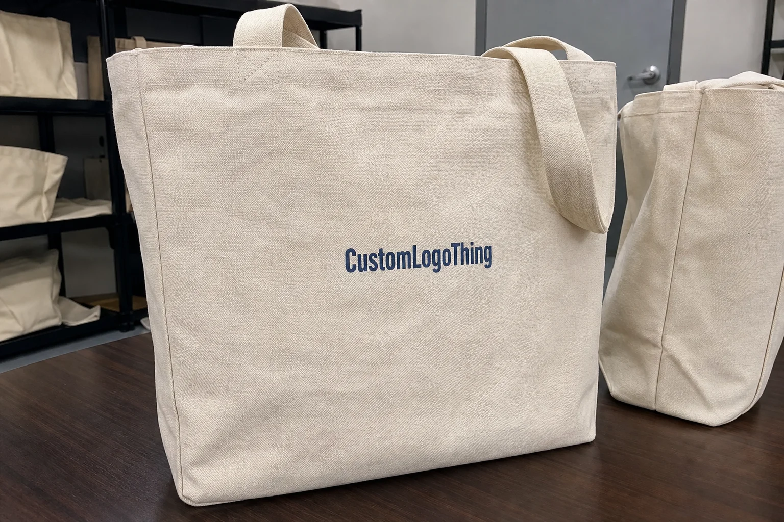
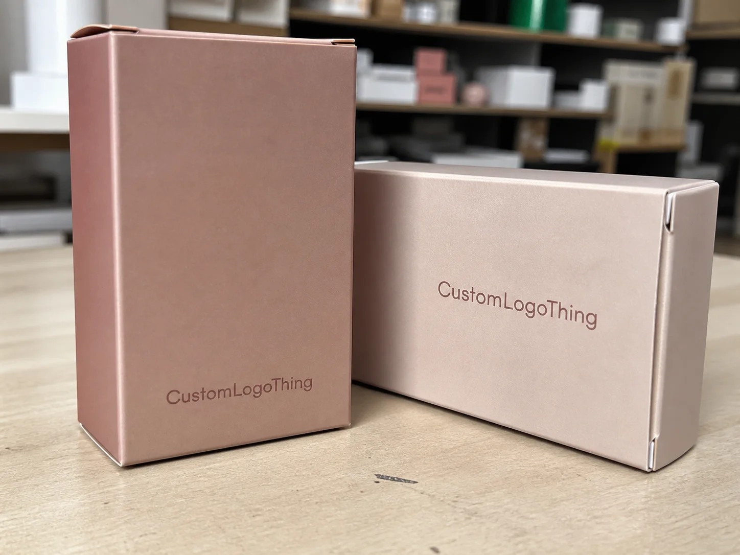
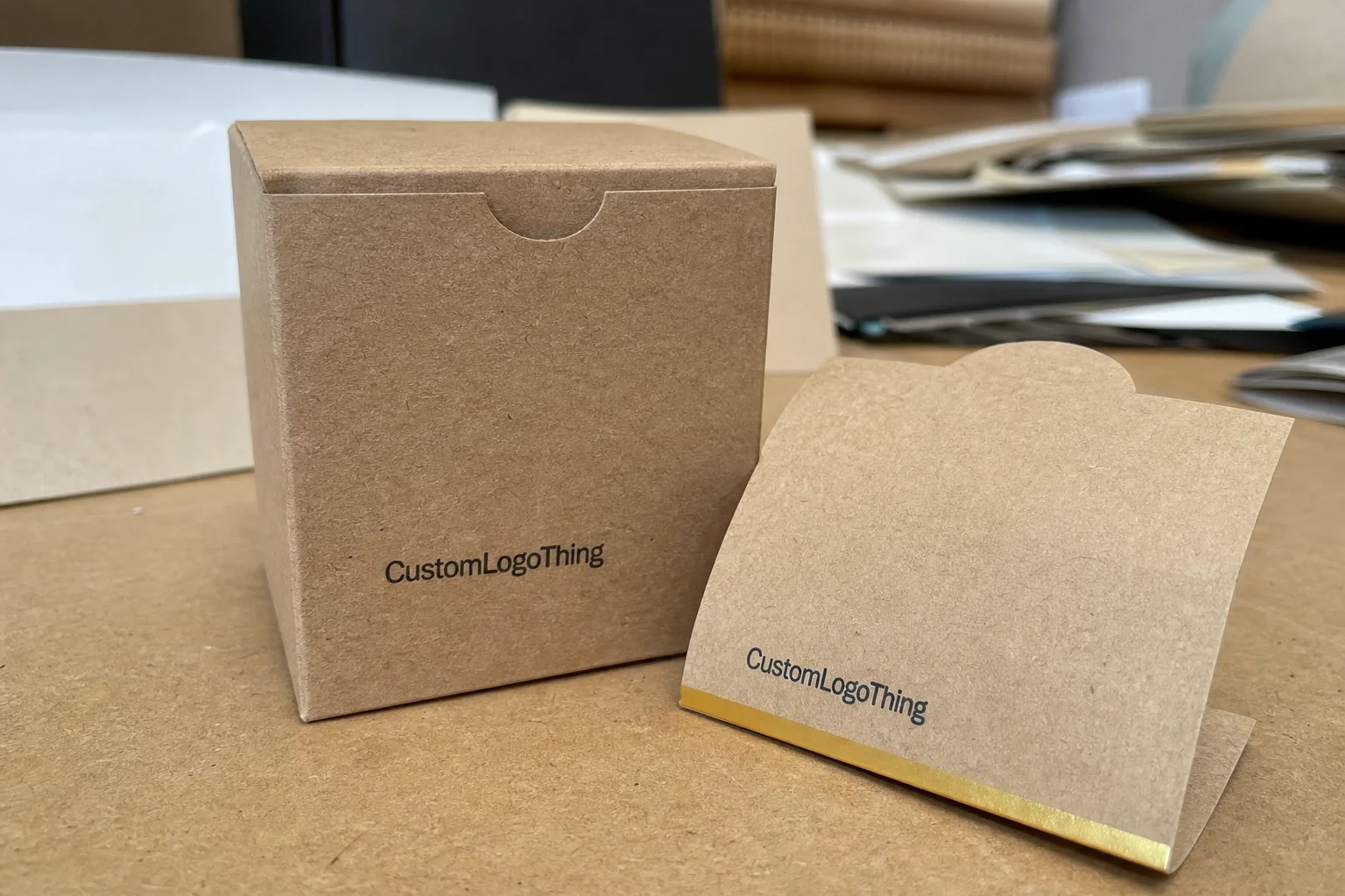
If you want the card to do real work, it has to feel like it belongs in the package system. That system can include Custom Packaging Products such as inserts, boxes, and mailers that carry the same design language from the outside in.
How Custom Thank You Cards for Packaging Fit Into the Unboxing Process
The unboxing experience is a sequence, not a single moment. Customers see the outer carton or mailer first, then the internal packaging, then the product, and finally the small details: tissue, filler, labels, and custom thank you cards for packaging. That order matters because the insert often lands at the emotional peak. The customer has already waited for delivery. They are opening the parcel. Their attention is high. They are basically holding a tiny verdict on your brand in their hands.
I’ve watched this play out at a fulfillment center in the Midwest where the team tested two pack-outs. In one, the card was buried at the bottom under void fill. In the other, it sat on top of the tissue and was the first thing the customer saw after opening. The second version got more QR scans and more social shares. Same card stock. Same print run. Same message. Just better placement. No wizardry. Just common sense, which is apparently rare enough to feel luxurious.
The best placements are usually the simplest:
- On top of tissue paper, centered and visible
- Attached to the outer wrap with a branded sticker
- Tucked into a pocket in a folded mailer
- Placed in the box lid so it appears immediately on opening
- Inserted beside the product with a clear visual break from filler material
Custom thank you cards for packaging also work best when they guide the next action without crowding the moment. That could be a QR code to product care content, a review prompt, a follow-us invitation, or a customer service email. But the card should not try to do six things at once. A single-message card feels premium. A cluttered card feels like a flyer. And nobody gets excited about a flyer tucked under tissue paper (shocking, I know).
Here’s a useful comparison I’ve used with brands during packaging design reviews:
| Card Type | Primary Use | Best For | Typical Print Impact | Operational Notes |
|---|---|---|---|---|
| Single-message thank-you card | Gratitude and brand memory | Luxury, giftable, subscription, DTC | Higher perceived value with minimal text | Easy to pack; low error risk |
| Multifunction insert | Thank you plus care or review prompt | Beauty, apparel, accessories, home goods | Good balance of utility and brand presence | Needs tighter layout control |
| Referral or promo card | Repeat sales and traffic | Brands with strong offer strategy | Conversion-focused, less emotional | Can feel salesy if overdone |
| Care instruction card | Reduce misuse and returns | Fragile, technical, premium products | Practical, trust-building | Must be written clearly and tested in fulfillment |
I’ve seen brands win or lose the unboxing moment based on details as small as a 2 mm margin. In retail packaging, that sounds tiny. In practice, that spacing can be the difference between readable and cramped, premium and rushed. If you’re using custom thank you cards for packaging, they should look like part of the system: same typography rules, same color family, same tone. If the insert feels like it was designed by a different company, the illusion falls apart pretty fast.
For brands using custom printed boxes, the insert can mirror the internal print style so the customer sees continuity from exterior to interior. That continuity is what makes the package feel designed rather than assembled.
“The box was good. The insert made it feel finished.”
Key Design and Cost Factors for Custom Thank You Cards for Packaging
Let’s talk numbers, because that’s where a lot of packaging conversations become vague. The cost of custom thank you cards for packaging depends on size, paper stock, color count, finish, quantity, and whether the card is printed on one side or both. A simple 4x6 card on 300gsm uncoated stock is usually far cheaper than a folded 5x7 card with soft-touch lamination and foil. That difference is not trivial. I’ve watched a team shrug at a quote and then act surprised when the finish they “kind of wanted” doubled the spend. Printer math is not a myth. It is a tax on indecision.
As a rough planning example, I’ve seen short-run 4x6 inserts priced around $0.18 to $0.42 per unit at 5,000 pieces, depending on artwork complexity and finishing. Bulk runs can drop the unit cost, but then you’re managing storage, forecast accuracy, and potential obsolescence if your branding changes. There is no free lunch here. Lower per-unit cost usually means more inventory commitment. Which is fine, unless your marketing team decides to rebrand halfway through the quarter (a personal favorite disaster of mine).
Finishes matter more than most buyers think. Matte stock tends to feel restrained and readable. Soft-touch lamination adds a velvety feel, which can work well for premium package branding. Foil can make a logo pop, but it can also push the card toward “gift card” territory if overused. Embossing looks elegant, yet it requires tighter tooling and a longer approval process. Recycled stock can support sustainability messaging, especially if the rest of the package uses FSC-certified materials from suppliers aligned with FSC standards.
Design is where conversion is won or lost. Fonts need to be large enough to read in a dim kitchen or office mailbox. Color contrast must be strong enough to survive variable lighting. White space is not wasted space; it is what keeps the card from looking frantic. And the call to action should sit where the eye lands naturally, usually near the center or lower third of the card, not buried in a paragraph block. If the customer has to hunt for your QR code, you’ve already lost the plot.
Here’s how I break down the common cost drivers for custom thank you cards for packaging:
- Card size: Postcards are usually cheaper than folded formats
- Paper stock: 300gsm, 350gsm, or specialty recycled boards change the feel and cost
- Print method: Digital is good for short runs; offset becomes efficient at scale
- Ink coverage: Full-bleed designs cost more than minimal layouts
- Special finishes: Foil, embossing, spot UV, and lamination add steps and cost
- Quantity: Larger volumes lower unit price but increase cash tied up in inventory
One supplier negotiation still sticks with me. A cosmetics client wanted 20,000 cards with a foil logo, black flood background, and rounded corners. The first quote landed almost 34% above budget. We cut the rounded corners, switched to a softer two-color layout, and moved the logo foil to just one side. The result looked cleaner, cost less, and ran faster through QC. That’s the sort of compromise that makes custom thank you cards for packaging workable instead of merely pretty. Also, the production manager stopped sighing every time the sample packet came back, which was a small miracle.
Cost should be judged against retention value, not just print expense. If a card lifts repeat orders by even a small amount, or reduces returns by clarifying use, the print cost can be justified quickly. Packaging people often obsess over pennies per unit. Fair enough. But if a $0.22 card keeps a $48 customer from drifting away, the math changes fast.
For brands building complete retail packaging systems, this is where the card should be evaluated alongside mailers, inserts, labels, and outer cartons—not separately. That broader view is how packaging moves from expense to customer experience.
If you’re comparing sustainability claims across material options, the EPA has a useful packaging and waste reference point here: EPA recycling resources. Not every card needs to be recycled content, but if your brand talks about waste reduction, your insert should not contradict that message.
Step-by-Step: How to Create Custom Thank You Cards for Packaging
Creating custom thank you cards for packaging works best when it follows a simple operational flow. I’ve seen too many teams start with design software and only later ask how the cards will be packed. That sequence causes friction. Start with the purpose, then the message, then the format, then the print spec. Otherwise you end up with a beautiful card that can’t be inserted without a warehouse worker muttering under their breath for eight hours straight.
Step 1: Define the goal
Decide what the card is supposed to do. Is it thanking the buyer, asking for a review, encouraging a reorder, explaining product care, or reducing support contacts? A single card can do two of those things well. It cannot do five without sounding crowded. For most brands, the best custom thank you cards for packaging balance gratitude with one next action.
Step 2: Write one clear message
Keep the copy short and specific. “Thanks for supporting our small team in Austin” feels more human than “Thank you for your order.” The order still matters, but the specificity gives the card a pulse. If the brand sells handmade candles, say so. If it ships from a family-run facility, say that. Customers can smell generic copy from across the room. They may not say it out loud, but they absolutely notice when the note sounds like it came from a template factory.
Step 3: Choose the format
Postcard, folded card, mini insert, or note card? The answer depends on how much information you need and how the card will sit inside the package. For compact mailers, a 4x6 postcard usually works well. For premium kits or gifting boxes, a folded 5x7 card can create more presence. When I reviewed an apparel client’s pack-out line, a folded card added just enough weight to feel intentional without slowing the packers down.
Step 4: Build the proofing workflow
Packaging cannot be handled in silos. Your brand team, operations team, and fulfillment partner should all sign off on the final proof. I’ve seen cards approved with beautiful layouts that failed because the QR code was too small for a handheld scanner on the warehouse floor. That’s the kind of mistake that costs time, not just money. And yes, someone will act surprised when the scanner refuses to magically read a postage-stamp-sized code from across the aisle.
Step 5: Test a small batch
Run a pilot before full production. Even 500 to 1,000 units can reveal a lot: whether the card sits correctly in the package, whether the text is readable, whether the QR code scans, and whether the message earns responses. Track the outcomes using review volume, QR scans, repeat orders, customer service tickets, or referral traffic. If the numbers don’t move, revise the card rather than assuming the channel is weak.
Here’s a simple production checklist I use with brands ordering custom thank you cards for packaging:
- Confirm final dimensions in millimeters and inches
- Approve paper stock and finish samples
- Check logo color accuracy against brand standards
- Validate QR code size and destination URL
- Review text for legal or support accuracy
- Test card placement in the actual pack-out flow
- Record unit cost at the planned order quantity
One client meeting in Los Angeles still stands out. The founder wanted “a heartfelt note,” but the fulfillment team needed a card that could be inserted by machine at 300 parcels an hour. We simplified the layout, moved the signature line lower, and used a 350gsm stock that fed better through the inserter. That tiny operational adjustment made the difference between a lovely idea and a usable one. This is the part people skip when they only care about how the mockup looks on a screen.
For brands already investing in branded packaging, the card should match the same visual system used on labels, seals, and cartons. That is especially true if you sell through e-commerce and want your product packaging to feel like a coherent experience rather than a collection of separate parts.
Common Mistakes Brands Make With Custom Thank You Cards for Packaging
The most common mistake I see with custom thank you cards for packaging is overcrowding. Brands want the thank-you note, the QR code, the review request, the coupon, the social handle, the return policy, and the manifesto all in one square of paper. That usually backfires. The card becomes visually noisy, and the customer reads none of it. It’s the print equivalent of talking too much at a networking event. Nobody enjoys it.
Another mistake is sounding like a template. “Dear valued customer” is not a relationship; it is a placeholder. If the message could belong to any brand in any category, it will not strengthen package branding. Specificity matters. Mention the order type, the product line, or the brand’s point of view. Even one concrete detail changes the tone. “Thanks for choosing our first ceramic batch” feels alive. “Thank you for your purchase” feels like a receipt pretending to care.
Mismatched design is a big one too. If your box uses earthy tones, recycled kraft, and restrained typography, a neon insert with heavy black borders will break the experience. I saw this firsthand during a supplier review for a home fragrance company. The outer box looked serene and premium. The insert looked like a gym flyer. The customer complaints were subtle but real: “The card feels off.” That’s a packaging problem, not a branding afterthought. And once a customer says “off,” you know the vibe is already bleeding.
Typography can quietly ruin an insert. Tiny type may fit the layout, but it also makes the card look cheap and difficult to read. A 7-point disclaimer line might be technically legal, but it’s a terrible customer experience. Good custom thank you cards for packaging should be readable at arm’s length, especially if they include a care tip or support email.
Finally, don’t skip fulfillment testing. A card that looks perfect in InDesign may jam a pack-out workflow, slide around in transit, or get inserted upside down if there is no visual cue. The warehouse does not care how elegant the mockup is. It cares whether the card slows the line by 6 seconds per order. I’ve watched a pack team lose patience with a “minimal” card that was so minimal nobody could tell which side was the front. Minimal is great. Confusing is not.
Here are the mistakes I’d flag fastest in a review of custom thank you cards for packaging:
- Too many messages on one card
- Generic copy that could belong to any brand
- Clashing colors or fonts that fight the packaging system
- Text too small for real-world reading conditions
- No test pack-out before full production
If your packaging strategy depends on consistency, the insert has to match the rest of the pack. That means the card, box, mailer, tissue, and label should all feel like parts of one designed sequence. That is what smart custom printed boxes and inserts do together: they create continuity.
For shipment integrity and transit performance, the International Safe Transit Association has useful test resources at ISTA. A card is not a transit-critical item, but if it affects placement, packing sequence, or box closure, it belongs in the broader pack-out test discussion.
Expert Tips to Make Custom Thank You Cards for Packaging More Effective
If you want custom thank you cards for packaging to do more than look nice, keep the structure disciplined. One primary message. One secondary action. That’s usually enough. A QR code to product care content or a review page can be powerful if the customer understands why it’s there. But if the card tries to drive traffic, gather feedback, pitch a discount, and tell the origin story all at once, the result is dilution. The customer blinks, shrugs, and tosses it. Brutal, but true.
Tailoring helps. A first order card does not need to sound like a repeat buyer card. A gift order might thank the purchaser while also noting how to contact support if the gift recipient needs help. A fragile product might include a care tip right on the front. That kind of segmentation makes custom thank you cards for packaging feel relevant rather than mass printed. Relevance beats cleverness more often than people want to admit.
Seasonal or campaign-based variants can work well, but keep the core structure stable. The logo position, typography, and brand tone should remain familiar so the customer recognizes the package instantly. If you change everything every quarter, you lose the memory effect. In packaging design, recognition is a form of efficiency. Also, it saves your team from pretending they enjoy endless revisions to the same card.
Material choice matters more than people admit. A 350gsm C1S artboard with a matte finish feels different from a lighter 250gsm coated sheet. Texture signals intent. A linen-like stock can elevate a giftable product. A recycled uncoated board can support a sustainability claim. If your brand sells alongside custom packaging products, the card material should not feel cheaper than the rest of the system.
I’ve had brands ask whether the insert really influences behavior or just makes the package “nicer.” The answer is both. But you can track it. Measure reorder rate, review volume, referral traffic, QR scans, and customer service feedback before and after rollout. Even a simple A/B test between two versions of custom thank you cards for packaging can show whether the call to action is working. That’s the nice part about packaging: unlike vibes, it can be measured.
Here are the most practical improvements I recommend:
- Use one headline and one body message, not three headlines
- Place the QR code with clear whitespace around it
- Match the card color palette to the box or mailer
- Use real customer language instead of corporate copy
- Print a sample and test it in natural light and warehouse light
One of my favorite examples came from a specialty food brand. They used a 4x4 insert with a short thank-you note, a storage tip, and a single line asking customers to scan for a recipe. Nothing flashy. The cards fit neatly into the mailers, and support emails about product storage dropped because the answer was already in the box. That is the kind of utility that makes custom thank you cards for packaging worth the line item. No drama. Just fewer repetitive questions and happier customers.
If you are aligning inserts with broader brand packaging standards, a good rule is this: the card should feel like it was designed at the same time as the box, even if it was printed later. That is how coherent retail packaging builds trust.
What to Do Next: Planning, Ordering, and Testing Your Cards
The smartest way to start with custom thank you cards for packaging is to audit what is already happening in your parcel. Open three recent orders and look at the sequence. What does the customer see first? Where does the card sit? Does anything feel redundant, hidden, or awkward? That quick audit often reveals more than a long strategy deck. It also saves you from making decisions based on what looks cute in a mockup and terrible in a shipping box.
After that, draft two or three message versions. One can be gratitude-only. One can include a review prompt. One can add a care tip or QR code. Choose the one that best matches the customer relationship you want to build. For a premium brand, shorter is usually stronger. For a technical product, clarity often matters more than warmth alone. Nobody wants a poetic paragraph explaining how to use a pump bottle.
Then request print specs from your supplier: size, paper stock, finish, minimum order quantity, and turnaround time. A typical production timeline for straightforward custom thank you cards for packaging might be 12 to 15 business days from proof approval, but specialty finishes can extend that. Foil, embossing, and Custom Die Cuts usually add steps. If anyone promises instant turnaround on a complex spec, ask what gets skipped. Usually the answer is “quality,” which is not a fun surprise.
Build a rollout plan that includes a test batch, a measurement window, and a refresh schedule. I usually suggest testing for at least 30 to 60 days, depending on order volume, so you can see enough customer behavior to make a decision. If the card lifts engagement, keep it. If the message falls flat, revise it. Packaging should be managed like a living system, not a one-time print job.
One final thought from the factory floor: the best custom thank you cards for packaging are often the ones that disappear into the workflow without causing friction, then reappear in the customer’s mind after delivery. That’s the sweet spot. Useful. Memorable. Not overdesigned.
If you want to improve your current insert strategy, start small, measure honestly, and keep the design aligned with the box, the mailer, and the product itself. That is how custom thank you cards for packaging support both experience and operations without turning into clutter.
FAQ
What should custom thank you cards for packaging include?
A strong card usually includes a brief thank-you message, the brand name or logo, and one clear next step such as a review link, QR code, or care tip. Optional details like social handles, referral prompts, or support contact info can work too, but only if they do not crowd the layout. The most effective custom thank you cards for packaging are readable in a few seconds.
How much do custom thank you cards for packaging usually cost?
Pricing depends on size, stock, color count, finish, quantity, and whether the card is single- or double-sided. Small runs usually cost more per card, while larger orders lower unit price but require better inventory planning. Simple designs on standard stock are usually the most budget-friendly option for custom thank you cards for packaging.
What size works best for custom thank you cards for packaging?
Postcard sizes are common because they fit most boxes and mailers without creating bulk. Smaller inserts work well for compact packaging, while folded cards suit premium brands or cards with multiple sections. The best size depends on how much information you need and how the card will be placed inside the package.
How long does it take to produce custom thank you cards for packaging?
Timeline depends on proofing, print method, finishing, and order size. Standard cards usually move faster than specialty options like foil, embossing, or custom die cuts. It’s smart to allow time for design approval and a sample check before full production starts, especially if the cards are part of a larger packaging system.
Can custom thank you cards for packaging help increase repeat purchases?
Yes, especially when the message feels personal and includes a relevant reason to come back. Cards can support loyalty by reinforcing trust, appreciation, and brand memory after the sale. They work best when paired with a clear offer, helpful information, or a simple follow-up action that fits the customer’s buying behavior.