Order Custom Cosmetics Boxes That Elevate Shelf Appeal
custom cosmetics boxes get judged fast. A buyer, a distributor, or a shopper usually makes a call before the product is even touched. That means the carton has to do more than look pretty. It has to frame the product, protect it during handling, and make the brand feel legitimate in a single glance.
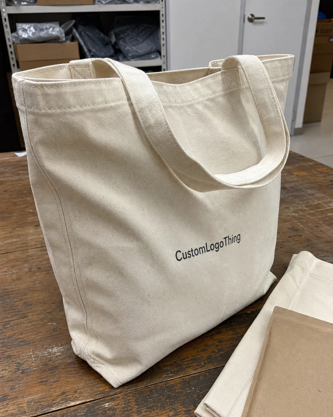
From a packaging buyer’s side, the box has to work on several levels at once. It carries brand cues, supports compliance, survives transit, and fits the actual product, not the rendering someone approved on a screen. For lipstick, serum, cream, or palette packaging, the difference between premium and forgettable is usually structure, print quality, and whether the carton was sized for the filled product instead of the marketing mockup. That is why Custom Printed Boxes matter so much in beauty. They are a sales tool, a shipping safeguard, and a regulatory surface all at the same time.
The practical decisions are rarely glamorous. Material choice. Box style. Insert design. Finish selection. Artwork clearance. Those are the things that save money later, or burn it. If you are comparing Custom Packaging Products, the framework below is the one worth using.
What custom cosmetics boxes do on the shelf
Packaging gets judged before the formula does. Beauty is especially unforgiving that way. Shoppers read the carton as a signal of what is inside, and they do it quickly. A rigid setup box says one thing. A simple tuck carton with a bright gloss finish says something else. Neither is automatically right or wrong. The point is to match the box to the channel, the price point, and the message the product needs to send.
custom cosmetics boxes usually have four jobs. They protect fragile components, create shelf presence, carry ingredients and claims, and make storage or shipping easier. For skincare, that often means holding a glass bottle upright with a snug insert. For makeup, it may mean keeping a compact from moving inside the carton. For kits and holiday sets, it means arranging multiple items so the package feels intentional instead of crowded and improvised.
Structure matters because it affects the real-world outcome. A polished print file does not help if a jar cracks, a closure pushes through the carton, or the box collapses in a master case. Good packaging design is not decoration first. It is engineering with branding on top.
There is also a legal side that gets overlooked until the proofing stage starts going sideways. Ingredient lists, warnings, barcode placement, country-of-origin details, and marketing claims all need space. Too much copy and the carton looks cramped. Too little and the package may fail the regulatory check. The best builds solve both problems without forcing the front panel to carry every single thought the marketing team had that week.
How structure, inserts, and finishes change performance
The most common cosmetic carton styles are predictable for a reason. Straight tuck-end and reverse tuck-end cartons work well for lightweight tubes, smaller jars, and entry-level retail items. Rigid setup boxes are better for premium skincare, gift sets, and products that need a stronger presentation. Sleeves fit well when the primary container already has a distinct shape. Drawer-style packaging usually belongs to higher-end sets because the opening motion feels deliberate instead of rushed.
Inserts change the result quickly. A die-cut paperboard insert, molded pulp tray, or folded partition can keep a product from shifting inside the box. That matters for glass droppers, compacts, dual-piece kits, and any item with a lid or pump that adds height. If the product travels through a distributor chain and then sits on a retail shelf, the box needs to survive both. If it ships direct to consumer, drop testing becomes more relevant. ISTA testing standards are a useful reference for shipment testing expectations: ISTA testing standards.
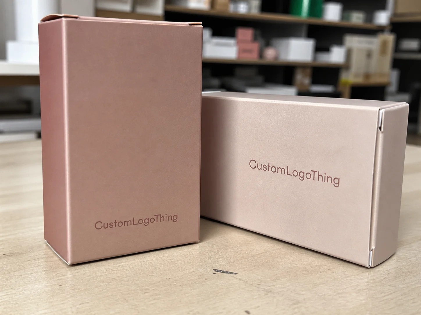
Finishes are where brands try to buy instant value. Matte coating gives a box a calmer, more controlled look. Soft-touch lamination adds a velvety handfeel, although it can show scuffing in ways people do not always expect. Foil stamping still delivers one of the clearest premium signals, especially on logos and small accent lines. Embossing and debossing add tactile depth. Spot UV works when the art has enough contrast to support it, but it is easy to overuse and turn a clean layout into a shiny mess.
Finish selection should not happen in a vacuum. A luxury finish on a weak carton is a poor trade. If the box will be handled repeatedly, a stronger structure often protects the brand better than another decorative layer. The best brand packaging combines appearance and durability instead of treating them as separate goals.
| Box style | Typical use | Approx. unit cost at 5,000 pcs | Performance note |
|---|---|---|---|
| Tuck-end carton | Tubes, small jars, entry-level skincare | $0.18-$0.35 | Efficient to pack; limited premium feel |
| Sleeve with tray | Gift sets, palettes, layered product packaging | $0.35-$0.70 | Stronger presentation, more assembly steps |
| Rigid setup box | Luxury cosmetics, high-value sets | $1.10-$2.50+ | High shelf impact, higher freight and labor |
| Custom die-cut carton with insert | Fragile bottles, droppers, kits | $0.45-$1.10 | Better fit, less movement, more prepress work |
Material sourcing matters too. If FSC certification is part of the brand story, specify certified paperboard and make sure the claim is used correctly. The Forest Stewardship Council explains chain-of-custody and certified sourcing here: fsc.org. That does not magically make a package premium. It does, however, strengthen the sourcing story when sustainability is part of the pitch.
Cost, pricing, and MOQ decisions buyers should model
Most buyers ask for a unit price first. Fair enough. It is also where a lot of bad decisions begin. A quote can look cheap because the box is simpler, the board is thinner, the insert is missing, or the finish list quietly excludes the things you actually need. Another supplier may look more expensive on paper and still be the better value because the spec is tighter and the carton is less likely to fail in transit. That is why comparing custom cosmetics boxes by total spec, not just headline price, usually saves money later.
The main cost drivers stay the same across most beauty packaging jobs: board grade, box style, print coverage, special finishes, insert complexity, and order quantity. MOQ changes the math because setup costs are spread across fewer units at lower volumes. On a 2,000-piece run, foil stamping and a custom tray can move unit cost quickly. On a 10,000-piece run, the same embellishments are easier to absorb because the fixed costs are diluted.
Another thing buyers miss: low price can mean low tolerance. Less board strength, looser fit, poorer registration, or fewer finishing options. That may not show up in the first shipment. It shows up as crushed corners, reprints, or packaging that feels cheap in hand even if the mockup looked fine. For competitive categories, the cheapest option is rarely the lowest-risk option.
A clean way to compare quotes is to split them into three buckets:
- Structural cost: board, construction style, insert, folding method
- Decoration cost: ink coverage, foil, embossing, spot UV, lamination
- Logistics cost: packing efficiency, carton count, freight, overage allowance
That makes tradeoffs visible. If a supplier can flatten the structure, reduce nested parts, or improve ship efficiency, the landed cost may improve even if the print line item is higher. For DTC and subscription brands, that matters more than a polished quote because the box is traveling farther and getting handled more often.
A useful buying rule: a better carton should pay for itself through fewer damages, stronger retail conversion, or improved gift-set sell-through. If a sturdier structure lowers breakage from 3% to 1%, the savings can cover a meaningful part of the packaging premium. The exact numbers depend on volume and product value, but the logic does not change.
Production steps, timeline, and approval checkpoints
The production path looks simple on paper and messy in practice. It usually starts with a brief, then moves through dieline development, artwork placement, proofing, sampling, and full production. Most delays are not mysterious. Missing dimensions. Late artwork changes. Unclear finish calls. A product sample that does not match the spec sheet. Those are the usual reasons a project slips.
For a standard folding carton with common print and no insert, the cycle can move quickly once artwork is approved. More complex luxury builds take longer because they need more sampling, more prepress review, and sometimes custom tooling for specialty components. A reasonable planning assumption is often 12-15 business days after proof approval for a straightforward run, with longer windows for rigid boxes, foil-heavy designs, or unusual inserts. That should still be confirmed with the supplier, because plant capacity and shipping distance matter more than optimistic calendars.
Three checkpoints deserve real attention:
- Structural approval: confirm box size, insert fit, and closure style before print files are locked.
- Color approval: review how brand colors, neutrals, and skin-tone adjacent shades print on the actual stock.
- Final prepress review: check dielines, barcode placement, ingredient copy, and small legal text before production starts.
Those are the points where hidden errors usually surface. If the supplier is working from the wrong bottle height or a label changes after the first sample, the whole run can drift. A good brief includes product dimensions, fill weight, closure dimensions, and the final packed configuration. A render by itself is not enough. Packaging is physical. The box has to fit the object that exists, not the object the deck pretended existed.
Common mistakes in sizing, artwork, and compliance
The most expensive mistake is usually sizing. Not a dramatic miss. A few millimeters is enough to create loose movement, crushed corners, or a carton that fits the bottle body but not the closure. Cosmetics packaging runs into this constantly because the visible product and the filled product are not the same thing. A jar lid, pump, or dropper can add more height than expected. If the box was sized around label dimensions instead of actual packaged dimensions, the fit test will fail.
Artwork problems are just as common. Small type becomes unreadable once it is printed on a narrow panel. Claims get packed too tightly and the front panel starts looking loud instead of premium. Low-contrast ingredient copy is a classic mistake, especially on dark backgrounds. Color is another trap. What looks clean on screen can print flatter, warmer, or darker depending on board, ink set, and finish. Screen color is not a contract.
Compliance is the quiet risk many brands underestimate. There needs to be enough space for ingredients, warnings, barcode placement, and any country-specific text that applies to the product. If the layout is already crowded, legal copy ends up competing with the branding. That is both a design problem and a coordination problem between packaging, regulatory, and production.
Custom cosmetics boxes should be reviewed against the actual retail scenario. A box that looks fine in a render can still fail after regulatory copy is added, especially when one SKU has to work across multiple markets. The safest workflow is simple: lock technical copy before the final artwork is approved, not after.
A practical rule helps here. If the box cannot clearly hold the product, the claims, and the legal text without crowding, the spec is not ready. That applies whether the order is for a launch, a line refresh, or a gift-set extension. Crowded packaging usually means someone tried to solve a structural problem with graphics. That rarely ends well.
Expert tips for retail, DTC, and gift sets
Retail packaging needs to win fast. Shelf blocking matters, so the box should have a clear brand mark, readable hierarchy, and a structure that looks stable under store lighting and in a crowded fixture. If the product goes through distributors and retail staff before it reaches the shopper, durability matters too. Corners get rubbed. Faces get scuffed. The design has to survive normal handling, not just a clean studio shot.
DTC is different. In direct-to-consumer fulfillment, the carton has to protect the product and still feel considered when the customer opens it. That does not mean adding layers for drama. Efficient dimensions, fewer voids, and a clean opening sequence usually beat ornamental complexity. Good product packaging for DTC is often less about visual fireworks and more about avoiding breakage, extra freight, and unnecessary void fill.
Gift sets live in their own lane. Customers expect higher perceived value, coordinated finishes, and better internal organization. Inserts matter more. Material pairings matter more. A matte outer shell with foil accents and a well-fitted tray often reads stronger than a busy printed surface. Gift sets can carry a higher unit cost because the retail price supports it, but only if the presentation earns that margin.
One useful test is to compare three samples before final sign-off: a display sample, a shipping sample, and a customer-facing sample. The display sample shows how the box reads on shelf. The shipping sample shows whether the structure survives transit. The customer-facing sample shows whether the opening sequence feels considered or clumsy. If one of those fails, the package is not done, regardless of how good the render looks.
Another thing worth checking: whether the carton still feels aligned when the product is handled at the edges, stacked in a case, and opened under normal retail or home conditions. That sounds basic. It is also where weak package branding gets exposed fastest.
For brands building a broader line, compare format families across SKUs. A serum carton, a palette box, and a gift set should feel related without being identical. Consistency matters, but repetition can flatten the shelf story. A good packaging system gives each SKU enough distinction to be recognized while keeping the family cohesive.
Next steps for a quote-ready packaging brief
If you want suppliers to quote accurately, the brief has to be specific. Start with product dimensions, including the final filled size and the closure. Add weight, fill count, box style, finish preferences, and whether you need an insert. Then include compliance copy, barcode requirements, and target quantity. Those details are not optional. They are the difference between a useful quote and a second round of questions nobody wanted.
A comparison sheet helps too. List each supplier’s structure, decoration options, lead time, sample policy, and total landed cost. Do not compare price alone. A lower unit quote may exclude an insert or push you into a weaker board grade. For custom cosmetics boxes, the better supplier is usually the one who understands the full packaging job, not just the print file.
The operational advice is plain: request a sample, verify the fit, review the print proof, and lock the spec before scaling the order. The fastest way to buy custom cosmetics boxes is to remove ambiguity before the first quote. Revisions get expensive once production has already been built around the wrong assumptions.
What should I include in a quote request for custom cosmetics boxes?
Provide exact product dimensions, weight, packaging style, print coverage, finish requests, and the order quantity you want priced. Include compliance needs, insert requirements, and whether you need retail-ready packaging, ship-ready packaging, or both.
How do I choose the right material for cosmetic box packaging?
Match board strength to the product’s weight and fragility. Glass items usually need a sturdier structure than lightweight tubes. Then choose the finish and board grade based on the channel: retail display, DTC shipping, or premium gift presentation.
What affects the cost of custom cosmetics boxes the most?
Quantity, board thickness, print method, special finishes, and custom inserts are usually the biggest cost drivers. Complex structures and low-volume runs raise unit cost because setup and tooling are spread across fewer boxes.
How long does production usually take for custom cosmetic boxes?
Simple runs move faster than luxury or highly customized packaging, which may need extra sampling and approval cycles. Delays usually come from artwork changes, unresolved dimensions, or late approval of proofs and finishes.
How can I avoid mistakes when ordering cosmetic packaging boxes?
Confirm actual filled product dimensions, not just label size, and test fit before approving mass production. Check readability, barcode placement, and regulatory copy early so the final print does not force a rework.