Custom treat boxes do more than hold dessert. They protect fragile product, shape the first impression, and decide whether a brownie, cookie, truffle, or pastry gets picked up from the counter or passed over. That sounds blunt because it is. Packaging is part of the sale. If the box looks flimsy, greasy, or generic, the product starts from behind.
That is why the best custom treat boxes are treated as retail packaging, not filler around the treat. A box that crushes in a display case, traps oil, or arrives with weak corners undermines even excellent baking. A better package does the opposite. It keeps the product intact, supports freshness, and makes the item feel worth the price whether it is sold as a snack, a gift, or an impulse add-on.
There is also a practical side that gets missed in a lot of packaging discussions: the box has to work for the staff who fill it, stack it, carry it, and restock it all day. Pretty is not enough. If assembly is awkward or the structure fights the workflow, the box becomes a problem instead of a tool.
Why custom treat boxes matter for shelf life and impulse sales
A cookie can taste excellent and still lose the sale if the packaging sags, smears, or makes the product look ordinary. That is the real test. In a crowded bakery case or at a checkout counter, the box has to do three jobs at once: protect the treat, communicate quality, and make the purchase feel easy.
Different treats behave differently. Sticky bars can transfer grease if the board and coating are too light. Frosted items need headroom so the lid does not bruise the finish. Fragile pastries and handmade chocolates need structure that resists flex, because a soft carton can look fine on a shelf and then collapse once it is stacked in a bag or delivery tote. This is where custom treat boxes become practical merchandising tools, not just containers.
The buyer sees package branding before tasting anything. That is true whether the pack is sitting in a bakery case, on a café counter, or in a gift bundle near the register. A clean printed carton with a clear logo, flavor callout, and stable form can create impulse sales faster than a plain sleeve ever will. People make quick decisions around sweets. The box has to earn that split second.
Practical rule: if the box cannot survive a typical handoff from staff to customer without denting, sliding, or showing grease, it is not ready for retail packaging.
For bakeries that also ship, the same box may need to balance display appeal with transit survival. That is why many teams pair a retail-facing carton with a shipper or outer mailer from Custom Packaging Products. The visible box sells the item; the outer pack protects the visible box.
Freshness is not only about the recipe. Board thickness, closure style, and how tightly the carton fits the product all affect how long the treat looks saleable. A loose lid lets movement damage decorations. A weak board telegraphs poor quality even when the dessert itself is excellent. Packaging does not create freshness, but it can protect the moment when freshness still matters.
How the structure, board, and finish work together
The structure starts with the board. For lighter baked goods, folded paperboard in the 14 pt to 18 pt range is often enough. When the pack needs more stiffness, heavier SBS paperboard or a kraft construction with stronger fiber can help the carton hold shape under stacking pressure. If the treat has weight, sharp corners, or an insert, extra caliper matters more than most people expect.
Closures matter too. Tuck-end boxes are common because they are efficient to run and easy to assemble. Locking tabs add security when the product is handled often. Inserts or partitions are worth considering for assortments, mini pastries, or anything that should not slide around during carryout. A box that is structurally simple but dimensioned correctly often performs better than a decorated box that looks nicer on screen but folds badly on the line.
Finish affects both appearance and durability. Matte coating usually softens glare and gives a more premium read. Gloss helps colors pop, but it can show scratches if the pack is handled a lot. Soft-touch lamination feels upscale, though it costs more and is not always the right choice for a grease-prone item. If the product uses heavy ink coverage, a scuff-resistant finish is often worth the added cost.
Ventilation and windows are useful, but not free. A die-cut window can showcase icing, sprinkles, or a stacked assortment, yet it can also weaken the panel if the opening is too large. Internal partitions improve presentation for a mixed box, but they add converting steps. The decision should be based on how the product will actually be sold, not just how it looks in a mockup.
There is a material truth here that matters more than people admit: some finishes help a box look premium in photos and still perform badly in humid or greasy conditions. That is why a good spec needs to reflect the environment, not just the brand board. If the box sits near warm lights, gets chilled before pickup, or travels through a delivery route, the finish should be selected with those conditions in mind.
Packaging trade groups such as PMMI and testing bodies like ISTA are useful references when you are thinking about handling, transport, and performance rather than pure graphics. That matters because a treat box is both a sales tool and a physical structure.
What drives cost, pricing, MOQ, and quote accuracy
Most pricing differences come down to a short list: box size, board grade, print coverage, number of colors, finishing, windows, inserts, and the amount of handwork involved. A simple one-color kraft carton and a full-color coated box with an insert are not in the same cost class, even if they carry the same logo. Buyers sometimes compare only the artwork and miss the structure underneath it.
MOQ matters because setup costs do not disappear on small runs. Plates, press preparation, dieline review, and converting setup have to be paid for somewhere. When the quantity is low, those fixed costs sit on fewer units, which pushes the unit price up. At higher quantities, the cost per box usually falls because setup is spread across more pieces. That is not a sales trick. It is basic manufacturing math.
Quote accuracy depends on the quality of the brief. Exact dimensions, product weight, count per box, whether the item is coated or greasy, and whether the pack must be retail-ready or ship-ready all affect the final number. If those details are vague, the first quote is only a rough starting point. A quote built on assumptions is rarely the quote that survives into production.
Here is a practical way to think about common options for custom treat boxes:
| Option | Typical use | Tradeoff | Typical unit impact at 5,000 pcs |
|---|---|---|---|
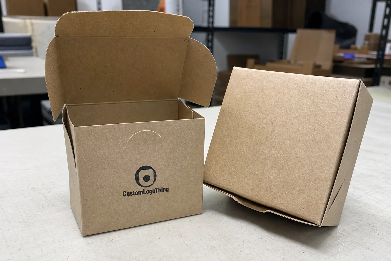
| Kraft folding carton | Rustic bakeries, simple cookie packs, natural branding | Lower print brightness, but strong shelf appeal for earthy designs | About $0.18-$0.28 |
| SBS paperboard with matte coating | Retail display, gift-ready sweets, premium branding | Cleaner print and sharper graphics, usually a bit higher cost | About $0.24-$0.38 |
| Window box with insert | Assorted treats, decorated items, bakery case display | Better visibility and stability, but more converting complexity | About $0.32-$0.52 |
| Soft-touch laminated carton | Gift boxes, seasonal launches, higher-end product packaging | Premium feel, but more expensive and less forgiving on greasy products | About $0.36-$0.60 |
Those numbers are not fixed quotes. They move with size, ink coverage, board availability, and whether the job needs special tooling. Still, they are a useful benchmark. A box that costs a few cents more can save money if it reduces breakage, returns, or repacking labor.
From a buyer’s point of view, total value matters more than unit price alone. If a stronger carton prevents one damaged dessert tray per case, the better spec can pay for itself quickly. That is especially true for product packaging sold at a premium margin. Cheap packaging that damages product is not cheap. It is expensive in the wrong place.
When sustainability is part of the brief, ask for FSC-certified board if that fits the brand and supply chain. You can verify paper and fiber sourcing through FSC, and that can help support both retailer requirements and brand messaging. It also makes the sustainability claim easier to defend if a buyer or retailer asks for proof.
Production steps and lead time from dieline to shipment
The production path is straightforward when everyone supplies clean information. First comes the specification sheet: box dimensions, product type, quantity, finish, and any inserts or windows. Then the supplier issues a dieline so the artwork can be built on the actual structure. After that, artwork approval, proof review, printing, converting, finishing, and final packing follow in order.
Late changes are what usually slow everything down. If the artwork still has moving copy, if the barcode placement is not final, or if the size changes after proof approval, the schedule gets pushed. Complex structures are another common delay because a carton with multiple panels, a window, and a partition takes longer to verify than a simple tuck box. Nothing exotic there. Just time.
Typical lead time often lands around 12 to 18 business days after proof approval for straightforward jobs, though larger runs or specialty finishes can stretch longer. Rush orders are possible in some cases, but they work best when the structure is already proven and the art is final. If the box is still being designed, rush requests usually become expensive and unreliable.
A practical schedule keeps the following locked early:
- Final product dimensions and pack count
- Logo files, flavor copy, and barcode data
- Material preference, finish, and insert need
- Target ship date and reorder window
If the box will travel through distribution, ask whether the pack should be tested against an ISTA method that matches the shipping lane. A carton that looks clean in the proof can still fail under vibration, compression, or drop conditions if the structure is too light for the load. That is especially true for taller cartons and assortments with uneven weight distribution.
One more prepress issue deserves attention: print density. Heavy dark coverage, rich black panels, or full-bleed graphics can show banding, rub marks, or color drift if the spec is not set correctly. Good artwork does not automatically become good packaging. The print process has to be planned for it.
How to size, spec, and brand a box that actually fits
Measure the finished product, not the recipe. That sounds obvious, but it gets missed all the time. Frosting domes, liners, cellophane wraps, candy cups, ribbon ties, and dividers all change the real pack-out size. A brownie that measures 3 inches on paper may need more room once it is wrapped or portioned for retail packaging.
Internal clearance matters. Too little room and the item scuffs or crushes. Too much and it slides around, which makes the contents look less intentional and can damage decoration. The right fit usually leaves enough space for easy loading without allowing the treat to drift during carryout or shipping.
Branding decisions should follow the sales environment. A bakery case box should read fast, with the flavor or product name visible in a glance. A gift box can carry more storytelling and a richer color palette. Seasonal artwork works well when the structure stays stable and only the graphics change. That keeps tooling under control and makes reorders easier.
Good packaging design also respects the shelf. Front-panel readability matters. So does barcode placement, especially if the box will pass through retail checkout. If the box stacks in a display case, the top panel should hold its shape and the side panels should not bow after filling. A carton that warps after being packed looks unfinished, even if the print is strong.
Here is a simple spec checklist that keeps most projects on track:
- Measure the product in its final condition.
- Confirm how many items go in each box.
- Decide whether the box is for display, gifting, or shipping.
- Choose the finish based on handling and grease exposure.
- Test the artwork against the dieline before approval.
For brands building out broader product packaging, it helps to align the treat box with the rest of the line so the logo, typography, and color system feel intentional across every carton, sleeve, and mailer. A coordinated look signals care without forcing the design to become heavy-handed. Consistency also makes reordering less painful, because the same design logic can carry across SKUs.
Common mistakes that cause waste, delays, or damage
The most expensive mistake is ordering too early. If the recipe, decoration, or pack count is still changing, the box spec will likely change too. That leads to rework, revised artwork, or a carton that technically fits but no longer matches the product.
Another common error is choosing a structure that looks elegant but cannot survive the actual workflow. Humidity, grease, and vibration are ordinary conditions in bakeries and delivery routes. A lightly built box that seems fine on a table can fail once it is stacked in a cooler, handled by staff, or carried in a vehicle. The problem is not the box in isolation. It is the box under real use.
Overdesign causes its own problems. Too many finishes, too much copy, and too many components can make the box harder to read and more expensive to run. Simpler branded packaging often performs better because the customer can understand it fast and the production line can run it more predictably. A clean carton also tends to age better if the product line changes over time.
Skipping sample testing is another avoidable miss. Ask for a proof or sample, then fill it with the real treat, close it, stack it, and move it the way the customer will. That one step reveals issues that artwork proofs never show, such as scuffing, sagging, or a lid that lifts when the box is full.
One more issue: buyers sometimes focus on the outer look and ignore the environment the box will actually live in. If the item sits near warm lights, frosting can soften. If the box is kept cold, condensation can affect print and coatings. There is no single material that solves every use case, which is why the brief needs to be honest about how the product is sold. Good packaging specs start with reality, not assumptions.
Expert tips for bakery displays, gifting, and seasonal runs
Separate the retail display spec from the shipping spec whenever the same product needs to do both jobs. The display box can prioritize appearance and speed at the counter. The shipper can prioritize compression strength and resistance to movement. Trying to force one box to do both usually raises cost without fully solving either problem. You end up paying for compromise instead of performance.
For mixed assortments, use inserts or partitions. They keep pieces from sliding together and make the assortment feel more deliberate. That matters in gifting because customers read organization as care. A neat layout in the box can make a modest assortment feel more valuable. Random movement does the opposite.
Windows should be placed with intention. Put the opening where the most attractive treat lands first in the shopper’s view. If the product has strong color, texture, or decoration, the window can sell it immediately. If the goods are plain or irregular, a full window may expose more than it helps, so a partial cutout or printed panel may be the better choice.
Seasonal runs are easiest when the structure stays fixed and the artwork rotates. That keeps the production file stable and lets the brand move through holidays without rebuilding the carton each time. It is also more efficient for reorders, because the box body stays the same while only the print changes. That is a practical way to control cost without making every launch feel identical.
When the product line grows, align the boxes into a family system. One structure for minis, one for gift sets, one for counter display. That kind of consistency supports stronger package branding and makes the line easier for staff to recognize and stock.
The best bakery packaging usually feels simple on the counter and disciplined in production. If it looks easy but fails in handling, the design was never simple in the first place.
Retailers also appreciate consistency. If the lid opens the same way, the box stacks the same way, and the branding lands in the same place from SKU to SKU, the whole line becomes easier to stock and easier to sell. That operational benefit is real, even if it never shows up in a mockup.
What to check before you place the order
Before you approve the run, make sure the basics are locked: exact dimensions, quantity, product type, finish preference, and whether the box needs to support display, gifting, or shipping. Those five decisions drive most of the cost and almost all of the functional outcome.
Ask for a sample or proof and compare it against the actual treat. A carton that looks perfect on screen can still fail in the hand if the product shifts, the lid flexes, or the graphics do not line up where the customer expects them. That is why buyers who order once and only once usually regret skipping the sample step.
For a smoother reorder later, keep a short project record:
- Approved dieline and final art files
- Board choice and finish spec
- Insert or window details
- Approved sample notes
- Target date for the next seasonal run
If you are sourcing multiple formats at once, it can help to review Custom Packaging Products as a starting point for related box styles, inserts, and retail-ready formats that can keep the line consistent. That kind of planning keeps procurement cleaner and makes the next order easier to place.
For bakeries, cafés, and confectioners, the right brief is not just about design taste. It is about how the package will be handled, stacked, displayed, and opened. Treat the box as a business decision, and custom treat boxes will do what they are supposed to do: protect the product, support the brand, and help the sale close.
What are custom treat boxes usually made from?
Most are made from paperboard, kraft board, or heavier folded carton stock, depending on product weight and display needs. A coated or laminated finish can improve scuff resistance and keep retail graphics looking cleaner. For grease-prone or delicate treats, the board and finish should support both structure and protection.
How do I choose the right size for custom treat boxes?
Measure the finished product, not just the recipe, and include frosting, liners, wraps, or dividers that change the footprint. Leave enough internal clearance so items do not rub, compress, or slide during handling. If the box will be stacked or shipped, test the size under real pack-out conditions before final approval.
What affects custom treat box pricing the most?
Size, material thickness, print complexity, finishing, windows, and inserts are the biggest cost drivers. MOQ changes the unit price because setup costs are spread across fewer or more boxes. A detailed quote is more accurate when you provide dimensions, quantity, product count, and intended use.
How long does production usually take for custom treat boxes?
Timeline depends on artwork approval, structure complexity, quantity, and whether the order needs special finishes or inserts. Simple boxes move faster than multi-component designs that require more proofing and converting steps. The fastest path is to finalize specs early and avoid late changes after the proof stage.
Can custom treat boxes include windows, inserts, or seasonal artwork?
Yes, all three are common when the goal is stronger presentation, better product stability, or holiday-specific merchandising. Windows work best when the product has strong visual appeal and the opening does not weaken the structure. Seasonal artwork is often most efficient when the box structure stays the same and only the print changes.