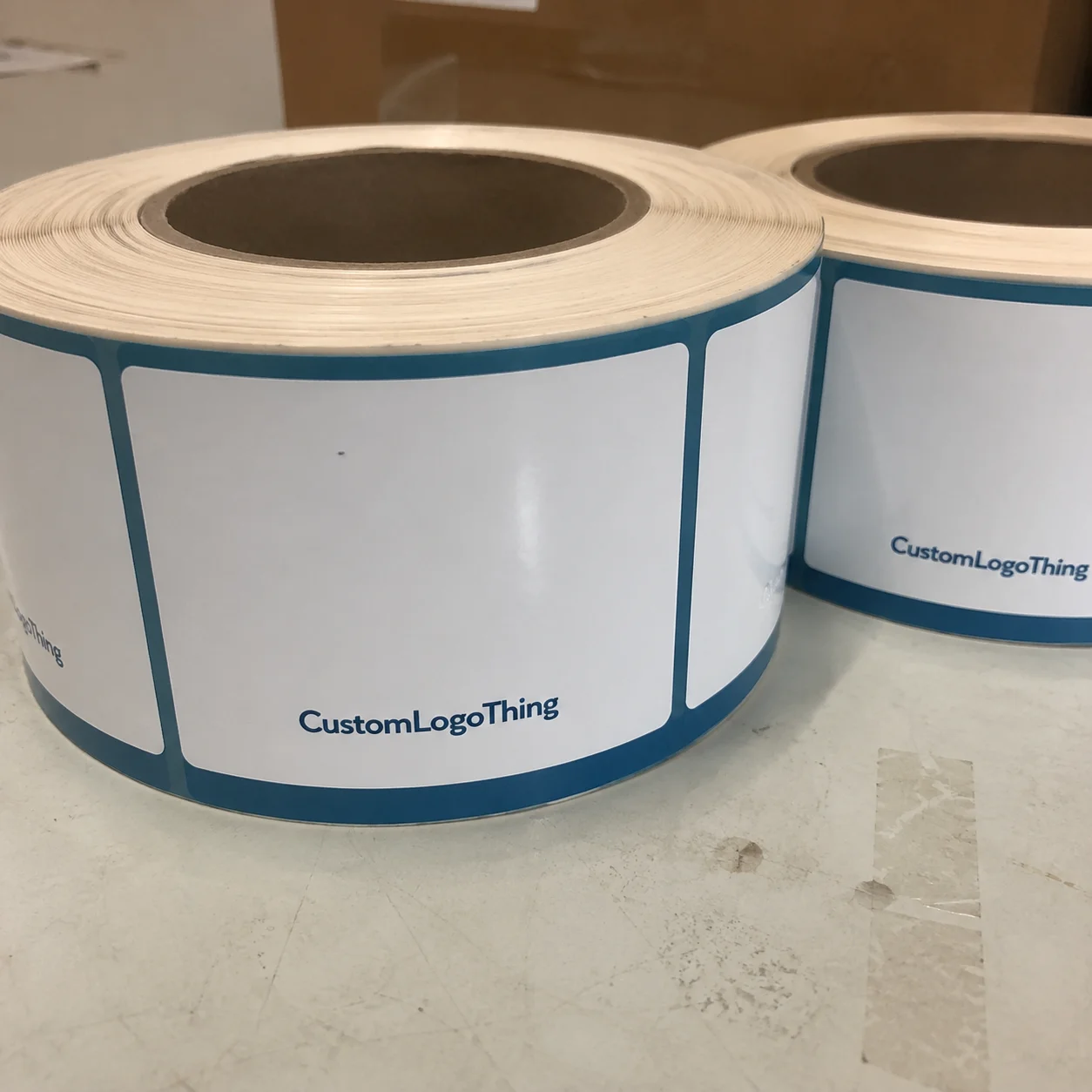
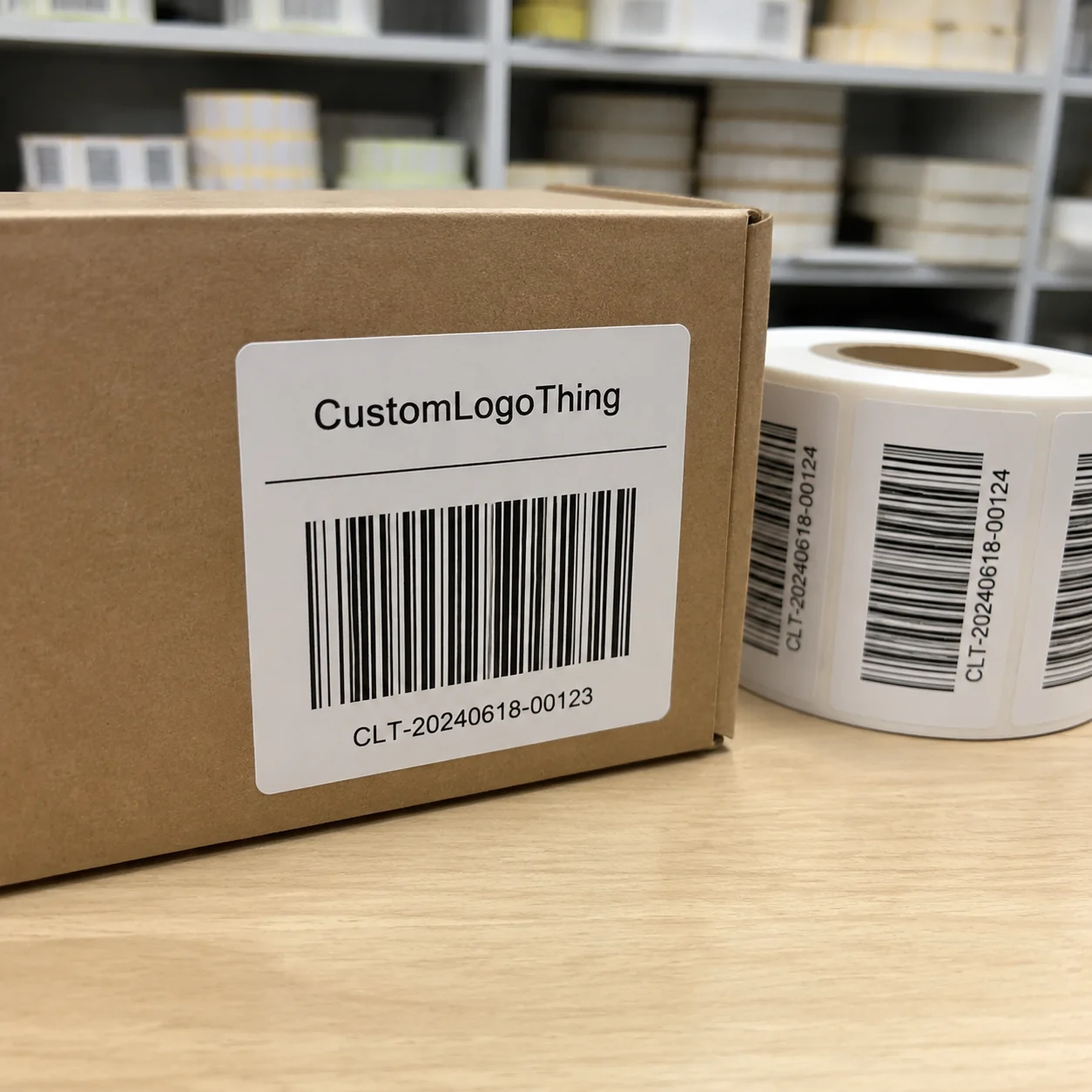
Shoppers read a care label faster than most brand owners expect, and Custom Wash Care Labels custom logo orders live or die on that small panel of fabric or film. If the logo looks sharp but the fiber content is cramped, the washing instructions fade, or the label scratches the neck, the garment feels unfinished no matter how strong the outer packaging is.
The care label is not just a compliance panel. It is part of how the garment feels, how long it lasts in the customer’s hands, and how credible the brand appears under close inspection. Good labels keep branding, readability, and comfort in the same place. That sounds simple until the layout has to hold a logo, size mark, origin data, care symbols, and sewing allowances in a space that may be only a few centimeters wide.
There is a reason experienced buyers treat labels as a trim decision, not a decorative one. A label that works on screen can fail in production because the stitch line shifts, the fold eats into the copy, or the surface texture clashes with the garment. That is true for luxury knits, workwear, athletic apparel, and even simple basics.
Why wash labels do more than show a logo
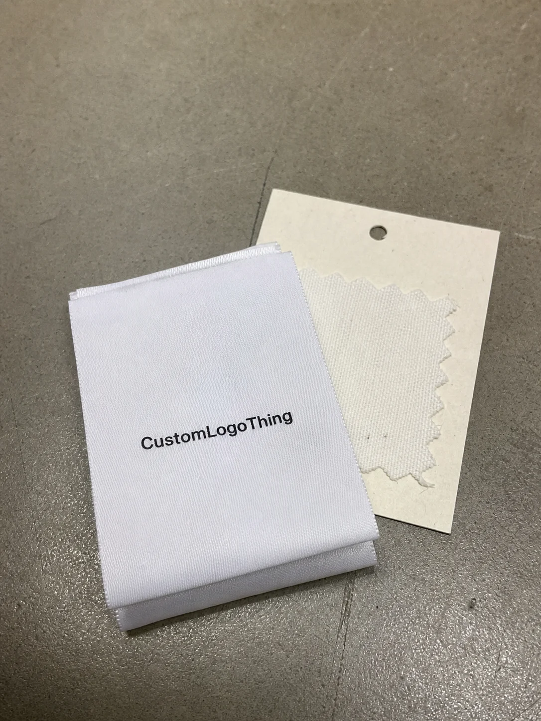
A lot of buyers only notice trim quality after something goes wrong. The label might look clean on a proof, then feel stiff once sewn into a seam, or the print may look crisp on arrival and start breaking down after a few washes. The difference is not cosmetic. It changes how the entire item is judged.
A good wash label has three jobs at once. It identifies the brand, tells the customer how to care for the item, and reduces confusion about size, fiber content, and origin. That matters because buyers often inspect the label before they study a hang tag or read the marketing copy. In apparel, the inner details are part of the product promise.
There is also a resale and return angle that gets overlooked. A shirt with a clear, durable care label feels more legitimate, which supports secondary-market value and cuts down on avoidable questions after purchase. If the label is missing, unreadable, or irritating against skin, the customer notices quickly. They may not know exactly why the garment feels less premium, but they will feel the gap.
“A label can be small and still decide whether the garment feels finished. If it is hard to read, itchy, or inaccurate, the customer notices immediately.”
The label also influences how a product is read against the rest of the brand system. A well-made box, a neatly printed hang tag, and polished outer packaging can be undercut by a flimsy care label. That disconnect is more obvious than many teams expect. The inner trim is a repeated tactile interaction, and repeated contact is where weak choices become visible.
There is another practical issue: labels are often one of the few parts of the product that remain after the packaging is discarded. Outer packaging can be beautiful, but the care label stays with the garment through use, washing, and resale. If the logo and care information are poorly executed, the brand loses a touchpoint that should have lasted the longest.
How custom wash care labels custom logo projects are built
The build starts with two questions: what information has to fit, and how should the label feel against the body? Those answers are related, but they are not identical. A woven label can deliver a stitched, premium look. Printed satin or nylon can carry finer detail and smaller type. Heat-transfer labels sit flatter and are often chosen when bulk has to be reduced to almost nothing.
A combined logo-and-care panel saves space and can look tidy on tees and sweatshirts, but it forces a clear hierarchy. The logo cannot dominate to the point where the fiber content becomes hard to read. A separate brand tab gives the logo more breathing room, which helps on premium lines, but it adds another sewing or placement decision. That tradeoff is worth making deliberately, not by habit.
The information commonly packed into one label includes:
- Brand logo or wordmark
- Fiber content
- Care instructions in written form or symbols
- Size marking
- Country of origin
- Special handling notes if the garment needs them
Fold style matters more than many buyers expect. A center fold, end fold, loop fold, or straight cut changes how the label sits in the seam and how much readable space remains after stitching. On lightweight knits or children’s apparel, a bulky fold can distort the fabric edge. On athletic wear, a low-profile finish or transfer is often the safer route because it keeps friction down at a stretch point.
Construction choice should follow the garment, not the other way around. Satin is familiar for fashion basics and usually feels softer than a woven edge. Nylon tends to hold print well and tolerate laundering. Polyester is a common middle ground because it balances print stability and cost. Cotton can suit a natural look, but dense copy and repeated wash cycles can make it less forgiving. Woven labels can look premium, yet a coarse weave can be more irritating than helpful on thin fabrics.
For brands planning a broader trim system, it helps to treat wash labels the way you treat Custom Labels & Tags and the rest of the packaging stack. They should not be designed in isolation. They need to fit the garment, the artwork, the sewing method, and the wider presentation, including Custom Packaging Products if the line is sold as a full retail package.
One practical check is to print or mock up the care copy at real size and fold it the way production will. Typography that looks fine on a screen can collapse once the label is folded and stitched. Eight-point type may sound readable on paper; under a center fold and a tight seam, it can turn into visual noise. That is why experienced spec sheets include dimensions, not just text content.
Cost, MOQ, and what changes your unit price
Pricing for custom wash care labels custom logo work depends on more than the logo file. Material, print method, color count, folding, and text density all affect the number that lands on the quote. A simple one-color woven label is not in the same cost class as a printed satin label with care symbols, origin text, and a logo in tight registration.
MOQ behaves the way it usually does in trim manufacturing: lower quantities carry a higher unit price because setup time is spread across fewer pieces. That is not a penalty so much as arithmetic. If the line is still being tested, a smaller run can make sense even at a higher per-piece cost. If the label format is stable and the garment is established, larger runs usually bring the unit cost down in a way that is easy to defend.
Broad budgeting ranges are useful, but only if they are treated as ranges, not promises. In many production settings, simple printed labels may land around a few cents per piece at scale, while woven or specialty-finish labels can move into the higher cents range quickly. Short runs, custom folds, complex layouts, or heat-transfer work can push unit cost into the $0.20 to $0.60 range or higher depending on setup and complexity. The pattern is consistent: the more the label asks of the factory, the more expensive each piece becomes.
Typical cost drivers include:
- Label material: woven, satin, nylon, polyester, cotton, or transfer
- Print complexity: one color versus multiple colors, fine type, symbols, or gradients
- Finish: cut edge, end fold, center fold, loop fold, or heat seal options
- Artwork cleanup: logo tracing, font substitution, or layout corrections
- Compliance revisions: text changes after the first proof
Quotes are easier to compare if the same spec sheet is used everywhere. A lower unit price means very little if one supplier includes proofing, layout cleanup, and a durability check while another excludes all three. That difference is common. A buyer can look at two sheets that appear similar and still end up with different landed costs once corrections, sampling, and reprint risk are counted.
| Quote element | Good sign | Risk signal |
|---|---|---|
| Material | Specified clearly, with finish and feel described | Vague wording like “premium label” |
| Artwork support | Proofing included, with text cleanup if needed | Buyer is expected to fix layout issues alone |
| MOQ | Matches the garment run and forecast | Too low to be realistic, or too high for a test launch |
| Durability | Wash resistance and print method stated | No mention of laundering or edge durability |
| Compliance detail | Fiber content, origin, and care content reviewed | Seller ignores label content entirely |
For many brands, the more useful comparison is not the absolute lowest quote but the spread across quantities. If a supplier shows you prices at 500, 1,000, 3,000, and 5,000 pieces, you can see how setup cost is being absorbed. That view helps with planning because trim is often ordered in the same rhythm as the garment run, not as an isolated purchase.
Process and turnaround: from artwork to finished labels
The process should start with complete inputs. A supplier needs the logo file, fiber content, care language, size marking, dimensions, fold preference, and attachment method before a proof can be meaningful. If those details are missing, the first layout is usually a placeholder, and placeholder proofs are where schedules start slipping.
What slows label jobs down most often is not production capacity. It is missing information. Low-resolution logos force redraws. Unclear color references create extra proof cycles. Care copy that arrives after the layout has been drafted can change line breaks, symbol placement, and spacing. Even one short sentence added late can alter the whole composition.
A practical timeline often looks like this:
- Quote review and spec confirmation
- Artwork cleanup and layout proof
- Buyer approval or sample confirmation
- Production and finishing
- Inspection, packing, and shipment
Most label orders begin after proof approval, not after the first inquiry. That difference matters when a launch date is already fixed. If the garment line is on deadline, the quickest way to shorten lead time is to have the content ready before requesting pricing. Confirm the fiber percentages early, decide whether the logo sits alone or with the care text, and settle the fold or trim size before the first proof is drafted.
Typical turnaround also depends on the label type. Simple printed labels may move faster than woven orders because the setup is less demanding. Complex woven artwork, specialty finishes, or custom die-cut shapes usually add days. Sampling extends the schedule, but it is often worth it on tighter garments because the sample exposes issues that a flat proof cannot show: seam distortion, stiffness, edge fray, and how the material behaves after folding.
For buyers coordinating broader product packaging, the same discipline applies to the rest of the system. The label, hang tag, carton, and outer mailer should feel like they belong to the same brand family, even if they are produced by different suppliers. Good packaging design is less about decoration than about consistency under handling, transit, and unboxing.
Material, print, and compliance factors that affect results
Material choice changes both feel and durability. Satin is soft and familiar for fashion garments. Cotton can suit a natural or heritage look, though it is not always the best fit for dense copy. Polyester and nylon tend to hold detail well and resist wear. Woven labels look premium, but they are not the best answer for every garment, especially if the product sits directly against skin.
Print clarity depends on more than the artwork file. Font size, line spacing, and contrast are critical. Tiny type may look acceptable on a monitor and still become unreadable after weaving, printing, folding, or repeated laundering. If the label needs multiple languages or symbol sets, spacing becomes even more important because the copy density rises quickly. A layout that feels tidy in English can become crowded as soon as it includes international care symbols and a second language line.
There are also compliance basics that should never be handled casually. The fiber content needs to be accurate. Country of origin needs to match the actual production flow. Care instructions should match the garment construction and finish. Market-specific rules vary, so the destination market should be checked before the copy is locked. A label that is correct for one region can still be wrong for another if the language, symbols, or required disclosures differ.
For general packaging and labeling guidance, industry groups such as the Packaging School / packaging.org, ISTA, and the FSC are useful reference points for material and transit thinking, even though final garment-label rules still need their own review. Those sources do not replace label compliance checks, but they help brands think more clearly about the full supply chain.
Fit to garment matters as much as print method. A soft tee usually needs a softer finish. Intimate apparel often does better with a low-profile label or heat transfer. Outerwear can handle a more durable woven edge because the base fabric is heavier. Athletic wear usually benefits from a solution that does not add bulk or irritation at a stretch point. If the garment is meant to feel lightweight and technical, a thick label can fight against that impression from the first touch.
Quality control on the label side should include more than a visual check. Good buyers ask for wash-resistance details, edge stability, stitch compatibility, and proof confirmation against the actual garment size. If possible, the label should be checked on the same fabric it will be sewn into. A panel that looks fine on paper can behave differently once the seam pulls it into shape.
Another useful control is to verify that the color match works under the lighting the customer will actually see. A logo color that reads correctly in a digital mockup can shift after printing, weaving, or lamination. If the garment line is being built around a precise identity system, that shift can be enough to make the trim look off even when the measurements are correct.
Common mistakes that cause reprints or rejected labels
The easiest mistake is to cram too much into one label. A logo, size, fiber content, care symbols, origin text, and legal wording can all fit sometimes, but not always cleanly. If the layout becomes crowded, something gives: readability drops, hierarchy disappears, or the fold cuts through important information.
Another common problem is mismatch. A rough woven label may work on jackets and denim, but it can feel wrong on a soft jersey tee. A glossy printed surface may look sharp in a proof and still read as too slick against a matte garment. The same logic applies in packaging: a surface that fights the substrate feels like a mistake even if the artwork is technically correct.
Proofing errors create expensive fixes. Wrong fiber percentages, missing origin data, or a care instruction that does not match the actual fabric can force a reprint. So can orientation mistakes, such as approving a fold that puts the logo upside down when the seam is sewn. These issues are small until they hit the line, and then they become production delays.
Proofreading pitfalls worth checking twice:
- Wrong fiber percentages or outdated material data
- Missing symbol translations for the target market
- Unreadable type size after folding or stitching
- Incorrect stitch placement that cuts into the content area
- Approval without a final garment context
There is a reason experienced buyers ask for a sample or preproduction mockup on tighter projects. If the garment has a slippery lining, a stretch panel, or a very narrow seam allowance, the label can behave differently than expected. A sample can expose those problems before the full order is committed, which is cheaper than learning the same lesson after thousands of pieces are sewn.
A final trap is assuming that a label approved for one fabric will work across the whole collection. A label that fits a heavyweight hoodie can feel harsh on a ribbed tee. A transfer that looks perfect on polyester may perform differently on a cotton blend. If the collection mixes fabric weights, the safest approach is to validate the label on the lightest and most sensitive garment first.
Next steps for ordering labels that fit the garment
If you want a clean ordering process, start with a complete spec sheet. Gather the logo file, fiber content, care instructions, size marking, label dimensions, fold preference, attachment method, and expected quantity before requesting a quote. That one step usually saves the most time and reduces revision risk later.
Ask for a proof or sample if the garment is unusual, the label space is tight, or the brand standards are strict. That is especially useful for new product packaging programs, where the label needs to work with hang tags, retail packaging, and the wider visual language of the line. Small differences in trim can change how premium the garment feels in hand.
Compare suppliers on more than price. You want someone who can explain print clarity, material options, proofing support, and how the care text will sit in the final layout. A supplier who asks good questions is usually more valuable than one who simply agrees to everything. Good questions catch mistakes early, and early corrections are cheap compared with reprints.
My practical rule is simple: finalize the spec sheet first, then approve a sample or proof, then order the production run. If the garment line is new or the label layout is tight, start with a smaller quantity and confirm the feel on the actual fabric before scaling up. That is the safest way to handle custom wash care labels custom logo projects without wasting time, money, or credibility.
What should custom wash care labels custom logo orders include?
Include the logo, fiber content, care instructions, size marking, and any required origin or compliance text. Keep the wording short enough that it stays readable after folding, sewing, and repeated washing. Ask for a proof to confirm spacing, hierarchy, and the final print or weave quality before production.
Which label material is best for soft garments?
Printed satin, soft polyester, or heat-transfer labels are usually better for garments that touch the skin. Woven labels work well when the brand wants a stitched look, but the hand-feel should be checked on the actual fabric. If the garment is very lightweight or stretchy, a low-bulk option usually performs better because it does not distort the seam.
How much do custom wash care labels with logo usually cost?
Price depends on material, print method, quantity, number of colors, and whether the order includes custom folding or special finishing. Smaller runs usually cost more per label, while larger quantities lower unit cost once setup is spread across the order. The cheapest quote is not always the best value if it leaves out proofing, durability, or the correct compliance text.
How long does production usually take after approval?
Most timelines start after artwork approval, not after the initial inquiry, because layout changes can reset the schedule. Simple label orders move faster when the logo file and care copy are ready and there are no revisions. Complex constructions, specialty materials, or sample approvals can extend turnaround by several days or more.
What is the minimum order for custom wash care labels?
Minimums vary by label type and manufacturing method, so buyers should ask for MOQ before they finalize the design. Lower quantities are often possible, but the unit price usually rises because setup costs are spread across fewer pieces. If the brand is testing a new product line, start with the smallest practical quantity and a clear spec sheet.