Buyer Fit Snapshot
| Best fit | To Retail Display Carton Design projects where brand print, material claims, artwork control, MOQ, and repeat-order consistency need to be specified before quoting. |
|---|---|
| Quote inputs | Share finished size, material target, print colors, finish, packing count, annual reorder estimate, ship-to region, and any compliance wording. |
| Proofing check | Approve dieline scale, logo placement, barcode or warning zones, color tolerance, closure strength, and carton packing before bulk production. |
| Main risk | Vague material claims, crowded artwork, missing packing details, or unclear freight terms can make a low unit price expensive after revisions. |
Fast answer: To Retail Display Carton Design: Board, Finish, Dieline, and Unit Cost should be specified like a repeatable production item. The safest quote records material, print method, finish, artwork proof, packing count, and reorder notes in one written spec.
Production checks before approval
Compare the actual filled-product size with the drawing, then confirm tolerance on folds, seals, hang holes, label areas, and retail display edges. Reserve space for logos, QR codes, warning copy, and material claims before decorative graphics fill the panel.
Quote comparison points
Review material grade, print process, finish, sampling route, tooling charges, carton quantity, and freight assumptions side by side. A quote is only useful when the supplier can repeat the same color, closure quality, and packing count on the next order.
The guide to retail display carton design starts with a simple reality I have seen again and again on factory floors from Shenzhen to Dongguan and down through Foshan: a 3 mm shift in the shelf-facing can outsell a prettier carton every single time. I watched that play out on a corrugated line in Dalang, where the first sample looked polished on screen, then we widened the front lip by 3 mm and the retailer immediately said, "Now it reads from six feet away." That is the work, plain and simple. The guide to retail display carton design is not about making a box look refined for a presentation deck; it is about making a carton do three jobs at once without bleeding money or making the packing team mutter under their breath.
I have spent enough time in folding-carton rooms in Suzhou, corrugated plants in Dongguan, and prepress departments in Shenzhen to know the difference between a concept that wins applause and a carton that survives a real retail launch. The strongest guide to retail display carton design work lives at the intersection of structure, speed, print impact, and compliance, usually on 350gsm C1S artboard for lighter SKUs or E-flute corrugated when the unit weight climbs past 1.2 kg. If one of those pieces is weak, the whole pack gets pulled sideways by the line workers, the buyer, or the store fixture itself. A carton can look elegant and still fail because a packer needs two extra seconds to fold one tab or the tray catches under a lip. Frankly, that kind of failure is maddening because it is so avoidable.
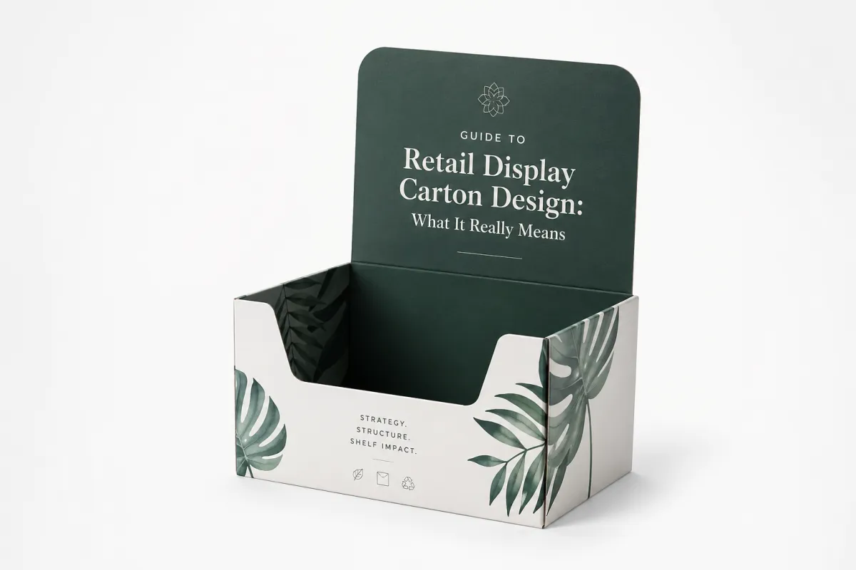
Guide to Retail Display Carton Design: What It Really Means
People hear guide to retail display carton design and assume it means "make the box look good." That is the junior version of the assignment. In practice, the carton is a brand-facing sales tool that sits between packaging engineering, merchandising, and retail marketing, and it often has to pass a 6-foot readability check under 4000K store lighting in less than five seconds. It has to protect product on the truck, open cleanly on the sales floor, and still give a shopper a reason to stop for three seconds instead of walking past the shelf with the usual hurry and tunnel vision.
I remember a meeting with a personal care brand in Chicago where the sales team kept asking for more copy, more claims, and more icons. By the end of the review, the carton looked like a crowded notice board in a factory cafeteria, and I say that with affection for cafeterias because at least those boards are useful. We stripped it back, made the logo 18% larger, moved one benefit line to the side panel, and tested the front panel at 12-point line height in a lighting mockup that matched a Kroger aisle. Sales later told me the buyer liked it because the front panel read instantly under fluorescent light. That is the part most teams miss in any guide to retail display carton design: the front panel is a selling surface, not a brochure.
These cartons show up in several formats. Countertop displays. Shelf-ready cartons. Club-store packs. Promo units that need to ship flat, then pop into shape fast on the retail floor. A 24-count snack tray for Costco in California wants different engineering than a 6-pack cosmetics tray headed to a pharmacy chain in Ohio. The use case matters because a countertop unit wants visibility and quick loading, while a club-store tray needs stack strength and clean edges after rough handling on a pallet. A practical guide to retail display carton design has to account for the retail environment before anyone starts arguing over varnish, foil, or embossing. I have watched teams obsess over finishes while ignoring whether the tray would actually fit the shelf gap. That is backwards, and it burns time.
"It looked plain on the render, but once we changed the shelf-facing by 3 mm, the whole pack read better under fluorescent light." That came from a buyer in a Chicago review meeting, and she was right.
Good display cartons are not overbuilt just to feel expensive. I have seen brands waste $0.14 per unit on heavy board and extra panels in a 5,000-piece run out of Ningbo, only to learn the retailer wanted the carton replaced every six weeks anyway. That is money down the drain. A serious guide to retail display carton design should balance protection, speed on the line, print impact, and retail compliance without adding pointless cost. If the carton does not earn its keep, it is just a fancy expense with a barcode.
When I visited a converter outside Dongguan, the plant manager showed me two nearly identical shelf-ready cartons on a Komori press line and a Bobst die-cutter area. One had a slightly deeper thumb cut and a more forgiving lock tab. Same artwork. Same board. Different reality. The easier version packed 11% faster over a 2,000-unit pilot, and the line crew in Changan stopped complaining after the first shift. That is why the guide to retail display carton design matters: small structural changes can save real labor, not theoretical labor tucked inside a spreadsheet. I wish more sales decks included that kind of honesty.
Guide to Retail Display Carton Design: How It Works
The guide to retail display carton design process usually starts with a brief, then moves to a dieline, then a prototype, then final production. It sounds tidy on paper. It almost never behaves that way in real life. The brief should include product dimensions, unit weight, pack count, retailer requirements, print goals, shelf or pallet footprint, carton grade, launch window, and where the job is going to run, whether that is Shenzhen, Suzhou, or a regional converter closer to the distribution center. If that information is fuzzy, the project starts wobbling by day two and rarely recovers without revisions and a few tense calls that nobody enjoys.
From there, the designer works out the structure. That is the point where the carton either earns its keep or turns into a headache for everyone downstream. A retail display carton has to survive transport, assemble quickly, and present the product clearly in store, often with a glue area of 6 to 8 mm and a lock flap that can be folded in under 10 seconds. Those are three different jobs, and they do not always get along. In one guide to retail display carton design project for a snack brand, we built a tray that looked clean until we loaded 24 units at 85 grams each and the front wall bowed 4 mm. Pretty became pointless in a single afternoon, and the plant supervisor gave me the look that says, "Well, now we know."
The structural decisions are where money disappears quietly. Opening method. Tear strip. Locking tab. Window size. Product loading direction. Shelf footprint. Each choice changes the die line, the tooling, and sometimes the lead time. I once watched a client ask for a wider window after sampling on a carton made in Dongguan. That one change meant a new knife rule, a fresh proof, and five extra business days, plus a second prototype at $42 before freight. In any honest guide to retail display carton design, that is not a small adjustment. It is an expensive adjustment in a polite shirt.
Retail teams judge cartons fast. They are not reading a memo, and they are not waiting for the brand story to unfold. They are scanning for clarity, price-point cues, and whether the display looks easy to shop, often while standing 7 feet from the endcap in a 30-second walkthrough. If the carton feels awkward to open or difficult to refill, it loses points immediately. A strong guide to retail display carton design has to think like a buyer and a store associate, not just like a graphic designer with a polished mood board. I have sat through enough review meetings to know that a gorgeous render will not save a carton that slows down a stock clerk in Atlanta or Minneapolis.
One rule I give clients over and over is simple: the carton needs to be understood in under five seconds. If a shopper cannot tell what it is, what size it is, and why it belongs in the basket, the design is doing too much. I have seen an excellent coffee display lose shelf space because the pack looked premium but buried the product name under a reflective band that flashed under 3500K LEDs. Nice effect. Wrong aisle. The buyer did not care that the foil looked luxurious if nobody could read the thing from the center of the aisle.
What Should a Retail Display Carton Design Include?
A strong guide to retail display carton design should include four things before anyone starts choosing decorative finishes: structure, readability, retail fit, and production practicality. Structure keeps the carton upright and shippable. Readability makes the product easy to spot from the aisle. Retail fit ensures the tray or display actually works with the shelf, endcap, or pallet space the buyer has already approved. Production practicality keeps the packing crew moving at a pace that makes sense, with a dieline, glue points, and loading direction that do not fight the line.
That is why I usually ask clients to think in layers. First, the carton has to protect the product during transit. Second, it has to carry the brand message with enough clarity that the shopper can understand the offer at a glance. Third, it has to run efficiently through a folding-carton line or corrugated display tray line without adding unnecessary labor. If a guide to retail display carton design leaves out any one of those layers, the carton can still look polished and still fail in the store.
For most projects, the best starting point is a clean hierarchy on the front panel, a board grade matched to the product weight, and a shelf-ready packaging format that suits the channel. A countertop point-of-purchase display needs different proportions than a club-store corrugated display tray, and a promo carton headed to a pharmacy aisle should not borrow cues from a warehouse-club pack unless the retailer wants that exact look. The right choice is usually the one that keeps the pack easy to load, easy to shop, and easy to replenish. That is the practical center of any guide to retail display carton design.
Retail compliance also belongs on the list. Barcode placement, case pack count, planogram width, stack height, and retailer-specific display rules need to be checked before sampling, not after the sample is approved and the clock has started moving in a very expensive direction. I have seen a simple adjustment to the barcode zone save a launch, and I have also seen a small compliance miss cause a rejection that stalled the entire shipment. That is the kind of detail that separates a nice concept from a carton that can actually reach the shelf.
If the product is fragile or premium, insert design matters too. A custom insert can protect glass, tools, cosmetics, or multi-piece kits, but the insert should still be easy to place and easy to explain in the quote. Many teams fixate on surface print and forget that an insert can add more labor than the box itself. A balanced guide to retail display carton design keeps the package working as a system, not as a stack of disconnected upgrades.
Key Factors That Make a Carton Sell
Structure comes first in the guide to retail display carton design. If the carton cannot hold shape, stack properly, or survive the trip from warehouse to shelf, the rest is decoration. For heavier items, I usually want stronger board, better load-bearing corners, and a locking feature that does not rely on hope, such as 400gsm SBS on a 1,000-unit display or B-flute corrugated for a 3.5 kg shipper. Tear resistance matters too. Retail staff are not going to baby the display, and neither will a distribution center in Guangzhou or a 3PL in New Jersey that is moving pallets at speed. The carton has to behave like it has a job.
Branding comes next, and this is where teams love to get carried away. Typography needs hierarchy. Color contrast needs to work under harsh store lighting. The logo needs to be visible from a distance, but not so huge it turns into billboard clutter. In one guide to retail display carton design project for an athletic accessory brand, we cut the front copy from nine lines to four and moved the barcode 14 mm lower to clear the shelf rail. The conversion rate on the shelf mockup improved because people could understand it without squinting or stepping closer than they wanted to. I have a very strong opinion here: if a carton needs a paragraph to explain itself, it is not doing its job.
Shopper behavior is brutal and simple. Six feet away, the carton has to read. Three feet away, it has to explain the offer. One foot away, it has to justify the purchase. That means the visual hierarchy needs to be built for speed, with a logo zone around 20 to 25% of the front panel and a benefit line that can survive a 2-second glance. A strong guide to retail display carton design will always favor instant recognition over clever copy that makes the creative team nod and the buyer keep walking. I have seen too many smart ideas die because they were clever first and clear second.
Retail compliance can kill a concept in a minute. Planogram fit. Barcode placement. Case pack counts. Stack height. Shelf depth. Some retailers have picky display rules that feel absurd until you get rejected for ignoring them. I have seen a $12,000 run delayed because the barcode sat 8 mm too low for the retailer's scanning setup in a Midwest warehouse. The lesson is simple: in a real guide to retail display carton design, compliance is not optional and it is not a detail to clean up later. It is the gatekeeper, and it does not care how nice your mockup looked in the conference room.
Sustainability needs honesty, not perfume. Use the board grade the product actually needs, such as 350gsm C1S artboard for a lightweight cosmetic kit or 1.5 mm greyboard laminated to printed paper for a rigid gift set. Reduce ink coverage where possible. Avoid decorative add-ons that do nothing except add waste. Recyclability matters, but so does right-sizing. Overbuilt cartons burn material and freight for no useful reason. I like to point clients to the EPA recycling guidance and the FSC standards when they want a cleaner paper story without making claims they cannot support. That keeps the conversation grounded in actual materials instead of marketing fog.
Retail display carton design also lives and dies on board choice. For light cosmetic kits, a 350gsm C1S artboard might be fine, especially for a 5,000-piece run at roughly $0.15 to $0.19 per unit from a converter in Shenzhen. For a heavier promo unit, I will often push for stronger SBS or a corrugated structure with a cleaner face. The exact choice depends on weight, handling, and the retail channel. There is no magic board that wins every time. Anyone selling one is trying to move inventory, not help you make a better carton. I have learned to trust the supplier who talks about limits, not just possibilities.
What shoppers notice first
They notice contrast, shape, and whether the carton feels easy to understand. If the guide to retail display carton design has done its job, the product message lands before the shopper even touches the pack, usually with a headline set large enough to read from 6 feet and a benefit statement that fits in 12 words or fewer. If the message needs an explanation, the design is already late and the shelf has moved on. That is not a moral judgment; it is just how retail behaves when people are in a hurry and the aisle is noisy.
| Option | Typical unit cost at 5,000 | Best for | Watch-outs |
|---|---|---|---|
| 350gsm C1S folding carton | $0.15 to $0.21 | Light products, strong print impact | Lower crush resistance, less forgiving for heavy loads |
| 400gsm SBS folding carton | $0.21 to $0.31 | Premium graphics, cleaner folding, better stiffness | Costs more, still not ideal for rough stack handling |
| Corrugated retail display carton | $0.29 to $0.48 | Heavier items, club-store use, shelf-ready trays | More bulk, higher freight, print finish options can get pricier |
| Custom display carton with inserts | $0.38 to $0.72 | Gift sets, fragile SKUs, multi-piece kits | Tooling, assembly time, and labor add up fast |
That table is not theory. It is the pattern I see over and over from plants in Dongguan, Xiamen, and Qingdao. A simple-looking carton can be the most expensive item on the shelf if it needs inserts, foil, spot UV, or custom tooling. In one guide to retail display carton design project, the client wanted a soft-touch finish plus foil plus a magnetic closure. The sample looked beautiful, no question. Cheap, it was not. The quote jumped by $0.27 per unit, and the retailer still asked us to strip it down for shelf consistency. That is one of those moments where everybody stares at the sample and then stares at the budget, and nobody wants to be the first person to speak.
If you want standards, do not ignore testing. The International Safe Transit Association publishes useful test methods for packaging validation, and they are not just for people who collect acronyms. Check ISTA if your display carton will face rough transit, vibration, or drop risk. A good guide to retail display carton design should always include testing, not just pretty renders and a confident sales pitch. I have had beautiful concepts come back from testing looking like they had been through a small war after a 1.2-meter drop and a vibration cycle, and that is exactly why the testing exists.
Cost and Pricing: What Changes the Budget
Price is where a lot of guide to retail display carton design projects get very real, very fast. The biggest cost drivers are board grade, print process, finishing, size, structural complexity, and order quantity. If the carton is larger, heavier, and fancier, the unit cost climbs. That is not a conspiracy. That is physics, press time, and labor showing up exactly where they should. Honestly, I think the budget tells the truth long before the presentation does.
Prototype and sampling costs usually come first. Then unit price drops as volume climbs. Low quantities always hurt. A run of 500 units can feel absurdly expensive compared with 10,000, especially if you are asking for a printed sample in one week and a production slot in Guangzhou the following Monday. I have seen a quote of $2.40 per unit at 500 pieces fall to $0.48 at 5,000 pieces with no change in structure. That is normal. The press setup, die cutting, and conversion labor do not care about your optimism or your launch calendar. They only care about time, material, and setup.
Here is a negotiation story from a supplier in Shenzhen. We had a carton priced at $0.29 per unit on 5,000. The client wanted a stronger board and a cleaner front edge, which added $0.08 per unit. They complained for 20 minutes. Then I showed them the return rate on damaged units from the previous launch, which had reached 3.6% over a six-week selling window. One reorder, one $0.08 increase, and they saved nearly $1,900 in claims. That is how a real guide to retail display carton design should be judged: total cost, not vanity unit price. There is always a moment where the spreadsheet argument finally meets the warehouse damage report, and the warehouse usually wins.
Hidden costs are where budgets get ambushed. Freight. Warehousing. Storage constraints. Setup charges. Rework after approval. Every converter has at least one fee they mention late if you do not ask directly. I usually tell clients to ask for a clean breakdown: artwork, tooling, sampling, unit price, freight, and any extra handling. If the quote looks suspiciously simple, it probably is missing something that will appear later. I have been burned by that more than once, and I have the invoices to prove it.
Finish choices also matter more than people think. Spot UV can look great, but it adds process steps and usually adds one extra day at a plant in Suzhou or Huizhou. Foil can pop on shelf, but if the carton is going to be handled hard, scuff risk goes up. Soft-touch lamination feels premium, yet it can make print runs more expensive and sometimes trickier to recycle. A smart guide to retail display carton design does not treat finishes like free candy. Every shiny decision has a consequence, and the consequence usually shows up in either cost or durability.
For a quick pricing reality check, compare the likely options before you approve a concept. A plain box that ships cleanly at $0.19 can be better than a fancy one at $0.44 if the retailer does not care about the extra sheen. I have seen brands burn $6,000 on finishes that landed flat because the shelf lighting washed them out in a store in Phoenix and the metallic ink disappeared under glare. That sort of mistake is why experienced buyers keep asking for mockups before they sign off. They have seen the same movie, and they know how it ends.
Paper and board pricing moves. Pulp supply shifts. Freight rates shift. Converters negotiate differently depending on volume and plant capacity. If a supplier gives you a quote that is far below market, ask what is missing. I have learned that the cheapest number on paper is often the most expensive one after revisions, reprints, or missed delivery windows. A practical guide to retail display carton design keeps one eye on the invoice and the other on the shelf, because both matter and both can bite you.
Step-by-Step Process and Timeline
A realistic guide to retail display carton design timeline starts with the brief and ends with shipment, not with the first pretty mockup. The usual path is concept development, dieline approval, prototype review, revisions, pre-production sampling, and final run. If the project is simple and the approvals are tight, that can move quickly. If six people need to sign off on every sentence, it will crawl, and someone will eventually ask why the calendar looks angry.
Day one matters. Send the supplier the product dimensions, weight, quantity, channel, retailer rules, artwork files, and expected finishes. If the carton needs to live on a shelf, on a pallet, or in a club-store stack, say that upfront. The better the brief, the fewer ugly surprises later. A solid guide to retail display carton design process is built on boring clarity, and boring clarity saves money. The glamorous part is the part everyone photographs; the useful part is the part that keeps the job on track.
Late changes are the real timeline killer. A new product weight after the dieline is approved. A color shift because marketing changed the brand shade by one Pantone. A window size that gets adjusted after the sample. I had one client move a locking tab by 5 mm after sample approval, and that single change pushed the schedule by eight business days, then added a second round of proofs in Dongguan and an extra courier fee of $38. Nobody was thrilled. The supplier was less thrilled. I still remember the silence on that call, which was loud enough to make me check if the speakerphone had frozen.
If you want to compress the schedule without wrecking the result, lock the structure early, approve copy fast, and keep one decision-maker in the loop. That last part is not glamorous, but it saves projects. The fastest guide to retail display carton design runs are the ones where someone can say yes or no without scheduling a committee for next Tuesday and waiting for three rounds of email. I say that with respect for committees and absolutely no enthusiasm for them.
Good vendors will tell you what is risky. Bad vendors will smile and promise everything. I trust the ones who say, "We can do that, but it will add six days," or "That finish will probably scuff in transit, so I would test it first." Honest friction is useful. Pretending a problem does not exist is how rush jobs turn into expensive messes that land on the launch team. I have inherited enough of those messes to know the smell.
I also like to build one extra approval step into the calendar for anything going into a retailer with strict compliance rules. That cushion usually saves the launch. If you are shipping through a distributor, you may need even more time for samples, carton drop tests, and logistics sign-off, and a typical production window after proof approval is 12 to 15 business days for standard folding cartons or 15 to 20 business days for Corrugated Display Trays. The guide to retail display carton design that ignores schedule risk is just wishful thinking in a nice font. Nice fonts do not rescue missed trucks.
Common Retail Display Carton Design Mistakes
The first mistake in the guide to retail display carton design playbook is building something beautiful that cannot be filled efficiently. If the packers have to twist, bend, or wrestle the carton on the line, you have already lost. The plant floor does not care that your mockup won praise in a review meeting. The line cares about speed, fit, and whether the carton jams at 4:15 p.m. on a Friday in a warehouse outside Memphis. Fridays are already bad enough without a carton that decides to become difficult.
Weak shelf messaging comes next. Too much copy. Tiny type. Low contrast. A logo lost under gloss and shadows. I saw one carton on a supermarket shelf in Seattle that looked elegant in daylight and nearly invisible under store lighting. The print looked expensive. The sales results did not. A good guide to retail display carton design keeps the front panel readable in the actual store, not under a designer's desk lamp or in a presentation slide with the brightness turned up. Store lighting is not kind, and pretending it is will not help.
Structural mistakes show up everywhere. Flimsy tabs. Oversized footprints. Weak load-bearing areas. Windows cut too aggressively and then reinforced too late. One brand I worked with insisted on a huge die-cut window for visibility on a carton produced in Wenzhou. Fine. But the board lost so much stiffness that the tray collapsed by day three of shelf life. That is not a packaging issue. That is a self-inflicted problem with a clean-looking sample. The hard part is that the sample often looks so nice you want to believe it.
"The pack looked premium, but the line hated it." That was the most honest sentence I heard from a plant supervisor in Jiangsu, and it saved the client from repeating the same mistake on the second run.
Budgeting mistakes are just as common. Teams approve foil, embossing, spot UV, and a custom insert before they test fit, shipping, and retailer acceptance. That is backwards. Always test the bones first. A smart guide to retail display carton design spends on structure before it spends on sparkle, because sparkle does not rescue a weak tray or a bad lock tab. A carton with a beautiful finish and a bad base is still a bad carton.
Another classic problem: ignoring the pack-out team. If loading takes an extra 15 seconds per carton, someone is paying for it somewhere. Labor adds up. I have seen a seemingly tiny slowdown create a labor bill that wiped out the margin the marketing team was celebrating on a 20,000-unit launch in Dallas. That is why I keep saying the same thing: if the people on the line hate it, the retailer usually will too. Operational pain has a way of showing up on the shelf with no warning, and nobody wants to explain that to finance.
Do not assume every idea that looks good on a render will survive real life. Lighting, handling, pallet vibration, customer touch, and store resets all stress the carton differently. A practical guide to retail display carton design expects abuse. It plans for it. The carton earns trust by doing the unsexy work well and keeping its shape after the second or third touch. That is not glamorous, but it is what sells the repeat order.
Guide to Retail Display Carton Design: Next Steps That Work
If you are moving forward with a guide to retail display carton design project, start with the facts. Product dimensions. Load weight. Target quantity. Retail channel. Shelf or pallet restrictions. Rough budget. If you can hand a supplier that list, you are already ahead of half the market, which often starts with a vague email, a loose deadline, and three people guessing at the same problem. Guessing is not a strategy, even if everyone sounds confident.
Build a checklist before you ask for a quote. I like to include dimensions, board grade, assembly method, print finishes, pack count, shelf environment, and whether the carton needs a structural sample or a printed prototype. That checklist keeps everyone honest. The best guide to retail display carton design process is simple enough that the production team can follow it without guessing, and detailed enough that nobody needs to "interpret" the brief. If people start interpreting, the project is already drifting.
Order one structural sample and one printed prototype. Then test both on an actual shelf or pallet. Not in a meeting room. Not under flattering lighting. On the real fixture, with the real product, where the packaging has to perform under real conditions. The difference between "looks fine" and "works fine" can be one store visit and one annoyed merchandiser who has already seen too many pretty failures. I would rather see an ugly sample that works than a beautiful one that cracks under normal use.
Get at least two supplier quotes and ask each one to break out tooling, sampling, unit price, and freight separately. I have done this on projects with suppliers like WestRock, DS Smith, and smaller regional converters in Shenzhen, Dongguan, and Suzhou, and the price spread can be surprising. Sometimes the lower quote hides a tooling charge. Sometimes the higher quote includes better board and fewer headaches. The point is to compare like with like, not just chase the smallest number and call it strategy. That habit has saved me more than once.
My last piece of advice is blunt: approve the carton that will get accepted, packed, shipped, and shopped. Not the one that wins a design meeting in a glass room. The best guide to retail display carton design is the one that gets approved, ships cleanly, and still looks strong at retail. That is the job. Everything else is just decoration with a budget attached. Nice decoration, maybe, but still decoration.
Teams overcomplicate this because they want the carton to do too much. Sell. Protect. Teach. Impress. Differentiate. Some of that is fair. Some of it is fantasy. A good guide to retail display carton design respects the retail floor, the packing line, and the invoice. If those three agree, you have something worth printing and something a buyer can actually live with. And frankly, that is a pretty good day in packaging. The practical takeaway is straightforward: lock the structure, verify the shelf fit, test the prototype on real product, and only then spend money on finishes. If you do that in order, the carton has a real shot at doing its job without surprise costs or late-night fixes.
FAQs
What is the difference between retail display carton design and a regular shipping carton?
A shipping carton is built mainly for transport protection, while a retail display carton also has to sell the product once it reaches the shelf. The display version usually needs cleaner openings, stronger graphics, and faster assembly because store teams and shoppers actually see it. The best guide to retail display carton design combines both roles without overbuilding the box and blowing up the cost, and a 350gsm C1S carton for a 200 g SKU behaves very differently from a corrugated shelf tray for a 3 kg multipack. I have seen brands forget that second job entirely, and then wonder why the shelf results felt flat.
How do I choose the right board for a retail display carton design?
Start with product weight and how the carton will be handled, stacked, and displayed. Stronger board makes more sense for heavier items or longer retail runs where crush resistance matters more than saving a few cents, especially if the product will sit in a humid warehouse in Guangzhou or Houston for two weeks before placement. Ask for a sample on the exact board grade before approving production, because paper specs on a quote sheet are not the same as a real carton in your hands. I always want to see the board under actual load, not just in a tidy spec table.
How much does retail display carton design usually cost?
Costs depend on size, board grade, print method, finishes, quantity, and whether the design needs custom tooling or inserts. Prototype and sampling fees are normal, and small runs usually have a higher unit price than larger production orders. A good quote should separate artwork, tooling, samples, and freight so you can see where the money is actually going. If a number feels oddly low, I get suspicious pretty quickly, because a $0.15 unit quote at 5,000 pieces can turn into $0.23 once you add spot UV, die changes, and local freight.
How long does the retail display carton design process take?
Simple projects can move quickly if the dimensions, artwork, and retailer specs are approved early. Most delays come from revisions, color matching, and waiting on multiple people to sign off on the sample, and a straightforward run typically takes 12 to 15 business days from proof approval to shipping when the plant is already set up in Dongguan or Suzhou. If you want a faster timeline, lock the structure first and keep the feedback loop tight. That sounds plain, but plain usually wins in packaging.
What should I send a supplier before starting a guide to retail display carton design project?
Send product dimensions, weight, quantity, retail channel, and any shelf or pallet restrictions. Include artwork files, branding rules, print finish preferences, and whether you need a structural sample or a printed prototype. The clearer the brief, the fewer costly surprises later. Suppliers are not mind readers, and frankly, I do not blame them for that, especially when they are quoting a 10,000-piece job in Shenzhen, Ningbo, or Xiamen and need the details before they can sharpen the die line.
Related packaging resources
Use these related guides to compare specs, costs, quality checks, and buyer decisions before making the final call.


