Buyer Fit Snapshot
| Best fit | Design Packaging for First Impressions That Last projects where brand print, material claims, artwork control, MOQ, and repeat-order consistency need to be specified before quoting. |
|---|---|
| Quote inputs | Share finished size, material target, print colors, finish, packing count, annual reorder estimate, ship-to region, and any compliance wording. |
| Proofing check | Approve dieline scale, logo placement, barcode or warning zones, color tolerance, closure strength, and carton packing before bulk production. |
| Main risk | Vague material claims, crowded artwork, missing packing details, or unclear freight terms can make a low unit price expensive after revisions. |
Fast answer: Design Packaging for First Impressions That Last: Material, Print, Proofing, and Reorder Risk should be specified like a repeatable production item. The safest quote records material, print method, finish, artwork proof, packing count, and reorder notes in one written spec.
Production checks before approval
Compare the actual filled-product size with the drawing, then confirm tolerance on folds, seals, hang holes, label areas, and retail display edges. Reserve space for logos, QR codes, warning copy, and material claims before decorative graphics fill the panel.
Quote comparison points
Review material grade, print process, finish, sampling route, tooling charges, carton quantity, and freight assumptions side by side. A quote is only useful when the supplier can repeat the same color, closure quality, and packing count on the next order.
The fastest packaging lesson I ever learned came on a humid afternoon at a folding-carton plant outside Shenzhen, where a buyer picked up two sample boxes, closed his eyes for a second, and said, “This one feels expensive before I even open it.” I still remember that because the room went quiet for half a beat, and honestly, that’s the kind of line that ruins your ability to think about anything else for the rest of the day. That moment stuck with me, because how to design packaging for first impressions is not just about graphics on a panel; it’s about structure, tactility, print discipline, and the little physical cues that tell a customer whether your brand is careful or careless. In my experience, people often make up their minds within 3 to 7 seconds, long before they see the product inside.
If you want packaging to do more than hold a product, it needs to act like a silent salesperson. It should look right, feel right, and open in a way that reinforces trust. That is the real work behind how to design packaging for first impressions, whether you’re building retail packaging for a shelf in Los Angeles, Custom Printed Boxes for an e-commerce launch in Chicago, or branded packaging for a wholesale presentation in London. I’ve seen beautiful products get judged down a peg because the box felt flimsy in the hand. I’ve also seen average products get a halo effect from packaging that simply felt considered. Packaging is rude like that—it tells the truth fast.
How to design packaging for first impressions: why it matters
I’ve stood on enough factory floors in Shenzhen, Dongguan, and Xiamen to know this: customers decide whether a package feels premium surprisingly fast, often in the first three to five seconds of handling it. They may not say it out loud, but they notice the board thickness, the crispness of the folds, the sound the lid makes, and whether the print looks sharp under fluorescent warehouse lights. That is why how to design packaging for first impressions matters so much; it shapes trust before the product has a chance to speak for itself. And yes, that tiny “thunk” when a lid closes cleanly? People notice it more than brands want to admit.
First-impression packaging is the mix of visual design, tactile feel, structural integrity, and unboxing behavior that forms a customer’s instant judgment. On a retail shelf, it works like a salesperson standing quietly at attention. In an e-commerce box, it’s the first physical brand touchpoint after the delivery driver leaves. In a buyer presentation, it can be the difference between “send a quote” and “we need a sample run.” That’s the practical side of how to design packaging for first impressions.
Packages send emotional signals whether we plan them or not. Clean corners suggest care. A balanced layout suggests consistency. Strong closures suggest protection. Soft-touch lamination, crisp offset print, and a tidy insert can communicate quality, cleanliness, and brand personality without a single sentence. Many brands spend too much time on slogans and not enough time on the physical story their packaging tells in a customer’s hands. I have a mild grudge here, because I’ve watched teams argue for forty-five minutes about a tagline and then approve a carton that collapsed at the corners. The box is doing the talking whether you like it or not.
The reason this matters is simple: strong first impressions affect purchase confidence, giftability, social sharing, and repeat buying. A box that feels worthy of being given as a gift gets saved in memory differently than one that arrives crushed or noisy. When the package looks finished and intentional, people are more likely to trust the product price, keep the brand in mind, and even post the unboxing on social media. If you are serious about how to design packaging for first impressions, you have to think beyond artwork and into actual user behavior. A $12 candle in a 350gsm C1S carton with matte AQ coating will often feel more credible than a $12 candle in a thin 250gsm uncoated sleeve, even if the formula inside is identical.
One client in cosmetics learned this the hard way. Their label graphics were elegant, but the carton stock was too thin, and the tuck flap buckled during shipment. The product itself was excellent, yet the packaging made it feel lower in value than it was. We fixed it by moving to a 350gsm C1S artboard with a matte AQ coating, then added a tighter insert. Sales did not jump because of ink alone; they improved because the package finally matched the product promise. That is the kind of real-world outcome that makes how to design packaging for first impressions worth doing carefully.
Packaging also has a timing problem. The customer does not get to “read it later.” They read it immediately, at the shelf, in the warehouse, or in the unboxing video. So how to design packaging for first impressions is really about reducing confusion and increasing confidence in one glance. If the structure is sloppy, the print is busy, or the brand message is buried, the opportunity is gone. A package that earns attention in under five seconds is doing real commercial work.
How packaging creates a strong first impression
The mechanics behind how to design packaging for first impressions break into four pieces: visual hierarchy, material selection, print quality, and the opening experience. Those pieces work together. If one is weak, the whole package feels weaker, even if the logo is beautiful. I remember one sample run that looked gorgeous in photos and somehow managed to feel like a cereal box with ambitions. That was the day I stopped trusting renders more than my hands.
Visual hierarchy is the roadmap for the eye. Good logo placement, disciplined typography, and a controlled color palette tell the shopper where to look first, second, and third. I’ve seen packages fail simply because the brand mark was too small, the product name was fighting with five other messages, or the contrast was so low that it disappeared in retail lighting at a supermarket in Toronto. For packaging design, clear hierarchy is not decoration; it is navigation. A 90 mm logo on a 210 mm front panel will read differently from a 45 mm logo buried below three claims.
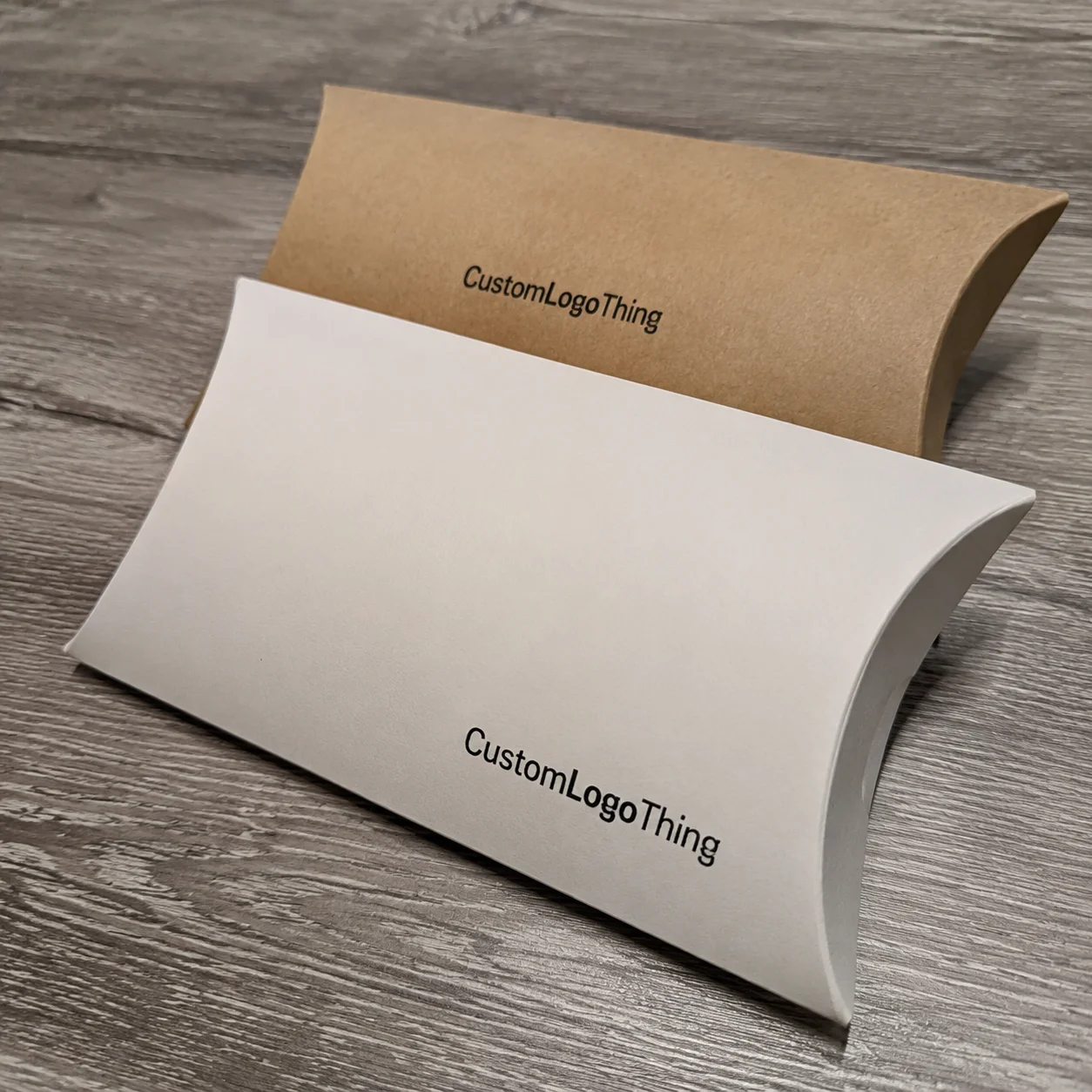
Material choice changes perception immediately. A rigid box with wrapped paper and a precise magnet closure feels different from a standard folding carton, and a kraft paperboard mailer tells a different story than a glossy SBS carton. Soft-touch lamination adds a velvety feel, embossing gives dimension, debossing creates subtle depth, and foil stamping catches light in a way that can make a brand feel more refined. This is where how to design packaging for first impressions becomes physical, not just visual. A 1.5 mm grayboard rigid box wrapped in 157gsm art paper will signal a different price tier than a 300gsm folding carton with a straight tuck.
Print quality matters more than most people expect. On a press sheet, a one-millimeter shift in registration may sound tiny, but on a luxury sleeve it can make a logo look cheap. I’ve watched teams approve graphics on a monitor and then get surprised when the actual carton looks muddy because the ink density, varnish choice, or paper absorbency was not matched well. Proper PMS color control, consistent coating, and clean dieline alignment are part of the first-impression equation. If your brand blue should be PMS 2945 C, then a 6-point drift toward teal is enough to make a premium box feel off.
Structural cues are just as important. A box shape that opens square, closes neatly, and holds the product with the right tension feels deliberate. Loose inserts, overstuffed cavities, and flaps that spring back unevenly create friction. That friction may seem minor, but the brain reads it as disorder. A good structure supports the brand’s story, and that is central to how to design packaging for first impressions. A well-cut tab on a carton in Guangzhou can matter as much as the front-panel artwork.
Factory processes are where the design either survives or gets damaged. Die-cutting determines fold accuracy. Folding-carton gluing affects squareness and closure strength. Litho-lamination can elevate a corrugated shipper into something more presentation-ready. Rigid box wrapping determines whether edges look crisp or sloppy. When I toured a plant in Dongguan, the production manager showed me two near-identical gift boxes; one looked premium, the other looked ordinary, and the difference came down to a slightly off-center wrap and a weak corner fold. That’s how small the gap can be.
Shipping durability matters too. A package that photographs beautifully but arrives crushed has failed at the exact moment first impressions count most. If the product is meant to survive parcel networks, then how to design packaging for first impressions must include compression resistance, corner protection, and transit testing. Packaging that looks good on a table but fails in transit is only half-designed. For mailers headed through Austin, Dallas, or Phoenix during summer, that heat and compression load can change the result enough to ruin a launch.
For brands that want to compare structural options, here’s a simple view of how common formats affect first impressions and budgets:
| Packaging format | Typical perception | Relative cost | Best use case | Notes |
|---|---|---|---|---|
| Folding carton | Clean, efficient, retail-friendly | Low to medium | Lightweight products, cosmetics, supplements | Fast to produce, strong print surface, easy to brand; common on 300gsm to 400gsm SBS or C1S board |
| Rigid box | Premium, giftable, high-touch | Medium to high | Luxury goods, electronics, presentation kits | More structural presence, longer lead time, higher unit cost; often built on 1.5 mm to 2.5 mm chipboard |
| Corrugated mailer | Practical, protective, modern | Low to medium | E-commerce, subscription, shipping heavy items | Can be printed well with litho-lam or direct print; E-flute or B-flute often used depending on weight |
| Paperboard sleeve with insert | Simple, refined, flexible | Low to medium | Accessories, sample packs, promotional sets | Good balance of cost, presentation, and customization; ideal for 250gsm to 350gsm board with die-cut windows |
When I hear someone ask how to design packaging for first impressions, I usually remind them that the package has to perform in multiple environments: a warehouse in New Jersey, a store shelf in Milan, a shipping hub in Sydney, and a customer’s kitchen table. If it only works in one of those places, it’s incomplete.
For reference on shipping and testing standards, I often point clients toward the International Safe Transit Association at ISTA, because transit testing tells you how a box will behave before customers find out the hard way. That kind of validation is part of serious packaging work, not an afterthought. A drop test on a 1.8 kg kit from 76 cm can tell you more than a polished render ever will.
How to design packaging for first impressions: key factors
Brand clarity is the first filter. A package should tell people who you are in a glance, not after a six-line paragraph. If the logo, product name, and brand promise are fighting for attention, the shopper has to work too hard. The best examples of how to design packaging for first impressions make the brand easy to identify from three feet away and still interesting at arm’s length. On a 12-inch shelf bay, that kind of legibility is not optional.
Audience fit comes next. Luxury buyers tend to respond to restraint, material depth, and subtle finishing. Subscription customers often want opening convenience and a moment of delight. Retail shoppers need quick legibility and shelf impact. B2B clients usually care about consistency, professionalism, and product protection. I’ve seen package branding fail simply because a startup used a luxury look for an everyday consumable, and the result felt disconnected from the actual price point. It was like showing up to a neighborhood barbecue in a tuxedo. Technically dressed up, yes. Right? Not even close. A $9 hand soap does not usually need a magnet closure and black velvet wrap.
Material selection changes both perception and logistics. Corrugated board offers strength and shipping protection. Folding carton stock delivers crisp printing and efficient production. Rigid board gives presence and weight. Kraft paperboard suggests simplicity, natural positioning, or sustainability. Specialty substrates can add texture, but they also bring sourcing and print challenges. That is why how to design packaging for first impressions should start with the product, not the mood board. A food supplement packed in 350gsm C1S board with aqueous coating will behave very differently from one packed in uncoated kraft from Vietnam.
Print and finishing choices must support the brand story. PMS matching keeps color consistent across runs. Matte lamination can feel quiet and controlled, while gloss can feel brighter and more commercial. Foil stamping works best when used with restraint, because too much foil can turn an otherwise elegant package into a loud one. Typography matters too; a beautiful typeface is useless if the letters are too small for retail lighting or too thin for a coated stock. A 7-point serif may look graceful in a PDF and disappear under LED track lighting in a store in Melbourne.
Sustainability expectations now affect first impressions in a real way. Buyers notice recycled content, right-sized packaging, and reduced material waste. Packaging that appears overbuilt can feel wasteful, even when it is technically strong. We worked with one personal care brand that cut their box dimensions by 14 mm in height, switched to FSC-certified board, and reduced print coverage on the inside panels. The result looked cleaner, cost less to ship, and aligned better with the brand story. For brands looking for responsible sourcing, FSC remains a strong benchmark for certified materials. In practical terms, shaving 28 grams off each mailer can matter across 10,000 units.
Cost factors always enter the room. Board grade, quantity, tooling, finishing complexity, special inserts, and unusual shapes all affect unit price. A 5,000-piece run might sit around $0.18/unit for a basic printed carton, while a rigid setup box with foam or molded pulp inserts can move into several dollars per unit depending on specifications. A more detailed quote might look like $0.15 per unit for 5,000 pieces of a one-color folding carton in 350gsm C1S artboard, while a 2,000-piece rigid box with foil and EVA insert can land near $2.10 per unit. Those numbers are not universal, of course, but they show why how to design packaging for first impressions must balance ambition with manufacturing reality.
Here is the part many new brands overlook: the package should also be easy to assemble, fill, and inspect on the line. If a design requires fiddly hand work, production slows down, labor costs increase, and mistakes become more likely. A nice-looking box that is painful to pack is not a good production solution. In my experience, packaging engineering and packaging design need to sit at the same table from day one, especially for factories in Guangdong or Jiangsu that run 20,000 to 50,000 units per shift.
Key decision checklist:
- Is the brand readable in under two seconds?
- Does the material fit the product weight and shipping method?
- Are the finishes aligned with the price point?
- Will the box survive transit and retail handling?
- Can the design be produced consistently at scale?
How to design packaging for first impressions: step-by-step process
The best packaging projects start with a brief, not a mockup. Step one in how to design packaging for first impressions is defining the product’s positioning, target customer, and unboxing goal before anyone starts placing logos on a canvas. Ask what the package should make people feel: confident, excited, calm, indulgent, protected, or gift-ready. If you skip that part, the visuals often drift. A brief that names a $38 retail price and a 420g product weight is more useful than a pile of mood images from Pinterest.
Step two is a competitor audit. Pull ten packages from the same category and look for what feels common, what feels tired, and what feels genuinely distinct. I like doing this physically, not just on a screen, because the weight, coatings, and opening feel reveal things photos never show. When we laid out eight skincare cartons on a conference table for one client in Singapore, the winner was not the flashiest one; it was the one with the cleanest hierarchy and the best structural fit.
Step three is choosing the package format based on product weight, fragility, display needs, and shipping requirements. A 70-gram beauty serum doesn’t need the same architecture as a 1.2-kilogram electronics kit. A folding carton may be enough for one, while a rigid box or corrugated mailer could be better for the other. Good how to design packaging for first impressions work starts with the right box type, not the prettiest render. If the item ships via parcel networks from Chicago to Dallas, compression and drop resistance should drive the structure choice.
Step four is building the visual system. That means logo placement, color palette, hierarchy, icon use, and messaging. Keep it disciplined. A brand can have personality without shouting from every panel. Strong package branding often relies on one hero element: a strong mark, a signature color, a distinctive pattern, or a material contrast. The goal is recognition, not clutter. A deep green carton with one foil-stamped logo often reads more premium than five colors and three claims.
Step five is selecting materials and finishes, then creating prototypes or structural samples. This is the point where paper feel, coating choices, and closure behavior become real. I’ve had clients change their minds after handling a sample because a matte laminate suddenly made the box feel calmer and more expensive than the glossy version they originally wanted. That tactile feedback is invaluable in how to design packaging for first impressions. A sample made from 157gsm art paper wrapped over 2 mm chipboard tells a different story than a digitally printed mockup on copier stock.
Step six is review. Put the dieline, insert fit, and proof sheets in front of the factory team and inspect for alignment, sizing, and legibility issues. Check barcode placement, safety text, and any fold lines that could cut through important visuals. I cannot tell you how many production headaches begin with a beautiful file that ignored one folding panel by a few millimeters. It’s maddening, really, because one tiny oversight can behave like a prankster in the production line and cost everyone an extra round of emails. A 2 mm text shift can be enough to push legal copy into a glue flap.
Step seven is validation in real conditions. Drop test the shipper. Open and close the lid ten times. Check how the box looks under warm store lighting and cold warehouse lighting. If it is a subscription item, put it through the same shipping route your customers will use. For a product launch, I would rather catch a weak corner or loose insert in sample stage than hear about it from an angry customer a week later. A real test on a route from Los Angeles to Atlanta can reveal more than a dozen comments on a PDF proof.
Step eight is final production approval. Confirm the timeline from prepress to sampling to full manufacturing. Clear decision-making matters here because a single late revision can push delivery by days or weeks. That is why how to design packaging for first impressions is as much about process control as it is about creative direction. If proof approval happens on a Tuesday, standard production often lands in 12-15 business days for a simple carton run, not counting freight from the factory in Dongguan.
A practical sequence I recommend:
- Write the packaging brief.
- Review the market and competitors.
- Choose the structure.
- Build the visual direction.
- Prototype early.
- Test in real conditions.
- Approve production files.
For customers building out larger product lines, I often point them toward Custom Packaging Products because having a coordinated family of cartons, mailers, and inserts makes package branding far more consistent across SKUs. A coordinated set can also reduce art time by 20 to 30 percent when the dielines are reused across sizes.
Packaging timeline: from concept to production
A realistic timeline keeps first impressions from turning into last-minute panic. For how to design packaging for first impressions, the workflow usually begins with discovery and brief development, then moves into structural design, graphics, sampling, approvals, and mass production. Each phase has its own bottlenecks, and they are usually more predictable than clients think. A brand in Portland launching in late September should start earlier than July if it wants room for one sample revision and one print proof correction.
Simple folding cartons can move relatively quickly because the structure is straightforward and the print process is familiar. Rigid gift boxes with custom inserts, specialty wraps, or foil tooling take longer because more pieces have to be aligned. In a typical production run, dieline creation and prototyping may take 3-5 business days, print proofing can take another 2-4 business days depending on revision cycles, and final manufacturing may take 12-15 business days from proof approval for standard jobs. More complex projects can stretch to 20-30 business days, especially if imported materials are involved or the factory is in Shenzhen and the wrap paper is sourced from another province.
Lead time also depends on tooling. If your package needs custom die lines, foil plates, embossing dies, or specialty inserts, those items add their own prep time. Material sourcing can matter too. When a client insists on a rare paper stock or a custom color wrap, the calendar gets longer, not shorter. That is just the way production works in a real plant, and anyone promising otherwise is probably skipping over a few important details. A custom molded pulp tray can add 7-10 business days before the first full run even begins.
Delays usually come from revisions, not manufacturing. Artwork changes after proof approval, structural changes after samples are made, and slow feedback loops between marketing, operations, and procurement all eat time. I once watched a perfectly good launch slip two weeks because three departments each wanted “one last tweak” to the front panel copy. I was sitting there thinking, with some frustration I’m not proud of, that packaging would be a far saner industry if everyone were forced to make decisions before lunch. That is the kind of issue that makes how to design packaging for first impressions part project management, part design discipline.
Planning ahead around product launches and seasonal demand helps immensely. If you know a holiday campaign is coming, lock the box size and structural format early so artwork can progress without rework. Build buffer time for transit, customs if needed, and final inspection. A great package is useless if it arrives after the sell-in window closes. For brands shipping into New York retail by mid-November, a four-week buffer is safer than a four-day hope.
Communication with the packaging plant and art team shortens the process. Provide product dimensions, weight, closure preferences, ship method, and target shelf position in one clear brief. The more the factory knows upfront, the fewer surprises show up during sampling. That advice sounds basic, but it solves a surprising number of production problems. A supplier in Ningbo can quote faster when the brief includes board grade, finish level, and target quantity of 5,000 or 20,000 pieces.
If you want the package to feel right on day one, treat the timeline as part of the design itself. A rushed schedule usually shows up in the final look. How to design packaging for first impressions is rarely improved by panic approvals. Good packaging usually gets its best outcome when the calendar leaves room for one honest correction.
Common mistakes that weaken first impressions
The first mistake is overdesigning. When a package tries to say everything, it says nothing clearly. Crowded layouts, too many icons, too many finishes, and excessive claims can make a box feel noisy at a glance. I’ve seen brands pack six benefits onto a carton panel that should have had one clear message and one supporting image. It’s the design equivalent of someone talking loudly in a quiet restaurant because they think volume equals confidence. It doesn’t. A front panel with three claims, two badges, and a giant hero image usually loses its focus by the 2-second mark.
The second mistake is choosing finishes that do not match the product or brand. A highly reflective foil package might look exciting in a mockup, but if the product is a simple daily-use item, the finish can feel disconnected. On the other hand, an understated matte package may be perfect for a premium skincare line or a craft food brand. Good how to design packaging for first impressions work is about fit, not just visual excitement. A $14 lip balm in a gold-foil rigid box can feel inflated; the same product in a clean 350gsm carton may feel more honest and more premium.
Structural neglect causes problems quickly. Crushed corners, loose inserts, sloppy glue seams, and lids that wobble all weaken confidence. I’ve been in factories where the print looked beautiful on the press check sheet, but the finished cartons felt weak because the gluing line was off by a few millimeters. The customer doesn’t know or care about the machinery; they just know the box felt wrong. In one plant near Ho Chi Minh City, a 3 mm offset in the crash lock turned a solid package into a frustrating one.
Readability is another common failure. Fonts that are too thin, colors that don’t contrast enough, or imagery that disappears under retail lighting can make a package hard to interpret. A shopper rarely stops to decode a label. If the package can’t communicate fast, it loses the shelf race. That is a core lesson in how to design packaging for first impressions. If your product name is 6 points on a cream background, it may vanish under the store’s 4,000K LEDs.
Shipping realities get ignored more often than they should. I’ve seen beautiful e-commerce packaging arrive dented because the outer mailer was sized too tightly or the insert allowed movement inside the box. First impressions do not survive a rough delivery. If your package can’t take the trip, it’s not really finished. A shipper that survives a 1-meter drop in testing but fails after 300 miles on the road still needs more work.
Cost creep is the final trap. Every extra coating, insert, specialty fold, and finish sounds small in isolation, but together they can push the unit price far beyond the target. It’s easy to say yes to everything in a design meeting; it’s harder to say no when the quote arrives. Brands need a clear finish hierarchy so the budget goes where customers will actually notice it. Spending $0.08 more per unit on a finish that customers never touch is a poor trade if the package already reads as premium.
Common warning signs:
- The front panel is crowded with claims.
- The box feels weak in hand.
- The colors shift between proofs and production.
- The insert fit is loose or hard to assemble.
- The package looks impressive in photos but not in person.
That last point matters a lot. Social media can flatter a package, but a real customer handling it on a doorstep or at a retail shelf sees the truth immediately. How to design packaging for first impressions means designing for the real world, not just the camera lens. A package that only wins on Instagram has not finished its job.
Expert tips to improve packaging design and save money
Start with the strongest structure that actually fits the product. Too many brands force an expensive format because they think premium must mean complicated. It doesn’t. A well-made folding carton with crisp print and a smart insert can outperform a clumsy rigid box in both cost and impression, especially when the product category expects efficiency. For 8 oz skin-care bottles, a smart carton often beats a bulky presentation box that adds freight without adding value.
Use one hero finish instead of five. I’ve seen beautiful packages ruined by over-decoration. Pick one strong tactile or visual accent, like soft-touch lamination with spot foil, or matte stock with embossing, and let the rest stay clean. That keeps the package feeling intentional while controlling unit cost. If every panel has a different effect, the design often loses its center. One well-placed foil logo on a 350gsm board can do more than foil on the top, sides, insert, and belly band.
Design for print efficiency. Avoid unnecessary color builds, tiny reverse type, or artwork that demands awkward press settings. The cleaner your artwork is relative to the production method, the better the consistency will be. If you know you need custom printed boxes across several SKUs, keeping a controlled design system can save a surprising amount of time and money across the line. A two-color system in Shenzhen will usually cost less than a full-bleed four-color design with special spot varnish and custom die-cut windows.
Prototype early. A sample that costs a little more up front can save you from a far more expensive mistake later. Wrong carton size, poor insert geometry, and bad closure tension are all easier to fix before full production. I’ve had clients save thousands by catching a one-eighth-inch sizing error during sample review rather than after 20,000 units were already in motion. A $120 prototype can prevent a $3,000 correction and a two-week delay.
Work closely with packaging engineers and production managers. They can simplify assembly, reduce waste, and improve consistency without stripping away the presentation value. Some of the best package branding decisions happen when the art team listens to the floor crew. The people loading cartons and wrapping rigid boxes every day know where designs tend to fail. A production manager in Suzhou can usually spot a glue-flap issue in under 30 seconds.
Right-size the package. Empty space makes a box feel less valuable and also increases freight expense. A product should sit securely without swimming in the cavity. Better sizing often improves the customer’s first impression while reducing board usage, shipping bulk, and filler material. That is one of the rare decisions that improves both perception and margins. Cutting 6 mm from the width and 4 mm from the depth can save material across a 10,000-piece order.
My practical money-saving rules:
- Choose standard materials first.
- Limit specialty finishes to one or two.
- Keep inserts simple unless protection demands complexity.
- Ask for sample revisions before full approval.
- Compare quotes at the same spec level.
Honestly, the best how to design packaging for first impressions work I’ve seen usually comes from disciplined choices, not lavish ones. Clean structure, solid material, and clear branding beat expensive clutter more often than people expect. A package built well in Dongguan on schedule will often outperform a lavish concept that never survives the quote stage.
For brands that want a more sustainable direction, the EPA’s sustainable materials guidance is a useful place to understand how material choice, reuse, and waste reduction connect to broader packaging decisions. That kind of thinking can support both brand trust and operational efficiency. Reducing board weight by 10% on a 15,000-piece run can lower freight costs in a measurable way.
What are the next steps to apply how to design packaging for first impressions?
If you want to put how to design packaging for first impressions into action, start with five decisions: audience, format, visual hierarchy, materials, and finish level. Those choices influence everything else. Once they’re set, the rest of the project gets much easier to steer. A brand selling in Seattle to eco-minded buyers may choose differently than a brand selling fragrance in Miami boutiques, and that should show up in the box.
Create a one-page packaging brief with the product size, target retail price, shipping method, brand personality, and any must-have features. Include the product weight in grams or ounces, because that number affects board selection and insert design more than many people realize. A clear brief saves time in sampling and reduces back-and-forth with the supplier. If the brief says “$24 retail, 380g product, parcel shipping from Shanghai to California,” the factory can quote with much more accuracy.
Gather physical references. Pull competitor packaging, premium samples, and even a few examples from outside your category that capture the feel you want. A luxury candle box can inspire a skincare launch if the structure and finish logic are similar. The goal is not copying; it is translating a feeling into a manufacturable package. I’ve seen the best ideas come from comparing a watch box from Japan with a tea carton from Copenhagen.
Request dielines or structural recommendations early so the artwork is built around real production constraints. That one move prevents a lot of expensive redesigns. If you start with the correct dimensions, everything from logo scale to barcode placement becomes easier to manage. A 72 mm-wide bottle carton and a 75 mm-wide one are not interchangeable once the insert is cut.
Schedule a sample review with stakeholders and test the package in-hand, on shelf, and after transit. I always recommend putting the package in actual conditions, because the desk test and the warehouse test are never the same thing. A box that looks good on a monitor may still fail when stacked, shipped, or opened under pressure. The best sample review includes at least one person from operations and one from sales, ideally in the same room for 20 minutes.
Then refine based on what the prototype tells you. Adjust the insert fit, the finish level, the type size, or even the structure if needed. That is how strong packaging gets built in practice. The final result should deliver the intended first impression without creating production headaches. If a test sample from a factory in Guangzhou feels 15% too loose, fix it before full production, not after the pallets are loaded.
One more thing I tell clients: do not fall in love with a concept too early. In packaging, the nicest-looking concept is not always the best-performing one. The best solution is the one that looks right, feels right, ships right, and can be repeated consistently at scale. That is the heart of how to design packaging for first impressions.
If you want to build packaging that earns trust from the first touch, use a brief, test your samples, and respect the realities of the factory floor. That combination is what separates decent packaging from packaging that actually remembers the customer after the box is opened. And if you keep how to design packaging for first impressions at the center of the process, your final package will do a lot more than contain the product — it will help sell it. For many brands, that means a better shelf presence, fewer damaged returns, and a stronger opening reaction from the very first delivery.
Frequently asked questions
How do I design packaging for first impressions on a tight budget?
Focus first on a strong structure, clean typography, and one or two high-impact brand cues instead of layering on multiple premium finishes. Use standard materials where possible, simplify inserts or closures, and work with your packaging supplier early so you don’t spend money fixing avoidable prototype mistakes. A 5,000-piece folding carton run in 350gsm C1S board with one-color print can often come in around $0.15 to $0.22 per unit, which leaves more room for a single premium finish instead of several.
What packaging elements matter most for first impressions?
Visual hierarchy, tactile finish, structure quality, and the unboxing flow usually matter most in the first few seconds. Clear branding and clean print execution tend to build trust faster than decorative clutter. A package that opens neatly and protects the product well often feels more premium than one with flashy graphics but weak construction. A 1.5 mm rigid box wrapped in 157gsm art paper will feel different from a 300gsm folding carton, and customers notice that difference immediately.
How long does it take to design packaging for first impressions?
Simple packaging can move from concept to production relatively quickly, while Custom Rigid Boxes or specialty finishes take longer. The main time factors are dieline creation, sampling, proofing, and approval cycles. If you already have product dimensions, artwork direction, and decision-makers available early, the timeline becomes much easier to control. For standard jobs, final manufacturing often takes 12-15 business days from proof approval, with more complex runs taking 20 business days or more.
What materials work best when designing packaging for first impressions?
Rigid board, premium folding carton stock, kraft paperboard, and corrugated all work well depending on the brand and product. The right choice depends on product weight, shipping method, retail presentation, and the price perception you want to create. A material should support both the look you want and the physical protection the product needs. A 350gsm C1S artboard with matte AQ coating is a common choice for cosmetics and supplements because it balances print quality, stiffness, and cost.
How can I tell if my packaging design makes a good first impression?
Test it in real hands, under real lighting, and inside the actual shipping or retail environment. Ask whether the package clearly communicates what the product is, who it is for, and why it feels worth the price. If people can describe the brand vibe and product value quickly, your first-impression packaging is probably doing its job. A sample that still feels solid after being opened and closed 10 times is usually on the right track.