Kraft Hang Tags Printing: Specs, Pricing, and Order Tips
Kraft Hang Tags printing looks simple until the first sample arrives. Then the stock starts doing part of the branding work before the ink even gets a chance. That is the appeal: kraft feels tactile, grounded, and less synthetic than coated white board. It can make a brand look careful without looking overdesigned, and it can make a modest product feel considered.
That same material also exposes weak decisions quickly. Thin type fades into the brown tone. Low-contrast colors lose authority. A tag that felt balanced on a monitor can look underfed in hand, especially once the hole, string, and corner shape are added. For buyers, the real job is not just choosing a look. It is matching paper, print method, finish, and assembly to a product that has to sell, ship, and survive handling.
Most orders for hang tags are attached to broader packaging decisions: Apparel Swing Tags, food and gift labels, retail inserts, origin notes, barcodes, and QR codes. If you are building the spec from scratch, keep the tag aligned with the rest of the pack through Custom Labels & Tags so the finish, color handling, and attachment choices do not drift from one item to the next.
Kraft hang tags printing: why buyers notice the difference fast
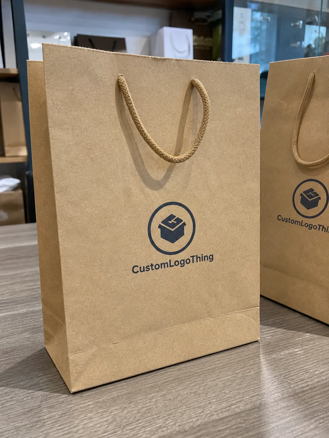
A kraft tag creates a first impression before anyone reads the copy. Smooth coated stock usually signals polish. Kraft signals something else: craft, restraint, recycled content, or a more natural retail position. That is useful if the brand story depends on small-batch production, sustainability, handmade cues, or a less glossy shelf presence. It is also less forgiving. With kraft, a strong design looks deliberate. A weak one looks accidental.
The paper itself acts like part of the layout. Brown fiber reduces contrast, softens some colors, and changes how the eye reads line weight. Black generally stays reliable. Deep green, dark blue, and some spot colors can work well if they are chosen against the paper rather than against a white screen mockup. Pale gray, beige, and pastel tones are where buyers get surprised. They may look refined on the design file and disappear once printed on kraft.
That is why kraft hang tags printing shows up across more categories than apparel. Fashion brands use it for swing tags and size tags. Food brands use it for bakery items, jars, and gift packaging, provided the regulatory content is handled separately. Home and gift brands use it to signal handmade or sustainable positioning. Retail teams often need the tag to carry more than a logo: price, SKU, care or origin notes, a barcode, or a QR code that needs to scan cleanly in a store environment.
The broader point is practical. A tag is a small component, but it has real workload. It has to look right, print consistently, survive transit, and remain legible after handling. If it only succeeds in a PDF, it is not finished.
For buyers comparing materials and verification requirements, the education resources at Packaging.org are useful, and FSC remains the reference point when fiber claims need to be checked rather than assumed.
"A kraft tag should not try to hide the stock. The stock is part of the message."
Paper weight, texture, and print method: the specs that move the needle
Start with board weight. For most custom tags, 300gsm to 400gsm is the practical range. Around 250gsm to 300gsm can work for lighter-duty tags, short runs, or products where the tag is not meant to feel substantial. Once you move above 400gsm, the piece starts to feel more rigid and premium, but punching holes, rounding corners, and folding become harder. More material is not automatically better. It just changes the mechanics of the part.
Texture matters just as much. Smooth kraft gives the press more control, so small type, line work, and barcodes behave better. Rougher recycled kraft adds character, but the ink tends to spread a little more, which softens edges. That can be exactly the look a brand wants. It is a problem when the design depends on sharp legal text or dense machine-readable codes. Recycled fiber also increases shade variation from sheet to sheet. That is normal, and buyers should ask about acceptable variation before approving a run.
Print method is the next decision point. Digital printing is usually the fastest choice for short runs, variable content, and early proof cycles. Offset printing makes more sense when the order is larger and the art depends on stable CMYK output or carefully matched spot colors. Flexographic printing is less common for premium swing tags, but it can be sensible for roll-fed jobs, simpler art, or long-run work where speed matters more than decorative complexity. If the tag needs white ink on brown stock, a specialty digital setup or screen print is often the cleaner route.
Finishing changes the result more than many buyers expect. Die-cut corners make the tag feel more finished immediately. Rounded corners help reduce edge wear. A drilled hole and eyelet change both the look and the stress point where the string pulls. A light aqueous coating can protect the surface without killing the kraft look. Soft-touch is possible, but it changes the feel enough that it should be chosen for a specific reason, not as a default. Foil can look strong on kraft if it is used with discipline; too much of it fights the material instead of supporting it.
The clearest rule is this: pick the stock and print method for the way the tag needs to perform in hand, not just the way it looks on screen. A good kraft tag usually looks restrained in the file and confident in the finished sample.
Cost, pricing, and MOQ: what changes your quote
Pricing for kraft tags is driven by a small set of variables, and buyers often underestimate how quickly those variables stack up. Size is one. Ink coverage is another. Then come board grade, number of print colors, die-cut shape, hole punching, stringing, varnish, foil, and any custom cutting tool the job requires. The more the order moves away from a standard rectangle on standard kraft, the more setup sits behind the unit price.
MOQ matters for the same reason. Small runs carry a higher unit cost because prepress, proofing, and make-ready have to be absorbed across fewer pieces. Larger runs usually improve the per-tag rate, but only up to the point where inventory starts to outlive the product line. That tradeoff matters in seasonal retail. A lower unit price does not help much if the tag style changes before the next launch and the remaining stock becomes dead weight.
For practical budgeting, it helps to separate the base tag from the extras. A simple one-color kraft tag at 1,000 pieces may land around $0.22 to $0.40 per tag, depending on the board and finishing. At 5,000 pieces, that same type of job may fall into the $0.08 to $0.18 range. Add CMYK, white ink, foil, or heavier finishing and the number climbs. That is not a pricing trick. It is the normal relationship between setup cost and volume.
| Spec | Typical unit price at 5,000 pcs | Best fit | Notes |
|---|---|---|---|
| One-color kraft on 350gsm stock | $0.09-$0.16 | Minimal branding, apparel basics, volume retail | Best when the design is simple and the contrast is strong |
| Full-color CMYK on kraft | $0.14-$0.24 | Illustrated brands, seasonal launches, richer storytelling | Color usually prints softer on brown stock unless white underprint is used |
| White ink, spot color, and premium finishing | $0.22-$0.45 | Premium retail, gifting, small-batch launches | Higher setup cost, better shelf impact, more proof control needed |
Two-quote comparisons are useful here. Ask for a standard version and a premium version with the same artwork. That makes it easier to see whether the extra spend is buying real presentation value or just extra setup. It also stops the team from treating every upgrade as essential. In many cases, the right answer is not the fanciest spec. It is the one that makes the product feel coherent at the shelf and stays inside budget.
One other cost point is easy to overlook: bad specs are expensive. A tag that scans poorly, arrives warped, or needs manual rework can cost more in labor than the upgrade would have cost in the first place.
If your order needs custom punching, mixed assembly, or stringing options, the detail list in our Manufacturing Capabilities page is the fastest way to map those options to a realistic quote.
Process and turnaround: from artwork approval to shipment
The production flow is straightforward once the brief is complete. It starts with size, quantity, paper choice, print method, and finish. The supplier then confirms or creates the dieline, and the artwork team places copy against the cut line, hole position, bleed, and safe zones. If the tag is double-sided, the hierarchy has to be decided early. Swapping information after the proof stage is one of the fastest ways to lose time.
Most delays come from revisions, not from the press itself. A small color change can trigger another prepress review. Repositioning a barcode may require a fresh check on scan quality. Moving the hole by a few millimeters may be enough to protect a logo, but that still changes the file. Special inks, foil, lamination, and custom shapes add more inspection steps, which means more time before the job can be released.
For standard digital work, a realistic turnaround is often 7 to 10 business days after proof approval. Offset jobs and more complex finishing usually stretch to 12 to 18 business days, with longer lead times possible if the plant is busy or the file still needs corrections. Pre-stringing, folded formats, and custom shapes can add a few more days. If the launch date is fixed, reserve time for proofing first and production second.
The fastest jobs tend to share the same traits: final artwork, a confirmed dieline, clear Pantone or CMYK calls, and one person who can approve without waiting for a committee. The bottleneck is often internal. If the brand team keeps reopening color or copy decisions, the schedule slips no matter how efficient the printer is.
For teams that sell through retail chains or distribution networks, it also helps to think of the tag as part of the shipping system. It is small, but it still has to survive handling, storage, and attachment. If tags will be packed with other components or delivered pre-strung, the carton pack method should be set with the same discipline used for other distribution materials.
Common mistakes that make kraft tags look cheap or unreadable
Contrast is the first trap. Dark brown stock plus dark type plus thin fonts is a predictable failure, not a design puzzle. Fine logo details can blur into the fiber. Pale beige, gray, and soft pastel colors often look elegant in a mockup and then lose enough contrast on kraft to become decorative instead of readable. If subtlety is essential, test the design on the actual stock before signing off.
The second mistake is ignoring the dieline. Copy that sits too close to the edge may trim badly or feel crowded even when the file looks balanced. A hole punched too close to a logo can make the whole tag feel accidental. Bleed matters on rustic stock just as much as on coated paper. A sloppy trim frame tells the buyer the order was rushed.
Finish mismatch is another quiet problem. High gloss on a natural-product line can feel out of place. Heavy foil on recycled kraft can look disconnected from the message. String and eyelet choices matter too. Natural jute, cotton cord, black string, and metal eyelets each carry a different visual weight. If the design says understated but the attachment says shiny, the tag reads as confused.
Functional mistakes are usually the most expensive because they are easy to miss during design review. Barcodes placed too close to the edge can fail scan checks. QR codes printed too small can degrade on rough stock. Hole clearance that looks fine on a screen can collapse once the punch is applied. Recycled kraft can also vary in tone across a run, so a proof that looks perfect on one sheet may drift slightly in production. Buyers should ask what level of variation is normal before approving the order.
- Avoid dark-on-dark layouts unless the type is large and the proof has been tested on the actual stock.
- Keep legal or care text legible at arm's length, not only at zoom level.
- Check barcode and QR placement against trim, punch, and string zones.
- Match attachment hardware to the brand palette and the product feel.
Expert checks before you approve the proof
A useful proof review is not just a search for typos. It is a check on whether the tag will work in the environment where it will actually hang, ship, and be read. Start with trim size, hole position, front-to-back hierarchy, and color callouts. Then look at the copy at arm’s length. A tag that reads well on a bright monitor can still fail under store lighting, especially on rough kraft where ink edges are naturally softer.
If the order matters to the launch, request a physical sample. That is especially useful for tactile brands, tight color expectations, or any tag that has to sit beside fabric, glass, or packaging and still look intentional. A sample also reveals whether the board feels too stiff, too thin, or too fibrous for the product it will carry.
Before approval, confirm the attachment method. Is the tag going on apparel with string? Looping around a gift box handle? Tied to a jar neck? Inserted into a sleeve? The answer affects hole position, cord length, and fold behavior. A tag can be printed perfectly and still become expensive if the warehouse has to rework it by hand.
- Verify the dieline, trim, and safe area.
- Check the exact wording, barcode placement, and size hierarchy.
- Confirm CMYK, spot color, or white ink expectations.
- Review the proof on a printed sample or under strong daylight if a sample is not available.
- Make sure the attachment method matches the final product flow.
That process sounds careful because it is. It is also cheaper than reprinting a run because the hole landed over a logo or the type vanished against the kraft tone.
Next steps for a clean, on-brand tag order
Before requesting quotes, gather the details that shape the job: tag size, quantity, board preference, print colors, finish, hole style, and whether the pieces will ship flat or pre-strung. If the supplier has to fill in the blanks, the estimate will be broad rather than precise. Clear inputs create cleaner numbers and better comparisons.
The most useful quote request is not the shortest one. It is the one that asks for a standard version and a premium version so the team can compare presentation against cost. A simple one-color kraft tag may be the right commercial answer for a basic line. A heavier board with more refined finishing may be the better choice for a premium launch that depends on shelf presence and tactile quality.
Do not lock the calendar until the proof is approved. An estimate is not the same thing as a production-ready order. If the design still needs a text fix, a barcode adjustment, or a color decision, the job is not ready. That is where many launch delays begin: not in production, but in the approval loop.
It also helps to treat the tag as one part of a wider packaging system rather than as a one-off item. If the brand is using labels, inserts, and hang tags together, the visual language should hold across all of them. That is where Custom Labels & Tags and the rest of the pack should be reviewed as a set, not one order at a time. If the workflow depends on special cutting, variable stringing, or assembly, the Manufacturing Capabilities page is the right place to confirm what is actually feasible before you commit.
For most buyers, kraft hang tags printing works best when the sequence is simple: brief, quote, proof, sample if needed, then production. Follow that order and the tag becomes a controlled buying decision, not a last-minute design gamble.
Frequently Asked Questions
What affects kraft hang tags printing cost the most?
Paper weight, ink coverage, finishing, die-cut complexity, and order quantity usually drive the price most. If the budget is tight, ask for alternate specs that keep the same look but reduce setup or finishing cost.
How long does kraft hang tag printing usually take?
Standard jobs move fastest when the dieline is approved and the artwork is final. Special inks, custom shapes, and extra proof rounds add time to the schedule, and pre-stringing can add a few more business days.
Can kraft tags be printed with white ink or full color?
Yes. White ink is often used to restore contrast on brown stock and keep text readable. Full color works best when the design is built for kraft rather than copied directly from a white-paper layout.
What file do I need for kraft hang tags printing?
A vector file with outlined type, linked images, and a clean dieline is the safest starting point. Include cut lines, hole placement, and any special-color notes directly in the production file so prepress does not need to guess.
What should I check on a proof before ordering?
Confirm trim size, hole position, color, and text legibility on the actual kraft tone. If possible, review a sample under store lighting so you catch contrast issues before production.