Buying Kraft Hang Tags with logo private label sounds straightforward until the sample lands on your desk looking too thin, too pale, or just not aligned with the rest of the packaging. Then the tag reveals its real job: it has to brand the product, carry information, and make the item feel finished all at once. If any one of those pieces is weak, the whole presentation drops a notch.
The first mistake buyers make is treating kraft as a “simple” material. It isn’t complicated, but it is unforgiving. The paper tone, print method, stock weight, hole position, and finish all show up in the final piece, and they show up fast. Kraft paper does not hide poor files or vague specifications. It exposes them.
That is why the right tag spec matters more than the phrase on the purchase order. A good private label hang tag should feel intentional, survive handling, and stay legible under real retail conditions. A bad one can make a premium product look like it was packaged in a hurry.
“The natural look gets attention. The real win is that the tag still reads cleanly, survives handling, and carries the brand message without fighting the product.”
Kraft hang tags with logo private label: what buyers usually miss
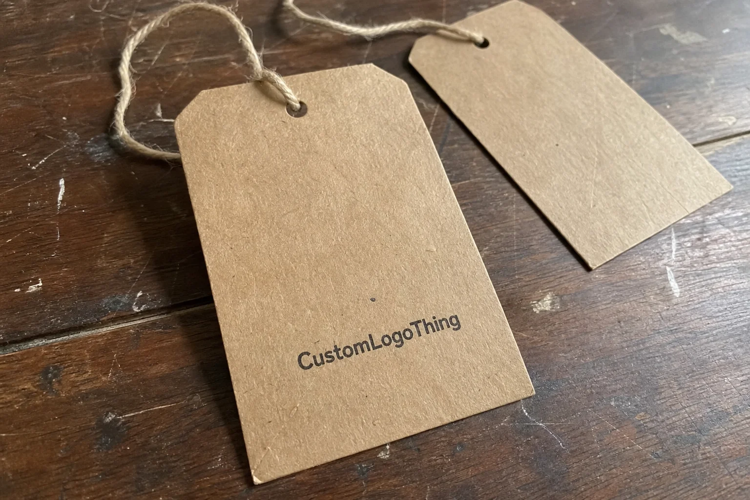
Kraft hang tags are usually uncoated, fiber-based paper tags with a natural brown, tan, or lightly recycled appearance. They show up on apparel, candles, gifts, handmade goods, and retail products that need branding without moving into full custom packaging. That part is obvious. What is less obvious is how much these small tags influence perceived quality.
For many brands, the tag is the first tactile proof that the product belongs to a real line rather than a one-off item. A sturdy hang tag with clean print signals consistency. A flimsy one can make even a well-made product feel underdeveloped. Buyers often focus on the rustic look because it photographs well, but the customer is holding the tag, not just seeing it in a product image.
Kraft also fits neatly into a broader paper packaging system. It works alongside paper bags, tissue, sleeves, and stickers without looking overdesigned. That is useful for private label brands that want a cohesive retail presentation without the cost or complexity of folding cartons. A well-made tag can do a lot of visual work for relatively little material.
What the tag should not do is compete with the product. Heavy decoration, tiny copy, or weak contrast can turn a simple branding piece into clutter. The best kraft tags usually look easy, even though they are rarely easy to produce well.
There is also a practical side that gets ignored: durability. A tag must survive shipping, storage, hanging, and repeated handling by store staff or customers. On kraft, edge crush, fiber lift, and scuffing become visible sooner than on coated stock. If the tag bends badly or tears at the hole, the brand looks careless before the item is even tried.
How the private label tag process works from artwork to shipment
The workflow is predictable if the buyer sends clean information. It usually begins with artwork submission, then size and material confirmation, followed by proofing. After proof approval, production moves into printing, drying, cutting, punching, finishing, inspection, and packing. It is not a glamorous process. That is exactly why it works when the inputs are right.
Artwork quality has a bigger effect on kraft than many first-time buyers expect. Vector files such as AI, EPS, or a properly prepared PDF print far better than a low-resolution image pulled from a website or social media post. Thin lines, small type, and faint gradients are all more likely to break down on kraft because the paper surface is less forgiving than coated stock.
Private label work also depends on consistency across SKUs. If the brand is running multiple product lines, the logo placement, typography, and spacing should stay consistent unless there is a clear reason to vary them. That consistency makes reorders easier and helps the packaging system feel coherent. The more a brand changes the tag from one product to the next, the less like a line it feels and the more like a patchwork.
One overlooked point: paper absorbs ink differently from coated materials, so color matching is not identical to what buyers see on a screen. Pantone references help, but the same ink can appear slightly duller or warmer on kraft because of the paper base. That is normal, not a defect. The real problem is approving a proof on one tone of kraft and expecting a different tone to behave exactly the same way.
Common finishing choices include:
- Hole punching for stringing or fast attachment
- Rounded corners to reduce wear and improve handling
- Foil stamping for premium contrast, usually gold, black, or copper
- Spot UV for contrast, though it can look odd on rough kraft if overused
- Emboss or deboss for tactile branding on heavier stock
Not every finish belongs on kraft. A rough, earthy paper surface can make one strong effect look more premium, while too many effects make the design feel busy. A clean foil block can work. So can a deboss on thick stock. But mixing foil, gloss, and multiple inks often adds cost without adding clarity. The material already has personality; the print does not need to shout.
Most delays come from missing details rather than slow production. No size, no hole position, no attachment method, no file format confirmation — each missing piece adds another round of back-and-forth. Buyers who send a complete spec sheet usually get faster proofs and fewer revisions. That is less about speed tricks and more about reducing ambiguity before the job enters the press queue.
Cost, MOQ, and unit price drivers that change your quote
Pricing for kraft hang tags with logo private label usually comes down to quantity, paper weight, print method, finish complexity, size, and whether the tags need any assembly. Each factor changes setup time, waste, machine running time, or manual labor. None of it is mysterious; it is just manufacturing math.
MOQ is where a lot of buyers get their first reality check. Small runs often cost more per tag because setup costs are spread across fewer pieces. A larger order usually lowers the unit price, but only if the quantity matches actual demand. Overstock is not a bargain if the extra tags sit untouched for months.
| Spec type | Typical setup | Relative unit cost | Best use case |
|---|---|---|---|
| 1-color kraft tag, standard shape | Low | $ | Testing a new private label line |
| 2- to 4-color printed tag | Moderate | $$ | Retail-ready branding with stronger visual impact |
| Foil, emboss, or custom die-cut | Higher | $$$ | Premium products, gift sets, higher margin SKUs |
| Stringed or assembled tag set | Higher labor | $$ to $$$ | Apparel and gift packaging needing ready-to-use tags |
For a practical benchmark, simple kraft tags in higher volumes can land around $0.08-$0.18 per unit, while smaller runs with specialty finishes often move into the $0.20-$0.45 range or higher. The gap widens quickly once the order needs thicker stock, custom die cutting, or assembly. A 350gsm one-color tag is a very different order from a 600gsm embossed tag with stringing.
Hidden charges are where budgets drift. Setup fees, custom dies, proof revisions, rush handling, extra packaging, and assembly can all change the final price. That is why a quote should be checked as a spec list, not just a number. Ask for a plain version and an upgraded version side by side. The comparison usually shows whether a premium finish is earning its place or simply increasing margin pressure.
Buyers should also watch the economics of color. Full-color printing on kraft can look attractive, but not every palette performs well on brown stock. Dark inks usually reproduce better than light ones, and highly detailed artwork often costs more to proof and correct. A simpler layout can be both cheaper and stronger visually.
Spec choices that affect durability, print quality, and shelf appeal
Paper weight changes the entire feel of the tag. Light kraft can look acceptable in a mockup and disappointing in hand. Heavier stock, often somewhere between 300gsm and 600gsm depending on the tag format, provides more stiffness and a more substantial feel. It also raises cost and may require a better-calibrated punch or fold method if the tag needs to hang neatly.
Print clarity is one of the most visible quality checks. Dark, dense inks usually work best on kraft. Black, deep brown, navy, and dark green tend to hold their shape well. Pale colors can disappear into the base material or lose contrast at smaller sizes. If the brand wants a soft natural aesthetic, that is fine, but the logo still needs enough separation from the paper tone to remain legible from a normal retail distance.
Size is not just a design preference; it changes usability. Smaller tags reduce material cost, but too little space leads to cramped logos, tiny product details, and poor scan performance for barcodes or QR codes. If a code needs to function, it needs margin. Crowded codes are decorative at best and frustrating at worst.
Hole placement deserves more attention than it gets. A hole too close to the edge can tear during shipping or when the product is handled repeatedly. Too large a hole can weaken the top of the tag. Rounded corners are another small decision with a noticeable effect; they reduce edge wear and tend to make the piece feel more finished. They also cost a bit more on some jobs because of tooling or cutting setup, which is why the buyer should treat them as a spec decision rather than an afterthought.
Texture can work for or against the design. Rough kraft gives a natural, tactile impression, but very fine details may not print as sharply as they do on smoother paper. Thin typefaces, hairline rules, and faint linework are common trouble spots. Strong typography usually performs better than delicate typography on this stock.
For brands making eco-related claims, documentation matters more than the look. Kraft can support a sustainable brand image, but the actual claim should be tied to verified recycled content, sourcing standards, or certification. If a buyer plans to reference certification, the source should be checked directly through FSC. Visual cues are not proof.
For products that go through heavier distribution or retailer handling, it can be useful to think like a pack engineer rather than just a designer. Industry references such as ISTA are more relevant to shipping cartons than single tags, but the principle is the same: if the piece scuffs, bends, or fails before the customer uses it, the spec needs revision.
Production steps and lead time: what happens after approval
Once the proof is approved, the order usually moves through prepress, plate or die setup, printing, drying, cutting, hole punching, any requested assembly, inspection, and packing. Each step adds time. Orders that look simple on paper can still take longer if they involve custom finishes or manual stringing.
A straightforward run often takes around 12 to 15 business days after proof approval. More complex jobs can take longer, especially if the order includes foil stamping, embossing, unusual shapes, or manual assembly. Seasonal demand can stretch timelines too. Production schedules do not pause because a brand suddenly needs tags for a launch.
Sampling is worth the extra step when the logo is new, the barcode must scan, the color match matters, or the order is tied to a major product release. A digital proof may be enough for simple repeat work. For anything with subtle contrast, small text, or a nonstandard kraft tone, a physical sample is a safer call. Scan testing should happen before full production, not after the order lands in the warehouse.
Rush orders can be done, but they reduce the room for correction. Less time means less time for file cleanup, proof review, and inspection. Buyers sometimes want speed and perfect finishing in the same sentence. Those are not always compatible. If lead time is tight, the spec should be simplified rather than overloaded with finish requirements.
Shipping and packing also matter. Flat-packed tags bundled cleanly in cartons are easier to count and store. Poorly wrapped or loose bundles can arrive bent or scuffed. If the tags will go straight to a warehouse or fulfillment partner, it helps to confirm carton labeling and packing preferences in advance. That small detail prevents receiving headaches later.
Common ordering mistakes with kraft hang tags and how to avoid them
Low-resolution artwork remains one of the most common problems. It looks fine on a screen and then breaks apart in print. Tiny text is another frequent miss. Kraft can handle a lot, but it cannot make unreadable copy readable. If the product details or care instructions need a magnifier, the layout needs work.
Another common error is choosing the wrong kraft tone. There are lighter naturals, darker browns, warmer papers, and cooler recycled stocks. The same logo can look restrained on one and muddy on another. Proofing on the actual paper tone matters because “close enough” often becomes “why does this feel off?” after production.
Some buyers overcomplicate the design. A tag with foil, spot UV, embossing, multiple inks, and several icons may look impressive in a file preview, but kraft already has texture and character. Too many effects can make the tag feel busy rather than premium. Usually one clear design idea is stronger than a stack of decorative choices.
Application method is easy to overlook. If the tag needs strings, fasteners, adhesive compatibility, or a specific hole size, that information should be part of the initial order. Otherwise the buyer may receive a perfectly printed tag that is awkward to attach to the actual product. Good packaging is not just about appearance. It has to work in the warehouse, in the store, and in the customer’s hand.
SKU confusion causes avoidable delays. One master file may get sent for five products, but three of those products need different sizing, barcodes, or copy. If each variation is not tracked clearly, revisions multiply quickly. Private label programs work best when the buyer keeps file naming, copy versions, and variable fields organized before production begins.
Expert tips for better private label branding on kraft tags
Typography is doing more heavy lifting than many brands realize. Bold, clean fonts usually print better on kraft than thin, elegant typefaces. Strong contrast helps, but spacing matters too. A simple layout with room around the logo often feels more premium than a crowded design trying to say everything at once.
A repeatable tag system is worth building early. One base layout can support multiple SKUs if the variable fields are planned well. That might include size, color, material, barcode, price, or care instructions. When the system is set up properly, reorders are easier and the brand stays visually consistent across product lines.
One tasteful special finish often beats several decorative extras. A deboss on heavier kraft can feel more substantial than a design crowded with foil borders and glossy accents. The best spending usually happens where the customer touches the product: the logo block, the paper weight, the hole reinforcement, or the attachment detail. It is rarely the ornamental piece that matters most.
Proofs should be reviewed in context, not on a phone while doing something else. If possible, mock the tag on the actual product or packaging. That shows whether the scale feels right, whether the branding reads from arm’s length, and whether the piece looks balanced next to the item. A beautiful PDF can still fail in real use.
Consistency across packaging touchpoints also matters. Tags, bags, stickers, and inserts should belong to the same brand family. If the hang tag is muted and earthy but the sticker is loud and glossy, the packaging starts arguing with itself. Buyers feel that mismatch even if they cannot describe it in design terms.
For brands building a broader packaging system, it helps to start with the Custom Labels & Tags range and design the tag around the rest of the pack. That usually produces a cleaner result than treating the hang tag as a separate, standalone decision.
Next steps for ordering the right kraft tag spec
The simplest way to order kraft hang tags with logo private label is to send a short spec sheet that includes size, quantity, logo file, paper tone, finish, hole placement, and attachment method. That is enough to get a real quote instead of a broad estimate based on guesswork. The more complete the brief, the cleaner the quote.
Ask for two versions: a basic build and an upgraded build. Side-by-side pricing makes it easier to see where the value actually is. Sometimes the premium option is only a few cents more and clearly worth it. Sometimes it adds cost without improving the product experience. The comparison usually makes the answer obvious.
Request a proof that shows the actual logo placement and the expected ink result on kraft stock. If the branding is new or the order is important, test a small run before scaling up. Small mistakes are annoying. Large mistakes are expensive and harder to correct. That is especially true when the tags are tied to a product launch or retail deadline.
Before approval, confirm how the tag will be used. A tag for a folded garment is not the same as one for a gift box or a bagged retail item. Product type, channel, and packaging all affect the best tag specification. Kraft hang tags with logo private label work best when they are built around the real customer experience, not just the mockup.
Done well, these tags are simple, durable, and brandable without wasting budget. Done poorly, they become the cheapest-looking piece of a product that otherwise had promise. The difference usually comes down to file quality, paper choice, and how carefully the spec was managed before approval.
What sizes work best for kraft hang tags with logo private label?
Most buyers choose a mid-size tag because it balances branding space and cost. Larger tags work better for premium apparel or when more copy is needed, while smaller tags fit simple retail branding and lightweight items. The right size should match the product rather than overpower it.
How much do private label kraft hang tags usually cost per unit?
Unit cost depends on quantity, stock weight, print colors, and finishing. Simple tags in higher volumes cost far less than small runs with specialty effects. A useful buying approach is to ask for a plain quote and an upgraded quote so the value difference is visible.
Can I add a barcode or QR code to kraft hang tags with logo private label?
Yes, but the code needs enough contrast and white space to scan reliably. Always test it on a proof before full production, especially on darker kraft stock. Keep the area around the code clear so print, texture, or layout elements do not interfere with scanning.
What is the typical lead time for custom kraft hang tags?
Lead time varies by quantity, finish complexity, and how quickly proofs are approved. Simple runs are faster, while special shapes, foil, embossing, and stringing take longer. Rush orders are possible, but they usually cost more and leave less room for quality control.
Are kraft hang tags a good fit for eco-focused private label brands?
They can be, if the paper and inks are sourced responsibly. Do not make environmental claims unless the materials or certifications can be verified. The natural look helps with positioning, but documentation is what keeps the claim accurate.