Custom labels for hand sanitizer bottles have a narrower margin for error than most packaging buyers expect. The bottle gets squeezed, wiped, tossed into bags, and stored near sinks or in cars where heat and moisture swing around. A label that looks clean on a monitor can fail quickly once it meets real handling. Edge lift, smudging, and cloudy adhesive lines show up fast on a small format like this.
That is why the label choice matters more here than on a dry shelf product. A good sanitizer label has to stay flat, stay readable, and still look intentional after shipping vibration, repeated touch, and the occasional spill. In practical terms, the label is doing part of the branding work and part of the durability work. If either side is weak, the package feels unfinished.
This matters across a wide range of uses: retail travel sizes, salon back-bar bottles, medical supply kits, private-label promotions, and refill programs. The formula can be solid, but buyers still see the bottle first. If the label curls, bubbles, or fades, that becomes the product story whether you want it or not.
Why sanitizer labels fail faster than the bottle does
Hand sanitizer is rough on labels for reasons that are easy to overlook. The product is often alcohol-heavy, the container is touched constantly, and the bottle lives in places that create condensation: bathrooms, purses, gym bags, cars, reception desks. Cheap paper stock does not handle that environment well. It absorbs moisture, wrinkles, and starts to lift at the corners.
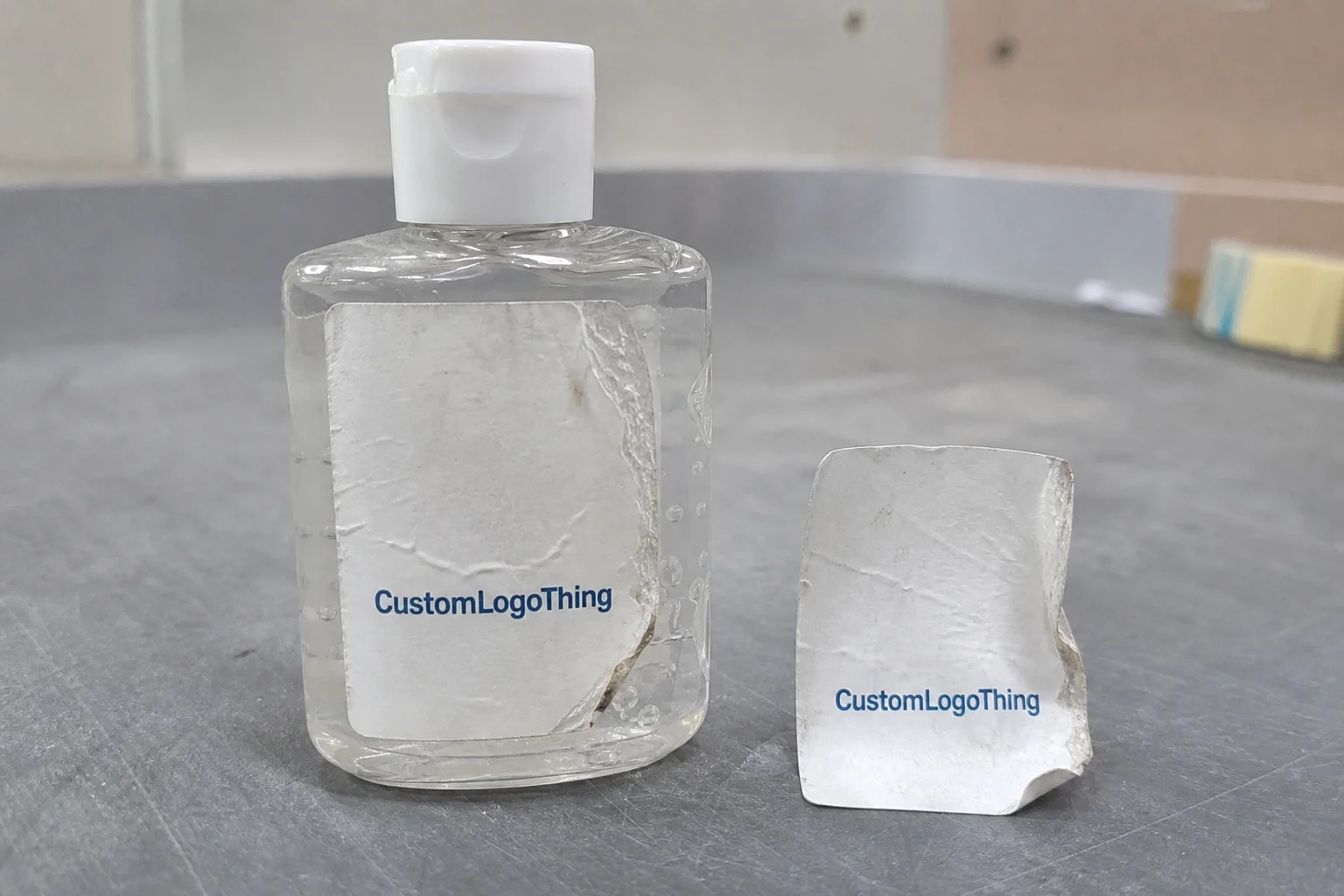
Small bottles amplify every flaw. A slight misalignment is obvious. A thin adhesive line becomes visible. A weak print finish dulls out faster because the label area is tiny and handled directly. A 1/16-inch error on a large carton might disappear. On a 2-ounce bottle, it looks like a production miss.
A label also has to match the bottle geometry. Round travel bottles, flat oval bottles, and pump dispensers each behave differently. A wrap label that fits a cylindrical bottle may curl if the bottle shoulder is too tight. A front-and-back system can solve some of that, but only if the panel sizes are measured correctly. Guessing from a supplier photo usually leads to rework.
There is another problem buyers feel before they can name it: the package looks temporary. A label with crooked edges or visible bubbling makes the bottle seem like a short-run prototype, even if the formula is stable and the brand is established. That perception hits private-label products especially hard because the label is carrying a lot of trust on a very small surface.
A sanitizer bottle is small, so the packaging has nowhere to hide. Poor registration, weak adhesive, and crowded copy all become obvious faster than they would on a larger product.
Different use environments create different wear patterns. Salons wipe bottles often. Gyms keep them near sinks and damp lockers. Medical supply packs sit in carts and drawers. Travel bottles get crushed in luggage. Those use cases do not require the same exact label spec, but they all punish paper stock and weak adhesives in predictable ways.
How the labeling process works on small bottles
The process starts with artwork, but the artwork is not the whole job. A proper label project moves through measurement, dieline setup, proofing, printing, finishing, cutting, and application. Most failures happen at the handoff points. The label may print perfectly and still fail because the dimensions were estimated instead of measured.
Three label formats show up most often on sanitizer bottles. Wrap labels cover the circumference and suit round bottles well. Front-and-back labels split branding and regulatory or ingredient text across two panels, which helps on narrow or curved containers. Pressure-sensitive labels are the standard for most custom bottle runs because they apply cleanly and can be produced in short or long quantities.
Bottle shape drives the layout more than most first-time buyers realize. A round bottle needs enough width to wrap without overlap, but not so much that the edges ride up. A flat bottle can carry more text, though the shoulders and seams still matter. Pump dispensers create more vertical space, yet the label may need to clear molded texture or a taper near the top.
Print method is part of the buying decision too. Digital printing usually makes sense for smaller runs, tighter deadlines, or variable artwork. Flexographic printing can be more efficient at scale, especially when the design stays consistent. Neither option is automatically better. The right choice depends on quantity, color count, finishing, and how much of the label is covered with ink.
Before committing to full production, test the actual bottle whenever possible. A design that looks balanced in a PDF can behave badly on the real container. This is especially true for custom labels for hand sanitizer bottles, where the label area is small, curved, and handled immediately after application.
If the bottle is part of a broader packaging system, keep the label format aligned with the rest of the line. That is where Custom Labels & Tags and other Custom Packaging Products help maintain continuity across different package sizes and reorder cycles.
Materials, adhesives, and finishes that hold up
Paper is still the lowest-cost option, and it is also the first one to fail when moisture enters the picture. For most sanitizer bottles, synthetic film stock is the safer choice. BOPP is common because it resists moisture, stays flexible, and prints cleanly. Vinyl or specialty films can also work where extra conformability matters, although they can cost more than the job needs if the bottle shape is simple.
Adhesive choice deserves as much attention as the material. A permanent adhesive is usually the right call for sanitizer bottles because removable adhesives can lift on curves or after repeated handling. If the product is intended for retail sale, long shelf life, or everyday use, the label should stay put without edge curl or corner lift. A label that starts shifting after a few days creates a quality problem even when the print itself is fine.
Finish changes both appearance and durability. Gloss tends to intensify color and gives the label a sharper, more polished look. Matte reduces glare and can improve readability in bright rooms or under retail lighting. A clear overlaminate adds scuff protection, which matters when bottles are packed tightly, carried in bags, or wiped down often. Varnish can also help, depending on the print method and the level of protection needed.
There is a sustainability tradeoff here. Paper-based looks can be appropriate if the bottle stays dry and the label will not face much wear. Once the product is expected to travel, get wiped, or sit near sinks, that aesthetic choice becomes a durability question. An FSC-certified paper option may be fine for some dry applications, but it still will not match a film label in wet conditions. If packaging has to survive transport stress as well as handling, testing methods from organizations such as ISTA are useful references for how packaging behaves under load.
Color and legibility are not cosmetic issues on a small bottle. Dark backgrounds can look premium, but small text can disappear if the contrast is weak. Ingredient lists, warnings, and barcodes need enough separation from the background to stay readable at arm’s length. On this format, clean typography beats decorative effects every time.
| Label option | Typical strengths | Common tradeoffs | Best fit |
|---|---|---|---|
| Paper label | Lowest material cost, familiar print feel | Weak against moisture, scuffing, and condensation | Dry environments, short promotional use |
| BOPP film | Moisture resistant, durable, good for handled bottles | Slightly higher unit cost than paper | Retail, salons, travel sizes, bathrooms |
| Vinyl or specialty film | Strong conformability, durable surface | Can cost more and may be overkill for simple jobs | Tricky bottle shapes, high-touch use |
| Film with laminate | Extra scuff and moisture protection | Adds cost and one more production step | Premium retail packaging, heavy handling |
Cost, MOQ, and unit price drivers
Label pricing is a combination of material, print method, quantity, size, finishing, and cut complexity. That sounds simple, but it is where many quotes become misleading. A 2 x 3-inch film label with one color and no laminate is a different job from a full-bleed wrap with rounded corners, protective finish, and dense copy. The price should reflect that difference.
Unit cost usually falls as quantity rises because setup and proofing get spread across more pieces. For simple film labels, a rough range around $0.18 to $0.28 per unit at 5,000 pieces can be plausible, though the actual figure moves quickly with size, coverage, and finishing. Smaller runs often land higher. Exact numbers without specs are only placeholders, not a quote you can rely on.
MOQ matters because it sets the tradeoff between flexibility and cost. Lower minimums help with launches, seasonal products, and test markets, but they tend to carry higher unit pricing. That is normal. Setup time, machine time, and prepress work do not disappear just because the run is small.
Several decisions keep pricing under control. Standard shapes usually cost less than Custom Die Cuts. Fewer ink colors keep production simpler. A matte or gloss finish is usually easier to cost than specialty effects. Full coverage graphics can raise the price if they consume more ink or press time. If the label is part of a broader packaging order, consistency across items can help keep the whole system efficient.
Hidden cost is where label budgets get damaged. A wrong size means reprints. Late artwork changes mean new proofs. A mismatched adhesive means the run may not work on the actual bottle surface. That cheap quote becomes expensive quickly when the first test reveals a failure.
Process and turnaround: from proof to delivery
A clean order usually follows a straightforward sequence: artwork review, digital proof, approval, production, finishing, quality check, and shipping. Missing any of those steps increases the chance of a delay. The better the file, the faster the process. A print-ready dieline with correct bleed, safe margins, and clean type can move quickly. A file that needs resizing, barcode cleanup, or compliance edits will slow the order down.
Regulatory text needs space early. Ingredient lists, warnings, directions, and business information should not be squeezed into the last available corner. Microtype is a common failure on small labels because the design looks acceptable on screen and becomes unreadable in production. Once the artwork is tight, there is usually no room to expand the text without rebuilding the layout.
Rush production is possible on many label jobs, but it is not free. Faster schedules reduce correction time and tighten the window for proofing. If the bottle is new or the shape is unusual, a short test run is usually cheaper than forcing a rushed full order. One bad batch costs more than the time saved by skipping a sample.
A reliable vendor should confirm dimensions, show a proof with scale, and give a clear turnaround window. Vague timing is a warning sign. So is a mockup that looks polished but never shows the real measurements. A mockup is useful for presentation. It does not verify fit.
Adhesive set time matters too. Labels may feel secure right after application, but full bond strength takes time to develop. If the bottles are being filled, packed, and shipped the same day, there should be enough handling time for the adhesive to settle before rough transit.
Step-by-step ordering guide for custom labels for hand sanitizer bottles
Step 1: Measure the bottle you actually have. Not the supplier image, not the listing photo, and not a guessed dimension from a similar container. Measure the real bottle and note where the label can sit without hitting a shoulder, seam, or aggressive curve.
Step 2: Define the content before design starts. Brand name, scent, size, ingredients, warnings, barcode, and any business details should be listed early. Small labels fail when text gets added late and has nowhere to go.
Step 3: Choose the stock for the use environment. Moisture, friction, and handling should drive the material choice. If the bottle will live in a car, gym bag, bathroom, or salon station, paper is usually the wrong answer.
Step 4: Review a proof at actual size. Check text size, barcode clarity, bleed, and wrap alignment. If the label follows a curve, look at the edges closely. A design can look balanced on a flat PDF and still fail once it wraps.
Step 5: Test a short run on the real bottle. This is the least expensive way to catch a sizing error or adhesive mismatch. It also shows whether the finished label looks right under normal handling.
The goal is simple. Custom labels for hand sanitizer bottles should fit the container, survive use, and support the product’s value without making the buyer work to read them. Measure first, design second, and approve only after the real bottle is part of the decision.
If the sanitizer bottle is one part of a broader product line, keep the visual system consistent across the full package set. That makes reorders easier and helps the shelf presentation feel deliberate instead of pieced together.
Common mistakes that make sanitizer labels peel or smear
Paper in humid conditions is still one of the most common failures. The label looks fine at first, then the corners lift, the paper softens, and the bottle starts to look old before it has even reached the end user. That is a predictable outcome, not bad luck.
Surface prep matters more than many buyers think. Dust, oil, condensation, and residue can keep the adhesive from bonding properly. A label should go on a clean, dry bottle. Not one that just came out of a cold shipment. Not one handled with lotion on the hands. Not one with mold release still on the plastic surface.
Curvature is another frequent problem. If the bottle is too round or the label is too wide, the edge wants to lift. Once that happens, the rest of the label usually follows. Bubbles are not just cosmetic. They become failure points because the edge has already started to move.
Overdesigned labels also cause trouble. Tiny text, thin reversed-out copy, and too many visual elements reduce readability fast. A sanitizer bottle does not have room for decorative clutter. The label’s main job is to communicate clearly and stay intact long enough to do it.
Approving artwork without checking the actual container is another avoidable mistake. A label can technically fit the dimensions and still fail because the shoulder is more curved than expected or the seam lands in the wrong place. The fix is simple: measure the bottle, request a size-true proof, and test on the real container before ordering volume.
Expert tips and next steps before you place the order
If the bottles are going into purses, bathrooms, cars, or gym bags, a synthetic film with a permanent adhesive is usually the right starting point. It costs more than paper, but it holds up better and avoids the half-peeling look that makes a product feel underfinished.
Ask for a proof that includes dimensions, not just a polished mockup. Presentation images are useful for internal review. They are not enough for production sign-off. The real fit on the real bottle matters more than the rendering.
For a premium feel, pick one visual decision and let it carry the label. Clean typography, controlled spacing, and one finish that suits the product often work better than packing the surface with multiple effects. Small labels punish clutter. They also punish weak contrast.
Order a test batch if the bottle or label shape is new. That is especially smart for private-label launches, salon kits, and retail packaging that has to stay consistent across repeat runs. One short test can save a much larger correction later.
If the sanitizer bottle is part of a larger packaging system, keep the same visual logic across cartons, mailers, and other branded pieces. That is where Custom Labels & Tags and other Custom Packaging Products fit into a larger line rather than standing alone.
The practical sequence is straightforward: finalize the measurements, gather the required text, request the quote, and approve a sample before scaling up. Reuse that checklist every time you Order Custom Labels for hand sanitizer bottles. Consistency saves money, and it prevents the small errors that become expensive once production starts.
What material is best for custom labels for hand sanitizer bottles?
Synthetic films such as BOPP or similar moisture-resistant stocks usually perform better than paper. Pair the film with a permanent adhesive so the label stays on curved, handled bottles. If the bottles will be stored in bags, bathrooms, or other high-touch environments, a laminate or protective finish adds useful resistance to scuffing and moisture.
Do custom sanitizer bottle labels peel in humid environments?
They can if the material or adhesive is wrong, especially with paper labels. Moisture-resistant film, proper surface prep, and enough adhesive set time make a noticeable difference. If the bottles are packed immediately after labeling, allow the bond to settle before rough shipping or repeated handling.
How long does production usually take for custom labels on hand sanitizer bottles?
Simple jobs often move quickly once the artwork is approved and the size is confirmed. Timeline depends on proof approval, print method, finishing, and shipping distance. Rush production is possible, but it usually raises cost and reduces the time available for correction.
What size should hand sanitizer bottle labels be?
Measure the actual label area on the bottle, not the product photo. Leave room for seams, curvature, and any ingredient or warning text. If the bottle shape is new, test the label on the real container before ordering the full quantity.
Can custom labels for hand sanitizer bottles include ingredients and warning text?
Yes, and they usually should if the product needs that information for retail or compliance reasons. Keep the type size readable on a small surface and reserve space early so legal text does not crowd the branding or barcode. That is much easier than redesigning after proof approval.


