label weavers personalized 100 Woven Sewing Labels 1 wide is a small spec with an outsized effect. A label that narrow does not just sit inside a garment; it changes the way the garment feels finished, how the brand is remembered, and how confidently the piece survives washing, handling, and repeated wear.
That is why the useful questions are not abstract. Can the design stay legible at 1 inch? Does a 100-piece run make sense for the production schedule? Which fold hides the edge cleanly without burying the logo? And what price should a buyer treat as realistic once setup, finishing, and shipping are included? For a wider comparison across formats, the Custom Labels & Tags page is a practical place to compare woven, printed, and other branding options side by side.
Why label weavers personalized 100 woven sewing labels 1 wide fit small runs
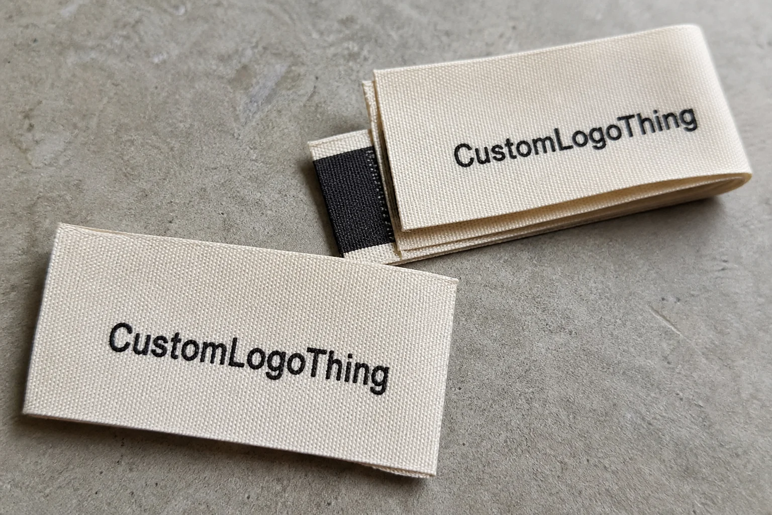
A 1-inch woven label can carry more weight than a larger, less considered trim because the weave gives it structure, wash resistance, and a textile feel that belongs on the garment rather than sitting on top of it. Woven construction also tends to age better than a printed label in high-friction areas. The tradeoff is obvious: the smaller the label, the less room there is for detail, so the design has to earn every thread.
That makes a 100-piece order especially useful for small brands. It suits sample drops, capsule collections, handmade goods, prototype runs, and limited releases where branding matters but inventory risk should stay low. If the label is being used on a product line that may evolve, a short run prevents the expensive mistake of locking in a design that seemed good at concept stage but fails at sewn size.
The phrase label weavers personalized 100 woven sewing labels 1 wide describes a production choice, not just a decorative one. It implies a label that needs to work in a real sewing workflow: stitched into a seam, folded into a neck area, inserted into a side tab, or placed where the buyer can see the brand without being distracted by it. That balance is harder than it sounds. Too much artwork turns into visual noise. Too little and the label looks generic.
Woven labels are built from thread, not ink. That matters because the image is created by structure, so the finish feels integrated with the garment. It also means the art must be simplified before production begins. Thin lines, long taglines, tiny registration marks, and overly detailed borders often compress into muddy texture at 1 inch. A good woven label is usually plain in the best sense of the word: clear type, controlled spacing, and one idea that reads immediately.
Material choice matters too. Most woven sewing labels use polyester thread because it tolerates washing well and holds shape better than softer, less stable alternatives. Some labels are finished with a softer hand for skin-contact placement, while others use a firmer edge for durability near seams that take stress. The best choice depends on where the label will live in the garment, not on how it looks in a mockup.
A buyer should think less like a graphic designer and more like a production manager. The question is not whether the label looks polished on screen. The real test is whether it still looks intentional after sewing, folding, heat, abrasion, and laundering. That is where the quality difference shows up.
Production steps and timeline for a 100-label woven order
The process starts with artwork review. A supplier or label house normally checks whether the file can be translated into thread counts, color boundaries, and edge structure without losing clarity. That is not a formality. A design that seems fine in vector form may need simplification before weaving begins, especially if the artwork depends on hairline detail or small text.
After approval, the job moves into loom setup and thread matching. The weaving stage itself is only one part of the timeline. Cutting, folding, edge finishing, backing selection, and inspection all matter, and each can affect the final appearance. If the label needs a heat-sealed edge or an ultrasonic finish, that adds another production step. For a 100-piece order, setup work can feel disproportionately large because the fixed prep cost is spread across a small quantity.
Simple labels usually move faster. Fewer colors, a clean shape, and a standard fold reduce the chance of revision. Dense text, complicated borders, specialty backing, or a request to match a very specific shade increases the likelihood of proof changes. That is why a small order is not always a quick order.
For planning purposes, a straightforward woven label run often lands somewhere around 12 to 15 business days after proof approval, with the caveat that queue length and revision cycles can push that out. Rush shipping only helps after production is complete. If the labels are needed for a launch, a sewing deadline, or a retail delivery window, the safer move is to start earlier than feels necessary.
Quality control on a small run should be practical, not ceremonial. The checks that matter most are simple: compare the proof against the actual garment, inspect the edge finish for loose threads, verify that the fold matches the sewing plan, and confirm that the text remains readable at arm’s length. A label that passes those checks is doing its job. A label that only looks good in a digital proof is not enough.
Packaging discipline matters as well. Small trim orders can wrinkle, bend, or arrive disordered if handling is careless. The broader logic used in packaging operations applies here too, which is why the handling standards described by packaging.org are relevant even for a seemingly minor item like a woven label.
Cost, pricing, and MOQ details buyers should compare
Pricing is usually driven by a few concrete variables: finished size, number of weave colors, fold type, border treatment, backing, and the complexity of the art itself. Those are the variables worth comparing because they affect labor and machine setup. A quote that looks lower on the surface may simply omit one of those costs until the end.
For a simple 100-piece woven run, a realistic starting range is often around $40 to $95 before shipping. That number can rise if the design uses multiple colors, a custom fold, a soft backing, or additional proofing. It can also rise if the artwork is dense enough to require extra translation work before weaving. Small quantity pricing is rarely about raw material cost alone; setup time is the bigger force.
| Format | Best Use | Cost Tendency | Readability at 1 Inch |
|---|---|---|---|
| Flat cut | Sample runs, simple sew-in applications | Lower | Good if the artwork is spare and bold |
| End fold | Side seams, necklines, clean visible edges | Moderate | Very good for a tidy branded finish |
| Center fold | Looped sew-in placement, neck seams, hanging points | Moderate | Good when the design is balanced and simple |
| Loop fold | Garments needing double-sided visibility | Higher | Good, but only if the layout is planned for both sides |
MOQ matters because the best value is not always the lowest unit price. A 100-piece order makes sense when the brand is testing a new product line, working through a small production batch, or trying to avoid dead inventory. On the other hand, if the labels will be used steadily across multiple drops, a slightly larger run can reduce the per-piece cost enough to justify the extra inventory.
Buyers should also watch for hidden charges. Rush fees, extra revision rounds, upgraded shipping, and special finishing can make a quote that looked competitive become less attractive once the order is finalized. The cleanest comparison is a quote that breaks out production, setup, and delivery separately.
A low quote only matters if the final label still reads cleanly, sews well, and arrives in time for the garment schedule. Cheap trim that fails in production is expensive in practice.
If the broader branding system is still being decided, it helps to compare woven labels against printed options, patches, and hang tags on the Custom Labels & Tags page before committing to a format.
How to spec the right size, fold, and finish
Start with placement. A 1-inch label can feel generous on a tote or utility piece and cramped on a delicate neckline. The garment determines the label, not the other way around. Measure the seam or panel where the label will be stitched, then ask whether the design can remain readable once the seam allowance and fold are taken into account.
Folds are not cosmetic. They determine how much of the edge is hidden, where the stitch line lands, and which parts of the design remain visible after sewing. End fold is a strong default when the label should look tidy on a seam. Center fold works well when the label needs to sit over a seam or be stitched into a looped placement. Flat cut is straightforward and often economical, but it leaves more responsibility on the sew operator to finish the edge neatly.
The face of the label should be designed around the reading order. Usually that means brand name first, then supporting detail only if there is enough room. Font weight matters more than many first-time buyers expect. Thin serif lines, decorative script, and compressed spacing can all collapse in thread. Bold simplicity usually outperforms ornate detail at this width.
Finish affects both comfort and durability. If the label sits near skin, a softer hand can reduce irritation. If the label is exposed at a seam that gets friction, a more sealed edge may be the better choice. There is no universal best finish. The correct one depends on the garment, how it is worn, and how much the label will be handled in wash and use.
It also helps to think about the label as part of a transit path. Trim orders are not fragile in the way glass is fragile, but they can still be bent, crushed, or sorted badly if packaging is careless. The transport standards used in other parts of product handling, including those discussed by ISTA, are a useful reminder that even small components need predictable handling.
The proof should be judged at actual sewn size. Screen brightness can make a weak layout look stronger than it is, and a design that reads well at full zoom may fail at 1 inch once it is folded and stitched. The strongest approvals happen when the buyer compares the proof against a real garment, not against the hope of a good result.
Common mistakes that hurt readability and durability
The most common mistake is overcrowding. Buyers often try to fit the logo, tagline, website, size, care message, and a decorative border into a space that can barely support the brand name. At 1 inch wide, restraint is not a compromise. It is the difference between a label that reads as intentional and one that looks rushed.
Thin typography is another repeat offender. What looks elegant on a screen can become a blurred texture once translated into thread. That is especially true for small serif details, script lettering, and narrow spacing between characters. If readability depends on tiny strokes, the artwork should probably be simplified before production begins.
Too many colors can also weaken the final piece. More colors do not automatically create a richer label; they often create more complexity and more opportunity for mismatch between proof and production. A strong two-color label frequently looks more polished than a crowded four- or five-color version at this size.
Fold mistakes are easy to miss in mockups and obvious in the finished garment. If the fold hides the brand name, cuts through key text, or leaves the seam line in an awkward position, the label will look improvised even if the weaving itself is accurate. That is why the fold should be chosen after the layout is finalized, not before.
Durability problems usually come from ignoring real-world use. A label that will be washed often needs enough structure to hold its shape. A label placed near skin needs to be checked for scratchiness. A label used on workwear needs to survive rougher handling than one used on a lightweight fashion item. None of that is glamorous, but it is what determines whether the trim feels premium after a few weeks of wear.
The quiet truth is that a good woven label succeeds because it disappears into the garment system. It looks right, feels right, and survives the job. If any one of those fails, the whole piece feels less finished.
Expert tips for a cleaner, more premium result
Simplify the art before submitting it. A compact logo, a strong wordmark, and one clear visual hierarchy usually produce a better woven result than an elaborate composition that depends on tiny details. When the label is this small, every extra line has to justify its existence.
Use contrast strategically. Good contrast does more for legibility than decorative borders or extra flourishes. Background and foreground thread should be chosen so the brand reads quickly under normal lighting, not only under ideal studio conditions. If the label has to be inspected to be understood, it is probably too subtle.
Order a small buffer if the labels will be used in assembly, retail stock, or fulfillment. A 100-piece order can disappear faster than expected once samples, reworks, and replacements are counted. That extra margin prevents one missing trim from slowing a whole batch of garments.
Inspect the proof like a production buyer, not like a logo owner. Check the actual width, the stitch line placement, the edge finish, and the way the fold affects the artwork. Then compare the proof to the fabric color and the garment shape. A label can be technically accurate and still look wrong if the surrounding product is not taken into account.
Brand tone matters too. A handmade product usually benefits from a quieter label. A utility piece can support a stronger mark. The woven label should belong to the product family, not compete with it. That is one of the clearest signs of a mature brand system.
Premium trim usually comes down to fit: the right size, the right contrast, the right fold, and a design that still looks composed after sewing and laundering.
What to do before you request a quote or place the order
Before asking for pricing, have the artwork file ready, confirm the finished width, and know where the label will be sewn. Those three details eliminate most back-and-forth. If the supplier has to guess at placement or fold orientation, the proofing process slows down and the risk of misalignment goes up.
It helps to decide what matters most before the quote arrives. List the priorities in order: legibility, fold style, hand feel, color accuracy, and quantity. That forces the tradeoffs into the open. In small-batch production, not every preference can be maximized at once.
Request a proof and compare it against the actual garment, not only against the digital art file. Scale can be deceptive. A label that seems balanced on screen may look crowded or too spare once it is physically attached. The garment tells the truth faster than the mockup does.
Timing should include transit, not just weave time. If the labels are needed for sewing, packing, or launch inventory, the delivery window must be checked against the production calendar. For companion packaging like inserts or hangtags, FSC-certified stock can be relevant, and the standard at fsc.org is worth reviewing if those materials are part of the same rollout.
For a small batch or a larger line extension, label weavers personalized 100 woven sewing labels 1 wide should be judged by whether they solve the actual branding problem: clear identity, clean sewing, durable wear, and a finish that supports the garment instead of fighting it.
What does 1 wide mean for woven sewing labels?
It refers to the finished label width, which is narrow enough for seams, necklines, side tabs, and other small branding placements. At that size, artwork needs to be simplified so the woven text and logo stay readable after stitching and washing.
Are 100 woven sewing labels enough for a small apparel run?
Yes, 100 is often enough for samples, capsule drops, maker batches, and early-stage brands testing a design. It is a practical quantity when you want a custom finish without committing to a larger inventory of trims.
Which fold works best for personalized woven labels in this size?
The best fold depends on where the label will be sewn and how much of the design needs to stay visible. End folds and center folds are common choices when the goal is a clean sew-in finish with readable branding.
How long does production usually take for a small woven label order?
Lead time depends on artwork approval, color count, finishing, and the current production queue. Simple orders usually move faster, but rush shipping cannot replace the time needed for weaving and inspection.
How can I make small woven sewing labels easier to read?
Use bold, simple typography and keep the amount of text to a minimum. Strong contrast between the background and the design also helps the label stay legible at actual sewn size.