Buyer Fit Snapshot
| Best fit | Packaging Branding Comparison projects where brand print, material claims, artwork control, MOQ, and repeat-order consistency need to be specified before quoting. |
|---|---|
| Quote inputs | Share finished size, material target, print colors, finish, packing count, annual reorder estimate, ship-to region, and any compliance wording. |
| Proofing check | Approve dieline scale, logo placement, barcode or warning zones, color tolerance, closure strength, and carton packing before bulk production. |
| Main risk | Vague material claims, crowded artwork, missing packing details, or unclear freight terms can make a low unit price expensive after revisions. |
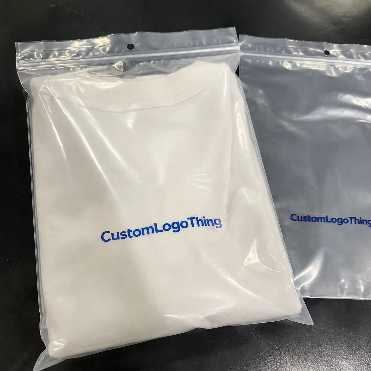
Fast answer: Packaging Branding Comparison: Choosing the Right Fit should be specified like a repeatable production item. The safest quote records material, print method, finish, artwork proof, packing count, and reorder notes in one written spec.
Production checks before approval
Compare the actual filled-product size with the drawing, then confirm tolerance on folds, seals, hang holes, label areas, and retail display edges. Reserve space for logos, QR codes, warning copy, and material claims before decorative graphics fill the panel.
Quote comparison points
Review material grade, print process, finish, sampling route, tooling charges, carton quantity, and freight assumptions side by side. A quote is only useful when the supplier can repeat the same color, closure quality, and packing count on the next order.
Two packages can look almost identical on a monitor and still behave like totally different animals on a corrugated line, a folding carton folder-gluer, or a retail shelf under 4,000K LED lights. That gap is exactly why packaging branding comparison matters so much, because what looks polished in a PDF may slow a packing team down, scuff in transit, or miss the brand promise the minute a customer lifts the lid. I’ve watched this play out more than once, including a client in Newark, New Jersey who approved a matte rigid box on screen, only to discover during production that the same finish showed every fingerprint after a 40-pack tote had been handled for fifteen minutes straight. The box looked like it had been through a subway rush hour. That’s the kind of thing no one mentions in a presentation deck.
In plain terms, packaging branding comparison is the side-by-side evaluation of visual style, material choice, print method, structure, and cost so a brand can decide which packaging version truly fits the product and the channel. Too many teams treat package branding like a style exercise and stop there, when the real job is to balance brand identity, protection, manufacturing efficiency, and repeatable results across 5,000 or 50,000 units. That balance is what separates good product packaging from packaging that quietly drains margin. I’ve seen beautiful boxes destroy a budget with the kind of confidence usually reserved for bad taxi rides.
At Custom Logo Things, I’ve seen this conversation come up everywhere from 250-unit subscription mailers to 20,000-unit luxury gift cartons, and the same question keeps returning: which option gives the right feel without creating a headache on the floor? That is the heart of packaging branding comparison, and once you understand the moving parts, the decision becomes a lot less subjective.
Packaging Branding Comparison: What It Really Means
Packaging branding comparison starts with a simple truth: two packs may share the same logo and still tell completely different stories. One might use a natural kraft corrugated mailer with a single-color flexographic print, while another uses a 350gsm SBS folding carton with foil stamping, embossing, and a soft-touch laminate. On paper, both can look premium, but in practice they send different signals, cost different amounts, and perform differently in storage, shipping, and retail.
When I say comparison, I mean the full package, not just the artwork. A proper packaging branding comparison looks at branding consistency, material selection, structural design, print method, and the real cost to make and ship the unit. It also asks whether the packaging supports the product’s price point, because a $12 skincare item in a rigid box may feel mismatched, while the same structure for a $90 gift set can feel exactly right. I remember one founder in Chicago telling me, with a perfectly straight face, that the box “looked expensive enough to be expensive.” Which, frankly, is not a plan.
There are a few comparison buckets I see over and over in factory meetings. Teams compare minimal branding against bold branding, premium positioning against value positioning, recycled substrates against virgin board, and standard print against specialty finishes. These choices affect everything from the perceived quality on a shelf to whether the order can run on a 6-color offset press in Dongguan or needs slower secondary finishing in Indianapolis.
Packaging branding comparison is also a logistics decision. A carton that looks wonderful but crushes easily in a fulfillment center will create a different customer experience than a slightly less dramatic design made from stronger board. In my experience, the smartest teams compare not only what the package says, but what it can survive on a truck from Dallas to Atlanta or in a pallet stack for 72 hours.
One buyer told me during a plant visit in Ohio, “We kept falling in love with the most expensive sample until the shipping team stacked 18 cartons high and the whole conversation changed.” That is exactly the kind of reality check a good packaging branding comparison should deliver.
How Packaging Branding Comparison Works in Practice
The practical workflow usually begins with brand goals and ends with manufacturing specs, but the gap between those two points is where most teams either save money or create problems. In a clean packaging branding comparison, the brand team defines the story first: premium, eco-conscious, playful, technical, or utilitarian. Then production teams translate that story into measurable requirements such as board grade, finish type, closure style, ink coverage, and assembly method. For a 10,000-piece project, those details can change the quote by 15% to 30%.
I still remember walking a folding carton line in Pennsylvania where the artwork looked elegant, but the solid flood of dark navy ink caused visible mottle after drying because the chosen stock absorbed unevenly. The design team had compared mockups, but they had not compared how the print would behave on that specific paper. That is why a serious packaging branding comparison always includes both design review and production review. If you skip that part, the press will happily teach you a lesson you did not ask for.
Here’s the basic workflow I’d expect on a well-run project:
- Define the product, channel, and brand objective.
- Collect structure options, such as mailer, folding carton, rigid box, or insert system.
- Compare substrates, including kraft board, SBS paperboard, corrugated board, and specialty papers.
- Review decoration options like offset printing, flexographic printing, digital print, foil stamping, embossing, spot UV, or matte lamination.
- Build prototypes and compare them under realistic conditions.
- Lock specifications and test for repeatability before the full order.
Packaging branding comparison gets much sharper once prototypes enter the process. A white soft-touch carton under showroom lighting can feel luxurious, but the same surface may show abrasion marks after a 2-day parcel journey. I’ve seen DTC brands learn this the hard way when unboxing samples looked flawless on a studio table in Los Angeles, yet arrived with corner rubbing after going through a sorter in Louisville and two distribution hubs. There’s nothing like seeing a luxury box come off a conveyor looking like it lost a fight with a carpeted staircase.
Factories matter here too. A corrugated converting plant in Shenzhen will handle a mailer very differently than an offset carton shop in Milwaukee or a digital print line in Barcelona running 1,000-piece seasonal batches. Same artwork, different machine behavior. Same brand goal, different result. A thorough packaging branding comparison should account for that reality, not pretend all suppliers produce the same output.
After the sample stage, many teams request press proofs, supplier samples, or a small pilot run. That extra step can feel slow, but it often saves money by preventing a bad full-scale decision. If you are comparing product packaging formats across channels, this is where the data gets real, not theoretical. A pilot run of 300 units can reveal score-cracking, registration drift, and glue failure long before a 25,000-unit order is locked.
Key Factors in Packaging Branding Comparison
There are several factors that should stay on the table during every packaging branding comparison, and I like to break them into seven categories because it keeps teams honest. If you only compare one or two, the result may look good in a meeting and fail later in production. A quote that saves $0.08 per unit can disappear fast if the box adds 12 seconds of hand assembly or a 3% damage rate.
Brand consistency
Brand consistency covers color match, logo placement, typography, and how the hierarchy reads across multiple SKUs. If your navy shifts from one carton to another by even 2 to 3 Delta-E points, customers may not notice individually, but the shelf presentation starts to look messy. That is especially visible in retail packaging where five or six variants sit next to each other, like a 6-foot shelf in Target or a countertop display in a pharmacy chain.
In a solid packaging branding comparison, I’d ask whether the packaging preserves the same tone across a matte mailer, a gloss carton, and a label application. A clean identity system is worth money because it saves rework and keeps the brand recognizable, especially when you’re using multiple print vendors in Toronto and Monterrey or two different factories in different time zones.
Material and structure
Material choice changes everything from stiffness to print vibrancy. Kraft board gives a natural, earthy look, while SBS paperboard often carries fine details better. Corrugated board adds strength for shipping, rigid board gives a high-end presentation feel, and specialty papers can create texture that immediately signals craftsmanship. A packaging branding comparison should ask not just what the board looks like, but what it feels like at a 30-centimeter handoff distance and whether it holds its edge after a 48-hour transit.
I once sat with a cosmetics founder in Austin who wanted the look of a luxury rigid box but the shipping profile of a corrugated mailer. We ended up comparing a two-piece rigid set with an inner tray against a reinforced mailer with a printed insert, and the second option saved about 18% on landed cost while still protecting the jars. That kind of result is exactly why packaging branding comparison should include structure, not just decoration.
Print and finish
The print method has a huge effect on how branding reads. Offset printing delivers strong detail and color control for medium to large runs. Flexographic printing is efficient for many corrugated applications. Digital print is often the best fit for shorter runs or frequent version changes. Add foil stamping, embossing, debossing, soft-touch coating, spot UV, and matte or gloss lamination, and suddenly the same artwork can produce wildly different brand signals.
In a practical packaging branding comparison, I like to ask whether the finish supports the message or just adds cost. A spot UV hit on a logo can improve shelf visibility, but if the rest of the design is already busy, it can feel overworked. The same is true for foil. A narrow foil detail can look sharp; a heavy foil flood can look expensive in a bad way. I mean, there is a fine line between premium and trying very hard, and packaging crosses it more often than people admit.
Cost and pricing
Cost is never just the unit price. Real comparisons should include setup charges, plates or dies, minimum order quantities, finishing premiums, freight, storage, and spoilage risk. A custom printed boxes order might look attractive at $0.42/unit for 5,000 pieces, but once you add tooling, freight from Qingdao to Chicago, and a longer drying cycle that slows shipment by 8 business days, the actual landed cost may move much higher.
One of the biggest mistakes I see in packaging branding comparison is comparing only the quote line for the carton itself. That ignores labor, assembly time, damage rates, and inventory carrying cost. A box that costs $0.06 more but cuts packout time by 4 seconds can pay back quickly in a high-volume operation. On a 20,000-unit monthly run, that is the difference between one shift and a lot of overtime.
| Packaging option | Approx. unit cost | Typical setup cost | Best fit | Typical lead time |
|---|---|---|---|---|
| Single-wall corrugated mailer | $0.38 to $0.72 | $180 to $450 | E-commerce shipping | 10 to 15 business days |
| Folding carton with 4-color offset print | $0.24 to $0.61 | $320 to $900 | Retail packaging | 12 to 18 business days |
| Rigid box with soft-touch and foil | $1.40 to $3.80 | $700 to $2,400 | Premium gifting | 18 to 30 business days |
Process and timeline
A strong packaging branding comparison includes the calendar, not just the concept. Artwork approval may take 2 to 5 rounds, structural sampling 5 to 10 business days, die creation another 3 to 7 days, and print production anywhere from 10 to 25 business days depending on finish complexity. Add lamination, curing, or hand assembly, and the schedule can shift fast. A simple tuck box can reach production in 12 to 15 business days from proof approval, while a rigid setup in Dongguan may take 22 to 28 business days.
One supplier negotiation I remember well involved a client wanting embossed foil on every sleeve, but the schedule was tied to a trade-show launch in Las Vegas. The finish would have added six business days, which would have missed freight booking by a day and a half. We switched to a high-contrast matte-plus-foil combination and kept the launch intact. That is the kind of practical thinking a good packaging branding comparison should uncover early.
Sustainability and compliance
Sustainability can be a brand advantage, but only if the claims are credible. Recycled content, FSC-certified paper, water-based inks, and reduced-plastic structures all matter, but they need to fit the product and the route to market. If your packaging will pass through a retailer with strict packaging specs, you may need ASTM testing, dimensional control, or clear material documentation. For broader standards and industry references, I often point teams to the EPA sustainable materials guidance and the FSC certification framework.
In packaging branding comparison, sustainability should not be treated as a sticker you add at the end. It changes substrate selection, finish options, and even ink choice. If your packaging is meant to be curbside recyclable, a heavy plastic laminate may work against that goal, even if it looks beautiful. A 350gsm C1S artboard with aqueous coating can be a better fit than a laminated board for certain retail programs in California or Ontario.
Channel fit
Retail shelves, DTC shipments, subscription packaging, and luxury gifting all ask different things of the pack. Retail packaging needs quick recognition and strong shelf presence. E-commerce packaging needs durability and a clean unboxing experience. Subscription formats need repeatable assembly and efficient packing. Gift packaging needs a sense of occasion. A good packaging branding comparison should match the channel before it worries about decoration.
For more examples of how this plays out in the field, our Case Studies page shows real projects that moved from concept to production with different materials, structures, and finishes in New York, Shenzhen, and Dallas.
Step-by-Step Packaging Branding Comparison Guide
If you want a method that holds up under pressure, use a structured packaging branding comparison rather than a gut-feel debate in a conference room. I’ve seen cross-functional teams spend two weeks arguing over the nicer one when a one-page scorecard would have settled most of the issue in an hour. For a 15-SKU launch, that hour can save a week of revision cycles.
- Define the brand objective. Decide whether the priority is premium perception, lower cost, faster fulfillment, eco-friendly positioning, or stronger shelf impact.
- Build a comparison matrix. Use rows for each packaging option and columns for structure, cost, timeline, finish, durability, and labor impact.
- Request sample builds. Ask for actual printed samples or near-final prototypes, not just blank mockups.
- Review in real conditions. Check daylight, retail lighting, shipping abrasion, stacking, and opening behavior.
- Score with multiple stakeholders. Marketing, operations, sales, and procurement should all weigh in.
- Lock the spec. Document board grade, ink standard, tolerances, and packout method so the decision stays stable on reorder.
That sequence sounds simple, but the details matter. During one meeting with a beverage client in Atlanta, marketing loved a silver foil carton, operations loved a lighter corrugated sleeve, and procurement loved the lower freight weight of the sleeve. The comparison matrix showed that the sleeve also saved 11 seconds per packout station, which ended up being the deciding factor. That is the sort of concrete outcome a disciplined packaging branding comparison should produce.
When I review samples, I like to touch the edges, not just stare at the panels. Are the cuts clean? Does the score crack? Does the coating mark when bent? Does the carton spring open too much after assembly? Those little physical clues reveal whether the packaging will feel expensive or merely look expensive for a minute.
It also helps to compare with real artwork, or artwork that is at least 90% complete. Empty prototypes can flatter a structure that will later be crowded by legal copy, barcodes, or ingredient panels. A serious packaging branding comparison should include the real visual load, because a design with six color blocks and two compliance panels behaves differently from a clean single-logo layout.
If you’re selecting a vendor, ask whether they can produce Custom Packaging Products that match the exact board, finish, and assembly style you need. The best suppliers will talk in specifics: board caliper, coating weight, MOQ, curing time, and how the package runs on the actual line. A supplier in Guangzhou or Ohio should be able to quote those details within one or two business days.
For brands that rely on product variation, I also recommend considering the role of labels and inserts inside the comparison. A strong outer carton can still feel underdeveloped if the inner branding is weak. Our Custom Labels & Tags category is often part of the broader package branding system, especially for seasonal launches or limited editions of 500 to 5,000 units.
Common Mistakes in Packaging Branding Comparison
The most expensive mistake is choosing the prettiest sample without checking how it runs on production equipment. I’ve watched this happen on a small corrugated mailer job where the artwork looked fantastic, but the locking tabs were just tight enough to slow the line by 20 percent. That delay turned a cheap pack into a costly one, because labor swelled and the team started hand-adjusting every tenth unit. I still feel a little annoyed thinking about it.
Another frequent error in packaging branding comparison is comparing unit price and nothing else. A lower quote can hide setup charges, shipping, reprint risk, storage fees, or spoilage caused by poor fit. The more complex the structure, the more dangerous that narrow view becomes. A $0.15 per unit quote for 5,000 pieces can look attractive until a second pass of sampling adds $240 in plates and a 9-day delay.
There’s also a timeline trap. Specialty finishes like foil, embossing, soft-touch coating, or multiple spot UV passes can add days to the schedule, and custom dies or plates can add more. If your launch date is fixed, a better package that misses the window may be worse than a simpler version that arrives on time. I’ve seen a Toronto launch slip three weeks because the embossing depth was revised after approval.
I see brand inconsistency all the time across cartons, mailers, inserts, and wrap labels. A team might nail the outer box and then use a generic inner insert that breaks the whole experience. Good packaging branding comparison keeps the system aligned so the brand feels intentional from the first glance to the last layer, whether the product ships from Atlanta or Shenzhen.
Then there’s real-world testing, or the lack of it. A sample that survives desk handling may still scuff in a fulfillment center, loosen under vibration, or lose its shelf face after stacking. If a package is going into retail packaging channels, a basic distribution test informed by ISTA methods can reveal risks long before a retail buyer does. For reference, the ISTA testing standards are a solid place to start when you want packaging that can survive transit instead of only photo shoots.
Finally, too many teams keep operations out of the room until the end. Once production raises a concern, redesigns get expensive and morale drops. The best packaging branding comparison meetings I’ve attended had a press operator, a shipping manager, and a buyer in the same room early enough to challenge assumptions while there was still time to adjust the spec.
Expert Tips for Smarter Packaging Branding Comparison
Use physical samples whenever possible. Color shifts, coating feel, and paper texture can be hard to judge on a screen, and a monitor will never tell you how a soft-touch finish feels under thumb pressure after a 12-hour shift. A real sample in hand gives you more useful information in 30 seconds than a spreadsheet can in 30 minutes.
If you’re deciding between folding cartons, rigid boxes, and corrugated mailers, ask the supplier for comparable examples from actual jobs. I like to compare not just the structure but the print method and finish history too, because a supplier who has run a similar order before can often predict issues before they hit the floor. That’s one reason a detailed packaging branding comparison is safer than choosing from a catalog page alone.
Keep one or two variables constant. For example, hold logo size, paper weight, or print palette steady so you can isolate the effect of structure or finish. If you change everything at once, you won’t know whether the better sample is better because of the board, the coating, or just a more flattering photo angle. On a 300-piece prototype set, that discipline is the difference between insight and guesswork.
Think like the customer for three seconds and for three minutes. In the first three seconds, does the box communicate value and clarity? In the first three minutes, does it open cleanly, hold shape, and reveal the product in a satisfying way? That time-based thinking is central to package branding and helps a packaging branding comparison move beyond aesthetics into real user behavior.
I also recommend checking line speed and labor efficiency. I once helped a snack brand compare a glued-end carton against a tuck-end design, and the gluer looked marginally cheaper until we timed the packout. The tuck-end saved enough labor to beat the glued version by a meaningful margin. Small differences like that matter a lot when you’re filling 8,000 units a day in a facility outside Indianapolis.
Document everything. Board grade, coating, ink system, die-line revision, assembly notes, tolerance limits, and approved reference samples should all be stored in the project file. That way future reorders do not drift. A strong packaging branding comparison only helps if the final choice can be repeated next quarter and next year without unpleasant surprises.
Next Steps After Your Packaging Branding Comparison
Once you’ve narrowed the field, gather three to five options that truly match your brand goals and compare them with a scorecard rather than a debate around lunch. This keeps the process grounded in facts. It also protects your team from the common trap of falling for the loudest opinion in the room, especially when a sales lead prefers a glossy sample and operations wants a board that survives 24-inch stacking.
Next, collect material samples, print samples, and rough cost estimates from your packaging partner. If you can get one sample in 350gsm C1S and another in 18pt SBS, do it. If you can compare a matte laminated version with a gloss version, even better. That kind of detail makes the packaging branding comparison much more meaningful. Ask for a firm quote at 3,000, 5,000, and 10,000 units so the scale effect is visible.
Then run a short internal review with marketing, operations, and purchasing. The brand team may care most about shelf presence, operations may care about assembly and damage, and purchasing may care about total landed cost. The final choice is usually strongest when it satisfies all three without pretending the tradeoffs do not exist. A one-hour review in a conference room in Portland can save a two-week correction cycle later.
If the packaging is changing materially, ask for a pilot run or a small production batch before you commit to full scale. That is especially smart when you are moving from standard print to specialty finishes, or from a folding carton to a rigid box system. A pilot run turns the packaging branding comparison from theory into evidence. For seasonal items, even 500 units can reveal whether the design stacks, ships, and opens the way you expected.
For brands building out a full packaging system, I’d also recommend reviewing the broader mix of boxes, mailers, inserts, labels, and tags. The outer shell is only part of the story. When all the components are aligned, branded packaging feels intentional, which supports both trust and repeat purchase behavior.
Finally, lock the winning spec and keep it as the baseline for every reorder. If you want the next production batch to look and feel like the first one, the details have to be written down clearly. That’s the quiet discipline behind a successful packaging branding comparison: not just choosing well, but preserving the choice with enough clarity that it can be made again the same way in March, June, and November.
“The packaging looked beautiful in the sample room, but the first time we watched it run at speed, we learned what really mattered.” I’ve heard some version of that sentence from buyers, operators, and plant managers more times than I can count, and it usually leads back to the same lesson: compare for the floor, not just the photo.
For brands that want support turning those decisions into actual deliverables, Custom Logo Things can help with custom printed boxes, branded inserts, labels, and other packaging formats that fit the product, the budget, and the production timeline. A thoughtful packaging branding comparison pays off most when the final package can be ordered again, packed faster, and recognized instantly by the customer.
What is packaging branding comparison and why does it matter?
Packaging branding comparison is the side-by-side Review of Packaging options based on branding, materials, structure, print method, cost, and performance. It matters because a pack that looks strong on screen may fail in transit, slow production, or send the wrong message on shelf. In short, it helps brands choose Packaging That Works visually and operationally.
How do I start a packaging branding comparison for my product line?
Begin with one clear brand goal, then compare each package option against the same criteria: cost, appearance, durability, print method, and production timeline. I usually recommend starting with three samples so the comparison stays manageable and practical rather than turning into a room full of mixed opinions. A 3-option review is often enough to see whether the best fit is a mailer, carton, or rigid box.
What matters most in packaging branding comparison: cost or design?
Both matter, but the best choice usually balances brand impact with production efficiency and total landed cost. A stronger design can still win if it improves conversion, reduces shipping damage, or supports a higher selling price, while a lower-cost option may lose if it weakens the brand story. In some cases, a $0.28 carton beats a $0.19 carton because it cuts returns by 2%.
How long does a packaging branding comparison usually take?
It depends on structure and finishing complexity, but sample rounds, reviews, and approvals often take several steps. If custom dies, specialty coatings, or multiple stakeholders are involved, the process can stretch by a week or more, especially when the first sample needs revision. A straightforward carton comparison may take 7 to 10 business days, while a rigid box decision can take 3 to 4 weeks.
What packaging materials should I compare first?
Start with the material that fits the channel: corrugated for shipping, folding carton for retail, and rigid board for premium presentation. After that, compare paper stock, coatings, and finish options so you can see which version best matches your brand identity and budget. For many brands, that means testing kraft, SBS, and 350gsm C1S artboard side by side.
Can packaging branding comparison help reduce long-term costs?
Yes, because it helps you avoid expensive mistakes such as overdesigned packaging, poor assembly performance, or damage in transit. The right comparison can reveal a package that lowers labor, freight, and spoilage even if its unit price is slightly higher. Over a 10,000-unit run, saving 3 seconds per pack can matter more than shaving $0.03 off the carton price.